[comment by Aisha Fouad]
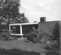
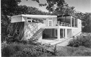
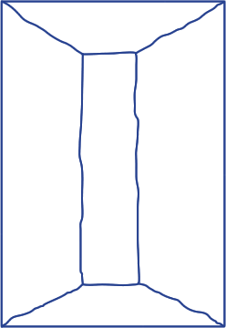
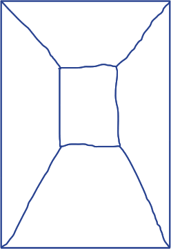
What really struck me of the Rietveld buildings I first saw is the way of arranging views from inside the building. Rietveld buildings have a certain lightness, a perfect balance of open and closed. Somehow they blend in with the environment and the surroundings, even though the Rietveld buildings are modern, concrete and often built with straight lines.
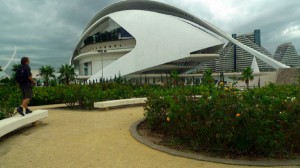
The Calatrava building I saw in Valencia was the Palau de les Arts Reine Sofia. Me and a classmate decide to walk in stead of taking the bus, and we were excited at first when we discovered the building from a distance. It became more and more impressive when we approached it. Then, standing at the foot of the building, I felt disappointment. The greatness did not work for me. The building made me insecure, like a monster that was asleep but could wake up any minute and eat me. It did not fit in with the surrounding park I think, or even in Spain. I wish I could have gone inside to experience the building and the views from the inside. Then I could double check my thoughts of the building and the surroundings, maybe I would understand it then.
I prefer Rietveld over Calatrava, I like the modesty that Rietveld radiates in his architecture (intended or unintended). Almost as if the open space within and around the building is the main subject, and not the beams and concrete walls. Calatrava's buildings seem more bombastic to me, almost an arrogant show off of what can be done in architecture. The building I saw was impressive but it did not fit in the environment at all. I felt as if it was designed first and then placed randomly in the city. Opposed to Rietveld, I did not feel or understand Calatrava's intentions with this building.
