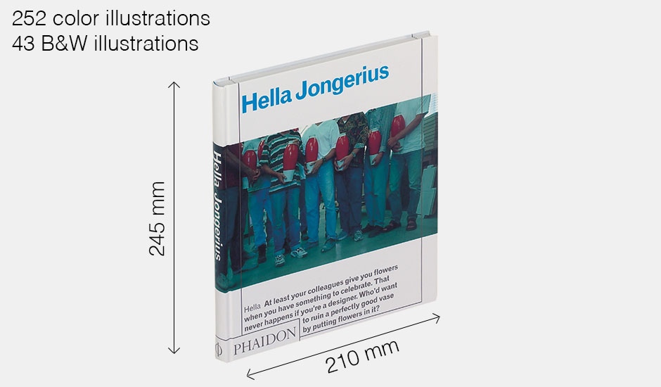
Designed by COMA (a Dutch graphic design team working in Amsterdam and NYC)
Why ? First impression
Because of the colors. The weight. The shape of the cover. The transparent papers inside. The size of it. Maybe also because it looks like the books my mother used to have and read when I was little.
Why ? The object itself
Physical aspect
Facing it, the object is shiny, composed of a large not centered title, a long and wide color picture placed horizontally in the middle and a silvery text at the bottom. The object looks humble, not pretentious. You easily guess it’s about a woman but the only thing you can see is male bodies holding red vases. The object wants to be complicated. By framing it’s cover with lines neither the text nor the picture are following, the object seems in a paradoxical state, containing without holding, focusing while spreading.
The object seems to feel comfortable on a table, it adapts to its surrounding. When you get in contact with it, it’s mostly homogeneous cold. At one point, the object asks to be touched further more.
After a week, the object seemed to reject the room I gave it on the floor. The colors of the book didn’t agree with the contact of the blue lino my room is filled with.
Many try outs showed that the object is not cooperating with any of my pockets which made me think that it’s not the type of object you can easily bring with you. Maybe it doesn’t want to be shared.
The investigation on the book and its environment led to the idea that design make an object belong to a place. A shape could apply to many structures. For this case, I could say that the addition of the table and the hands are comfortable for both the user and the book.
It felt like the design of this book is a communication between vanishing in its environment (this conclusion came with experimenting the book placed next to the toilets for few hours) and being dedicated to a specific situation (open on a 75cm height table, in contact with both glances and hands).
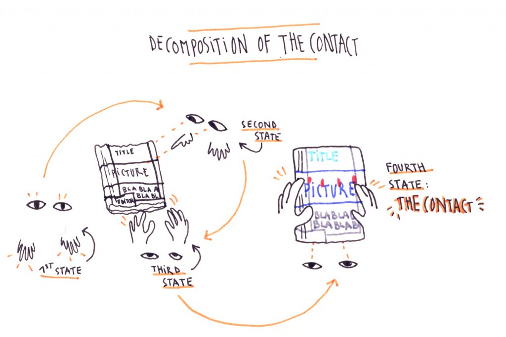
Why ? What does the contact of this designed book to a non-designer person ?
Non-Designer Person (NDP) : It’s a book.
Hypothetical Designer Person (HDP) : Yes. Can you guess how it was made ?
NDP : It has a blue wire that connects all the pages and the cupboard cover, so I guess it was industrially sewn. The pages are smaller than the cover.
HDP : Do you feel any rhythm in the layouts ?
NDP : Yeah, you can feel a harmony in the structure and links between texts and pictures. Sometimes the presentation wants to show an evolution, the composition is a bit repetitive. Maybe because of the grey frames that are always at the same place on each page.
HDP : How many colors do you see ?
NDP : Six. Blue, red, grey, black, yellow and white.
HDP : What do you think the colors are based on ?
NDP : I guess that the pictures taken for the book were inspiring for the designers, so the colors must belong to the topic.
HDP : How can design tell something without any words ?
NDP : In this case, you can follow a conversation between how the images and the texts are placed. There are smaller and bigger images, just like the text. The parallel is made by the composition and the sizes.
HDP : Without knowing what the book is about, can you guess the subject ?
NDP : The rhythm of the book is carried with transparent mat papers, dividing the object in multiple parts. It feels like your are transported from a place to another in a spatial way. You also feel that the positions of the pictures are showing an evolution. As if the book is built through its topic.
HDP : Now that you wondered how esthetic can lead your glance, how do you meet the content ?
NDP : Content can be shown in so many ways. You can say something, and act in a way that says something else. Opening a book that you find esthetic, a book that attracts you and, then, realize that the content is disappointing, you feel like you’ve been cheated. Esthetics can fool you, because design is the structure of the content, it’s what make the content accessible.
HDP : How would you apply these ideas to this specific book ?
NDP : This book lied to me in a way. Because I felt like the content wasn’t worth the design.
Why ? How to meet a book without reading it ?
Defining taste, instinct and anticipation
Either you hide your eyes, or you empty your brain.
The first part of the book that you notice is the spine, which is always trying to attract you. Showing all the information you need. Since I have to focus on the object, I blurred my vision to only see color spots on the shelves of the library. What is easily attractive to me is simplicity.
But then, the question that comes to me immediately is « How design can please me and others ? How can a designer can discuss beauty and attraction ? How to anticipate the singular tastes of people ? »
My instinct led me to this book in its visual aspect, and what I define as beauty could lead me to another interest, the topic. Beauty or visual statements can be the link to knowledge. It’s just like meeting someone in a club. First of all, you’re attracted by the spine, then by the cover, and, finally, by what’s inside (if you dare opening). Design is maybe about meeting an appearance to then go further, what makes you want to understand the attraction of what we define as « beauty ».
I’d say that design is the body while content is the mind. As your esthetic cannot please everyone, your mind is flexible, and the information you can get in a book won’t ever sound the same. Both esthetic and content can evolve but the link between how you show and what you show always works as parallel.
In fact, the book says something. The way you edit a book makes the object a story on its own. When you see the evolution of the images and the process Hella is going through, the discussion bellow the pictures emphasize this specific process. While the project is getting bigger, the information on the book are moving. Even though I feel like the book has a repetitive aspect, the pictures taken by Joke Robaard are a link between the content and the visual aspect. Esthetic is built but content is the starting point, so that’s when design has to adapt.
« [Maybe] Graphic Design will need to become a part of the thing and not the thing itself »
Michael Bojkowski
What seems interesting, reading back the first impressions I had, is that Graphic Design evolves with technologies. To me, this book can stand for a specific time of the book’s History (the 00’s) as Michael Bojkowski made me realize, questioning « Why graphic design ? ».
Hella Jongerius by Hella Jongerius / Rietveld library catalogue no : jonger 1


