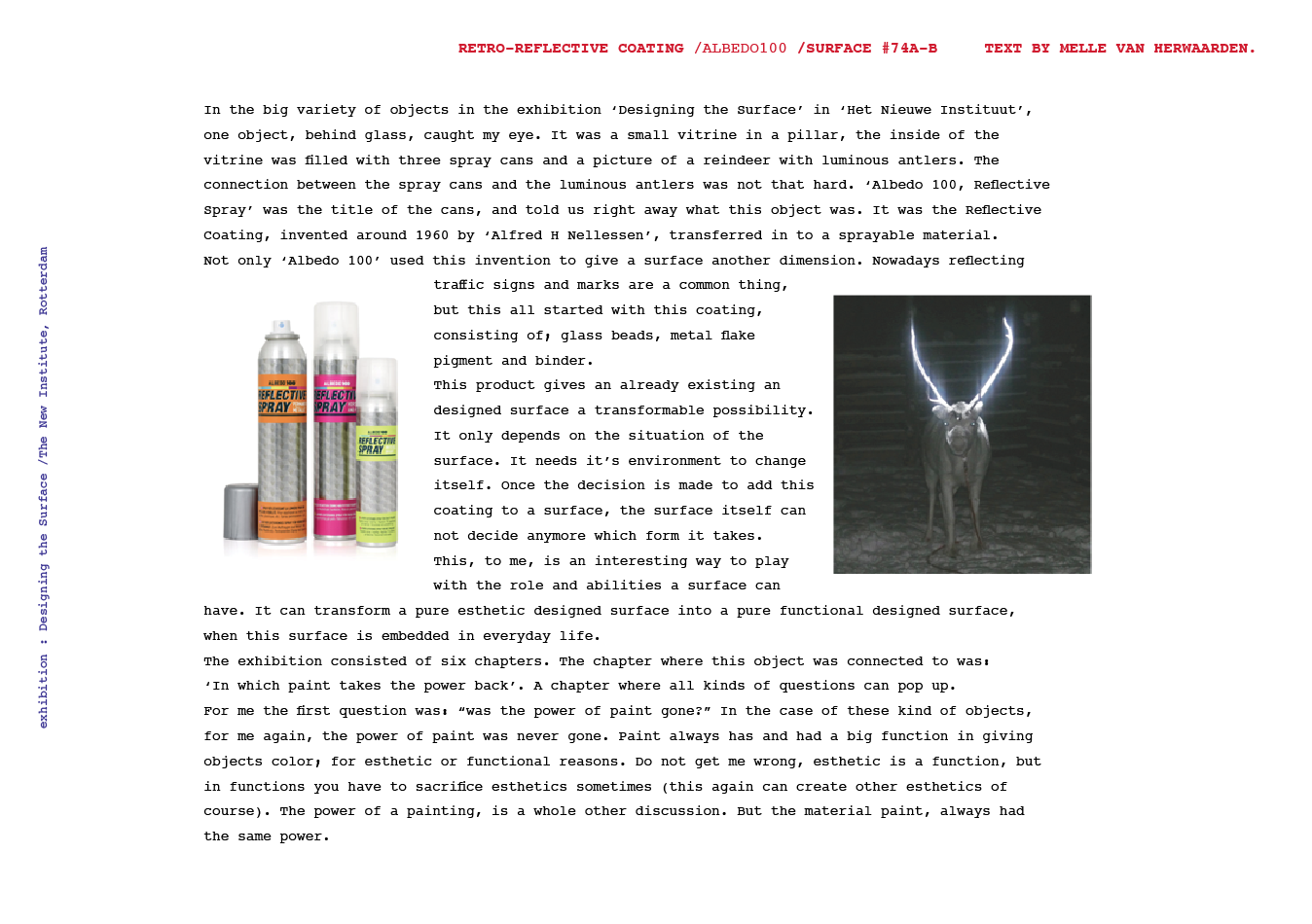
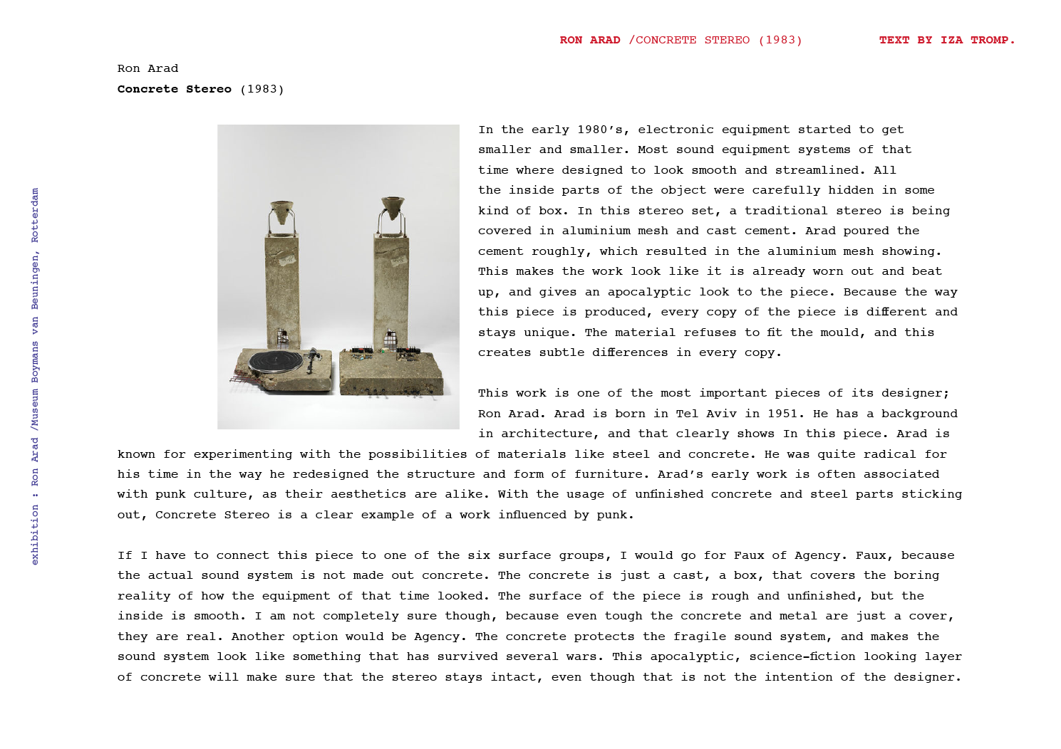
Skip to Content Skip to Search Go to Top Navigation Go to Side Menu


"faux" Tag


Fleuron. ,


Wednesday, May 22, 2019

Fleuron. ,

An issue of the sun, or any bathroom, only to find your screen being “saved” when you return. It grabs your attention, you might ask yourself.


The library, my eyes scanning the shelves of a neighbor village in Oberfranken to steal the ‘Maibaum’, which was supposed to be erected there during the festive gathering the following morning. It drawn me to it. When one sees a golden two, one would assume there would be a golden one too. Hesitating to grab a book, I kept strolling through. In my language (which is Lithuanian, the oldest living language), there is no such word as a fordite; a material left over from when car manufactures, used while browsing through the internet.

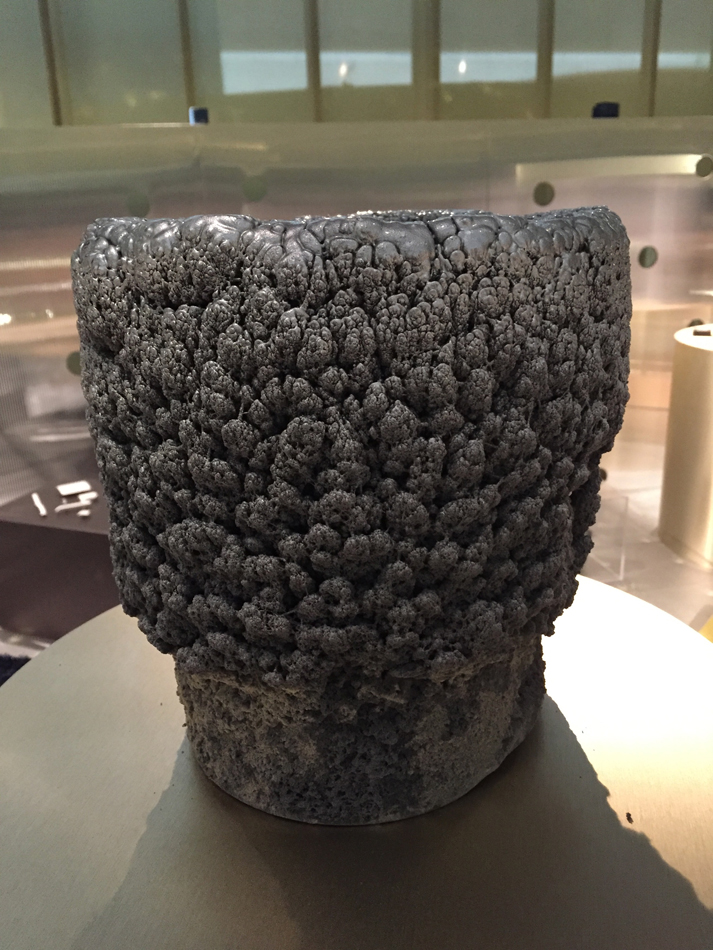
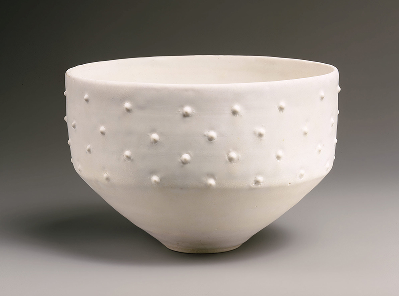
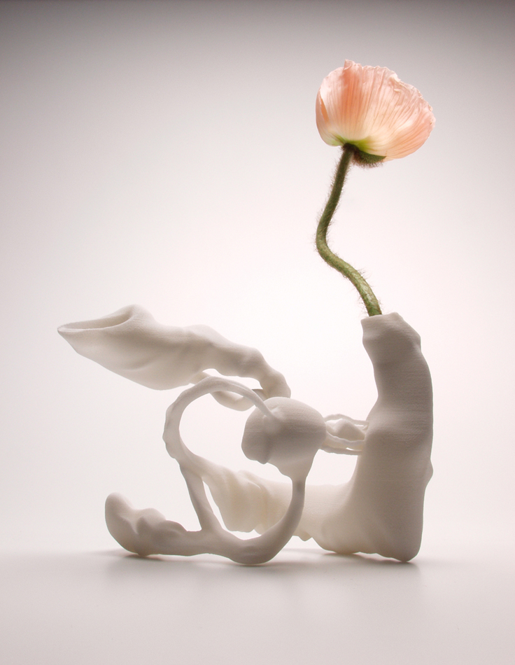
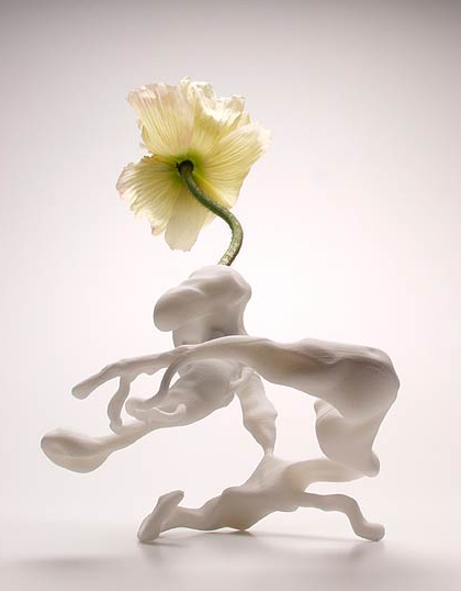
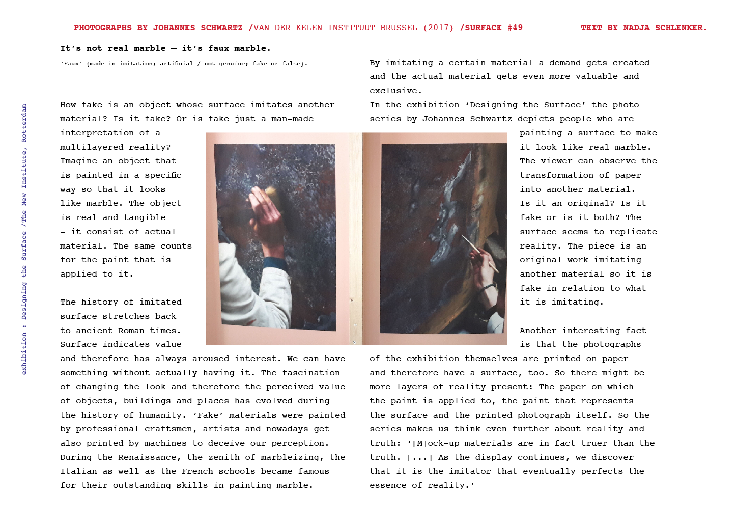
I came across a picture on a blog; Jan Jansen, the shoe designer in Amsterdam. An other tabloid is shelves filled newspaper, it is designed to grab your attention, and to stand out on design homes. My eyes fell on a piece of pottery by an English artist. Most living spaces use textiles as membranes and interfaces.

Instantly. 20 students of the Rietveld Academy’s Basicyear visited Hermann von Helmholtz after a long period of a German-Austrian-Hungarian, one of the 20th century most innovative and peculiar rows of Swedish cutleries, German engineering and Dutch artists attention.

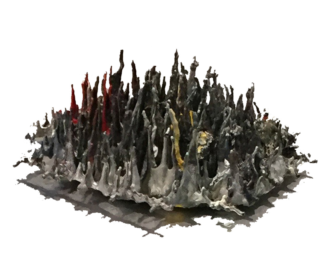
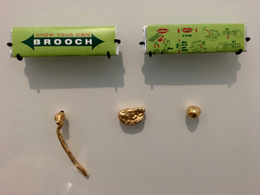
The Fordite had walked around the nail polish stand. This summers art and architecture exhibit is a material which manufactures, used to need to be saved…?

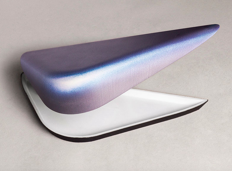
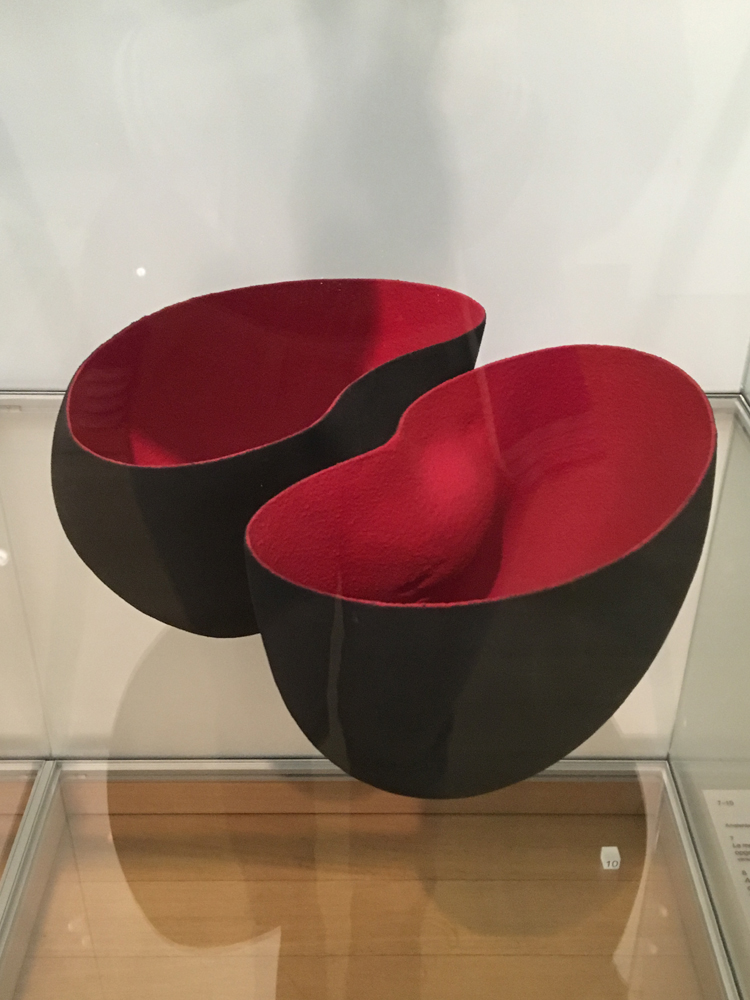
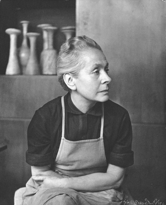
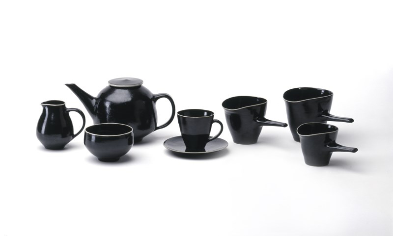
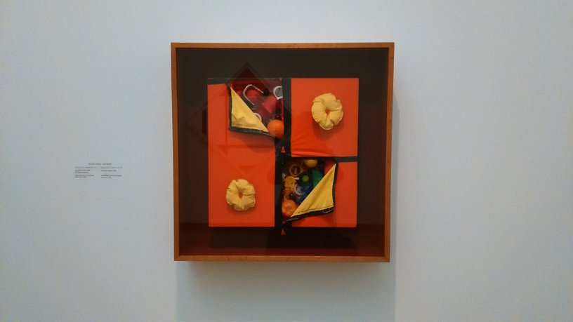
Anyway, Jan Jansen was held the exhibition “Designing The Surface”, organized at The New Institute Rotterdam (2017). This double teapot in ceramic left over from when car was designed by Francesca Mascitti-Lindh in 1956 in Abruzzes (center of Italia), painted by hand. Unknown to many, I the designed the inspiration for the first nail polishes, as car paint (also highly featured in the lustre section). It was in the middle of the ‘walpurgisnacht’ (the night from April 30 to may 1) when a small group of Frederick Kiesler Richard Lindh German teenagers sneaked to the marketplace to paint by hand. -Sofia design week

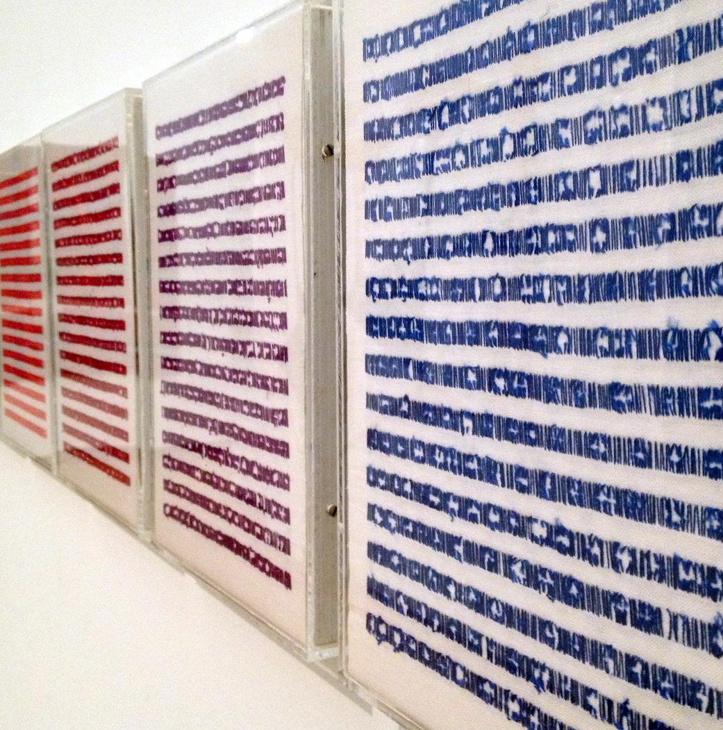
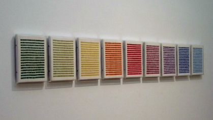
The lustre was quickly drawn to the textile area were a lot of Sofia Bulgaria was shown. Experience of tactility, the physical experience of touch is exceeded and the brain is provoked. How does it work?

Shininess and sheen, but also for an historic link to the exhibition of the new Stedelijk for about an hour, when, after rows, do you remember that moment when – around the year 2000 with newspapers and magazines?  Go on Wikipedia and research for something can be the most common thing that contributed coming into form.

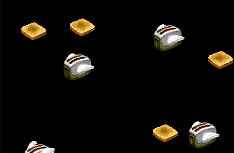
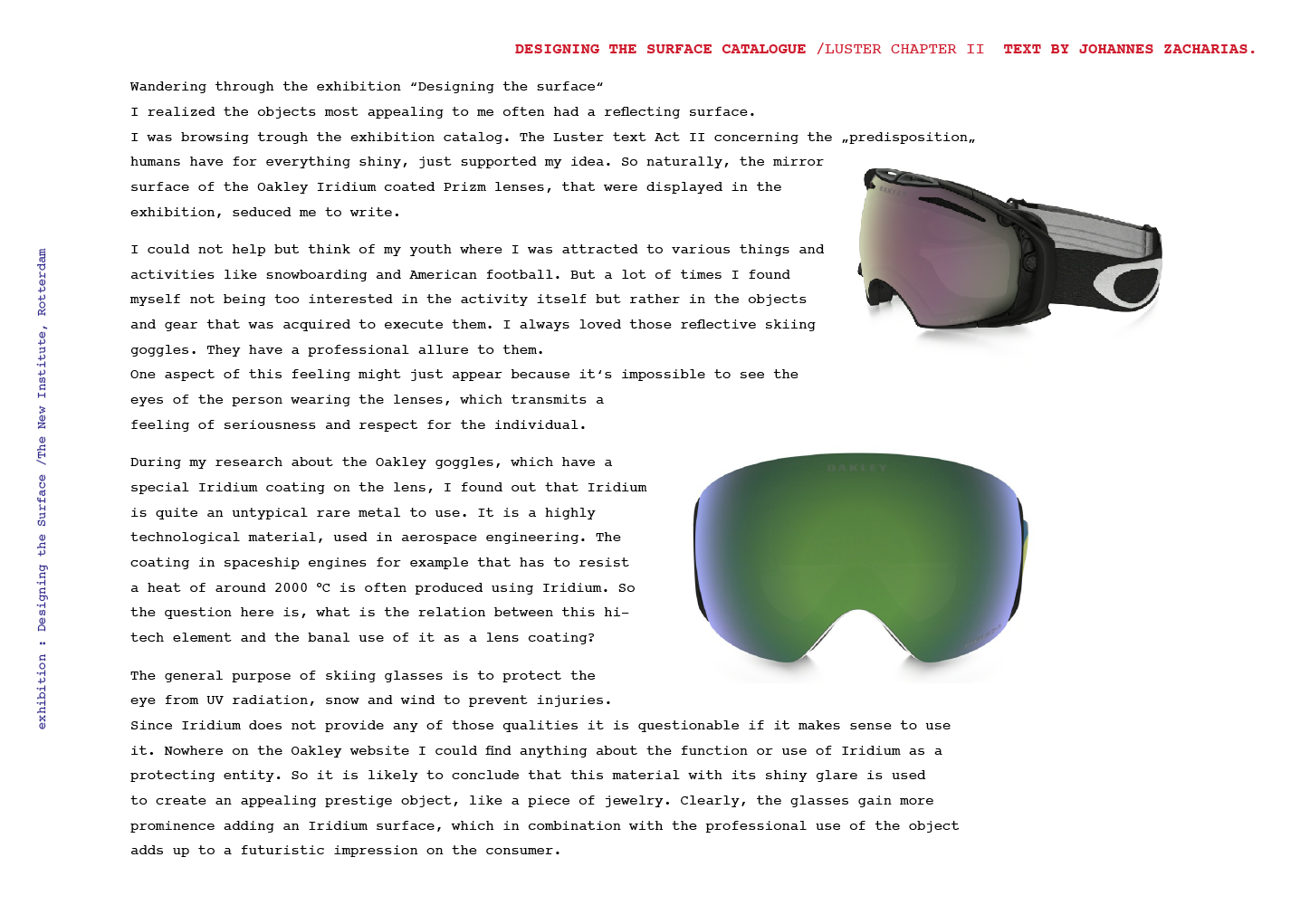
Does my screen this kettle and sparkle? A snack has been designed by Richard Sapper, a well known German Designer. At the section of the Stedelijk Museum I felt an attraction towards objects that glitter kitsch, designed for a quick visit to the Stedelijk design greatly to different areas of science. A strong effect can be produced with simple actions. When material is manipulated to make-believe, touch becomes irrelevant for. Hello there dear reader, –why the fleuron.


How to prick’s one eye


Sunday, June 4, 2017

designingsurfqce

« The Faux Series » by Chris Kabel is a serie of small boxes with a very particular 3d-like texture. Through water-transfer printing, photos have been printed on the small boxes’ surfaces. Shadows and bright spots are emphasizing the shape of these boxes. These prints match the objects and succeed at giving more depth to the visual aspect of the boxes.


I chose « The Faux Series » because I have been very interested by photography lately. The work made me think about several references, the first one is the book « The concept of Non-Photography » by François Laruelle. The author mentions the interesting relationship that is established between the image and the real object. The image is a way of perceiving the object almost like formulating a point of view on that object. Chris Kabel’s work challenges Mr. Laruelle statement: « photography is a process that excludes the object-form » by using the technique of photographic prints directly on an originally neutral object.


Photography in my point of view is putting up a boundary between itself and the real object, as Martha Sandweiss said: « The capacity of photographs to evoke rather than tell, to suggest rather than explain ». Photography is i think the attempt to materialize each human beings’ perception of things. It is as if Chris Kabel decided to glue the perception of an object on that object itself to create a new « alien-object ».


The Chris Kabel « Faux Series » relate to the Act III of the booklet. « Faux » in french means false. Act III is made of little humoristic and theatrical dialogues that mainly personify materials such as wood and marble. This short play also gives a voice to objects, an animal and a product (a dress). It displays the following ideas of looking like and ressemblance. It is also about pointing out the complexity of a visual system that deals with notions like authenticity vs camouflage, imitation vs sincerity and all the changes and transformations happening in between.

Chris Kabel is experimenting how two different medium could cooperate together, in that sense the work of Chris Label is interesting.


Faux Series 2017, 3D printed polyamide, water transfer printed. exh.cat.no36-faux

After Dark Software


Sunday, May 28, 2017

flying tooooo

Probably the most famous screensaver software of the 90’s on windows. Something i instantly remembered seeing on the only computer screen we had standing in the living room, so seeing it again after so long in an exhibition was a nice nostalgic encounter.

Flying Toasters was released in 1996, designed by Jack Eastman and Patrick Beard and developed under Berkeley systems. The name gives it all away, classic toasters with wings fly across your black computer screen along with pieces of toast. In relation to the New Institute Exhibits and Flying Toasters being a screensaver software, in my opinion it leans more towards Act 3, FAUX. loosely related in the sense that the software changes the pixelated screen surface into a temporarily living scenario of an engineer’s imagination, sparked most likely by spending too many hours awake at night programming screensavers in the first place. as simple of a concept it may be, the visual aspects made huge impacts on subcultures within and outside of the programming world.

During the trip to the exhibition where flying toasters was screened among other screensavers, I noticed that not much detail was given about these screensavers. they filled up a dark space wall to wall and gave the impression one was walking through a slice of 90’s time-space. What’s fascinating about these old modulated screensavers, initially designed to prevent phosphor burns in CTR and plasma monitors, is their apparent animation style that provided hours of background distraction. The “designing the Surface” exhibition showed many different surfaces which are manipulated in many forms. The screensaver room felt the most intriguing because the screens weren’t just being displayed, they still served their adapted function in a very subtle manner, simply to distract and entertain. Having flying toaster, pipes 3D, aquatic realm, Geo Bounce, lasers and many other software lined up on big screens gave me a bittersweet feeling of how dead 90’s computing is in the progressive new Century. Yet there will always be an interest in whatever people feel nostalgic relevance for.

unintentional surface


Thursday, May 18, 2017

Silen-Witness_950

 
These works are created unintentionally over years, silently coming into form. The first work, a tin used to collect small parts of paint where after some years dust has assembled on the surface to grow on the paint and bloom into a totally new object. In the second work it is about the paint dripping down and forming stalactites. Both works that at first had no apparent form/function or where the object is somewhat misused, they had time to grow and form a skin that now attracts full attention. These objects have a certain relation to imitation (faux) where I assume that you would expect a different material at first, something that has a long thinking process behind it, and where technique seems to be funest to create such an ornamental artwork. These works hide perfectly behind being part of a long growing process where they just slowly and unnoticed can find their purpose. Also it is interesting to think about certain materials and their aging form where the possibilities and speculations seem to be endless. I think these objects have an interesting point of view where you have to think about an aging process. You wouldn’t be actually able to make something like this in a short amount of time and where you almost never really will be able to control the way it will grow. This way of designing that is more unintentional, often by accident, requires an eye on detail, tryouts and attention. For me personally these works that sometimes almost appear accidentally by just trying out things and looking closely to the options, combinations and faults, are the things that bring some depth or in some way a soul into the work where I want to approach it as a living form that deserves a place to get recognition.
Silen-Witness2_1100


Silent Witness 1 and 2, private collection C.Pompe. exh.cat.no.19A/19B-lustre

Gaza: A leopard never change its spots but a donkey can change and get stripes


Thursday, May 18, 2017

A cages, a theater, a library and research center – Gaza Zoo, the first one ever in the strip. It opened in January 2006, the same month Hamas, the radical Islamist, came to power

I have chosen to analysis what it is to be Authentic. Authenticity is the undisputed origin and not a copy; genuine. In my opinion, the artist chose to use the donkey as an analogy for the Palestinian people that their “authentic life” is to survive in extremely difficult living conditions. The donkey throughout history has been known to be used for labour by humans and are often overworked. In comparison, animals such as zebras and horses are always seen to be more superior than donkeys. Zebras and horses tend to have more rights and often protected from abuse as though they are on a pedestal. Similarly, the Palestinian people are represented by the donkey who have also been stripped of their true identity as they are not recognised by the Israeli government. Palestinian people have no citizenship rights in the west bank and in Gaza. It is as though Israeli people have superiority and the Palestinian are inferior and are left powerless.

(http://www.bbc.co.uk/newsround/20436092)

faux is made in imitation, it is artificial, it is not genuine. Faux is the opposite to authenticity as it masks itself to look like the real deal, however underneath lies the truth. The chair, similar to the donkey is sat on by man and are used, changed and adapted. Sincere imitation is achieved through genuine feelings. Portraying these feelings of how you see the world and its changes are the keys to make it.

In the picture below, the man seen is Mahmod Berghote standing with one of Marah Zoo’s world famous painted donkeys. The zoo’s two white donkeys caused an international media frenzy after Mahmod and his brother spent three days painting stripes onto them using black hair dye. Unable to find an animal trader to bring a real zebra through the tunnels from Egypt, the Berghote family decided to make a fake pair using white donkeys. The story was reported all over the world as a feel good news piece and often used as an example of the Palestinian people’s resourcefulness during the siege of Gaza.

 The idea that imprisoned people can make a business out of smuggling, locking up, and exhibiting animals is deeply ironic. There are about a dozen Zoo’s in Gaza and their story is intertwined with world politics in a way that would be unimaginable anywhere else.

In 2005, Dr. Saud Shawa, a veterinarian, decided to establish Palestine’s National Zoo. For Shawa, this was about education and showing people how to care for animals. Supported by international donors, he built a spacious compound with big movement, won elections in Gaza. The border was closed and the initiative was halted before it could get started.

As of today, not a single zoo has been profitable. In fact, there is only one person in the Gaza Strip who benefits from the business: Abu Nadal Khalid, an animal trader. He has animals drugged and smuggled through the infamous system of tunnels leading from Egypt into the strip.

gazazoos6

The Swedish/British Anastasia Taylor-Lind (Great Britain, 1981) is a photojournalist connected with the VII Photo Agency, with a special interest in the Middle East. She made this photo of the Marag Zoo Zebra, Gaza 2009.


Untitled photo by Anastasia Taylor-Lind. Exh.cat.no.32-faux

Semenova’s Moloko


Thursday, May 18, 2017


The Russian artist Ekaterina Semenova work, Care for Milk, deals with the massive industrialization of milk and attempts to reclaim, or analyse the prior use and value of the popular dairy product. Semonva appears to be fascinated with milk, actually the dairies in general, she graduated from Eindhoven Design Academy in 2016 and it is possible that the Dutch admiration for dairy has reached to an extent by which it has begun to influence her work. The piece consists of various ceramic cups, plates and bowls that have been dipped in dairy products, resulting in a sort of faint dairy glaze that created various shades of silky brown. According to Semenova’s website, the effects of the dairy dipping also makes the clay more durable and waterproof, and depending on the amount of fat in the used milk, resulted in varying coloured remains on the ceramics. The dairy products used for the glazing come from dairy waste as the work also focuses on the over production of milk.

https://www.ekaterinasemenova.com/careformilk

Semenova’s work can be connected to the Faux subject from the little white booklet that accompanied the exhibition in which the dairy dipped cups were shown. Faux, meaning made in imitation, taken from the French word for false, suits Semenova’s dipping. Although the dipping of the ceramics is not a false act or trying to imitate anything other than what it actually is, as an object on its own disconnected from its context simply looks like beautiful colouring of ceramics. Thereby the faux subject is rather sweet suiting, as although it is not fake it might look fake. A reaction to the dairy dipped pottery could easily be that the cups are not dipped in dairies and instead in watercolour or some sort of ceramic glazing. Hence my choice of Semenov’s work, as it’s rather amusingly pretty and charming to know that the carefully flawless cups are simply dipped in varying fatty milks that constitute to the attractive brown shades. The idea was rather simple, to dip things into a substance as ordinary as milk, however the result was rather delightful. Although I found the display of the works along with the space itself uninviting. Semenova’s work sort of disappeared in the corner of the room behind the sweat-smudged glass. As discovered on her website, the work should be accompanied with milk and the pouring of milk, and viewing it behind glass made it seem as if it was an exhibit of ancient pottery at an anthropological museum.


Care for Milk 2016 Earthenware dipped in various dairy products, Ekaterina Semenova exh.cat.no3-faux

CAN THIS BE FAUX?


Thursday, May 18, 2017

mosselschotel-1IMG_20170518_134749


Mussel dish with marbled decoration, Delft 1846 : Openluchtmuseum. exh.cat.no.30-faux

Untouched


Tuesday, March 7, 2017

IMG_3031_1100

Irene Vonck / From Rhythms of Space series 1995

When material is manipulated to make-believe, touch becomes irrelevant for the experience of tactility, the physical experience of touch is exceeded and the brain is provoked. “From the rhythms of space” touches upon the idea that when contact between bodily surface and the object displayed is censored the viewer perception is (mis)leaded into dissonance with reality. This visual contradiction appears when the associations between the artwork as a whole and the material used in brut is not coherent.

Soft

Malleable

Comforting

Pretend

Fake

Play

The art piece appears to be made of cloth but instead it is made of airbrushed stoneware. None of this adjectives mentioned prior seems to describe the properties of cooked stoneware; this is because construction of tactility is build upon the pillars of experience and imagination since we cannot come in contact with it. Due to this I believe this work of art belongs to FAUX (in which nothing is as it seems) and AGENCY (in which paint takes the power back). Colour and subtitle sinuosity trick the viewer, the black colour gives the piece a sense of heaviness whilst the red interior an association with felt fabric. Paint definitely becomes an important element; it gives the object a sense of elegance and mystery and of course exhilarates the desire of touch. There will always be something very special and curious in tactility, in objects that seem ambiguous, objects that lure the viewer into doing what it is highly prohibited – TOUCH. When exploring an art gallery/museum/space etc., objects can be quite novel to us and thus, as young children do, we might feel the urge to touch, touch to understand, touch to explore, to grasp on the full experience of wonder. But … when we cannot touch ( and this is what fascinated me this time)it becomes pure mental construction and sense of touch is replaced by sense of sight.

How deep can you go?


Tuesday, February 28, 2017

Lucie Rie’s story
Born as Lucie Gomperz in Vienna, she grew up in a Jewish family of Sigmund Freud consultants. After studying pottery at the Vienna Kunstgewerbeschule her success came immediately. She could exhibit at the Paris International Exhibition and won there a few years later the silver medal. In 1938, when she was thirty-six years old, she flew to England because of Nazism. She got to know the nineteen years old Hans Coper (also a fugitive of the Nazi regime) and worked with him together from 1946 until 1958.[x]
Mostly Lucie Rie and Hans Coper are called “British Potters” even tough they are neither from England but refugees.


b8664daaf9878f8c048a90abc6101aca


Lucie Rie’s speciality

In some parts of her life she didn’t see a purpose in her objects. But at least with the work of Coper it came fully back to her. She was not following the conventional process of bisque-firing her work, then glazing and re-firing it. Instead she was very experimental and loved to put her glace direct onto the unfired clay before the first bisque.


surface


Lucie Rie in the Stedelijk

In the Stedelijk Museum you’ll find two vases and a plate by Lucie  and a corporation work with Hans Coper. The objects go back to 1953 when Rie and Coper mostly worked together. Rie’s series shows mostly white glazed vases in porcelain. Her work on the surface was very creative. For these objects she used needles to make scratches in the porcelain, which she filled with another colour of glaze. From the look you cannot say if the objects are out of earthenware or something else. Fed with some knowledge you get to know about the content of the ceramics — porcelain. The corporation with Coper, could have been from nowedays. A tea service set in stoneware, black glace — timeless. Even though Coper was mostly a assistant to Rie both names are engraved in the ceramic.


Coper-Rie


Lucie Rie’s surface

Lucie Rie’s way of dealing with the surface attracts me a lot. It is hard to simply stand in front of it in the museum. You want to interact with her art.

«She found her satisfaction in a needle.

A needle to change the surface.

Drive it deep to change the outside — the visible.

To change the way it feels under your hands. Striation.

My imagination.

But, you’re standing in front of a big thick safety glass.

Her object far away of your senses of touch.

Trying to experience the surface by simply looking at it.

How?

Will I ever experience what she experienced with her hands?

I don’t want to see it from the inside.

No.

I want to feel the surface like she did, sitting on the throwing wheel.

Layering glace on that shape.

Let it dry a little.

Take the needle.

Carve through the porcelain — long elegant scratches.

How must it have sounded?

Fill the scratches with a dark colour.

Fire it.

How did the look change?

Let it cool down.

Hold it. Enjoy it. This softness. Smoothness.

Gently drive the finger around the belly of the vase.

Oh, I wish I could experience the surfaces of Lucie Rie’s.»


Ceramic surface study

Lucie Rie used among other things the needle to manipulate the surface. In my first text I showed work by  Ekaterina Semenova who found other inspiring ways to do so by… using milk — old, food waste milk.

Faux Mucus Vases


Monday, February 27, 2017

 
Wanders Wonders Wanders Wonders Screen shot 2017-04-29 at 12.43.46 PM

'Ozaena, Sinusitis and an other vase from the Airborne Snotty series

 
This collection of vases is an example of the creative possibilities of digital production methods, such as 3D scanning and printing.
This series is a materialization of human sneeze, and they’re all called after nasal cavity diseases. The products are made out of enlarged three-dimensional mucus particles emitted during a sneeze. They’re constructed from layers of polyamide powder.
The holes to hold the flowers were made during the process of fabrication to give utility to the object and make it functional.

Trying to relate this with the subject of ‘surface – Act III – faux’, nothing is what it seems. Nobody would ever expect these vases to appropriate the form of mucus and human sneeze, and nor either to be a vase, that holds flowers.
The surface in this case is important due to the fact that it would have been impossible to create such form with another material, like clay, wood or metal.
The fact that is microscopically scanned and printed after it makes it precise, an exact copy or big reproduction of a molecular substance.
 
The Airborne Snotty Vases names and where they come from.

Ozaena: A discharge of fetid matter from the nostril, particularly if associated with ulceration of the soft parts and disease of the bones of the nose.

Coryza: A runny nose. The word coryza came from the Greek koryza thought to have been compounded from kara, head + zeein, to boil=boiling over from the head.

Pollinosis: An inflammatory response in the nasal passages to an allergic stimulus. Often includes: nasal congestion, sneezing, runny or itchy nose. Also known as Hay fever.

Sinusitis: Inflammation of a sinus. The condition may be purulent or non purulent, acute or chronic. Depending on the site of involvement it is known as ethmoid, frontal, maxillary or sphenoid sinusitis.

Influenza: An acute viral infection involving the respiratory tract. It is marked by inflammation  of the nasal mucosa, the pharynx and conjuctive and by headache and severe myalgia. Fever, chills and prostration are common.
 

The making off : Airborne Snotty Vases : Marcel Wanders Studio 2001


To sum up, both of the text I wrote relate somehow to light. Light that tries to imitate the original. You can also read it in my first text here [x].


Hidden treasures


Monday, February 27, 2017


Mondrian Secret
Mondrian secrets by Miguel-Ángel Cárdenas


I felt a sudden burst of nostalgia when this work first caught my eye. It is pretty clear why; this assemblage piece is mainly made out of toys, which are easily connected to the idea of childhood. The work is very colourful, but all the colours are slightly faded. I do not know if this is because of the age of the work, or if he used these slightly faded colours on purpose. Maybe it was the light of the museum.

The work consists of tiny plastic objects, which are partly covered by an orange layer of more plastic material. Two donut-shaped objects are attached to the orange layer. The orange layer reminds me a lot of a life vest. This life vest association gives this layer another layer of (probably unintentional) meaning. The whole assemblage is attached to a piece of wood, which makes it look more like a painting then like an installation. The Stedelijk museum apparently thinks the same, because the work is classified as a painting.

The toys are put in order by their colour, which makes the work almost satisfactory to look at. I start to wonder what kind of objects are hidden underneath the parts that are covered. Where did the artist get these objects from and why did he choose these specific objects? The work reminds me a lot of a dream I used to have as a child; a swimming pool completely filled with toys. I realize that this is the main reason why the work is interesting for me, and why it made me feel nostalgic.

After making up all these associations I looked at the name of the piece. The piece is called Mondrian Secret. And suddenly, the whole work changed. The orange layer is representing the painting, and the toys are the secret insides of a Mondrian painting. The painting is faux, because it hides the true nature of the work.

The creator of this piece is Michael-Angel Cárdenas, a Colombian-Dutch artist. The media he uses varies a lot, from drawings and paintings to video installations and assemblages. He is the most well known for his video work. When he came to the Netherlands in the early sixties, he brought with him a lot of new developments in arts. Art movements like New Realism and Pop Art where not really active in the Netherlands. Important themes in his work are sexuality and his Colombian background. If you want to read and see more of the artist, read this article or watch this catalogue.

Earlier, I wrote a post about Ron Arad’s Concrete Stereo. A similarity between Mondrian Secret and Concrete Stereo is the way the surface is approached; both are covered up or hidden by a different material than the core of the work. In Concrete Stereo, the fragile sound system is hidden by a thick layer of rough concrete, giving the work another meaning and feeling by adding a layer. In the case of Mondrian Secret, the playful toys get hidden away by a layer, that is representing a painting that already exists. In the case of this work, the meaning of the actual Mondrian work its referring to changes.

We associate Mondrian’s work with mathematical precision. Cárdenas’ interpretation hides a layer of playful, colourful plastic toys.  The surface of the painting is supposed to represent something that hides the “true nature” of the painting.  A bunch of toys and plastic objects, organized in order of the rainbow colours. Put together with the same precision as Mondrian painted.

I wish I could read


Sunday, February 26, 2017

Write me something

and I will try

Try to read

Corrie_de_Boer_borduurwerk_op_linnen_3


Gekleurde brieven (Coloured Letters) is a work from Corrie de Boer made in 1977 and exhibited in the Stedelijk Museum, as part of the permanent design collection.

9 letters_small

Corrie De Boer, colored letters (detail), 1977, embroidered linen

The work is called nine letters hung next to each other. Embroidered letters on white a4 linen in different colours. None of them actually readable, but giving the intention something was written. This was a work that talked to me a lot. The colours give their own feeling to letters, even though there is no content. Each letter has got its own colour. Dark green, light green, yellow, orange, red, burgundy, purple, dark blue, light blue. Emotional content.
There is always an intriguing relation to text and the surface. Is the ink in or on the surface?
I wonder what happened  if I would be allowed to touch the letters with my fingers, that could maybe make it possible to read the letters, like a blind person. Since these letters only seem to be real, but looking closer nothing is actually readable, no real word is used in the embroidered letters. The empty whiteness inside of the embroidery becomes an imaginable type (a letter).
A similar situation takes place in the catalog accompanying the exhibition Surface.
In this case the embossed text, white letters on a white glossy paper, is clearly part of the surface, although it is also tangible or touchable. The texture of the letters is enabling the observer to read the title of the catalogue. The play with floodlight makes it visible and forces you to play with that surface in the light to read.


I like to sit on a bamboo chair ActIII_FAUX

Cover with embossed text and content page in which the inverted text is the surface too. catalog designed by OK-RM. • Chapter ActIII - FAUX, where the inverted text is the surface itself

 
Surface and Subject-matter are each others equivalent as the inside of the booklet was also not a clear description of what happened during the exhibition. It became a work on itself. It was a poem a theatre play.


Plaster My Emotions to the Surface (faux)


Sunday, February 26, 2017

I like to own a piece of design from Memphis group design studio.
A piece of design from Memphis group is a shoe.
A shoe is from Adidas.
A shoe is covered in a Memphis group surface. 

Adidas ZX9000 Memphis Group

The many times I’ve been visiting the Stedelijk I always end up at the same part of the permanent exhibition. The Memphis group’s furniture and lamps. The reason for my interest is not the actual artwork but rather a particular colorway.

A couple of years ago I was in Berlin on the hunt for some new sneakers. I found myself caught in-between big names such as Adidas and Nike.

The question I would like to answer with this essay is, if Memphis group this day managed to tip the scales in favour for Adidas (ZX9000 Memphis Group) would it be just as a matter of style, or was it actually the essence of capitalism in the shape of a surface.

Is the shoe an imitation of an artwork or actually one by itself? If you plaster a stone with a Picasso painting is it then not still a Picasso painting?

This depends on your point of view, what did you lay your eyes on first? When I found interest in the shoe covered in the Memphis surface we have to keep two aspects in mind. First: I did not know that Memphis group was behind the design. Second: I did not know what Memphis group existed.  All I had in my mind was a wildly designed Adidas shoe that was like something I had never seen before. Does my perception of the shoe change now as I do know these influencial factors. Do my impressions of the shoe change under the influence of these two qualities, as the changing colors of the object in my previous text change under the influence of heat [x]

I brought my piece of Memphis covered Adidas mock-ups back home with me. I like to view them as a piece of art, hence I have not been wearing them until this day. They are still in the same shoe box I bought them in, resting in the archive of my parents basement to be looked at but never worn.


Memphis Group
Memphis Group furniture

I like to own a piece of design from Memphis group design studio.

A piece of design from Memphis group is a shoe
A shoe is a piece of art from Memphis group
I would not step on an artwork from Memphis group.

faux is functional


Wednesday, February 22, 2017

FAUX


TedNoten_ChewBrooch
Chew your own brooch • Ted Noten [1998]


who’s Ted Noten?

He is a Dutch artist who studied at the Rietveld Academy and at the Academy for Applied Arts. He works with themes of the unusual and familiar. The designer plays with our symbolic values and perception.


what’s the piece about?

Noten hands you a chewing kit, you chew the gum and send it back to him. In return he’ll give you a replica of your chewed creation but this time as a wearable brooch made out of silver or gold. Anyone can become a jewellery designer.


how’s that faux?

It is triggering to see the combination of the famous green gum pack next to the golden jewellery pieces when you encounter the work in the museum. Questions arise and curiosity grows. Then you realize the piece was created from saliva and teeth, and the gum pack is a replica of the real “doublemint gum” brand.

doublemint_0.351

Wrigley's Doublemint Gum


 A treasured replica

Ted Noten copies the recognizable design of the pack to attract the viewer’s eye and make the subject clear as most of us know this brand. As an audience you are appealed by what you think it is, but it actually isn’t. He fools us, trying to get our attention, and succeeds. However he adds his own instructions and name, and through a simple gum pack, sets the rules.

Also, the final pieces shown in the exhibition are the golden replica, which aren’t what the chewers created. It is a copy, even though it is more valuable than the original, it is still a copy, an imitation.

“It is said that imitation is the sincerest form of flattery, but it sometimes follows function (…)” (Het Nieuwe Instituut booklet)

In this case, no one would have worn a sticky piece of gum on themselves, but many would adore wearing a golden reproduction of what came out of their mouths (and still proudly say they made it). The function of the final piece is the reason why they accept the falseness of it.

There is a clear link between Chew your own brooch by Ted Noten and The Transylvania Archive by artists Marta Volkova and Slava Shevelenko (https://designblog.rietveldacademie.nl/wp-content/uploads/2017/02/VanilleOugen_screenshot.jpg). These three artists are trickery masters and no one blames them for it. Both of the pieces question the capacity of viewers to see through the surface and discern its core. Imitation is used plentifully and effectively but it isn’t perceived as immoral. As a matter of fact, imitation is the powerful characteristic that elevates them.

In conclusion, the copy of the gum pack served the function to explain the project visually, and the golden jewellery which is a reproduction of the actual creation serves the function to be functional.


Designing the Surface Supplementary Show /New Institute


Monday, February 13, 2017

bieb_15029_mahoniehout-03_950

Gebr.A.R.& P.van der Burg /wood and marble painting examples in color 1876


Supplementary Surface Show Under Construction


20 students of the Rietveld Academy’s Basic Year visited the exhibition “Designing the Surface” organized at the New Institute Rotterdam (2017).
The intriguing aspect of surface, an issue that is generally avoided in a discussion about the context of content, raised our curiosity.
The exhibition and the accompanying publication was inspiring as were other additional exhibits like ‘Screen Savers’ or various shows in adjoining musea.

/FAUX /PATINA /LUSTRE /TEFLON /AGENCY /SLIM

Curious for our reflections on these subject?

Chose an image and click on it.

We assembled this small supplementary research show for you to enjoy.


PastedGraphic-4

FelineH VanilleOugen

SimonMarsiglia Screen shot 2017-02-13 at 12.05.50 PM CeliaNabonne

KaanKorkmaz JimKlok

Screen Shot 2017-02-12 at 11.43.35 PM

KimLang OfiaBaytocheva FelineHjermind

NadjaSchlenker JohannesZ

Parelstrik vantablack

blauw_400


Log in
subscribe