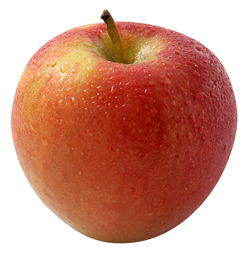
choosing a book without paying attention to the content is like picking an apple based on its skin and form. you never know if the consistence and the taste is reflected by its surface but still you choose it, thinking that the appearance echoes what you want to find inside. this intuitive and impulsive choosing process based on your assimilation faculty, knowledge and cultural education, needs to be done without concession. avoiding everything that incorporates elements which make you doubt is a way to find the precise object that fits your taste. this process can be long but it makes you swim fast through objects and, at the end, allows you to find the right fruit, in which the design and the content are reflecting each other, the materialisation of your desire. this search technique lead me to an old fashioned catalogue issued for an exhibition of herman de vries at the groninger museum in groningen, the netherlands. the book was published in 1980 by the museum itself and is entitled, like the exhibition, “herman de vries, werken 1954-1980”. the design of the book is made by “std suurling treffers designers”. they also came from gronigen and they were, at this time, the graphic designers of the museum. alongside of working for the museum and being independent designers they were also working at the minerva art academy. nowadays the studio doesn’t exist anymore.
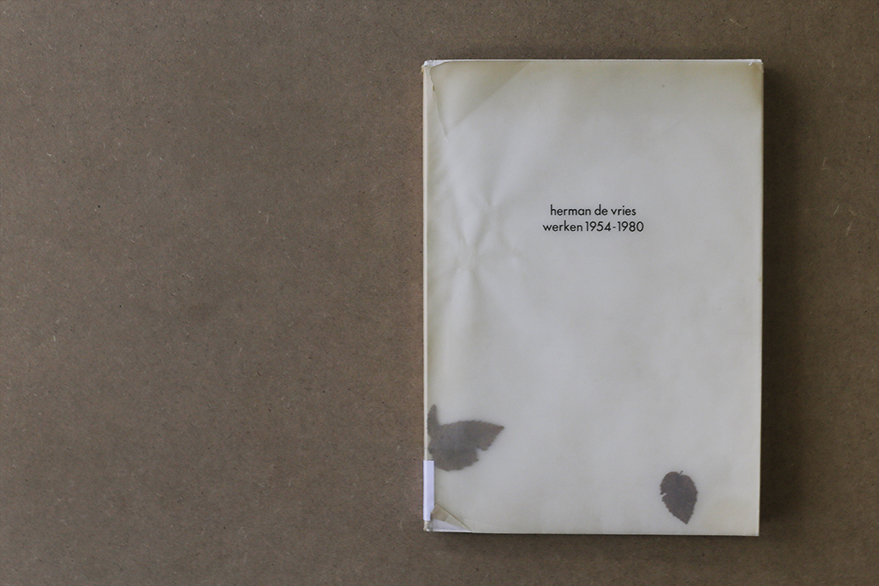
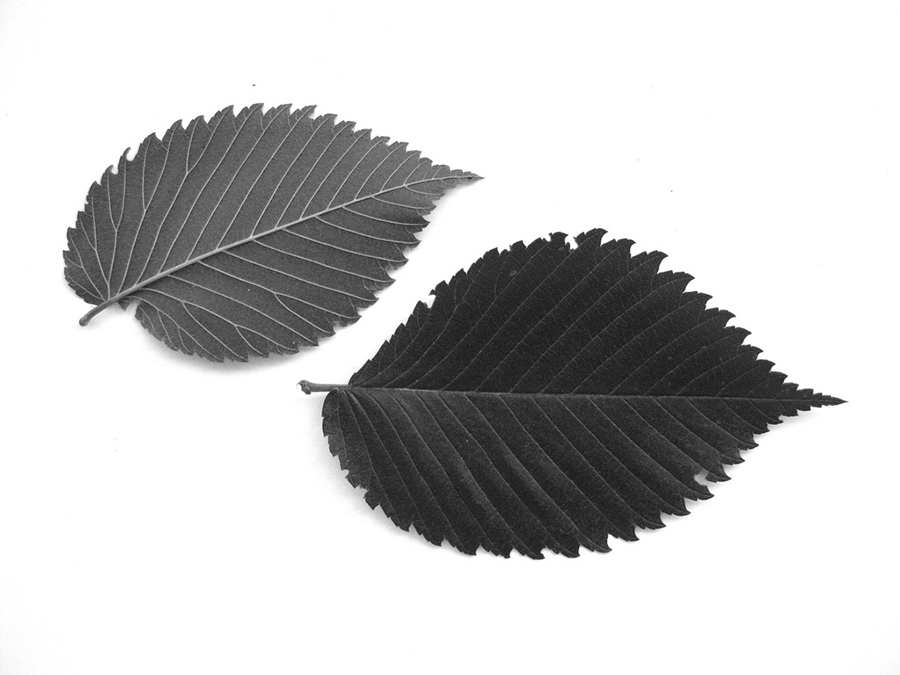
speaking about the design of the catalogue, the cover appears fragile and at the same time raw, ruff and powerful. the delicate aspect of the book comes from two different components. firstly, the paper used as a protection for the book itself is created by two layers of recycled transparent paper. the weight of times altered the colour of the paper into different shades of beige and adds an antique aesthetic to the object. secondly, in-between this two layers of tracing papers, two real leaves drift with the rhythm of the reader turning the pages. on the website of herman de vries it is said that they came from a western tree called acer campester. strangely the copy from the gerrit rietveld library contains different ones, looking like the leaves of an elm tree, which is really common in the netherlands. we will probably never know, if the artist himself puts different types or if someone lost the original ones and exchanged them. these natural elements encapsulated into the cover protection remind on the origin of paper, namely trees and leaves, and point out that these objects, made for human use, were, first off all, living matter.


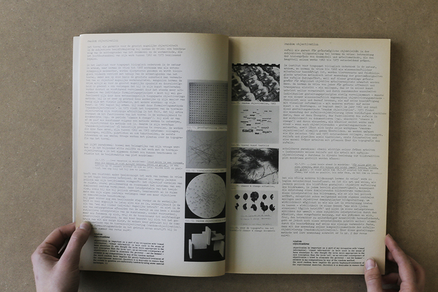
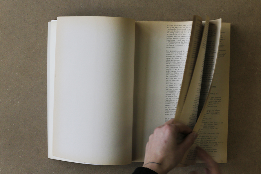
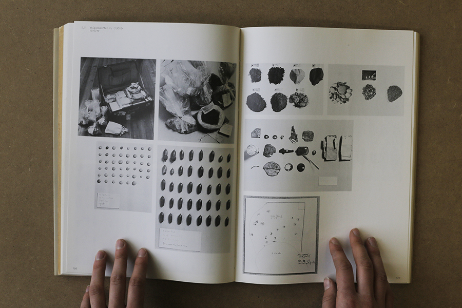
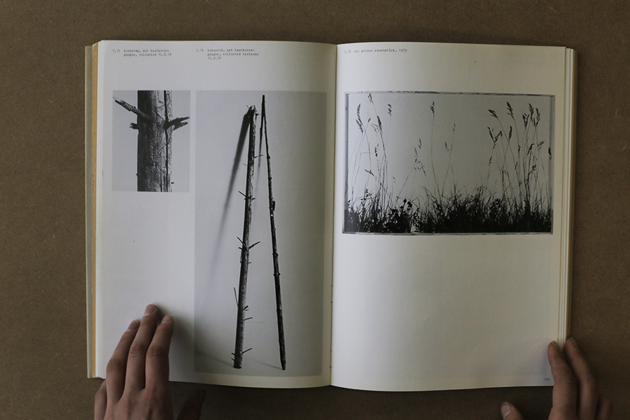
the cover reveals another radical choice: the absence of capital letters. this vacancy occurs in the whole book. most of the time, attributed to the bauhaus ideology of typography, this non-use of capitals could represent the honest approach of the artist herman de vries in his work and his aim to represent nature in it’s purest and simplest form. the first part of the the book, introduced by the director of the groninger museum, frank haks, is mostly composed of texts, essays and poetry by and about herman de vries. the designers chose to create the layout using the aesthetics of a type machine, therefore making use of the typography “courier”. looking at the work of herman de vries, this decision resonates his visual language. the paper being used is another example. it is brown, natural and rough. the second part of the book focuses on showing images of his art works. alongside to this change the paper changes as well. becoming more neutral, it gives the the work all the space needed for expressing itself.
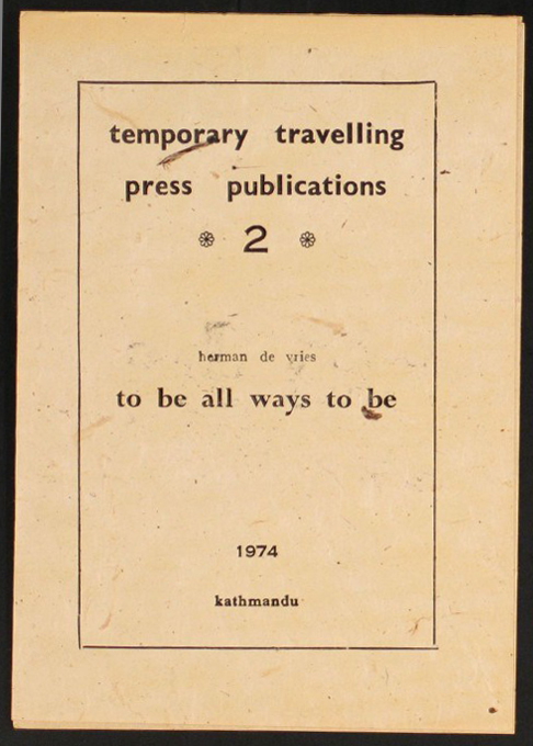
on the back cover, a curious detail pops up: a red stamp saying “all”. it is hard to understand its visual appearance for different reasons, mainly because it is the first time that we see colour. in addition, the size and the disposition are not fitting with the layout either, they are more strictly constructed. during the research about the artist i came across a video which fulfilled my curiositiy. presenting his exhibition for the biennial of venice, where he was representing the netherlands, herman de vries showed an old mantra printed on a booklet in 1974 in katmandu. the sentence “to be all ways to be” is written in big letters inside of it, the typography and the size are exactly the same as in the book.

considering the design of this book, it makes a good example for a successful reflection and interaction between the graphic designers and the artist. in this case, herman de vries took part in the making process, adding some characteristics of his own work to the cover. the catalogue therefore got a handcrafted look and gives the impression to handle something rare and authentic. the aesthetic choice demonstrate the graphics designer’s respect for the artist and merge the book with the world of de vries. a bridge is created, giving the book the aura of an artwork.
Rietveld library catalog no : vri 7