The book I chose for my research is a book that probably doesn’t catch the eye of many people who pass it. With a relatively simple cover and a design that most people at a glance would brush over as conservative, straightforward or maybe even boring, Rosemarie Trockel’s exhibition catalogue about her exhibition “post-menopause” may seem like an odd choice for a design research essay but upon further inspection the design reveals itself to be quite rich and complex.
Maybe it makes sense to start with the outside, the part of the book that you inevitably will see first when you meet it.
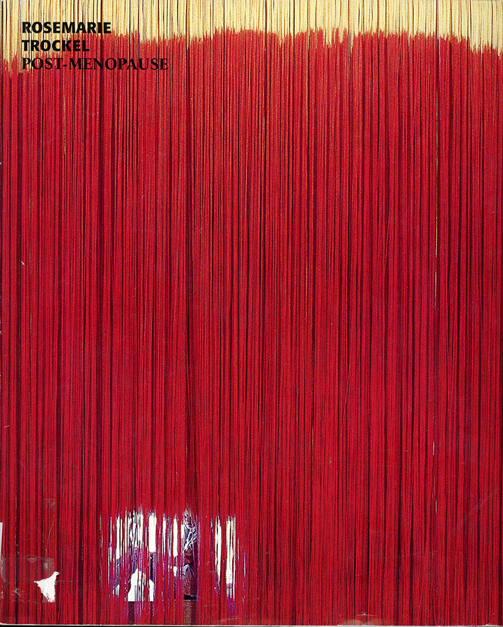
On the cover you can see a picture of a big installation work called “yes, but”. The way Yvonne Quirmbach (the designer of the book) chose to present the work makes it feel more like a 2 dimensional graphic work or painting than the huge installation it actually was but it serves the purpose of making a graphically interesting and simple cover. Other than the image the front cover also contains the name of the artist and the exhibition in the upper corner. If you take off the dust cover (that has said image on it) the “actual” cover of the book is blank white with just the name of the artist and exhibition in the same spot as on the outside cover. One interesting detail is if you take the the dust cover out and look at it there is a little caption for the picture you will only see if you actually take the cover off.
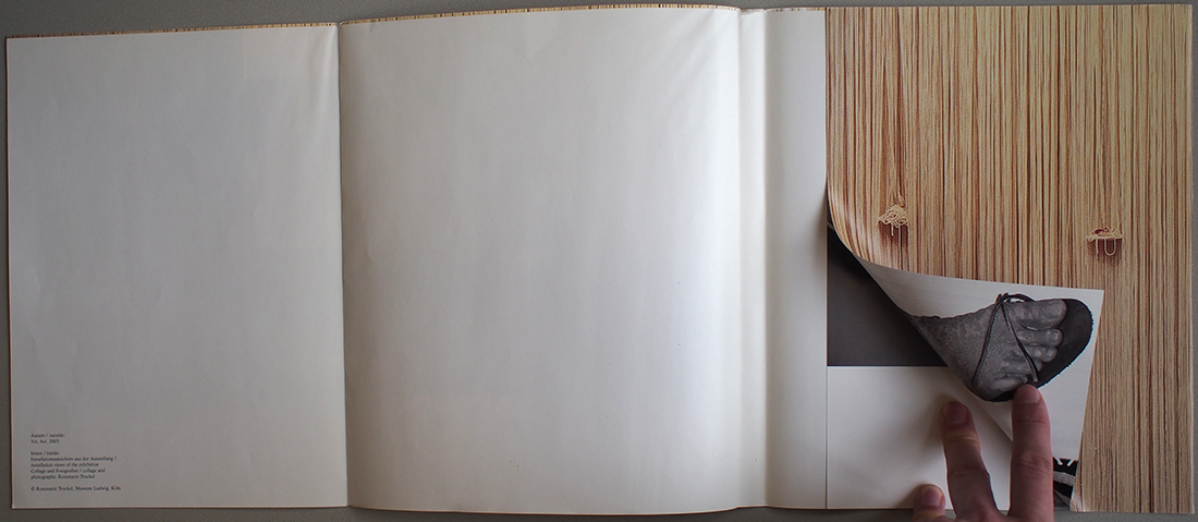
There, also is a caption for another work which it says is inside. The dust cover actually unfolds and there is a poster of a big installation/collage inside but except for that already pretty hidden caption there is nothing that gives that away. I myself only discovered this totally by accident after I had the book for over a week already.
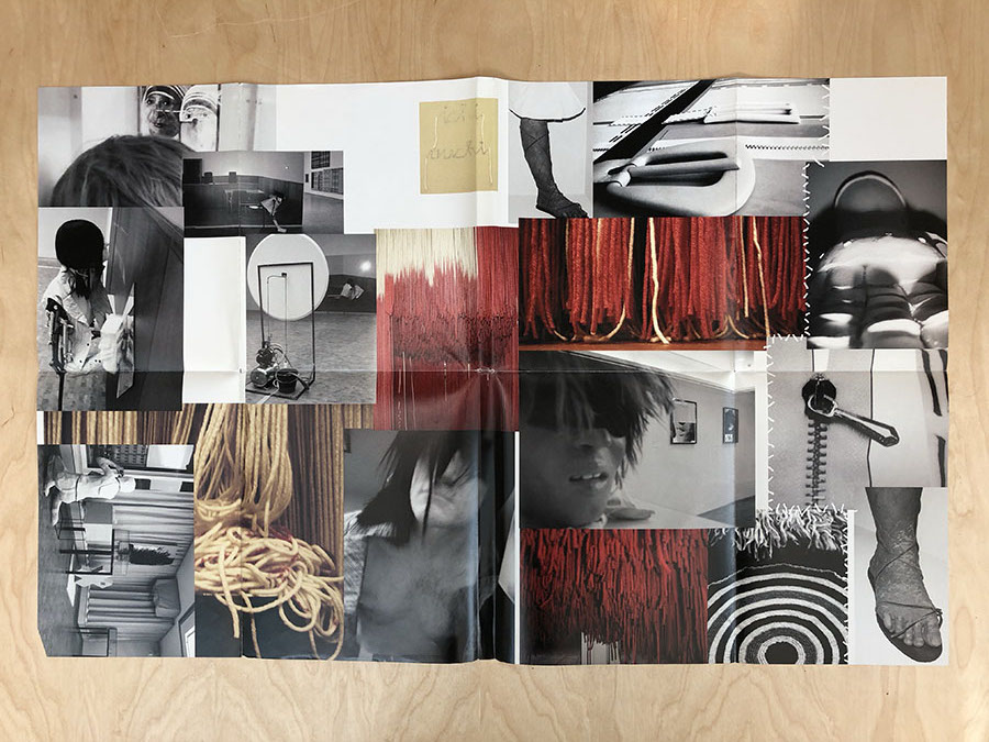
This is a good example of one of the hidden details this book has in it. It really wants you to explore it but never pushes you to. Instead it gives you space to do so.
So let’s get into it.
When you open the book you’re gonna encounter its title together with some short basic info which is placed in the center but aligned to flush left. A subtle choice that also gets masked by the fact that each line only contains at most a couple of words. The designer is playing with the blank space here using it to give the text some room to breathe without making it appear to monolithic which could be the case if it (the text) was fully justified.
Over at the next page you will find the table of contents. The arrangement of the text remains the same but this time it becomes a lot more visible because the page is more filled and some lines of text even reach the outer margin of the page. Still the aesthetic that got introduced on the previous page gets maintained and overall it is not only pleasant to look at but also easy to read because you can start reading in the center. This praxis of introducing a design element to the reader in a subtle way and then building on it further is a recurring theme in the way the book is designed.
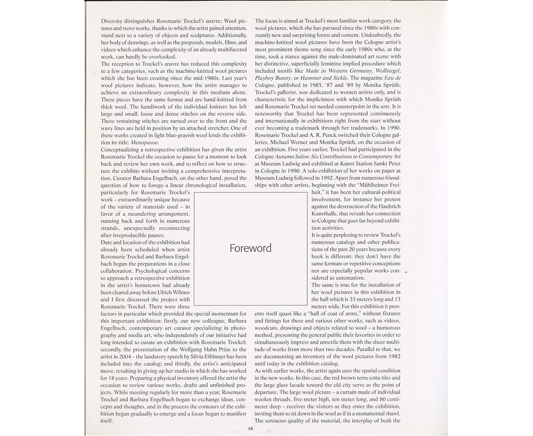
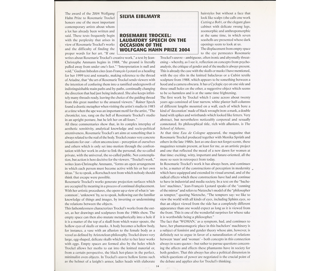
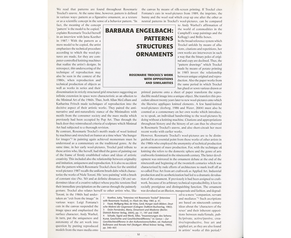
A good example of this is the way the book handles the element of the box within a text in the text centric parts. The book contains some longer texts which could lead to long visually uninteresting passages but Yvonne Quirmbach introduces a simple element that breaks up the monotony of it. This element is a rectangular box which she places in the center of the two text columns. The first two texts are just a greeting and a foreword so as I see it more of an appendage than part of the content of the book. To communicate this in a visual way the designer uses the boxes. For these two, lets say minor texts, the boxes just contain a single word that describes the function of the text and sort of are a title as well (Greetings, Foreword). For the first text that is actually part of the content (in the way I interpret it at least) she then changes it with a slightly wider box, containing the name of the author of the text as well as the title, all in bold capitalized letters. She keeps the width and the capitalized type in the next text but changes it up with two different sizes, the bigger one being noticeably bigger than the one used before. The two texts are quite far apart from each other within the book though so a lot of readers probably won’t notice the difference in size so much.
As you can see she gradually explores the usage of these boxes and builds on it without overwhelming the reader. She continues to explore them further by using them for footnotes and then also for text related images. She introduces new elements slowly taking her time with each, introducing one after the other to subtly lead the reader through the book. This approach is also mirrored in other aspects of the design of the book like the presentation and arrangement of the pictures.
Her design choices in general don’t make any judgement about the work, they are plain while still offering variety. Yvonne Quirmbach makes a statement by not “over designing” the book and making her choices minimal but noticeable to observant readers. She is inviting the reader to take a closer look at the content, drawing people in through small almost hidden details rather than attention grabbing imagery. I want to continue this legacy by inviting you to look into Rosemarie Trockel’s work as I think it offers a lot.
Rosemarie Trockel: Post-Menopause. design by Yvonne Quirmbach, Rietveld library number: 754.2 tro 5