Skip to Content Skip to Search Go to Top Navigation Go to Side Menu


"authenticity" Tag


Its very salty, but it just needs a little bit.


Friday, February 15, 2019

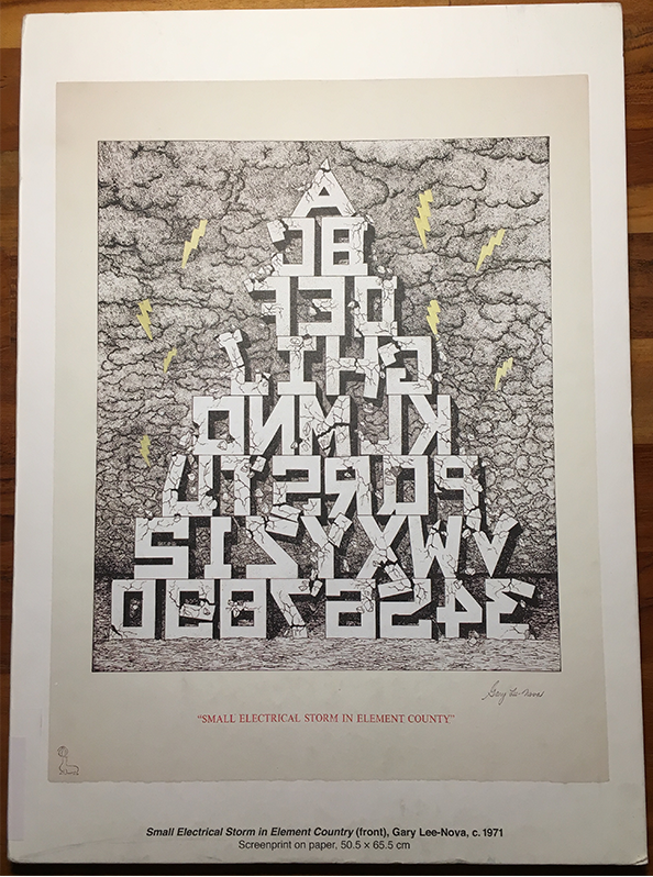
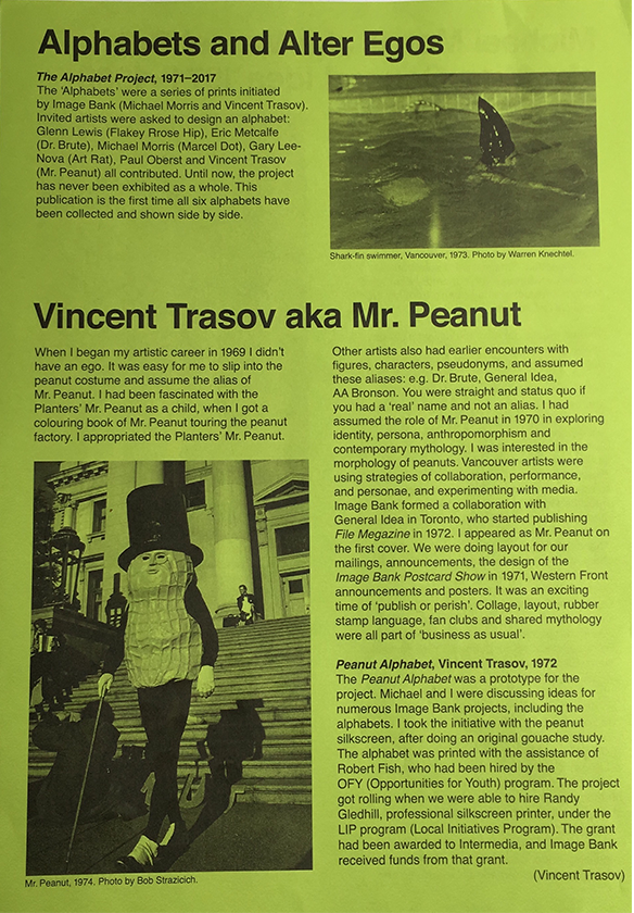
The Alphabet book seemed an interesting choice among other publications that the Rietveld Library had acquired last year (2018) because it is an odd book at first glance. It is very different from most books you might come across in a library. There are only eight pages, yet each of those pages is nearly 3mm thick and made of cardboard. The book is slightly larger than A4. Another thing that sets this book apart is that there is no title on the front of the book but rather on the bottom of the spine. You can also find the title on the Kunstverein website. What really strikes me about this book is that each page has one image of an alphabet. In total six different alphabets are shown. Each alphabet is from 1971 or 1972. The ‘Alphabets’ series was a project originally initiated by Vincent Trasov and Michael Morris. The artists who created these alphabets all seem to have an alter ego of sorts, the most prominent being ‘Mr Peanut’ which is an alias for Vincent Trasov. He dons a peanut suit inspired by ‘Mr. Peanut’ which is a logo and character made famous by ‘Planters’ a company which sells processed nuts, mainly peanuts. The reason Trasov’s alias Mr. Peanut is more prominent is because of his run for the 1974 Vancouver civic election, where he dressed up in his peanut costume. He ran on the platform of ‘PEANUT’. ;- Trasov was persuaded to don the costume as a symbol for the collective aspirations of the art community and run for mayor in the 1974 Vancouver civic election on the art platform: P for Performance, E for Elegance, A for Art, N for Nonsense, U for Uniqueness and T for Talent.. Trasov received 2685 votes accounting for 3.4% of the total vote. Trasov could not likely have really thought he was going to win but this would serve as a satire on the political climate of the time. Canada in that time went through a period of political unrest and economic difficulty. What made his candidacy even more interesting is that he did not utter a single word. Mr. Peanut became a kind of walking sculpture. The talking was left to his campaign manager John Mitchell.

In 1972 Trasov and Morris using their Imagebank (sort of collective) hired a silkscreen printer and printed the Peanut Alphabet. One of the people I spoke to at Kunstverrein speculated that the alphabet project was an exploration of visual language via the alphabet as a kind of study. At the time the hopes of Morris and Trasov was that this project would become larger than it really did. They invited some artists to create alphabets as representation of this language they where exploring. These alphabets also had a correlation to their alter egos in some way. At that time you would have been considered to be a part of the status quo if you did not have an alias for your work. So in some way to keep up a certain authenticity these artists felt they had to have an alter ego, and so it is only logical they would strive to create an alternative language that went against the status quo in the art community that they did not want to associate themselves with. At the same time artists in Canada Including Trasov and Morris, found themselves in a period of immense sharing of ideas with like-minded artists, this created systems and networks for artists to share these ideas even before the internet. Morris says that their survival as artists even depended on these networks.

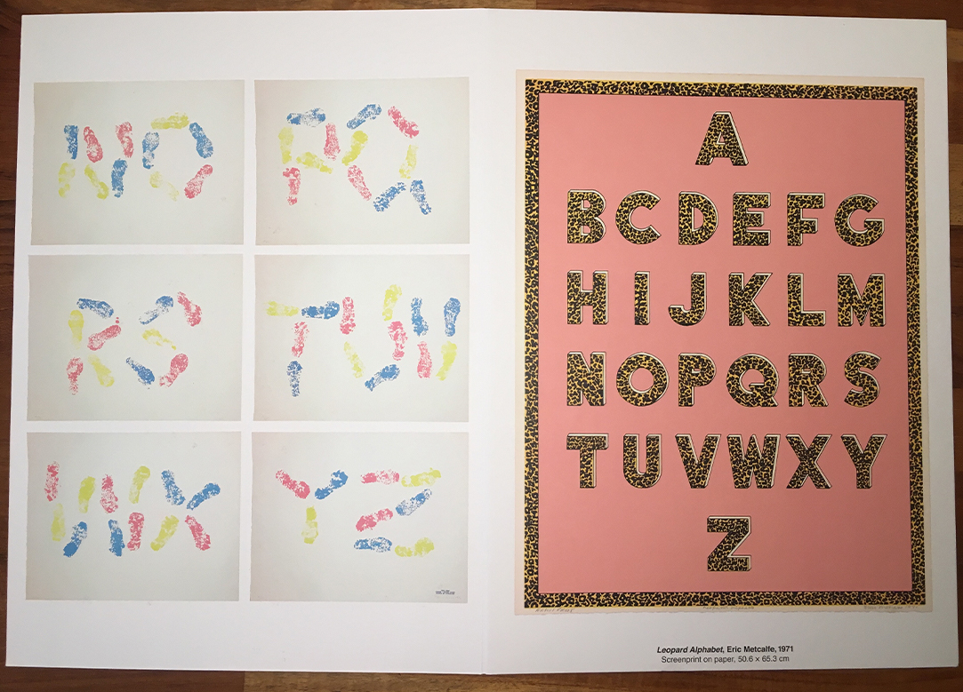
‘The Alphabet Book’ was designed by Marc Hollenstein who does most of the design for Kunstverein publications. The Individuals I spoke with at Kunstverein are a student and Rietveld Academy alumni . For the most part I did not have to ask them any questions since they had allot to say about the book, but one thing that interested me about the publication was the thickness of the pages. They told me that this was a kind of suggestion of the volume the book could have been in regards to Morris and Trasov wanting this project to be larger than it ended up becoming.

In a way you could see ‘the alphabet project’ as a tragic comedy. There are these satirical elements, a strive to share ideas, and artistic work yet, a certain failure in the exact systems these artists  tried to create in a pre-internet society that in reality faced a similar political and economic climate that we face today. The difference today maybe that satire is so relevant yet so irrelevant, we live in a society where the satire has potentially become reality, at least in political terms. This does not take away from the work and ideals behind the project, maybe it would have taken a different direction in a post internet society. The most ironic thing about this project is maybe the fact it never became so big is what makes it so interesting.

Also if anyone has a couch that isn’t straight apparently the designer of ‘The Alphabet book’ Marc Hollenstein is looking for one because he has a non square living room.

Vincent Trasov: The Alphabet Book. design by Marc Hollenstein, Rietveld library number: tras 1

How to prick’s one eye


Sunday, June 4, 2017

designingsurfqce

« The Faux Series » by Chris Kabel is a serie of small boxes with a very particular 3d-like texture. Through water-transfer printing, photos have been printed on the small boxes’ surfaces. Shadows and bright spots are emphasizing the shape of these boxes. These prints match the objects and succeed at giving more depth to the visual aspect of the boxes.


I chose « The Faux Series » because I have been very interested by photography lately. The work made me think about several references, the first one is the book « The concept of Non-Photography » by François Laruelle. The author mentions the interesting relationship that is established between the image and the real object. The image is a way of perceiving the object almost like formulating a point of view on that object. Chris Kabel’s work challenges Mr. Laruelle statement: « photography is a process that excludes the object-form » by using the technique of photographic prints directly on an originally neutral object.


Photography in my point of view is putting up a boundary between itself and the real object, as Martha Sandweiss said: « The capacity of photographs to evoke rather than tell, to suggest rather than explain ». Photography is i think the attempt to materialize each human beings’ perception of things. It is as if Chris Kabel decided to glue the perception of an object on that object itself to create a new « alien-object ».


The Chris Kabel « Faux Series » relate to the Act III of the booklet. « Faux » in french means false. Act III is made of little humoristic and theatrical dialogues that mainly personify materials such as wood and marble. This short play also gives a voice to objects, an animal and a product (a dress). It displays the following ideas of looking like and ressemblance. It is also about pointing out the complexity of a visual system that deals with notions like authenticity vs camouflage, imitation vs sincerity and all the changes and transformations happening in between.

Chris Kabel is experimenting how two different medium could cooperate together, in that sense the work of Chris Label is interesting.


Faux Series 2017, 3D printed polyamide, water transfer printed. exh.cat.no36-faux

Gaza: A leopard never change its spots but a donkey can change and get stripes


Thursday, May 18, 2017

A cages, a theater, a library and research center – Gaza Zoo, the first one ever in the strip. It opened in January 2006, the same month Hamas, the radical Islamist, came to power

I have chosen to analysis what it is to be Authentic. Authenticity is the undisputed origin and not a copy; genuine. In my opinion, the artist chose to use the donkey as an analogy for the Palestinian people that their “authentic life” is to survive in extremely difficult living conditions. The donkey throughout history has been known to be used for labour by humans and are often overworked. In comparison, animals such as zebras and horses are always seen to be more superior than donkeys. Zebras and horses tend to have more rights and often protected from abuse as though they are on a pedestal. Similarly, the Palestinian people are represented by the donkey who have also been stripped of their true identity as they are not recognised by the Israeli government. Palestinian people have no citizenship rights in the west bank and in Gaza. It is as though Israeli people have superiority and the Palestinian are inferior and are left powerless.

(http://www.bbc.co.uk/newsround/20436092)

faux is made in imitation, it is artificial, it is not genuine. Faux is the opposite to authenticity as it masks itself to look like the real deal, however underneath lies the truth. The chair, similar to the donkey is sat on by man and are used, changed and adapted. Sincere imitation is achieved through genuine feelings. Portraying these feelings of how you see the world and its changes are the keys to make it.

In the picture below, the man seen is Mahmod Berghote standing with one of Marah Zoo’s world famous painted donkeys. The zoo’s two white donkeys caused an international media frenzy after Mahmod and his brother spent three days painting stripes onto them using black hair dye. Unable to find an animal trader to bring a real zebra through the tunnels from Egypt, the Berghote family decided to make a fake pair using white donkeys. The story was reported all over the world as a feel good news piece and often used as an example of the Palestinian people’s resourcefulness during the siege of Gaza.

 The idea that imprisoned people can make a business out of smuggling, locking up, and exhibiting animals is deeply ironic. There are about a dozen Zoo’s in Gaza and their story is intertwined with world politics in a way that would be unimaginable anywhere else.

In 2005, Dr. Saud Shawa, a veterinarian, decided to establish Palestine’s National Zoo. For Shawa, this was about education and showing people how to care for animals. Supported by international donors, he built a spacious compound with big movement, won elections in Gaza. The border was closed and the initiative was halted before it could get started.

As of today, not a single zoo has been profitable. In fact, there is only one person in the Gaza Strip who benefits from the business: Abu Nadal Khalid, an animal trader. He has animals drugged and smuggled through the infamous system of tunnels leading from Egypt into the strip.

gazazoos6

The Swedish/British Anastasia Taylor-Lind (Great Britain, 1981) is a photojournalist connected with the VII Photo Agency, with a special interest in the Middle East. She made this photo of the Marag Zoo Zebra, Gaza 2009.


Untitled photo by Anastasia Taylor-Lind. Exh.cat.no.32-faux

”I like to sit on a bamboo chair, a bamboo chair is made of aluminum”


Monday, March 13, 2017


https://designingthesurface.hetnieuweinstituut.nl


Museum ”Het Nieuwe Instituut” in Rotterdam organized an exhibition all about the last layer of finishing a design:” the surface”.  Within this exhibition, the question is asked: ”in which way is the surface important within design” .

Every usage of a surface has a function. And there are many different functions. Such as protection, appearance, to optimise of in order to add a total new archetype to an object.

I received a catalogue after the exhibition.  A quite extraordinary one, it’s more of a book a novel allmost (since there is also no map of the whole expo within). In a quasi-poetic way, various issues about the contemporary approach, meaning and usage of the surface are described. The book connects the topic ‘surface’ to the importance it has for contemporary design and how it might influence the future. I chose to write about the book called: ”I like to sit on a bamboo chair, a bamboo chair is made of aluminium“.
In this text, I will describe the book’s content and appearance.


(Interview with makers exhibition [x])


By pressing the title into the cover, its surface is adjusted. It seems like the pages are black and the letters are white, but is we take a look at the side of the book (which is also visible within the image), we can see that the pages are actually originally white.


Book’s Appearance

As you may see from the images above, a quite extraordinary way of letter pressing has been used by making this book. From the outside, the title is embossed in the cover. With that it becomes touchable, as a kind of braille. By pressing the title into the cover, its surface is adjusted. And by adjusting the surface the text becomes visible without the usage of any ink. From the inside all pages are black. It seems like the pages are black and the letters are white, but if you take a look at the side of the book (which is also visible within the image), we can see that the pages are actually originally white. So, we can conclude that the pages where printed in black, apart from the text. So, this is kind of an ‘’inside out’’ way of letter-printing. Again, the surface of the pages is adjusted. An unconventional way of inverted text processing, which shows us a different view in approaching a books design. This way of book design becomes applied to the content of the book in which the possibilities within the approach and usage of the surface are widely described by six acts.

Book’s content

To be honest, I never been to this exhibition. But this book gives me a very good sense of the discussed topic. In the acts the authors are describing occasions with become very visual. As an exhibition by itself.

(interview with book authors [x])

The book is divided in six acts :

Act I • In which condition is only skin deep – Describes how archetypes of surface and content can be enlarged, hided and manipulated by adjusting the surface

ACT II • In which all that glitters is not gold – Describes the possibility of a detailed finishing of the material by editing or adjusting the surface, which appeals to our attraction to the object. In this state of adapting the surface it is possible to bring in a certain authenticity to the object/product.

Act III • In which nothing is as it sees – Describes that an imitation can actually optimize the essence of a material. It can be an honouring of the material

ACT IV • in which paint takes the power back – Describes how paint can be a revolting, efficient, quick and direct material to express revolutionary thoughts.

ACT V • In which to come clean, is a home truth – Describes how we consort our fears by adjusting the surface. Fears such as the fear of decay.

Act VI • In which the future is superficial – Describes how this knowledge can gives us many possibilities within future design.

The acts are giving quasi poetic examples of cases in which the surface is being questioned. There are examples from art and design works of the exhibition in ‘’Het Nieuwe Instituut’’ in Rotterdam. Also there are (fictional) cases relating to the conventional approach towards the surface or (fictional) examples in which the surface is being approached in a more innovative way and the human reactions and questions on these inventions.

Man sits on invisible chair
I use the title of the book “I like to sit on a bamboo chair, a bamboo chair is made of aluminium” as an example to show what a discussion it can evoke.
It is only the title of the book; the chair might not exist. but I find it a quite interesting example. Since I know nothing more about this bamboo chair, I have to assume something to make its artificial existence a little more concrete. I am declaring that this aluminum chair has a bamboo print, and that’s that why the designer is calling it: “a bamboo chair made of aluminum”. The bamboo chair is made of aluminum but the designer is calling it a bamboo chair. Just by adjusting its surface, a whole discussion about the object can arise.

How can one sell a bamboo chair as a bamboo chair while it is made of aluminum? If the designer is able to produce a bamboo print upon the chair so it appears to be a bamboo chair and a spectator cannot see the difference between “real bamboo” and “fake bamboo” and beside that at least one important archetype is represented “being lightweight”, can we than call the chair a bamboo chair? The bamboo chair could simply have been an ordinary aluminum chair.

But fact is, there are thousands of aluminum chairs on this world. As a designer, you are often making things for the commercial market. If you are producing a chair, you want to make an original one. Because thousands of chairs have already been made. Also, aluminum chairs, and also bamboo chairs. You want your fingerprint to be effective, you want your expenses to be low.

Fact is that an aluminum chair is highly sustainable. You can easily place it outside in all weather.  You might like the material bamboo more because of its appearance (such as warm and natural colours), but it is less sustainable than aluminum. So, you mix them up, so you have archetypes of both products you like, and at the same time you have made a very original chair that no one made before only by adjusting the surface with a bit of paint. Cheap, and effective.

I think the whole surface discussion in the book tells us most of all a lot about how much we are in search for authenticity. Both in Design and Art. The surface is described as one of the most important things we are confronted with while approaching anything physical. How unlimited our possibilities can be in leaving a certain mark on an object and how effective it can be. However, that does not directly mean it is just a “fake trick” (although it can be).

It is also a way to approach material in a more scientifically way, in order to orchestrate your product. Simply to get the best out of it. We don’t have to hook up to conventional usage of material while we can take a broader look upon material. Its archetypes and how we can adapt this to other material. What are possibilities? It is a trick, but also something which is very necessary if we consider design as the act of: “creating something better/ more appealing”.

Buy Buy Buy + Lessons in the Capitalized Art Scene


Sunday, January 29, 2017

I was attracted to the book. My desire was driven by the tangibility of its opening mechanism. So simple yet so satisfying to open the binder. Almost a modern take on a grand old anglo-saxon book binding tradition, all that it almost needed was a royal institutional stamp in wax, now just to let me break the seal.

Akademie X: Lessons in art + life

Attractive and seducing in its simplicity. The binder hits your tangible senses immidiately.

When first Akademie X lessons in art + life was opened, it contained a colorful index, for some reason I was drawn by its strict composition of its bars of pastel color, most likely because I am a long lost lover of chaotic mess and dynamic colors and these strict lines grabbed my attention as the opposite to my immediate visual desire. But also the paper-texture of the front cover was very rough, it gives a good balance between the soft pastel colors and the rough paper. It creates tension somehow.

Akademie X - Index

Akademie X - Index has a beautiful scale and the paper quality immidiately catches your attention.

I continued in my discovery of the book and was drawn by the interesting format, that the content was organized in. The complete book is a collection of educational looking, enlightening content. The content are various contributions from artists all together forming the fictional institution “akademie x”, the worlds first akademie without the boundaries of a physical institution. It is a collection of thoughts and exercises and light guidance in how to live a (healthy) creative life. On the back of the book it states; “This inspirational and practical guide on how to live a creative life has been devised by the world’s most thought-provoking artists + writers.” The content of the book differs from each other, every chapter is a contribution written by a specific artist. Additional to this, each contribution is supplied with a small section of photos of each artists major works. Because of the contributive element, each chapter has a different formatting (or more precisely; the formatting intended by the artist has been left untouched perhaps).Graphic Designer and Art Director Julia Hastings who has designed the book, has created the complete book in a beautiful colorful grid. Within this grid all artist contributions are placed centered in a white frame. The white frame has the rough rectangular dimensions reminding of an A4 xerox, which gives the intentional A4 feeling as well. Furthermore on some of the sections the A4 xerox has been added “archival holes” to give it the feel of an archived xerox paper.

Akademie X - Xerox Representation

Akademie X - Xerox representation; but is it authentic when its computer generated?

But it somehow questions me if it creates a dishonest feel however? Does the computerized graphic representation any good for the book, or should it have been a real scanned xerox, ugly and crumbled as it could be? But in fact perhaps giving it a more honest representation. The important graphical design take is the grid surrounding the imaginary A4 xerox.

Just like the notion that a digital music album of today, still necessarily have to be released in square dimensions. It tricks a conservative notion in us that the dimensionalized representation of an A4 (or the square music album) is giving the book (or music) authenticity, wereas the xerox scan might have created a messy output but more authentic representation. And perhaps a more real feel and less “anti-commercial” commercial look? Because is this book basically commercialized authenticity? What story does it tell?

That sets me into another troubling chain of thoughts. Researching upon the publisher made under the publishing house Phaidon; after browsing through the catalog of publishings it was easy to spot the certain anti-commercial yet commercial grip that is intended for the viewer. It is made pretty, just as mentioned above with the non-authentic A4 xerox. The quality of the paper is a little thicker than a regular 80g/m3 A4 inkjet paper, yet the paper texture is the same as a regular 80g A4.

Courier_New_2017

The hipocrisy of the post-digitalized world permeates the art world, authenticity will be absend during the next decades.

The heavily intended “courier new” layout font catches exactly the hungering market-ready segments of art students, intellectual art lovers and participants in the game of academic thinking, promising us the authentic experience for the flashing dazzling price of only 29,95 EUR. Nevertheless we are victims of todays best commercialized marketing-weapon: capitalized user experience (or experience economy). We are quickly dwelled into the narrative of “authenticity”. You, me and everybody remotely interested in capturing the “anti-neo-capitalized” authenticity which doesn’t exist in the western world anymore in my opinion. These fleeting moments of absolute truth is in fact just a marketed salesmen’s narration. You are not even aware of the fact, that it is a product you are buying yet. Courier-fonts and rough textured high-quality paper, lead their perceiving way, persuades you to think it is as real as what you handwrite yourself. The undecided white pages and lack of commercialized layout-settings makes you think you have a nice little treasure of undisturbed authenticity. Every word spelled out in the art worlds best authentic-yet-commercial-friend “courier new” makes you accept the narrative that this is not a commercial book, but a guiding collection of fine arts academy notes taken directly from the worlds best mentors and professors. Bring in Harry Potter’s Tom Riddle and his soul-sucking diary of truth. “This book will learn you to live a healthy creative life” could be the salesmen-slogan spelled out on the front cover, but then it would probably attract the silicon-valley entrepreneural segment (and not the intended in-crowd from the contemporary art scene).

In 1999 the american authors and economists B. Joseph Pine and James H. Gilmore wrote a book named “Experience Economy” and already in 1998, Pine and Gilmore wrote an article in Harvard Business Review stating “Welcome to the Experience Economy” proclaiming a new era of capitalized business models [X], based upon the design of experiences ultimately leading to excessive brand-value. This economic understanding permeates todays music industry, art scene and creative industries for good or for worse. In terms of the art world it dilutes the honesty and blurres the vision.

The most famous example was the capitalized Starbucks coffee experience.

The Starbucks coffee experience states that buying a cup of coffee from 2 cafés (a non-branded café and the other from starbucks), has the same given production rate, that the brew of beans costs for both cafés. Now the experience of coffee is what you are buying, that includes brand-value and the sub-cultural element of being a part of something, a community of coffee-lovers. You are an expert for the dazzling price of 10 EUR at Starbucks.

The most important element in this example is also the birth of anti-culture that automatically are created. More precisely put; counter-cultures to the specific structures, which automatically appears. The experience economist and marketing director’s supreme job, is then to capitalize it well too! In best case without you even noticing that you are being sold a new “counter-culture” product. So relax fellow art student, you are consuming capitalized products without even noticing it, the more awareness of your normcore behavior you spread the sharper your marketed profile gets.

Normcore understood as the counter-culture developed in the fashion industry as a counter-culture to the posh stylized look of the 2000’s. Normcore became the unpretentious, normal-looking phenomenon working against the same industry during the 2010’s. However, it was developed within the industry by the industry nevertheless, it’s just as transgressive [X] as the commercial fashion-culture it developed itself from, capitalized “hide-and-seek” in it’s purest form, now happening faster than ever before (or is it slower than ever before?).

Which leads to my dystopic conclusion; that the book (red. Akademie X) is a very well designed output of capitalized experience design – and values, wrapped into a nice little narrative about contemporary cultural succes.

Courier_New_2017_2

“If you buy this book, you will learn the basic steps in the secret language of contemporary art!”

You are perceived to buy the commercial starbucks coffee, disguised as an easy looking authentic cardboard cup of joe, with courier new fonts written all over the dark brown fair-trade cup full of promising brew.

“An artist should not make himself into an idol” is one of the commandments that the book states, even though the complete list of artistic contributors have been idolized and later on capitalized by thousands of museums, gallerists, art students, artists, intellectuals and academics worldwide. And no harms done by that, if you don’t take the cultural commandments for granted or listen to them.

But the western contemporary cultures excessive authenticity-hunt is full of hypocrisy in our post-digitalized, yet soon to be automated, world. We are soon based upon digital systems designs that are dictated by the linear neo-capitalistic ideologies. We just don’t want to admit it yet.

Now go out and write some more creative commandments and cultural stigmated dogmas with New Courier fonts.

We will need these statements to understand the hypocrit-era that we truly live in today.


Akademie X : lessons in art + life /Rietveld library catalogue no : 700.8 mor 1


External Book References:

  • Various Authors (2015) Akademie X: Lessons in art + life, Phaidon Press, London 2015, Printed in China

  • Pine, J. and Gilmore, J. (1999) The Experience Economy, Harvard Business School Press, Boston, 1999.

Log in
subscribe