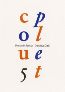
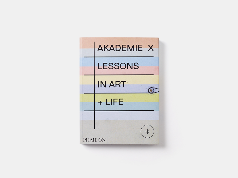
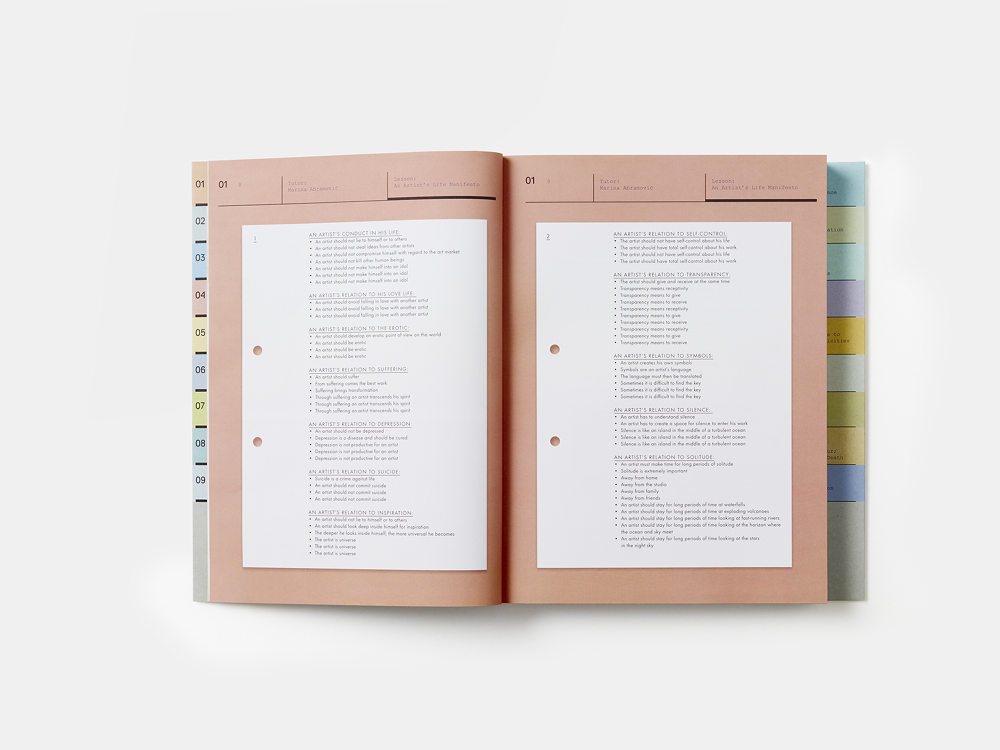
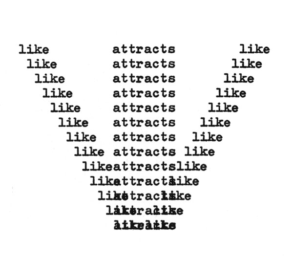
This thin book with its soft flappy cover gave me a sense of preciousness.
It needed two hands to hold, it urged for my attention.
The white lp-size cover, its simple black typography yet incomplete
title made it mysterious. It sought more effort than a
quick look to discover the meaning.
Flipping through the pages I was completely
surprised and somewhat confused as more and
more empty pages revealed themselves.
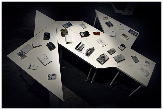
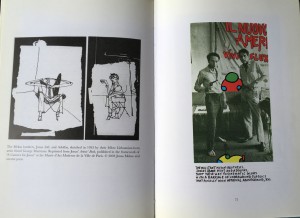
Then eventually three huge images of an installation appeared. I would probably not have looked at them with as much care and appreciation
as I did, if it was surrounded by visual or written information.
The silent white pages that led up to these images made them
more valuable. The emptiness was key to this aura of worthiness.
A fourth smaller image appeared after a few empty pages.
The series of images started and ended with a white bar, suggesting a beginning and an end of the empty space.
Than the catalogue ends with emptiness.
In The Elements of Graphic Design [x], Alex W. White explains the functionality of emptiness in graphic design:
”Emptiness is silence, an open field, a barren room, a blank canvas, an empty page. Emptiness is often taken for granted
and thought best used by filling in. It is generally ignored by all but the few who consciously manipulate it to establish
contrast, to create drama, or to provide a place of actual or visual rest.”
The emptiness creating visual rest and drama are actually
simultaneously existing in this book. One would think
drama and visual rest would not be ableto co-exist.
The impatient ongoing episode of flipping white pages,
the dramatic surprise of a sudden huge image and then
the visual rest to read the image with great care.
Pjotr de Jong, the designer [x] and a dear friend of Aernout Mik [x],
shed some light on the being of this book. It all started with an
exhibition in Hannover. Aernout Mik had won the Preis des
Kunstverein Hannover 1995 alongside two German artists,
Bernhard Büttner and Michael Stephan.
The three artists were given a space in which
they were able to show their art. The German
artists asked the director ‘how the space had to be filled’.
Aernout [x] was astonished by this question and made it
clear that no one but himself would decide on how his
space was going to be. He took this German question
and used it to title his work.
He [x] was asked to make a catalogue for this
exhibition and this book is the result of that.
He rebelliously decided to make
the ultimate anti-catalogue. Bare emptiness
was in a similar style to his exhibition space,
the dominant theme.
Pjotr and Aernout spent their whole budget on
the most expensive synthetic paper available.
They maximized the size of the images and printed
them on full pages. Pjotr stated that the images
were badly printed because of the synthetic paper.
In my opinion they added to the mystery of the book.
This probably is the least informative catalogue ever made,
yet it’s the most memorable one I ever came across.
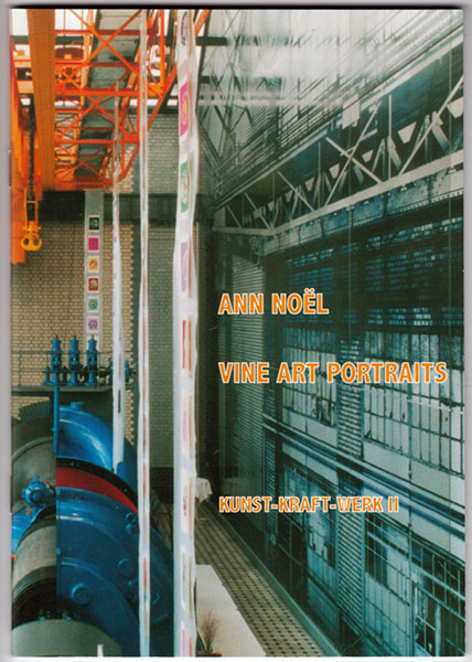
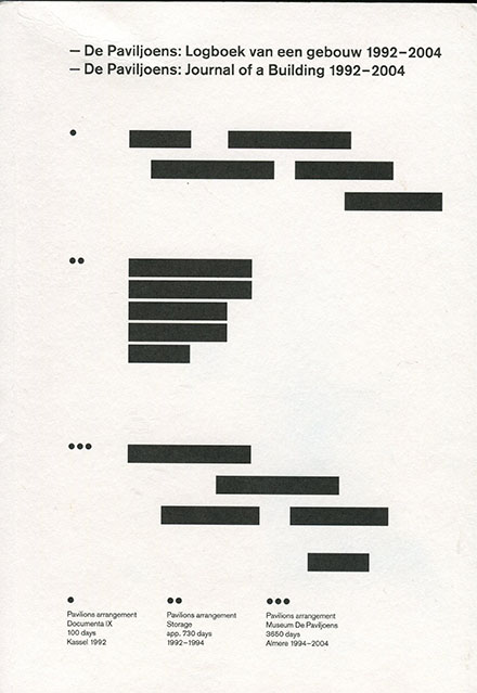
Aernout Mik : Wie die Räume gefüllt werden müssen. /Rietveld library catalogue no : mik 6
Coarse antique white paper. Slick bright white paper. Corresponding with these two feelings 70’s architecture gives me. This vintage feeling of the past, but in its day so modern and progressive. The book feels historic yet contemporary. I feel like I’m holding a treasure in my hand. This book; 17 by 24 centimeters, comfortable in one’s hand and easy to carry with you. Beautiful pictures in black and yellow printed on this coarse paper feeling like an old precious book in my hands.
O B S E R V A T I O N S:
First of all, the book is titled “De kritiese jaren zeventig”, which I think is genius. The 70’s way of spelling “kritiese” is used in the titel, rather then the contemporary “kritische”. The book, designed by Beukers-Scholma, is linked to a 2004 exhibition with the same name. Their work contains several award winning designs.
The book consists of 2 types of paper: coarse antique white paper and smooth bright white coated paper. Furthermore it contains 3 types of pictures: black and white, black and orange, black and yellow. The coloured pictures are like black and white prints on coloured paper.
Black and white prints are used for specific buildings. Every chapter is divided in paragraphs that deal with a building. The pictures of these buildings are in black and white on coated paper. The texts are also printed black on white coated paper.
The colour yellow presents scenes: People or streets. They are accompanied by relevant quotes and precede the introduction of every chapter. They are printed on antique white paper.
Orange is the colour being used in the general introduction as well as every chapter’s introduction and the first and final page of the book. The black and orange pictures that introduce the book are printed on antique white paper. The single orange introduction pages for each chapter are printed on white coated paper.
THOUGHTS:
How can I not read this book? Knowledge, knowledge, knowledge. I’m not, I’m not reading. But I see words, I see sentences, their meaning is clear to me without doing effort and so I want to read, I want to continue what my mind processes without conscious effort. This coarse paper feels so…… coarse? soft? Old? Precious I guess. I know this book is about the past. And we’re making the same mistakes all over again. Humanity makes the same mistakes all over again all the time everywhere, always. Why is there so much violence, why are people so unhappy. And I mean unhappy, unsatisfied in a well-developed country. This book evokes so much in me. And it’s not the architecture, not so much the design, but the fact that I know it’s about the past and I am not happy about the world and… Past, present, past, present and I wonder; where is this going? The design of the book anticipates on the context very well. At least on the fact that the book is about the past. And the design feels like the past, it feels like not now. Old pictures, blurry pictures, pictures in black and white, black and yellow, black and orange. Then again I also think this book is bullshit. Pure bullshit. Like everything contemporary related to architecture; this quasi science. Conceptual bullshit about how architecture makes a better world. But it doesn’t because we are inherently messed up. People are insane.
Let's try to take a step back.
The book feels like an escape. Just like how I can get lost in google maps, looking at buildings, I can get lost in this book
The book makes me passive, receptive. Maybe that’s how I am in general. No I’m not. I’m creative. I create. I’m not that passive. But then again I am. Well at least lately I am. Sigh. I just want to see, touch, feel, sense the book. Which is okay. I guess. That’s the assignment. But then again, am I researching? Is this going anywhere? No. I just want to get lost. Lost in the images of the book. Lost in the colours of the book. Why do I enjoy looking so much? I do it so much. Just watching buildings. Going on google maps or biking around the city and just looking at buildings. Getting lost in watching them and enjoying them. I can hide my face behind the book. I like it. I want to disappear……………………….
With drawing and painting I tend to write a lot. Write previous to painting or using written words in paintings. I tend to write a lot. In this assignment however. I seem not so capable of writing. Even though I’m writing now. The book makes me very passive. Makes me want to see the book, feel the book, read the book, but not write about the book.
Now how did this all start? How did I end up picking this book? It started with a list of books we could choose from and I decided to look for books about architecture and found this lovely book about 70’s architecture. I happen to have a thing for post-world war II, pre-90ties architecture, so I had to choose this book. Then the book also happened to be so well designed. Also, the text is not only about the architecture but the whole social context of the 70’s. The book contains beautiful pictures, not only of buildings but also of people and sceneries. Sceneries of the 70’s. This book is a history book and its content is wonderfully converted in its design.
It wasn’t a spontaneous encounter. I looked for it.
De kritiese jaren zeventig : architectuur en stedenbouw in Nederland, 1968-1982 = The critical seventies : architecture and urban planning in the Netherlands, 1968-1982. /Rietveld library catalogue no : 719.22 vle 1
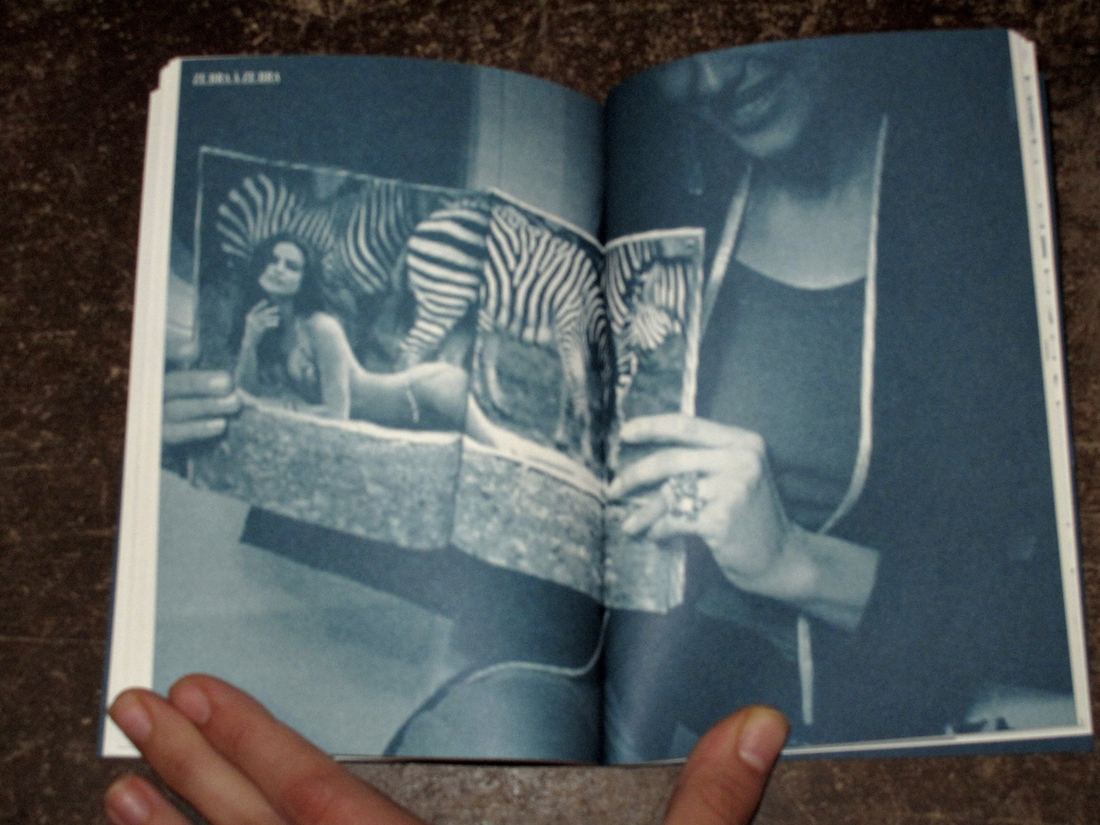
The photograph of a detail.
The remains of a campfire.
In the right-top-corner an other one:
children making a campfire.
The two images communicate.
Two photographs cut out and put together create a panorama.
Every chapter is an other story.
It’s an artist book.
It intrigues me.
Honesty emanates from it.
It’s pure.
It has this uniqueness that makes you fell in love.
From time to time,
there is a little bit of fragility.
The writings are wobbly.
Pictures are cut here and there they go on top of the other one.
Typewritten text strip are highlighting us.
The book has this very personal attitude. It’s hand made.
It has been made a while ago.
In the 1980’.
I’m a viewer.
I’m entering someone else world.
The title is written by hand.
I cannot read it.
It intrigues me.
I figure it out after a while:
« Midden-Delfland ».
I need to know who did it.
The name of the author is not written anywhere.
Everything is in dutch. I don’t understand.
I decide to go back to where I’ve found it.
The man who works here, in the library is a real passionate.
Of course he knows the artist:
Krijn Giezen: an important early eco-artist from the Netherlands (1939-2011). He started as Assemblage artist in the 60-ties and played an important role in the development of Land-art and Conceptual-art in the 70-ties. Other Eco-artists were Sjoerd Buisman, Herman de Vries, Hans de Vries and Waldo Bien. Eco-art is a collective term for art in which our relationship with the natural world is the main subject. Eco-art is not bound to materials and disciplines, but is bound by the integrity of its message: Eco intends to improve our relationship with the natural world.
Did he also design it ? We don’t know.
He may have collaborated with Hans de Vries.
They did few books together.
The internet is not helping.
Midden-Delfland is a place in the Netherlands, all the pages are related to the place and not the book.
If I want to know more about this book I will have to contact the artists.
Krijn Giezen died some years ago and Hans de Vries is a common name in the Netherlands, also in the artistic field.
I cannot contact them.
Mmmh…
I start to feel the need and the urge to discover more about this book.
Midden-Delfland…Krijn Giezen…Hans de Vries
Midden-Delfland…Krijn Giezen…Hans de Vries
Midden-Delfland…
I should go there !
I should do a trip to Midden-Delfland !
Tuesday i will go to Midden-Delfland,
find more about the place and take some pictures of it.
I woke up too late.
I left the house at 1pm.
My trip to Midden-Delfland is now starting.
I take the tram. Oops. It’s the wrong one. I jump out of the tram.
I see the number 12 (right tram), I run to catch it, take a seat and start reading peacefully.
I’ve got time. I’m supposed to get out at the terminus.
The journey is taking quite a while though. As I decide to find out where I am, I recognize my neighborhood. I had passed the terminus a while ago and was now going in the opposite direction.
I finally arrive at Sloterdijk to catch my train to Delft.
There I will eventually find the bus number 33 that will take me to Midden-Delfland.
I wait.
The bus 33 is the only one which runs every half hour.
It’s now 4:45pm.
The sun will disappear any minute now, but I won’t photograph until I reach Midden-Delfland. ?I will manage with the light there.
As I’m in the bus I see the night slowly arriving.
Never mind if it’s not the right stop, I jump out.
I’m in the countryside. The landscapes are the same all around me.
I’m now walking. I want to discover more.
I have to take a few pictures while I can.
It’s just been 5 minutes that I’ve been walking but the light is now gone, it gave place to the darkness.
I don’t have a flash on my camera.
I’m tracking the streetlights.
This place is scary.
It’s been 15 minutes now and I’m still walking on that same road.
I’m not satisfied by the pictures I’ve been taking so far, they’re boring.
There, I see a church. It’s surrounded by street lights.
I walk in that direction. It’s too dark there, nothing interesting is happening.
That’s it, I’m going home.
I’m thinking “I should have woken up earlier”.
The bus is coming in 2 minutes. I feel lucky.
I’m freezing to death here.
I check in. It sounds like my OV chip-card doesn’t work.
I’m surprised, I’ve just recharge it in Delft station.
I try again.
It doesn’t work.
I don’t have any cash to pay the 5 euros the driver is now asking me for.
He doesn’t accept my Credit Card, I ask him where can I go withdraw.
The bus driver says he is not from here. He doesn’t know where I can withdraw.
He’s now asking me to leave the bus so he can continue his journey.
I leave the bus.
What an asshole !
The next bus is in an hour. In a fucking hour !
I’m freezing.
I’m not going to stay there, static, dying.
I walk, following the road I came from.
Everything is dark around me.
The only houses I see are very far.
Everything is just fields and ships.
I can’t believe the guy left me.
I’m shocked.
I’m thinking “And what if I get raped ?”
A human is passing by.
Hallelujah.
He looks at me like I’m crazy when I tell him I want to walk to Delft.
That city is 10 kilometers away.
The bus stop is just near.
I didn’t see it because it’s just a pole.
The next bus is coming in 45 minutes. ?
This time I will get in and won’t get out before Delft.
I wait.
I’m standing.
I hate to wait standing.
I start to sing, and dance to get warmer.
It’s so cold out there.
I’ve just been waiting 5 minutes; but I can’t. I can’t wait anymore.
I’m hitchhiking.
I raise my thumb.
People are looking at me weird.
It’s been 10 minutes that my thumb is raised.
Nobody has stopped.
I’m starting to think I’m going to die here.
Maybe it’s because of the cap.
Or maybe it’s the big scarf that I’m wearing around my head.
I decide to let go of the cap.
Even without it no one is stopping.
I’m still singing and dancing but now some tears of despair are running down my cheeks.
Oh my god, Oh my god !
Yes !
Someone stopped !
He doesn’t look creepy at all !
I’m so happy right now.
The guy is even going to Delft !
I’m so happy right now !
We start a small talk.
He is quite surprised that I come from France so I tell him the story about me studying at Gerrit Rietveld Academie and my project about Midden-Delfland.
He understands better now.
He grew up here, in Midden-Delflandd.
Today he was visiting his parents.
He had never heard of Krijn Giezen nor Hans de Vries.
I ask him a bit about this place where he grew up.
What was it like to be a kid in Midden Delfland in the 90’s ?
First I learn that Midden-Delfland is a commune composed of three villages.
There are three schools.
Everyone knows each other.
It’s a quite safe place to live in.
He tells me that it’s a privilege to be raised and/or live there:
It’s close to the beach (45 minutes biking),
It’s close to the city ((Delft) if you don’t miss the bus!)
The guy really seemed to have enjoyed his childhood.
While he keeps telling me about the joy of living in a village I was just thinking “HELL NO!”
I couldn’t picture myself living there.
And here we were: Delft’s train station.
I was released.
In 1 hour and 37 minutes I will be back at my place.
I made a book about Midden-Delfland.
Landschap : een impressie van het landschap Midden-Delfland winter 1983-84 door Krijn Giezen: wonen werken en rekreëren. /Rietveld library catalogue no : giez 2
‘You’ve got beautiful stairs, you know’
Een publicatie van werk door Ola Vasiljeva
Design door Julie Peeters
In magazine formaat publiceert Kunstverein Munchen een publicatie over Ola Vasiljeva. De kaft vertoont een simpele, snelle tekening van een man die lijkt te zijn gevallen. De achterkant een installatie, een gele verf marker balanceert op de top van een blauw glas in de vorm van een getailleerd overhemd.
Het ontwerp vraagt om mijn aandacht, maar waarom?
Kennis over het grafisch vormgeven van boeken heb ik niet en dus was ik van plan om de ontwerpster van de bovengenoemde publicatie te benaderen voor een interview.
Ik was, moet ik eerlijk bekennen, vrij nerveus voor mijn gewenste afspraak met Julie Peeters, en wachtte af op een antwoord op de email die ik haar had toe gezonden. Peeters, een grafisch ontwerpster geboren in België, en winnares van de fel begeerde boekdesign award The Goldene Letter, ‘Schönste Bücher aller Welt’.
Over titels gesproken.
Enkele dagen gingen voorbij en een response bleef uit. De vragen die ik haar had willen stellen stonden geschreven op een pagina in mijn notitieboek. Ik las ze nog eens door en wierp nog een blik op de publicatie in mijn tas, die overigens al een aantal weken te laat ingeleverd was, en bedacht me dat ik de algemeen benodigde kennis op het gebied van grafisch vormgeven misschien wel wat had overschat.
Zonder Peeters, besloot ik mijzelf te interviewen met een selectie van de vragen die ik klaar had staan voor mijn interview. Ik waan mijzelf grafisch ontwerper en probeer op mijn eigen vragen antwoord te geven doormiddel van research naar grafische vormgeving in z’n algemeen, onderbouwt door mijn eigen onafhankelijke denkbeeld.
Wat is belangrijk bij het ontwerpen van een publicatie over andermans kunst?
Het lijkt mij een belangrijk gegeven dat er treffende overeenkomsten zijn tussen de ideeën en meningen over design van zowel de auteur als de grafisch ontwerper. Grafische vormgeving kan een visuele kunst op zich zijn, mits het doel van de publicatie dat toelaat.
In het geval van ‘You’ve got beautiful stairs, you know’, zal de vormgever een bescheiden rol hebben moeten aannemen, om zo het werk van Ola Vasiljeva zo veel mogelijk voor zichzelf te doen laten spreken. Wanneer een publicatie een artistieke uiting kan uitbeelden van zowel de vormgever als de beeldend kunstenaar te samen, geloof ik dat er sprake moet zijn van een zekere harmonie. Uiteenlopende ideeën kunnen geloof ik snel tot een onaantrekkelijke publicatie leiden.
De focus in het maken van een publicatie met daarin iemand anders z’n werk ligt in het zo goed mogelijk weergeven van installaties, tekeningen en teksten. Daarbij moet er voor worden gezorgd dat het uiteindelijke design binnen de esthetische stijl van de auteur valt. Goed overleg tussen de publicatie vormgever en de beeldend kunstenaar lijkt mij dus een essentieel gegeven in de totstandkoming van een goed product.
Wat is grafisch vormgeven?
Een grafisch ontwerper houdt zich bezig met het proces van visueel communiceren. Hierbij worden typografie, fotografie en illustraties op een efficiënte of artistieke wijze gecombineerd en samengevat tot een geheel. Het gaat om de visuele representatie van ideeën en beelden.
Omdat de print en het boek als medium al lang bestaan zijn ze veel ontwikkelingen doorgegaan op het gebied van vormgeving
Vandaag de dag hebben we een goed overzicht en een canon aan informatie over deze veranderingen. Het is interessant om te zien dat er her en der zekere regels zijn ontstaan binnen het ontwerpen van een boek, iets wat ons in het verleden misschien wel heeft tegengehouden om vooruitstrevend te zijn. De opkomst van het modernisme verschafte daarentegen een nieuwe blik op het design en ontwerp van een boek. Oude regels omtrent de indeling van tekst en afbeeldingen werden losgelaten en er ontstond een zekere artistieke mogelijkheid tot het expressief ontwerpen van een boek. Je zou denken dat, zoals men bij bijna elke tak van artistieke expressie denkt, dat innovatie in het heden moeilijk klaar te spelen is, omdat de geschiedenis ons leert dat er al vele jaren van vooruitstrevend denken over heen zijn gegaan en dat de nieuwigheid en noviteit overal wel een beetje van af is. Dit lijkt me een goed voorbeeld van een psychisch effect wat de uitgebreide informatie over onze geschiedenis met zich meebrengt. Ik geloof dat een weidse kennis over de historie van design een keerzijde met zich meebrengt, namelijk het versmallen van ons creatief denken. Kijk bijvoorbeeld naar alle ‘alternatieve’ of ‘onafhankelijke’ culturele stromingen die de afgelopen decennia zijn ontstaan. In feite zijn dit allemaal eindeloze herhalingen van voortijdse daden onder het mom van rebellie tegen de gevestigde orde, terwijl er wordt gedaan alsof het allemaal voor het eerst gebeurt, weten we diep van binnen wel beter.
Rem Koolhaas heeft op een van de ruiten van zijn schoenenwinkel in het centrum van Amsterdam een leus staan die het vooruitstreven en innovatief denken mooi vertaald. ‘We ended up breaking the rules of shoes, not just for the sake of breaking them, but simply by not knowing them’
Waarom wordt er vandaag de dag nog steeds zoveel fysiek gepubliceerd terwijl het elektronisch publiceren zoveel voordelen kent?
Ik geloof dat de grafisch ontwerpers van deze tijd een zekere nostalgische waarde toe hechten aan de print als medium. De fysieke aanraking van een boek is iets wat de wereld langzaam aan het verliezen is. Van generatie op generatie worden de boeken en tijdschriften exponentieel ingewisseld voor hun digitale opvolgers. Het lijkt mij dus een kwestie van tijd dat het aantal fysieke publicaties afneemt en de digitale publicatie stroom toeneemt.
Veel van de jonge grafisch ontwerpers in opleiding zijn vanaf hun geboorte opgegroeid in een digitale cultuur, zij zullen dus ook sneller grijpen naar een elektronische, digitale manier van niet alleen ontwerpen, maar ook publiceren.
Ik durf daarentegen wel te stellen dat de fysieke publicatie van het boek nooit zal uitsterven, gezien er voor veel mensen nog steeds en altijd zal gelden dat er niets gaat boven het kunnen vasthouden van een boek.
‘IN ORDER TO BUILD A NEW STRUCTURE, PIERROT NEEDS TO FORGET THE PRECISION OF LANGUAGE’.
(pagina 47, You’ve got beautiful stairs, you know’)
Ola Vasiljeva : you've got beautiful stairs, you know. /Rietveld library catalogue no : vasi 1
Never Odd Or Even (2005), Mariana Castillo Deball, Revolver Publishing
Scanning through all the possible titles in the list, I landed on something I recognised: ‘Never Odd Or Even’, by Mariana Castillo Deball (M.C.D.) I found myself attracted to it, because it reminded me of an album I used to listen to a lot when I was younger. Initially, I really didn’t like the front cover’s typography, but when I flipped it open, I found myself very confused about the way the book was structured. When I inspected the other pages, I decided this would be my book of choice. I thought the back cover and inside looked very interesting and beautiful, but I didn’t understand why it looked the way it did, what purpose it served, if it even had any.
When I started looking online, I could only find a lot of information about the second volume, but the first volume only gave me two not very detailed links, one to the art foundation’s website and one to the publisher’s website. It became clear to me that it was a ‘book’ made up out of dust covers. It was some kind of art publication. The fact that it was sheets of paper specifically designed to protect books, protected by a layer of plastic seemed absurd and quite funny to me. Even though my main attraction was the construction of it, there are a lot of different styles of graphic design found throughout, which I found to be quite interesting, both together and on their own.
First, I indexed all the individual pages of my copy as follows. By doing this, it became clear to me that there is a discrepancy between the number of covers that are contained in my copy and what the publisher advertises. My copy only accounts for as much as twenty-two covers, whereas it should have been twenty-three. This number includes the outer cover, following the counting system of the second volume. Otherwise, there are two pages missing. Also, none of the books in this list exist in reality. They seem to do what art is known to do: imitate life. The publication kind of looks like an exhibition in itself and it actually is almost some sort of catalogue of the actual exhibition it is part of. I can’t support this factoid with photographic evidence, as there are no accounts to be found on the web. The exhibition seems to have taken place before museums, artists, or audiences started to upload any documentation on the web, but based on what is available online for the second volume, the before mentioned seems highly probable.
So there were two minor design mysteries: it is unclear why the publication is formatted the way it is, but it is also unknown what the content of 1/23 of its totality is.
Could this missing piece hold the key to unravelling this mystery? Highly unlikely, but it remains a point of curiosity nonetheless.
To understand Volume I (2005) with as little information as there is available, we must resort to looking at Volume II (2011). With six years separating the two, there are some differences, but integrally they appear to carry the same concept — it’s a series and not two separate works after all. Volume II has some colour prints and more ‘pages’. Although I admit that I don’t know the exact way the exhibition was held in 2005, I think it’s not unreasonable to assume it was very much similar to how it was handled with the second one. To get a better idea of how it would interact with space, here you can have a look at the press release and photo album for the exhibition at the Grimmuseum in 2011.
Never Odd Or Even at the Grimmuseum (2011)
Never Odd Or Even is a collection of dust covers for non-existing books and in the exhibition, the contents of these non-existing books are explored and theorised about, in works and performances that use text as their primary medium..
In an interview, Manuel Raeder has made clear that the outer cover’s typography has been designed by the artist herself — based on Tangram puzzle shapes — and the pages were done by the artists she invited to participate in this collaborative work. The latter being pretty clear just by reading the flap of the outer cover. Finding out about the inspiration for the type made me appreciate it a bit more. The collaboration apparently also extended into the exhibition surrounding the publication, working together on shaping how the public experiences the work. The second volume was published through Raeder’s publishing house ‘Bom Dia Boa Tarde Boa Noite’.
I contacted Raeder, with regards to the missing page, who worked on Never Odd Or Even together with M.C.D. I was really happy to see that he was very quick to respond. However, he didn’t readily have the information on hand, so he told me he’d forward my question to some others. I didn’t contact M.C.D., as she doesn’t seem to have any contact information freely available.
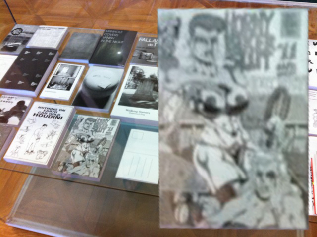
When I inspected some pictures from the Brno 2016 exhibition, I noticed that not only did they exhibit the first volume of the work, but that the missing cover was actually squarely visible.
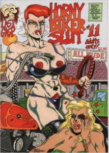
After doing a bit of C.S.I.-style zooming and enhancing, the title of the page appears to be a comic-book cover, titled ‘Horny Biker Slut #11’. This quirky title and cartoon imagery could make sense of the reason why someone decided to steal it from my copy, however inexcusable it may be. But there is one thing a bit strange about this particular cover. When I googled it, it actually exists and you can purchase it from Amazon for $19.99 + shipping. The fact that this title actually exists in real life makes it different from all the other titles, creating a whole new question altogether.
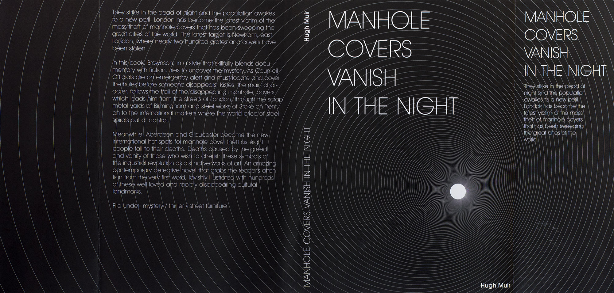
By this time, Mrs Schryen (someone working for Studio Manuel Raeder) got back to me. She informed me that there were in fact two covers missing; the above mentioned Horny Biker Slut #11, as well as one titled ‘Manhole covers vanish in the night’, which looking back on the Brno pictures, was also squarely visible.
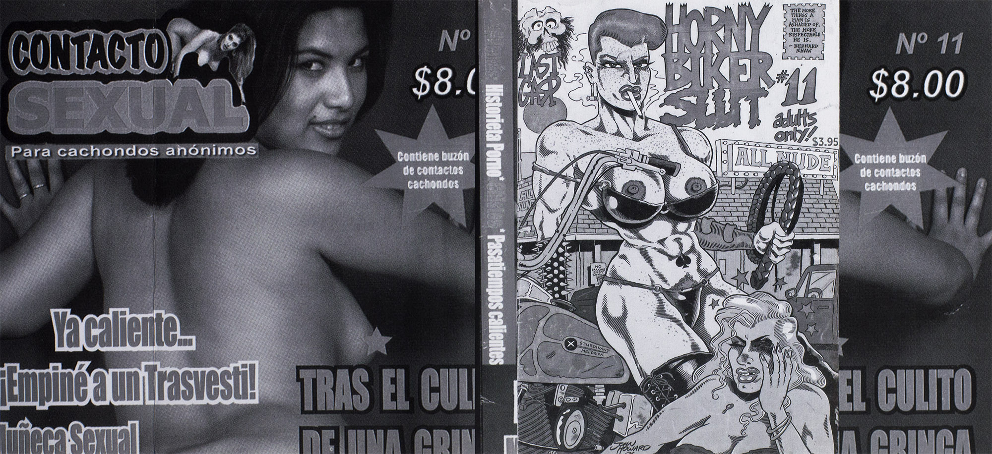
I previously stated the Horny Biker Slut #11 cover existed in real life, but in the full publication version you can see above, it looks to be collaged together with the 11th issue of ‘Contacto Sexual’ on the back and both flaps, and something called ‘Histoire Porno’ along the spine. The other cover appears to reference, word for word, an article from the Guardian, dating back to 2004.
The fact that there is a second cover missing from our library’s copy means that the two volumes seem to be inconsistent in their numbering. The first one doesn’t count the outside cover as a ‘page’ and the second one does.
Never Odd Or Even at the Grimmuseum (2011)
The artists involved in this project don’t seem to be concerned with consistency, correctness, nor the concrete.
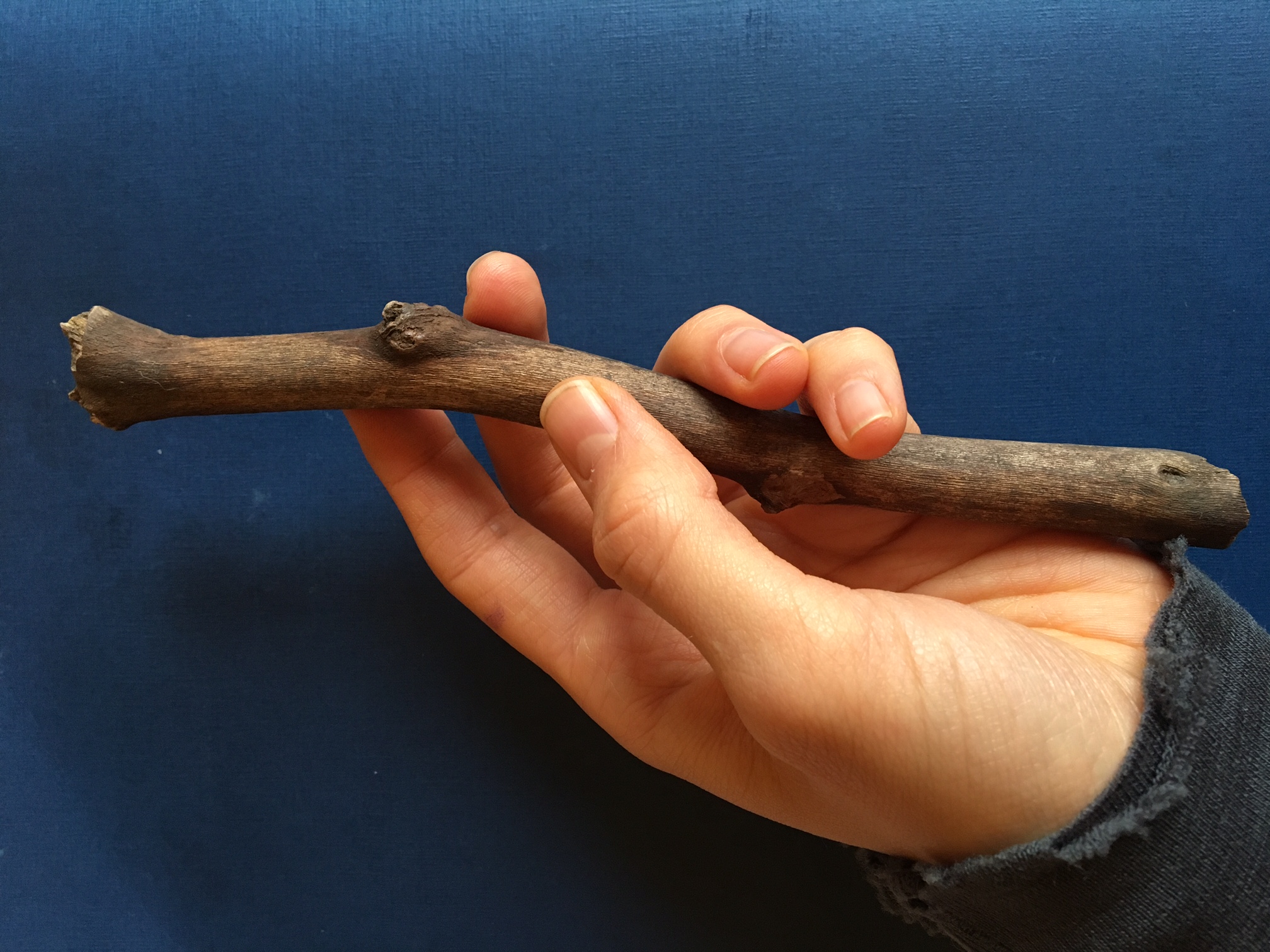
A thin book. A plastic waterproof cover. A present clear light blue. Frames on a wall, nature and figures of humans standing on their own interfering with a wooden stick. Throughout the book the wooden stick is working like a tracer holding the pieces of the book together.
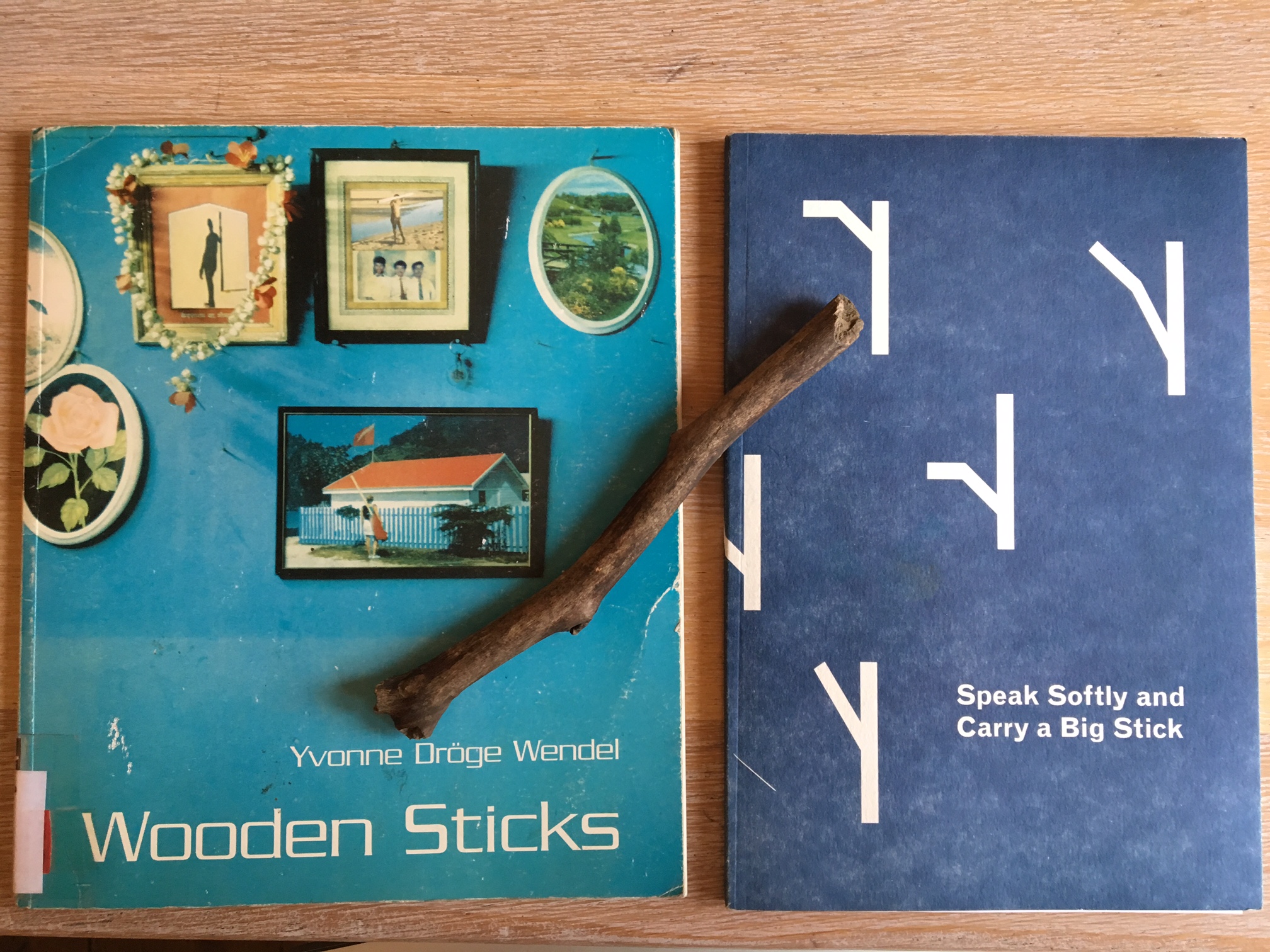
I found it in the middle of the long list of choices, a list with new books for the library of the Gerrit Rietveld academie. This book might be new in the library, but was made in 1996. The book was made after Yvonne Dröge Wendels’s work and exhibition “Wooden sticks” at Witte de With in 1995. It is self-published and designed in collaboration with Jan Geerts. He happen to be nowhere to find on the world wide web which makes me wonder if he even works as a graphic designer? Maybe he was simply a good friend helping out with a simple set-up for the book to be printed and manifested as an object on its own.
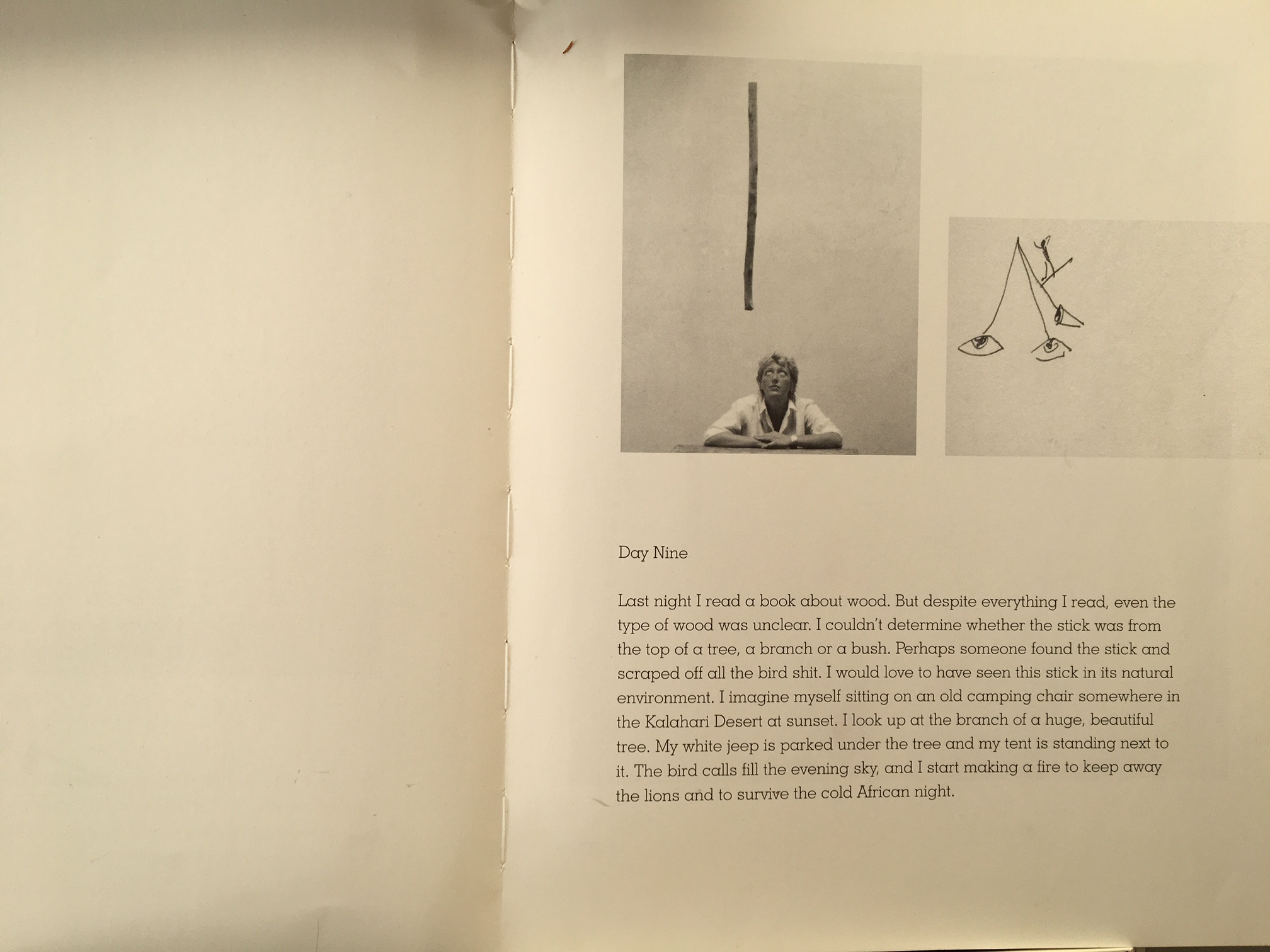
I got curious with the look of the tittle “Wooden sticks” simple and effective, the two oo’s next to w, the emotions and memories wood evokes and the sticks connected to it made me wonder what was inside. So I took the book out from the shelf. At first glance, to be honest, I did not like the look of it, why is it plastic? Why this fond? Peculiar blue. Naah.. its not me, but I then flipped through and the pages had the perfect flip through, where you don’t miss a page doing it, and I fell for the instant feeling of development in intensity as I flipped it in my hands. Two chapters. The first, text, b/w simple documents of her process – where she construct an experimental set-up- through which she approach the object of a wooden stick in different ways- it shows her different perspectives, postures, gestures, moods over the time of thirteen days. Second chapter, a colorful and intense rough collage of different art historical, archeological, anthropological descriptions of sticks. Its a book of how-to, but not with conclusions and clear answers.
There is a very present feeling of not being modern in its design, hit by nostalgia it reminded me of books from my childhood. The bendy softness, yet solid presence, not fragile though light and the simpleness of the design. My first thoughts about the graphic design was, “It’s like the pages are pre-made templates ready to be filled out with words and images of your choice.”
A simple book with a sense of layers and depth in context.
Turning my head towards Ms Dröge Wendel.
Yvonne Dröge Wendel happen to be in my very close vicinity as she is the head of Fine Art department at the very same academy as me and the library where I found her book.
But she’s a busy teacher and artist at this moment, not to reach.
Where to go.
Library.
“Oh you like wooden sticks? We just got this one”‘
A brand new soft paper dark blue cover with what I assumed to be graphic-designed sticks. Is there any link besides the look and the theme?
The book is made by Alex Zakkas, a designer and artist who happen to be at his final year of DOG-time at the very same school as me, the library and Wendel, the Gerrit Rietveld Academie. And one of his very starting point was indeed the work “Wooden sticks” by Ms Dröge Wendel.
We meet.
Being in contact with a book called Wooden sticks about wooden sticks and their different uses I unconsciously started seeing them everywhere on my walks and ended up with one in my bag the last month.
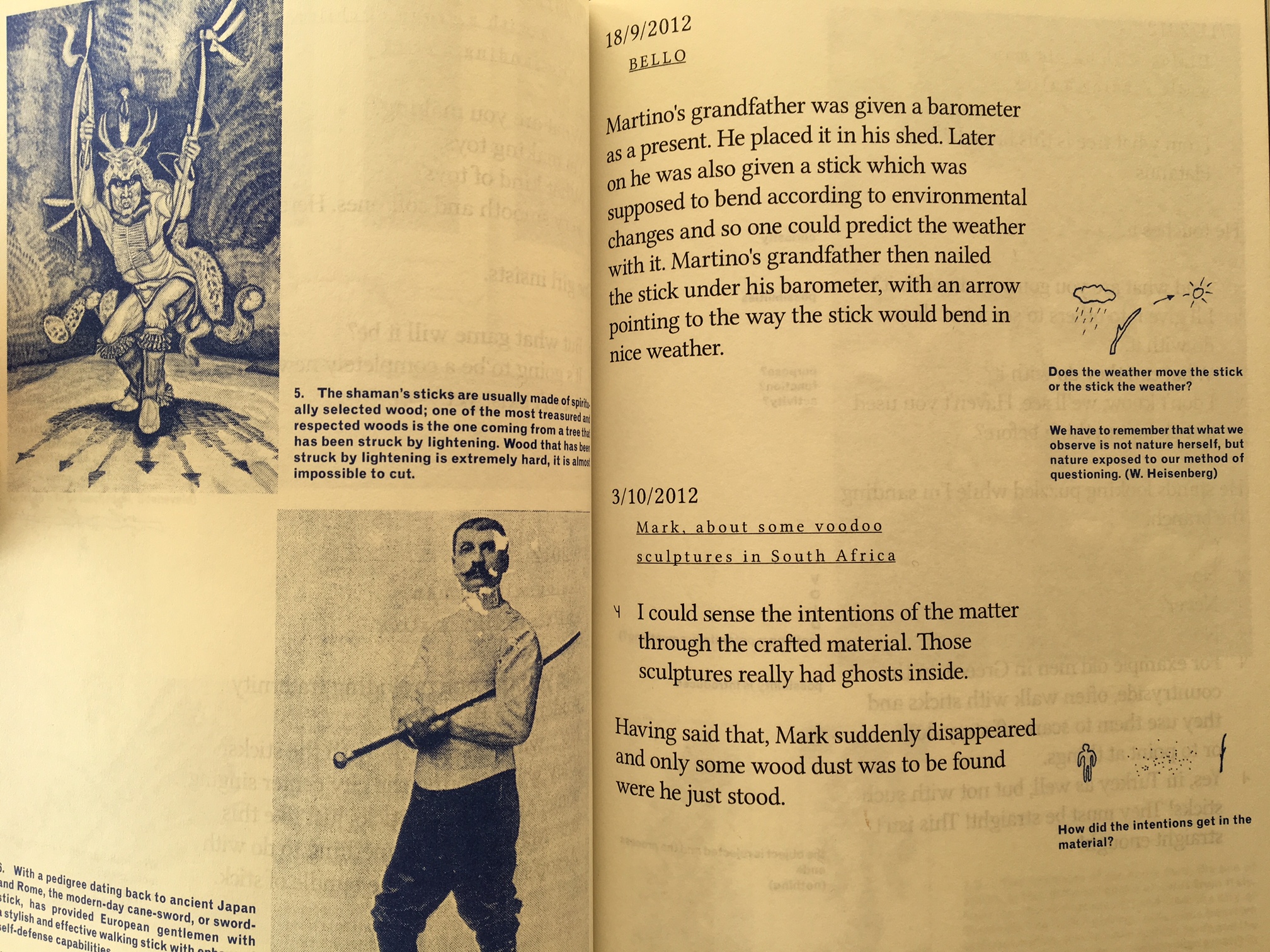
Alex Zakkas made this book in close relation with his good friend, the designer Martino Moradi. Its the compilation of his one year residency work. It didn’t start as a book-project but was made within the last two months of his residency at T.U.Delft Institute of Positive Design, a Phd. world of design as he puts it. And he tells me that he feels the precense of that academic design world very much in the way the book is designed, in contrast to Wendel’s book.
It works with black as the main colour, blue as the more reflective colour (for his sidenotes/drawings) and three very glossy spreads of colour images to break it up. Every text is played graphically with, as a direct responce to the content. The presence of the graphic design is clear, it constanly works as a support for Zakkas research upon the object of the wooden stick. In contrast to Wendel’s project, Zakkas interest was to look as closely as possible at the process of transforming raw material(including found objects, such s the sticks) into man-made artefacts and to collect insights on how a designer’s intentions condition a range of possible interpretations. “as triggers(or restrictions) for subjective associations, the specific materiality and varied tactile qualities which I introduced on sticks became an important aspect of my research process” – Alex Zakkas.
It becomes very clear to me as we speak, how Yvonne on the other hand, more than designing, decided rather to let it be as it is/was. As she treated the sticks as “a place of meaning; a thing with ‘just enough qualities’ she seems to treat her book the same way. No extra. A very welcoming and unpretentious effect upon me as the reader. Open for me to read and fill out the space myself. Filled with space around the simple text and images. Space to think and wonder
Its two ways of playing. Both with clear choices. A reminder that layers in the design can add meaningful and playful insight to the work. But letting it stand raw gives space for reflection in another sense.
when putting Dröge Wendel’s and Zakka’s books up against each other…
There are very clear links to Wendels book and work, conscious and unconsciously as Zakkas puts it, when asked.
As my starting point was the development of intensity in Dröge Wendels book, I decided to make a visual and simple illustration of the different approach to the design of these books, the way they develop when I read through them with my eyes, mind and feelings.
The most interesting thing about the book I chose in the library: For Every Dog A Different Master [x] was oversized texts which were intolerable for me. I was very confused how to perceive the texts on the book which did not seem like texts because of illegibility. At the beginning I thought it has something to do with different cultural background, which is that moderation from the balance between negative and positive space is highly valued in life generally in Asia. However, soon I had to admit that graphic design no longer can be classified its style by borders.
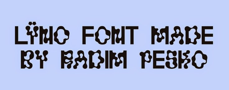
Since I have researched about Radim Peško [x] who is, editorial, typeface designer as well as photographer combined, I gazed that texts could become images and be totally looking different with the other not only by its size and composition, but also typeface itself. There was no much things to get from his other books which were about his photographs so I made a research about typefaces that he designed. Furthermore, I wanted to know what kind of impacts typeface can have because I used to marginalize it.
Stedelijk Museum is one of my favorite museums in Amsterdam since I came to the Netherlands. Stedelijk Museum exhibits modern and contemporary art and design to give visitors insight in their connection between art and life reflecting social issues. The Logo of Stedelijk Museum caught my eyes at first glance because of its confusing flow. The font of the logo: Union designed by Radim Peško is simple without ornament. The design of logo by Mevis & Van Deursen is controversial due to its readability. However, I think it is clear enough to represent the identity of Stedelijk Museum symbolically. The shape of the S represents the dignified history of the Stedelijk Museum and vibrant atmosphere.
Stedelijk Museum Logo
Signage proposal
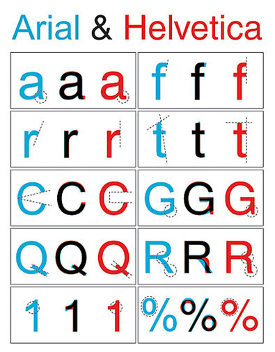
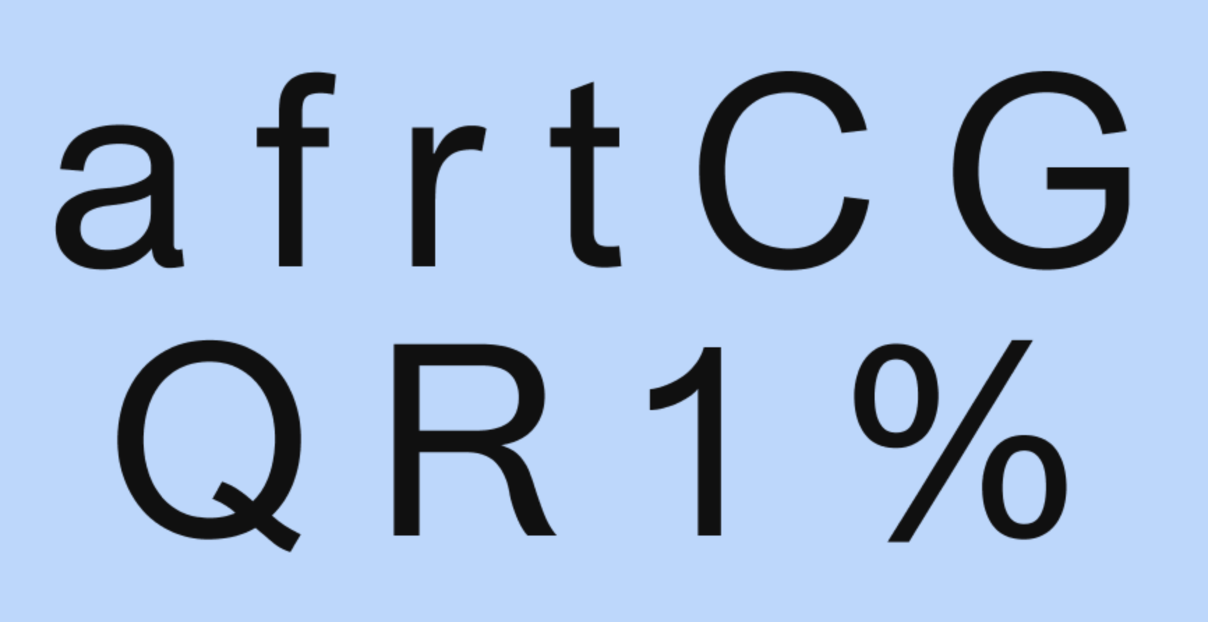
Usually logo reflects the value and direction that the brand pursues. Throughout research about many kind of logos, it was interesting to see how the image of the brand remains in memory by the logo. Also, I was intrigued to investigate conspicuous components in the logo design such as typeface. Union is a typeface which was designed by Radim Peško. Union was designed based on Helvetica and Arial.
Helvetica was designed in 1957 by Max Miedinger. Helvetica’s design is based on that of Akzidenz Grotesk (1896), and classified as a Grotesque or Transitional san serif face. Originally it was called Neue Haas Grotesque; in 1960 it was revised and renamed Helvetica (Latin for “Swiss”).
Arial was designed in 1982 by Robin Nicholas and Patricia Saunders for Monotype (not Microsoft), it’s classified as Neo Grotesque, was originally called Sonoran San Serif, and was designed for IBM’s bitmap font laser printers. It was first supplied with Windows 3.1 (1992) and was one of the core fonts in all subsequent versions of Windows until Vista, when to all intents and purposes, it was replaced with Calibri. [x]
In brief, these typefaces have something to do with their intended usage. Helvetica was designed for print, while Arial was designed for laser printers and then adapted for use on computers.
Normally Arial has been considered as an imitation of Helvetica although both have its own uniqueness by each delicate details that they have. Look at the below pictures. For instance, the terminals of the lowercase in Helvetica cut off straight while Arial’s is cut at an angle. Arial has blander appearance and Helvetica has an overall less rounded appearance and slightly higher waistline. Due to these trivial differences, Helvetica looks more elegant than Arial.
Radim Peško explained about this combination, “Union is intended for situations where Helvetica seems too sophisticated and Arial too vulgar, or vice versa.”. Eventually the new is evolved from the combination with the old. I think that the intention of Union implies the position of Stedelijk Museum.
Helvetica and Arial
Union
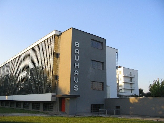
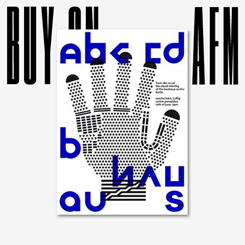
Frequently graphic designers design typeface only for museum itself. Another examples for instance are: the identity for The Chicago Museum of Modern art (commissioned by the same designer duo Mevis & van Deursen and designed by Karl Nawrot) or Bauhaus-Archive Museum. Design studio L2M3 looked to the typeface Bayer Universal reflecting the heritage of Bauhaus typographical design designed by Herbert Bayer. Universal encapsulates the Bauhaus’ stark aesthetic by basic principle of typographic communication of Bauhaus,
1. Typography is shaped by functional requirements.
2. The aim of typographic layout is communication (for which it is the graphic medium).
3. For typography to serve social end, its ingredients need internal organization (ordered content) as well as external organization (the typographic material properly related).
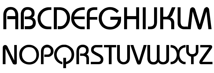
Bauhaus and Universal
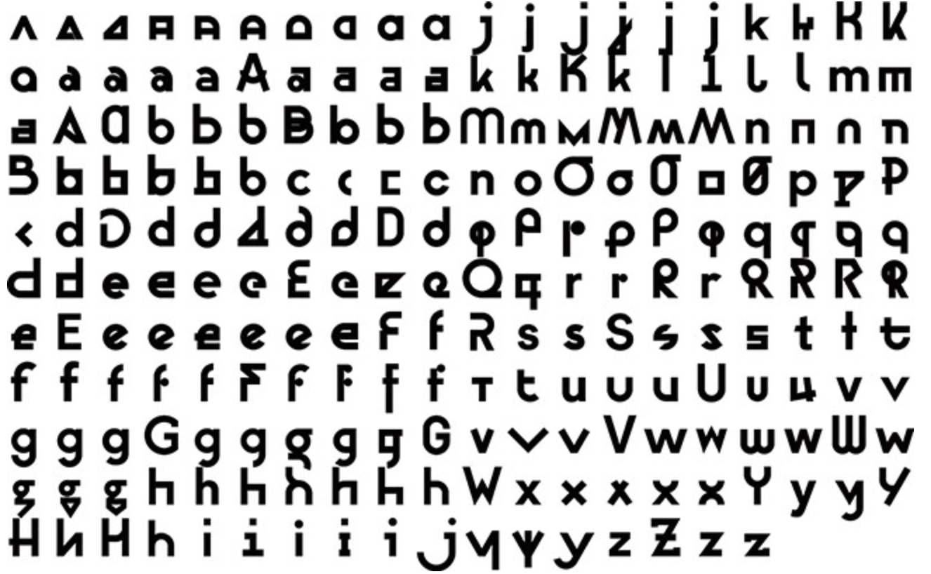
The interesting fact in design process of new identity of Bauhaus-Archive Museum: Bayer Next is that it retained originality but did not restrained its possibility. Sascha Lobe of design studio L2M3 [x] updated more than 555 glyphs and we see more than 10 different versions of each letters. The goal of Bayer Next [x], he says, was to create peculiarities within the typeface. This idea is contrasted with Bayer’s original ideal for simplifying typography down to a universal typeface as we see Bauhaus’ philosophy.
Bayer Next
Poster of Bauhaus-Archive Museum
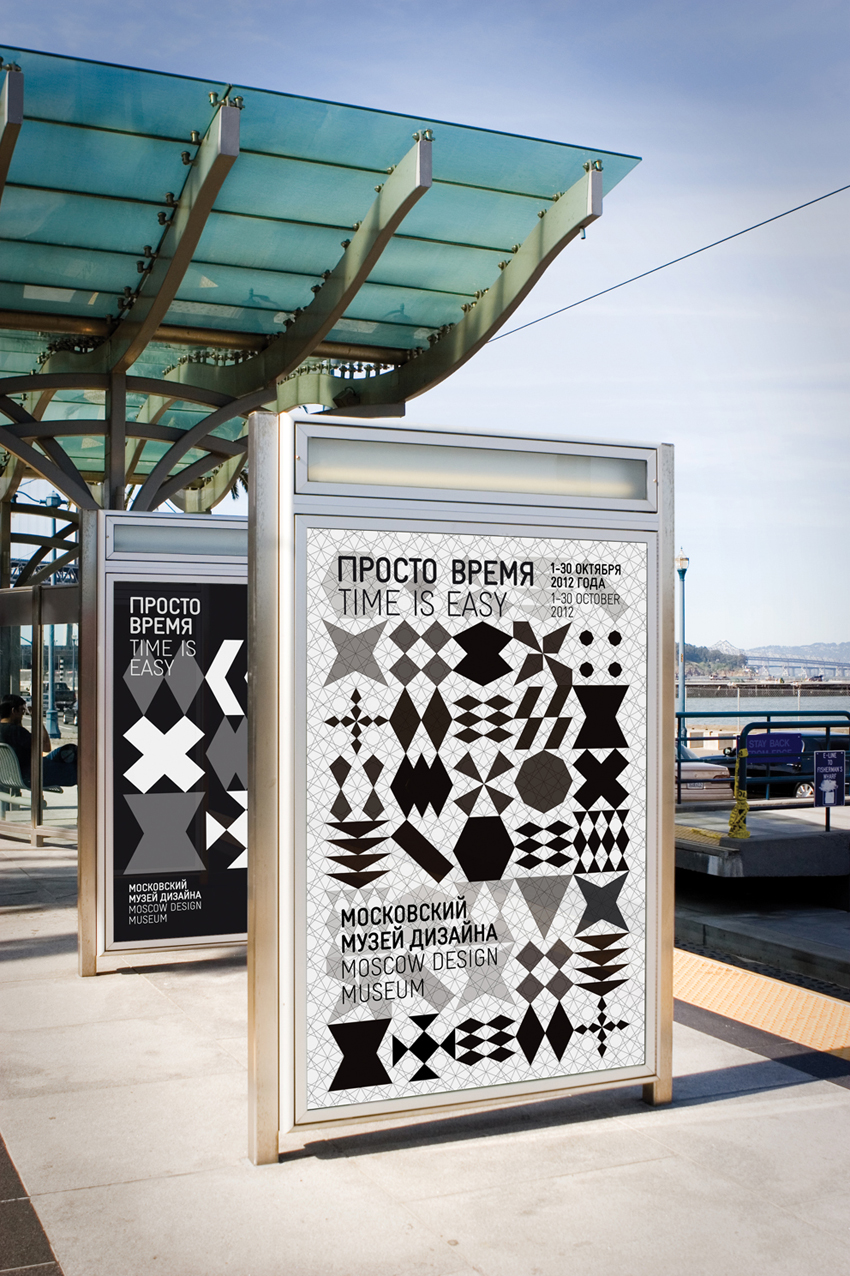
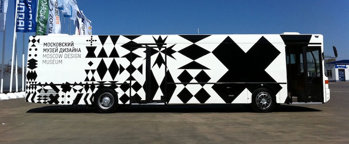
I had thought this expansion and flexibility of identity does not give exquisite image of the brand in memory of public. However, good identity does not mean tangibility as a one certain figure. These examples, see below another example of Moscow Design Museum, are ubiquitous. This museum is based on Moscow but it is mainly imagined as a nomadic, pop-up museum. And, their identity was designed by Amsterdam-based Lava design studio [x]. The identity of Moscow Design Museum does not even emphasize its name to identify them but numerous and changeable icons for logo, which was inspired by Russian glass patterns. Good identity is adoptable for various applications and formations in digital society. Eventually typeface is recognized as one of the strong image although sometime they are not readable.
Moscow Design Museum
Katerina Sedá : for every dog a different master = kazdej pes jiná ves.. /Rietveld library catalogue no : sed 1
Frankly, when I read through the book-list, I could not find a book which made me feel interested just by the title. So I decide to walk through the library and choose.
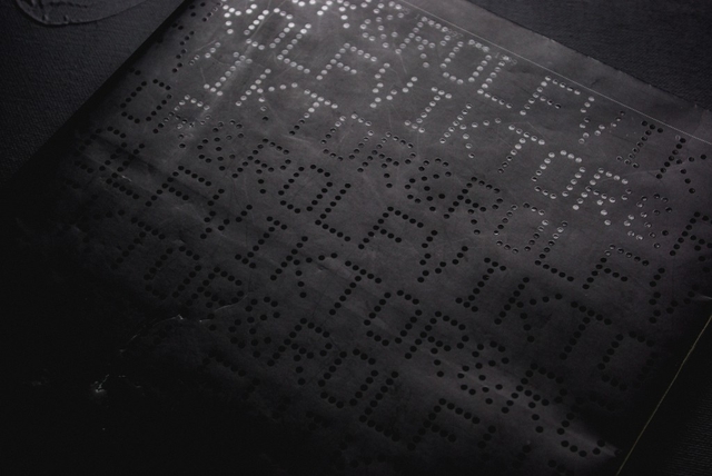
The reason why I chose this specific book was its black smooth color cover with the dots typo, braille lookalike. It has caught my eye and wanted me to see and analyze its content. Page after page I began to realize there was a type of system that the designers, Armand Mevis and Linda van Deursen carried out. A designer makes choices. When it comes to book design, he or she is likely to decide on redaction, typography, grid system, editing, binding, format, print technique, paper quality and so on. The sum of these choices create a unified expression that tells us something. It can be a parallel language to that of the content of the book and it can be more or less emphasized and thought-out. Some would say it could even be devious in its intentions.
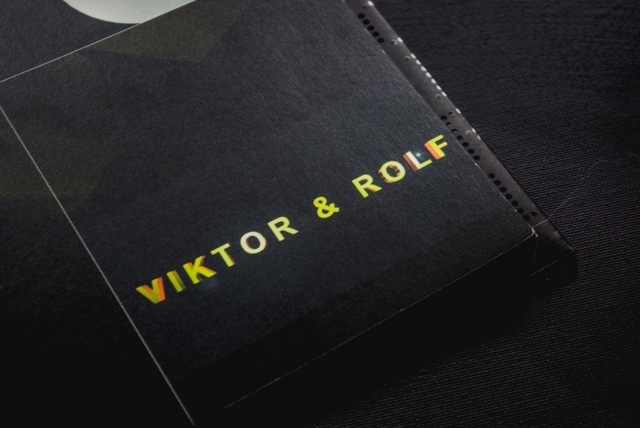
This is an exploration of a book of Viktor & Rolf, from a design perspective.
The cover consists of mat black thin board with the title in what looks like braille typography with dots which looks like sewing. The black cover folds in to almost full width of the very first and last page. I learn from the designer that this is a technical solution to add steadiness to the book.
It was published by Artimo in connection to Viktor and Rolf exhibition ANDAM. It is designed by the design office Mevis & Van Deursen. I interviewed Linda Van Deursen in connection to this essay to get further insights in the design choices and the conditions from which the book came to be.
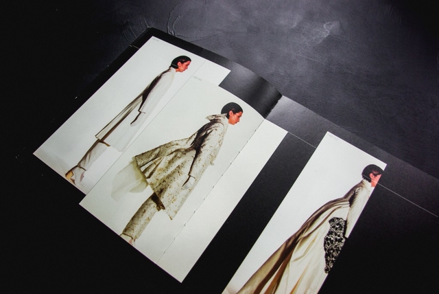
There’s an intriguing black colour inside the book in every page. This feature clearly communicates that it is a book mainly concerned with visual language or images. It resembles a visual preface or introduction to the book. The book has it owns signature, which is a brilliant manifestation of overlapping functions of the grid lines in the publication, categorizing the content by dots. Most of the paper types only occur in one single signature, this gives us a clue about the parallel function of the book.
I learn from that the book is a sort of material archive or assortment of papers of a specific kind. A rule that she set up for the book was that only two sided paper (meaning the paper has a different appearance on each side) of the type used in posters and envelopes (because they can’t be see through) were to be used. Not only does this create an intriguing visual and physical experience but it serves as a kind of metronome or conductor where the different surfaces of the paper are altered rhythmically but not predictably (you learn the rhythm and then it alters). This feature creates a playful element to the structure of the book. In addition to this, all rules seem to be broken at least a couple of times in the book which is a testimony to the sure instinct and playfulness of the designer.
I find out in every other pages, codes and images. This book doesn’t contain much text, except the references in the end of the book. cause there’s no text I started to take another good look at the repeating dot lines, placement and spacing of the images, composition and sizes of the images. I found out that any other collection has it’s own lay-out.
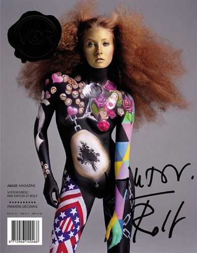
Viktor & Rolf seal, designed by Mevis and van Deursen
For example the second collection in the book is mostly big pictures, mostly layered, the white dotted lines mostly separate the photo’s, but are black when most of the line is over another photo (with white collection photo’s). The fourth collection is only shown on all the right pages, left ones left black. The seventh has one big image per page, combined with a few miniatures. And so on. The repeating white lines always go together with the codes along side of them. There’s a code for every image on the page, therefore it’s always easy to look up what you’re looking at. It really feels like you have to follow this actual ‘timeline’ through the whole book. De pages with collection photos on them have a ‘C’-code, which stands for collection.
The rest of the images are pronounced with ‘NC’ which – duh – stands for ‘no collection’. These NC-works are basically all the other things they did, such as installations, perfumes and the photos they commercially used for promotion back in the days. All these NC pages have their own different lay-out too. When you go through the book at first, it may look really chaotic. If you slowly go through it from front to back, the way you are suppose to read it (timeline) it makes a lot more sense, because the changes in layout fit the changes in style and time of the collections.
One other publication Mevis & van Deursen designed for Viktor & Rolf is the No.E Magazine as catalogue of Premiere Décenne at the Museé de la Mode et du Textile in Paris 2003/04 [x]. A publication reproducing all fashion magazine pages on V&R published to that date.
Around that same time (2005) Mevis & van Deursen published their own studio publication “Recollected Work” [x].
Viktor & Rolf : 1993, 1994, 1995, 1996, 1997, 1998, 1999. /Rietveld library catalogue no : 907.8 vik 1
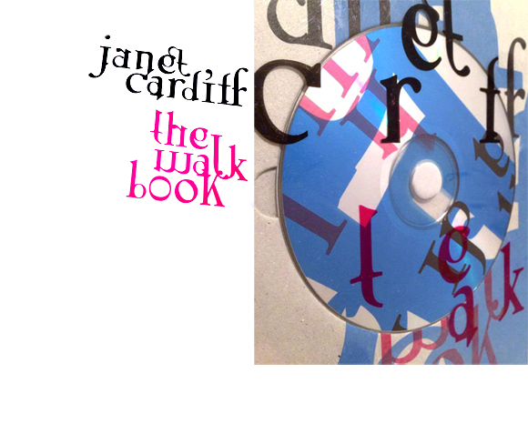
As soon as I opened Janet Cardiff’s The Walk Book in the Rietveld library, I knew I had found the book I was going to make my research on. There was not a single page that didn’t awake my curiosity on how the design had evolved.
The reason for this was the very dynamic and multidisciplinary design. Distinctive colors, shapes and placement of the content creates a chaotic and playful impression. Although you suspect the organized work behind it. Those responsible for this are the two designers, Thees Dohrn and Philipp von Rohden who shared the design agency Zitromat in Berlin. The later of which I had a chance to interview on a few points. I will share this with you as the text develops.
Let’s begin where the journey of the actual The Walk Book begins. It was initiated by a proposal from the art collector Francesca von Habsburg to the artist in the early 2000’s. The hopes of von Habsburg were to enlighten many others to “the magical world behind Janet Cardiff, her creative talent, and vivid imagination”. She also says “Hopefully, it will reveal how she works in a playful, yet extremely serious manner (…)”.
For those who aren’t yet acquainted with Cardiff, let me give you a short introduction.
As this book investigates, she has created several video and audio walks. These are extraordinary works that allows the participant to experience a dualistic moment through the act of walking and continuously listening to her narrative. The act of walking unfolds the space along with the process of narration which creates both a corporeal and a visceral form of knowledge, as two intertwined levels of consciousness.
In my interview with Philipp von Rohden he shares with me that from the start the plan was only to make something like a small catalogue on approximately 120 pages for one of the “walks”, but as the actual result now shows it turned into a 345 page book.
One of the additions to the production was the artist’s own suggestion to turn the book into a walk itself. This is the reason for the cd on the cover. This inventive design allows even the front of the book to be dynamic, as another aspect of this multi-layered book.
oooooooooooooooooooooooo
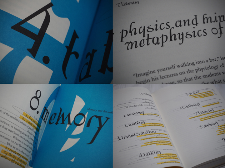
But it is not merely a cd that adds to the aesthetics of the book, the track-list introduces me, as the reader/walker to the book in a frisky way. It invites to a vivid insight into Cardiff’s work and welcomes you to approach the book in a non-linear fashion. The audio walk in itself makes the already expressive impression of the pages become even more alive. The book actually expands even outside the pages when brought along on a walk and your “real world” impressions become combined with the audio and the content of the book. Pictures appear almost animated and the content is even more appealing when you’re encouraged to dive into parts of the the material along with Cardiff herself. I start to detect the hidden codes for the different design layers. For example I notice differences in size and color of the text according to the different sounds or voices I hear.
Perhaps it has already started to make more sense now that I’ve shared a little more on the actual subject of the book, and how she expresses herself. Fact is, that when I ask what is the organizational guideline behind this very expressive design I’m told that they based their inspiration on Cardiff’s own working process.
She works by collecting fragments and combining them to art pieces. Sounds, pictures, words. And this notion of collecting fragments is what initiated the design. A clear example is the special typeface used on the cover and also on titles inside the book. These characters were set up especially for this book and were created by finding typography elements and then combining them. Collecting fragments.
oooooooooooooooooooooooo
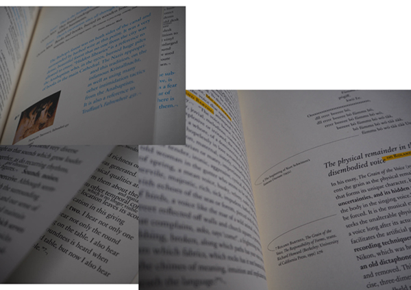
Another design element inspired by the work process of the subject herself are the yellow highlighted words continuously occurring in the text, smaller sized sentences in between the lines in the middle of a text and the little arrows leading the reader away from the columns to imbibe some extra information that could be useful for understanding the text.
These features are not just there by chance, they are inspired by Cardiff’s own notes, which are actually embedded in the book as well in their full pride on pages 54-61 for example.
oooooooooooooooooooooooo
The result were these playful pages that by constant interruption prevent a traditional reading experience. Von Rohden comments on the way Cardiff highlights certain pieces of her notes, crosses out and adds words to the texts in between the lines, “is it just a comment? Is it important or not?” he asks rhetorically. This process is clearly applied to the design of the book and I think it’s fun to be invited to see the connection.
Further, I’m informed that they had 6 content layers when designing the book.
For example my suspicions when experiencing the walk are confirmed:
Cardiff’s voice is always blue,
and a little bit bigger
than the author Miriam Schaub’s texts that are black and seem regular sized in comparison. Another layer example are the pages in the back of the book that contains writings from exterior curators and are drained in a yellow color to divide them from the rest of the content.
Other genuine elements in this book that the artist herself is particularly happy about are the fold out pages to show the actual audio editing. Among other things, she also mentions the photos that are simply thrown into the book, detached so that you easily can hold them up in front of you when you experience the walk that’s included. I agree with her that these relatively rare book design elements definitely contribute to the exciting impression of this book.
The project went on for ca 2 years and the design process was short and difficult, described as a nightmare by von Rohden. But that doesn’t change the fact that he feels it was an honor to be a part of a project like this, and that it is rewarding to see that the book still seems to have some relevance after more than a decade.
I’m happy I got acquainted with this book, the artist and the design methods. Brought upon much inspiration for the future.
Thank you to Philipp von Rohden and Janet Cardiff for sharing your thoughts and knowledge about this book.
The Walk Book /Rietveld library catalogue no : card 1
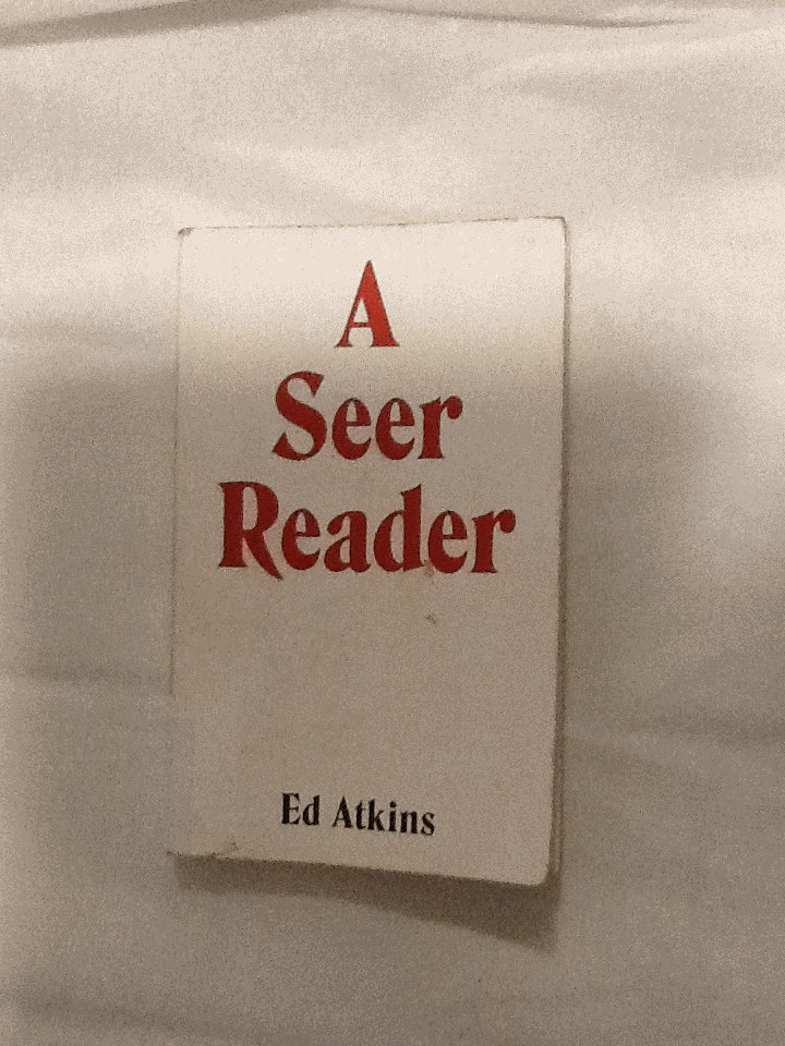
I was trying to find a book in the library with a design which excited me; something I’d like to write about. I chose to pick up A Seer Reader for the assertive, bold cover design it boasted. By using red, white and black, the colour contrast is stark, the combination connoting power. The font type replicates typical, 70’s typography, with its sweeping thickness and curvy motion; it asserts a confidence. A shallow indent delicately engraves ‘A Seer Reader’, indicating the importance of the books title, over the authors name. The ‘A’ starting the title, leads a triangular shape centering attention to the middle of the page. Every element to the cover designed by Zack Group, makes for an eye-catching, attention-grabbing book. The cover enticed me to open the book, and discover what inspired me to chose A Seer Reader for my investigation on design. Surprisingly my analysis wasn’t the result of my initial drawing to the cover, (and therefore comes without credit to the books designer,) but moreover to the author, Ed Atkins.
I discovered that every page of the A Seer Reader was adorned with dancing doodles; playful, printed, pen-style drawings dangle from the words, interrupt the verses and sulk in the far corners of the pages. There are tiny squiggles, illustrations, and symbols referencing or resembling punctuation. The doodles appeared to me, to specifically elude each poem with unique visual imagery. I decided I’d like to discover why they were designed in the way they are. I’ll investigate the context the book is published within, and therefore the content of A Seer Reader. Focusing on the style of the font used for the doodles, their arrangement on the page, and the choice of imagery, I’ll analyze specific examples from the book in attempt to explain why the doodles are designed in this way.
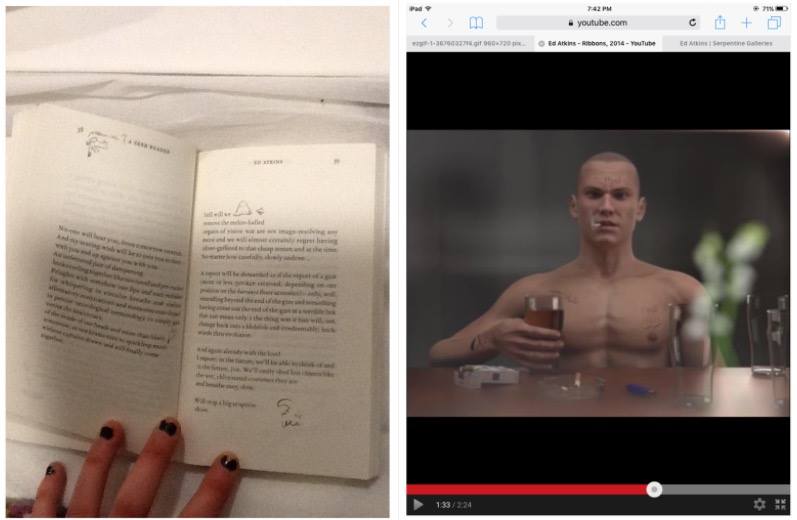
A Seer Reader was published for Ed Aitkin’s solo exhibition in Serpentine Gallery during 2014. Working predominantly with video and language, Ed Atkin’s visual art is inspired by the poetry he wrote for A Seer Reader. Ed atkin’s solo at Serpentine consisting of sound works, text instillation and images revolves around a multi-screen video instillation named Ribbons, where Atkins attempts to emphasise questions concerning the relationship between real life and virtual concepts, objects and environments. He explains that his videos are a ‘…kind of poetry of their own’.’ ‘…interested in previously literary-theoretical concerns about seeing and reading, interpretation of metaphor, figuration and literality.’ He uses CGI to literalise what was once only possible in metaphor.
In Ribbons he creates a surrogate character resembling his own physical appearance in a haunting online replication of a life. Atkins intends to ‘re embody’ himself as a possibility of what we may become in an paradoxical way of spreading a message that we need to focus on developing a more powerful mortal life. Through this high tech HD animation he ironically uses his medium to do exactly the opposite by creating a virtual world.
The character developed by Atkins is a young white male, wearing a bald
head and an action man body adorned with tattoos, he has a habit for drinking alcohol and smoking cigarettes. His appearance and his humanly habits reflect somebody stereotypically disapproved of, in today’s society. Atkin’s concern for the world we exist within, is evident in the design of the tattoos enscribed on the skin of his surrogate, Dave. Desperate phrases like ‘love please’ and ‘bankrupt’ are scrawled onto his skin to illustrate his story of conflict. They physically demonstrate the feelings Dave would have as a human, but as a virtual delegate, his being is absent from. On his skin; they’re positioned outside the human nervous system. I think this indicates a detachment from the animations human intimacy with himself.
After studying the videos Atkins produced for his solo exhibition, I noticed similarities in style between the doodles illustrating A Seer Reader, and the tattoo’s scrawled on Dave’s skin. It now became evident to me, that considering the importance of what the drawings suggest in his video work, the way they are designed in A Seer Reader will also have a special significance to the ideas Atkins questions in his work.
I’m curious as to why the doodles appear in the font style they do. They are printed on the paper in a scrawly handwriting in a biro or sometimes with a bold marker
The independent, physical and primally instinctive movement of writing with a pen in ones hand, is raw and natural to the intellectual human being society knows today. Atkin’s uses the soon disappearing practice of writing by hand, to convey the humanly emotions of himself, or anybody in our society today, onto the virtual future we face (the skin of Dave). Therefore the font design that distinguishes the poetry in A Seer Reader, from the handwriting doodles can be compared to the contrast between Daves cgi skin and his tattoos.
The poetry is written in a serif font type, commonly used in literature of today, its appropriate for clear messages to encourage the reader to focus on the content of text. It may be used to help develop the trust of the modern target audience, which is important if they are to value Atkins’ poems as high literature. By choosing a serif font which was developed digitally, Atkins paradoxically hints at what the digital world has already done to change the way our brains work, to raise questions regarding our future and technology. There is a confident, official level of professionalism created by digitally produced font, totally un-emotionless and un-personal for the reader of today. Its in these respects that the I relate the choice of serif font to Atkins virtual surrogate replica of a human. Both the poetry in sensible, digital serif font and the pinky rendered skin of the CGI Dave is tormented whilst illustrated by a real humans handwriting scribbles. The choice for handwriting therefore poses a conflict between some of the characteristic, fundamental elements of human development regarding language in the mortal world, (a practice at threat of,) the human’s of our virtual future; a product of our current society.
By using handwriting the design of the doodles appears uniquely personal; autobiographical. Atkins uses his own style of taking notes to project his personal concerns with society onto his surrogate; he plays with his ego, flipping himself into his virtual identity blanketed by his naked, surplus and mortal emotions Through his CGI in Ribbons. In A Seer Reader the intimacy created between the reader and Atkins, through his use of highly personal handwriting, implies the doodles are like entries to a diary, personal thoughts belonging to the artist. The doodles style in handwriting therefore allows us to understand Atkin’s truly distressed feelings towards our existence in the future he insights, in the mostly raw, open and honest way.
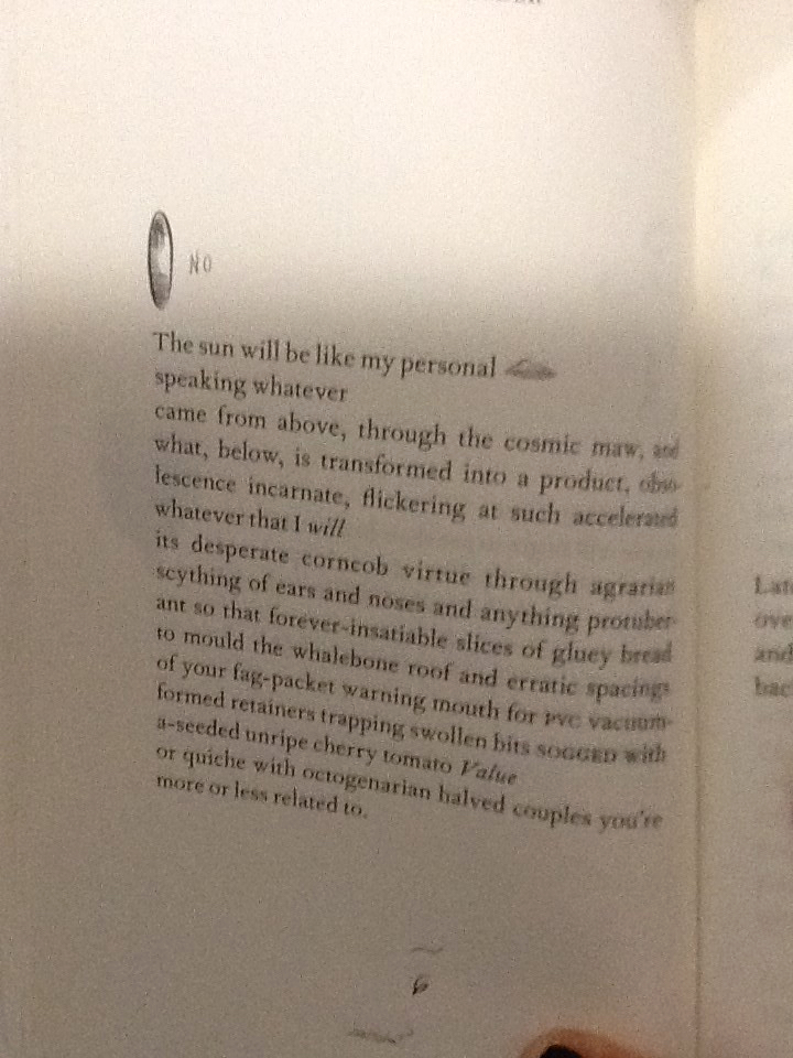
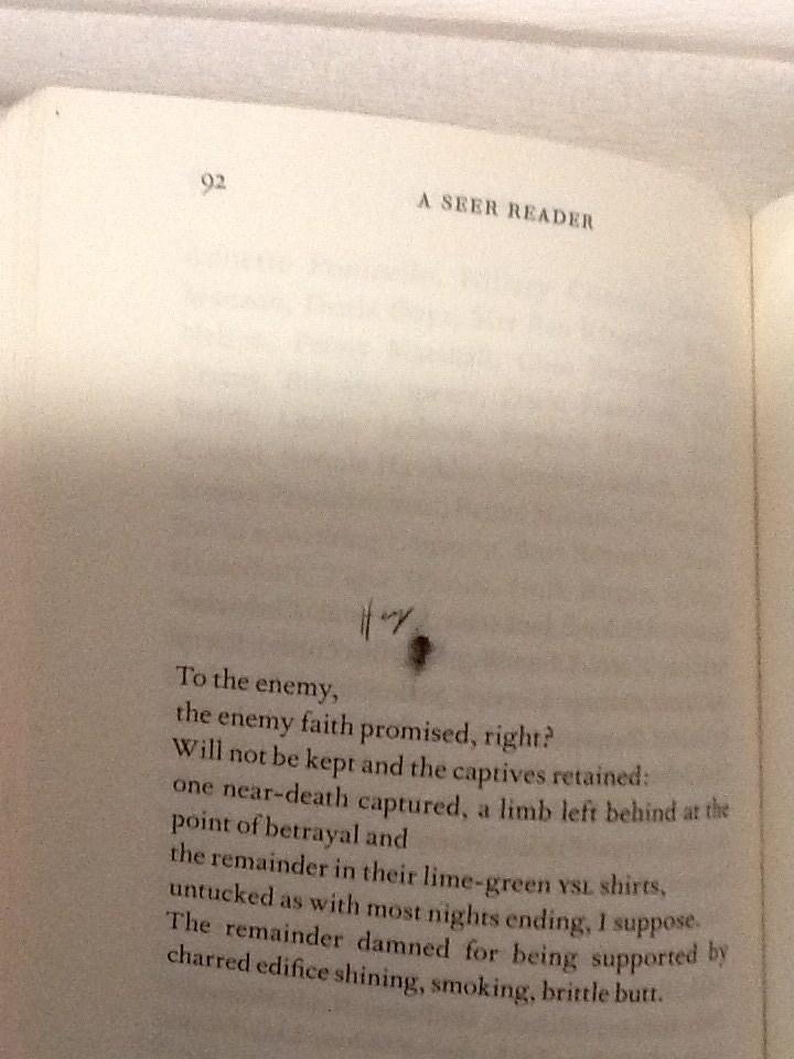
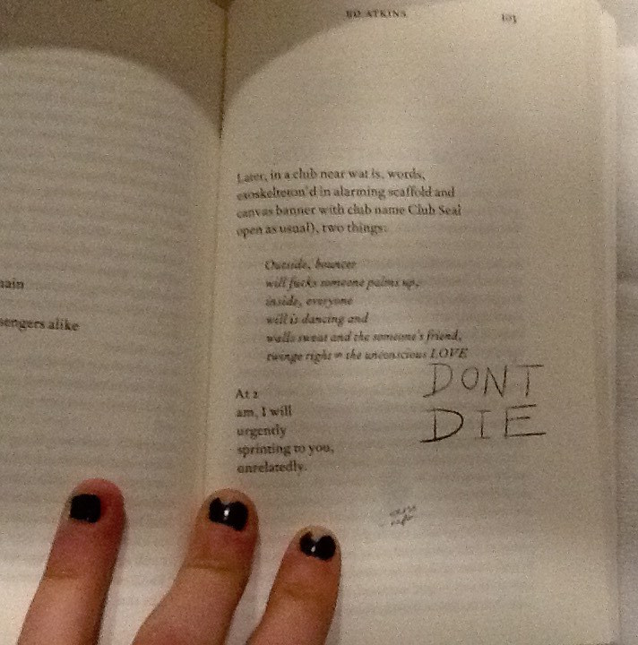
A consolidation thoughts form from Atkin’s head; the handwriting translates a universal language of emotion, in how each word is formed from the authors hand to the paper. The handwriting helps to illustrate Atkin’s feelings as he writes, and emotionally connects with each specific word. For example on page 92 of A Seer Reader, Atkins poem stabs at capitalism and using a current slang, (another characteristic typical to a human of our time,) he makes a metaphor for our choking industries; ‘butthole’.
He illustrates with a pencil sketch of a butthole, labelled with more slang; ‘hey’. He adopts a loose, scrawly joined up handwriting to do so. It feels fluid, creating a casual, relaxed visual effect which allows the readers feel comfortable to laugh, as he playfully mocks the sincerity behind his poetry. By contrast the choice in design regarding capital letters, a larger size font to the majority of the doodles and sharp points determining the end of letters, suggest aesthetics which relate to an irrational state of urgent, abrasive, human panic.
Page 103 in the handwriting ‘DONT DIE.’
Capital letters accentuate importance, taught in the grammar of the languages in our society, showing Atkin’s thoughts which should shout from the page. These features of the handwriting style show how Ed Atkin’s conveys different emotions through the doodles design, he plays with his readers to elude how he feels as the artist.
The design regarding the placement of the illustrations on each page and they’re relationship with the text arrangement is also of interest to me. The doodles are very specifically positioned, creating a new design and rendering a unique layout on each page. The notes are cheerful, their haphazardness and impermanence in position creates a youthful energy of its own. Many harass the text, dangling from the words, interrupting them like a vandalised high school text book decorated by an excited teenage rule-breaker. Upon flicking through the book I think Atkins creates a chaotic feel with the arrangement of the doodles. Maybe he does this in an attempt to question the power which our mortal life (represented by the emotive tattoos / doodles he writes by hand,) has, over the possibility of a virtual future (what his poetry represents). An issue presently discussed within his poetry, as well as what he represents with his surrogate Dave in Ribbons. Chaos raises concern to me, and suggests Atkins might be trying to raise awareness of his issues with the future and society today, through fear.
On some pages it appears the design regarding the placement of doodles serves purely for illustrational purposes. For example on page 86 a smiley mouth and a big floppy tongue curve and grin around the word ‘mouth.’
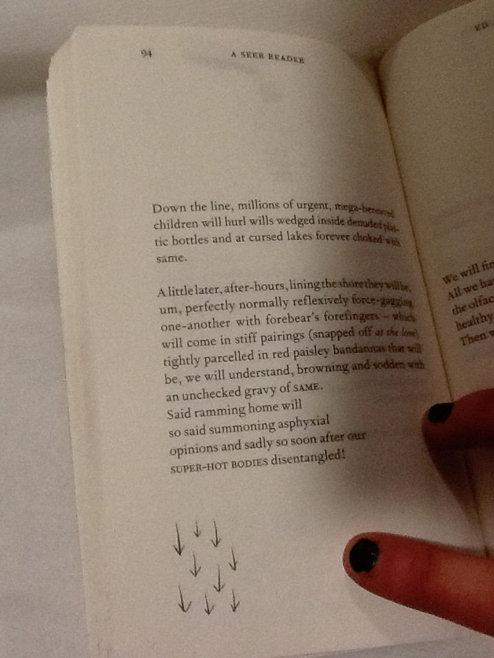
The positioning of the doodle presents a clear visual anecdote of the text, as its placed directly next to the words, the reader sees them together creating imagery. The poem on page 94 begins with ‘down the line.’ Directly beneath at the end of the poem and the lowest point on the page is an illustration of 9 arrows pointing downwards.
Again this provides a clear illustration of the text, but it also speaks of itself and the symbol is close to the bottom of the page, it feels they are going down as well as ‘being’ ‘down’.
I’m curious to understand if there is a relationship between the way the doodles are used for illustrational purposes which seem therefore to be in harmony with the poetry, and the concepts which lie behind Atkins exhibition at serpentine which A Seer Reader was published for. Despite the chaos of the doodles, and the lively energy they carry as they appear in different places for each poem, they do help the reader take their imagination further in their illustrative quality. If the handwriting doodles refer to issues regarding mortal life, and the poetry talks on the concern for the virtual future, then Atkins could be showing the bond between the illustrations of his thoughts, and his poetry. As one where he symbolizes how mortal life still has power to change the effect of the virtual world or what is to be of the future, as the illustrations aid the text.
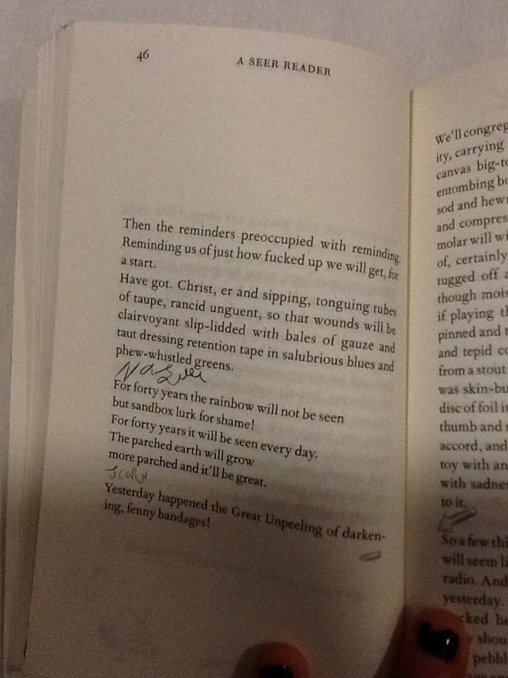
The discourse structure (involving the positioning of illustrations with relation to the poetry,) may be designed as it is in A Seer Reader to give stage directions to the reader. It creates a similar discourse structure within the poem to that of a script. On page 46 Atkins places the handwriting scribble ‘nausea,’ in a new verse, in line with the direction the poem would be read in.
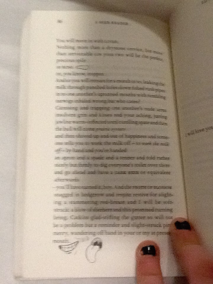
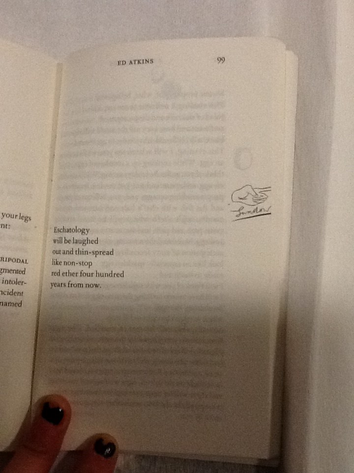
Atkins allows these direct assertions of feelings to stand as lines by theirselves. They appear significant and with a different font (in scrawny pen,) they contrast to the rest of the poem, they work as powerful instructions. With their own space they order the reader to feel something. They also give relief to the poetry; a breath between verses to give time for the reader to reflect, to feel, before continuing to read. When looking at page 99 a short, six line poem is centred to the left of the page, so the text lays closest the core of the book.
A poem which torments human’s obsession with eschatology, with disregard and humour. A slap-stick illustration of a hand, labelled ‘swallow,’ underneath, sits directly in line with the verses on the opposite side of the page. Aligned with the poem on a vertical axis, its clear the text and illustration are to be read one after the other; they have a connection, although they are separate because they imply a direction; a change of action. The illustration is cut right to the edge of the paper, giving the impression there is something to reveal on the next page. Its likely that after reading this grave poem, which makes dark humour about the possibilities of our future, the space allows the text and the reader to breathe. I think Atkins wants the reader to digest the words of this poem, look to the right and ‘move on,’ indicated by the encouraging instruction of a pointing finger to turn the page. In this case the positioning of the doodles may be used as a order to feel an emotion like a stage direction, or to initiate a direction.
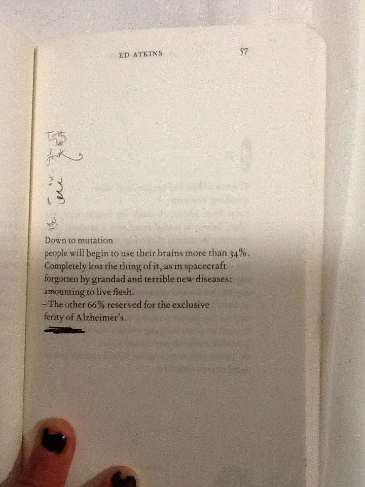
Some doodles intimately relate to words in the poems. On page 57 a bold marker is used to underline the final verse in the poem, this draws attention to it and marks the line with importance.
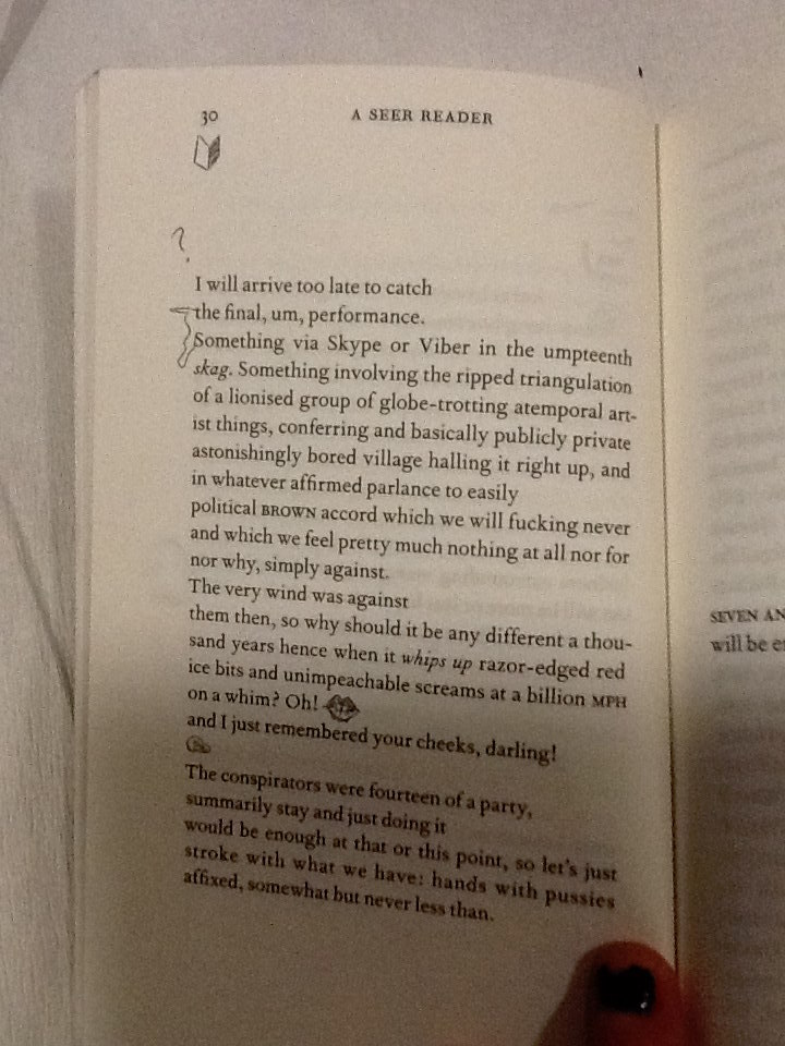
On page 30, the two opening words, which start verses following each other, are connected with a squiggle.
When joined they spell the phrase ‘the something.’ Making a new verse within the poem. This statement also exists on the page now without relation to its context in the poem without the joining squiggle. This draws emphasis to the phrase and creates layers within the poetry.
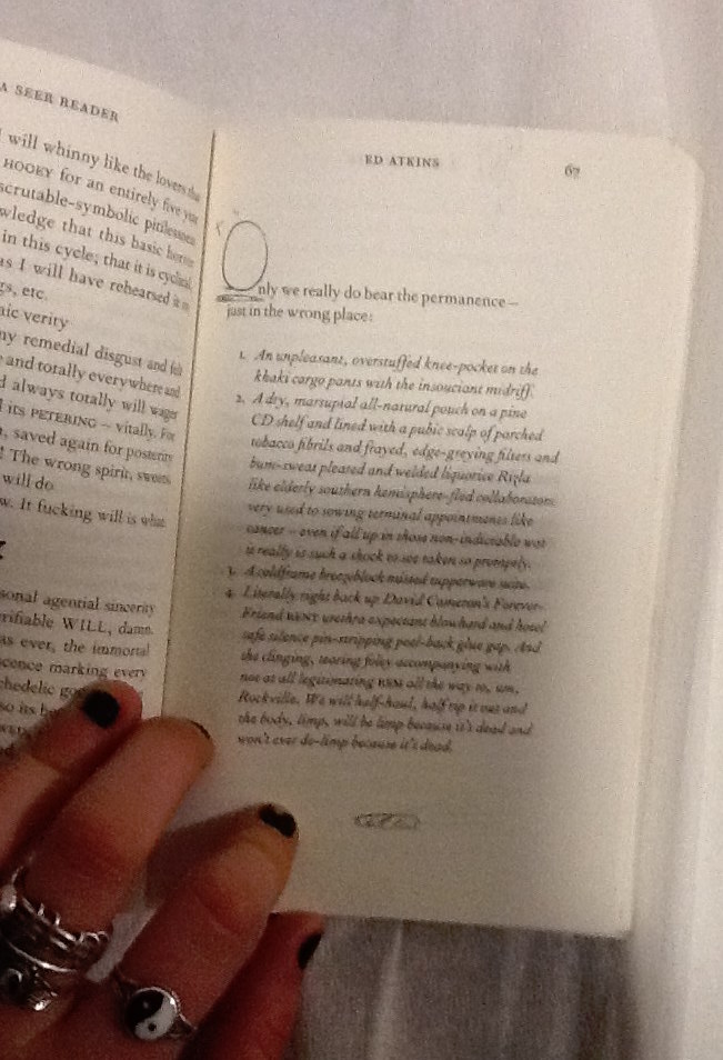
In some cases the positioning of the handwriting squiggles make them a part of the poem, although they contribute letters in a different style to the rest of the poetry in its serif font. On page 67 the poem begins using letters O the handwriting style, to begin the first words of following verses.
The size of the squiggly letter is obese to the rest of the text, it helps to compose a bold and grand opening word. This is a common design in a lot of literature, Atkins makes a reference to it in his own style in an impish attempt to add intellectual value to his poetry through his page design. The choice to have these in the doodle style instead of the serif font refers to the power the doodles have over the poetry on the page, as they refer to the dying practice of handwriting as a symbol signature of our mortal lives in society today.
I’d like to find out why Atkins chose to use this specific imagery, for his doodles. Many of the symbols he uses look similar to punctuation, commas, full stops, brackets. His choice to use marks in A Seer Reader and for the tattoos in his video, which are similar to punctuation, gives a further clue that not only the handwriting is being used as a symbol of our mortal life today. There are other reoccurring themes within his imagery, including hands, eyes, penis’ and delicately sketched vaginas. All parts of the human body. Atkins decision to design his illustrations using this imagery, again, references mortal
life and current society which he discusses along with his thoughts about the future in his poetry.
By investigating Ed Atkins process as an artist, focussing primarily on his exhibition at Serpentine Gallery 2014, and more specifically the video work Ribbons, I have come to various conclusions about why the doodles which intrigued me into investigating the design of A Seer Reader, are designed in the way they are. The handwriting style the doodles are written in, connotes natural human thought patterns, unstable emotions and ultimately the questions the author presents. Handwriting also serves as a symbol for language and writing in which could represent the typical medium used and developed throughout our human age. It therefore creates a tension with the computer generated font type used for the poetry, which might suggest the virtual future which Atkins discusses, as a running theme to his work. The doodles appear in totally different positions throughout the book, on each page. I therefore discovered various different reasons for the design of their arrangement. They can be placed intimately within contact of the poems, to draw attention to specific words or phrases, or to illustrate an idea directly which shows how human knowledge can still be useful for bettering the future, when considering the broader context of his practice. They can be placed in a location on the page which will give a direction to read in or indicate that one should stop reading to feel something. The placement of the doodles when they create letters which integrate directly with the poem, connate high literature as Atkins desires his writings to be read with sincerity as he discusses deep issues surrounding our society and regarding the future. Finally the chaotic feel created by the different placement of doodles on each page questions the urgency of the issues the handwriting stands for; the mortal world and its conflict with the virtual world of the future. To end my investigation I discovered that the imagery Atkins uses in the design of his doodles references English punctuation, and the human body. Again it links directly with his exhibition and his proposal of questions regarding our existence in the society we live in today, and its relation with the virtual future.
In high school, my teachers always thought that the content of a book was more important than the appearance. I had to choose my books based on the texts inside of those. Opposite to what I was asked to do high school, in this Basicyear I was asked to choose a book on its graphic design. I was pretty surprised when I was told to because I am totally not used to do that. I liked the idea of it immediately. At the same time, I actually did not really get why we had to reflect a book’s appearance until we had this guest presentation of Elisabeth Klement, a teacher from the graphic design department in Rietveld. She showed lots of books where she did the graphic design for or just really liked. She told us that the content of a book is dependent on the looks of it and also the other way around.
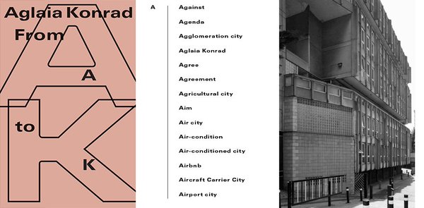
So when I was wandering through the library, this specific peachy/sand/pink colored book caught my attention immediately. I remembered that Elisabeth showed this one in her presentation. I took it out of the shelves and saw this nice bold font on the front saying: ‘From A to K, Aglaia Konrad’
The book is like an encyclopedia. In an alphabetically placed order, you go through a list of words which refer to the rapidly advancing process of urban globalization. The content is focused on the relationship of society and spaces and how they change. On the cover of the book, the letters and words A to K are spread playfully over the cover. The A and the K are echoing behind the title as big geometric shapes which remind me of modernistic buildings from the past 50 years. graphic designer Linda Van Deursen made the decisions about the fonts, the cover, and the initial layout. She created an architectonic feeling in all these choices. The co-designer of the book is Eva Heisterkamp, a freelancer who got this job from Linda because she thought the job would suit her.
Aglaia Konrad is an Austrian photographer. She has a fascination for architecture, urbanization and especially their transformation. This leads into rough photographs of abandoned buildings, unfinished constructions and city infrastructures without any human beings involved. She experiences architecture and urbanization as something overwhelming. Something elusive. It is not simply about architecture but about trying to understand space and how it becomes nature itself in at a certain point. She studies the signs and codes, actions, representations and meaning of the architectural system.
Last year she had a solo exhibition called ‘From A to K’ in Museum M in Leuven. Paired with this exhibition she decided to publish a book included all the terms referring to her studies in alphabetical order. The photos featured in the book are her works from 1950 on till now.
Linda van Deursen acclaimed international fame. Together with Armand Mevis she established the graphic design studio Mevis & van Deursen in 1986. Linda Deursen has been head of the graphic design department at Gerrit Rietveld Academy from 2001 till 2014. She is a critic at Yale School of Art since 2003. The agency has done great things. For example identity projects, organizing events, exhibitions. One of their more recent projects is the logo and identity for Museum of Contemporary Art Chicago. They were awarded for several art prizes as the Amsterdam Prize and the Grand Prix at The Brno Biennial
Recently they also design the printed version of the magazine South as a state of mind: DOCUMENTA 14. A magazine which is being published four times biannually till the opening of the exhibition in Athens which is paired with documenta 14. The magazine could be seen as a manifestation included critique, art, literature and research.
Eva Heisterkamp was a student of Gerrit Rietveld Academy, she graduated in 2007 in the TxT department. Joke Robaard was head of the department back then. After having worked for Mevis & van Deursen for four years she now became head designer of Stedelijk Museum in Amsterdam. I was especially interested in her role in the whole design project I was wondering how much she had to say about the layout and division of the content. She answered me all my questions clearly in an email.
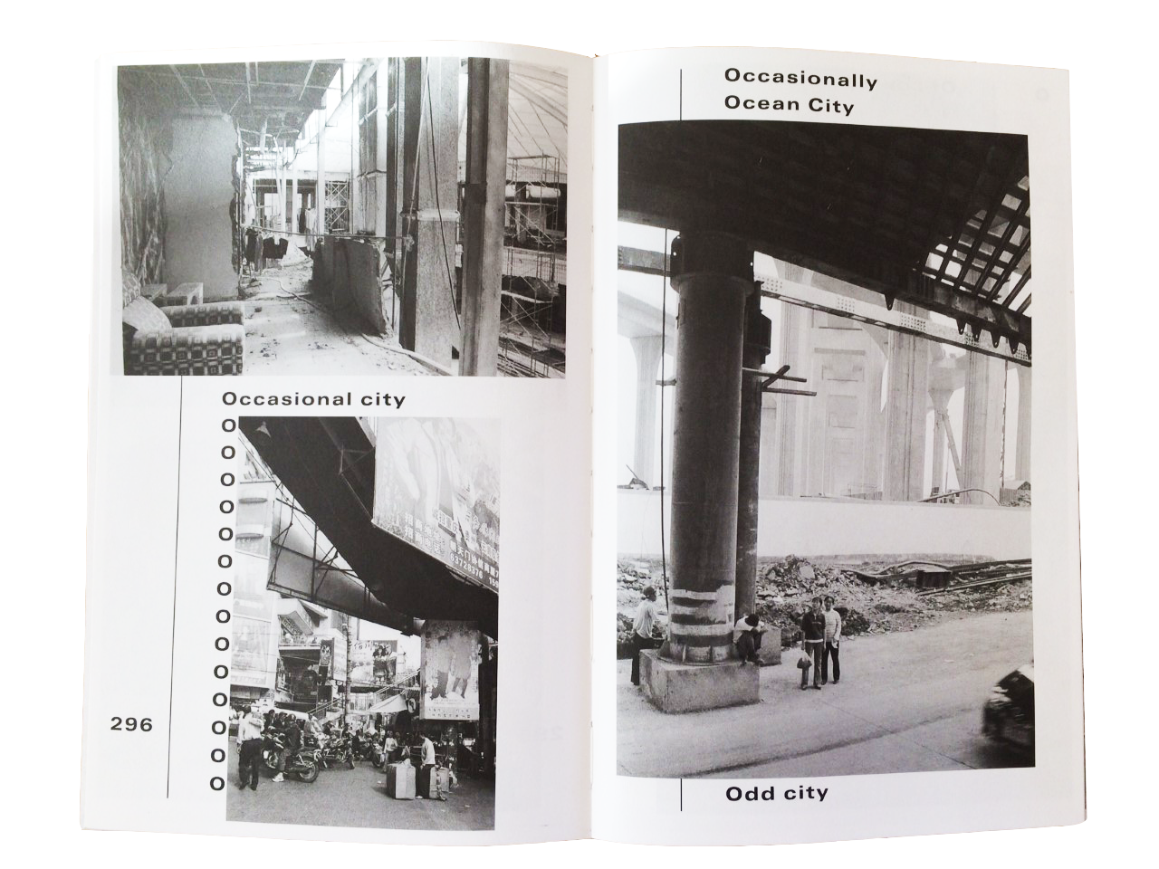
After analyzing this book the past few weeks, I could tell that the design of the book made the content stronger. Using Times Ten and Univers as main type fonts is very convincing. The fonts are formal but also a bit playful because they are a bit horizontally stretched. The empty space between the words refers to the emptiness of the decayed cities. The repetition of the words in alphabetical order refer to the repetition of modernistic buildings and the recurrence of urbanization. Every page has a vertical line placed on the left side, which accentuates the vertical aspect of modernistic cities where all buildings are raising to the sky. The book sometimes still seems under construction like cities themselves are. At one page you just see a row of O’s on the left side and a picture placed over what used to be ‘ the rest’ of the word which starts with an O. The pictures are most of the time black and white except for some pages. Eva herself decided which pages she wanted to be in color and which ones to be in black and white. There is also another book which is all printed in color but less editions of those were published.
Aglaia selected the pictures per chapter. She communicated this to Linda and Eva. Eva told me that through the whole process a lot of things changed and she could decide a lot in the design process. For example this case she told me that the font size of the essays were smaller in the beginning. In the last correcting round, the authors of the texts disagreed with the font size. The whole layout shifted, which made it very hard to finish the book in time. I find it very remarkable and a bit funny that the title refers to an unfinished alphabet because the design itself also seems like ‘unfinished’. Eva noted that here and there are some mistakes been made in the design, but I think we will find it out ourselves.The content, the appearance and even the process were constantly progressing. It all was endlessly in juxtaposition. That’s why I think content and appearance are always dependent on each other.
Aglaia Konrad, from A to K /Rietveld library catalogue no : konr 2
I find books very beautiful, both as reading material, but also simply as design objects. What got my attention when I chose this book is the very noticeable yellow paper band around it, with a line of cut out text over it. This creates two overlapping layers of text, which I find an intriguing choice both because of the unusual amount of text appearing on the cover and because of the confusing effect it generates.
Anyway, the book itself is actually simply a catalogue, yes, nicely organised and curated, but still just a very simple catalogue like many others, illustrating an art collection and describing it’s value.
The designer is Walter Nikkels [x], a rather well known dutch typographer based in Dordrecht. He had a very broad career, even winning two prizes for his work as a designer. He curated many books and catalogues, worked as a graphic designer for Stedelijk museum, but also curated several exhibitions and did the interiors for Museum Kurhaus Kleve.[x]
As I was researching him, I found that in 2013 he published a book called “Walter Nikkels: Typography: Depicted [x]” written and designed in collaboration with graphic designer Wigger Bierma, who actually taught at Rietveld until a few years ago. It is a chronological survey of Nikkels’ work trough images, a sort of dictionary of his visual voice.
Graphic design is a language that uses elements like typography, colour, composition and paper kind, to communicate information visually.
Each graphic designer develops a style during their career, and in a way, it becomes a personal voice. Sure, it’s usually very much related to the aesthetics of the historical context the designer is working in, there will always be a ruling combination of colours or the particularly popular font of the moment, but I think what makes a very good graphic designer, is the ability to develop a personality that makes his work recognisable and unique, but without becoming overly repetitive (and therefore boring).
Walter Nikkels worked mainly on museum catalogues, it’s very important to him for the content of the books to be neat and legible to the reader. In the Daled collection catalogue I borrowed from the library his attention to the balance and to highlighting the value of each image and art piece featured in the book is particularly evident.
He treats graphic design like architecture, the page like a vast blank space where elements are organised to give meaning and importance to the content, like art pieces in a museum. There is a great sense of rhythm in his work, and a great sense of silence, reached through colour, composition and most importantly, typography combinations.
“Couplet 5” Invitation card design (for Stedelijk museum 1995)
Vertical composition – The word couplet is divided in its two syllabs (cou – plet) written on two separate but parallel columns. Number 5 appears in the first one to balance the symmetry, maybe confusing the reader at first, but “couplet” is written in blue and orange letters (in contrast to the black number) guiding the reader’s eyes through the word.
Interesting in particular, even though hardly noticeable, is the difference in typography between the columns, the first one bearing text in regular style, as a pose to the second one in italic.
Catalog “Barnett Newman Notes” 1993
Use of vertical composition appears again – and, again, a peculiar orientation of text – to make a separation between the name of the artist ( Barnett Newman) and the book content (notes), while keeping the two together in the same composition.
“Ich ist Silent” catalog, 2000
Once again a very simple, regular, geometric composition – Once again the variation of typography (in this case spacing between characters and size) to maintain a certain composition
It’s a form of graphic design that may not appear as very creative, in the sense that it’s mainly driven by practical purpose of clarity. I mean, there are many ways of treating the content of a book by making it more playful, while still keeping it very easily understandable.
Nikkels’ style definitely belongs to a more traditional kind of graphic design, focused on the meticulous search for the right balance in elements such as: the dialogue between text and image, the overlapping of different layers of text (like, as I mentioned before, on the cover of the Daled collection book), the choice of typos combinations and colours, the relevance of the background, composition, spacing, size, proportion and more.
However I think one defines balance for him/her self.
I mean, of course there are composition rules that one can’t ignore because they are shaped on the way we process visual input by nature, but balance doesn’t necessarily mean neat, and this took me a while to understand and accept.
I always just assumed that Walter Nikkels’ way, was the only way, because it makes sense, but I figured, it just really depends on one’s purpose at the end of the day.
By understanding balance and the rules of composition a graphic designer develops a “handwriting”. Manipulating and experimenting with the possibilities they offer, just like pretty much everything the art world. And this also made me think of the fine line there is between art and design. How personal can graphic design become before it is considered a form of expressive art?
But – maybe it doesn’t make sense to separate the two anyway.
Everyone has an innate individual way of visualising words on paper. It’s in the way one writes notes or thoughts on a sketchbook, even. We are naturally inclined to express ourselves visually and this visual language is universally understandable no matter how personal it is. Graphic designers communicate information, as well as expressing themselves through their work.
And even Walter Nikkels. He filled a whole book depicting his graphic vocabulary, maybe a bit cold and hardly “expressive” in the strict sense of the word, but his style still features elements reflecting his individual personality, otherwise he wouldn’t have had a point in making the book in the first place.
Daled : a bit of matter and a little bit more : the collection and archives of Herman and Nicole Daled, 1966-1978. /Rietveld library catalogue no : 700.5 dal 1
Walter Nikkels Depicted /Rietveld library catalogue no : 757.3 nik 1
boring Facebook blue and random pages in between. Unsettling uppercase letters of split up words all over one page, very prose looking straight aligned text on the other. A woman holding a picture of another woman lying naked under a zebra. Low resolution smiley face.
Hanne Lippard graduated Rietveld as a graphic designer, but then carried her words from printed matter to sound files and live performance. ‘Nuances of No’ is her book, a collection of written work released in 2013. In making the book, she designs her own content, which allows her to create a similar voice to her sound work.
Visual information like spaces provoke silences in the readers head voice.
By the placement of the words on the page in relation to each other, or switching or removing letters and making slip of the tongues, she also plays with language, takes attention to sounds and stretches their meanings.
The design of the word becomes the form of her voice.
In her spoken works she has a monotone, articulate, clean and soft tone which is robotic yet sounds as if it could be coming from somewhere inside your head.
This similar feeling is present in the book as well, this time through the colour of Facebook; trustworthy, artificial and sort of anonymous. Some pages in between have pixelated smiley faces and click button images taking the reader into a virtual world context, which adds to the atmosphere she creates.
December 2016, I’m at the school library. Our society is individualistic, so we take ourselves too seriously. The graphic design in here reflects that; everything should be minimalistic, aesthetic and decent all the time. There is no space for an ugly colour scheme or a freakishly curly title anymore. It’s pleasant to look at for sure, I think, but it doesn’t fascinate me. I mean, what stories do those smooth columns tell?
Today, the sky is grey and my energy is gone. Art makes me sigh because I’m so moody and I long for my bed. Unfortunately, I can’t go home and sleep, because I received a long list of books, of which I should choose one to research its design.
With a crotchety gaze, I witness a mountain of books slowly emerging on top of the reading table. I see the diligent hands of my classmates searching for a nice design, while I hear “ooh!” and “ah!”, but in my mind, I only hear “boo”. I conclude that I truly hate graphic design and try to find an acceptable book.
After a couple of sighs and an attempt to sleep on the ground, I find something that satisfies me; a book with self-mockery. It’s called Cosima von Bonin hippies use side door. The moment its colourful cover smiles at me from the pile of bitter looking books, I admit I don’t really hate graphic design after all. Apparently, there are still books in this library that are a little less tight.
2
January 2017, I’m in my room. Choosing a book was easy, but researching it is not. Somewhere in the back of my mind there is the fading knowledge that this assignment is important, because it’s very useful to learn about graphic design. But the rest of my mind is stuffed with other things, so I’m very much distracted.
At a certain point, my thoughts drift away to my website. I type the address in my browser and then watch it with a frown, concluding that I should make my own design, instead of using a template. With confidence, I open Photoshop, to make a visual plan of what my website should look like. But my confidence doesn’t last long. Those damned fonts! None of them seems to work! And then the background… White looks so bald, but all my alternatives look distracting. I just want my website to look cool and exciting, but that turns out to be much more complicated than I thought.
I ask Google desperately what to do, and although I find answers that make sense, it doesn’t help me get much further. Then, I realize there’s a better way to learn; I should analyse existing designs. Hey, wait… Wasn’t that the assignment for the book? I try to clear my mind of distracting thoughts and finally place the book in front of myself. Let’s see what I can learn.
3
The book asks for attention by the way a big colourful photo is printed on its cover. I see a stuffed shopping cart in a lumberyard, in which two little black dogs cheerfully look at the camera lens, with their pink tongues hanging from their mouths. The image stops where the wrapper begins, except for the dogs’ tongues; they’re printed on the bright orange wrapper as well. This little graphic wink breaks the ice; it gives the book an approachable feeling. Besides that, the awfully bright colours and the simple font make the book look modern and careless.
I start to leaf through the book. The paper is thick and matte, so the pages make a pleasant, crackling sound, as they slip along my thumb. I see big photos printed in colour, big white spaces and small amounts of text. Once in a while, I get a glance of something odd, repeated through the book but always looking the same; it’s a photo on a different paper size, that looks a bit alien amongst the other pages. The frivolous artworks that are being presented and the royal use of unprinted paper make the book look even more careless. Still, the book is attractive, because of the large amount of images in comparison to the text.
From the text, I conclude the book is a catalogue, showing the latest exposition of Cosima von Bonin’s work. The book itself is designed by Yvonne Quirmbach, a graphic designer from Berlin.
4
One of the things Google told me when I was looking for the secrets of graphic design, was how a graphic design is comparable to an outfit. Just like fashion, graphic design is a language that is being used to tell a clear message. Like google said, you wear a bathing suit to the beach and a suit to a job interview, not the other way around. But there’s more to clothing choices than that; if you want to show off at the beach, you might put on your fancy sunglasses and if your job requires that you’re humoristic, you might wear your Simpsons-socks at the interview. It’s the same with books; within the lines of the function of a book, the designer has the freedom to tell a lot more.
And that’s clearly visible in the book I chose. Quirmbach’s design adds to the carelessness that can also be found in Von Bonin’s works, so the design and the content are at the same level.
5
Now, I discovered something important; I was wrong about graphic design. It does tell a story. So, if I translate that to my own attempt to make a web design; the design shouldn’t look cool and exciting, instead it should tell the viewer that my work is cool and exciting. But… Wait, is that what I want it to tell? And if I do, how am I going to translate that into a lay-out?
The design struggles clearly haven’t decreased, but fortunately, I gained some respect for graphic designers. Next time I enter the library, I’ll do it with a humble bow, instead of a moody face.
Akademie X : lessons in art + life /Rietveld library catalogue no : 700.8 mor 1
I was attracted to the book. My desire was driven by the tangibility of its opening mechanism. So simple yet so satisfying to open the binder. Almost a modern take on a grand old anglo-saxon book binding tradition, all that it almost needed was a royal institutional stamp in wax, now just to let me break the seal.
Attractive and seducing in its simplicity. The binder hits your tangible senses immidiately.
When first Akademie X lessons in art + life was opened, it contained a colorful index, for some reason I was drawn by its strict composition of its bars of pastel color, most likely because I am a long lost lover of chaotic mess and dynamic colors and these strict lines grabbed my attention as the opposite to my immediate visual desire. But also the paper-texture of the front cover was very rough, it gives a good balance between the soft pastel colors and the rough paper. It creates tension somehow.
Akademie X - Index has a beautiful scale and the paper quality immidiately catches your attention.
I continued in my discovery of the book and was drawn by the interesting format, that the content was organized in. The complete book is a collection of educational looking, enlightening content. The content are various contributions from artists all together forming the fictional institution “akademie x”, the worlds first akademie without the boundaries of a physical institution. It is a collection of thoughts and exercises and light guidance in how to live a (healthy) creative life. On the back of the book it states; “This inspirational and practical guide on how to live a creative life has been devised by the world’s most thought-provoking artists + writers.” The content of the book differs from each other, every chapter is a contribution written by a specific artist. Additional to this, each contribution is supplied with a small section of photos of each artists major works. Because of the contributive element, each chapter has a different formatting (or more precisely; the formatting intended by the artist has been left untouched perhaps).Graphic Designer and Art Director Julia Hastings who has designed the book, has created the complete book in a beautiful colorful grid. Within this grid all artist contributions are placed centered in a white frame. The white frame has the rough rectangular dimensions reminding of an A4 xerox, which gives the intentional A4 feeling as well. Furthermore on some of the sections the A4 xerox has been added “archival holes” to give it the feel of an archived xerox paper.
Akademie X - Xerox representation; but is it authentic when its computer generated?
But it somehow questions me if it creates a dishonest feel however? Does the computerized graphic representation any good for the book, or should it have been a real scanned xerox, ugly and crumbled as it could be? But in fact perhaps giving it a more honest representation. The important graphical design take is the grid surrounding the imaginary A4 xerox.
Just like the notion that a digital music album of today, still necessarily have to be released in square dimensions. It tricks a conservative notion in us that the dimensionalized representation of an A4 (or the square music album) is giving the book (or music) authenticity, wereas the xerox scan might have created a messy output but more authentic representation. And perhaps a more real feel and less “anti-commercial” commercial look? Because is this book basically commercialized authenticity? What story does it tell?
That sets me into another troubling chain of thoughts. Researching upon the publisher made under the publishing house Phaidon; after browsing through the catalog of publishings it was easy to spot the certain anti-commercial yet commercial grip that is intended for the viewer. It is made pretty, just as mentioned above with the non-authentic A4 xerox. The quality of the paper is a little thicker than a regular 80g/m3 A4 inkjet paper, yet the paper texture is the same as a regular 80g A4.
The hipocrisy of the post-digitalized world permeates the art world, authenticity will be absend during the next decades.
The heavily intended “courier new” layout font catches exactly the hungering market-ready segments of art students, intellectual art lovers and participants in the game of academic thinking, promising us the authentic experience for the flashing dazzling price of only 29,95 EUR. Nevertheless we are victims of todays best commercialized marketing-weapon: capitalized user experience (or experience economy). We are quickly dwelled into the narrative of “authenticity”. You, me and everybody remotely interested in capturing the “anti-neo-capitalized” authenticity which doesn’t exist in the western world anymore in my opinion. These fleeting moments of absolute truth is in fact just a marketed salesmen’s narration. You are not even aware of the fact, that it is a product you are buying yet. Courier-fonts and rough textured high-quality paper, lead their perceiving way, persuades you to think it is as real as what you handwrite yourself. The undecided white pages and lack of commercialized layout-settings makes you think you have a nice little treasure of undisturbed authenticity. Every word spelled out in the art worlds best authentic-yet-commercial-friend “courier new” makes you accept the narrative that this is not a commercial book, but a guiding collection of fine arts academy notes taken directly from the worlds best mentors and professors. Bring in Harry Potter’s Tom Riddle and his soul-sucking diary of truth. “This book will learn you to live a healthy creative life” could be the salesmen-slogan spelled out on the front cover, but then it would probably attract the silicon-valley entrepreneural segment (and not the intended in-crowd from the contemporary art scene).
In 1999 the american authors and economists B. Joseph Pine and James H. Gilmore wrote a book named “Experience Economy” and already in 1998, Pine and Gilmore wrote an article in Harvard Business Review stating “Welcome to the Experience Economy” proclaiming a new era of capitalized business models [X], based upon the design of experiences ultimately leading to excessive brand-value. This economic understanding permeates todays music industry, art scene and creative industries for good or for worse. In terms of the art world it dilutes the honesty and blurres the vision.
The Starbucks coffee experience states that buying a cup of coffee from 2 cafés (a non-branded café and the other from starbucks), has the same given production rate, that the brew of beans costs for both cafés. Now the experience of coffee is what you are buying, that includes brand-value and the sub-cultural element of being a part of something, a community of coffee-lovers. You are an expert for the dazzling price of 10 EUR at Starbucks.
The most important element in this example is also the birth of anti-culture that automatically are created. More precisely put; counter-cultures to the specific structures, which automatically appears. The experience economist and marketing director’s supreme job, is then to capitalize it well too! In best case without you even noticing that you are being sold a new “counter-culture” product. So relax fellow art student, you are consuming capitalized products without even noticing it, the more awareness of your normcore behavior you spread the sharper your marketed profile gets.
Normcore understood as the counter-culture developed in the fashion industry as a counter-culture to the posh stylized look of the 2000’s. Normcore became the unpretentious, normal-looking phenomenon working against the same industry during the 2010’s. However, it was developed within the industry by the industry nevertheless, it’s just as transgressive [X] as the commercial fashion-culture it developed itself from, capitalized “hide-and-seek” in it’s purest form, now happening faster than ever before (or is it slower than ever before?).
Which leads to my dystopic conclusion; that the book (red. Akademie X) is a very well designed output of capitalized experience design – and values, wrapped into a nice little narrative about contemporary cultural succes.
“If you buy this book, you will learn the basic steps in the secret language of contemporary art!”
You are perceived to buy the commercial starbucks coffee, disguised as an easy looking authentic cardboard cup of joe, with courier new fonts written all over the dark brown fair-trade cup full of promising brew.
“An artist should not make himself into an idol” is one of the commandments that the book states, even though the complete list of artistic contributors have been idolized and later on capitalized by thousands of museums, gallerists, art students, artists, intellectuals and academics worldwide. And no harms done by that, if you don’t take the cultural commandments for granted or listen to them.
But the western contemporary cultures excessive authenticity-hunt is full of hypocrisy in our post-digitalized, yet soon to be automated, world. We are soon based upon digital systems designs that are dictated by the linear neo-capitalistic ideologies. We just don’t want to admit it yet.
Now go out and write some more creative commandments and cultural stigmated dogmas with New Courier fonts.
We will need these statements to understand the hypocrit-era that we truly live in today.
Akademie X : lessons in art + life /Rietveld library catalogue no : 700.8 mor 1
External Book References:
Various Authors (2015) Akademie X: Lessons in art + life, Phaidon Press, London 2015, Printed in China
Pine, J. and Gilmore, J. (1999) The Experience Economy, Harvard Business School Press, Boston, 1999.
“A Flexible History of Fluxus Facts & Fictions”(2004) is a series of memories by artist Emmett Williams. He presents these memories through collages. On the left-hand pages a historical picture is shown. On the right-had pages his own work is shown. His own work consists of either a historical picture of something that he has made or a picture of a work made by someone else mixed with his own trademark drawings. Often he uses the same drawings.
The most important “additive” is a small, brightly colored human figure. It is present on nearly all pages. These small humanoids appear to be Williams’ trademark drawing, almost like a signature. They appear and re-appear almost in all of his own works, but also in almost every text about him. I fail to discover an origin. It seems to be a quick drawing that simply stuck around. The work it is most featured in is “Twenty-one Proposals For the Stained-glass Windows of the Fluxus Cathedral “. This work shows a variety of sketches for lead-pressed windows. About these drawings Williams says: “All these funny little people, who are they, where do they come from, and where are they going? I don’t think they are self-portraits, although they do creep into a lot of my works. They have been keeping me company as far back as I can remember, even as a child, ever-present doodles dancing in and out of a kind of automatic drawing.”
The second most present drawing is that of a round head, reminiscent of Mayan imagery, sticking out his tongue. This image is one of the main symbols of Fluxus. It is first featured on the Fluxus-manifesto. It seems well used by not only Emmett Williams, but also other artists, where it functions as a symbol for Fluxus. I cannot find any sources for the meaning of the symbol. It might be random, which would fit the Fluxus movement.
The left-hand pages are the historical ones. They keep up the appearance of being informative. But often they lack interesting information or they are just not complete. They give you just enough information to become curious, but they never deliver.
Another choice within the of the book, which strikes me as odd, are the page numbers. Only the works of Williams are marked. And the table of contents only reflect those pages. The historical documents and pictures are not registered. And thus are difficult to re-find. This makes me wonder with what goal or reason this book was made. It’s hard for me to believe that its original set-up is that of an overview of Fluxus-art. The numbering makes me feel like the book is a the consequence of the arrogance and nostalgia of a has-been artist. “Look, I was part of this important movement” Williams screams at me through his book.
Emmett Williams gives me the impression of being an artist wit low technical ability. In his many collaborations he appears to offer no more than the concept. Even so with this book. For the last three-or-so books he has worked on, he collaborated with his wife, Ann Nöel. I feel that somewhere in this mixing of artistries the book suffered. Ann Noel’s books are well composed and often interestingly designed, with a lot of thought to spacing.
Fluxus, or any movement that presents themselves as performative and playful, is something that triggers me. Often though, the joyful and exciting aspects of such movements are not translated well into other mediums. As is the case with this book.When I picked it up for the very first time, a sense of anticipation took hold of my body. “A Fluxus book, by a Fluxus author” I thought “will be as lively, as I imagine the period to be”. But the opposite is true. The very strict character of the design of the book (left historical, right his own work) creates a limited set of rules. A set of rules that is never broken within the book. They make the book, after the first bunch of pages, a very boring read. Ofcourse, in the book, information is presented. This information gives you an insight in the events and people that were the Fluxus-movement. But because of the dull choices in design, the information gets lost, or in the best cases, makes you want to read other books.
I’ve looked up other works by Emmett Williams that were meant to last and not be for the moment, like a performance. Besides his acts he also wrote concrete or visual poetry. These poems are simple but effective. They show a small idea, well executed. They often deal with the personification of language versus language being something abstract. It can be powerful in this way and expertly exert the feeling of Fluxus. Emmett Williams shows that he knows what spacing your words can do. He shows that he thinks about how a page should be divided. So why did he give up in “A Flexible History of Fluxus Facts & Fictions”?
What is it with Fluxus, Dada and other movements that burn so brightly, but are so sad to recollect? Maybe it is the fleeting quality of such movements. On the side of the theater school it states “Art is a deed in time”. I feel this is true for all performative art forms and everything related to or commenting on performative art forms. The art “happened’ then, with the performance. Every attempt to recreate it is a way to hold on and futile. Fluxus is like an ex-lover. We should let go. Factual (or fictional) descriptions of Fluxus meetings leave me silent with awe, burning with envy and somber with historical awareness. I was not there! And I will never will be.
A flexible history of Fluxus facts & fictions /Rietveld library catalogue no : 706.8 flux 2
A line, a letter, a page, a building, a photo, a book – separate stages that can either stand by themselves or remain transitioning points while executing somebody’s vision. It is common that an artist starts one’s creative process with making a sketch or writing down a sentence that popped out in the head, though, later on this idea might get a completely unexpected appearance. After the piece is created it will most likely be documented in a book, that sometimes serves as an autonomous work. Therefore, it is important to choose a right graphic designer to collaborate together for this process.
For my design research, I have decided to look into Alon Levin’s designed book ‘De Paviljoens: Journal of a Building 1992-2004’ that is a documentation of the former contemporary art pavilion in Almere.
According to the Artistic Managing Director of the Museum De Paviljoens, Macha Roesink, the aim of this book was to expose the complexity of building such as De Paviljoens and document the history in a case study of the life of a building, in the form of a journal composed of accounts by many of the people who have been involved.
Museum De Paviljoens
The building is transportable, like the ultimate kit, but it is standardized to meet building regulations. Documenting it in a book clearly makes it even more handy. I think it was not accidental that Alon Levin was invited to design the book as he himself works transiting from fine arts to design. To understand the concept of his way of working, it is important to look at his other projects.
In A. Levin’s book ‘Things Contemporary’ published by Dexter Sinister & Alon Levin, 2009 he talks about his interest in man’s eternal pursuit of order; not the ideal of order, which renders things absolute, resolve and static, but in the actual process of organizing things, which inevitably falls short. Artist takes up forms such as the triumphal arch, the victorious podium, or the Ferris wheel, and translates them into model-like wooden constructions and plaster forms reminiscent of the model. It creates images for the ambiguity of success and failure, for the instability of ideological, economic and scientific systems. Analogous to the accumulation and formation of knowledge in the “free encyclopedia” Wikipedia also Levin prefers, when he reused, deconstructed or repeated individual elements of his own works. Data, buildings and documents appear as moving building blocks in a constantly transforming and updating view of the world. To process this information, he uses charts, diagrams and transforms his knowledge into abstract geometrical shapes that later become sculptures or installations. Space-grabbing constructions from simple materials available in the construction market are based on the exploration of the technical and architectural achievements of the Western world and their significance for contemporary society.
Things Contemporary published by Dexter Sinister & Alon Levin, 2009
Even though, it seems Alon Levin himself does not see switching from graphic design to fine arts as transitioning, I was curious to find out when and how do these two spheres meet. His pieces and texts are based on invoke either the incalculably large or the immeasurably small, hence the mathematical sublime, the way in which they thematise structure and collapse points. Using the design made for ‘De Paviljoens: Journal of a Building 1992-2004’ and photos of various installations I tried to create some ‘systems’ that could represent their ‘shape’. I discovered he used three sizes for the font, therefore a zigzag in my drawings representing ‘text’ in the book is in three different sizes. Considering purified and structured shapes he applies into his pieces I decided to replicate both pages and 3D objects into slightly modified, geometricized shapes. At some point I realized a certain rhythm appears, which blurs the line between two subjects of my research.
Left – sketches of installations by Alon Levin, Right – schemes based on ‘De Paviljoens: Journal of a Building 1992-2004’
In fact, these two ‘sequences’ I made are just my interpretations of Levin’s creations. They might transit into something new and exciting at some point and that would probably be sort of an example the way the original author was building them. In ‘Things Contemporary’ he admitted that during his studies at Gerrit Rietveld Academie he wanted to understand the power of manipulating information: not just consume it, but to actually make it. To try and understand how all the information we ingest daily is organized and what the thoughts and structures behind it are. I think one of the best representations of this attitude is in his project ‘The Basics of Growth’ that dealt with similar ideas in botany as in economy, making some comparison through books that A. Levin had published himself. The content of these books was from Wiki that provides the material for the content of a book. He later on transits from the book into 3D structure based on the same subject, which in this case was a greenhouse on the rooftop of the office building.
The Basics of Growth
I presume researching the history of the pavilions, he applied this same method in a reverse version – firstly, understanding the building with its context and then transmitting it into a book.
Throughout my research I learned that the endless cyclical game is the fundament of Levin’s work – a natural flow that drives him from one medium to another.
De Paviljoens : journal of a building, 1992-2004 /Rietveld library catalogue no : 700.4 pav 1
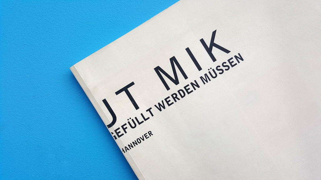
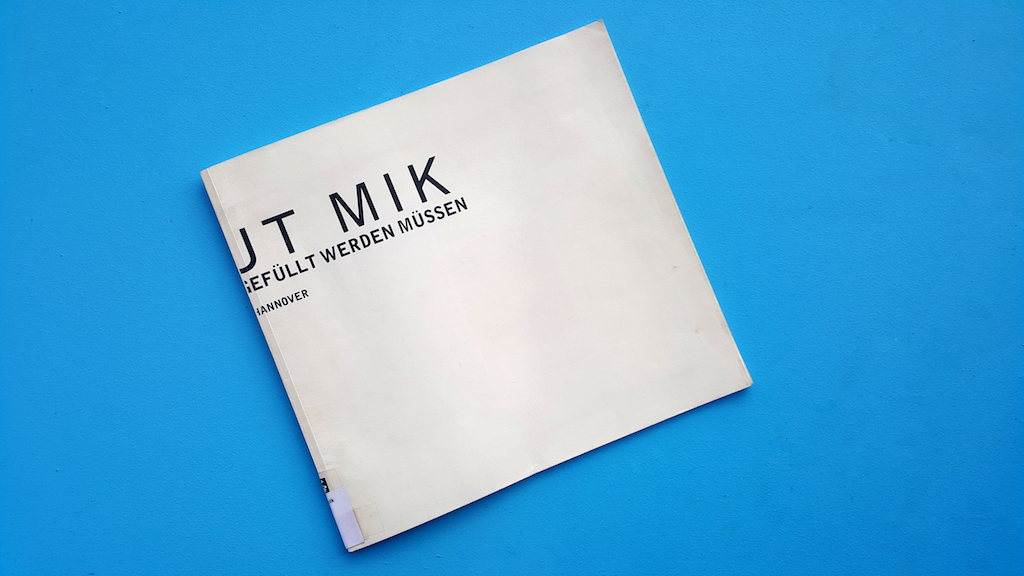
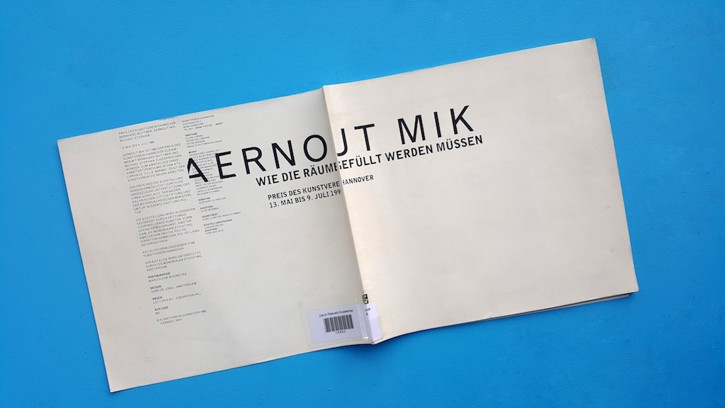
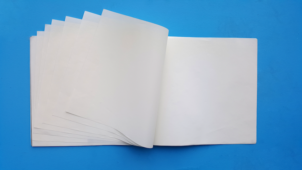
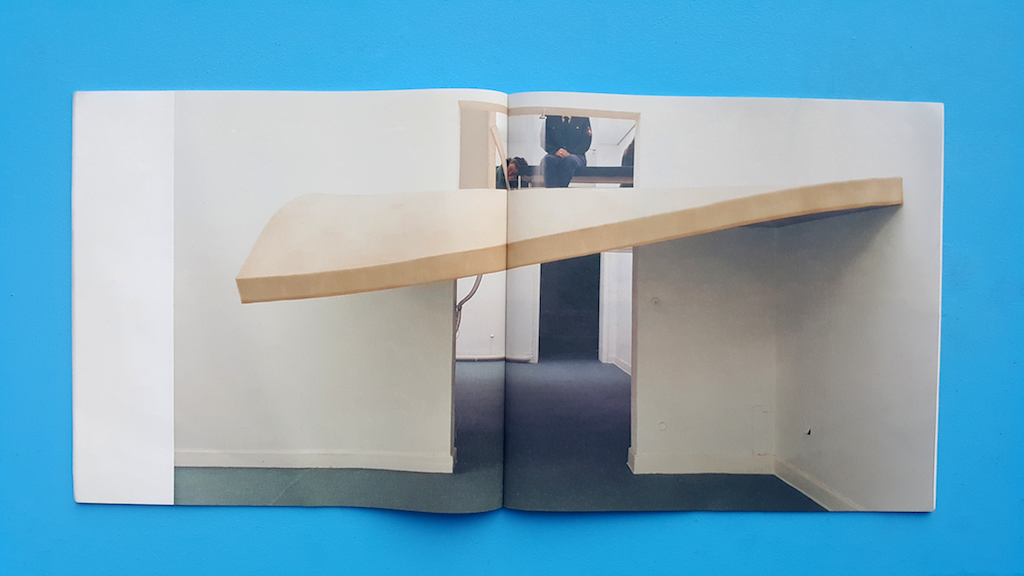
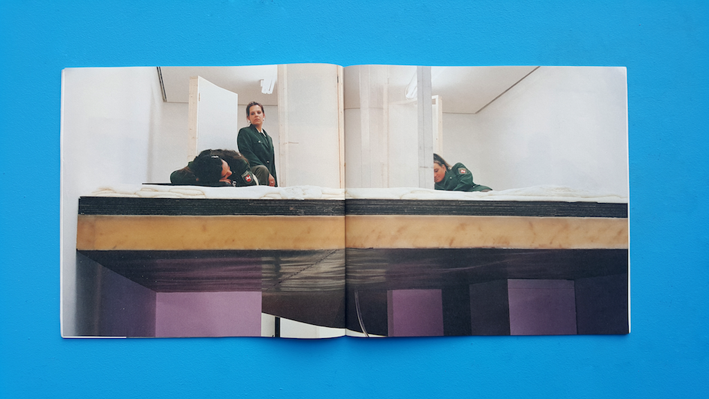
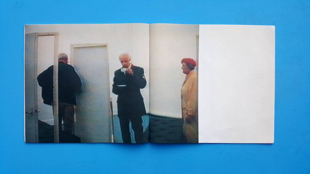
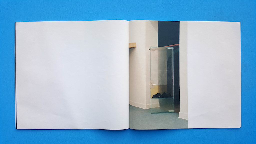
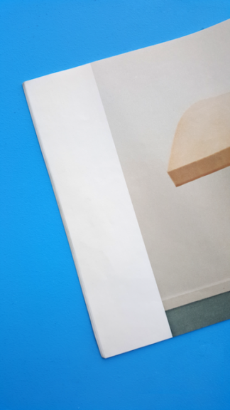
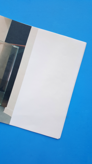
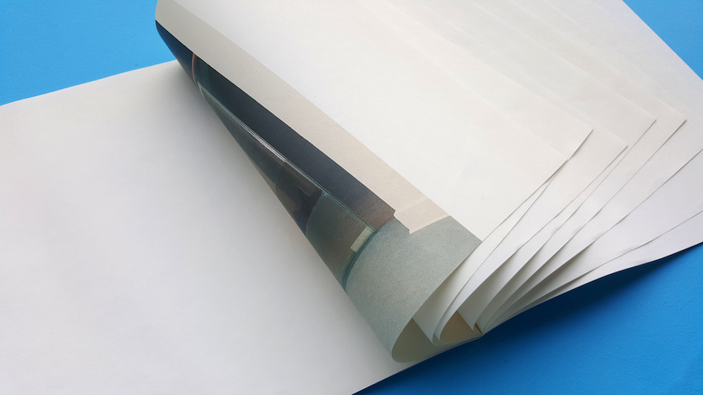
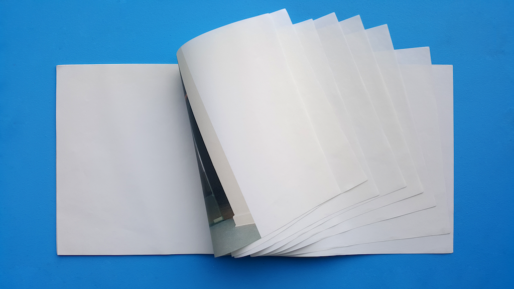
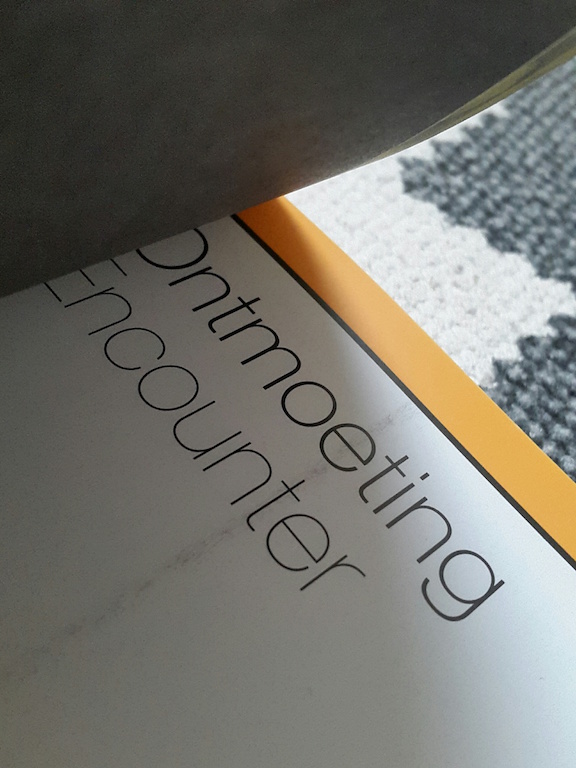

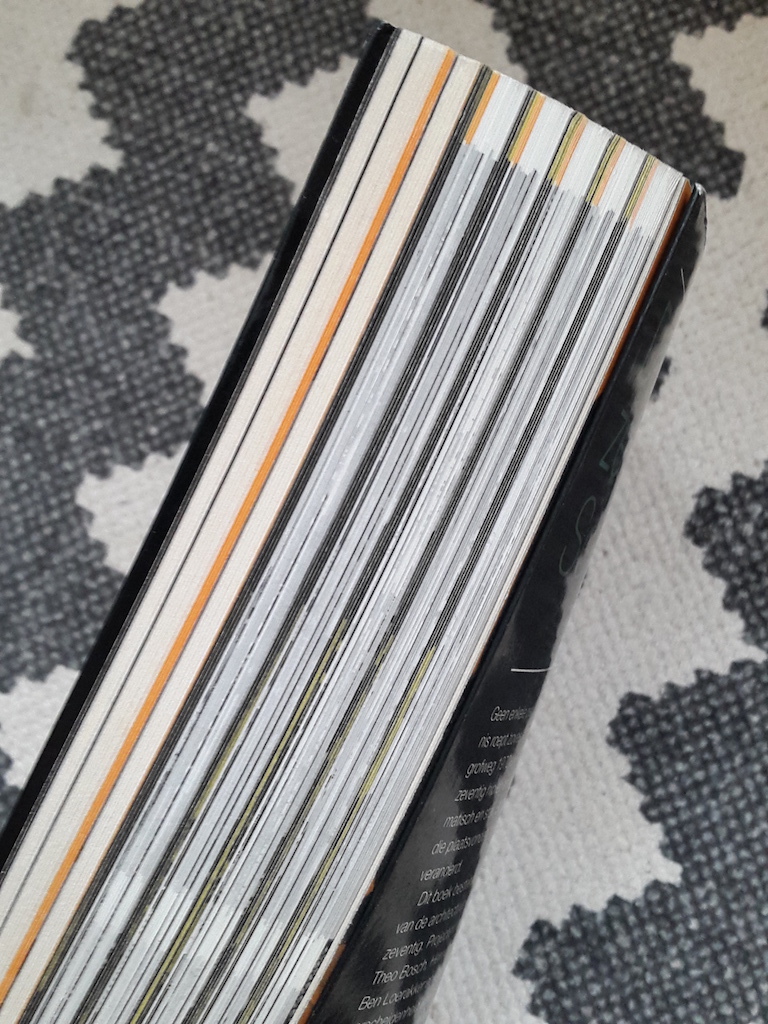
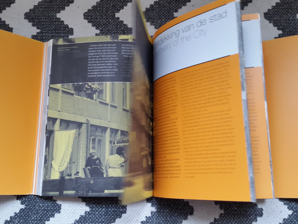
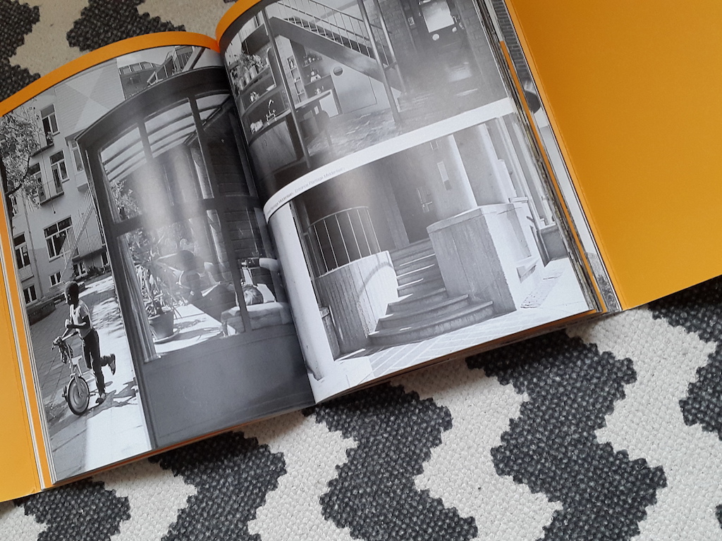


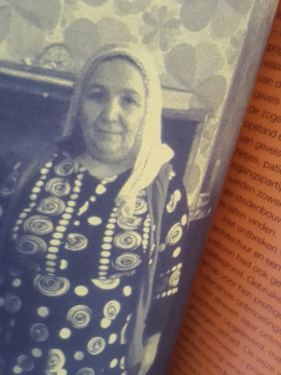
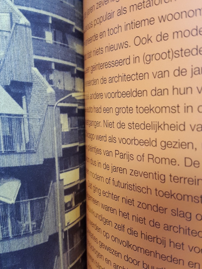

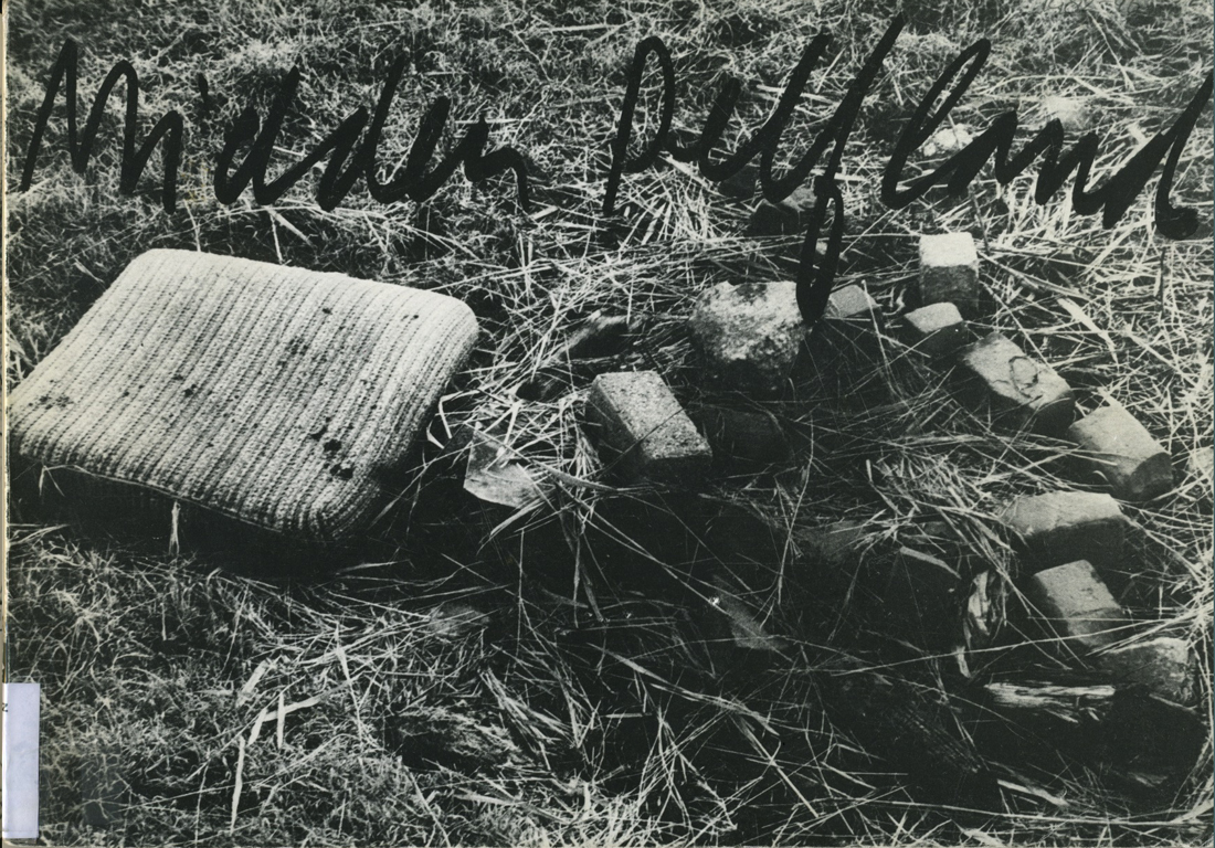
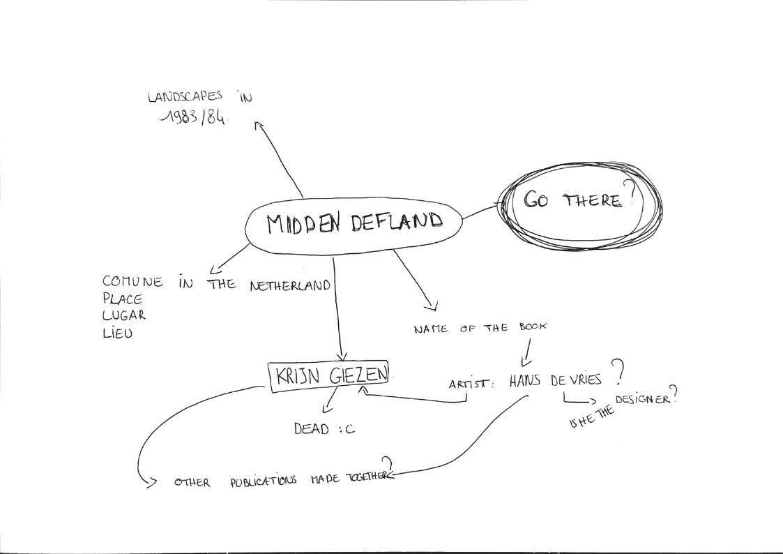
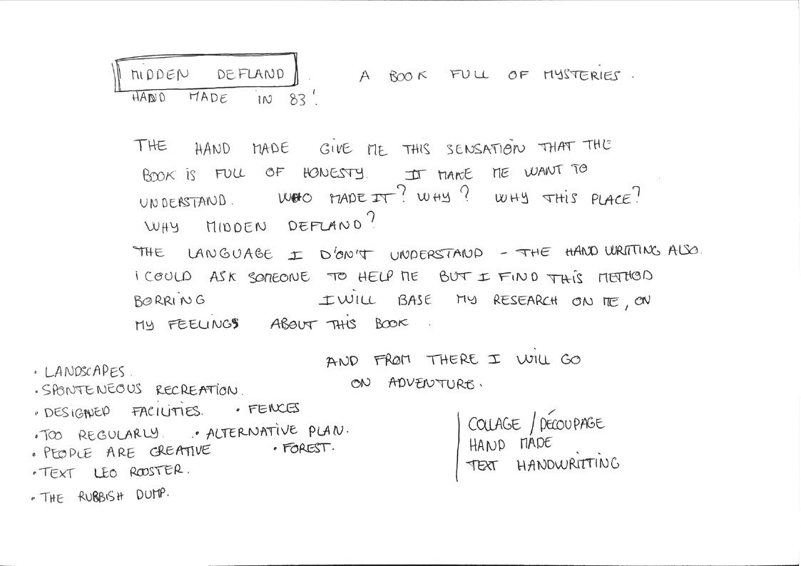
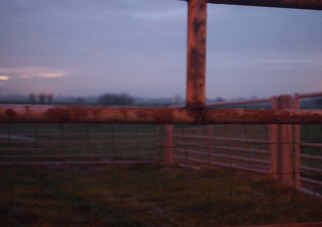
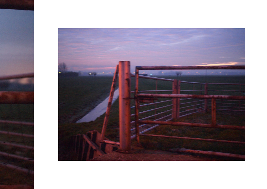
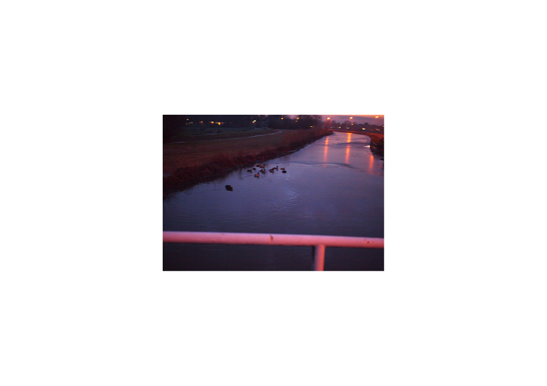


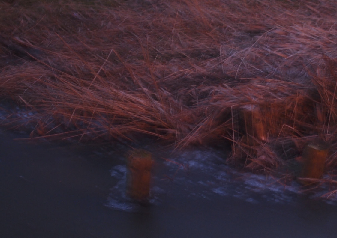


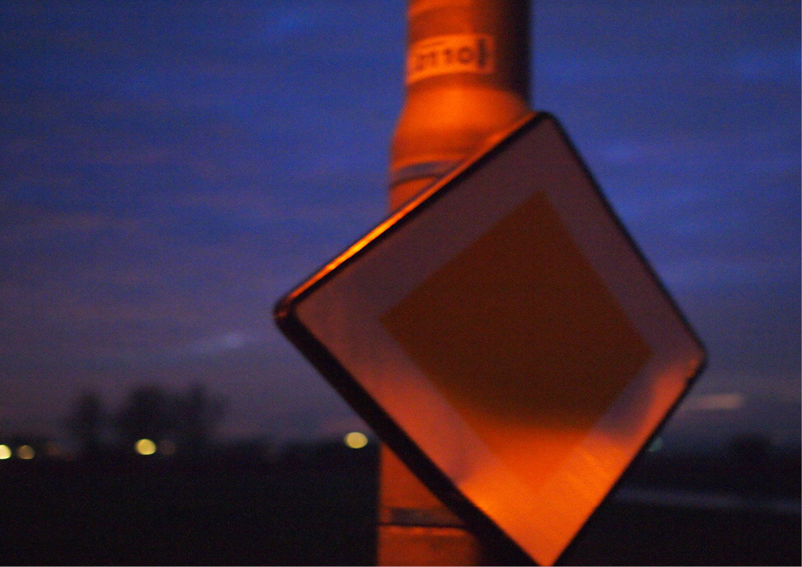

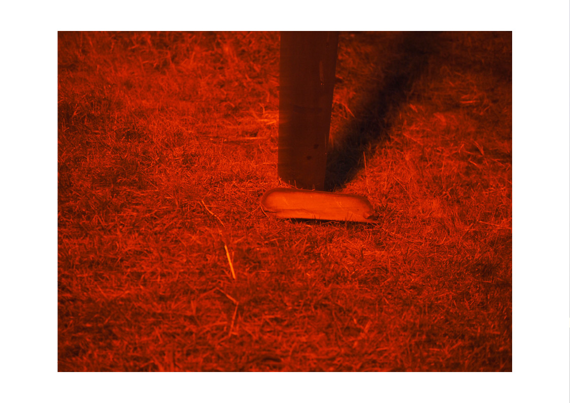
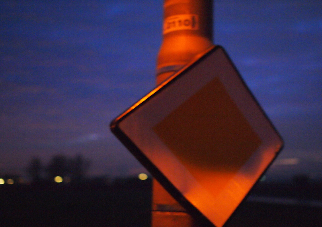
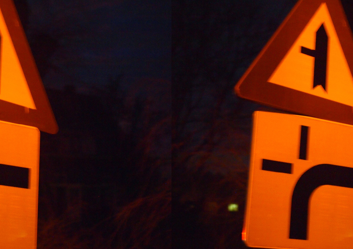
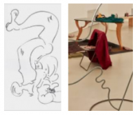
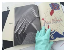
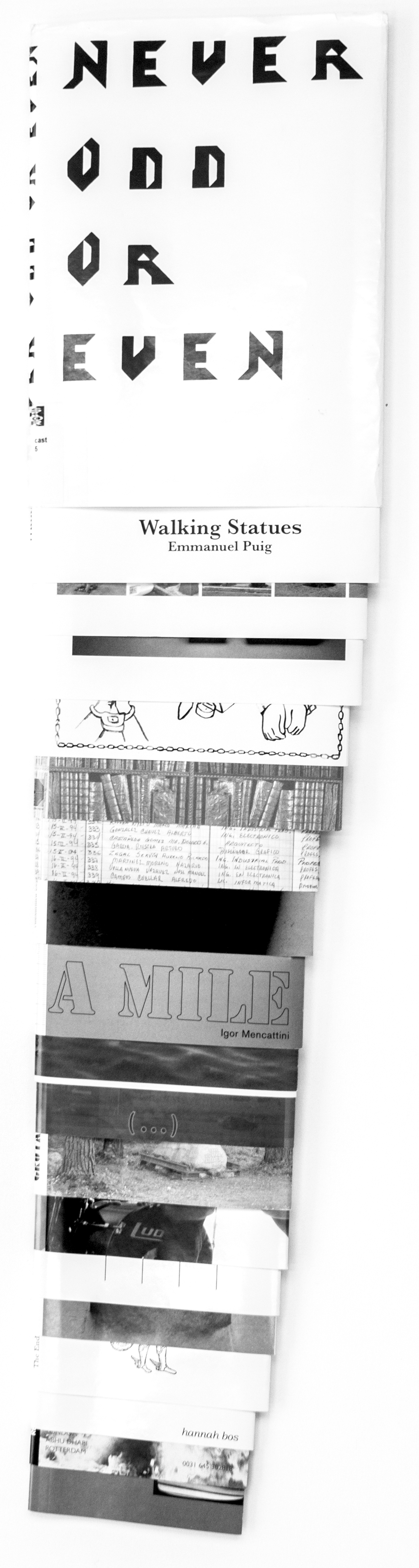
")
")