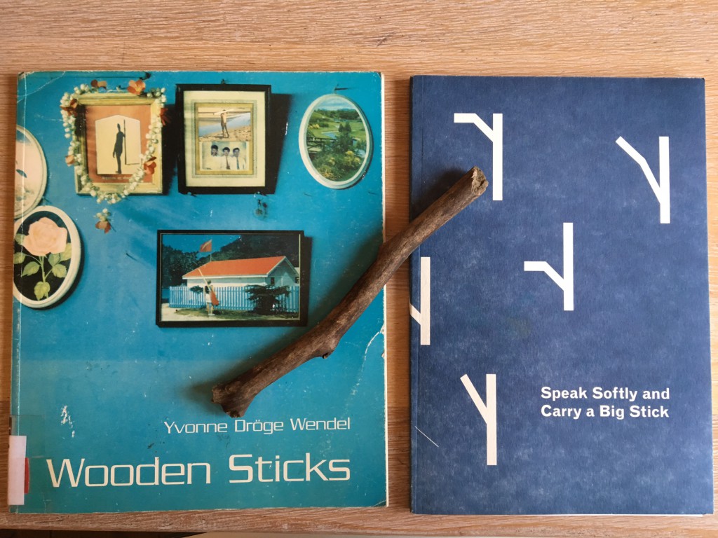
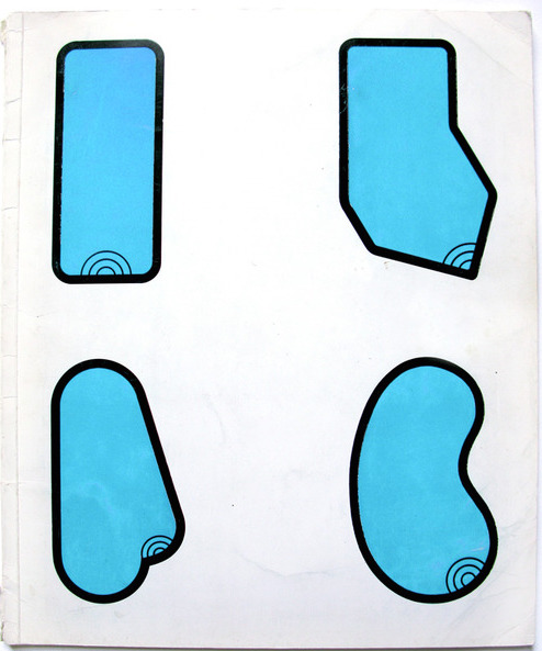
A thin book. A plastic waterproof cover. A present clear light blue. Frames on a wall, nature and figures of humans standing on their own interfering with a wooden stick. Throughout the book the wooden stick is working like a tracer holding the pieces of the book together.
I found it in the middle of the long list of choices, a list with new books for the library of the Gerrit Rietveld academie. This book might be new in the library, but was made in 1996. The book was made after Yvonne Dröge Wendels’s work and exhibition “Wooden sticks” at Witte de With in 1995. It is self-published and designed in collaboration with Jan Geerts. He happen to be nowhere to find on the world wide web which makes me wonder if he even works as a graphic designer? Maybe he was simply a good friend helping out with a simple set-up for the book to be printed and manifested as an object on its own.
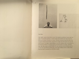
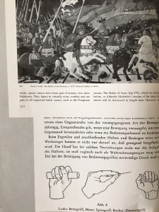
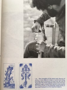
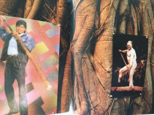
I got curious with the look of the tittle “Wooden sticks” simple and effective, the two oo’s next to w, the emotions and memories wood evokes and the sticks connected to it made me wonder what was inside. So I took the book out from the shelf. At first glance, to be honest, I did not like the look of it, why is it plastic? Why this fond? Peculiar blue. Naah.. its not me, but I then flipped through and the pages had the perfect flip through, where you don’t miss a page doing it, and I fell for the instant feeling of development in intensity as I flipped it in my hands. Two chapters. The first, text, b/w simple documents of her process – where she construct an experimental set-up- through which she approach the object of a wooden stick in different ways- it shows her different perspectives, postures, gestures, moods over the time of thirteen days. Second chapter, a colorful and intense rough collage of different art historical, archeological, anthropological descriptions of sticks. Its a book of how-to, but not with conclusions and clear answers.
There is a very present feeling of not being modern in its design, hit by nostalgia it reminded me of books from my childhood. The bendy softness, yet solid presence, not fragile though light and the simpleness of the design. My first thoughts about the graphic design was, “It’s like the pages are pre-made templates ready to be filled out with words and images of your choice.”
A simple book with a sense of layers and depth in context.
Turning my head towards Ms Dröge Wendel.
Yvonne Dröge Wendel happen to be in my very close vicinity as she is the head of Fine Art department at the very same academy as me and the library where I found her book.
But she’s a busy teacher and artist at this moment, not to reach.
Where to go.
Library.
“Oh you like wooden sticks? We just got this one”‘
A brand new soft paper dark blue cover with what I assumed to be graphic-designed sticks. Is there any link besides the look and the theme?
The book is made by Alex Zakkas, a designer and artist who happen to be at his final year of DOG-time at the very same school as me, the library and Wendel, the Gerrit Rietveld Academie. And one of his very starting point was indeed the work “Wooden sticks” by Ms Dröge Wendel.
We meet.
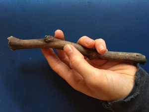
Being in contact with a book called Wooden sticks about wooden sticks and their different uses I unconsciously started seeing them everywhere on my walks and ended up with one in my bag the last month.
Alex Zakkas made this book in close relation with his good friend, the designer Martino Moradi. Its the compilation of his one year residency work. It didn’t start as a book-project but was made within the last two months of his residency at T.U.Delft Institute of Positive Design, a Phd. world of design as he puts it. And he tells me that he feels the precense of that academic design world very much in the way the book is designed, in contrast to Wendel’s book.
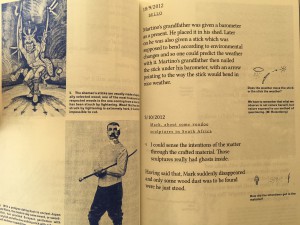
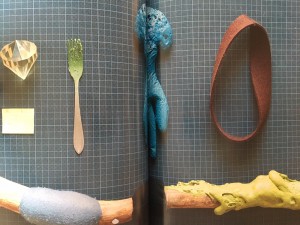
It works with black as the main colour, blue as the more reflective colour (for his sidenotes/drawings) and three very glossy spreads of colour images to break it up. Every text is played graphically with, as a direct responce to the content. The presence of the graphic design is clear, it constanly works as a support for Zakkas research upon the object of the wooden stick. In contrast to Wendel’s project, Zakkas interest was to look as closely as possible at the process of transforming raw material(including found objects, such s the sticks) into man-made artefacts and to collect insights on how a designer’s intentions condition a range of possible interpretations. “as triggers(or restrictions) for subjective associations, the specific materiality and varied tactile qualities which I introduced on sticks became an important aspect of my research process” – Alex Zakkas.
It becomes very clear to me as we speak, how Yvonne on the other hand, more than designing, decided rather to let it be as it is/was. As she treated the sticks as “a place of meaning; a thing with ‘just enough qualities’ she seems to treat her book the same way. No extra. A very welcoming and unpretentious effect upon me as the reader. Open for me to read and fill out the space myself. Filled with space around the simple text and images. Space to think and wonder
Its two ways of playing. Both with clear choices. A reminder that layers in the design can add meaningful and playful insight to the work. But letting it stand raw gives space for reflection in another sense.
when putting Dröge Wendel’s and Zakka’s books up against each other…
There are very clear links to Wendels book and work, conscious and unconsciously as Zakkas puts it, when asked.
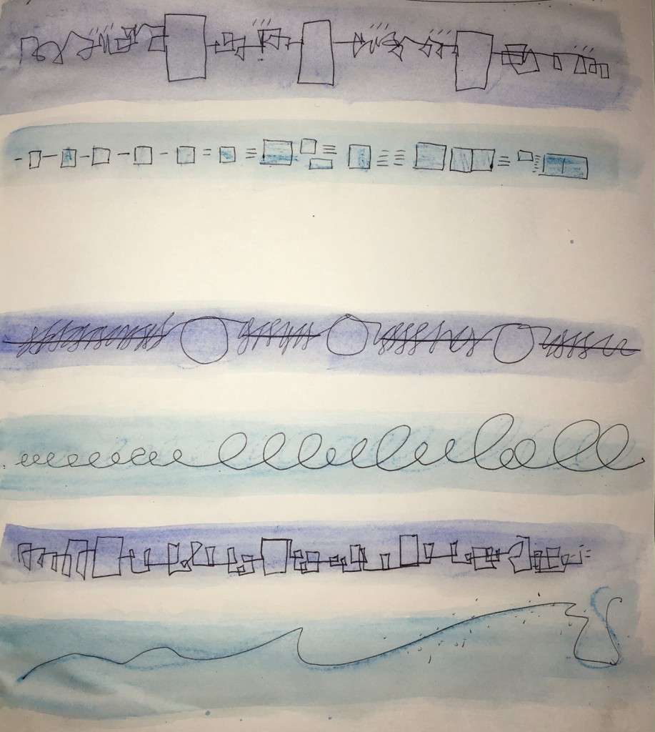
As my starting point was the development of intensity in Dröge Wendels book, I decided to make a visual and simple illustration of the different approach to the design of these books, the way they develop when I read through them with my eyes, mind and feelings.
Zakka's - dark blue, Wendel light-blue
Yvonne Dröge Wendel: Wooden Sticks. /Rietveld library catalogue no : dro 1
