Skip to Content Skip to Search Go to Top Navigation Go to Side Menu


"playing" Tag


UNIVERS REVOLVED


Tuesday, May 22, 2018

UNIVERS REVOLVED is a three-dimensional alphabet consisting of 26 letters. It was created by Korean artist Ji Lee as an attempt to challenge and question conventional reading methods. With the Latin alphabet as the starting point Lee revolves the existing letters around themselves in a 360 degree using a 3D modeling program until they become symmetrical ‘objects’ which the user can arrange to form words and sentences readable from left-to-right, right-to-left, top-to-bottom and bottom-to-top, as well as using them to build sculptures, buildings or furniture. His project ‘3-D Chess Board was created to “add an extra dimension of physicality to the game’s battle field.” Lee combines learning with play. On one hand he wants to challenge the linear way in which we perceive and on the other he seeks to add a playful perspective, turning two-dimensional letters into three-dimensional objects which you can build and create with. (More about the importance of play in learning and building is to be found in Johan Huizinga’s book Homo Ludens). Similar to Lee’s 3D alphabet, graphic designer and illustrator Karl Nawrot uses a playful approach too, where “geometrical forms don’t confine themselves to neither the constraints of two dimensional paper nor the responsibility of representing something else”. This can be seen in several of his works and typefaces including the Bauhaus Type 2012 ,  Ghost(s) Writer or Stencils etc.

11one_action

Example of words written with the typeface Universe Revolved


Karl Nawrot

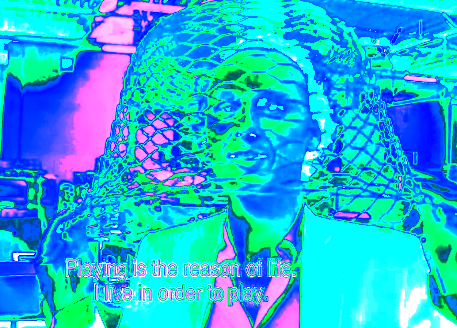
Example of work by Karl Nawrot

Lee states that the linearity of reading, which we have adapted to as the reading standard, could be a possible limitation to extend our ability to perceive the world in different ways. While linearity offers a system to ease communication it also leaves out certain aspects for which our brains would be able to convey and interpret in their own ways. Linear means for something to be arranged in a straight, or nearly straight, line; a sequential progress of an order. An arrangement that provides the most ‘logical’ way to read, perceive and understand. Linear goes from A to B, B to C, C to D and so on. However there are plenty of examples of non-linear narratives as well. The early calligrams of Emil Bønnelycke and Guillaume Apollinaire, where written words are placed to form a visual image, to Tarantino movies where the scenes are jumping from one chapter to another and back again, almost resembling a circular structure. Although many mention-worthy novels, films and texts belongs in this category, it seems that linearity is reserved for formal matters whereas the non-linearity belongs to the narratives. And this exactly is what is so interesting about Lee’s Universe Revolved.

It could be that it’s either the linearity of which we learn or the mere lack of three dimensionality in most subjects such as literature, physics and mathematics that is the core problem. And if it’s applicable or not is hard to determine, as the linear methods do provide common ground for us to communicate and understand each other in the first place. Imagine if that was only the first step in the learning curve and that Lee and Huizinga’s ways of combining playing and learning was applied, not instead of, but in extend of this first step. Fora dyslexic or a person with dyscalculia it might be difficult to follow a course of which you have to make a logic sense out of a two-dimensional arrangement of letters or numbers, but if these subsets of alphanumeric had an actual, physical existence too, there would be a change for one to grasp, feel; sense these letters and numbers, not only for their logical purpose but for their potential as well. Take the Danish mega brand Lego for instance. The very name is a hybrid of the phrase ‘Leg Godt’ which translates to ‘Play Well’. The playfulness is incorporated in the very name, and though the various sizes and colors of the lego blocks don’t indicate a specific value, it’s possible for kids (and adults) to construct three-dimensional objects, letters, cities etc. in a way that makes sense for them.

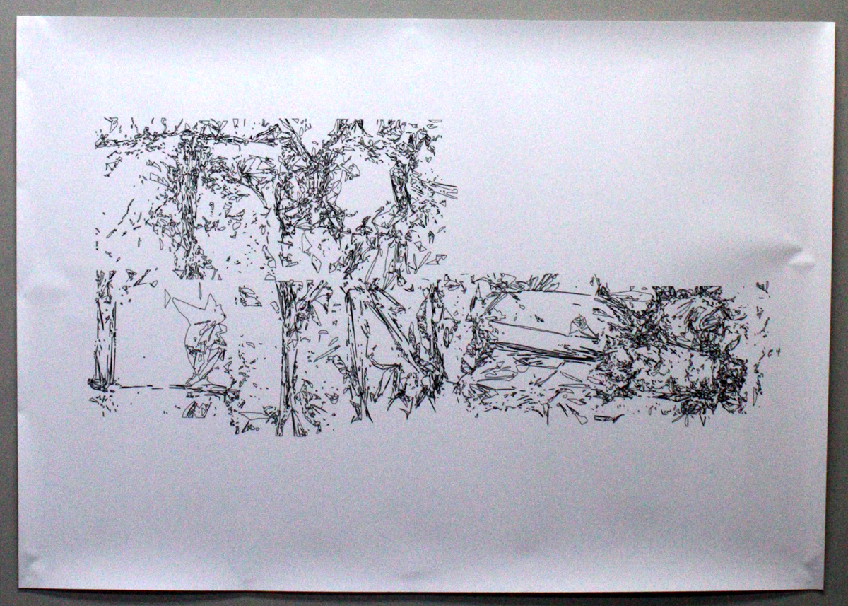
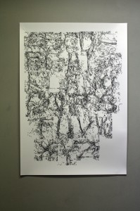
For this research we have both made our separate attempts to interpret the Latin alphabet in a personal way. With tin foil and patience, WooRyun Song has created letters by grabbing and crumbling the foil into small, physical landscapes each one containing a different letter. Due to the chosen material it has reflective paths and shiny hills. When the letter A has been formed, you go to B, C, D until all letters has been given a physical existence. She then unfolded the roll of foil, stretching it slightly until it’s back to its two dimensional form. Using digital techniques, she made the last few steps to create a new font in this project called ‘From Plane to Line, From Line to Plane’, outlining the patterns and letter of the tin foil landscaped.

From-Plane-to-Line_1200       From Plane to Line, From Line to Plane

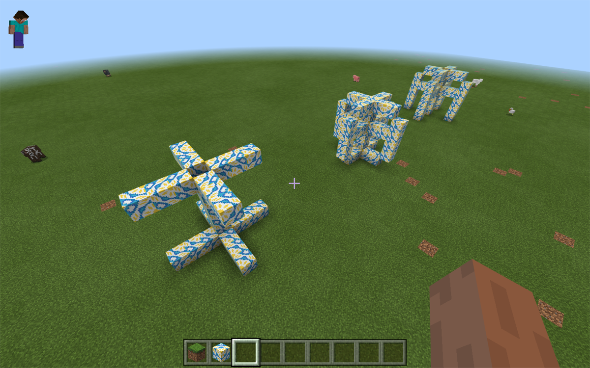
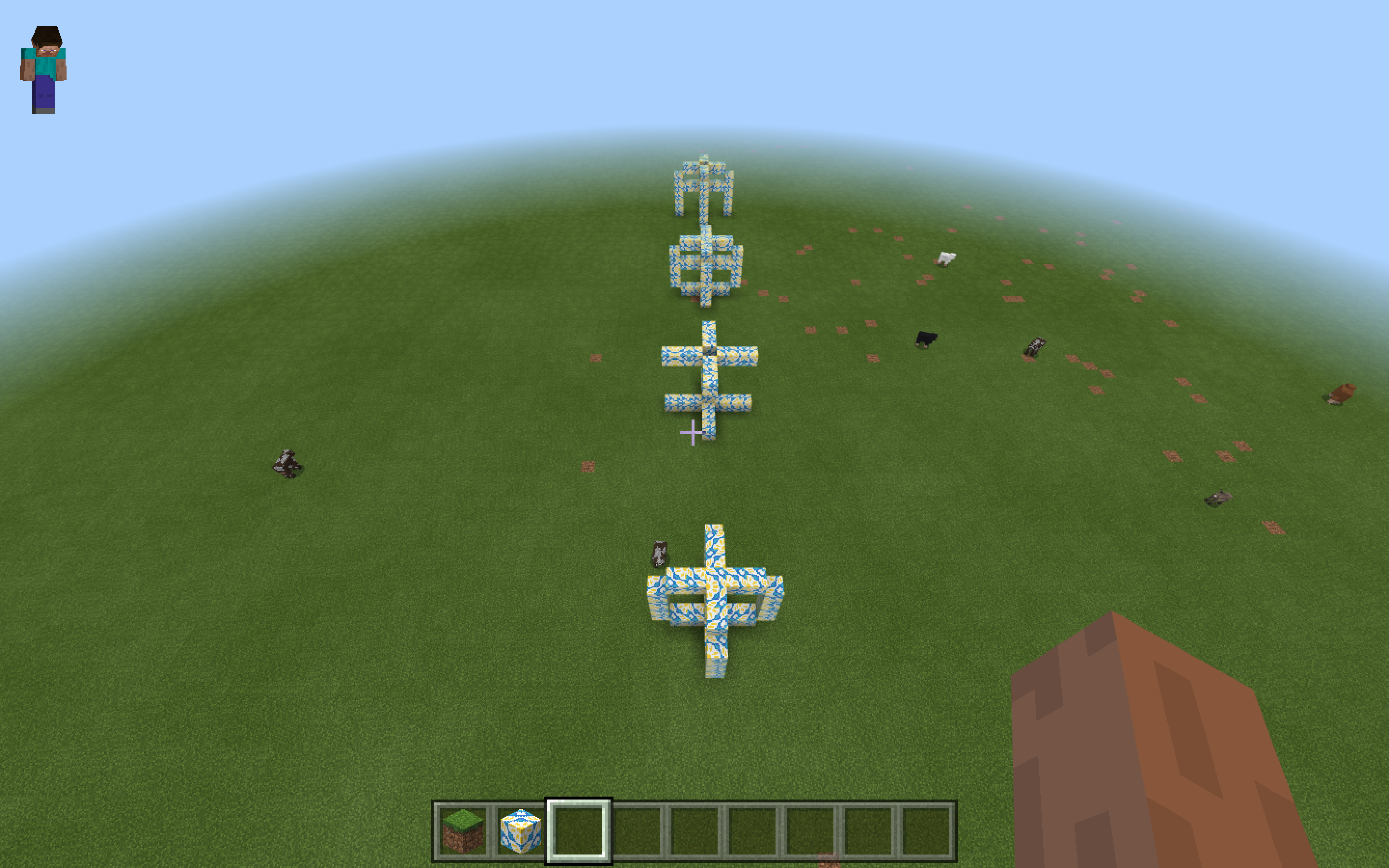
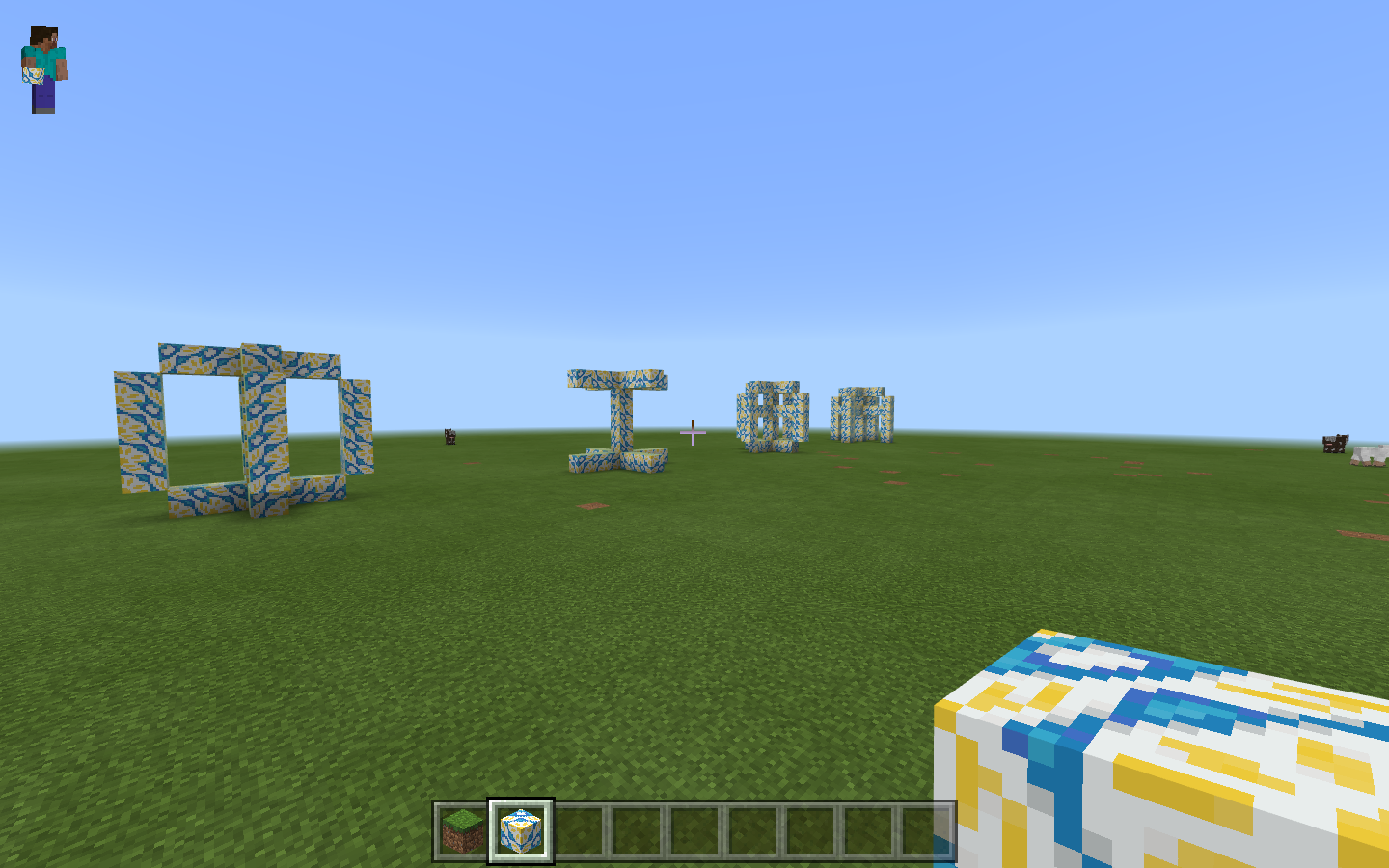
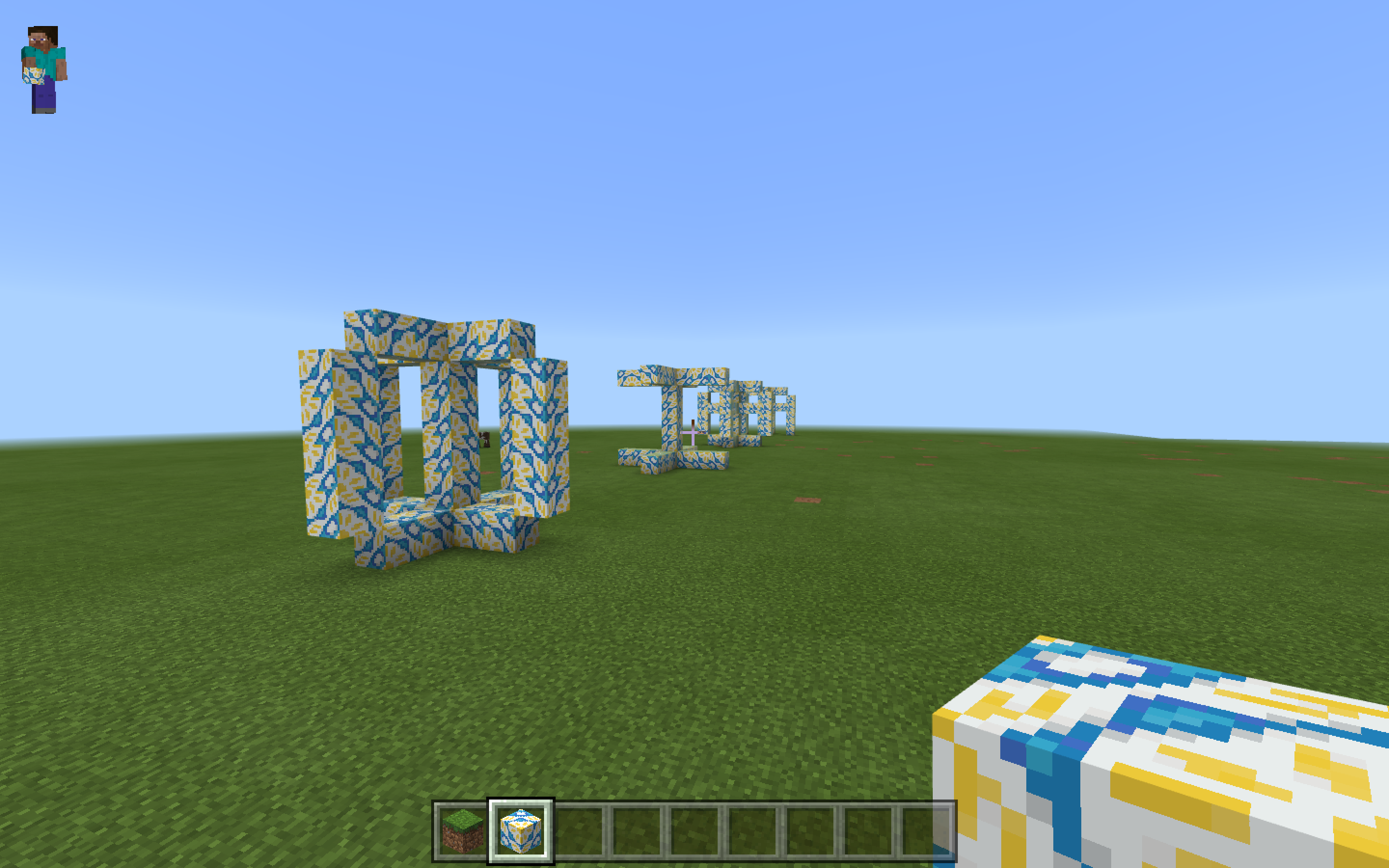
As for Sidsel Lehn Mehlsen, she used the video game Mine-craft (quite similar to the idea of Lego) to build sculptural letters in a virtual park. Inspired by Lee’s approach she revolved the letters around themselves, but unlike a full 360 degree the letters have only been extracted at 90 degrees angles, forming a cross when seen from above.

Skærmbillede-1_1200 Skærmbillede 2018-05-21 kl. 12.00.44

Skærmbillede 2018-05-21 kl. 11.59.05 Skærmbillede 2018-05-21 kl. 11.58.57

Anthon Beeke plays


Thursday, September 26, 2013

This is a poster for an exhibition in the Stedelijk museum by Anthon Beeke.

Anthon Beeke-dansendemeisjes-stedelijk

It has been printed in several different colored layers which show dancing figures. Anthon Beeke designed this poster in 1995. He sought to achieve independence from the rules of typography, and from popular trends.  This unconventional move has earned him a unique place in the Dutch graphic design history.

Before I came to Gerrit Rietveld Academie I graduated in graphic design on the Media College Amsterdam. After four years I disliked graphic design so much that it made me come to Rietveld. This graphic design school is very strict and technical without much freedom. Form follows function, as they say. You learn more to become a desk top publisher. I learned about Anthon Beeke but did not really notice because it was not allowed.

But not long ago I rediscovered his work and I really started to admire the pleasure he puts in his work, Form follows fun! And I totally agree with this concept. It makes possibilities limitless. One of the reasons why I came to Rietveld is to create without boundaries, because I really felt constricted. Since he was the first to step out of these rules I decided to chose this poster. It got my attention right away, in spite of the fact that the line of sight was partly blocked by some other objects at the entrance viewpoint.

I think it is not his best poster design but I chose this object more or less because of the artists. The whole poster looks like an accidental moved photo at a party with a lot of dancing. The font that he chose adds to the dancing, it is if the letters are dancers as well. I also like the fact that it is a layered print, nowadays this look is easily Photoshopped, but he experimented with the layers and colours.

Anthonbeeke-dansendemeisjes-closeup

At the graphic design study I learned the Do’s and Dont’s which you have to obey. Of course it is good to obey these rules and if you don’t it easily becomes a bad design, but if you don’t obey and do it well it will become way more interesting then following the rules. It’s more exciting. I had to make a poster explaining typography rules this is a small part of the poster showing the Dont’s.

Don'ts typography

It’s in dutch, this is the translation:

Use more then 3 typefaces.

Align text in Block form.

Use outline on a font.

Right text alignment.

Chinese typography, line the text from top to bottom.

Obvious rules, but if you break them it could be so interesting, Anthon Beeke did this many times and he is one of the designers that could do that well.

Hollandfestival-Anthonbeeke

All the dont’s i learned are in this poster, but he did it so well that its interesting and exciting but also readable and understandable. There is a story behind this poster as well. The theme of Holland festival was avant-garde in the second world war. He used a poster of Dirk Elffers and painted it white.

Dirkelffers-weerbaredemocratie

And the Typography is copied form a letterproof of Piet Zwart. ”Pure stealing, a shame!” Anthon Beeke said. Every time he sees the poster he has to smile, because the poster says on the left side, Designgraphy: Dick Elffers, Piet Zwart, Anthon Beeke.

But what inspires me the most is that you can see in his design that he is having fun making design. In dutch graphic design it’s called grafisch vormgeven, vormgeven means form-giving, giving things form, sounds so much nicer then design. But that is really what he did, he has an assignment and looks at the possibilities (while playing) and starts giving it a form.

viewoncolour-AnthonBeeke-knitting-itsamiracle

This is for a magazine called ‘View on Colour’ which he published with his wife Lidewij Edelkoort. In this cover, about knitting, you can see something you can not think off from the start, you have to play and have fun to surprise yourself and have something to use.

James Victore says something very interesting is the book It’s a miracle about Anthon Beeke’s work.

”Anthon Beeke always kept playing. A lot of other graphic artist look more like accountants with posh watches and they don’t ask themselves what impact their design has. He plays for his own pleasure and to surprise himself. He doesn’t make work for clients, not for commissions, not for the money, its not even about the assignment or design it self – Its about him. And because its about him it’s about us. The more authentic and personal it becomes, the more impressive his designs becomes gives it more dept; it speaks to us, we can here him snigger of fun. He speaks to us because he gives himself to us. Anthon plays”(Translated from dutch version, not original quote)

I have nothing more to add or say because this quote says it all.

Bye-Anthonbeeke-nudeabc

I like Hutten


Thursday, September 26, 2013

tabel chair orange


Both parts are built by straight lines and rectangle forms. So plain and elegant it is easy to walk by. The work contains out of two separate parts that together create an object we recognize as a chair. The Table Chair is manufactured by Droog Design and can be found in different variations. The Table Chair is the exam work of  Richard Hutten when he graduated from the Design academy in Eindhoven.
It takes some time to realize how the different parts work together. My brain process what I see. What is the object and what do I think the object is? Can I try it, Please? How would a dinner party or a meeting work out when using Table Chairs? There is a feeling of being tricked. The designer  have a sharp sense of humor.

Design has always struck me as a contest in elitism, tyring-to-be-smart and commercial profit. The Table Chair’s supposed function is completely unpractical and has no intention to flirt with the viewer. Richard Hutten’s complete lack of compromise with his customers, the material and his own creative process is something I admire. I’m attracted to the Table Chair because of it’s obviousness. Still I haven’t seen anything like it before. The Table Chair is such a conceptual piece that it first makes me laugh and then gets me interested in the designers other works. It makes me see a 40 min long interview with Richard Hutten on YouTube. It makes me consider the DesignLAB program at Rietveld. It makes me visit the store that distribute Richard Hutten‘s other work. It makes me question my own sense of  value. And it makes me like his Facebook page. I like Richard Hutten.

Parkrand Building, Entrence

Parkrand building, seen from east

The Parkrand Surveillance


The ultimate Hutten experience, a journey through Amsterdam
I. Contact
I send an email to Richard Hutten Studio and ask for information about where I can find Huttens works in Amsterdam. Favorably somewhere I can experience the works in any way. While thinking about what to do next I use Huttens own method and start playing around, in Photoshop. I realize how fantastic color combinations you can find and that everybody really do look better in black and white.

II. Action
I have never been west of the Rembrandt park before. On my way to the Parkrand building I notice how the neighborhoods I pass differs to the area I live in. There is much less shops and almost no restaurants. The houses people live in have smaller windows and are not as old as the houses in the Museumkwartier. I recall a sequence in an interview with Richard Hutten where he speaks about cultural and social design. He says that is the only design that interests him. The Parkland-project is a typical example of cultural and social design to improve the reputation and well-being of the suburbs west of Amsterdam. The Parkrand building is an apartment complex where Richard Hutten designed three outdoor rooms: one room for children, one living room and one dinning room. I get to Doctor H. Colijnstraat and start looking for a way in to the outdoor rooms. I can’t get in anywhere. I try to follow a couple of construction workers but then I reach a locked door and see the surveillance cameras.

III. Capital
There is one place in Amsterdam where I know I have a chance to see Richard Hutten design products close up. The droog store near Nieuwmarkt distribute Richard Huttens design and has Richard Hutten design works on display. I recognize three. The Loo Table, a extremly small table with a stick coming up from the center, it keeps toilette paper rolls in place, 59,00 €. The Leaves, small and strong magnets put together with plastic leaves, 29,95 €. The Domoor cup, an oversized childrens cup that make passing tourists to fascinatingly mimic the drinking movement. I realize that it is a rich mans world and pay 10 €.

IV. Use
A black Domoor cup, also known as Dombo, with tea. My father laughs when he sees me. “What is that?!” I explain to him that it is my new cup. He asks me if I like it. I tell him I do.

Playing is the reason The Loo table at Droog Design

How to drink from a Dombo mug


Use Designblog TravelTags


Tuesday, November 23, 2010

.

Visit all “50TravelTags”

.

from the Designblog tag-list.

.

browse mapping by Maria Micheva

It is not easy to navigate in the design world, let alone Designblog.
The 979 postings and over 2000 keywords turn it into a subjective maze. How are you going to find an entrance to amazing stories and surprising opinions. In-depth interviews and downloadable theses and research papers.
Before you know it, you turn from user to participant of a universe that sucks you in or swings you out.


browse mapping by Severin Bunse

Students from A group decided to help you along by browsing the blog for you. Becoming your guides, in a manner of speaking. Creating new tags that can serve as “Travel Tags”. [invention, ice-cold, climate, crisis, fun, erudition, rules, gravity, convention, removable, purple, symbol, social-talk, audio-zine, similarities, mode, funny-story, flexibility, women, do-it-yourself, icon, sharing, interpretation, role, masterpiece, travel, imagination, slowMe, play, peaceful-living, mystery, sexuality, reflector, 0-dimension, no-comment, theater, ideology, dress, sharing, hidden, art-of propaganda, dependency, break-up, sign, young, pulling-pushing, conditional, breakfast, porcelain, Norwegian-mythology]-tt. You can look them up in Designblog’s tag-list, under [50-TravelTags].


browse mapping by Anouk Buntsma

Browsing surely illustrates that Designblog can become a true Pandora’s box. On the TravelTag poster, which was printed on this occasion, you can see a selection of their journeys in the form of ‘browse-maps’. Visualizations of their browsing history. These visual sketches show clearly that browsing through the blog leaves a clear individual trace. No person experiences it the same way. The blog creates –by design– a colored travel experience that synchronizes with your personal taste and ambition.


Log in
subscribe