This is a poster for an exhibition in the Stedelijk museum by Anthon Beeke.
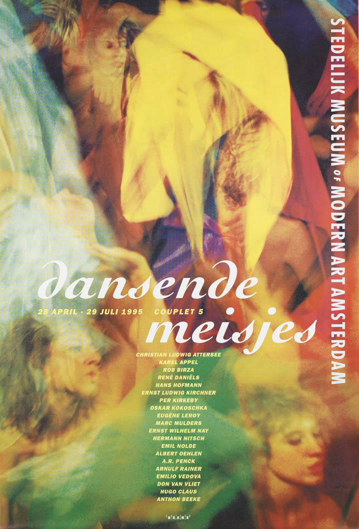
It has been printed in several different colored layers which show dancing figures. Anthon Beeke designed this poster in 1995. He sought to achieve independence from the rules of typography, and from popular trends. This unconventional move has earned him a unique place in the Dutch graphic design history.
Before I came to Gerrit Rietveld Academie I graduated in graphic design on the Media College Amsterdam. After four years I disliked graphic design so much that it made me come to Rietveld. This graphic design school is very strict and technical without much freedom. Form follows function, as they say. You learn more to become a desk top publisher. I learned about Anthon Beeke but did not really notice because it was not allowed.
But not long ago I rediscovered his work and I really started to admire the pleasure he puts in his work, Form follows fun! And I totally agree with this concept. It makes possibilities limitless. One of the reasons why I came to Rietveld is to create without boundaries, because I really felt constricted. Since he was the first to step out of these rules I decided to chose this poster. It got my attention right away, in spite of the fact that the line of sight was partly blocked by some other objects at the entrance viewpoint.
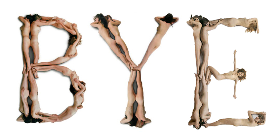
I think it is not his best poster design but I chose this object more or less because of the artists. The whole poster looks like an accidental moved photo at a party with a lot of dancing. The font that he chose adds to the dancing, it is if the letters are dancers as well. I also like the fact that it is a layered print, nowadays this look is easily Photoshopped, but he experimented with the layers and colours.
At the graphic design study I learned the Do’s and Dont’s which you have to obey. Of course it is good to obey these rules and if you don’t it easily becomes a bad design, but if you don’t obey and do it well it will become way more interesting then following the rules. It’s more exciting. I had to make a poster explaining typography rules this is a small part of the poster showing the Dont’s.
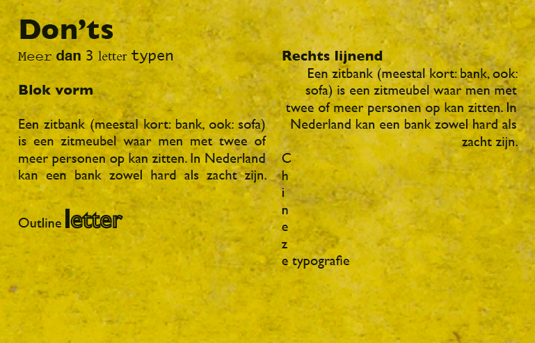
It’s in dutch, this is the translation:
Use more then 3 typefaces.
Align text in Block form.
Use outline on a font.
Right text alignment.
Chinese typography, line the text from top to bottom.
Obvious rules, but if you break them it could be so interesting, Anthon Beeke did this many times and he is one of the designers that could do that well.
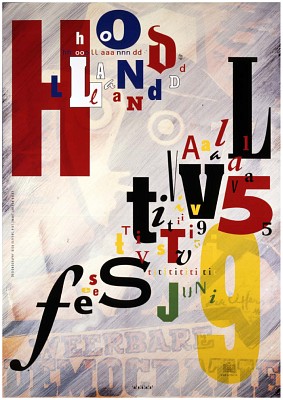
All the dont’s i learned are in this poster, but he did it so well that its interesting and exciting but also readable and understandable. There is a story behind this poster as well. The theme of Holland festival was avant-garde in the second world war. He used a poster of Dirk Elffers and painted it white.
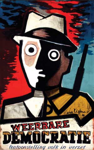
And the Typography is copied form a letterproof of Piet Zwart. ”Pure stealing, a shame!” Anthon Beeke said. Every time he sees the poster he has to smile, because the poster says on the left side, Designgraphy: Dick Elffers, Piet Zwart, Anthon Beeke.
But what inspires me the most is that you can see in his design that he is having fun making design. In dutch graphic design it’s called grafisch vormgeven, vormgeven means form-giving, giving things form, sounds so much nicer then design. But that is really what he did, he has an assignment and looks at the possibilities (while playing) and starts giving it a form.
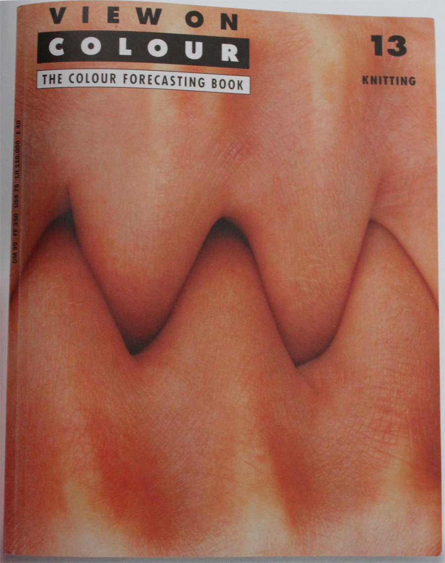
This is for a magazine called ‘View on Colour’ which he published with his wife Lidewij Edelkoort. In this cover, about knitting, you can see something you can not think off from the start, you have to play and have fun to surprise yourself and have something to use.
James Victore says something very interesting is the book It’s a miracle about Anthon Beeke’s work.
”Anthon Beeke always kept playing. A lot of other graphic artist look more like accountants with posh watches and they don’t ask themselves what impact their design has. He plays for his own pleasure and to surprise himself. He doesn’t make work for clients, not for commissions, not for the money, its not even about the assignment or design it self – Its about him. And because its about him it’s about us. The more authentic and personal it becomes, the more impressive his designs becomes gives it more dept; it speaks to us, we can here him snigger of fun. He speaks to us because he gives himself to us. Anthon plays”(Translated from dutch version, not original quote)
I have nothing more to add or say because this quote says it all.