Skip to Content Skip to Search Go to Top Navigation Go to Side Menu


"atmosphere" Tag


Exploring White Light


Monday, April 2, 2018

There’s more then just a simple white, the daylight is very different from the morning to the evening, there is warm white light and more cold to very blue light. This warmth in light is defined in the Kelvin scale. Buying a light bulb you can decide the color temperature. What interested me was how light is used in different spaces. Therefore I searched in the internet for extreme examples of light. That’s how they look next to each other:

Example

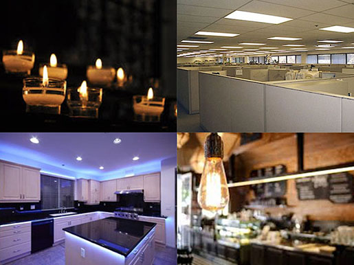
Even what we think of as white can be different. Some people are very aware of these differences for most of us light is just there and we don’t really care about it. Even if flickering LED’s in offices produce physical stress or candlelight can make someone look more attractive. In my color system I want to make these differences visible. I made a list of places that possibly show them:

Museums, Libraries, maybe private kitchens or restaurant kitchen and offices. I wanted to visit three of each to be able to compare them.

Public spaces are often aware of the kind of atmosphere they want to create. A library wants to be inviting, a museum wants to direct the visitor to the artworks and in other places it could be more about having enough light and not so much about the atmosphere.
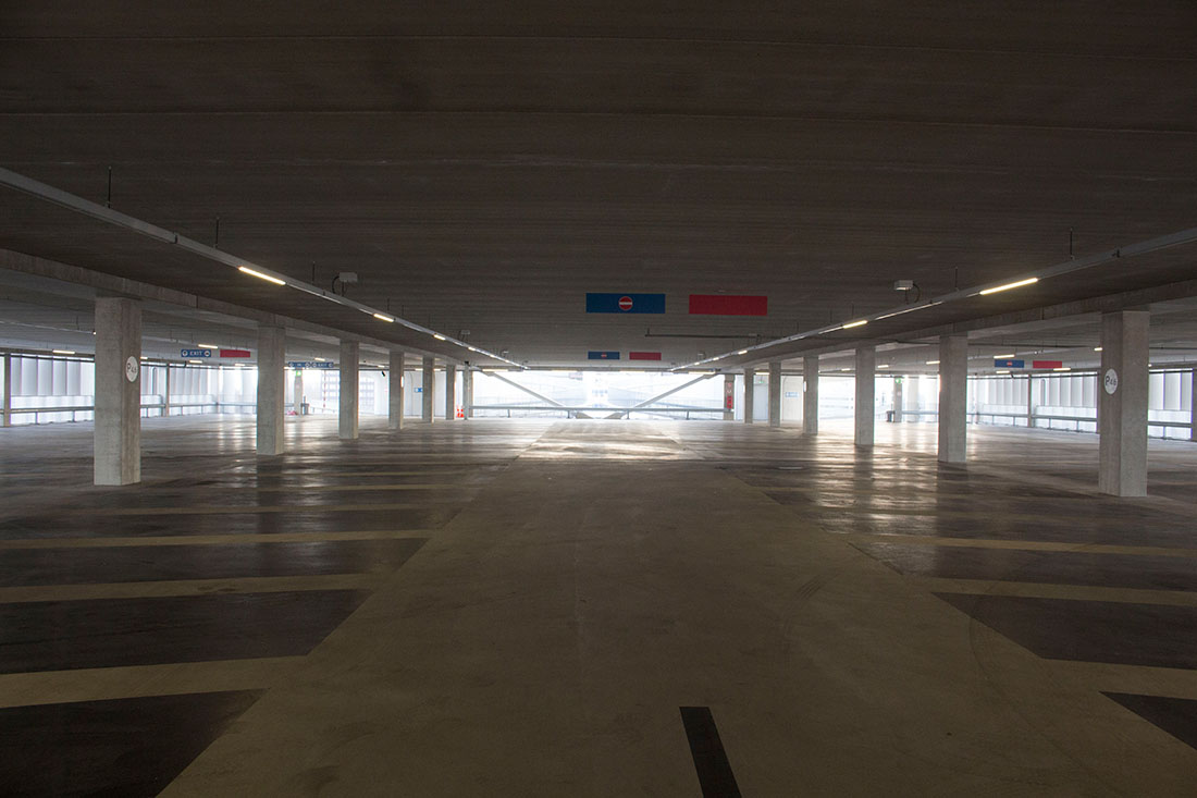
I took my camera and started photographing my first stop was not on the list, but close to Rietveld. A parking lot. I saw a lot of flickering LED lights, green lights from the electronic car chargers and blue lights in the elevators. It was day but by night is must feel a bit scary there. Next to photos of light the photos became more and more architectural.

Parking Lot

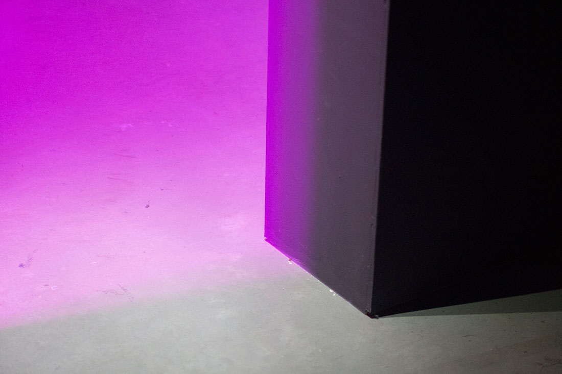
The architecture of the places continued to play a role in the next pictures too. In the Eye Museum it was dark with a lot of projections and also purple light. That was the point where it went away from only the spectrum of white lights. The purple light was nicely cut by the edges of the building and created beautiful shadows.

>Purple Edge

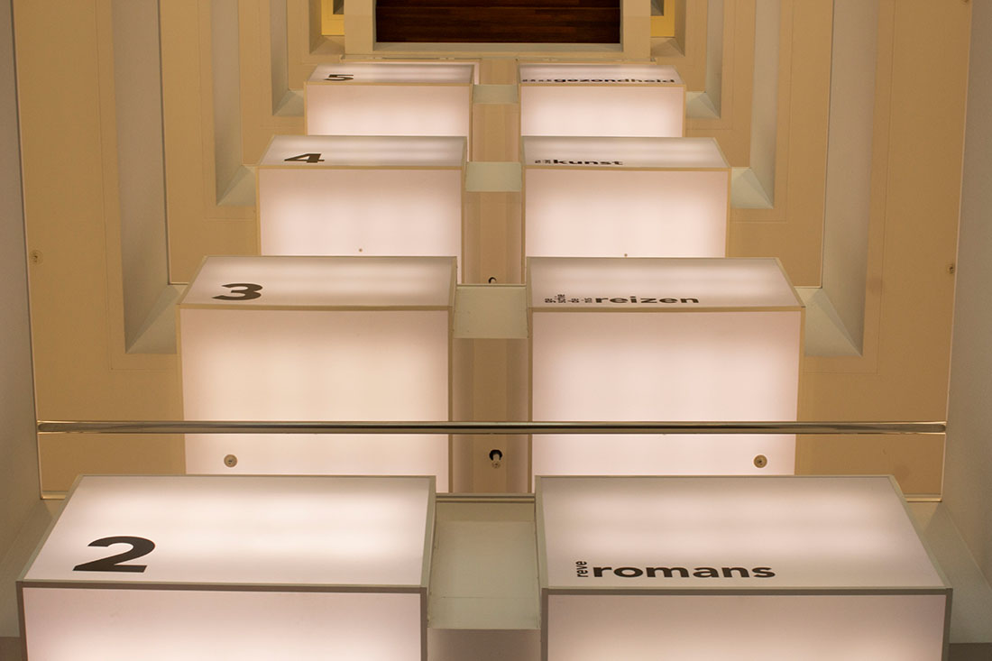
To stick to my list I went to three different libraries. With a lot of warm and yellowish light. The photos I chose in the end where mostly from the central library.
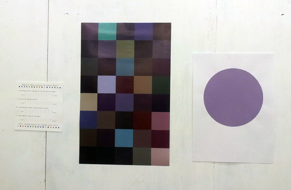
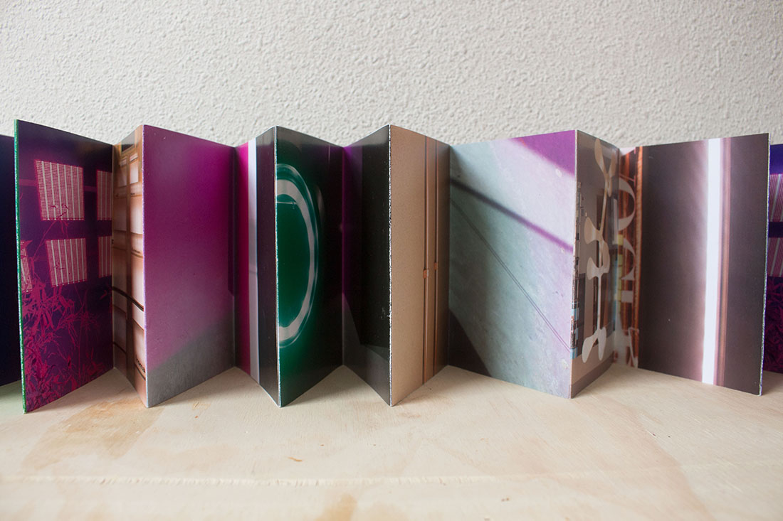
In the end I did not visit all the places but I had a feeling of continuing the collecting without any direction, so I wanted to have a format to put them before taking more pictures. I chose the Leporello. With not much experience in book binding I wanted to try a new format that’s easy to teach myself. The part where I struggled the most was still to come. Making the selection of my photos and arranging them.

Example

I printed the photos out, cut them in the middle and rearranged them. I wanted to select them by a similar place or color, but when I printed them out I found it more interesting to combine the different ones. Now it was a bit like puzzling the photos together and making two rows for each side of the Leporello. Some of the photos from really different places fitted very nicely together. I was happy about the selection, and didn’t want to compromise them more. From the printed photos I went back to the computer and fitted the photos on A3 sheets, so each photo was about a size of 15cmx 21cm. What I realized after the printing is that in this size the photos not really matched the format any more. I still wanted to see how they looked as a finished thing. So I started putting everything together.

Front

Leporello

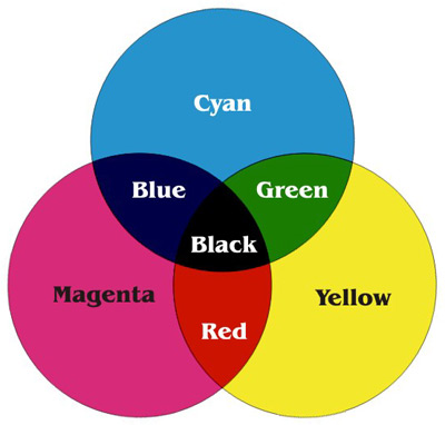
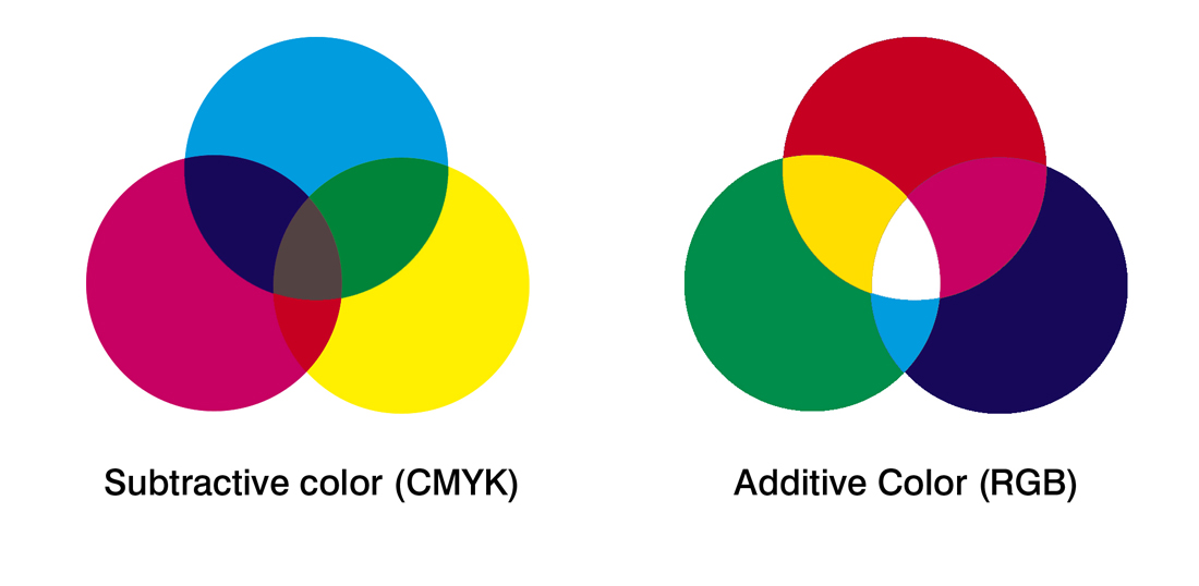
Looking back on it now, the Leporello is a step in the process. I found it difficult to find the right frame for it and to make the step after having a selection of photos. I put the Project to the side, because I did not have an idea how to change it. Since I started writing down the process I think about continuing with the color system. I thought to make more pictures that have green, blue and red light. Which are on top of each other white light. I thought about my presentation of the discovery of Maxwell and tried to split one of the photos I liked most into the three basic colors. I printed it on transparent sheets and hold them into the light. The result I liked a lot and I thought to use them as a cover for a new booklet. Maybe not a Leporello and probably a bigger size. The next step is to take my camera and add the missing photos to the selection. What I learned from the last time is to be more selective about the photos and what I missed was to have a specific eye on what photos I’m looking for. To make the book look more finished I want to visit the bookbinding workshop instead of DIYing everything.

The CMYK Colour Model


Tuesday, February 4, 2014

the CMYK colour model is short for cyan-magenta-yellow-key (black) and refers to all colours as mixtures of these four process colours. so, within this model, a colour would be described through the quotient of cyan, magenta, yellow and black that can be found in the mixture.

the CMYK colour model is predominantly used in the printing process and is often referred to as four-colour printing (which corresponds to the four inks used). in order to fully understand it, it is vital that we examine another colour model named RGB (red, green, blue) that is used in display devices such as computer monitors. so, whatever you see on a screen is in RGB. however, these colours can only be viewed with the aid of natural or produced light – making it impossible for documents to be printed as exact copies of what can be seen on a screen. this is why these documents must have their colours translated into CMYK prior to sending it to the printer.

all the heavily paraphrased information above seems to make sense on a superficial level, but in fact i find it all extremely perplexing and difficult to grasp. unfortunately i never learned the complex language of science and since it is awfully strenuous to translate a language one doesn’t understand, here is the even-more-technical-side explained by someone who seems to know what they are talking about:

“When two RGB colors are mixed equally they produce the colors of the CMYK model, known as subtractive primaries. green and blue creates cyan (C), red and blue creates magenta (M), and red and green creates yellow (Y). black is added to the model because it cannot be created with the 3 subtractive primaries (when combined they create a dark brown). The K, or “key,” stands for black.” (taken from here)

subtractive-colour_redu

upon my investigation, i found that the aspect of the CYMK colour model that i found most compelling was the simple fact that a countless amount of colours are but a mixture of four: cyan, magenta, yellow and black. this thought was inevitably on my mind for days proceeding my research.


//

the idea for a translation of the CYMK model came to me when i was listening to Billie holiday’s  1941 version of “am i blue?” over a cup of coffee. it started me off on a long trail of thought which went a little like this:

blue? blue?! how has blue come to mean a sad & melancholic mood or person?

although the colour blue is used to describe a specific feeling, colour can also be used to illustrate mood or atmosphere – for instance – in less direct ways. this is apparent in art, music, poetry, prose… but why do we associate certain moods or meanings with certain colours? and more even-more-generally: why do we often have the urge to illustrate colourless things through colour?

i am extremely fond of the randomness of this occurrence  the randomness of the colour blue (with all its different tones) being chosen to represent something that is beyond blue literally, as a colour, a sensory experience…


//

i had the idea of translating the CYMK colour system in a way that i made each colour (cyan, yellow, magenta and black) represent something different. and so i did. i decided that i was going to translate this system into a system that determined the “colour” of one’s day. first, i made a list of things that tend to have an effect on my day. then i selected the four that i felt have the most influence on the “mood” of my day. i proceeded to make them into questions (which can be answered on a scale of 1 to 10):

– how happy/satisfied are you with yourself today? (C)
– how well rested do you feel? (M)
– how good does today’s weather make you feel? (Y)
– how similar is today to yesterday? (K)

each of these questions substitute C, M, Y, and K accordingly. and when answered as a numeral value (from 1 to 10), i have the percentages i need to make a colour with the aid of photoshop. the system i’ve created is therefore a colour-determining tool.

i decided that the colour i’d silkscreen would be the result of my answers to the questions the morning after i created the system. my answers were 5, 5, 3, 1 and made into percentages as shown below:


 …and “the colour of my day” beside my silk-screened circle version:

 circle_redu


//

i knew that to develop my project further i’d have to send this survey around and ask people to fill it out. therefore, i made an online survey using a survey-making-website (which can be accessed here):


this website organized the data which i later used to determine individual colours for each of the 40 people world-wide who answered my survey on the 12th of december, 2013. i mapped out all 40 colours to illustrate the colours of one day, according to the answers of 40 people:

colour-system_redu


a problem i encountered on two occasions was that if 10 (being absolutely) was the answer to the last question: how similar is today to yesterday? (K), then the colour would be entirely black. since the other quotients would be cancelled out, i didn’t want this to happen. so instead, i set the percentage as 95% rather than 100%. even though both appear to be black anyway, i like the idea that there are still undertones of colour. and although it did not stay completely ‘honest’ to my original system – at the time i thought it would be a good compromise.


//

after i was done with the poster shown above, i decided to design a survey of my own (which i would put online and use if i were any good at computing):

i think through this translated colour system, i managed to play on the randomness of colour representations, but also create a functional and fun system (which also has the potential of becoming interactive).

colour-system_total_redu


Log in
subscribe