Not so long time ago the Museum of Modern Art in New York has acquired
23 digital typefaces for their design and architecture collection.
Included are five Emigre font families:
Jeffery Keedy’s Keedy Sans 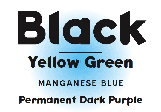
Jonathan Barnbrook’s Mason Serif 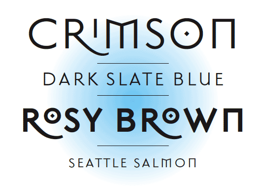
Barry Deck’s Template Gothic 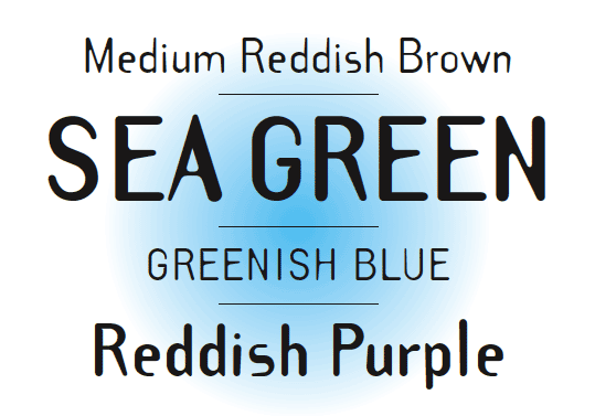
Zuzana Licko’s Oakland 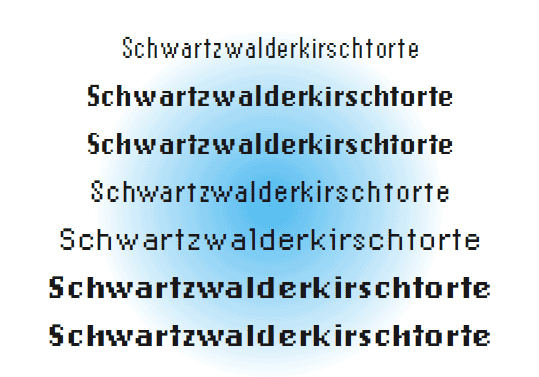
P. Scott Makela’s Dead History 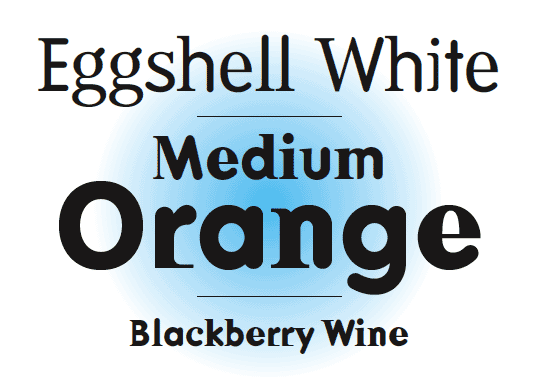
This acquisition marks the beginning of MoMA’s effort to built a collection of typefaces documenting designs covering the twentieth century. These fonts are synonymous with the early days of the digital era. In their designs they exhibit the experimental variety and technical challenges and opportunities brought to type design as a result of the introduction of the Macintosh computer. No type collection is complete without them.
In 1984 Rudy VanderLans and Zuzana Licko
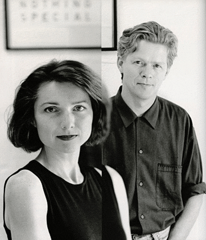
launched a type company named Emigre, based in Northern California, making it the first contemporary type foundry to sell original fonts made on and created for the computer. In addition to designing and licensing over 300 typefaces by a wide range of designers, Emigre also published a magazine for 21 years that published criticism and essays on graphic design while providing a beautiful showcase for Emigre’s fonts.
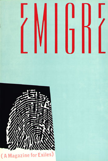
right: over of first Emigre magazine
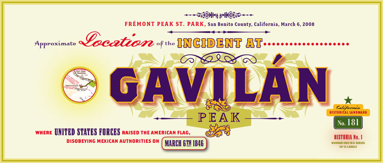
Founded in these years, coinciding with the birth of the Macintosh, Emigre was one of the first independent type foundries to establish itself centered on personal computer technology. Must to say that Zuzana Licko was among the first to create typefaces made of pixels and composed of dots on a grid to be printed on early dot-matrix printers– From the beginning Zuzana Licko who is responsible for many of the beautiful and most popular typefaces in the Emigre library started to create fonts digitally because as left-handed she couldn’t be the best calligraphist and draw it by hand. She was using Fontographer- an application for designing fonts and exporting various font file formats As excellent designer Rudy VanderLans was also a good photographer– but the most I liked his Historia Type Specimen. He put different typefaces in one. It’s really amazing how he could do it without contradictions of fonts! Each “layer” is specific but together they creating good composition and looks very nice! He believed that any font can be successfully combined with any other font. It’s not so much a matter of which font combinations to pick, it’s a matter of how you use the fonts in combination. Size, color, tracking, contrast, layout and overall purpose determine how fonts can be combined successfully.

Emigre tried to be every time on the edge, they designed type faces, wrote articles, made their magazine like fresh air to designers and organize their exhibition as well! When one journalist asked them to look back what the did and their plans they answered they haven’t retired. They are still full of energy and looking into the future, and days are filled with new, exciting projects and creative challenges of all kinds. I think it’s the best way to be your own and never stop, only look forward and never regret about some failure. Emigre is not a company is just a group of people who are interesting in what they are doing! It the secret of any success!