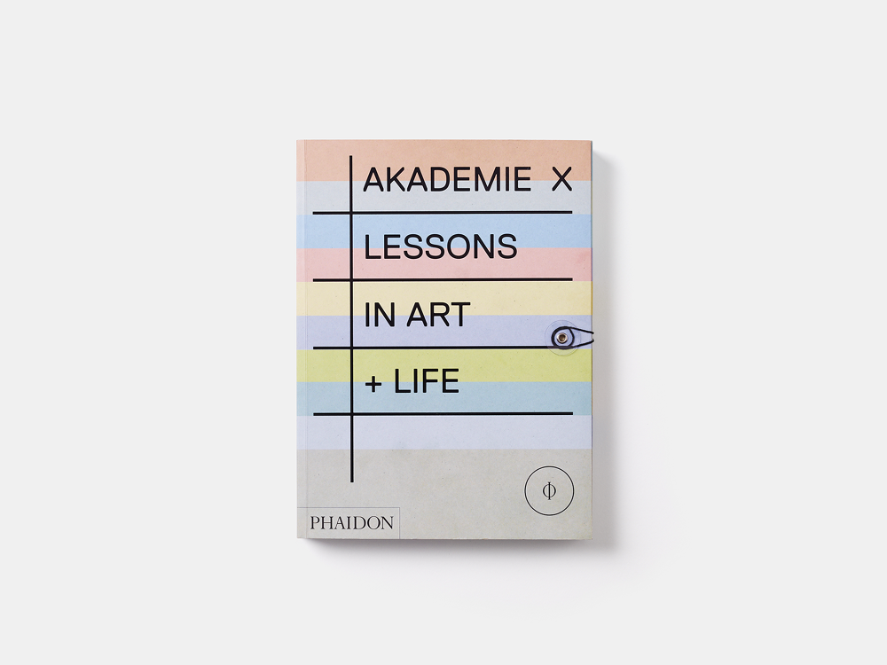
I was attracted to the book. My desire was driven by the tangibility of its opening mechanism. So simple yet so satisfying to open the binder. Almost a modern take on a grand old anglo-saxon book binding tradition, all that it almost needed was a royal institutional stamp in wax, now just to let me break the seal.
Attractive and seducing in its simplicity. The binder hits your tangible senses immidiately.
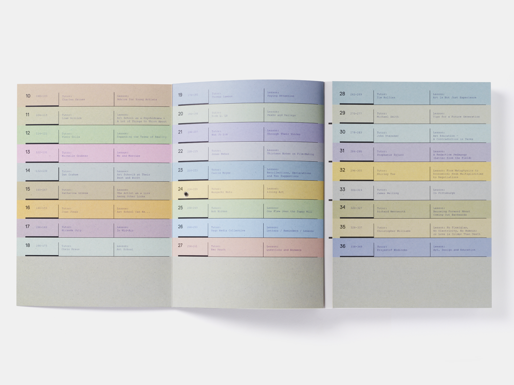
When first Akademie X lessons in art + life was opened, it contained a colorful index, for some reason I was drawn by its strict composition of its bars of pastel color, most likely because I am a long lost lover of chaotic mess and dynamic colors and these strict lines grabbed my attention as the opposite to my immediate visual desire. But also the paper-texture of the front cover was very rough, it gives a good balance between the soft pastel colors and the rough paper. It creates tension somehow.
Akademie X - Index has a beautiful scale and the paper quality immidiately catches your attention.
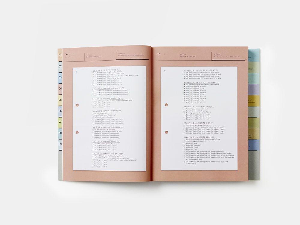
I continued in my discovery of the book and was drawn by the interesting format, that the content was organized in. The complete book is a collection of educational looking, enlightening content. The content are various contributions from artists all together forming the fictional institution “akademie x”, the worlds first akademie without the boundaries of a physical institution. It is a collection of thoughts and exercises and light guidance in how to live a (healthy) creative life. On the back of the book it states; “This inspirational and practical guide on how to live a creative life has been devised by the world’s most thought-provoking artists + writers.” The content of the book differs from each other, every chapter is a contribution written by a specific artist. Additional to this, each contribution is supplied with a small section of photos of each artists major works. Because of the contributive element, each chapter has a different formatting (or more precisely; the formatting intended by the artist has been left untouched perhaps).Graphic Designer and Art Director Julia Hastings who has designed the book, has created the complete book in a beautiful colorful grid. Within this grid all artist contributions are placed centered in a white frame. The white frame has the rough rectangular dimensions reminding of an A4 xerox, which gives the intentional A4 feeling as well. Furthermore on some of the sections the A4 xerox has been added “archival holes” to give it the feel of an archived xerox paper.
Akademie X - Xerox representation; but is it authentic when its computer generated?
But it somehow questions me if it creates a dishonest feel however? Does the computerized graphic representation any good for the book, or should it have been a real scanned xerox, ugly and crumbled as it could be? But in fact perhaps giving it a more honest representation. The important graphical design take is the grid surrounding the imaginary A4 xerox.
Just like the notion that a digital music album of today, still necessarily have to be released in square dimensions. It tricks a conservative notion in us that the dimensionalized representation of an A4 (or the square music album) is giving the book (or music) authenticity, wereas the xerox scan might have created a messy output but more authentic representation. And perhaps a more real feel and less “anti-commercial” commercial look? Because is this book basically commercialized authenticity? What story does it tell?
That sets me into another troubling chain of thoughts. Researching upon the publisher made under the publishing house Phaidon; after browsing through the catalog of publishings it was easy to spot the certain anti-commercial yet commercial grip that is intended for the viewer. It is made pretty, just as mentioned above with the non-authentic A4 xerox. The quality of the paper is a little thicker than a regular 80g/m3 A4 inkjet paper, yet the paper texture is the same as a regular 80g A4.
The hipocrisy of the post-digitalized world permeates the art world, authenticity will be absend during the next decades.
The heavily intended “courier new” layout font catches exactly the hungering market-ready segments of art students, intellectual art lovers and participants in the game of academic thinking, promising us the authentic experience for the flashing dazzling price of only 29,95 EUR. Nevertheless we are victims of todays best commercialized marketing-weapon: capitalized user experience (or experience economy). We are quickly dwelled into the narrative of “authenticity”. You, me and everybody remotely interested in capturing the “anti-neo-capitalized” authenticity which doesn’t exist in the western world anymore in my opinion. These fleeting moments of absolute truth is in fact just a marketed salesmen’s narration. You are not even aware of the fact, that it is a product you are buying yet. Courier-fonts and rough textured high-quality paper, lead their perceiving way, persuades you to think it is as real as what you handwrite yourself. The undecided white pages and lack of commercialized layout-settings makes you think you have a nice little treasure of undisturbed authenticity. Every word spelled out in the art worlds best authentic-yet-commercial-friend “courier new” makes you accept the narrative that this is not a commercial book, but a guiding collection of fine arts academy notes taken directly from the worlds best mentors and professors. Bring in Harry Potter’s Tom Riddle and his soul-sucking diary of truth. “This book will learn you to live a healthy creative life” could be the salesmen-slogan spelled out on the front cover, but then it would probably attract the silicon-valley entrepreneural segment (and not the intended in-crowd from the contemporary art scene).
In 1999 the american authors and economists B. Joseph Pine and James H. Gilmore wrote a book named “Experience Economy” and already in 1998, Pine and Gilmore wrote an article in Harvard Business Review stating “Welcome to the Experience Economy” proclaiming a new era of capitalized business models [X], based upon the design of experiences ultimately leading to excessive brand-value. This economic understanding permeates todays music industry, art scene and creative industries for good or for worse. In terms of the art world it dilutes the honesty and blurres the vision.
The most famous example was the capitalized Starbucks coffee experience.
The Starbucks coffee experience states that buying a cup of coffee from 2 cafés (a non-branded café and the other from starbucks), has the same given production rate, that the brew of beans costs for both cafés. Now the experience of coffee is what you are buying, that includes brand-value and the sub-cultural element of being a part of something, a community of coffee-lovers. You are an expert for the dazzling price of 10 EUR at Starbucks.
The most important element in this example is also the birth of anti-culture that automatically are created. More precisely put; counter-cultures to the specific structures, which automatically appears. The experience economist and marketing director’s supreme job, is then to capitalize it well too! In best case without you even noticing that you are being sold a new “counter-culture” product. So relax fellow art student, you are consuming capitalized products without even noticing it, the more awareness of your normcore behavior you spread the sharper your marketed profile gets.
Normcore understood as the counter-culture developed in the fashion industry as a counter-culture to the posh stylized look of the 2000’s. Normcore became the unpretentious, normal-looking phenomenon working against the same industry during the 2010’s. However, it was developed within the industry by the industry nevertheless, it’s just as transgressive [X] as the commercial fashion-culture it developed itself from, capitalized “hide-and-seek” in it’s purest form, now happening faster than ever before (or is it slower than ever before?).
Which leads to my dystopic conclusion; that the book (red. Akademie X) is a very well designed output of capitalized experience design – and values, wrapped into a nice little narrative about contemporary cultural succes.
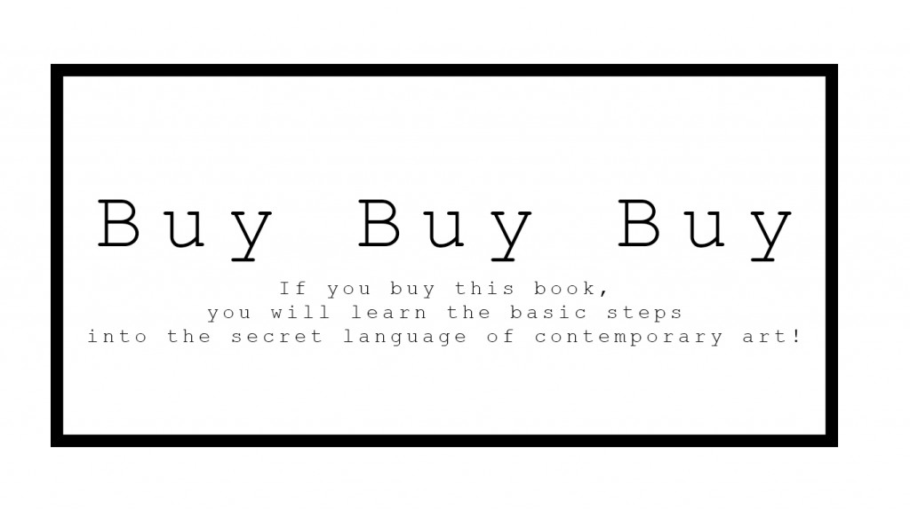
“If you buy this book, you will learn the basic steps in the secret language of contemporary art!”
You are perceived to buy the commercial starbucks coffee, disguised as an easy looking authentic cardboard cup of joe, with courier new fonts written all over the dark brown fair-trade cup full of promising brew.
“An artist should not make himself into an idol” is one of the commandments that the book states, even though the complete list of artistic contributors have been idolized and later on capitalized by thousands of museums, gallerists, art students, artists, intellectuals and academics worldwide. And no harms done by that, if you don’t take the cultural commandments for granted or listen to them.
But the western contemporary cultures excessive authenticity-hunt is full of hypocrisy in our post-digitalized, yet soon to be automated, world. We are soon based upon digital systems designs that are dictated by the linear neo-capitalistic ideologies. We just don’t want to admit it yet.
Now go out and write some more creative commandments and cultural stigmated dogmas with New Courier fonts.
We will need these statements to understand the hypocrit-era that we truly live in today.
Akademie X : lessons in art + life /Rietveld library catalogue no : 700.8 mor 1
External Book References:
-
Various Authors (2015) Akademie X: Lessons in art + life, Phaidon Press, London 2015, Printed in China Pine, J. and Gilmore, J. (1999) The Experience Economy, Harvard Business School Press, Boston, 1999.
