Skip to Content Skip to Search Go to Top Navigation Go to Side Menu


"The Fashion of Design" Project


The condition of Techno Craft in 2011


Tuesday, December 20, 2011

Impression of STRP 2011. This video reflects my personal experiences at STRP 2011, the 9th day, November 26th.

Get the Flash Player to see this content.

STRP Festival [strp.nl] is one of the largest art & technology festivals in Europe where music, art and technology meet. The multidisciplinary program combines 360 degree experiences with adventure to appeal to a wide audience. You will find projects by young game designers alongside major works from established international artists, experimental live cinema, and successful pop artists and DJs. At STRP, interactive art, light art, robotics, concerts, theatrical and dance performances, experimental music, interviews, discussions, films, lectures, video art, animation and workshops co-exist dynamically.

Twisting: from “the Stijl” to “the Amsterdam School” by bicycle


Thursday, November 17, 2011

during a 3 hour bycicle tour two parallel architectural movements from the early twentieth [The Amsterdam School and De Stijl] were highlighted

stadionkade - stadionplein - stadionweg

cliostraat - olypiaplein - valeriusplein - koninginneweg

amstelveenseweg - surinameplein - hoofdweg - mercatorplein - jan evertsenstraat

frederik hendrikstraat - nassaukade - spaarndammerbuurt

hembrugstraat - zaanstraat - haarlemmerplein - haarlemmerdijk

haarlemmerstraat - prins hendrikkade - damrak - prins hendrikkade

geldersekade - oudezijds voorburgwal - rokin

muntplein - vijzelstraat

a week later we completed the tour –started at "The Rietveld Academie"– by visiting the ultimate architectural "de Stijl" statement "Rietveld Schröder House" Utrecht

Trash of the Titans


Wednesday, November 16, 2011

As children we were told fairy tales when adults wanted us to stop crying. Stories of kidnapping, the black death and drug use sometimes disguised in jolly rhymes, melodies and childish fantasies. They have taught us not to look in the room meant to be kept shut, in other words; be obedient otherwise face terrible/fantastical consequences.

Not always, this kind tales –sometimes happy– about far away lands, keep us amused in a world so “understood” and “real”.
Walter van Beirendonck uses this element in many of his clothing articles. Connecting both worlds of childish imagination and colors with the really real world of grown-ups.

And it can really get

real.


It looks like van Beirendonck is busy writing his own fairy tales with every show. Each representing a different space and feeling.
He has even created a character to better express himself with.

 A quote;

MISSION OF MONTH: AS THE SNAPPIEST DORKIAN KNOWN, CHOSEN ALIEN OF THE W.& L.T.HOOD AND EARTHLING-MAGNET – PUK PUK’S MISSION IS TO TRANSEND THE W.& L.T. AUTUMN VIBES TO THE EARTH ALIENS.

 KWKWKWKWKWKWKWKWKWKWKWKWKWKWKWKWKWKWKWKWKWKWKWK

HI HI HI FASHION-FRIENDS. PUK PUK WANTS TO TAKE YOU FOR A RIDE ON THE BIG WHEEL THIS MONTH AND FROM THE TOP TAKE A SNEAKY LOOK AT WHAT W.& L.T. HQ IS PUTTING IN ALL L(OVE)-RATED STORES FOR THE CHILLY MONTHS COMING. IT IS A CANDY-CUCKOO RANGE THAT WILL SING OUT TO ALL W.& L.T. FANS AND WAKE-UP ALL THOSE NON-W’S TO SEE WHAT A SEXY FUN TIME THEY CAN HAVE BEING A W.& L.T.ING.

 ALTHOUGH I AM SMOOTH, BLUE AND HAIRFREE, WAY BACK WE DORKIANS WERE HAIRY ALL OVER. TODAY I FEEL LIKE TEDDY-VELVET AND IN ORDER THAT ALL FANS OF W.& L.T. CAN EXPERIENCE THE PLEASURE OF THE TOUCH OF PUK PUK THEY HAVE RELEASED SOME VERY SPECIAL SWEAT-TOPS IN TEDDY MATERIAL. SOME COME IN A HARLEQUIN CHEQUE AND SOME COME WITH OLYMPIC MEDALS AND ALL ARE PURRY SOFT!

 W.& L.T. THEN ENTERS THE FREAK-SHOW TENT FULL OF MAGICAL PEOPLE WHOSE CRAZY EXISTENCE IS NOT LIKE MANY OTHERS ON EARTH. INSPIRATION COMES FLOODING FROM THE HAIRY PEOPLE AND CELEBRATED WITH T-SHIRTS AND DENIM WITH A HAIRY PRINT ALL OVER. THE LOOK IS WILD, TRASHY AND LETHAL AND SURE TO GET THOSE HUMAN APE-GENES OH OH OHING. THOSE NICE PEOPLE EVEN PROVIDE RAZORS SO YOU CAN GET CREATIVE AND GO ELVIS.

 AND THEN BACK ON THE BIG WHEEL AGAIN, SPINNING INTO AUTUMN WINTER, IS THE TASTE OF SAUSAGES AND BIG RED LOLLIPOPS FROM THE FAIRGROUND. W.& L.T. RE-CREATES THE PLEASURE GARDEN WITH LOLLIPOP T-SHIRTS (LICK ME!) AND HOUSE OF HORRORS BAGS AND TOPS WITH ILLUMINOUS IMAGES OF SKULLS. HOLD ON TIGHT THE RIDE IS JUST BEGINNING!

 PUK PUK MUST GO NOW BUT PROMISES TO BRING YOU MORE NEWS FROM W.& L.T. NEXT MONTH. REMEMBER IF YOU SEE ME FLYING ABOVE YOU IN MY STELLAR CADILLAC REMEMBER TO GIVE ME THE HORN!

 KKKWWW PUK PUK

 * NOT LITERALLY – EARTHLINGS WILL NOT BE ABLE TO PERFORM THIS TRANSITION UNTIL THE YEAR 2497 AND THE GOLDFISH POPULATION WILL BE THE FIRST TO WORK OUT HOW

That’s an actual quote from Walter’s website; http://www.walt.de.
The Character is Puk Puk, who comes from planet Dork. Tells it how it is and is inspired by the people of Papua New Guinea.
They even kinda look like Puk Puk if you squint your eyes a bit.

What I also like about van Beirendonck besides his difficult name, is that he seems to live in his own world. As do many of us. Actually, we all live in our own little imagination, it’s only our relation to others that makes it seem and feel so shared. Perception in our civilized society is very important.

If you were at a party with 30 people, chances are 7 might be schizophrenic. Today we don’t get burned at the stake or get shock treatments and lobotomies
(our memories of them nothing more than Ramones lyrics and Jeffrey Dahmer victims). You do however get shunned from being “normal”.
Bah, who the fuck wants to be normal anyway?
Furthermore who’s to say what normal is?
(If we’re talking about mathematical norms, then sure a norm is the recurring number, but the idea that this recurring number is the best,
what’s that about?)
Some cultures modify their bodies as a form of beauty, while other cultures frighten themselves with stories of malformed humans who are either savages or uncivilized.

O brave new world that has such people in it.


I am a storyteller and it is my way of thinking and presenting in a total way.”

(more…)

IE


Tuesday, November 15, 2011

I thought for a long time about the Kho Liang Ie and his work, looking for all sorts of information, I even went to the industrial area where the Stedelijk Museum Library situated, and could not write a word. The only thing that is on the Internet is a biography, in the library all books and articles only in dutch language (sorry, but I do not know dutch).
And then I got lucky and found a booklet called ‘IE’. Read all three of the essay (which were in english!) on Kho, and than one of them caught me.
It is very rare material about Kho Liang Ie and his works, whitch did not exist in the Internet before. Now it does! It is my contribution to the online library of brilliant people.

(more…)

Wim da Vinci


Monday, November 14, 2011

This is a cover design for a brochure of the Teleac, made by Wim Crouwel. It remembers me of when I was a kid and I saw for the very first time an Italian 1 euro coin. On the coin you see the Vitruvian man, made by Leonardo da Vinci in 1487. It shows de measurements of the human body, so he found out for example that the length of the outspread arms is equal to the height of a man, and that the length of the hand is one-tenth of the height of a man. The drawing itself is often used as a symbol of the essential symmetry of the human body. The drawing is based on the ideal proportions of the human body. The drawing was inspired by Vitruvius, who was an ancient Roman architect. He described the human figure as the principal source of proportion among the Classical orders of architecture.

It might be too much honor to Wim Crouwel for comparing him to Leonardo da Vinci, but I think that both of them have a certain accuracy and precise. Wim Crouwel worked with grids. He used them as a tool so that the drawing was in correct ratio and perfect proportions. If you look at the drawing of Wim Crouwel you could see the same; from one point of view you can always see a circle in the middle of the square. I think the drawing fits the meaning of the brochure perfect. I like this drawing because it’s so geometric, It looks architectural, industrial and above all very modern.

Where did the Swiss style came from?


Monday, November 14, 2011

During the industrial Revolution there was a growth in advertising. They were able to print faster and more because of the better press-machines. At the turn of the century, art nouveau was the most important European art-movement. The movement used elegant undulating lines and flat planes filled with detail, and was often accompanied with a symbolism. It was used in architecture, fabric design, and the industrial arts, but it was especially a big role in graphic design.

Art nouveau inspired many artists to break with academic art and unite into autonomous groups.Peter Behrens and Henri van de Velde, both with art nouveau backgrounds. They were both inspired by the arts and crafts movement, Behrens and Van de Velde pointed on the involvement of artists in industry. Behrens designed for the EAG (general electric company) their architecture, advertising, products, logo, and printed work. Van der Velde was a leading figure among the artists who aimed to bring art to industry, but he was not alone in wanting reform. In 1907 there were a group of German industrialists, architects and designers who formed the Deutcher Werkbund.

It was an association aimed to bring art and industry together. Van der velde had been one of the founding members. Called to germany, at the turn of the century, as the Grand Duchy of saxony-Weimar’s artistic adviser for industry. His job was to ‘raise the level of arts and crafts production. The Werkbund was the main forum for discussion and the means of publicizing avant garde ideas.

A drawing of Lucian Bernhard’s in 1906 produced a radical change in advertising posters. It was the result of a design contest. On the poster you see two matchsticks and the word Priester on a plain background. This started the ”plakatstil” (poster style) emphasizing clarity and simplicity. Many designers who worked in this mode followed, included hans Rudi Erth, Julius Klinger, Ludwich Hohlwein and Edward McKnight kauffer. Emil Cardinaux designed the first Swiss poster similar to the German plakatstil, and, inspired by Cardinaux, you could say there was a clear trend in the Swiss posters by 1910. With realistic images and simple typography this became known as Basel realism. Leading designers were Niklaus Stoecklin and Otto Baumberger, whose posters were characterized by a hyper realistic approach.

(more…)

SOLID Style


Monday, November 14, 2011

– Look at me, don’t look at me.

This was a description given by Patti Smith, when being asked about her style in an interview. The sentence caught my attention because of its simple descriptiveness of the rebel attitude. But this text is not about the musician and poet Patti Smith, but about the clothes she often wears. Made by her close and old friend Ann Demeulemeester, whose work I’ve tried to approached.

Ann Demeulemeester and Patty Smith. Two successful stories, still going on.
It seams they function like each others muses and fuel each other with creative energy. They have collaborated in some of Ann’s collections. She seems like the perfect model for Demeulemeesters design. She expresses individuality and androgynity and that is two important themes in Demeulemeesters work.


Ann Demeulemeester
B.1951 in Belgium
Lives in Antwerp (in Belgium’s only le Corbusier house [x])
Attended the Royal academy of fine arts, Belgium 1978-1981
One member of the notable fashion group “The Antwerp 6” [x]
Set up her fashion house in -87.
In 2009 her business generated sales of about 40 million dollars.
Only wears her own design.

Consistency

Long term friendship, long stabile career and a loyal crowd who follows her.
Going through the history of her collections, from 1987-2011, You see that she has a single solid vision. Her outspoken critical approach to trends, hype and celebrity dressing is probably a reason to her popularity. She explains the success to old-fashioned hard work. Inspired by her father.

The Crow, Edward Scissorhands, leather, latex, horse hair and feathers…
My First impression was from the collection of 2011.

I wouldn’t wear it.

Fashion for older women. Women Interested in art, who use to be punks in the 80’s. All black… Lacing, high booths, leather gloves, fetish, goth, pale, thin models.
In interviews she says she hates to be labelled as gothic.
I like dark, but more sober. I could do without the leather laces…

Atmosphere

Former industries, now galleries-area in Berlin.
I walked through a open door. Surprised to find a clothing store there [x], and even more surprised that they represented Ann Demeulemeester.
They didn’t greet me, three busy quiet guys dressed in black. everything was black. I was a non-potential buyer, and felt a bit uncomfortable spending too much time in there. I wanted to take a picture but wasn’t allowed. Couldn’t understand why, didn’t ask why. The place felt like a secret club rather then a public place.

Second store visit in Amsterdam, at Van Ravenstein [x]. (This time with my own photographer). White clean facade. classy, neat store. A bit nervous to feel like the non-potential-buyer again. The store was not very big but had three assistants; one young and two elderly women. I look around I order to recognize something from Demeulemeester, but it seems that this store was selling a more “simple” selection out of the collection. One of the assistants showed me, and I picked out some things that felt the most characteristic.
Another costumer was giving me a quick but evaluating look, from head to toes.
With carefulness I tried on a black shirt with white birds claws-print, and a thin, black cardigan with an unusual cutting. I read the clothes with my pre-impressions of a mood composed by websites, music, models, etc. but anyhow, I got cheesy heavy metal associations from the shirt… The cardigan was OK. Comfortable, and I like that it had a hood. It was hanging down in a nice way. I felt some eyes in my neck and one of the assistants asked me if it’s a good size. I gave the answer, yes yes it’s good, even though it was a bit too small.

I asked the assistant if she could describe the design from Demeulemeester. She was thinking for a while, and the answered with a very low and soft voice: androgynous… rocky… simple… women. She couldn’t say who the customers were. Demeulemeester herself says her clients is not fashion victims, but individualists that chooses what he or she wants.

…austerity…dark…cold…wind…serious…quietness…concentration…horses…

photomontgraphms


Monday, November 14, 2011

German graphic designer, typographer and photographer, Anton Stankowski truly made a mark on photographic history. As a student Anton, as well as some other students of the Folkwang School of Design, used the janitor’s basement as a darkroom, for diverse photographic experiments. Whether they were exposing light on to the film or the paper, making photomontages or, photograms. After finishing his education he kept taking photographs using the medium as an objective way of documenting thoughts and later as a specific working method.

Having never done photograms, I- the researcher, used this opportunity to go to the darkroom and use similar materials as Anton Stankowski did at one time to remake one of his photograms using only certain amount of light to portray nails onto the light sensitive paper. By doing this part of the research I got a deeper understanding of photograms, and realized overall how much you can play with lighting in photography itself. Here is the result of my remake:

Early in the process of developing my negatives I saw that some pictures seemed to have had some unusual light exposed on them by mistake leaving some pictures cut into half with different lighting on each half. When developing one of these photos on to paper I moved my hand under the light while the film was being projected on to the paper causing less light to reach that specific part of the picture. In spite of these clumsy mistakes this image is a favorite from the experiments. This series of unfortunate events having such a good ending made me think about how much of Anton’s work in the darkroom, especially as a student, was a coincident that lead to something interesting and how much of it went as planned and still had the same outcome as he wanted.

Going through Anton Stankowski’s photographic collection I noticed that they are nearly never showing faces of people. In his self-portraits a face can be seen, but even then it is ether blurred or moved. Another noticeable theme from his collection is how often he photographed street life (more often than not from his balconies – or at least with a view looking down on his subjects).  Therefor when taking pictures to develop and include in the research I tried to have these two notes in mind.

Stankowski was one of the first to make so called typographic photomontages, though definitely, taking his inspirations from his teacher Max Burchartz. Using these typographic photomontages in advertisements while working for an advertisement agency in Zurich he quickly became the pioneer of Swiss Constructivist commercial graphics.


Actions/Reaction; Questions/ReAnswer


Monday, November 14, 2011

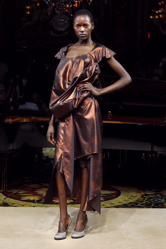
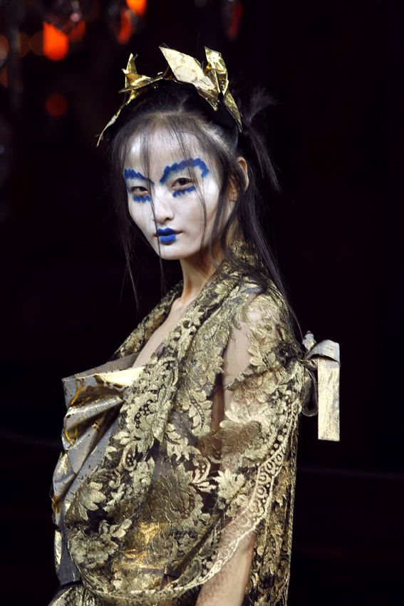
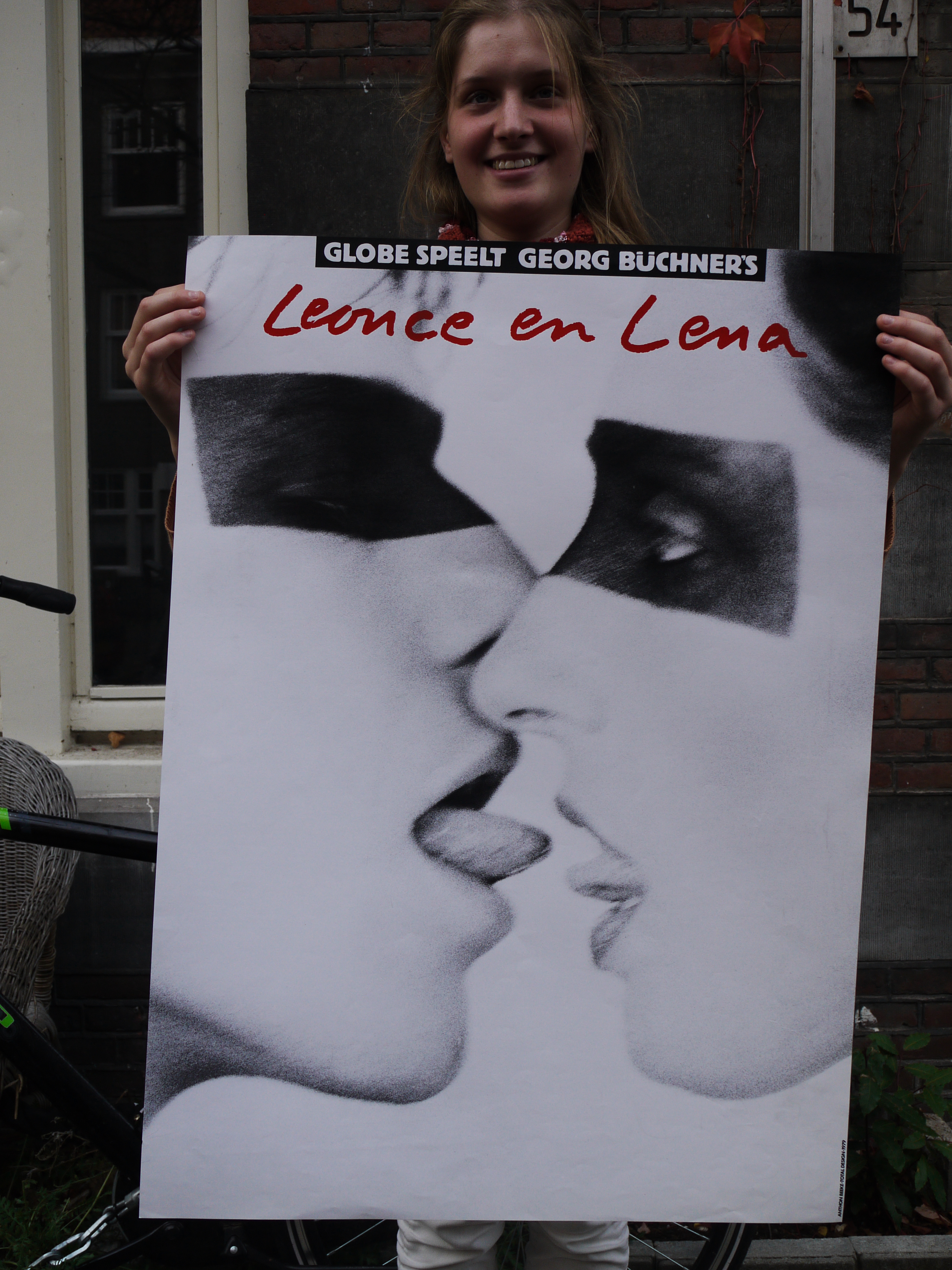
First of all, I already studied fashion design during a year. I know it’s not long period, but I have my own preference about fashion design which is simple. But As you know, Walter Van Beirendonck’s work is not simple is more like an overstatement to me. Honestly, When I first looked around his exhibition in ‘MOMU’, It did not really impress me. Just another ‘Fashion’ show room. Moreover, I really felt a headache. There were various colored clothes, even it’s figure. But after exhibition I realized it’s not the same compared to any other showing room. That is more detailed. This means it’s not just for ‘Looking-Good’, but also his philosophy. It is a completely unique perception of beauty to me. It is not only shape, His view-point and spectacular fashion, socially critical themes touched his designs. (HIV, Alien, Exteriority, Exotic Culture, mass consumerism, Warfare of World, et c.)

 He combines this with his fascination for technology, high-tech materials, multimedia and experimentation with sharp, critical statements. He usually tests the limits of beauty, giving his own interpretation of concepts that society imposes on us. And how he works today’s important themes into his collections and presentations.

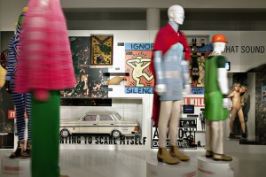
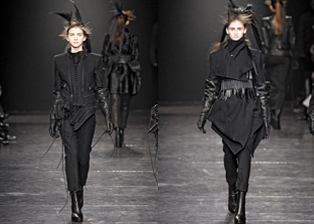
Actions/Reactions sector in 'MOMU'

In his collections, I researched about ‘Actions / Reactions’.

He incorporates themes such as AIDS, the burqa (Muslims female cloth) debate, mass consumption, ecology and capitalism. He likes to compare the way he does this with the richly imaginative way that people in West Africa deal with tragic events, such as death, by burying their dead in coffins sculpted in the shape of an automobile, and onion or other fantastic forms. Actually even I had no knowledge about this.

This collection has focus on controversial issues and social statements. I think that is very important because of fashion; clothes is a good way to implement and give a message. Through a very basic behavior, wearing clothes. So, I think, Fashion has to be more mass influenced. Like a symbol. In this regard, I found that he tried to communicate face to face. In my view it is like a demonstration without sound.
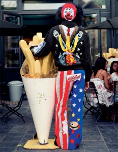
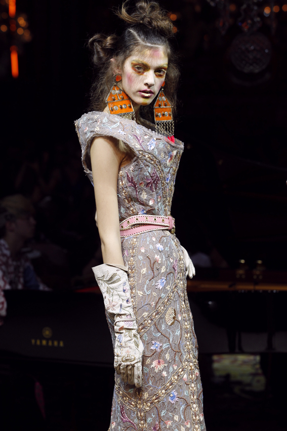
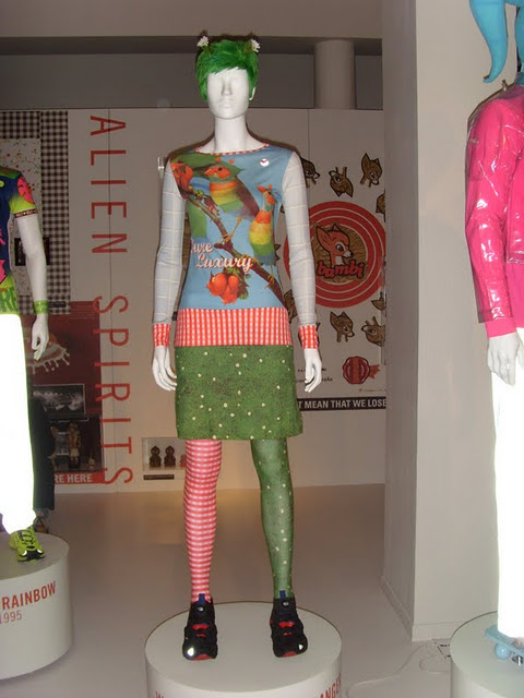
Mr.Greedy

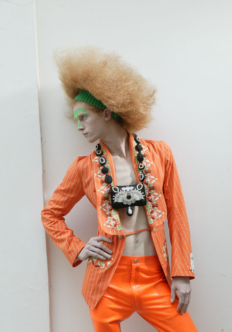
I think he is the most socially engaging in the collection Stop Terrorizing Our World. (S.T.O.W.) In my view, As can be seen in the picture, they represent the protagonist, who are important in our contemporary world. The Exterminator, for example, with all the diseases around the world, such as AIDS, overpopulation, fevers, and so on. Mr. Greedy stood for America and the fast food industry. However horrible or difficult the issue, his message is always a fundamentally positive one, with a powerful belief in progress and change.

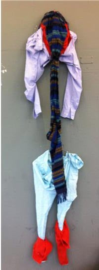
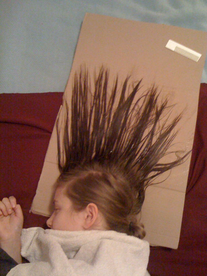
After being inpired by him,
I destroyed and reconstructed clothes.

5 years ago, I read Che’s biography. I still remember his words; “Soyez réalistes, demandez l’impossible!” – Be realistic, demand the impossible!

 I know, Walter didn’t demand to solve an impossible problem. Its a hard one to solve, even if everybody knows these problems. In my view, Walter will be more affective than che ever was. Even if he were still alive! I will really expect his forward move. He is a mastermind to me.

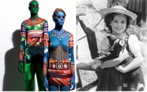
He was inspired by 'Heidi' animation.

Additional, I found some reference example that interested me.

In ‘KILLER / ASTRAL?TRAVEL / 4D-Hi-D’ printed with a picture of Heidi and a goat with green ‘devil’s eyes’ and the slogan ‘Fatal attraction’ in flock print (referring to HIV) leather dogs collar, shorts (‘feed up’) in imitation leather socks printed with dolls motifs, leather shoes, nylon masks with the inscription Terror Time.

American president Ronald Reagan with Confetti

In ‘STOP TERRORIZING OUR WORLD’ suit in cotton with embroidered slogans in Japanese and Arabic letters (referring to the ecological problems at the north and south poles and in the amazon), loose hood trimmed with imitation fur, shirt in cotton embroidered with slogans, leather shoes. kind of like the environment movement. And “Mr. Greedy bomber” jacket in wool with embroidered motifs such as American president Ronald Reagan in a clown costume on a rocket, woolen trousers with ‘stars & stripes’ motif, loose hood edged with imitation fur and embroidered Ronald McDonald figure and dollar signs, knitted jumper in wool, T-shirt in man-made fiber, make-up; confetti.

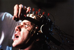
'A Clockwork Orange' by Stanley Kubrick

I want to call it “Questions / Answers” Also his work will be an answer about nowadays’ topics. I think he expects, after I saw/wore his artwork, to change our thought and behavior. It is like a silent revolution.


Finally, during investigations I found an inspiringAnOtherarticle about him.

some more interesting articles/links are:

Expo Walter van Beirendock@MoMu on Belmodo.tv
Mode Museum's "Dream the World Awake" on MoMu.be
Flanders Fashion Institute blog

Walter van Beirendonck's own Vimeo channel
and the MoMu exhibition booklet

Vivienne Westwood / The end of the world.


Monday, November 14, 2011

In my research project I went looking for something that really struck me while analyzing Vivienne Westwood’s latest collections and labels. She started her collections living in a punk era filled ideals, fighting against the mainstream society, this was very obvious in her early work. Though, looking at her collections from this era I see a soft version of the work she used to make, seen in the style, color and fabric she used. In my opinion punk now has a small role in the influence of making her later collections. I feel that the edge is off and that it has smoothed out over time. I still think her work is really fantastic, but that is not what matters right now. I know she still follows several ideals like using Eco-materials with print on t-shirts that refer to how people treat nature.


But why did she change her image and became softer as she was. An image changes over the years, but is this a new way of rebellion by expressing herself in a softer way? Why doesn’t it come across as a rebellion to me, can we make a statement in a fancy wardrobe? After studying her collections I thought to myself that I might have became a custom to the fashion of today and versatility of showing itself.

After doing some research I came upon a project called the Worlds End Shop:
The World’s End Collection is a range put together personally by Vivienne Westwood in which she has selected her favorite pieces from the archive as an antidote to the transient nature of trends. There are styles worthy of repeating over and over again and through the World’s End Collection Vivienne is able to offer her loyal and new fans alike pieces which are her favorites and which they can purchase even after the season is over.
Created with wastefulness in mind, the collection makes use of leftover fabrics and off cuts from previous seasons to minimize the squandering of the earth’s resources. As such, quantities are produced based on what length of fabric is left. Garments are therefore produced in limited runs and some are unique. Fabrics combined in one garment are carefully chosen by Vivienne to complement each other and are used until they run out. This makes each piece a limited edition.
After I had read the concept of the Worlds Ends Collection I saw that we not always need to rebel in a way as was done in the punk-era. We can change our approach to maybe attrackt a bigger audience. By using smaller details while still getting the message across.
WORLD\’S END SHOP

The fine line between art and commercial photography


Monday, November 14, 2011

Juergen Teller is seen as one of the most influencing fashion photographers of this time. For the past twenty years his work has been featured in leading magazines. He has had exhibitions in museums and galleries. He has done campaigns for the worlds biggest fashion brands, and has worked with top models as well as with celebrities.
He is perfectly capable of combining the world of fine art and the world of commercial photography. And he walks an extremely fine line between these two.

We recognize his pictures by the random and untidy context in which he places and photographs his models, and also himself. His pictures seem negligent snapshots rather then constructed fashion photos. And therefore, according to a lot of people, rather art than advertisement.

Looking at Tellers oeuvre (so far) it is extremely difficult to draw this line between fine art and commercial photography. Teller himself refuses to separate the commercial fashion pictures and his most autobiographical non commissioned work. He tries to combine his commercial commissions with his personal work, even though it is very difficult to find the right balance. “This is something I struggle with and think about a lot. I need the commercial commissions to support my family and me and to finance my personal work. I prefer being able to do my own work with as little boundaries as possible, for example the pressure of selling the pictures. But the commissions I get are not unpleasant at all. I meet inspiring people and get to visit places I would never visit. Above all that I see everything I do as my work, commission or no commission. The division is not so clear actually.” Teller is very autonomous in his ideas. With his raw, sometimes autobiographical style he is able to push the levels of commercialism.

When I was researching Tellers history there were a few things I found remarkable. I will point these out in order to underline my perspective in this research.

First is his strong attitude, which influences his ideas. He is persistent on achieving what he has in mind and will not easily let anything get in the wayof it. He doesn’t care what other people think about his work, and is convinced by his own style.

When he got the commission to photograph jewelry for a catalog of the auction house Phillips de Pury, Teller at first thought of using supermodels. This choice would have made sense. But he thought about these young girls, who are not so much interested in jewelry than for example his mother is. Therefore he decided to shoot all the pictures for the catalog with his family.

He doesn’t try to create something that isn’t there. He anticipates on movement, time and place and therefore manages to capture extraordinary moments.  When he worked with Tilda Swinton to make a fashion-editorial he found it difficult to get her out of her role as a mother. Instead of forcing her, he decided to let the kids join in the picture.

Second is his willful, creative mind and his perspective on beauty. Teller has a remarkable preference in his subjects and models. This unique perspective has a lot to do with his frustration about the fashion industry, which I will explain further in the third point. We see a gradual tilt in his preference in subjects and models. He explains: “In the past I always thought I had to photograph people that I really liked or that inspired me. I thought it was the only way to shoot good photographs. But when I made my book “Go-Sees”, in which I photographed girls who introduced themselves as a photo model, I learned to concentrate and photograph people which wouldn’t interest me at first sight”.

(The book ‘Go-Sees’, mentioned in the quote above, marked a turning point in Tellers career. The following video embarks upon this point and……., well, it speaks for itself. Juergen Teller on his Go-Sees series)

The models Teller favored have always been different from other photographers. In his early career he noticed Kate Moss. She was short and quirky, fairly strange compared to the supermodels of that time.

As time passed by Tellers popularity grew, he got more commissions and editorials. His preference for models tilted from younger girls to older women. This is closely related to the third point which is his attitude towards the fashion industry.
Most fashion photography is done by gay people finding women sexy, which is sort of not sexy at all, at least to a heterosexual man. She’s so retouched, so airbrushed, without any human response at all, and, well, you don’t really want to fuck a doll. I just turn the page. It doesn’t really interest me very much. My work has nothing to do with that. I just really like women, and I like men, and I like children, and I like eating, and I like doing everything. It’s something real. I’m for the individual human being, not some plastic figure some gay guy thought out. That’s valid for something, but it’s not my cup of tea.”

He takes a clear viewpoint compared to the average fashion photographer. He is determined about capturing the moment as it is, and therefore he never retouches his photos. About this Teller says: “I’m interested in the person I photograph. The world is so beautiful as it is, there’s so much going on which is sort of interesting. It’s just so crazy, so why do I have to put some retouching on it? It’s just pointless to me.” Already in his early career Tellers work was completely different to the general fashion photography. He gave them raw photos and dared to show the ugly side of things. He visualizes the imperfection of what’s real.

While doing a commission for Vivienne Westwood he decided to photograph Westwood herself instead of the model that was present. Every other photographer would have frowned upon this situation, choosing a sixty year old woman with sagging breasts over a skinny, soft girl.

It takes a lot of courage to make this conscious choice to go against the grain. He dares to seek the controversy; he dares to make fun of the objectifying fashion industry. He remains true to his own aesthetic. He explores the relationship between the photographer and his subject and pushes it into new territory. The line between fine art and commercial photography will remain thin, if not invisible. Teller does commercial commissions, he has an eye for the brand and it’s customer. But his work is so specific, that he dares to make it for an extremely small target group. If they don’t like it, they don’t like it. He has found a smart way of combining his individual creativity with commercial commissions. This hits the core of his work and his success.  “I just want to do what I want to do”.

Unterwegs mit Juergen Teller [x][x]

pick a flower in a garden


Monday, November 14, 2011

Still remember that day I popped in the WALTER VAN BEIRENDONCK
DREAM THE WORLD AWAKE
exhibition. It was a hardcore CHILDREN’ PARADISE more than an exhibition. What is beauty? Why do you judge or accept beauty? …. I had tons of questions. We are used to people wear correct clothes. Although this old-fashioned point of view is fading, we subconsciously judge beauty with classical aesthetic standard.

From what I learned, the “Alterations” mind as redesign some interesting elements which had already been designed in good shapes and reasons. Every work can be seen clearly done by his order, like being interested in colors, prints, proportions and sizes are all taken to their extremes. There is a scene popped in my mind – The growing trees were ruined and given new lives which had colorful and plastic leaves, but smelt like blood! Walter van Beirendonck is the gardener.

I can see he transformed objects, occurrences and scenes into quirky and eye-catching images. With an imaginative spirit, he is too brave too simple, he can melt people immediately. By breaking the normal Human Figure, Beirendonck shows metaphors and symbols. What he wanted to share with people is imperfect beauty, exaggerated imagination in real. He acted like a child absorbing the exotic basically culture, choosing the detail he was partial to, and just keep doing it to amuse us.

He made some ladies’ wear in “Alterations”, but he struck me as being inexhaustible inspiration in menswear. Compared those made by nature menswear, the women’s clothing seemed a bit mediocre and limited, but I really enjoy it. I found out a common “hobby” that he enjoyed dramatizing A detail. Here is one of the women’s clothing made me burst into a laugh. Picture!

You can say there is a mini planet on the top of the head, or animals in forest, a volcanic eruption…Beirendonck also said in the interview, in the world, there is tension in the silhouette as well.

And unconsciously, I have already followed his trick dividing the human body in two parts. I was so curious to find out some clues about this huge headset.

Hui’an women!!

As one of the keywords from “Alterations”, Hui’an is a seaside county on the coast of Fujian province, China. Hui’an Women are best known for their unique clothing, which contains the essence of the central plain and sea cultures. The overall style of the clothing was shaped in 1200 years ago, which stood out for its harmony colors, lines and patterns. It is a combination of traditional and modern elements.

The traditional clothes of Hui’an, a floral pattern kerchief, short jacket, silver waist belt and loose trousers is a joke. The short jackets they wear expose their bellies and waists, representing “democracy” or freedom and also save material for “thrift”. Their trousers bottom are wide, often 40 cm around, which has earned them the moniker of “waste”. The joke gained popularity in the 1950s, and is still used today.

The Hui’an women are tiny and light, with an upside down triangle hairstyle. They usually have floral pattern kerchiefs cover the hair, put plastic flowers as decoration. The way Hui’an women adorn their hair reflects the importance ancient women paid to the head jewelry.


Another obvious detail is butterflies. Ding! A mystery is discovered.

The color and silhouette of Hui’an garb comes from the national badge and the worship of totem. Butterfly is the object that Hui’an people adored very much. They believed the colorful butterflies symbolized brilliance and wore accessories with butterfly shapes, and they always keep bilateral symmetry. This cultural trait emphasized racial group relationship. The culture might be not that interesting for people they are not living in. The interesting point is you can look through the development process and understand why this outcome. I think this is the reasonable visual angle from designers to be inspired.

Living in this affluent society, we have some boring “easy fashion” and Walter van Beirendonck, two extreme fashion style and spirit. I feel like protect rare animals and cherish illusions. From this trip been into  Beirendonck’s beautiful world, I can breathe deeply and free. Try hard and sometimes out of order  can build up a own “factory”.

This should not be shown!


Monday, November 14, 2011

“In zijn affiches zit alles samengebald. Een poster moet een voorbijganger die met twee volle boodschappentassen op weg is naar een sissende bus, in een fractie van een seconde raken, naar binnen trekken of bespringen als een kale dwerg”. Dick Okker, het Parool, 5 februari 2011

Anthon Beeke is en was een graficus met een sterke wil om nieuwe dingen te maken en barstte altijd van ideeën. Hij was met zijn werk, en dan met name in zijn posters, erg op de grens bezig van wat mensen nog konden aanvaarden en niet. Hij hield zich er bezig mee hoe mensen op iets reageerden. Sommige posters riepen veel reacties op. Ze werden van de muur afgetrokken, beklad of kapot gemaakt. De affiches die hij maakte moesten op je afkomen als je er voorbij loopt. Dus die reactie van mensen was precies wat hij wilde.
In 1970 zei hij dat hij het grafisch ontwerpen niet wilde gebruiken om dingen mooi te maken, zoals in die tijd veel werd gedaan, maar dat hij de mensen bewust wilde betrekken bij de situatie waarin ze verkeerden. Het moest een soort confrontatie zijn. “Een affiche moet shockeren”, was een van zijn uitspraken.


Toen ik deze laatste opmerking las, begon ik me wat af te vragen: Hoe zou ik deze posters beleven? Voel ik dit ook als een confrontatie? Wat voor reactie roepen ze bij me op?

Ik had ze natuurlijk op internet al vlug langs mijn ogen laten schieten, al scrollend, op zoek naar informatie. Maar ik had de affiches nog nooit in het echt gezien. Toen ik ze dus voor het eerst ‘real life’ zag, kwamen ze echt binnen. Ze waren heel anders dan dat ik ze op internet had gezien. Intrigerend, precies wat de bedoeling was van de posters. “Dit gevoel wat ik heb, is natuurlijk precies wat ie wilde bereiken”, dacht ik.  Ze zijn ook zo simpel. Alleen een foto en een titel. Op de foto’s zie ik lichamen of delen van lichamen die de poster bedekken. Dat is het eerst wat opvalt, daarna de titel. Alsof de titel ondergeschikt is aan de foto. Pijnlijk, dood, donker, maar ook passie en seks is wat ik zie. Wat een lef moet die man hebben gehad! Het zijn beelden die je pakken. Anthon Beeke maakte deze beelden gewoon!

De suggestie van seks blijft hangen na dat ik de posters had gezien. Als voorbeeld neem ik de drie posters hierboven. Ik vind het raar om ernaar te kijken. Ik voel me op een of andere manier betrapt. Terwijl ik gewoon naar een poster sta te kijken. Sta ik nou zonder dat ik er voor heb gekozen naar een seksueel beeld te kijken? Of maak ik dat er zelf van in mijn hoofd? Want bij de poster van Leonce en Lena is de suggestie van seks veel groter dan dat er werkelijk seks wordt afgebeeld.

De poster van de voorstelling van Troilus en Cressida valt ook erg op. Hoewel ik deze nooit in het echt heb gezien, dus alleen op internet, blijft hij toch in mijn gedachten hangen. Ik weet waar ik naar kijk, maar op een of andere manier is het ook een vervreemd beeld. Er klopt iets niet. “Wat was het idee om het zo op een poster te zetten?”, gaat het door mijn hoofd.

In dit affiche verbeeldt het lichaam van de vrouw letterlijk het paard van Troje, in het verhaal een houten paard, waarmee Romeinse soldaten Troje binnen vielen. De oorlog in Troje was ook daadwerkelijk bij het schaken van een vrouw begonnen. Bovendien was het motto van Gerardjan Rijnders voor zijn voorstelling: “Seks is oorlog”. Dit wilde Anthon Beeke in zijn affiche voor de voorstelling ook uitdrukken. Hij fotografeerde daarom een naakte, met olie ingesmeerde vrouw die voorover gebukt staat, met op haar rug een leren paardentuigje. Hij noemde zijn poster een feministisch statement.


De posters werden destijds gewoon op aanplakborden geplakt. Maar daarna bekrast, betekend of er gewoon afgetrokken. De vrouwenbeweging protesteerde fel tegen sommige posters van Beeke, en dan met name de poster van Troilus en Cressida. Sommige theaterdirecteuren durfden de posters zelfs niet de presenteren in hun theater. En hielden ze op bepaalde momenten bedekt.

Hoe reageren mensen nu op dit soort beelden. Op beelden met naakt die de suggestie van seks oproepen?  Bij de tentoonstelling begin dit jaar in het Museum Jan van der Togt in Amstelveen werden veel van Beeke’s posters getoond, maar er werd getwijfeld op de beroemde, omstreden poster van Troilus en Cressida voor toneelgroep Globe wel getoond moest worden. De poster was misschien te pervers om te tonen aan het publiek. Waarom nu niet en toen wel?

Is naakt of (de suggestie van) seks dan nu echt nog zo’n groot probleem? Je zou denken dat we wel wat gewend zijn bijvoorbeeld met de reclamecampagnes tegenwoordig van Diesel of de American Apparel. Blijkbaar wel. Om een voorbeeld te noemen, kwam er in januari dit jaar een kalender uit van de Italiaanse fotograaf Oliviero Toscani. Op elke pagina, bij iedere maand staat een close-up van het vrouwelijk geslachtsdeel. In Italië is er veel ophef over ontstaan. De feministen zijn boos en vinden de foto’s een belediging voor de vrouwelijke waardigheid. De kalenders mogen nu ook niet verder uitgegeven worden.


Volgens de vrouwen op de foto en de fotograaf zelf, zijn de foto’s een symbool van “untamed feminine beauty”. Volgens Toscani is zijn werk gericht tegen de standaard modefoto’s waar vrouwen mooi opgemaakt zijn en mooie kleren dragen. Hier wil hij juist de puurheid van de vrouw laten zien.

Met zijn vagina-kalender is hij in een bepaald opzicht met hetzelfde bezig wat Anthon Beeke deed. Hij zit ook erg op de grens van wat mensen nog kunnen aanvaarden en wat niet. Mensen voelen zich geconfronteerd met iets wat ze liever niet willen zien en kunnen het niet snappen.
Ik zou daarom willen afsluiten met een quote van Anthon Beeke zelf:

‘Tolerantie moet je steeds weer bewijzen en dat kan alleen door het te tarten.’

Mess and experiments


Monday, November 14, 2011

Punk subculture emerged in mid 1970’s in the north eastern United States. Later it formed in United Kingdom and Australia. Firstly, it was a lot about music and expressing ideologies through it. Punk related ideologies are mostly concerned with individual freedom and anti- establishment views like not selling out, anti- authoritarianism, DIY ethic (do it yourself), nonconformity. Politic views include anarchism, nihilism, socialism, anti- militarism, anti- capitalism, anti- racism, anti- sexism, anti- nationalism, anti- homophobia, environmentalism, vegetarianism, veganism and animal rights. To sum up, it is evident that it is basically being against mainstream, boredom, general rules and some bad effects in our society.

Therefore, punks were trying to draw attention in many ways: using music, attitude, DIY, zines , design and fashion. (Some interviews with zine-sters – The Paper Trail Interview Series) The easiest and most visible way to express yourself and show your individuality in thinking is using your appearance. In this case Punk is not difficult to recognize. (at least it was in in early 80’s). Punk seeks to outrage others with highly theatrical, anti-materialistic use of clothing, hairstyles, cosmetics, tattoos, jewelry and body modification. Today everyone knows what Punk fashion is, but in 1970 it didn’t exist so, it is quite interesting how things like that are being formed.
Look at this film Death Is Their Destiny (1978) by amateur filmmaker Phil Munnoch, aka ‘Captain Zip

Punk youth took old clothing and deconstructed them into new forms, destroyed fabrics, made new outfits to attract attention. They often torn fabrics, frayed the edges made prints which are now normal,but in the 1970s it shocked many people. Safety pins and chains held bits of fabric together. Neck chains were made from padlocks and chain and even razor blades were seed as pendants. They often even did not wash their clothing until it was impossible to wear them.

Furthermore, Punk hair. They spiked it as high as possible into a Mohican hairstyle by a variety of means including sugar and water solutions, soaping gelatin, pva glue, hair sprays, hair gel, egg whites. Often colored in intensive colors like green, blue, red, pink… It intended to attract attention and shock people. They were shaving areas of the scalp. Both sexes did this. They also,tend to have body piercings in at that time not common places.

Me_Punk

I was thinking how I could relate myself with Punk. I remember when I was a young teenager I used to listen to some of the Punk music and wear punkish clothing together with face piercing which I even did myself. Moreover, I was vegetarian and I had been trying to get deeper into some ideologies, but I just stopped at a time and of course, now I’m not like that although, I feel that some ideas stayed with me. It was just trying to find out who I am. When I think about this now, it seems quite silly, but fun. I could claim that many teenagers now or before tried to be a ‘Punk’ even though they don’t really get what it was all about. For them it is more about appearance which I consider a normal thing.
Accordingly, I’ve decided to try how it feels to wear a Punk ‘Mohawk’ hairstyle which today entered mainstream fashion, but still for me is quite extreme. However, the Mohawk tribe never actually wore the Mohawk hairstyle traditionally.The association with the so-called “Mohawk” hairstyle and the Mohawk tribe came from Hollywood and more specifically from the 1936 movie, “Drums Along The Mohawk”. So, I decided not to shave the sides of my scalp, but only to try to do my hair up with egg as I found this recipe while doing my research.

First, I combed my hair and when decided to put on some hair wax. Secondly, I beat two eggs and applied them to the hair. Later, I put my head on the cardboard and formed the style. I used some strong hair fixing spray and the hair dryer. So, I lied on that cardboard for quite a while waiting for everything to dry. Unfortunately, when I decided to stand up ,I felt that my crest is falling down. I did not even get a chance to do the same procedure with the other side of my head. The most exciting thing is that you can see how the hair changes you although, it could be more fun if I had used some colors also. So, in conclusion, my experiment wasn’t very successful, but now I know how difficult it is to make such thing and what kind of strong products you have to use which are definitely not good for your hair and for the environment?!

In my opinion, Punk clothing and hairstyles really make you feel more powerful, rebel and free. Although, I think you can easily hide yourself in it and loose a bit of individuality if you seek the same style of clothing, same details and same set ideologies. It might sometimes confront with the inner person. Of course, some other slightly different Punk directions emerged later with different ideas…

Something which was rare, different and strange later always becomes something acceptable, normal or even fashionable. Punk fashion was really commercialized and many well-established fashion designers like Vivienne Westwood and Jean Paul Gaultier have used Punk elements in their production. Although, Punk clothing was initially hand made it became mass produced. I see that it happens in every aspect of life. Therefore, Punk movement gave a lot to our society. It made many people broaden their minds, let some of them feel more independent which I think, created some good ideas and it had a good influence in developing our society and art while making an inspiring mess.

Misinterpreted


Sunday, November 13, 2011

This article is about my research into the alien spirits collection by Walter van Beirendonck.
First of all, it isn’t designed as a collection, the outfits are picked from various collections from 1994 up to 2011 for his exhibition in the fashion museum in Antwerp. He picked outfits with a common theme; “Alien Spirits”.

And that theme can be described as a theme with alien and indigenous influences. As Walter describes it:

“‘Alien Spirits’ references my interest for all things alien but also the spiritual like shamanism.”
-Walter van Beirendonck

But to describe it like that would be too easy, there is more to it than that. To me it is more about interpreting certain traditions and habits and using them in new outfits.
But Walter isn’t a scientist, he just looks at clothing and traditions of certain indigenous tribes (Like the Maori, the Masaï, the Hopi Indians, the Pende people etc.) and uses some of their accessories and clothing in new outfits. But he isn’t looking at what the purposes of the accessories are, so he uses them in a very wrong way.

And I think he does that on purpose, he likes to radically change the way the indigenous pieces are used. For instance, he uses the spiral eyes of masks used in traditional burial ceremonies of the Tolai tribe in Papua New Guinea in several of his outfits.

And just as he likes to deliberately misinterpret indigenous traditions he also likes to misinterpret our traditions. For that misinterpretation you need somebody who doesn’t belong in a culture to look at their habits with a fresh and unknowing eye.
And just like Walter uses himself as an outsider of indigenous cultures, he uses Aliens as outsiders of our western culture.
In 1999 he made a movie about two aliens coming to earth and scan the world. But he lets them misinterpret certain of our habits. For example, in “relics from the future, 2006” he uses jewelry which is still attached to the small black cushions on which they are presented in the stores. And in “Welcome Little Strangers, 1997” instead of a small flower behind the ears of the models they have wigs made of grass.


The misinterpretation of our traditions is a theme that is used in more things. A lot of big Hollywood movies and television shows use the same idea:

In “the gods must be crazy” (Jamie Uys, 1981) a cola bottle is tossed from a plane in the Kalahari dessert and believed to be a sign from the gods by bushmen.

video fragment The Gods Must Be Crazy

In Mars Attacks! (Tim Burton, 1996) Aliens come to earth and think a white pidgeon that is released as a sign of peace, is a threat and begin shooting people.

video fragment Mars Attacks!

In the TV-Show 3rd Rock from the Sun the misinterpretations happen a lot. It is a show about Aliens living on earth disguised as normal humans. They cannot figure out human basic emotions, they believe gelatin pudding is an evil creature and so on.

These are just a few example, movies like, for example, Men in Black, coming to America and almost any other Hollywood science fiction movie use the same idea of misinterpretation.

Whereas the big Hollywood movies and shows use that idea more for a comical purpose, Walter uses it for a different reason. To me his works are more about trying to have us look at our clothing and traditions in a new way and questioning them.
Why do women wear dresses and skirts and men don’t? And so on. He really wants us to look at our clothing again, because how crazy and extravagant his designs are, they are still intended for sale and to be worn in the street.

“Clothing is to me something to sell and to wear – that is its function. Of course you can tell stories and communicate with fashion, and that is something I definitely try to do in my collections. But essentially it’s a consumer product.”
-Walter van Beirendonck

So after my research the definition of the Alien Spirits ‘collection’ is:
“The deliberate misinterpretation of traditions in other cultures” with the goal of having us look at our clothes with a fresh eye.

Behind the Poster


Sunday, November 13, 2011

Since I have grown up I have been exposed to more and more designs and designers. During my research of Wim Crouwel, I was introduced to Swiss Graphic Design and Joshep Müller-Brockman in particular, as this designer was a big inspiration for him. Müller-Brockman was one of the great pioneers in the New Graphic Design movement, (also known as Swiss Graphic Design), educator and writer who helped define the movement within the 50’s. It represented what designers would consider cleanliness, readability, objectivity and structure. For me, the simplistic color schemes and structure within the design really speaks to me.

Müller-Brockmann began his career as an illustrator, but it was not until his turn to graphic design that he found his true calling. He is perhaps best-known for creating mathematical grid style to provide an overall orderly and unified structure.[x]

Müller Brockmann’s wide-range passions, interests, and commitments enable one to approach his work from several points of view, and his influence in graphic design extends well beyond his familiar poster work. He also was an accomplished photographer, often integrating experimental photography, photomontages, and light paintings into his design work. He loved music and over the course on many years made the now famous poster designs for the Zurich Tonhalle (Concert Hall), which were highly influenced by the “feeling” aroused by music. Josef Müller-Brockmann’s ideas are mostly related to abstract concepts, seen in many of his Zurich Tonhalle Concert posters. He argued that music is an abstract art therefore should be “interpreted abstractly,” and based strictly upon the established rules of typography and a grid.[x]

Nevertheless, all his works were built upon a grid system and in Müller-Brockmann’s book Grid Systems in Graphic Design he describes his process of using the grid and specifically reinforces the purpose and importance of its use and simplicity. Labeling it “constructive design,” Brockmann describes the Swiss style as economic and rational, and it is interesting that even those designs that appeared free of structure were rigidly organized beneath the surface.

What I like about the series of posters for the Zürich Ton Hallen, designed in 1960, is the angular look on structure and alignment within the text and within the shapes and space. The two tone color scheme also helps it to visually stand out. These posters were one of the revolutionary turning points in contemporary graphics. And it was not just another transitory style- it defined a contemporary graphic environment worldwide.

(more…)

Fashion and business – a sad love story


Tuesday, November 8, 2011

During the research of my subject there was one point where I got stuck.
I knew that I could read more about the designer, but never really understand what he is about. So I choose two ways of dealing with the subject.
One was the text and in the second one I tried a tailoring-procedure the designer is famous for called “deconstruction by myself”. I used the pictures of this second research to separate the text, so that they are naturally incorporated.


It seems almost unbelievable to start a career in the fashion-industry, to become famous and never get criticized for your work. Now written down it looks even more surreal. But at least one succeeded by achieving this: Maison Martin Margiela.

(more…)


Log in
subscribe