
"School versus Stijl" Category
Like clothing to fashion – an architectural research
Wednesday, November 30, 2011
The initial starting point of my research is rooted in the interest around the De Stijl movement and its outspoken elements regarding architecture. From 1917 until 1931 while being in The Netherlands and bordering countries, one was able to find a great body of work containing certain remarkable aesthetics. An underlying common intend was to create spiritual harmony and order by reducing the use of forms and color. Stylistically that lead to the conclusion of implementing primary colors, black, white, vertical and horizontal lines as basic elements. Abstraction was the thing.

Anyway my idea of what my research topic should be all about shifted shape numerous times during the process of finding a spark. The reason for that can certainly be found in my personal approach towards architecture which I will involve a little more later on. Questions concerning the different stages in the process of designing architecture reoccurred. The importance of De Stijl for works of upcoming future architects was another aspect I chose to lie my focus on. While hunting down valuable pieces of information with consideration towards De Stijl’s influence nowadays, I found myself in the lucky position of gaining insight into architecture students’ minds while wrenching out new ideas. I went and asked.
nieuwe keramiek – ceramics now
Wednesday, November 30, 2011
‘Being a potter is absurd in modern times’ – this phrase you can find on the first page of Introduction chapter by Alison Britton of ‘The new ceramics’ book published in 1986. The link that I’m searching for in this small visual research is retrospective – how old is the ‘new ceramics’? For those who were born in 1980s and 1990s the quote from Hans Coper that has been written in 1969 may sound extreme but still urgent – ‘Practicing a craft with ambiguous reference to purpose and function one has occasion to face absurdity’. Still the great amount of ceramic artists throughout the XX and XXI century have been reverting back to the basic shapes and rough finishing, but using the diversity of crafting technologies and visual references from different ages, cultures and geographies – antique Mediterranean, ancient Chinese and Japanese, European of ‘medium tempus’.
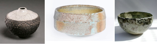
My interested to this topic started a couple of year ago with studying and collecting images of ceramics I could find on web. And these examples of pottery or ceramics for my totally ‘know-nothing’ mind were breathtaking and seemed to be so ‘contemporary’ and sophisticated in their simplicity, untidiness and rough beauty.
read the whole research, download pdf: ![]()
Ludwig Mies van der Rohe
Tuesday, November 29, 2011
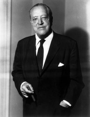
Ludwig Mies van der Rohe (March 27, 1886 – August 17, 1969) is considered as one of the most influential German architects of the 20th century. Most of his work was in the design and construction of commercial and industrial buildings. From his work on the German Pavilion in Barcelona to the Tugendhat House in Brno, the Seagram Building in New York to the Farnsworth House in Illinois. Van der Rohe defined an architectural vocabulary for the modern world in the terms that are clear and honest. Mies’ modernist thinking was influenced by many of the design and art movements of the day. In particular, the layering of functional sub-spaces within an overall space and the distinct articulation of parts as expressed by Gerrit Rietveld appealed to Mies.
The Farnsworth House, one of three designed by Mies van der Rohe “Wohnhäuser (dwelling house)” is in Chicago, USA. The basic idea in designing this window house was a philosophy of “less is more.”
The interior shows its transparent environment. It was all traditional – waived space-defining elements, such as separate rooms, doors, paintings on the wall, etc… It is named after Dr. Edith Farnsworth, in 1946 when Van der Rohe gave them the order to design a weekend house.
Generaly:
The Farnsworth House creates an universal transparency, which enables it to embrace the nature in its wholeness. At the same time the buildings owner called it a “Transparency as like a x-ray” in which the only privacy can be found in the intimate nucleus (bathroom). Almost seamlessly, the daylight brings all of his reflections of nature into the interior of the living space, but the days will return to the night, so one can feel at one with the surrounding environment. He is forced to a “transparent” way of life, unlike the similar designs of Richard Neutra, Phillip Johnson and Albert Frey, in which there is an abundance of materials, never solely glass. The only thing preventing the light entering the house is the silk curtain, which gives the illusion of a luminous crystal at night.
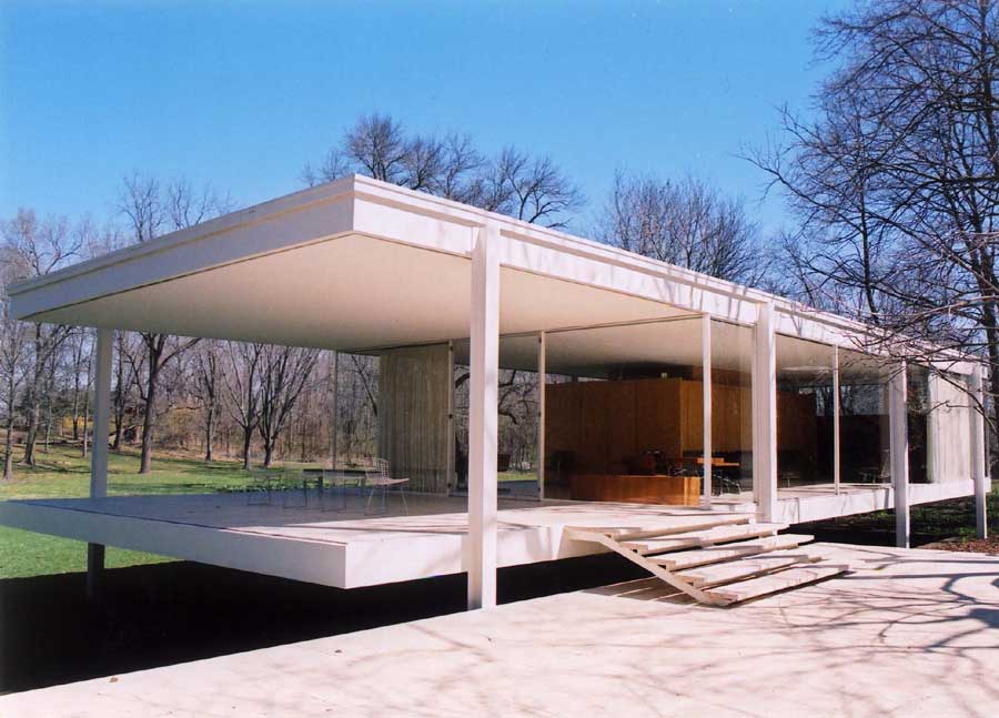
The glass construction enables one swell and fall loose transfer. A conservatory outside, level with the living area, and another little terrace further in, and the overhang of the roof and floor plate, give the feeling of a floating house. The design, based on a strict grid, contrasts the organic forms of nature. The building is decorated in very neutral colors, a white steel structure, with pure silk curtains, the limestone floor lets the colors of nature come into play. The main idea behind the building was to make the building appear inferior to the natural surroundings.
Construction:
The construction is based on a self-supporting steel frame, where the level design is laid out and the relevant horizontal components are raising the ground level by 1.58m.The majority of the facade is glazed, fixed and fastened to the supporting I-beams over the angle. Nowadays single glazing is no longer deemed sufficient enough for insulation. The building is able to use the condensed water for heating. Nevertheless, it serves as a prototype for many facades which are in use today. Single space-defining element is the closed-off area, which includes a kitchen, two bathrooms, a technical side room and a fireplace. From this core zone extends a wall to ceiling, which includes the installation of pipes. The other wall has been stressed in so its non-structural function does not touch each ceiling. The space is divided into four sections by using spatially varying quality.
All of Mies van der Rohe’s furniture is now made according to his designs and specifications. He uses the same materials he used in his architecture; steel and glass. They still work by his mottos: “God is in the details” and “Less is more”. In perfect balance of proportion, function and detail lies timeless natural beauty.
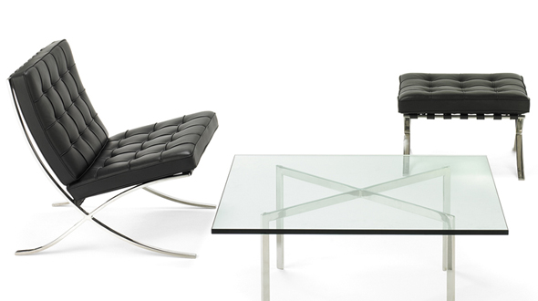
Barcelona Chair No. 7 – reflective finish • No. 8 – mirror finish
Source list:
http://nl.wikipedia.org/wiki/Ludwig_Mies_van_der_Rohe
http://www.furnituredesign24.com/gerrit-rietveld.aspx
http://www.knoll.com/products/downloads/MiesBrochure.pdf
http://www.dhm.de/lemo/html/biografien/MiesvanderRoheLudwig/index.html
pictures:
http://www.google.de/
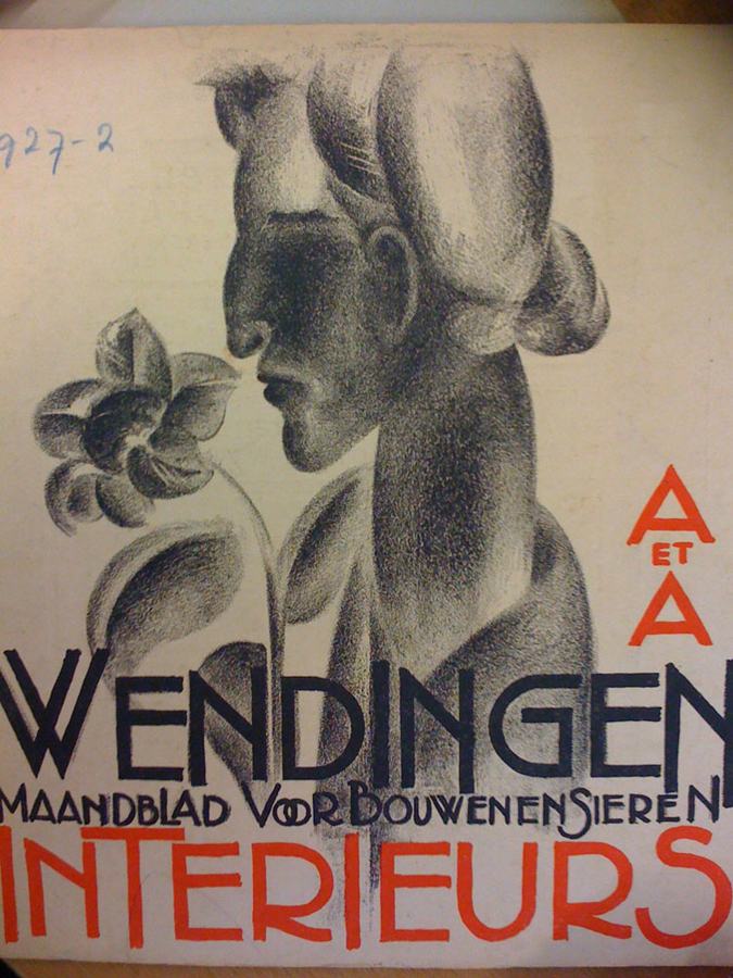
Wendingen Crystal Issue
Monday, November 28, 2011

click the image to download this issue as pdf

Crystalline Fantasies in the World of Architecture is a co-production of

Lotte van der Hoef & Ralph Dennis

Heavenly Glass
Monday, November 28, 2011

The first time I went to the Tuschinksi theater I must have been somewhat around 10 years old. It made a huge impression on me, between all the ugly stores and cheap restaurants, a beautiful building with butterfly cocoons and metal trees.
Remembering this I decided to rediscover this building when we got the assignment on the “Wendingen” magazines.
So with my camera I went there, the building was still as impressive (looking a bit smaller though) and from the entrance to the loge it was a real joy. There is so much detail at first it looks like scribbling, but after a while I could focus on individual parts of the interior. Behind the bar there are three heads, enlisted by glass birds in blue and yellow. The walls mostly covered by paintings and endless woodwork. And the many lamps, in all possible shapes. Mostly they look like stylized insects.
But when I asked a lady if she maybe had some information on the theater and the lamps and glass-work specifically, she told me no. Also, sadly, I could not go past the entrance hall. Luckily I was allowed to take some pictures [x].
Photos without legs
Saturday, November 26, 2011

Gaspar Felix Tournachon was the first man who took to the sky with a camera and a balloon around 1855. Since then there have been remarkable advances in aerial photography such as the use of kites and even pigeons. The idea: let’s make photos from the sky. But the simplest of ideas can evolve to have great consequences and impact on design, science, war, life and perceiving our world.
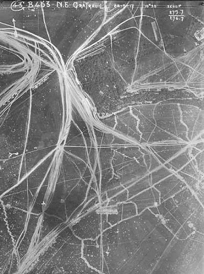
The first Photos taken from the sky were regarded as art. Later the combination of revolutionary technologies were used for map making and surveying. Aerial photography became, like many other advances in technology, big in times of war. During the First World War photos were taken from the sky for mapping and scouting areas of battle. The leap of technical improvements made by the army where appreciated in the scientific world. Scientists were now using aerial photography to develop concepts and ways of thinking. Another contribution to science was the possibility to minizalise field research. However, one problem applied itself: conclusions needed to be drawn from a complex play of lines, surfaces and (black and white) tones. Therefore the interpretation of aerial footage demanded a great deal of knowledge and experience.
De Stijl
Friday, November 25, 2011
Dutch periodical founded by Theo Van Doesburg in 1917 and published in Leiden until 1932; the name was also applied from the 1920s to a distinctive movement and to the group of artists associated with it. The periodical’s subtitle, Maandblad voor de beeldende vakken (Monthly Journal of the Expressive Professions), indicates the range of artists to which it was appealing, and van Doesburg’s intention was that it be a platform for all those who were concerned with a new art: painters, sculptors, architects, urban planners, typographers, interior designers etc.
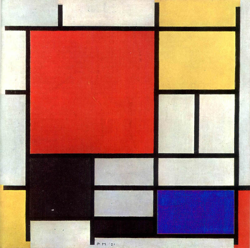
Proponents of De Stijl sought to express a new utopian ideal of spiritual harmony and order. They advocated pure abstraction and universality by a reduction to the essentials of form and colour; they simplified visual compositions to the vertical and horizontal directions, and used only primary colours along with black and white.
.
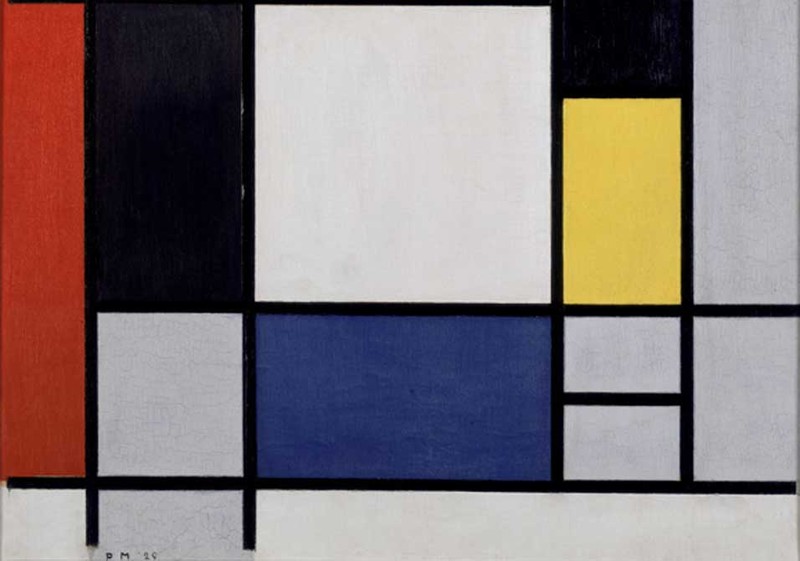 Piet Mondrian, Composition with Yellow, Red, Black, Blue and Grey
.
Paintings in Wendingen magazine
Friday, November 25, 2011
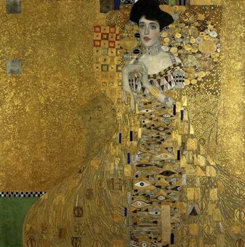
In my research project I became very interested in some paintings that I found in one of the Wendingen magazine I researched. It was very strange to see some issues about Pyke Koch or Klimt because Wendingen was a monthly publication aimed at architecture and interior design. I am wondering why the chief editor who was the architect H. Th. Wijdeveld decided to publish some issues about paintings in this magazine which appeared from 1918 to 1932!
After the First World War in Europe it was a difficult and depressing period. For the young hoping for careers in architecture, painting, sculpture or interior design the prospects were bleak, with preference inevitably going to older and more experienced exponents with establish reputations, the fact of being young meant a disadvantage. Even the older generation with a record of solid achievement reaching back perhaps to the days before the Great War found it hard to make ends meet in the drab years of the Depression and anyone fortunate enough to be in safe and congenial employment took care to hold on to his position at any cost. It was quite hard for painters to alone sell of their works and many artists started to paint decorative elements screens for interior decorators or to design china or textiles. It presented good opportunities to earn some money. On top of all that, a new movement – Art deco started to come in use.
Art Deco took place in various subjects including architecture.
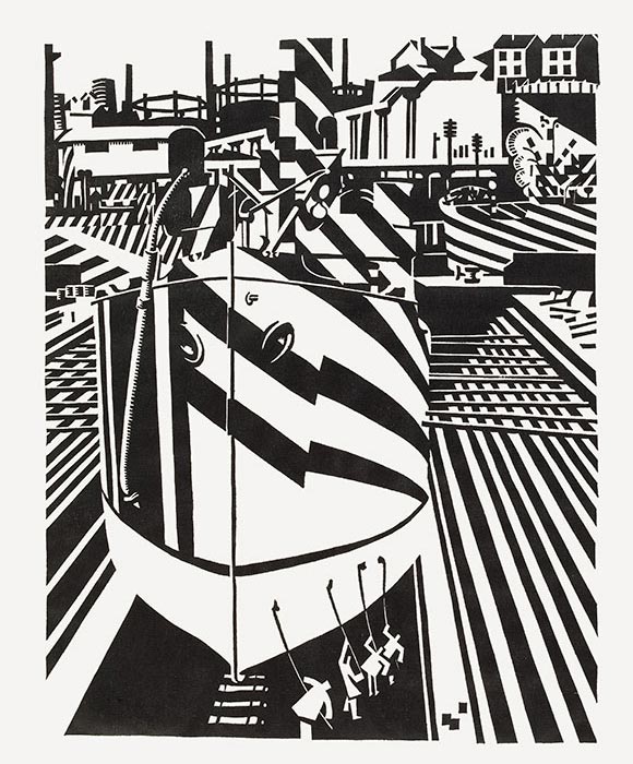
Frank Lloyd Wright was at the end of the nineteenth and beginning of the twentieth century the American architect credited with the invention of the skyscraper. Wright was instrumental in fashioning a specific American Tradition of modern decoration upon which American Art Deco was built. This is particularly true of the horizontal style of domestic architecture. The best example is ,,The Robie House’’. Inside of the building you can find a lot of decorative elements. On the wall you can see long, black stripe, on the windows arty stain glass, which bright designs. All these Art Deco elements were influence by a number of other art movements. For instance, Edward Wadsworth was one of the main figures in the Vorticism movement. If you look at “The Robie House” walls and ,,Liverpool shipping’’ you can see that Wright using the same concept of a vortex as Edward.

You can find the same examples with Art Deco style and Expressionism(forms derived from nature are distorted or exaggerated and colors are intensified for emotive or expressive purposes), Futurism (forms derived chiefly from Cubism were used to represent rapid movements and dynamic motion; showing hostility to traditional forms of expression), Cubism (the reduction of natural forms to their geometrical equivalents).
In Amsterdam you can find Art Deco style in Architecture too. One of the most famous building is ,, American Hotel’’. It was built in 1900. In American Hotel there are many features which are typical of the Art Deco style period, such as the stained-glass windows. Also you can see some paintings which are placed inside. The café American has beautiful interior which reminded me some of Klimt works. Ornaments on furniture (especially on chairs) and colour palette are quite similar like The Café American.

Moreover, one of the Dutch artist- Pyke Koch was interested not just in painting and drawing but in interior design too. He created and also made interior designer for the van Dam van Isselt house in Utrecht. Pyke Koch painted on the marble table, garden doors and painted dolphins on the floor.
Wendingen magazine was published in 1918 almost in the same period when Art Deco movement started. I think this style was very important in a lot of art fields and it was relevant with architecture and interior design. It can be a reason why in Wendingen magazine you can find some information about artists who was the most concentrate in paintings.
Rietveld knew his lines
Thursday, November 24, 2011
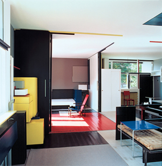
Two years ago I was building a model of a chair. After I have stared in 50 minutes of a detail of two black straight lines at the chairs back, my friend asked me: ”Julia what is it about your lines? There is only a difference of one centimeter?” I didn´t know what my problem was, but I knew this centimeter was a critical part if my chair would communicate or not. When I visited Rietveld Schröder house I got reminded of the situation with my friend. Every centimeter of the house was dynamic. The Schröder house with its characteristic bright colors and construction touched me. I could relate to myself in the aesthetic expression, but what do I have in common with the way Rietveld was working with the Schröder House?
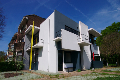
Mrs. Schröder let Gerrit Rietveld design a house for her and her children. Rietveld and Schröder worked with the original idea together but Rietveld decided about the color and form. Mrs. Schröder wanted to have the interior with an open space that was customized for her everyday activity. Rietveld created a house that combined this everyday life with a playfulness. The house is made like a coordinate system of flat surfaces and straight lines. He used geometry och mathematics as a tool and trusted his feeling when he created the form. Gerrit Rietveld could feel if a form was working or not. He was only using geometry and mathematics as a tool. He was thinking in three-dimensional terms and sketched in 3D. His first model was made of solid wood which gives character to the building. The second model was made of cardboard, glass and matchsticks which is different from clay that usually is used as model material.
He worked asymmetrical when he composed volume of the different surfaces. One rule he used was that the lines should not be perpendicular or parallel with each other. This is associated with his feeling of three-dimensional forms. He could feel when the planes have the right position.
He worked playful with the surfaces. When he was working with overlapping he always let one line continue in front or behind the other one. I believe that if a corner had been formed it had been a static expression. Some surfaces were slotted in the facade so it visually looks like they go into the wall. He built volume by letting the flat surfaces be slotted into each other. The Schröder House has multi intersections for the structure, but the main reason for that solution is aesthetic.
For Rietveld it was more important to create volume with space, then the material with which it is built. He said “The reality which architecture can create is space” (The work of G. Rietveld architect; Theodore M. Brown; A.W.Bruna & Zoon, 1958).
He was influenced by De Stijl’s paintings in the way he choose to paint details in bright red, blue and yellow. The facade was painted in white but with blocks of three different shades of grey to make the surfaces fold back into each other. He decide to have black lintels to make them reflect as little as possible and make them become one with the windows. From a light view the window’s reflect black and in that way he made a stronger connection with the interior and exterior space. The colors is important in my personal impression of the Schröder house. I like that he works with color at the same way as with a three-dimensional surface. He gave me the feeling that he was sculpturing more than painting when he arranged the color on the surfaces.
I got emotionally touched by the Rietveld Schröder House because Rietveld did not work with that house in a traditional way. He was feeling the forms. Just like me when I was working on my chair. I knew something was wrong. I am sure that Rietveld has been staring at a lot of angels and compared a 132 cm long beam with a 135 cm long one, when he was designing the Schröder house. Just like Rietveld I prefer to sketch three-dimensional and I´m thinking a lot about how different form relates to the space and to it self. I think Rietveld shows in the Schröder House that architecture can both work as an art aswell as a design object to which you can react and feel touched, but which is at the same time a functional home. That Rietveld used the elementary forms and had the ability to keep their independence in the new wholeness is what makes this house special to me.
Colouring Interiors
Thursday, November 24, 2011
There is no spectacular reason why I chose this Wendingen magazine. I haven’t had the luck to know anyone who owns such furniture or designed their home according to the Amsterdam School. But maybe because I know so little about the Amsterdam School and the Stijl I became curious in it’s influence on present design, art and architecture. Additionally, how do we people living in the 21st century look at the ideologies of the artists like Piet Kramer, Gerrit Rietveld and W. M. Dudok? Also, what do we think of the photographs of interiors that were designed by these designers?
The first thing I thought of when I saw the photographs is that I wouldn’t want my house to consist of only primary colors with the black, white and gray colour combination. I generally find their houses too impersonal and geometrical because of the lack of spontaneity and absurdity.
The Schröder-Rietveld House, however, I find exceedingly playful because of the ability to turn an open space into separate private rooms. Also, the practicality of the house is simple, sincere and has its particular charm.
The main reason why I liked this ‘Wendingen’ magazine was because of the numerous black/white photographs. My focus also drew to the captions underneath the photographs 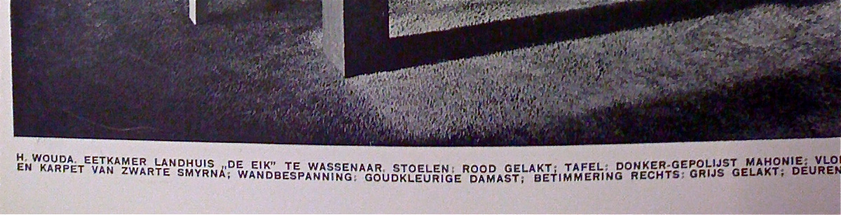 as they tried to describe the colors of the furniture, which you could not see or even guess.
For some years ago I liked to find old , black & white pictures of random rooms. I would use colored pencils to color these, for example, living rooms or dining rooms in. I would attempt to make the color combinations expressive, intense and sometimes clashing so they become livelier.
I like to work with themes such as nostalgia: focus on the beauty as on the absurdity of it. The furniture in the ‘Wendingen’ issue have a touch of nostalgia now, which I do not believe that someone like Rietveld or Kramer would have wanted their designs to turn into. This is simply bound to happen, so the interesting part to it now is what to do with these photos in the Wendingen issue?
There were several photographs of Piet Kramer‘s work in the issue, which I genuinely like, and who is now one of the known key figures of the Amsterdam School. I did a bit of investigation on him to see what else he has made, how his style developed and who he worked with etc. This I considered to share on the blog but I did not desire to simply focus on him but specifically on the work shown in the issue. I wanted to rediscover the style of the Amsterdam School and turn these practical and geometrical methods into something bourgeois and decorative and work against their ideology, without offending them.
Why artists want to be different
Thursday, November 24, 2011
After visiting the Rietveld Schröder House(>) in Utrecht and listening to the guide’s explanations about Gerrit Rietveld himself and his approach to art and architecture, I started to think and wonder about our school, The Rietveld Academy. Everything the guide said sounded familiar; Rietveld started his projects by making 3D sketches out of paper or cardboard, rejected decoration without some kind of function, loved simplicity, searched for refreshing visual effects, but the most important; every time he took a chance by just doing something.
Why are we learning this way of expressing ourselves? What was wrong with the traditional academic approach? And why is the Rietveld Academy still known as being different then other Art schools? I started my research on this subject after reading about the Vienna Secession in the ‘Wendingen’ (>).
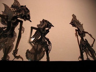
Wayang van Oranje
Thursday, November 24, 2011
3 weken geleden hebben we een bezoek gebracht aan de Rijksacademie, hier mochten we oude Wendingen inzien. Al gauw vond ik een exemplaar wat mij gelijk aantrok, dit ging over Marionetten poppen. Het gedeelte dat mij het meest interesseerde gaat over de Wayang poppen. Ik ben zelf van Molukse komaf en ben opgegroeid in een familie met Molukse normen en waarden. Ik herinner me nog heel goed toen ik een jaar of 6 was dat mijn moeder thuis een Wayang pop had, het was een Wayang Kulit (Letterlijk leren wayang). Als kind was ik er bang voor. Hij rook vreemd en zag er eng uit, had hele dunne armen en een spitse neus en hij hing in de kamer van mijn broer. Na het inzien van deze Wendingen kwamen deze herinneringen weer boven. Ik was erg benieuwd wat de wajang poppen betekenen, waar ze vandaan komen en wat voor verhalen ze met zich meedragen.
Verder dan Faust..
Thursday, November 24, 2011
 Ik zit in het archief van de rijksacademie en blader door de Wendingen issues. Opeens stuit ik op een uitgave gewijd aan de internationale theatertentoonstelling in het Stedelijk Museum Amsterdam [x]. Mijn oog viel op een afbeelding van een decortekening van Goethe’s Faust ( domscene I) getekend door Kurt Gutzeit. Een architect afkomstig uit Duitsland, lid van de Deutsche Werkbund Een groep van kunstenaars en architecten. die in 1907 in München werd opgericht. De oprichters van deze werkbund streefden naar verbetering van het kunstnijverheidsonderwijs en kwaliteitsverhoging van de gebruiksartikelen. Ook namen ze een hele open houding aan tegenover de machine. Ze wilden een hechtere band smeden tussen kunstenaars en industrie. Dit verklaard de connectie tussen Kurt Gutzeit en de Wendingen. Ik ben altijd geïnteresseerd geweest in theater, het is een op zich zelfstaande kunstvorm. En hier wil ik uiteraard meer over weten.
Frank Lloyd Wright and the Dutch connection
Thursday, November 24, 2011
Frank Lloyd Wright had his breakthrough as an architect in 1893 with the Winslow house, then he was only 26 years old. 65 years later in 1958 he saw his last project finished, the Pilgrim Congregational Church in California, then he was 91. Durning his long career he became one of the most important and influential architects of the 20th century, and is credited to be on of the founders of modernism. Wright supplied some of the essential bridges between the architectural culture of the nineteenth century and that of the twentieth. He also was one of the first architects to break with electicism founding a new style based on a spatial conception of interpreting planes and abstract masses. This is considered to have evolved into the international movement, particularly through Dutch developments.
Jan Duikers, a digital tour through memory lane.
Thursday, November 24, 2011
Some people may remember taking the fast turn around the corner into the Cliostraat for the very first time in their lives. I do. Others remember being safely tucked in a seat on dad’s bike, speeding through the grey streets of Amsterdam, early in the morning on a sunny day in September. Suddenly dad’s brakes and stops in front of a building quiet different from buildings you are used to know. The whole neighborhood seems like one grey mass of brick, but this building looks different. You get pulled of the bike, dad takes you by the hand and leads you through a gate onto a large playground. The glass building overlooking the square completely dominates the open space formed by the surrounding buildings, not by sheer size but by its open form, the glass used and the clean paintwork. Placed diagonally in the open space, it seems to form a glass palace, safely hidden by the housing blocks surrounding it, protecting, but also open and inviting.

eerste openluchtschool voor het gezonde kind