Bloody Revolutionary Immaterial Pink Homeless
Heavy White Monumental Attracted Blank
Old-fashioned Evil Digital Tijdloos Shiny
Material Playful Basic Sorry Smoking
Porcelain Content Extraordinary Insecure
Cross Fluffy Childish Primal Tacky
Some works initially aim to touch your feelings and to change your carefully complied seeing of life. They can cause a whole pattern of various emotions from the complete abhorrence to inexpressible delight. I walked through the halls of the “Dream out Load” exhibition and noticed a small group of people gathered around something that seemed to be very interesting. “That’s gross!” – Somebody exclaimed but continued starring at the subject of interest. I love gross and in a second I found myself looking at the “Circumventive organs” by Agi Haines and a short footage about implanting the organs inside the artificial (I hope so?) human body. From that moment I would start calling her “a mad scientist” of the design. What she designs is not posters, not buildings and even not that fancy clothing you are wearing. The subject of her focus is mainly a human body and organs.
Electrostabilis Cardium by Agi Haines on vimeo
With the introduction of bioprinting the possibility of new organs is becoming a reality. The ability to replicate and print cells in complex structures could mean different cells with various functions could be put together in new ways to create new organs we would take millions of years to evolve naturally. Frankenstein-esque hybrid organs could then be put together using cells from different body parts or even different species.
This short film envisions the surgical procedure designed for the fitting of Electrostabilis Cardium, a defibrillating organ using parts from an electric eel that can discharge to release an electric current to the heart when it recognizes it going into fibrillation (heart attack).
Alongside the film are other ‘Circumventive Organ’ designs including Tremomucosa Expulsum an organ that uses rattlesnake muscles to release mucus from the respiratory system of a person who suffers from cystic fibrosis and dispel it through the stomach, as well as Cerebrothrombal Dilutus which contains cells from the salivary gland of a leech and releases an anticoagulant when it feels the pressure of a potential blood clot in the brain as a way of avoiding a stroke.
Agi Haines’ mind-bending, hyper-real sculptures function in an epistemological limbo, existing somewhere between art & science, technology and ethics, and present and future. Haines creates pieces that are uncanny, transgressive, and sometimes conflicting, stunning in their insight and repulsive in their execution. Her near-future world is one in which rattlesnake muscles can be 3D-printed, inserted into the human body and used to combat cystic fibrosis.
I chose Agi’s work as a main topic of my research because bioprinting and bioart is something that intrigues me a lot. Though I was never familiar with bioprinting, I was always interested in this incredible and magical world of the body and it’s insides, how it lives, transformes, reacts and evolves. I am fascinated by the possibilities of 3D bioprinting and how it can affect the evolution process. My belief is that the future of design lays in more extensive work with human body as a material and If I will be given a chance to take part in the process of organ designing, I would be glad to create something useless and provocative. In the interview Agi explains how the organ printing works: living cells mixed into cell-friendly material, such as collagen, that will make a scaffolding for cells to grow on. Then the organ is being printed layer by layer, just the same as an ordinary 3D printer works.
The ability to replicate and print cells in complex structures could mean different cells with various functions could be put together in new ways to create new organs we would take millions of years to evolve naturally. Haines envisions what it would be like to not only replicate existing human organs, but also produce newly designed, improved organs for implantation as (curative) therapy for chronic diseases and defects. In the same way, animal cells with useful properties might even be employed to create organs with entirely new properties. An organ that incorporates eel cells could conceivably function as a natural defibrillator, delivering a resuscitating electric shock in case of cardiac arrest.
If you prick us do we not bleed" work by Agi Haines
… can we consider bioprinting as an art form?
I keep on asking myself this question, because the border between biology, genetic engineering and art rapidly disappears, or, more likely, has already disappeared. Tissues, organisms, organs and bacteria became a media to create works of art. They have been used in the same way as one artist would use the paintbrushes or the materials from the Rieveld’s trashcans.
Even before the bioprinting, American artist Eduardo Kac established the name “Bioart” for his works. Kac considers himself a “transgenic artist,” or “bio artist,” using biotechnology and genetics to create provocative works that concomitantly explore scientific techniques and critique them. In 1998 he comes up with his work “Genesis” that explores the intricate relationship between biology, belief systems, information technology, dialogical interaction, ethics, and the Internet. The key element of the work is an “artist’s gene”, i.e., a synthetic gene that he invented and that does not exist in nature.
"Genesis" by Eduardo Kac
Another project of Eduardo Kac was famous glowing rabbit called Alba. By injection of green fluorescent protein (GFP) of a Pacific Northwest jellyfish into the fertilized egg of an albino rabbit he creates the bunny that can glow green when illuminated with the correct light.
“GFP Bunny” has raised many ethical questions and sparked an international controversy about whether Alba should be considered art at all. “Transgenic art brings out a debate on important social issues surrounding genetics that are affecting and will affect everyone’s lives decades to come,” Kac is quoted as saying.
'Alba' glowing in the dark bunny, by Eduardo Kac
Faced with some operations our aesthetic but also ethics sense is often put in a critical position. We are forced to redefine the border between animate and inanimate world and our definitions of subject and object. Indeed, when the symbolic and material boundaries of humans opened to technology, some considered it as hospitable, however many found it offensive or even dangerous. One of the main concerns about bioart is that people view it as an unnecessary use of living organisms. While the use of living organisms is often tolerated because they are used for research and thus improving the quality of peoples’ lives, bioart is often criticized as an uncalled-for practice because of the role of aesthetics in the artworks. In addition, bioart creates uncertainties among the public because bioart projects such as eugenics are undertaken by artists and not researchers. Nevertheless it is important to bear in mind that (bio)artists also need to do research prior to conducting their experiment or artwork.
Coming back to bioprinting as an art form, I would also like to mention the Dutch artist Diemut Strebe and her 3D printed Van Gogh’s ear. She created the replica ear using living cells from van Gogh’s great-great-grandson. The ear itself is made from actual living tissue and was 3D printed into a shape resembling van Gogh’s left ear. The ear is currently being displayed in a German museum and is suspended in a clear display case full of a nourishing liquid that is expected to keep it viable for many years. The artist has also added a microphone to her installation so you can actually speak to the replica of Vincent van Gogh’s severed ear [x].
"Sugababe" by Diemut Strebe • "Body Modification for Love" by Michiko Nitta
Another artist, who is trying to make our life more interesting, bypassing the ethic issue, is Michiko Nitta and one of her works – Body Modification for Love. It is an idea which could be developed in the future – a technique for genetically growing selected parts of another person on another person’s skin. What Nitta is proposing is for example a nipple of ex-girlfriend or a mole of ex-boyfriend. Patch of living hair would be also possible to grow on somebody’s else arm. It is supposed to be a new form of tattoo as Nitta says. Parents are always upset when their kid makes his first tatoo. How upset they are going to be now, when their beloved one would come up with a nipples on his forearm?
The options are endless and there are a lot more projects, researches and artists I could also mentioned here. There are a lot of things to discover yet and who knows – maybe in the nearest future our bodies would be modified and consist of artificial organs? Not the best scenario, to be honest..
This research project is based on the "Dreaming Out Load" design exhibition curated by the Stedelijk Museum Amsterdam
Have you ever had different impressions than in the past or than other people in the same space? I can give two examples;
There is a place where I always pass by with my bike. Today, I decide to walk along that same space. I stroll in this space. I ramble through every corner and small alley. My feet lead me to the scenes which were always there but very new to me; an ivy-covered wall, small scribbles of children probably who lives in this neighborhoods, tiny bike tricycle lying on someone‘s front garden and windowsill-piece with nice touch. I enjoyed these scenes while walking through the same place where I pass by regularly. I always thought I knew this place very well, but today I was only started to become conscious of these new and everyday-life scenes.
My friend and I passed through the narrow alley and came to a small door. When we opened the door we were able to enter a space. It was deep and narrow. The width was not enough for us to stand side by side. The side walls are high and ceiling was open towards a nice blue sky. I could see a bird flying and hear the wind. Space was quite dark, but I felt very comfortable and fresh. But my friend had left the room already, later she explained why; she felt almost choking so left the space early.
This might be a daily experience which we encounter often, but if it occurs too often we might not put any extra attention to it. I had a curiosity for this event, and wondered why there are such differences according time and person. I am sure that many readers had the same experience like this and wondered about it.
Metaphorically speaking, space is ‘vessel’ that contains food, and this food can be defined as ‘happenings (or events)’ in the space. This ‘vessel’ gains its meaning only when it is used and it meaning will be even enlightened if the ‘food’ is delicious. On the other hand, the shape of ‘vessel’ differs according to its containing food; bowl, plates or cups. Every food has is matching vessels, if it is not matched well; simply, the food loses its merits. And of course this same food in same vessel can be tasted differently to every people depending on their preference or their body conditions. This ‘taste’ can be also, metaphorically, defined as ‘spatial-experience’. I want to explore these factors that create different taste which can be said as ‘recipe’- The secret of tastes. And I presume this factors-recipe- is ‘Experience’.
I "Am" "Here" In This Space "With" You : read or download my thesis below
It appears you don’t have a PDF plugin for this browser.
No biggie… you can click here to
download the PDF file.
This essay initiated my graduation project “A Scenic Contemplation” presented at the grounds around the Rietveld academy as part of the 2013 graduation show.
– A Korean Philosophy about window and surrounding says: “ Window is a frame that can hold scenery.”
This philosophy about the window is called “borrowed scenery”. The borrowed scenery method reflects the exterior landscape into the inner spaces, forming new scenery.
This method does not destroy environment. It just borrows the environment. If you follow this philosophy you can live with a breathing landscape painting. When you borrow a landscape via the window, the architecture can breathe thought the window. The borrowed senery method make your senses soft.
I was impressed with this philosophy, especially with the attitude and the way how they treat the environment. They did not use the environment only for their own sake, but they borrowed the scenery and lived along with it.
It is a humble way to live with the environment.
text by Hanna Lee [graduate student department of inter-Architecture 2013]
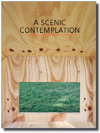
Download the publication ”A Scenic Contemplation“
Exploring Valencia (Spain) as a prologue to Manifesta8, most students of the Basic Year visited "The City of Arts & Sciences" designed by Santiago Calatrava. As inhabitants of The Gerrit Rietveld Academie designed by, and named after Gerrit Rietveld himself, a comparison became inevitable. What follows are their comments and images.
[comment by Alexandra Karpilovski]
Calatrava feels like something not for you and not for me, but for someone whom we do not see. It makes me feel small, but also nothing.

It makes me think of a monument over the times that has passed, something sculptural and grand and made to impress but fails in that and becomes something static and untouchable. That a buildng that takes up so much space is mostly used to see and not to be touched.

The difference between Calatrava and Rietveld is like comparing two different worlds. For me Rietveld represents a calm structure, everything fits effortless and live in symbiosis with each other, the whole mind behind the building is put into place, on the exact spot where they should be, the body of the houses is on the inside, while Calatrava on the other hand just goes manic and drags different forms into space, just to make it look interesting.

Calatrava makes me feel that someone is trying to say something, but of course I don´t understand, it is to big for me.
[comment by Michael Hautmulle]
Both Calatrava and Rietveld are known for the details in their work, and it shows in both their work. The way in which they both apply it is very different however, where Rietveld has designed beautiful buildings, they are beautifull because of their practicality, 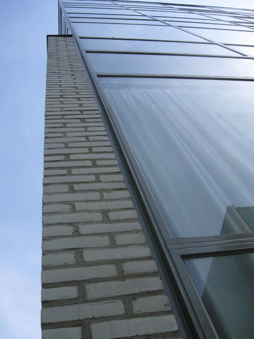 so that every detail
is constructed to make the use of the building more clear and make the life and function of the occupant more clear. Calatrava has a very different approach, he uses details purely on an esthetic basis, his building may not be very practical, I do not say whether or not they are beautiful, that is an individual matter, 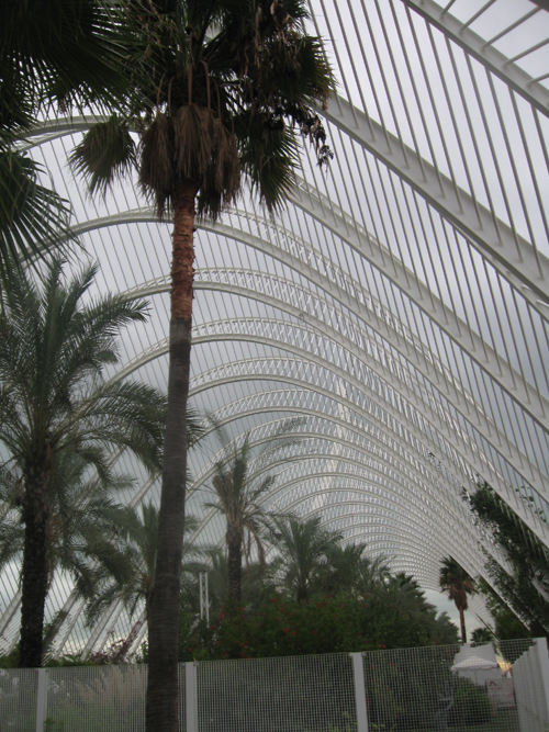
but every centimeter has been specifically designed to create the image that he desires. Again I do not wish to say much on the matter of esthetics, but I do believe that the most beautiful design is that which serves a purpose, not for idle beauty but as an object, or building, that fulfills its purpose well. That is the most beautiful of all.
[comment by Titia Hoogendoorn]
While Calatrava’s architecture could be seen as a sculpture and sometimes almost as decoration for the surroundings, Rietveld’s buildings are anti-decorative and more an expression of architecture. They both include the environment in their works. One by fitting in (Calatrava) and the other by adding (Rietveld). The shapes and colours of Calatrava's buildings are flowing along with nature (blue and white/sea and air) in comparison to Rietveld who devides space accentuated by primary colours. The architectonic skeleton of his buildings coincide with the construction while the skeletons of Calatrava seem an effort to make them visible on the outside.
[comment by Anna Kinderman]
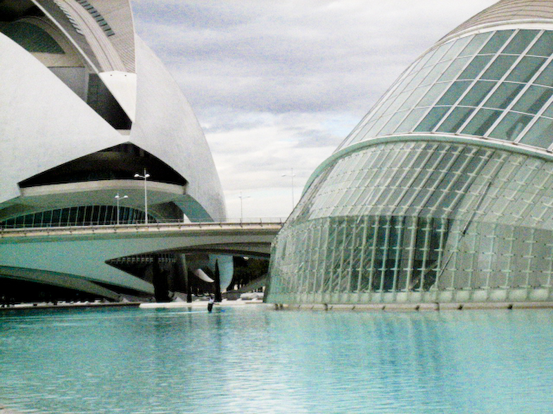
Inspired by organic beings Calatrava forms futuristic, abstract entities, which he covers with diverse details and additional figures. Many details are purely visual and omit practical ulterior motives. However, he is limiting to discreet colors like white, blue and azure. Inspirations: torso, bull ribs, foliage,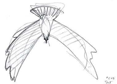
 wings. His buildings are more like sculptures than functional buildings.

In contrast Rietveld is interested in function. He was inspired directly by the materials and dealt with the use of the building. With the reduction of coloring to the primary 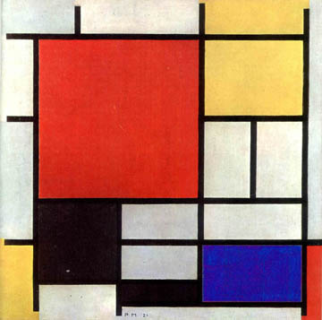
colors like red, yellow, blue, black and grey he wanted to emphasize the different layers/planes. His strict geometry and minimalistic tendency distinguishes him from Calatrava like black from white.
[comment by Lovie Peoples]
Rietveld and Calatrava are two totally different architectures to me, both in the way their buildings look and the feeling they mediate.
Calatravas buildings are like sculpture houses and bridges. Fixed artworks that was created to demonstrate what he wishes to show. His imaginations illustrated on the ground in a space. To me it doesn’t leave that much to my imagination you are in his world. Either you like it or you don’t.

Rietveld houses have an obvious presence, melting in to their environment instead of creating an environment totally in them self. Which makes them a part of it and lifts them up. They make a dialoged to the space around it and invite me to feel at ease with my own thoughts and feelings in them. A meeting point in what he has left as a building and the person in them. An open dialogue with the viewer.
[comment by Molnar Tamas]
The two architects represent opposite design philosophies and approaches to man and its created environment. While Rietveld takes man and its size as starting point and adjust details to this, Calatrava creates vast spaces and buildings to impress the viewer, making man’s size unimportant. The Spanish exaggerated “machosim” meets the cool and minimalist Dutch world. Experience vs. functionality.
However, both of them are lacking in cosiness, Rietveld’s sharp edges and grey colours are rather cold and not welcoming. Calatrava uses the huge size of his buildings to alienate the spectators, making them feel being in a church or at some futuristic place. His typical white colour also contributes to the sacred, church-like sensation, where one should feel devotion and its own littleness. The usage of forms is also different. Rietveld introduces forms derived from the cube, the “box”, making and industrial and artificial look. Calatrava prefers the organic shapes, however, those are clearly computer generated “natural” forms put in order which finally results in the experience of an artificial environment just like in the case of Rietveld.
[comment by Pieter Tensen]
Calatrava designs buildings you can hardly call buildings. They are more like sculptures you can visit. This is something you really notice from the outside and is a major point where Calatrava confronts Rietveld in his designs. Rietveld cared about the outside of a building too, how it looks, but it appears obvious in that way.
In Rietveld’s buildings everything is build up out of 90 degrees corners. This was his main trademark. Natural shapes and the human body, on the other hand, inspires Calatrava. They have one major thing in comment. They both care a lot about details. Although the buildings they designed we’re big and impressive sometimes, the eye for detail is very specific for both.
[comment by Stefan Voets]
“Rietveld adored light and bright spaces without too much detail. This is why most of his buildings are made of primary colours and forms (squares, rectangles). According to Rietveld, a building has to be functional too (functionality is extremely present in his architecture). Calatrava’s work is differently shaped, because of the massive surfaces and the lesser subtility. The material is heavy-looking.”
My second search in the library, this time with a whole list of tag-words in the back of my head. I try not to search for something precise, but rather let it come to me. I pick up a lot of books, not knowing what feels right. Then I see a book with an interesting structure on the cover. It looks like a computer-drawn structure, like a cheap 80’s wallpaper. On the first page I read that this publication is part of a numbered series, from 1-1000. While making this book, by using different techniques, 1000 different books were made. Each unique book has its own number, this one is numbered 756. I expected this book to be about production techniques, but instead it’s about human behaviour and how we perceive things. More human than the cover. More human, less machines.
772.9 suy 1b