Skip to Content Skip to Search Go to Top Navigation Go to Side Menu


"de Stijl" Tag


Chair-making for Dummies


Tuesday, October 24, 2017

“A seperate seat for one person, typically with a back and four legs.”

The result of google-searching what is a chair?


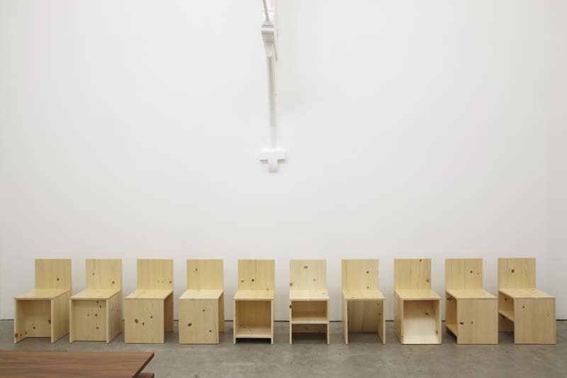
Donald Judd started making furniture when he moved with his family to a remote town in Texas in 1973. No desirable furniture available in his surrounding area, he got to work himself and began making furniture with the only material at hand, lumberyard-cut pine.

Judd thought a chair had to show the function of the object, as well as the image. To sit on it, and a chair. Separating his art from his furniture, he decided he wanted to make “well functioning” furniture, not an “artist’s furniture”. Now, in his opinion a “well functioning” was determined by the following;

“The art of a chair is not its resemblance to art, but partly its reasonableness,                                       usefulness and scale as a chair.”                                       (Donald Judd from “It’s Hard to Find a Good Lamp” 1993)

Besides that he pointed out that if one was to embark on both the path of furniture making as well as art, that there will be consistent similarities in the interests in form.

I had the choice between either doing theoretical research or practical, research for the essay. For the sake of my own enjoyment and an end result where I  have heart for, I choose the latter. Making the chair and experiencing it Now, here my task started. Figuring out how to make a “well functioning” chair, and keeping in check with Judd’s minimalist aesthetic. Truth be told I was quite excited!

For more information on Judd and his furniture I have the following link;

 (click the yellow dot to click the link)

Chairs man


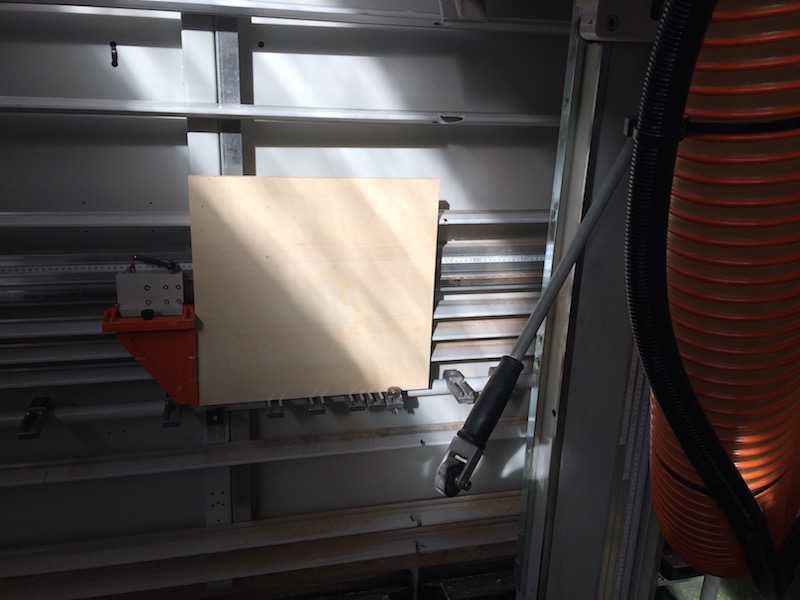
Step one, gather the materials. 

IMG_5774

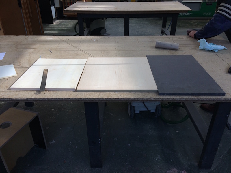
For me I wanted to put myself a bit in Judd’s situation. To gather from the materials to my disposal. I could’ve chosen to let wood be custom cut for me, but I liked the idea of having to find pieces among the leftovers a lot better. And so I found the pieces of wood that could be used as the parts of my chair.


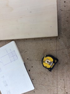
Step two, measuring. 

22790181_736686986530751_938404995_oIMG_5775-300x225

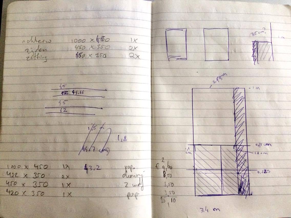
With this I had to keep in mind design as well as function. The width of seating had to be comfortable, but not look off-balance compared to the rest of the chair. The height of the seating was the same case. As for the back of the chair, I decided to make it about shoulder height when sitting down. This was because I have the tendency to hunch my shoulders too much while working on projects. And honestly, if I was making a chair anyways, why not make one that would function for more than just another chair in the classroom? Why not make one that would help with my posture as well? Same thing for the smaller compartment under the seating, great for storing materials in case my desk gets too crowded.


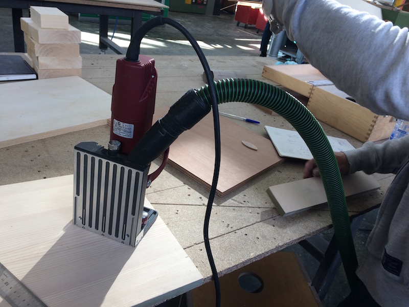
Step three, cutting. 

IMG_5780

Please be careful when cutting the wood! It is easy to forget to adjust the size, and if you cut one piece entirely or even slightly off, you’re a long way from home. Precision is essential with making a chair as simplistic as the ones by Judd. One centimeter off, and the whole work falls apart. Sometimes even literally.


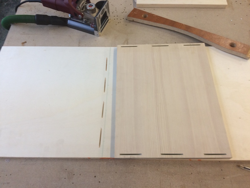
Step four, figuring out how Judd even kept his works together. 

This was easily the hardest part. I love the form of Judd’s chairs, but it was quite complicated to figure out how the wooden chairs remained chairs without any visible nails or use of dovetail joint. I was lucky to receive some help by one of the employees of the wood-workshop. She explained to me that I could make little slits within the wood, to then make one on the other piece of wood which would touch it at the same point. A small oval piece of wood would then be put between the two slits and keep them connected. Kind of like a puzzle piece!


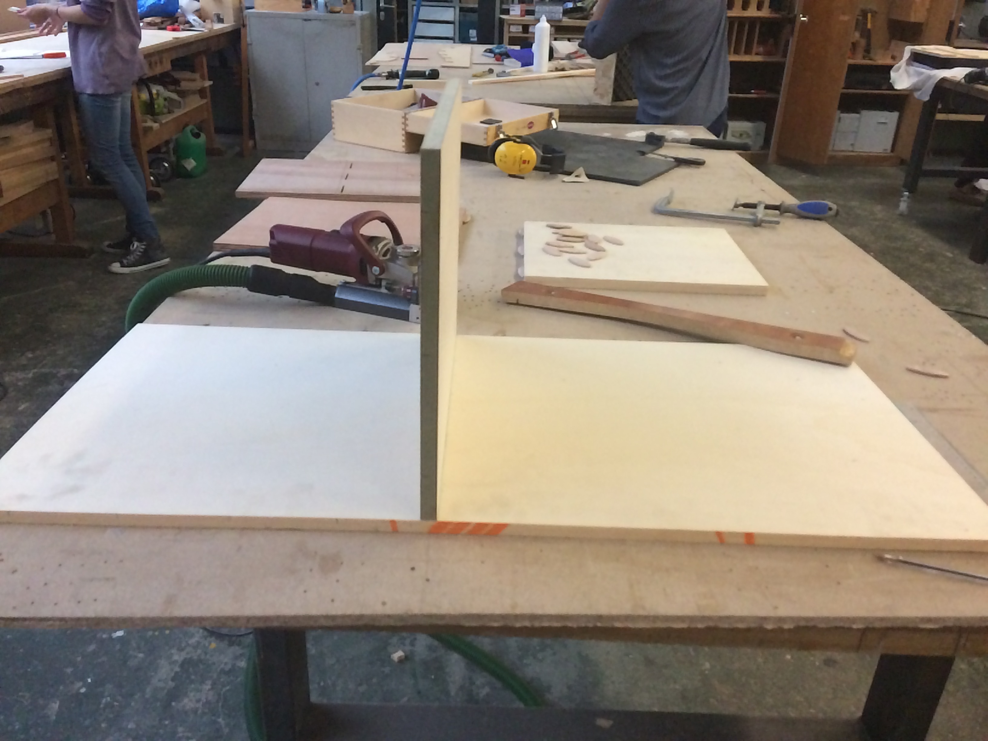
Step five, actually putting it together. 

IMG_5782IMG_5828

For someone that has the concentration level of a fruit-fly, this task was a challenge. You have to make sure that all the slits connect perfectly, align perfectly, and that the width between the slits and where the wood is supposed the end, are the same on both pieces.

Then, you try it out. Put it together to make sure that every puzzle piece connects. Ensuring you did it correctly through and through.

IMG_5827


Step six, keep it together.

IMG_5830IMG_5844

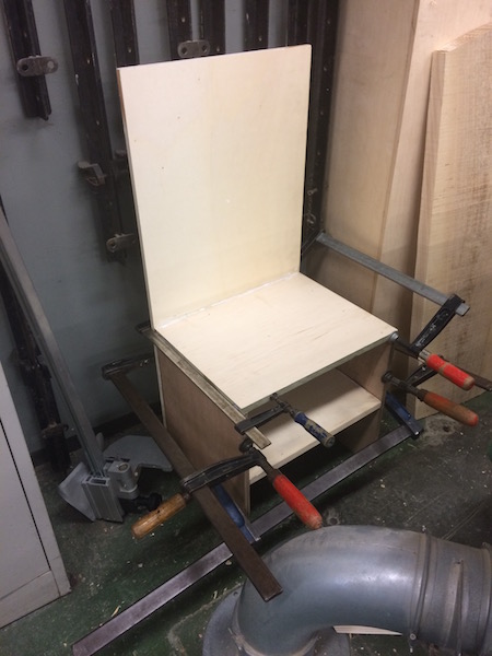
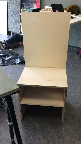
Besides the slits and wooden pieces, you should add glue to keep the chair a chair. Keep pressure on the points where the joints need to be as tight possible, so it can carry the weight of the average person. Preferably a bit more than that.

Let it dry overnight.


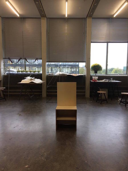
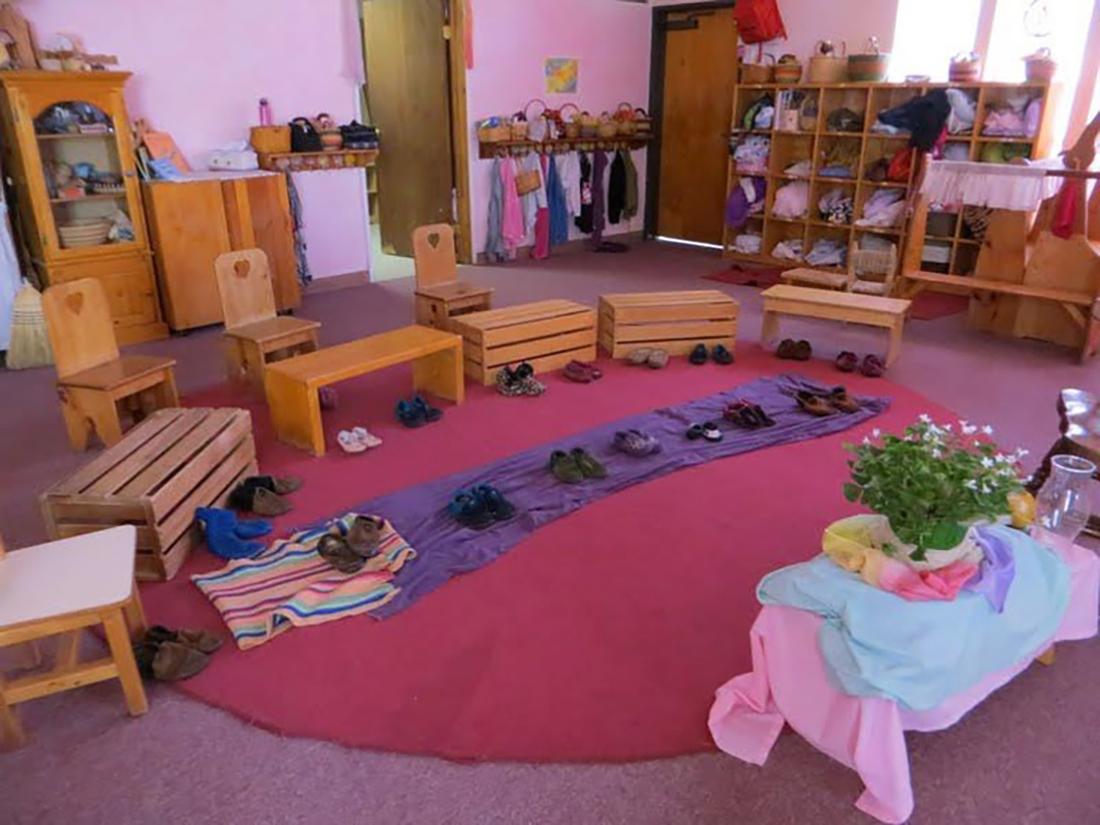
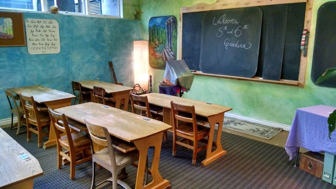
Step seven, place it within school. 

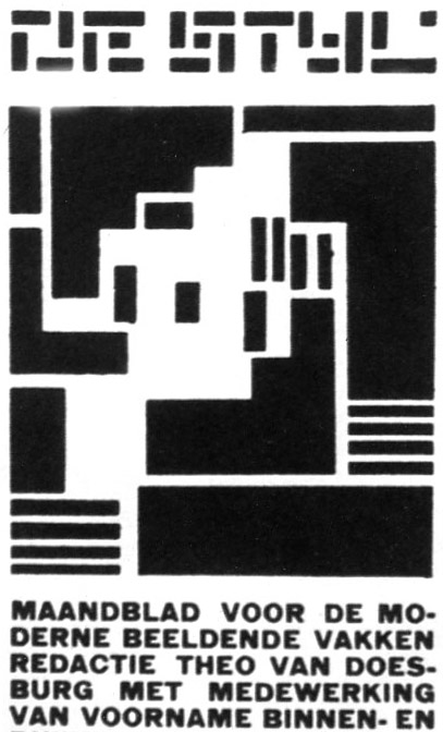
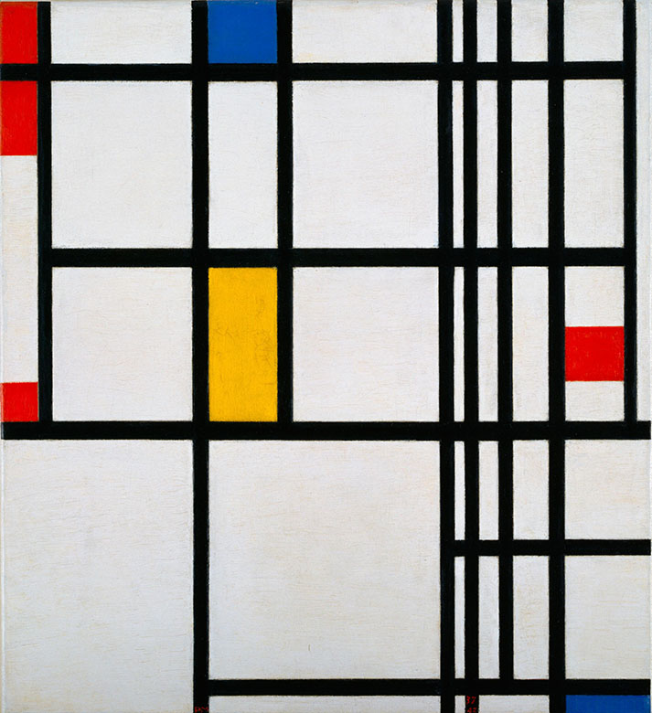
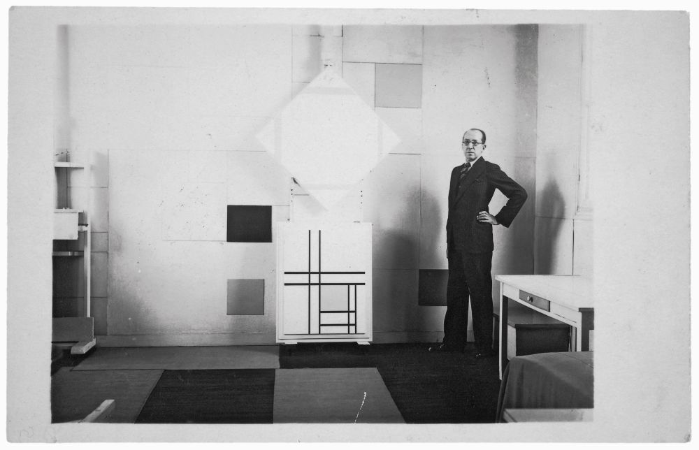
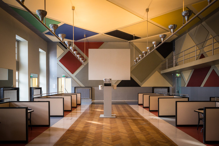
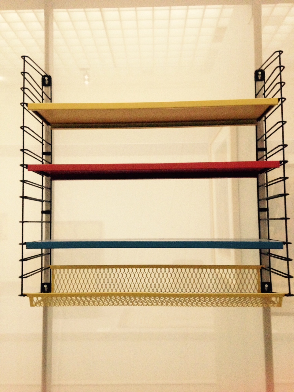
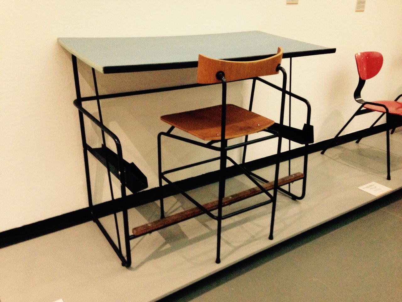
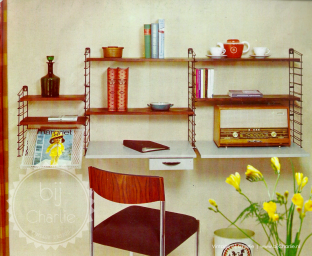
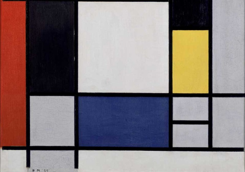
The reason I did this, was because the assignment I had gotten was to explore the similarities within Judd’s furniture and de Stijl. And as Judd had said, if one makes both art, furniture and architecture at the same time, there will be consistent similarities of form within all of these. And Gerrit Rietveld, influential artist within de Stijl, happened to do two of these.  My chair standing there, I saw their shapes came together quite nicely. The same geometrical forms, same practicality.

Now if you are interested in finding out more about the combination of these two things, de Stijl and Judd, please click the yellow square!


 chairio

Step eight, enjoy your work

Sit on it, drag it around to sit on it in different places, store things within the compartment and revel in the fact you actually made something you can use.

I found a few other enjoyable examples of chairs made from things in your surrounding area.

[click the yellow dot , it will lead you to a fun and educational video]

Building Blocks: De Stijl and Typeface design


Friday, October 20, 2017

video-1508250602   Spending an afternoon using an old letterpress I experienced what it would have been like to create printed text in the early 20th century until offset printing took over almost completely. This was a nice way to immerse myself into the subject of De Stijl and its relation to type design.

The Stijl movement which was founded in 1917 consisted of artists and architects who started building a new world, presumably as a result of the war that was just coming to an end. They literally started constructing their ideal world out of furniture, buildings and artwork. It seems to me that they tried to clear up the mess they saw around them by creating perfect straight lines and rigid blocks. Using primary colours, black and white, strict rules and useful functions they began portraying a ‘perfect’ world. In a way, they brought everything back to the basics while simultaneously making basic things more complex.
When researching De Stijl’s typeface design the first thing that comes to mind is the magazine published by Theo van Doesburg. The front cover, designed by Vilmos Huszar particularly caught my attention. Specifically the way the same exact rectangles create both the image and the type.
It seems to me like a practical method to create text, why not use the same structures used to create image, kill two birds with one stone kind of thing, and seeing as the spacers of the letterpress are perfect rectangles why not use those…? The Doesberg type shows this use of the letterpress spacers particularly well. One can see exactly where the spacers have been placed to create the alphabet.

alphabet-Theo-van-Doesburg-02
The same goes for Vilmos Huszar’s use of ‘building blocks’ to create both the text and image of the Stijl magazine cover. Or the logo he made for  ‘Miss Blanche Cigarettes’, again the same shapes are used to create the text and the image.

Huszar


This theme of using the same ‘building blocks’ to create image and text alike began to be a recurring subject in my research on de stijl’s type design. The line between image and text seems to blur and they both become the same thing, both showing information to the viewer.

Another fine example of this, is the 1941 publication of the fairy tale Het Vlas (The Flax) written by Hans Christian Andersen and illustrated by Bart Van Der Leck. The entire book is constructed out of straight lines, both the text and the images. One can see the strict guidelines that Van Der Leck stuck to precisely. This idea of having strict rules interests me, I find myself doing this at times with my own work, for example not letting the pen lift off the page. Although it makes sense to create these guidelines at times, I do get to a point where I’m thinking ‘I could create a more satisfying outcome if I didn’t have these self imposed rules’. Perhaps I am experiencing a similar thought to that of Van Der Leck when after disagreements with other members of the movement he decided to depart from De Stijl and create more abstract works with diagonal lines and other shapes and colours. Here is an early piece by Van Der Leck from his time with De Stijl and then one of his later works where you can see his departure from the strict guidelines.
 

Compositie 1917 no. 3 (Leaving the Factory), 1917 Abstract Composition, 1927
 
Abstract Composition, 1927 / Compositie no. 3 (Leaving the Factory), 1917


Going back to when he did use straight lines to illustrate the images and text for the fairytale, it seems as if this rigid rule was almost created as a challenge… To push further into the non obvious, the non default way of drawing things, the strictly abstract and to also challenge the viewer. In the literal sense as well: the text in this book is not necessarily easy to read.

Lets not forget who the audience of this book was supposed to be. If I imagine coming across this book as a child, lying among all the other softly illustrated fairy tales it would definitely stand out, I would have had to focus extra hard on each letter for it to make sense and watch as the lines constructing the letters merge into the ones creating the images. This principle, the way the image and the text is created in the same way, out of the same blocks is what stands out most about the typefaces designed by De Stijl. To take this one step further, it could be said that it is all the same, all the creation made by these artists is the same, for they use the same rules and guidelines.

The buildings, the furniture, the paintings, the typeface, all a creation from the same lines, forms, shapes and colours. This element is what I tried to explore in this little animation, the way the same ‘building blocks’ can create image and type. The seemingly rigid forms shift and transform around the page and merge into each other. Where is the line between image and text? I tried to play with this concept by letting the ‘building blocks’ move around the page and shift from image to text and then back again.

Colour Coding Space


Thursday, October 19, 2017

When we paint we create compositions, shapes and forms from colour. The colour choice is important in our spaces and on our walls sending messages to the brain, different colours evoking different emotional response. Colour is engrained in literature and film like ‘The Yellow Wallpaper’ where yellow connotes to madness and insanity or visually in ‘Blue is the Warmest Colour’ (where blue features in every scene) we can see it as freedom in deeper tones and a depression as it becomes more diluted, in each context colour can play a different role. Red, the third primary, is depicted as villainous characters and day-to-day we see red road signs as danger. Each colour resonates, we have an emotional response, and this is why the psychology of colour is intrinsic to human life.

Mondrian's Studio Mondrian-composition-in-red-blue-and-yellow-1937

In De Stijl we saw a reduction in form and simplicity of colour pulling back to these three primary colours. This movement strived to strip back the chaos of war and the ornate elaborate architecture of 1917 as painters Piet Mondrian and Theo van Doesburg took two dimensionality into the three dimensional architectural form. In Mondrian’s paintings the lines move out almost from the canvas to enter the viewers own space and pull you in to the squares of colour. In the recreation of Mondrian’s room I felt the same pull, there was a flow in the space that I enjoyed, the room was awash with white but had these fleck of colour that mirror his paintings. The freshness and purity was achieved through colour awakening my eyes to a new experience to colour. It opened up a window to my experience of colour and its effect on the soul, first looking at these three staple colours and then then into the wider sphere of the colour wheel.

Blue

My room also is predominantly white to promote a clean fresh feeling but is splashed with blue in curtains, cushions and rugs. Blue is said to promote a feeling of creativity in a study by the University of British Columbia as creative blue is represented as something that is not tangible, the sky, the horizon, the sea. Where sky meets sea it is a point of contact that can never be reached and this adds space to an environment and seems to give depth to a room. Rudolf Steiner’s schools used colour as a vital part of the formation of a child and blue was especially key. For the 6th, 7th and 8th grade the classrooms where painted blue because Steiner believed that we undergo a 9 year old change, finally seeing colours for what they are. Before the classrooms where painted in warmer reds and oranges because at this age the child sees the colours for their complimentary match on the opposite side of the colour wheel. So, in both cases the cooler blue tones calm the child down and add space for the child to focus, promoting Steiner’s non-suffocating environment to set free their thinking and ideas.

Steiner's Warm Classroom Steiner's Blue Classroom

Yellow makes babies cry and irritation in adults which is why this colour is used to paint restaurant walls, stopping people from staying too long taking up valuable space. Where I currently live the walls are drenched in a bright sickly yellow pressing a sense of forced optimism, this tone reflects more light, excessively stimulating the eye making it understandable that yellow can fatigue both eye and optimism. ‘Yellow Scream’ by artist Kim Beom beautifully reflects this angst creating a composition reliant on the psychological weight of each scream. This use of yellow links back to an idea of madness and as Beom adds black it reflects Steiner’s theory of this darkened yellow depicting the grotesque creating a compelling piece of performance art. It is an unnatural colour, like the other primaries drawing away from the natural mirroring De Stijl’s movement, however out of this context yellow can be antagonistic to the human eye.

Red

In Barnett Newman’s ‘Who’s Afraid of Red, Yellow and Blue III’ we can see the use of an overwhelming red applied layer upon layer, the artist presents us with an invasive red further juxtaposing nature in industrial mechanical colours. This piece demands the viewing to look at it and have a reaction in Newman’s didactic idea rather than that of De Stijl’s expression of freedom, the red evoked such strong emotional response is was attacked by critics and attempted to be destroyed. The red of the teacher’s pen acts as a warning through colour conditioning and it is interesting that within a different a context primary colours can have a different response and pose as a protest. If we add white, however something different happens and pink can be used to calm. ‘Cool down pink’ is widely used in prisons in Switzerland to calm down the inmates because it is believed to be physically soothing. This soft feminine colour has spread through prison to Texas where prisoners are dressed in pink jumpsuits or drunkards being locked in pink cells to calm down. It is interesting how diluting such a vivid colour of blood, passion and anger can alter its effect on the human spirit becoming something to pacify a patient.

Pink Prison Cellpink-jailpink-inmate

The psychology of colour influences how we decorate our homes, institutions and environment. Tonal variation, hue and complimentary colours all play a role in how each day is coloured. De Stijl reduced it down to a purity and simplicity of colour that opens up new ways of seeing, transforming our space into something painterly and making the two dimensional into the three. We connect to colour through conditioning and through tone playing a part in each moment. Colour responds to the spaces we move in and alters our perspective on how we see our homes and world.

A feeling that reality can be heightened


Thursday, October 19, 2017

With my roll of freshly drawn papers I step out of my house on a rainy day in the direction of Rietveld. I see my neighbor throwing away a stack of paper rolls. Another unfamiliar face to me of the many people living in the city of Amsterdam. The rain is too bad to go out without protecting my papers, and I manage to put my roll of papers in one of the tubes.

Satisfied with the abundance of the trash of the city I cycle away. Smiling because I realize that sometimes a problem can be solved unexpected, quick and easy. Many times the world around me seems too complex and too unpredictable to find suitable solutions. This complexity and unpredictability often gives me the idea that the world around me is imperfect and far away of any ideal world, any fantasy world or any utopian world. I start to wonder how artists and designers of different times make an attempt to get step by step closer to for them a more perfect world.

pposter_950


Questioning the material world

Opening my paper roll at Rietveld I see there is still a poster in it. A well protected and kept poster. A poster that once was a solution to a certain question. I try to figure out the question that lays hidden in this poster. Why and based on which principles is this made? As an artist and designer myself, I keep on questioning this to the material world around me. But many times, I find myself in getting shallow answers and understanding of the material world around me.

A well protected and kept poster. A poster that once was a solution to a certain question. I try to figure out the question that lays hidden in this poster. Why and based on which principles is this made? As an artist and designer myself, I keep on questioning this to the material world around me. But many times, I find myself in getting shallow answers and understanding of the material world around me.


                                             The solution for a problem


New Social Design

I send him a mail and we meet up the next day. Melle Hammer tells me how he is creating mainly by necessity. He says "The difference between art and design is ridiculous. The underlying principle is just the creating, nothing else". Creating is not to create a nice fancy tool, not to have something decorative, but just to serve a certain function. He tells that his girlfriend had a birthday party but didn't had enough space to let all the guests sit, so in one day he made a table and extra chairs so all the guests had a place and a table to eat from.

“The difference between art and design is ridiculous. The underlying principle is just the creating, nothing else”

In making his decisions certain things are important. Such as recycling, using everything from the material and not creating waste, and using simple material options and using the maximum of working with the qualities of the material. In hearing his story of his years as a student and as an professional designer you hear mainly his eagerness. The eagerness in his hands, the eagerness in his ideas, the eagerness in his eyes and the eagerness in giving smart solutions to the world around him.

MelleHammer

He tells me that he just moved out. He is now looking for a new place to live and recently went to Almere to visit the project called The Fantasy and The Reality. Thise project I consider as Modern Social Design. Modern Social Design is a new term used in design. A group of people is attracted by it to shape reality. Examples of principles they work from are:

    1. Search a connection with the society
    2. Design social
    3. Sustainable
    4. Connect ethics with aesthetics
    5. Strife towards involvement
    6. Be critical
    7. Be transparent
    8. Be humble and serving
    9. Be dedicated and radical
    10. Take responsibility together.


The fantasy and the reality

All these principles can be found in this project. Melle explains to me that Almere knows two experimental neighborhoods, The Fantasy and The Reality. These two neighborhoods are a result of a contest. On a place of 450 m2 people were able to design a house with fantasy, with a temporary character, this was the assignment for The Reality. The designers did not had to take construction rules, destination plans and quality requirements. The seventies winning designs are realized with a subsidy with ten thousand gilder. Just as The Fantasy, did the buildings get a temporarily character. The place is now functioning as a holy place for people that love experimental architecture. The inventive solutions on energy, price and recycling are serving recent issues. The first experimental neighborhood in Almere was the neighborhood The Fantasy. In 1982 a contest was send out with the name “unusual living”. The idea was to break down the neighborhood after 5 years, but the project was a great success and got the status of high architectural appreciation. After 5 year it was decided to keep the neighborhood. A second design competition started after the success of The Fantasy. To develop diversity was the theme “temporary living”. The participants didn’t had to be a designer or architect. These days a lot of Dutch and foreign tourists visit the neighborhood on a yearly base. In this story as well, you hear that the initial plan is adapted and new decisions are made. This is again the research and the questions again that counts most.

How high can the creative class rise

Giving, creating or claiming empty spaces to let something new emerge is essential for the development of the world around is. This is a great example of a place the government gives to let something new emerge. A answer to a question of how should the world look like when designers get the freedom to create? A realized fantasy, a small utopian answer. These places of creative explosion are essential to create and keep a creative class in society alive. For more in-depth understanding of the creative class, Richard Florida wrote the book “The rise of the creative class“.


Utopian thoughts in design

This wish to develop works for a future utopia is alive in a lot of human beings. To my own surprise, I relate the word utopia in the first place to social and economical issues. The word utopia is first used by Sir Thomas Moore in 1516. He used this word for an ideal community or society possessing perfect socio-political-legal system. In this definition I don’t hear much about architecture or design. Utopian visions are of all times and shapes, as written by Faber and Faber in the Faber book of Utopias. They keep embarking of new creative solutions and ways what it means to be human and live in a society. A specific field that draws my attention are utopian thoughts about sound as a more integrated part of our societies. A specific symposium was held about this topic called Utopia of Sound. This in bundled in a book by Diedrich Diederichsen and Constanze Ruhm. For the excerpt click this link. It was held in 2008 at the Academy of Fine Arts in Vienna.  Here thought were shared about futuristic ideas about the sonic. Not emancipated from music, but sound as a genre on itself.  Sound gives human freedom against the representational logic of notation, Societies can get stuck in patterns that are harmful. How can you give people a mechanism to escape from that trap and make real progress? In many famous utopias, design and architecture are not the main focus but the condition humans live by.


De STIJL

stijl

Although, the fact that De Stijl exists this year (2017) for hundred years made me realize how much designers work from an utopian idea just as much as social and political change makers. An exposition in the Gemeente Museum in The Hague (Den Haag) elaborates broadly on this topic. I always believed that the material and shaped world around me is less important than the situation. Diving into the Stijl actually made me aware of the fact that this goes often hand in hand.

Gemeente_museum Where Thomas Moore uses Utopia as a perfect place, diving into how design works. I come closer to realize that the perfect place is an illusion to live up to, but creating a perfect research and process will give in the end more output.

In that sense, the developments the Stijl made are fascinating to follow. The Stijl stands out because its aspirations were as social as they were aesthetic. By ostensibly removing the individualism of the artist in favor of precision and universal harmonies. The De Stijl (Dutch for “the style”) group was one of several art and design movements that responded to the chaotic trauma of World War I with a “return to order.” Their aspirations were total: in order to reform society, their aesthetic aimed to eliminate false distinctions between so-called “high art,” “applied art” (such as graphic or product design) and architecture. The fascinating aspect is that De Stijl artist made a huge impact on modern designers: minimal simplicity, establishing tension and balance between solid and empty space, the grid. The style has been a catalyst for innovation.

The most remarkable way of creating was the way of Mondrian. BBC wrote an in-depth clarifying blog about his vision. He was applying his utopian rules in his own lifestyle. Other people part of the stijl were focussed on shaping other people their surroundings, but on a less rigorous way in their own life. With Mondrian it was exactly the other way around. It speaks for itself that in his interior only his own paintings were there. In the end, he is one of the most radical de stijl interio designers. By 1909, he felt sufficiently self-confident to depart radically from 19th Century traditions – as witnessed by the way he transformed his studio. He got rid of some old-fashioned furniture, as well as several fusty carpets and drapes, and painted the walls bright white. For the rest of his life, Mondrian always arranged his working environment sparsely and meticulously, in a way that chimed with his abstract paintings – as journalists who came to interview him often noticed. Between 1921 and 1925, Mondrian created in his famous studio in Paris at Rue de depart 26 an environment that corresponded exactly with his idea of the the new plastic, as he called his extraordinary art. A famous quote of him is: everything is expressed through relationships. This is made directly clear by everything that is in his work space with a reason. Carefully placed and thought of. In his mind a radical world of an artist takes place, that works on new art for a not yet existing outside world. The desire for the style is entirely satisfied in it.

mondrianinhisstudioinparis193372

Slowly I start to see the profound relationship between utopian ideas and Mondrian’s art. His art can give a feeling of heightening reality. And that’s what Mondrian was searching for in his paintings: a heightened experience of reality. Certainly, his abstract paintings have a sure grasp of a visual utopia.

In the stories of Mondrian I hear his obsession for modernity. Sometimes he gets criticized that he did not had a relation to the real world. Some people assume that he was living a monk-like life, who devoted his life to abstract paintings with no relation to the real world. Although, throughout his career, he engaged with, and fed off, aspects of modernity that he encountered in the cities where he lived. He loved music and clothes, always kept up with the latest developments in popular culture. From this I learn that sometimes it is necessary not to have a close relation with the real world and withdraw from it, to give a new answer on the question what it means to be human.

In hearing the stories of these designers, they seem to have a sharp analyzing ability in questioning the world around them. Plus being aware of their dissatisfaction and being able to react on that with a new solution, a new answer. In the work of these people I sense a strictness to the principles they work from. A certain sincerity, directness and clarity to that what they create.


Shaping your world

In the end designers and artist can focus on shaping and creating the world of people around them, but most essential is shaping your own direct world. Next to really doing the deed of creating, it is of importance to share stories and moments of an imagined place or state of things in which everything is perfect. For me the creators that take the effort to make a change in their direct surrounding the most true to themselves. From their way of decision making, we can learn that working, creating and implementing your own utopian ideas in your direct surrounding are essential to let your own utopian ideas become more realistic. It is necessary for people to learn that the access, the freedom and the impact people have on their direct living surrounding is always present. It is the direct space people live in and have the freedom to shape it.


 The necessity of uplifting stories

After the conversation with Melle, I realise that he was the owner of the cardboard cases. The poster designed as well by a great photographer lady from Rietveld that committed suicide. As sad the story can get. This reminds me to even share more stories of hope that an uplifted version of reality is possible. The last week was full of expected and unexpected relationship with humans and objects. I used them to get new inspiration and to express my insights. I look at the cardboard case that came into my live by necessity and I look at the poster that came into my life by coincidence. Realizing now, that the unknown face of last week and the unfamiliar and meaningless poster for me, now became a familiar face, with a name and a story. And that an understanding in me was born that where the poster, the font, the colours and the layout came from. I smile realizing that with being eager to understand the simple question “Why is this made and based on which principles?” gave me an unexpected answer back that helped me to develop further my own design and art principles. The accessibility to smart solutions, can in this case, and in many others, literally be found on every street corner in Amsterdam. Many designers create from their own inner utopia. Everyone has moments that they experience something or hear something that sparks our imagination that the reality we currently experience is heightened. This drive to keep on searching and creating for a heightened idea of reality will keep people and the material world moving forward.

Architecture and Environment Coexisting


Wednesday, October 18, 2017

Presenting itself as the architecture of the future, the new ideals of De Stijl privileged man-made realities, and therefore they had to be detached as much as possible from anything that might recall elements we find in nature. But is it really the best solution for a human, which is to all extents a natural creature, to be living in an environment which denies such a big part of its essence?

Imposing

Theo Van Doesburg, one of the founders of De Stijl movement, believed that because you can’t imitate nature, and you therefore need to move as far away from it in your design. There should therefore be a clear separation between nature and culture. A building with clean geometry, primary colours and curated composition was in his opinion the best way of creating a holistic experience. Studying his theories, sketches and actual buildings it appears that the surroundings should fit into the atmosphere the building creates, rather than the building into its surrounding. Van Doesburg followed his theory mercilessly. And maybe this strict praxis is the reason that only a few of his architectural designs actually got build.

It makes sense that, considering the time frame in which De Stijl developed, artists promoted a radical new approach to design and art, disclaiming anything that might refer to the past. This is true for De Stijl but also for the futurist movement and many others. We are forced to recognize that any movement in any context has an influence on what follows. The idea that a space should be as impervious as possible to any organic shape or colour, advocates an understanding of the world where humans are placed diametrically opposed to nature, and justifies a sort of alienation from it. In a way this is still just a residue of the dialectic of the Enlightenment. Evolution in this mindset is seen as the process of placing humanity as superior to its surroundings, and as consequence, of marginalizing it to new self-made environments with no regard to the old ones. Examples can be seen in Van Doesburg’s works such as the Huis Van Zessen, the project for the Maison d’artiste, and in L’aubette Cafe. This multifunctional cinema and dancehall presented a minimalistic interior and bold decoration of diagonally squares in strong colours were not normally seen in public spaces. And even though the creation is considered a masterpiece today, customers did not feel comfortable when visiting the Café. The atmosphere of the place was not considered cozy. The L’aubette Café makes you wonder if Van Doesburg’s theory is simply too strict and fierce to execute in real life. This manner of not taking the surroundings and people into account, has without doubt stimulated a big development in the way we think about design today. But is this challenging style too distant from the user’s demands to actually work?

aubette cafe

 L’aubette Cafe

Combining

Even though De Stijl has become very influential, and we see elements that allude to it in many modern design and architectural works, the issue of the role of nature has been re-considered in different ways. For instance, Frank Lloyd Wright represents a more organic approach of  doing this. His works mirror his belief that structures should reflect harmony between humans and nature. He achieved this by incorporating the present natural elements into the design of the structure. Each new design was carefully thought into the environment it should be in. The most famous example is the praised Falling Water House, built in Pennsylvania in 1935. The house is built on top of a cliff from which a waterfall originates. And although the modern house consists of inorganic geometrical rectangles, it seems perfectly in harmony with the surroundings. This is achieved by the use of rock-like bricks and the synergy between the position of the house and the waterfalls helps it to both stand out and to fit into its surroundings. This approach of placing minimalistic houses in the middle of wild nature has since become popular. For many it’s seen as the ideal way of achieving architectural serenity and a way to be in touch with nature, which is paradoxical considering the contrast between the unstructured wild nature and the inorganic shape of the these kind of houses.

fallingwater-3

 Falling Water House

Incorporating

Another compromise is to literally immerse the structure into nature, making the whole as homogeneous as possible. This is evidently the opposite of Van Doesburg’s philosophy. As an approach it dates back to primitive housing, when nature itself had to provide shelter. Turf- houses were used as dwellings for thousands of years. Because of the turf’s biodegradable properties, this tradition has been lost. Still in countries like Iceland it’s not difficult to encounter traditional turf houses that blend completely with the surroundings.

turfhouses icland

Icelandic Turf-House

In modern architecture these principles of integration have continued to develop. An example could be Malator Earth House in Druidston, Pembrokeshire, Wales, built in 1998 and designed by architects Future Systems for a former Member of Parliament; or Villa Vals in Switzerland, which was designed by Bjarne Mastenbroek and Christian Müller, respectively of the architectural offices SeARCH and CMA. Their design plan was to completely integrate the villa into the landscape to avoid disturbing the unspoiled nature.

malator earthhouse

Malator Earth House

villa vals

Villa Vals

Rethinking

Aside from the aesthetical differences between the architectural typologies we have analysed, what really is relevant is the interaction between the building and nature. The fact that nature determines the building’s survival, as well as ours, can’t be ignored, and now it’s clearer than ever. The sort of ideology promoted by movements like of De Stijl, that didn’t take into consideration nature and its resources, represents in a way the cause of all the major ecological issues we are facing today. Turf houses and eco-houses that merge totally with nature are not only an architectural achievement but also an ideological one as most of the resources aim to be sustainable. It’s necessary now to find a new way of incorporating sustainability in our lifestyles and as consequence in our architecture.

a cooperative research by Thea Knarberg & Emma Sardoni

Marshall Moderism


Wednesday, October 14, 2015

IMG_0377_2

The Design Derby exhibition at Boijmans Museum in Rotterdam compares what was happening in design in the Netherlands and Belgium from 1815 to present day. Pieces were picked as representative of the era of design in both countries, which allowed you to make comparisons of the objects for design and aesthetic value, but also by being displayed chronologically, you are able to see where on the timeline they place and thus allowed you to to understand the context in which they were designed and the preceding works/ inspiration. I picked two pieces from the 1950’s produced during the post war reconstruction period; a fascinating time for the reestablishment of design as a social, economical and cultural actuality.

I chose two pieces with very similar aesthetic qualities and obvious connections visually/materially, produced a year apart they are from exactly the same period so can be perceived from a single point in European history despite different national situations.
The first piece is a bookshelf designed by D.Dekker for Tomado – Dordrecht in 1958, The shelves are a genius design, with simple brackets on either side and tin trays which can be slotted in at any level, there’s a variety of combinations/arrangements of the unit so they adapt easily to any room.

Tomado Bookcase

The second is desk and chair by Jacques Seeuwes, designed for the architecture department of the University of Ghent in 1959. The only colour used is a bright blue Formica on the table, which compliments the soft dark tones of the oak seat and foot rest.  Its a vivid primary colour which is fitting with the modernity that was being practiced in the design at the time, when the chair is tucked under the table, there is brilliant flow of the basic forms, and the subtleties in angles of the chair suggest a certain spring to it by highlighting the ergonomics which contrast to the stubborn rigidity of the black tubular frame, they both exhibit a neo-plastic approach to design. This is collection of research i made in order to further understand the situation of each country after the war and how design fit into their society at the time. What were the inspirations/ defining influences in the Netherlands and Belgium which concluded in two very similar pieces of furniture.

Jacques Seeuwes Desk


De Stijl introduced an important merging of art an design by promoting an Utopian philosophical approach to aesthetics. The goal was to catch timeless beauty in spare precision, De Stijl movement was a reaction against the excessive decoration of the Art nouveau that preceded. It was an attempt at a universal language in design and aesthetic, that applied rules which erased all subjectivity to the artist because the individual was loosing its significance, ideals of the period shift from visually heavy to visually light and ‘de Stijl could be seen as social redemption.

During the post war reconstruction period, Tomado thrived because its products represented the incoming modern Dutch household; cheap, affordable, functional furniture. The core of Tomado string furniture was formed by pragmatism, before the war there was a demand of bits and bobs and comfort in clutter, but in the aftermath, there was a desire for a fresh functional way of living to maximize efficient recovery and thus wanted to be surrounded by practical and rational possessions. Tomado’s minimalist airy structures symbolized the modern age, and these bookshelves in particular were commonly present in households around the country, just like IKEA is nowadays.

tomado bij charlie ikea


The Dutch government returned to the Netherlands from its exile in London in 1945. The government, while in London, had created plans which would speed up the country’s challenging industrial and economic reconstruction, there was no conflict between industry and the arts, because the Netherlands has a trading history and sourced its cultural input from its colonies in Asia. This meant that recognizing the need for mass production to furnish homes wasn’t politically opposed and the dutch produced functional furniture for the masses with talented designers appointed to every sector, Marshall Aid investment into the Netherlands accelerated industrialization and by 1950, 38% of the population was working in manufacturing or some form of industry.

In Belgium, there is a rich history of the arts and crafts from their own country because they had no interest in their colonies in Africa. This meant that high level professional craftsmen worked hard to produce and design quality products, and then after the war they were fighting against the industrial takeover. However there were a lot of poor factory workers and thus mass production was a cheap necessity, people weren’t as encouraged by the government to pursue design careers whereas in the Netherlands every state company had a designer.

Marshall Aid played a large role in the modernization of Europe, with the investment to rebuild its financial economical and industrial systems, and along with the money came the intention to inject a new ‘spirit of productivity’.

e4436177fef81c8674471797ff6828ba f_10547351_1

In Belgium they funded the Belgium Office for Increasing Productivity (BDOP), which supported The Design Centre. Design in Belgium was struggling to find its place in society, The Design Centre aimed to broaden the understanding of design as a social, economical and cultural phenomenon, however, the BDOP demanded a definition of design which was appropriate to the contribution towards the economic efficiency, it was struggling to leave behind the origins of design promotion, dominated by national export interest and be recognized for its social and cultural value by the Belgian government, this was frustrating because of course they believed that design is the most visible and pervasive cultural manifestation of a country at any time.

Industrial design was redefined in Belgium  in the 1950’s, and planted foundations in 1954 under the reign of the first social-liberal government.
Industrial design is a creative activity whose aim is to determine the formal qualities of objects produced by industry. These formal qualities are not only the external features but are principally those structural and functional relationships which convert a system to a coherent unity both from the point of view of the producer and the user. Industrial design extends to embrace all the aspects of human environment which are conditioned by industrial production.

With this definition you can understand how the values of De Stijl integrated easily with this new wave of industrialization. Design was being viewed as a practical notion where productivity and efficiency is key, with such a mechanical demographic, it makes sense that the prevailing approach to design in Belgium was that of De Stijl – the international modern style, and easy to replicate in industry.

After WW2 De Stijl became known as the International Modern Style. However without Theo van Doesburg to lead the way and enforce the ideals and definitions of the movement, the strict pre-war rules were broken. The post-war reconstruction forcing society to depict a new way through complete disarray towards the future, efficiency was key and maintenance of artistic values weren’t withheld so preciously. Broader structural design properties of industrial materials could be worked with more easily in mass production too and the extreme ideals of De Stijl were not practical anymore.

To conclude, the unifying desperation of each country to rebuild after the upheaval of the war and the catastrophic state in which the Nazi’s left, meant the productivity objectives that accompanied the Marshall aid from U.S, persisted to define the countries’ reform and thus profitability and potency heavily determined design of the post war era.


Paul Schuitema


Sunday, November 18, 2012
When I presented the designer I selected to write about to my teacher, and mentioned the fact that it was difficult to find information about him even at the libraries, he asked me to think of what made me chose Paul Schuitema and not one other of his contemporaries like Moholy-Nagy or Piet Zwart.
Actually the answer is quite simple. When I first entered the exhibition I was very impressed of how the museum chose to present his work, as if it was a work in progress in his studio. The presentation consisted of repetition, cuts, different papers, drawings, different tryouts, and sketches, all very obsessive and concentrated, almost like a mechanical machine.


Of course, all of this made sense immediately as I read that he lived in the time of industrialization and mass production after World War 1 and was inspired and worked with the ideas of the Russian constructivism, the Dutch DeStijl, German Bauhaus and “New Objectivity”. But still, first I was a bit startled. I tried to look for something else because I thought, like my teacher also said, that photography is as such an autonomous medium so in not very many cases it can be seen and understood as design. Than I understood that he uses images as “Applied or Useful Photography” – cutting and organizing them with pieces of text, creating a sort of collage for posters and advertisements – using the techniques and aesthetics of Graphic Design.

I knew he had links with the Bauhaus and the “New Objectivity” movement and I found the names of the other better known designers of his time, but there was nothing mentioned about Paul Schuitema. Finally, after reading about all the theories from Weimar, I found some scanned pages from the english vesion of the book “Visual Organizer”.

Soon I discovered that he was not only a graphic designer, but also a furniture designer, a photographer, and a typographer. He studied Drawing and Figurative painting at the Academie voor  Beeldende Kunsten in Rotterdam. He was a member of Kurt Schwitters’ “Circle of New Designers”. In 1931 he designed the poster for an exhibition at the Stedelijk Museum (which displays names such as  Moholy-Nagy, Herbert Beyer, Karl Teige. Lajos Kassak, Jan Tschichold, Piet Zwart, Cesar Domela and himself) and yet despite the seeming fact that in his time he was a well known advertisement designer, today people seem to have forgotten him.


       Exhibition Poster       Berkel  Berkel


In the early ‘20s he had to perform building-jobs to support himself. This is the moment when he got in contact with the working class. This was soon to be a big influence upon his works. Berkel is mentioned as being the first who gave Schuitema the opportunity to work on graphic design. And here comes the moment when the photographs he uses becomes as important as typography in advertising a product. At first he worked with professional photographers, but because of their ‘artistic’ approach they couldn’t catch the simplicity of the subject as Schuitema wanted it, so he had to learn to use the camera, and all the techniques included, so he could get rid of the decoration and aesthetics and created his own photography.

“If you become more of an expert yourself, and if you are also creative, your work will only get better” Schuitema once said.


  Photography


His contemporaries understood his wish to abandon any form of decoration in his prints, and saw his works becoming as sober and direct as he himself. Schuitema used the spatial effect of text by printing one on top of the other (only san-serif’s), simplicity, asymmetry and contrast such as horizontals, verticals, and diagonals, juxtaposed. Applying narrow, bold, small or big letters, mostly red, black, white, and sometimes blue, colors he managed to create dynamic covers. In relation to this process his images are not only illustrations or symbols or decorations, which accompany texts, but represent an organically linked body of work.

“You sought automatically for unity of text and image. This is also the reason why you printed the letters on the photo, then you got at least one optical occurrence. A red text on a black and white photo, a black text on a red picture.”

De Stijl


Friday, November 25, 2011

Dutch periodical founded by Theo Van Doesburg in 1917 and published in Leiden until 1932; the name was also applied from the 1920s to a distinctive movement and to the group of artists associated with it. The periodical’s subtitle, Maandblad voor de beeldende vakken (Monthly Journal of the Expressive Professions), indicates the range of artists to which it was appealing, and van Doesburg’s intention was that it be a platform for all those who were concerned with a new art: painters, sculptors, architects, urban planners, typographers, interior designers etc.

Proponents of De Stijl sought to express a new utopian ideal of spiritual harmony and order. They advocated pure abstraction and universality by a reduction to the essentials of form and colour; they simplified visual compositions to the vertical and horizontal directions, and used only primary colours along with black and white.

.

Piet Mondrian, Composition with Yellow, Red, Black, Blue and Grey

.

(more…)

Twisting: from “the Stijl” to “the Amsterdam School” by bicycle


Thursday, November 17, 2011

during a 3 hour bycicle tour two parallel architectural movements from the early twentieth [The Amsterdam School and De Stijl] were highlighted

stadionkade - stadionplein - stadionweg

cliostraat - olypiaplein - valeriusplein - koninginneweg

amstelveenseweg - surinameplein - hoofdweg - mercatorplein - jan evertsenstraat

frederik hendrikstraat - nassaukade - spaarndammerbuurt

hembrugstraat - zaanstraat - haarlemmerplein - haarlemmerdijk

haarlemmerstraat - prins hendrikkade - damrak - prins hendrikkade

geldersekade - oudezijds voorburgwal - rokin

muntplein - vijzelstraat

a week later we completed the tour –started at "The Rietveld Academie"– by visiting the ultimate architectural "de Stijl" statement "Rietveld Schröder House" Utrecht

D group /Type Design, from Experimental to Corporate


Tuesday, April 22, 2008

Helvetica is a feature-length independent film by Gary Hewitt, about typography, graphic design and global visual culture. It looks at the proliferation of one typeface (which is celebrating its 50th birthday this year) as part of a larger conversation about the way type affects our lives. (http://www.helveticafilm.com/) Helvetica introduces type as more than common. A specialized design discipline.

helvetica movie image1helvetica movie image2

A lecture by Henk Groenendijk on experiments in type design, related to ‘developping cultural and economical progress in the 1950-’70, gave more insight in the context that proved so fertile for Helvetica’s rise to stardom.

Indiana Number-paintingLogo’s from fiftiesSandberg Experimenta TypograficaModern Banking

Time and space is a given phenomenon in education at the Rietveld Academie, where things constantly present themselves in past and contemporary creative projects. As an almost casual gesture, some 2nd year students from the graphic design department dropped by to present their recent type designs in progress.

Student type design

Finally research material was edited down to A4 sized guided tours into selected subjects. All subjects presented in this list are also available as hard copy research prints at the ResearchFolders available at the Rietveld library.

As usual we selected subjects with a direct connection to the context of the presented material in this classbloc. In this case Helvetica the Movie” and its content, was researched through subjects like the Corporate Alphabet, Wim Crouwel, Laurenz Brunner, Experimental Jetset, Norm type design and their publication “TheThing” or Letterpress.

The lecture gave a much broader perspective from which researches like de Stijl fonts, Buro Destruct, Zaph Dingbats, the Univers Font, Systemfonts, Swiss Style/Modernisme, Guy Rombout‘s AZart and Edward Fella were initiated. Widening the discussion towards the Helvetica subject by adding links to the actuality, some more subjects were added, Jonathan Barnbrook. Richard Niessen, Type Radio, Emigre‘s Zuzana Licko, Jonathan Puckey‘s Type Tool, the mysterious typebased posters of Michel Schuurman and ultimately the concept of Dead Type by Hansjakob Fehr


Log in
subscribe