Skip to Content Skip to Search Go to Top Navigation Go to Side Menu


"conceptual" Tag


WHAT HAPPENS WHEN TABLES BECOME CHAIRS


Monday, December 1, 2014

tafel-stoel


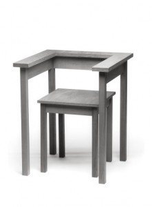
Wandering around in the Stedelijk museum my sight was caught by this ‘Tafel-stoel’ (table chair) by Richard Hutten (1990). It is part of the furniture collection. This collection will always have significance because furniture is part of the basics we use in life.
I was initially looking for an interesting chair, but this design didn’t look like a real chair. But then, what is a ‘real’ chair? To answer that question we’ll have to make up a definition of the chair in general. I would say that a chair is a design made for sitting with a backrest (otherwise it would be a stool). In this case there is a backrest present, but it doesn’t really function as such. I could imagine that leaning against it would make it fall. Therefore I would say that this chair is a case on the border of being a chair or a stool. Meanwhile it is also a table. Or actually it was. It looks like the former tabletop was cut out to become the sitting of the chair. Pondering about the traits of the chair I figured that this design item still has relevance for us in life and work nowadays. The question about the definition of the chair will always remain present and this chair is an example of it. Sometimes we can’t categorize items and that’s what makes these objects interesting to look at. They make us wonder and evaluate our attitudes towards the things we use in our daily life. And as Wittgenstein noted in his ‘Tractatus’ ; “we have to know about the connections between the objects we use to understand the world“.

They are always placed in a certain context. A table is not just a bare object, there are chairs around it, it is situated in a room, etc. With this philosophy in mind we might understand a little better why this chair is not easily understood. The connections are not clear.


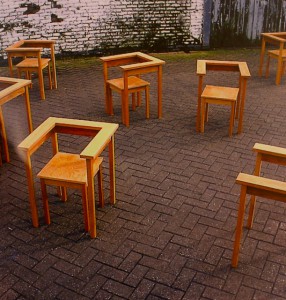
The relevance of this chair will become more clear when we look at the reason why the Stedelijk came up with this collection to exhibit. The collection is considered on the basis of five themes, addressing aspects such as furniture in the collection which enjoys the status of international design icon and evolutions in particular kinds of furniture design (The furniture collection Stedelijk Museum Amsterdam – Dosi Delfini, L. A. [x]). The ‘Table Chair’ is an example of a conceptual design. Conceptual designs can’t be missed in an overview of furniture from (roughly) the last century, since that become a big focus in the world of art. Art can’t get more abstract than a white canvas. But ideas can go as far as you can imagine and beyond. And that’s where the conceptual art comes in. It’s about ideas, not about beauty and functionality alone. In Hutten’s work we can see the extreme clarity of form, which still leaves an unexpected amount of freedom in interpretation. “The austerity of his designs is the rare kind that makes you feel cheerful” (Richard Hutten – Ed van Hinte). As with the Table chair: it can be used in various ways, even in a way the designer could never have foreseen.


You could place the back- and armrest in another way then you would regularly expect. For example the other way around, so it becomes more like a table to lean on.


It is exactly what would give joy to Hutten and to me. I also like conceptual art a lot. But it can be a trap in which objects become too direct. Hutten knew about this pitfall and made sure that there was always enough space left for imagination in his designs. He said: ‘Traditionally design is about solving a problem. I don’t solve problems; I create possibilities’ (Richard Hutten: works in use – Brigitte Fitoussi). I share this opinion with him, because problem solving is one thing. Creating new things is something different. It is like grabbing something out of the air (which is quite hard). And it is like making a chair out of a table, which becomes a creature, challenging your common sense.
 

Six Feet Under


Tuesday, April 10, 2012


&Foam
Foam lies in the city center of Amsterdam, in the museum on the Keizersgracht. That is where they program a wide range of expositions. From world famous photographers to young and -as of yet- unknown talent. Grand long-term expositions are followed by rapid successions of  smaller expositions.
&Foam are special editions seeking new collaborations with exceptional artist, with intersecting  the fields of photography and other forms of art.
The current &Foam exposition at display in the Vijzelstraat in Amsterdam is about Philippe Vogelenzang

‘Six feet Under’
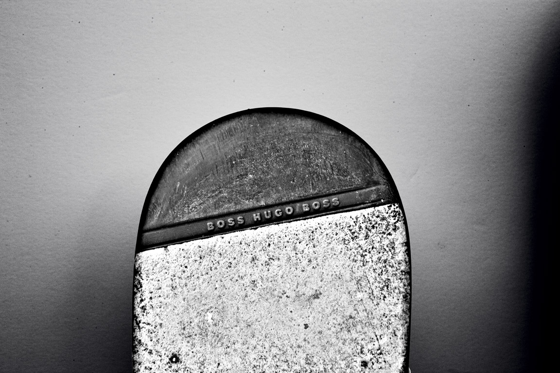
While visiting the ‘Fashion &Foam’ exposition one particular black and white photograph immediately caught the eye. A photograph depicting the bottom halves of seven soles. Shoe soles branded with the names of famous brands like Moshino, Prada, Hugo Boss, Lanvin, Emporio Armani en Vero Cuoio; designer shoes one and all.
After my tour of the rest of the exposition this piece again caught my eye, this time from a distance. The picture -while still recognizable as the same work- looks completely different from afar compared to what you see close up. These were not shoes, but gravestones!
The artist is playing tricks on his audience. He fools you into seeing the wrong thing, at least that is what it seems at first. The picture leaves a completely different impression from a distance and at second glance. It also made me curious as to the message of the piece. Then again the title is descriptive enough ; ‘Six feet Under’


‘Six Feet Under’


The young photographer (1982) lives in Amsterdam. He mostly works in fashion photography doing shoots for national and international fashion magazines. Digging deeper it soon became clear that he is a very active artist. The internet seems to be full of pictures by Philippe Vogelenzang. Many of the websites containing his pictures are about fashion photography. But not just any fashion photography. There always seems to be a story behind the pictures. A little something extra.


Interview with Philippe Vogelenzang

Does the academy still influence your work?
“No, the academy does not influence my work.
Before going to the academy I studied ‘Design en Styling’ after which I studied Art History for two years at the UVA (university of amsterdam) .”
After studying photography for a year at the ‘Koninklijke Academy for Fine Art’ in the Hague I decided to quit my studies and start to develop my own photographic aesthetics and intensity. The first year at the academy in the Hague did of course provide me with a solid base.”

How did you like the transition van studying at the academy to working in the field?
”I liked it a lot, I made many friends. And also made contact with a lot of photographers, they taught me a lot.”

Where do you get your inspiration?
“Inspiration comes from myself, the surroundings; everywhere basically.
I always work out my feelings and I make what I like and feel I want to make.
How it all eventually develops, as it is growing. Focused work is completely different of course.”

Do you like working with a theme?
“Yes, I like working with themes. I am especially drawn to start working on projects that tell a story and address important social issues.”

What is the relationship between your work at Fashion &Foam and you other work?
“In my photography i mainly focus on portraiture, fashion photography and art. Starting often with nostalgic of classical pieces. Aesthetics also play a big part in my works, that is where the fashion comes in. Fashion &Foam is a reflection of whom I am and what I strive for’’

In Fashion And Foam your work seems like conceptual photography, what do you think of this?
“My work is now with foam editions and is picked up that way and it seems that way more and more recognition for my work to occur, it is now as well as in foam in a more artistic angle. This is not something you can control it, but it is an honor if you work in this way is put down. “

What camera do you use?
” I was just sponsored a new camera, a Leica S System. Before that one I used a Canon 1Ds mark II”
One more interesting project in cooperation with Majid Karrouch is Project MODE MADE MAN – (for Amsterdam Museum

Vogelenzang in Foam see: http://www.foam.org/press/2012/en_foam


FunctionalVsEngagé


Thursday, May 28, 2009

In my first post about two of the most important and influential dutch graphic designers, Wim Crouwel and Anthon Beeke (pdf), i tried to compare them by their different approach. Especially the way Beeke designed, really intrigued me.
It was provocating and controversial which made him one of the leading conceptual engaged designers.
On the other side, Wim Crouwel is known as a more functional designer, which means less conceptual.

But is it really that easy to divide and are all this categorizations correctly made?

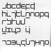
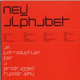
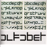
Especially in the case of Wim Crouwel i doubt it. His design of the new alphabet was based on the begin of computer technology, in a time were blogs, facebook and internet in general didn’t exist. Coming up with a font type based on this new technology combines in a perfect way a clear, functional and computer like approach. Computer like is also the keyword for, in my opinion, a highly conceptual design.
With the awareness that this technology will change they way we communicate, document, the way we are. His style is timeless (even if it also relates to the early 70s) and applicable still nowadays.

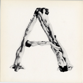
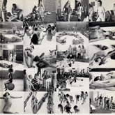
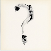
Beeke’s Human alphabet, using the aesthetics (look at the swedish film makers Ingmar Bergman and Vilgot Sjöman) and social and political topics like sexuality, seems more related to that specific time.

So Aesthetics is next to conceptualism and functionalism a really important aspect, what makes Crouwel’s design less depend on a certain time period.

Never the less, Anthon Beeke’s radical and shocking way, even if it is not so applicable in our times anymore, was responsible for breaking through the conservatism of (Graphic design) and is so a mirror of other important political and social openings in this time period, and even if his aesthetics are not so up to date, his conceptual engagement is.

link: The Human Alphabet as a visual brand

link: Anton Beeke exhibit at Centre for Visual Arts Zeeland


Log in
subscribe