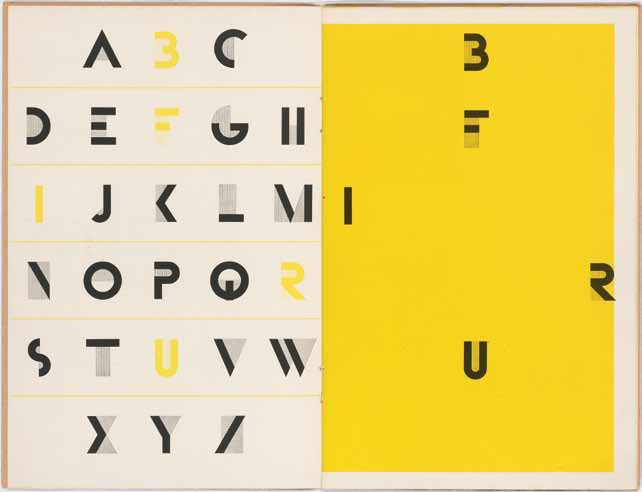
„Bifur: caractère de publicité” by A.M. Cassandre, Paris 1929
I found this book most interesting at the collection exibit I saw at the University of Amsterdam. A.M. Cassandre, whose real name was Adolphe Jean-Marie Mouron, was an Ukrainian- french graphic designer from the Interbellum period. He was designing posters and letter types.
Bifur was poduced by Deberny & Peignot from Cassandre’s designs. The book is a publication of this font released in 1929.
I chose this book cause i was impressed by a font itself and also the form of the book- how it was printed. I really like the simplicity and a specific character of it. The font was originally produced in 1- and 2-color versions. The one presented in the book is a 1-color version. I think visually it is very appealing and it was quite innovative for its time. The simplicity of the geometrical form, clarity of the message, funcionality create a beautifully balanced font. For me particularly attractive is the fact that some of the letters could be read as images and some of them as the letters with a small decorative element which anyway stays really simple. For example the lines in the letter „L” create the letter but in „M” they just create space around it. That makes me look at it, also the illustration in the book and not something that creates a readable image.
I also like the way how it is presented in the book. I think the combination of this elegant form of the font and the yellow colour create an absorbing, unique image.
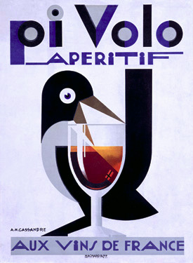
Personally i also like the posters of A.M. Cassandre and i think the font in his works is very well combined with the images and shows how important this connection is.
post by Hania Sobolewska

