My first discoveries
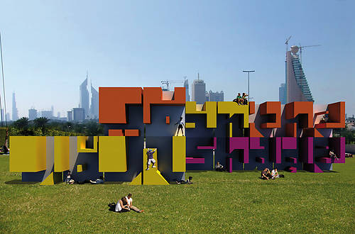
One of the first impressions I got of the Typographic Matchmaking, was an image of a huge three-dimensional shape with letters that I did not manage to read. However, I could sense meanings and my curiosity grew to decrypt this ‘unknown language’. The shape proved to be a mixture of both Latin and Arabic words, translating each other and forming a common text. As a matter of fact, it was a construction of the type font StoryLine, and one of the outcomes of the Typographic Matchmaking 2.0:
khtt.net
Naturally, I had discovered The Khatt Foundation – Center for Arabic Typography. Founded by Huda Smijtshuizen AbiFarès in 2004, this online platform offers a space for projects which develop Arabic typography and design, and deal with its relation to the Western society.
The project
The first initiative to the Typographic Matchmaking took place in 2005-07, the second in 2008-10. There is a lot to say about the project. The Typographic Matchmaking 1.0 deals with the typographic needs of contemporary design in the Arab world, specifically for publications and new-media. The Typographic Matchmaking 2.0 / in the City stretches the research into the urban space. Here, the focus is to bring the marriage between Arabic and Latin writing cultures to the three-dimensional city.
Huda Smijtshuizen AbiFarès introduces 15 professionals from Europe and the Middle East to collaborate in 5 teams. Each team consists of one Arab and one Dutch type/graphic designer and one architect or industrial designer. Each team also deals with a different subject. It is inspiring to me that they immediately move away from the original classical type and experiment with both language types, starting from scratch. The participants then visit respectively each other’s countries, and the cities of Amsterdam, Beirut and Dubai.
Backgrounds
I find it interesting to mention, that one of the reasons argued for the Typographic Matchmaking is, that because of the poor matches between the Arabic and Latin fonts, most bilingual design projects in the Middle East start in English before getting translated. Too often, the street sign you meet in the Middle East are written in a way that forces the Arabic language to adjust to the Latin language. The basic idea is thus to create new fonts that work both in Latin and Arabic, and especially to find types that create harmony between the different language structures. The aim of the project in the City, is also to bring back the sense of belonging to fast growing multicultural cities in the Arabic environment. One of the big challenges here, is how to deal with a visually already overcharged space. New alternative spaces within the contemporary, shopping dependent, urban structure may engage inhabitants on many levels and create a more emotional relationship with the direct environment and the larger world.
Another important reason is the demand for Arabic identity in the West. I could very well imagine that even people who do not speak Arabic, can connect to their roots through the presence of Arabic script.
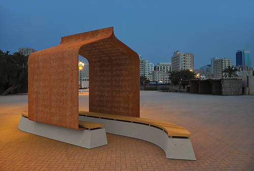
Nuqat-folly, with poetry on its walls in the type font Nuqat:
Yielding outcomes
The Typographic Matchmaking is a merging of two cultures, where both adaptation and play are central. I was curious to see how two totally different kinds of languages can translate each other and at the same time meet each other’s ‘needs’.
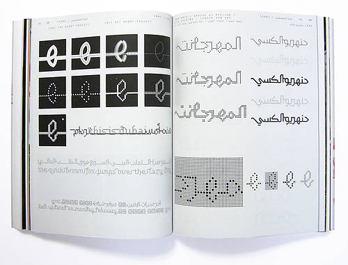
The font named Nuqat is developed with a grid. The text is created out of dots in both language structures. The system of the grid has here the capacity of making a text where the letters are – or disconnected, or linked to each other. I find this font interesting for its apparent multiple possibilities. I also like to see how it could suit in different public spaces.
Here is a link to see some examples of the Nuqat used in several ways:


