Skip to Content Skip to Search Go to Top Navigation Go to Side Menu


"memories" Tag


NOTES FROM THE DEAD


Wednesday, May 3, 2017

Screen Shot 2017-05-14 at 19.07.24
Dying is something we all have to face one day.

When it finally happens, we trust on the people closest to us to give our remains a place to rest, playing the right music at our funerals and keeping us from being forgotten, by remembering us, and telling stories about us to our grand kids.
 
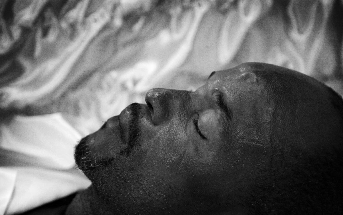
But what if a person dies who doesn’t have any close ones to remember them…
Who doesn’t have friends or family to attend their funeral..
 
In Amsterdam it happens multiple times a year.


The Pool of Death

Drug addicts, drunks or abusers rejected by friends and family…

Illegal migrants, wanderers and hobo’s without papers, permits and names…

Rejects and the misunderstood, whose mental disorder kept them living in seclusion… Recluses who cut off all social contacts or lost everyone that was ever dear to them… Elderly who outlived every last relative… Youth, abandoned and unable to survive on their own…

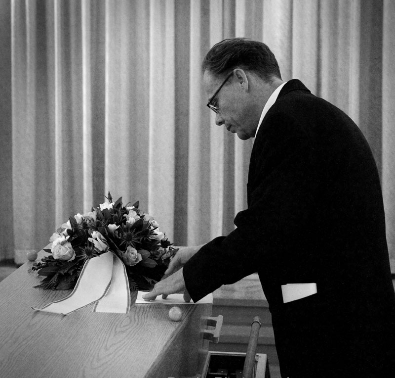
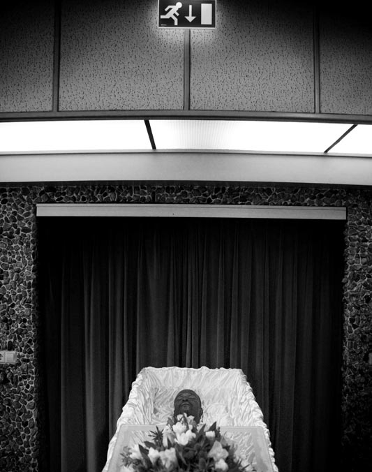
The pool of death is a group of poets, who honour the lonely deceased.

As the sole attendant of a lonely funeral they accompany the lifeless remains to the grave where they recite a specially written poem.

To write about someone, and give their story to the world, a poet needs to learn as much as they can. Like a detective, they look for clues. They visit the homes of those lost, talk to their neighbours, and search through city archives gathering as much information as they can to form a sense of the person that was.

The same week i received the assignment (to meet up with someone that inspired me), I attended a funeral, my second of the past two years. This very present sense of death and mortality made me think of the Pool of Death and the Foundation of Lonely Funerals, a project by artist/poet F. Starik.


ZW_EENZAME-UITVAART-20090305-_253 ZW_EENZAME-UITVAART-20090305-_202 ZW_EENZAME-UITVAART-20090305-_204 ZW_EENZAME-UITVAART-20090305-_228 ZW_EENZAME-UITVAART-20090305-_039 ZW_EENZAMEw-UITVAART-20090305-_027

Images above by Jan van Breda

 Frank Starik

I had met Starik once before, about a year ago, when he was clearing out his workspace. He was leaving his current atelier to work from home, and couldn’t bring all the things that had come to fill that space. I got a tip from someone very close to me who was helping him sort out what he would take with him from what he would sell, that the rest would be thrown out.

Amongst all the things, I found this big box. Inside it, were all these wooden crosses. They were old crucifixes that all seemed to be missing their christ figures, leaving them to look like movie props for an old Hammer production starring Christopher Lee. When I asked him why he had so many of them, and what happened to their prophets, he addressed me in the solemn but raspy voice of a chain-smoking reverend:

“Well my son, I have dedicated a great part of my life to freeing Jesus from the cross…he’d been hanging there long enough!”

When I later continued my look around, I found an army of Jesus dolls lying carefully displayed on the ground, as if they were all out sunbathing on the beach.

Along with the crosses, I left with some old photo works. Most of them were collages made on old canvas frames, all black and white.


 The Detective

On an early Sunday afternoon I went to my appointment with Starik at his house.

Next to his writing table stood an enormous plant and above his couch hung a note saying: “we are decent and normal”. Some of his work’s consist of a note or message, handwritten on a painter’s canvas. I really like these works. They might seem simple but they work really well.

I was curious about the proces of writing a poem for a person that just died, in total solitude. Somebody you’ve never met: how do you learn about them? Are you allowed to visit their homes and search for clues like a detective?

He told me that sometimes it was very difficult, depending on the situation. He was allowed to go into their homes, but a lot of times these were in total chaos. The anonymous deaths are often discovered when the neighbours call the police to complain about the smell. It can be weeks before they are found, and by then, the bodies are in a state of decay. But sometimes you can find something that can be of use. He confirmed my suspicion and said it was very much like being a homicide detective. He always makes a talk with the neighbours, and if the person still has some long lost family members, searching the city archives can be a big help.

Sometimes people have a strange relationship with public workers, relationships that in a way replace the lack of closeness with anyone else in their lives.

He told me of the anonymous death of an autistic man, who had a special relationship with his plumber. Being extremely parsimonious, he was particularly stingy about his water-heater, and feared spending even a single cent too much. Every day he would blow the flame out, fearing it was burning away a lot of unused gas. Sadly he was never able to reignite the flame, so every day, when he needed hot water, he would call the plumber to reignite it. Because the plumber understood the man’s condition, and knowing this system would actually cost him significantly more than he was trying to save, they worked out a deal. Each day he called, he paid only 10 euros. This was still significantly more than he would pay if he simply kept the water heater running..

He also told me about another man who fabricated the whole of his own history. Among the stories he told people is one about him as an important war hero with the resistance. His long lost family members however, said he had actually been working for the Germans. He kept on with these stories for so long that he came to believe them, and lived on in his own fantasy, in his own fabricated biographies. In the poem Starik wrote for him, he kept those fabricated stories alive and didn’t kill them off.


 The Design

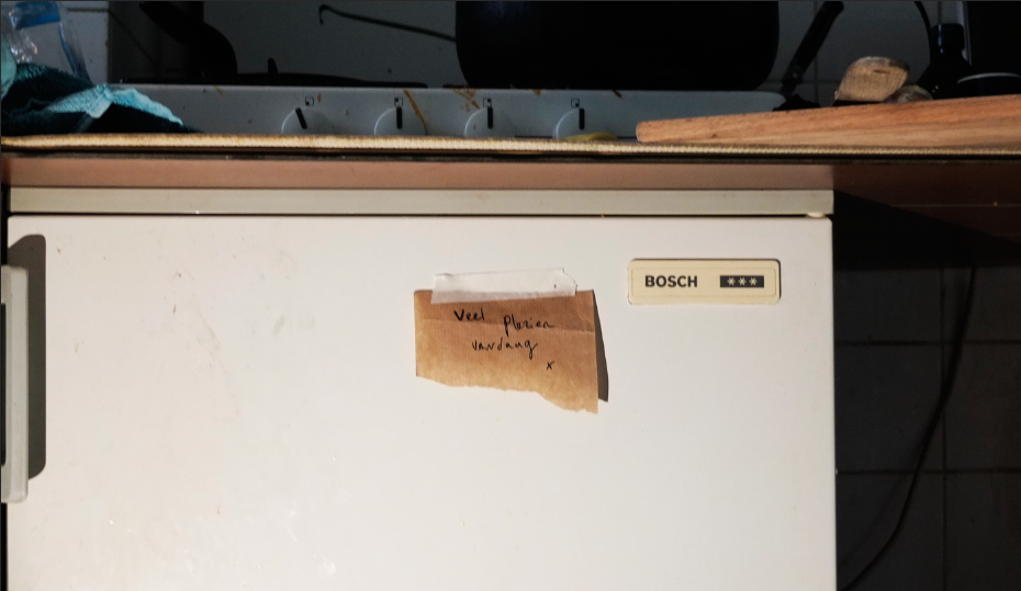
After you die, you sort of live on in marks you’ve left behind..in handwritten letters and notebooks…in old grocery lists…in doodles and scribbles… because handwriting is really someones second voice. Handwriting is personal, has a character that speaks for itself: a voice that is read instead of heard. Reading a person’s script, you can almost hear a person’s voice talking.
De Dichtkist
I wanted to make a sort of vending machine, containing unopened letters written by somebody that passed, so that the living could receive letters from the dead.
This transformed into the big turning of the wheels, and then to the transfer turning of a scroll from the bottom to the top. Inspired by Starik’s written canvasses, it became a sort of alter, displaying a composition of words.
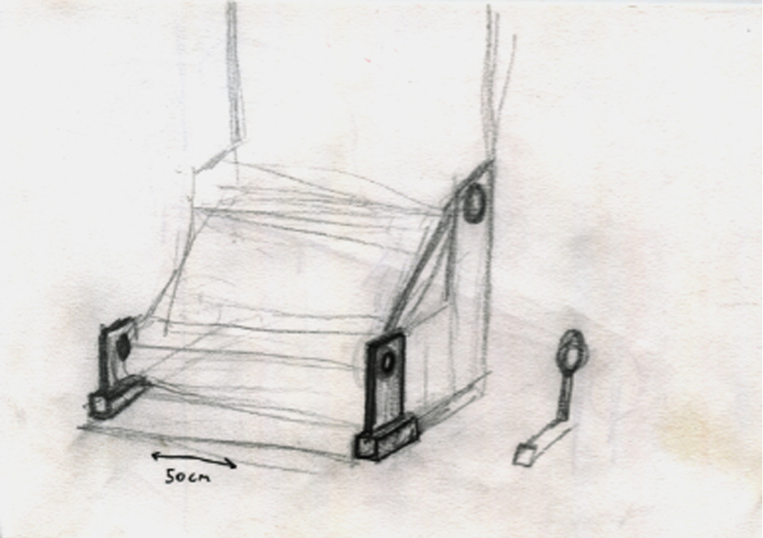
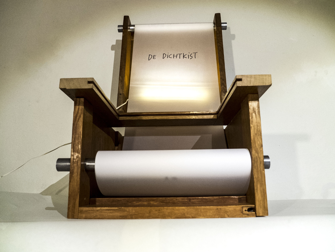
output_aysYPv   31_1100
De Dichtkist (translates into “sealed burial box with poems“) is a tribute: a coffin for handwriting, an open casket, a single space for the second voice and all of its marks to collect, and with a bit of turning, display. As it fills up, that turning can lead to a sort of conversation. The second voice can speak with itself. Built from the wood of century old doors, de Dichtkist houses the marked memory of lives that will some day, come to end.


Thread 53’’41’’43’’


Sunday, March 29, 2015

Like with a thread, it’s hard to find its top, it was hard to discover the beginning of this story.

A thread unravels itself on the ground
Its top is hard to find
Persistently strings are being pulled
Hooked on a state of mind
Fingers move on a virtuous trance
And yet no end is found


The thread starts to move around virtual spaces
Auctions and images
Prices and selling strategies
Long, thin and flexible form of material
Draws a series of messages
And sequence of connections


Flashes of images across my mind
From Hitchcock’s Rope dinner masterpiece
To Ernesto Neto’s suspended organisms
And Bjork’s Unravel portrait of decease
Besides, Garth Knight and Andrea Davies bondage motif


All these threads hold our existence together
Link memories to one another
Sprout canons of aesthetics
Create a language of composition
A fine line around the subject
Threads,
Filaments,
Fiber,
String,
Ropes
………..


Words like
Height 53’’
Width 41’’
Depth 43’’
Seat height 15.75’’
Starts to seem familiar


Slowly the string unravels into a ball of yarn
A triangular shape collects its pieces
Like a home for sailors ropes
A bow of Vikings boats
A tribute to a freezing place
And heroic seaman’s stories


Scandinavian blood runs through its veins
From 1935 to 2005
Award winning and acclaimed
Under the enchanting songs of the mermaids
Changed its powerful Viking name
To a meticulous fragile Harp sound


Depicted countless times
Spread out on different hands
Has long lost its original traces
Varies from site to site
Bleach, oak, ash, maple or walnut
As colours come and go
As the costumer pleases


Preserved under the sacred power of museums
Or kept among the noble houses
Once a piece of art
Now a  prototype


Yet far from being familiar
To a southern soul
Where wild oceans and fishing ropes
Scatter along the coast


Hammock nets, swing along the breeze
Fill the air with pine-wood trees
With Hollywood glamour mixed along
A slightly pear shaped frame is born


Taking the name of the place on the globe
Anonymously design,
Acapulco becomes
With its recycled PVC woven cords
Tropical colours and metal structures
Gain its place has percussionist
The southern orchestra member of the Northern Harp


Memories of gardens and beach
Come along……
White smooth sand, teaching you
How to sit in first hand


Or at the times you had
that white, blue, red, hand painted flowers
in the back of a tiny little chair
The size of half adult leg


With its straws and braided seat
Filled with the popular themes
Of a country of craftsman and traditions
Where you learn how to play hide and seek
At that moment you realize you can sit
Without anyone holding your seat
Unless you’re in a room filled with valuable chairs
And cameras everywhere


The Harp chants
Hypnotize my senses
That Viking treasure
That lays now among other chairs
In such a confined pointless room


I wonder how does it feel to sit on that chair
That same one that JØRGEN HØVELSKOV
Designed


Perhaps its transparency blends in
With my pale skinned shoulders
Perhaps my body will
Submerge into those strings
And stripes will be carved along my skin


Like that first chair
marked my silk buttocks
and drawn moving patterns
when I was a restless two years old child


I imagine how my back will melt
Into a flexible wave of relaxation
Like if I was made of clay
And my body shapes would assume the negative forms of that chair


Then those legs, spread out on the floor
like spiders using their glands to shape their web
Would invite me to cross my long legs
And play its imaginable pedals


The chair becomes wood
The ropes become thread
The thread becomes ………………………………………………………….
……………………………………………………………………………..unraveled


Harp Chair by JØRGEN HØVELSKOV
[x]


Proving Prouvé


Friday, March 27, 2015

Starting our research trip through the endless material of chairs and endless amount of possibilities to wright a research about, we traveled to remote cities to attend group chair exhibitions. During this whole complicated ritual of coming up with a specific chair, I was always thinking of the simplest one. One that I could really describe because it would be just basic. And what is about basic that fascinates me is that anyone can imagine themselves on it. It might not be the most comfortable chair but for sure it will be one to spend some study hour on.
During these basic thoughts on basic chairs, my mind would travel to the chairs that I had been sitting on for 12 continuous years in my life, from the moment that I started primary school and finished high school.

13.thrania_metalika_gl

It is probably be the chair I have been sitting on the most. I have spend endless amounts of time getting bored on this chair, getting back pain on this chair and always trying to switch between positions as to find the right place for my feet. This would be in school, when I would bend my knees, place my legs under my butt so that I have a pillow on the basis of the chair with my feet coming out of the empty space, right under the piece of plywood supporting my back. Teachers would not allow non upright positions.
I remember I was then complaining to them on why they were using a comfortable chair with foam pillows for their desks in class, while us, a mass production of  students in a mass production education were sitting on mass production chairs.
This would be just four steel legs and two molded pieces of wood. Thin plywood.
On the group chair exhibition I found myself identifying with Jean Prouvé’s Standard Chair produced during the 1930’s-1950’s since it looked very similar to the school chair I was recalling at the moment.

jean prouve

Going through the background of Jean Prouvé and his architectural achievements I got informed about his fascination with mass production of machine-made furniture and his constant adaptation to the problems of his times through working in a collective union with fellow architects such as Le Corbusier, Eileen Gray and Sonia Delaunay. In 1930, Jean Prouvé  joined the French Union of Modern Artists(UAM), a groundbreaking movement who’s artists proclaimed ‘We must rise up against everything that looks rich, against whatever is well made, and against anything inherited from grandmother…”.  Apparently, through this collective way of working, simple and basic furniture for collective use were produced. Educational furniture was some of them.
This is when I realized that my visual connection of his chair to my school chair was not random.  The name of it gives it away: “Standard Chair”.
Unfortunately I never got to sit on one of the Standard Chairs but I am convinced that it feels more or less the same.

Both chairs I am comparing take the stress on the back legs where they bear the weight of the user’s upper body. Prouvé incorporated this simple insight in his design for the Standard Chair: while steel tubing suffices for the front legs, since they are subject to less stress, the back legs are made of voluminous hollow sections that transfer the primary weight to the floor.

Feels like it is a chair to keep you aware and well-postured. I remember sitting on ugly yellow cubular (rectangular) steel legs when new, clean and polished chairs arrived having tubular(round) steel legs. A small detail I remember since somehow I prefer the first ones. I can also recall the high pitch sound of these steel legs when you would boringly move the chair in the classroom by scrubbing it on the floor. It sounded like it is going to collapse, like all the rust-proof elements would finally get un-proofed. But they didn’t.
They survived through many years, through many students sitting awkwardly on them, vandalizing them, chipping off the layers of the plywood one by one on your front classmates’ chair, writing nonsense with blanco pen in the back of it or making graffiti on it.
There was also this plastic black cap used to block the empty space of the tubular steel at the edge of it. This cap that you could patiently remove during the boredom of the class, revealing the empty space, where you could dispose your chewing gum if the teacher would see you, where you could loose your pen or hide a cheating note.

I am mostly fascinated with Prouvé’s chair because it somehow summarizes all these memories in an official and prototype way. All these years of experiencing the school chair were brought to the foreground at my first encounter with this chair, proving to me that I was sitting on it without even realizing it. That it was Him behind it.
It seems like his industrialized Standard Chair was indeed used in schools at that time and that it did inspire even Chinese companies to copy it and send them to schools all over Europe by stacking them on each other just like a good mass production product would do.

A-001


Memorization


Tuesday, May 6, 2014

How does the history of browsing stay in your memory?
How do we perceive the visual experience of websites which are opening up in new windows?
I question myself and try to observe my behavior when I am browsing around Internet webs. How do I chose the website and what makes me choose them? What determines if I like to stay on the page and look properly through it or if I click to the next page?
What is my choice based on? What visual experience do I get? What videos do I chose to click on? Is it exiting enough to look what is next? I think most of my internet browsing is based on visual experience, except particular situations when I am looking for certain subjects, where the context is more important than the visual experience.
Almost every morning, when I am starting my day, like a due during the breakfast I check my mailbox, read the news and brows around interesting blogs . Mostly they are about music, art, fashion,  news, or just whatever captures my eye.
“Capture my eyes” what are they capturing exactly? I think it is the matter of personal choice, what color, forms, shapes you are attracted to.
I find out that my choice of webpage is purely based on visual impression and it does not necessarily have anything to do with content. After I browse trough what stays in my memory and for how long?  What do I keep in my mind and what can easily be forgotten?


I choose to open Designblog for the first time, looked at the first page which comes out and then close it in 1 minute. I sketched my first impression immediately, what was there? Few geometrical shapes, and bright attractive colors this was the most catchy and noteworthy things.

browsing-history-1_redu


Next step, I simply let myself browse for half an hour, without forcing myself to memorize, reading most interesting things, watching concerning videos or look at images and illustrate my memories. As a result I had same expressive geometrical shapes and specifically recognizable colors, also some words or sentences from the context.
What was my experience? Well even if I illustrate and was attracted by colors, mostly I memorize the context of the posts and the idea what it was about.

30-min-browsing-reading-watching_redu


After this I browsed around in 1 page for fifteen minutes

browsing_15 min_3_redu


Finaly I watched a video, not paying attention to the surroundings

watching_video_4_redu

Culture mixing and the living-room memories I’ve never had


Friday, March 8, 2013

In my quest to choose an object to research out of the current display of design at the Stedelijk Musem I initially thought I would go against my instincts. I thought small, delicate, rational. I even went as far as to write a full research on “small, delicate, rational” but after I was done I couldn’t go to sleep. Needless to say, my roots got the best of me and I ended up being hunted down by the work of Philip Eglin. To give a little background Eglin is an alumni of the Royal College of Art in London and he is specialized in ceramics.

The work in question is entitled “Virgin and dead Christ” and it was made in 1998. The decade it was made in is so well embedded in it in fact that it has on one side Hugh Grant’s ’95 mugshot. Instinctually I wanted to know a bit more about the motivation for such a detail, and Mr. Eglin obliged me with a reply (in the age of rapid fire communication, artists apparently are kind enough to answer the curious):


Something as dated as this reference could now sound obsolete (in fact, it is assumed as dated), but in my view it’s delightfully reminiscent of the time when I was a kid and also of Romanian style of ceramics that I grew up with – not in the traditional sense, but in the purely kitsch one.

Easy to say that ceramics was never considered art in the country I come from. It’s purpose was either utilitarian (dishes, cups, etc), traditional (folkloric patterns) or of display on a smaller scale (think grandma’s living room, on a shelf).

My most prominent memory of ceramics is in fact the last one of the above since throughout communist times (until 1989) in Eastern Europe and even well after (old habits die hard) it was a custom to gift and later to show off in your vitrine figurines which made no connection to the surroundings of your living room and which were hidden behind glass for purely functional reasons (it saves on a lot of dusting hours). I suspect this was done because of the need to be sorrounded by beauty, but given the lack of education on the subject, never a true understanding of how to handle and consume said beauty.

The most common subjects which found their way into Romanian living-rooms were porcelains (named “bibelouri”, from the French “bibelot” or English “trinket” – which stands for ornament) of: random French couples dressed a la 17th century, random curved ladies in provocative poses, ballerinas large and small, peasants male and female, mythological figures, horses, peeing little boys, Christ and Madonna figures, dogs, chicken, weasels, bunnies and other furries.

The list was peculiar but standard. The objects, always poorly made, did not have any other redeeming qualities either than a striving for beauty and having been made of materials more delicate than plastic.

These tiny sculptures were never displayed as individual pieces, but crammed together. So, you would always see a bizarre Noah’s ark of larger than life dogs next to ballerinas and in a 17th century French setting in a 20th century Eastern European living room.


Seeing Philip Eglin’s work in the Stedelijk museum only later brought on the realization that I was, in front of “Virgin and Dead Christ”, catapulted back into a Romanian living room. The work screams contemporary through it’s eclectic mix of features on the two characters and patterns on their surface, but it also comes to me as a commentary against cleanliness and the rationality of Dutch design.

There is no reason, everything seems to have been pushed together against it’s will. The theme speaks of centuries of reinterpretation, during which the Madonna has been turned on all of it’s sides, so much so that now it’s impossible to have just one view of what the scene should look like. The subject has been done and done to death. Maybe that is why if it is to be done again it can only be done with a sly humour and a stamp of Hugh Grant’s face on it’s side. No longer can we look at it in reverence. The relation that we have with the image goes beyond “no judgement”, it’s also somehow pop culture in itself.

There are inspirations in Eglin’s work which are easily traceable” Northern Gothic religious woodcarvings, Chinese porcelain, English ceramics, contemporary packaging, popular culture. There is also a lot of humor as his later work (porcelains of the Pope, footbal teams etc) would go on to suggest.

Choosing Eglin has been for me an exercise in respecting my roots and disregarding the fact that they are not clean, solid, elegant ones, but messy and irreverent. After all, there is in design enough proof of cleanliness. A little chaos is therefore needed as well.

In retrospect the choice was also motivated personally by the stubbornness of both my parents to have a house lacking in ornaments. While I was familiar with the norm for Romanian living-room displays, I never did have any small ornaments, only one large library filled with books and records. In those small figurines as in Eglin’s work, I contaminated myself with a nostalgia for a time which I never truly lived, but only observed from a distance.
 

OUTDATED OR ANTIQUE?


Sunday, October 3, 2010

Once every often when browsing between the many beautiful glossy covers in libraries I come across a tattered old book that I feel I need to save. Especially when held together by peaces of tape and covered in coffee stains of it’s previous users, I am convinced it needs my love and attention. This book ticks all the boxes.

Inexplicably immediately memories pop up of me hovering at my fathers desk while he is working. Looking up to him and his work which I don’t fully understand. Then again, my father was a graphic designer and my associating him and that specific memory with a book on typography might not be that strange after all.

The book “Drukletters hun ontstaan en gebruik” (Printing types their origin and use) by M.H. Groenendaal is filled with old mysterious languages I can’t read. Worlds of knowledge I can only imagine. Wonderful shapes I love looking at. Shapes that take me to exotic places, inhibited by people you now only find in books. Or maybe the way words used to look before I could read. Wasn’t it a fascinating thing? Adults staring at pages covered with weird lines that didn’t make any sense for hours at a time. You could only imagine what these lines told them. It was almost like a secret society to me, and I couldn’t wait until I was invited in. This is what intrigues me most still, something I cannot understand and therefore let’s my fantasy run wild.

When you start reading the dry factual text, however, all mystery of meaning evaporates. Fantasy disappears and is replaced by hard fact. Being a hopeless dreamer, naturally I was let down a bit.

But then I come across delightful sentences that have now regretfully almost disappeared from use, and instantly I am charmed again.

The book by Groenendaal is actually a very thorough reference work on the history of typography. Dealing from the earliest types of passing on information; such as cave paintings; and the development of the alphabet, up until the most contemporary typographers of the seventies.

As the book is written before the computer age when the phototypesetting was hardly introduced yet, it’s not completely unfair to say it is heavily outdated.

However I am glad to find that the book is still widely used and it is often referred to in new publication to date. Also, earliest copies of “Drukletters” are now sold as book antiquities. It is safe to say that it really has no need for me to save it.

Rietveld > lib. cat. no: 757.3 1F

Thinking over the Thinkbook


Tuesday, September 7, 2010

When going inside the exhibition of Irma Boom I decided to look for the one book that made me want to grab it, huddle in a big fluffy chair and disappear behind it.

The SHV Thinkbook attracted me because it is plain black on the outside, like in the past many books were. Some of these ancient books also being on display (part of the private collection), I can see where she might have got her inspiration from.

Books to me are objects I love being around. They often bring back sentimental memories of a snug warm house and evenings spent divulging my favourite books again and again. And so does this book designed by Irma Boom.

I always thought there is something fascinating about books that are plain on the outside. They hardly reveal any of its mysteries at first glance and thus makes me curious about its contents. When you open it a whole world opens up before you. I wasn’t disappointed now. When you open the SHV Thinkbook you find colourful page after beautiful colourful cotton page, 2.136 pages of them! Within the letters of the title are hidden. Also, on the edge of the pages you can read a poem by Gerrit Achterberg.

Irma Boom wanted the book to be a voyage. For me the voyage already starts with goggling at its cover. Alas, that is as far as I am going to get, since it wasn’t allowed to touch any of the books.

All I can say is: it is a mighty shame I wasn’t allowed to take it home with me and discover its many secrets.


Log in
subscribe