You know how, when you have a bag of sweets, the yellow one is going to taste sour like a lemon, the green one tart like a green apple and the red one will taste the sweetest, like a strawberry.
Have you ever had a blue sweet? They do exist but often don’t represent a certain familiar kind of food. The blue is “odd-tasting”, the blue one is often considered the least tasty of these four colors or at least the least familiar. This is because we are used to associating dark colors, like black and blue, with rotten foods.
Different research over time has proven that color can affect the (sense of) taste of different kinds of food. Even if the food doesn’t actually taste sour but is yellow, our brain will respond to that colour and tell you that this food tastes sour.
“we taste with our eyes long before we taste with our mouths”. Here is a short video of an intelligent looking man telling you more about this phenomenon.
I know there are a lot of interesting turns on this “color” theme but this topic of color in connection to taste and/or the expectation of taste is one I found particularly interesting because apparently we can change each others senses of what we see just by changing a colour which is pretty spectacular!
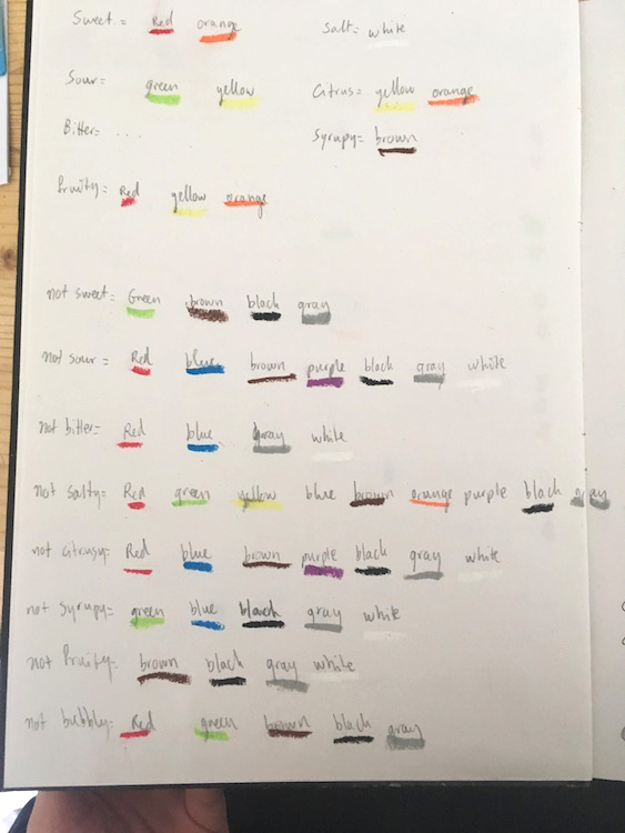
So; I did some research and wrote the basics of what I found down in my notebook.
Certain colors stand for certain tastes as well as the perception of the freshness and/or ripeness of the foods we see. Our brain creates this link between color and taste and/or smell and also just the expectations of the taste of certain foods.
For example; we expect a red apple to taste more sweet in comparison to a green apple that would have a way more sour taste (which is ok because we know that red is sweet and green is sour).
I wanted to somehow capture this occurrence and I figured that the best way to let the colours speak would be on a photograph because this way the look of the food (where you say “this shape looks like a banana”, or “this shape looks like a lemon”) is the only thing determining your expectations of the food and not the smell, consistency etc which I felt would not make my point stronger.
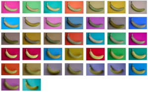
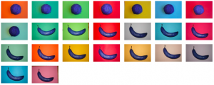
The next step was to take pictures of a banana, a cooked stake and a tomato, putting them on a differently-coloured background in each picture.
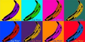
I didn’t feel this worked at all. Looking at these pictures, my perception of the food didn’t change. It looked flat and the only thing that came up with me was how much the bananas looked like an Andy Warhol print.
So then I read about this one study (click “download” in the link. p.22 of the downloaded file) that took place in the 1970’s where investigators had put participants in a room with a colored light and a plate containing cooked meat and fries. Because of the dimmed colored light the participant wouldn’t really be able to determine the color of the food.
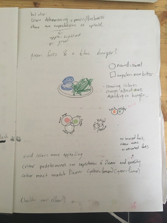
Once they had half way finished the plate the light in the room would slowly go back to a normal color which revealed that the meat was blue and the fries were green. As a reaction to this, a lot of participants refused to finish the plate and/or immediately felt sick.
I think this was a strong investigation because it shows very clearly that the color of the food is very important to our brain. It has to work. Our banana simply has to be yellow and our apple red or green, otherwise your brain will definitely warn you not to eat it and it will look way less attractive to eat.
Some extra ideas that came up
So I figured this was what I did wrong with the banana.
This is where the idea of colouring the actual food lured me in. It made total sense that when it would work in this study, it might also work on my photograph.
This way the shape of the food would not cooperate with the color it had which might not work for our brains.
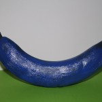
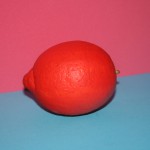
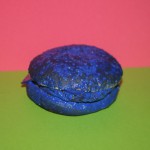
I chose new foods that have a clear taste in our head. So a lemon, a hamburger, a vegan burger and a banana.
And then I painted them which made me decide to let the vegan burger go because this was near to impossible to do and it didn’t have the look that I wanted it to have.
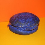
I took these photo’s from above (see above) and thought it was too clean which food isn’t. To me, making the pictures from above made the images look flat, less like real (eatable) foods but rather like something fake, non-existing.
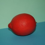
This is why I decided to take the next pictures from the side rather than the top, like the food would be laying in front of you when you look at the image. I used two different background colors for two reasons; To further convey a spacious effect (rather than flat) and to experiment further with the color perception at the same time. The latter conveyed by trying to make the changing perception with different colors more clear in one single image. You could put your hand on the top part of the image and the experience would be different than when you would cover the bottom part, just like it would be different looking at the image and the colors as one whole.
Then I would have to make a next, maybe final, step. What images/image should I use as my final work or should I just continue experimenting until the end result will automatically present itself to me?
Should it be a book? A print? A collage? Everything? A lot of times a photo (series) is displayed in a frame on a wall and maybe also sold in a booklet or on postcards on the side. Is that how it should be with this work? And if I would put work on the wall. Would that be one photo or a series of photos and how would that work since all the works have different colors with the possible result that the colors don’t go well together on the wall.
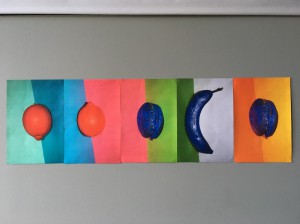
There are a lot of possibilities but for now I found one way to present the final work I was particularly happy with because of the overall composition of the images I was content with made above but also, to be honest, kind of based on intuition and the general feeling some of the pictures gave me.
I think that, in general, the pictures are very well able to work by themselves but I also think that the images have the ability to amplify/strengthen the general notion of this work, the changing perception of food depending on color.
So in this instance I chose, as perhaps a final work (for now), a collage of different images working by themselves, together.

