Grey is everywhere. Grey is the sky, the concrete of buildings, the street and its tiles, the walls of the room I am now sitting in, steel linings of windows, many pieces of clothing, the hairs of aging people –
There are many shades of grey, colder and warmer ones. Grey can be defined as the colour between black and white. It can also be seen in a slightly more abstract way as colorlessness, being undefined, without character.
Several definitions of the word grey are:
- Without interest or character; dull or nondescript
- Not accounted for in official statistics
- (of a person’s face) pale, as through tiredness, age or illness
- (of the weather) cloudy and dull[1]
What all these definitions have in common is that they, in some sense, refer to an absence. It is the absence of color, of character, of definition – it is a lack of capacity to be interesting.
So why would anyone ever choose the color grey for something they made? Would this then be for the object to go as unnoticed as possible? Would it be to suggest neutrality?
THE BOOK
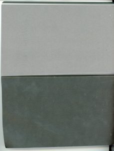
I found a book in the library that was completely covered in grey. The grey enfolded the text and the images that were inside, also filled the empty pages in between. The sides of the pages were grey, as was the cover, so that the book looked like a tile.
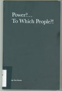 It was called “Power?… To which people?!”. It was a book about the Dutch artist Jonas Staal and contained a collection of essays and images related to the work of this artist. The graphic designer was called Laura d’Ors.
The greyness of the book was so dominant that I could not get past it. Although the content seemed interesting and I was somehow
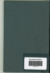 tempted to read some pages and look into the images in detail, I mostly kept turning it around, covering my eyes in the grey that was all over.
I think the grey put a kind of silence around the book that made it into a very solid object. It was such a big visual decision that it forced me to relate to it
before relating to the book itself .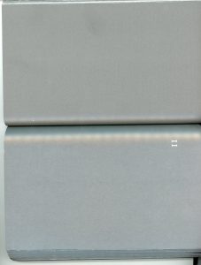
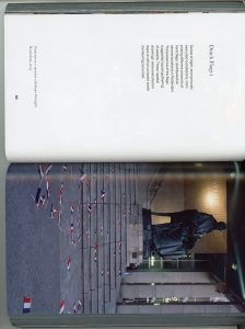
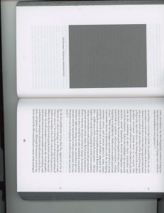
I found myself just flipping the pages in search for more grey, tracing the surfaces that I found with my fingers. I found the colour was also very present in some images in the book. Because of their connection with the cover that had struck me, these images stood out to me more than the other images that were in the book.
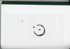
It took me a while to realize that the text was written in the same grey. Contrasting with the white background, it looked somewhat darker. I only realised its greyness when there was a big symbol placed next to it in the same colour.
THIS GREY
So what was the grey of this book exactly like?
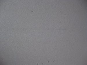 I think a picture will never show the colour right as I saw it. It was a cold tone, with some hints of blue in it. It reminded me of the Rietveld grey, the colour that is used to paint the walls of the academy. It had the same natural and deep, yet cold quality.
Still, it was different from the Rietveld grey. It seemed less accessible. It was not a colour you could walk into. It was not a colour you would put on a wall. I think it was less green than the Rietveld grey. It was a bit darker as well.
WHY?
To come back to the question I posed earlier: why would anyone ever choose grey for something they made?
In the case of the book there are two aspects of the choice. The first one has to do with the excessive use of the colour. If another colour, for example green, would have been used in the same way that now grey was used, this would have equally caught my attention.
Now, let’s imagine it was green; what would this then result in? I think I would have thought that it would be a book about nature. Or imagine it was red; what kind of associations would that give? It could be about violence, love, blood…
The encapsulating of a book in one colour the way it was done here, immediately results in questions from the reader: why is it like this?
So why then did the designer choose grey? This is a hard question to answer, because associations with grey very often relate to backgrounds, such as walls and skies. Seeing it in such a prominent position where it is taking a lot of attention, is confusing.
Maybe that’s exactly the reason why she chose this colour – it is an anti-colour; like I said, a kind of absence. It puts the book into a background and by that enfolds it in the greyness of the world. It becomes part of the sky, the concrete and steel. It doesn’t have a colour to speak, it has a colour to be. To be a thing.
[1]Oxford dictionary
Jonas Staal: Power?… To Which People?!. design by Laura d’Ors, Rietveld library number: staa 1
