For an artist, a book can be an interesting medium to show and explain work to the audience. Graduated as a young jewellery artist, I made this year my first book whereby I experienced the importance of a book design in relation to the concept of your work: it should connect together seamlessly.
In this essay I will explore the book design of Pierluigi Cerri and his team, in relation to the work of the Japanese artist Mariko Mori.
“Dream Temple” is the title of the book and of the project made by the artist. It is about the legend of the Japanese Dream Temple, a place for meditation and for studying Buddhist Sutras. Look at this video to get an impression of her work: Mariko Mori Dream Temple.
Mariko’s work is tying the knot between dream and technology, past and present, spirit and body.
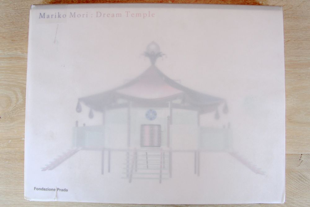
Looking at the book the first thing that strike me, was the transparent vellum that is used for the cover and when you look trough it, the slightly blurred computer drawing of the dream temple is visible. To me this creates a nice dreamlike feeling, which is in line with the title of the work.
The title is printed in a purple/ pink color on the left corner of the cover and because of the font size it feels less important than the visual image of the temple.
Remarkable is also the way the book is printed. This rectangular book is bound at the long side, what means normally that you look in the longitudinal direction; but in this case you have to look in the width. This isn’t typically Japanese, but is more common there than in Europe.
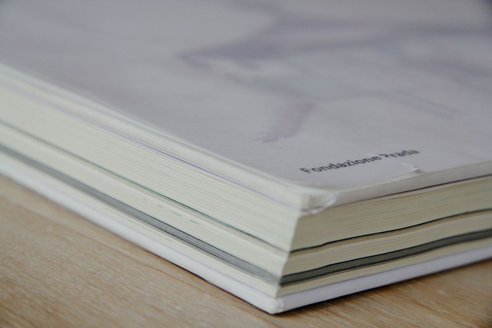
When I look at the structure of the book, I can already see from the outside that the book is split in different parts. It starts with a short introduction of the concept and finishes with an explanation of the inspiration, two interviews and a catalog. In between the book is organized in 6 parts, showing the working process of the artist, from the first drawings to the final artwork. Every part is printed on different paper, with transparent vellum in between as the clear changeover. The layout is plain structured as well, like a documentation, with all the time the first page blank or provided with a Japanese inscription and the second one with images and drawings.
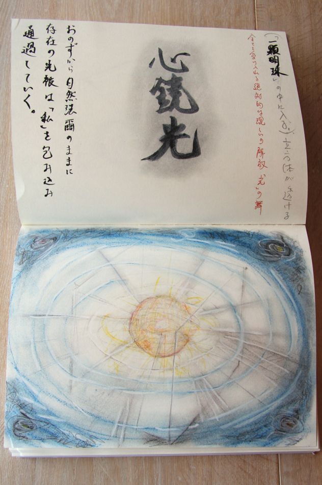
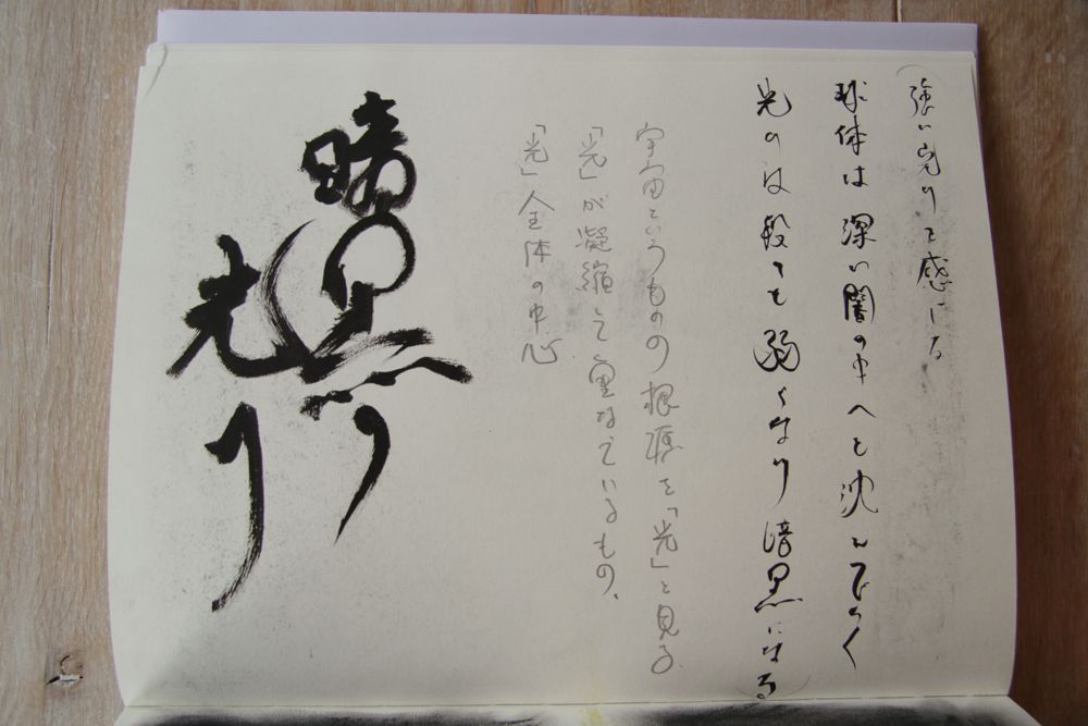
After the introduction the book starts with pencil and watercolor drawings, where the artist is visualizing her concept. The yellowish paper where the drawings are placed in full size, creates a sketchbook feeling, also by the way how the paper feels. Some pages next to the drawings contain text. Despite of the fact that I cannot read the Japanese characters, they are visually very interesting to see and they suggest to be an inscription of the drawings. The text is placed on different places across the paper in a playful way and mainly in a straight line from the top to bottom. In my opinion, this part is the most personal one of the book. You really get the feeling if you are looking into the sketchbook of Mariko Mori.
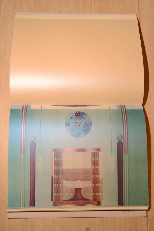
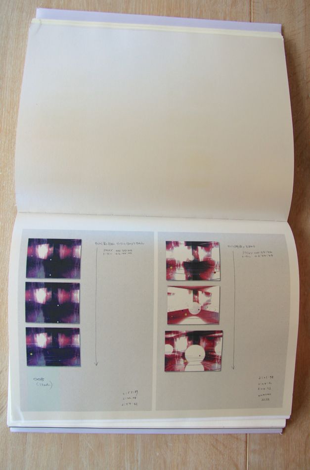
The second part is like a storyboard and is combining different ideas of the Dream Temple. The digital images in color are printed on a special type of paper with a pearl shine. This gives a mysterious feeling to the images and is verging on kitsch, what you can also say of Mori’s Dream Temple itself. This part starts with full paper size digital images and continues with pages separated in two, to display the pages of a notebook and hand written notes. Visually I miss something in the layout that makes it attractive to look at, probably that’s the reason for the special type of paper to give it some shine.
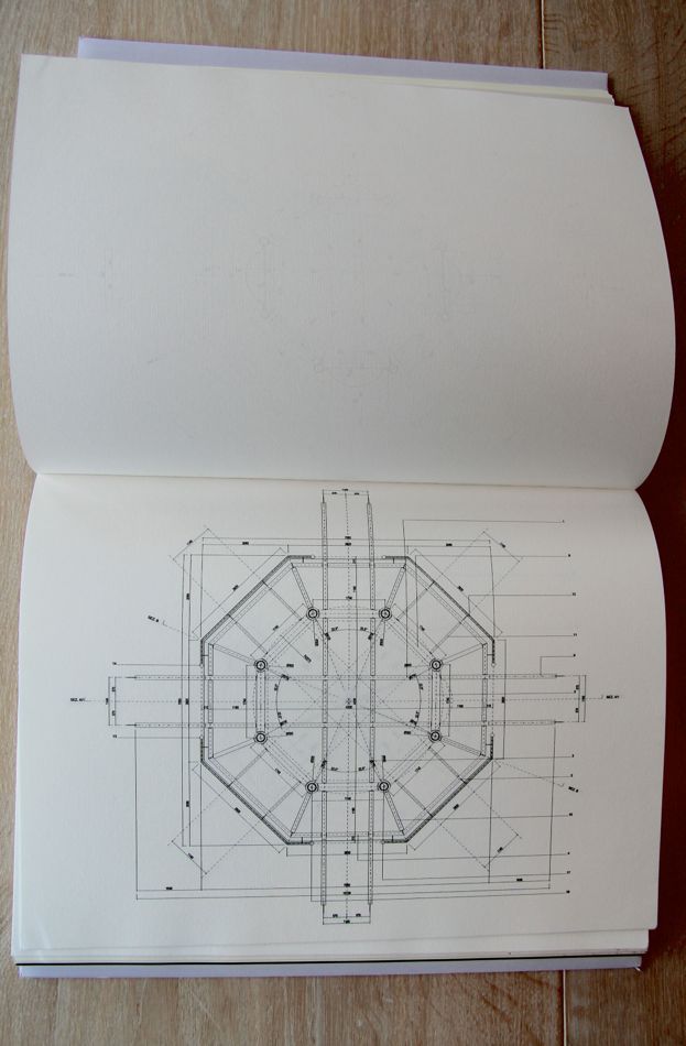
Architectural drawings, printed on a thinner paper with a ribbed texture, are the next step. This paper which is often used for hand drawings and paintings, gives the construction drawings a more informal look.
The fourth part consist of more watercolor drawings and they are placed on the same paper and in the same way as in the beginning of the book.
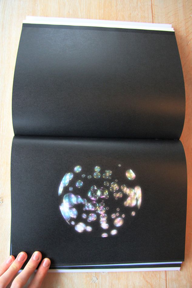
Then follows a more mysterious part, with black pages of video stills centered in the middle. She is showing her vision suggesting that a contemporary meditative space can be a mesmerizing journey into the micro and macro cosmic forces of creation.
The layout in this part of the book is representing this idea, were the round images are printed on paper with a kind of glitter effect, so they look like magic planets. They blend into the infinity of the black paper; like the universe.
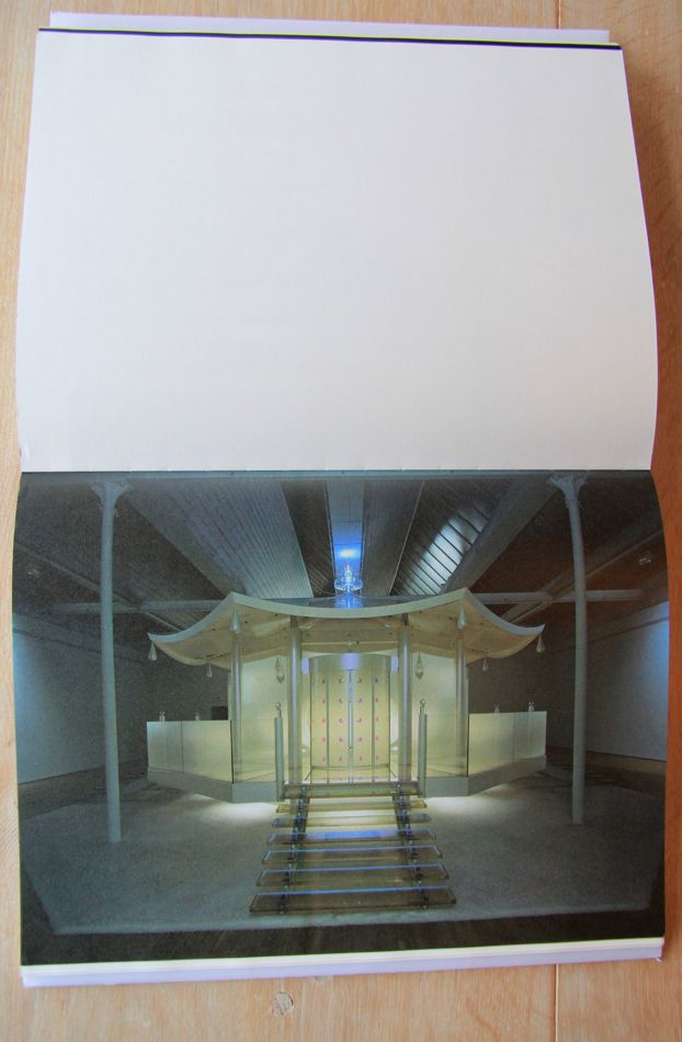
The last part represents the final pieces in full paper size. The pictures have a strong dark – light effect to give the work a more mysterious and extraterrestrial feeling and the final built Dream Temple look like something of the future. To give more attention to the slightly dark pictures, the opposite pages are blank and white.
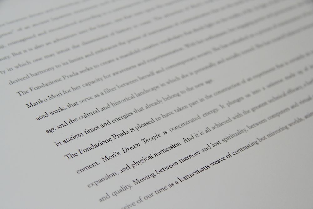
Looking at the typography, the book is clearly separated in two different parts. The introduction and documentation in the end consist of computer printed text and is left-alined. It creates a formal and aloof image.
Different is the main part of the book, which feels more personal linked to the Japanese nationality of the artist and the subject. The Japanese characters are handwritten in pencil and also traditionally calligraphed with black ink and they are lined from the top to bottom. This typographic contrast is in line with the artist who is dealing with the past and present at the same time.
Pierluigi Cerri and his team designed the book in a modern sleek and clear way, what makes it a bit impersonal. But still there are some playful elements who breaks through the formality, like the transparant vellum and the use of shiny types of paper. Looking at their other designs I see this tasteful details as well.
Despite of the use of different paper and layout, it remains rather formal for an artist book. It could be nice if the book was more representing the meditation feeling of the the Dream Temple.
This book design reminds me allot of the art and design in Italy, where I stayed for a year.
Italians are searching for a way to deal with contemporary life and the remains of their glorious past. They do that by combining a formal more classical structure, with playful elements and high quality materials.
These elements also fit well with Mariko Mori’s approach. All in all the design of the this book reflects the high quality of her Dream Temple.
Rietveld library catalog no: mor 1
