I tried to let my mind be open for new impressions during my selective process. My main goal was to find something that inspires me. Something that I can relate to but still find exciting in a new, different way. I also wanted to find a book with well thought out typography. So I can learn from it. Analyze it and break it down. Pick it apart like an engine.
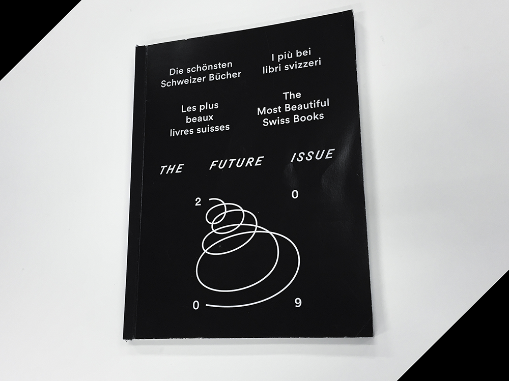
At first, all the showcased works by students caught my attention and I started going though them. Although many of the works were inspiring—I felt like I had more to see before making a final choice. I started to drift towards industrial design. The aesthetics were nice, with a lot of grids and furniture covering the front pages. But the typography that I was looking for was missing. At last I found a book called “The Future Issue” next to the industrial design section. At first glance, the typography of the cover really struck me. It was well designed, set in black and white, in a balanced layout. I opened the book and saw that it was designed by Laurenz Brunner. He’s known to me from before and an interesting designer, the choice was easy.
The Future Issue—Vol. III
FUNCTION AND FORM
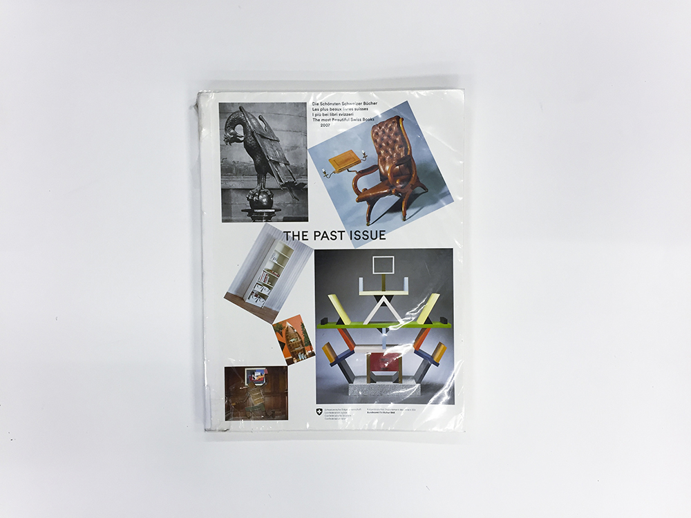
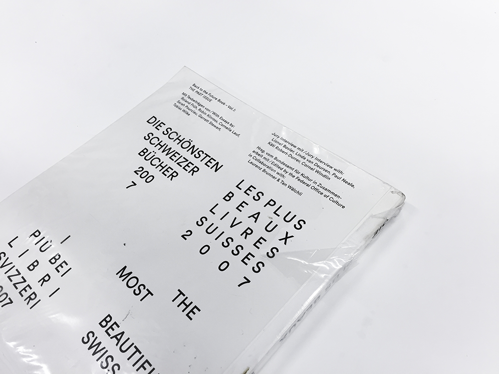
In 2007 the first volume of “The Most Beautiful Swiss Books” was released. This catalog is the first part of the Back to the Future Trilogy. “The Future Issue” which I found, is the third volume. In order to learn about the design I decided to go back and start with taking a look at the first catalog to see how the design has developed. All three volumes are designed by Laurenz Brunner. A composition of several colorful images are covering the front page. The title “The Past Issue” is written across the center of the cover. The images are positioned in a way so their corners touch each other. Connecting them together, almost creating a spiral effect. I like the fact that it also creates a clear hierarchy among the images. The cover feels well balanced yet without losing tension. Some of the images are rotated. It helps breaking up the square layout and also makes it more difficult for the eye to see the pictures individually. Instead we focus on the whole picture and get the impression of a playful yet organized layout.
The Past Issue—Vol. I
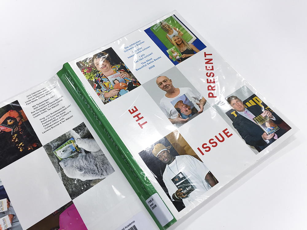
The second volume in the series, “The Present Issue”, has a similar cover. Yet again we see a composition consisting of colorful images. Although this time, the layout is much more organized. Every image contain the same size, and no one is rotated. They are positioned in a grid, spanning from every corner to the center, also connected by the corners. The titled is allowed much more focus—being set in a larger weight, in a bright red color. On the contrary, the title lose readability as the words are rotated. By comparing the two covers you easily spot the similarities and the differences. It is almost like they are reversed. On “The Past Issue” the images are allowed freedom and the typography is kept minimal. Creating a playful layout. While on “The Present Issue”, the images are static and the typography is allowed freedom. Filling the same function as the images on the previous cover.
The Present Issue–Vol. II
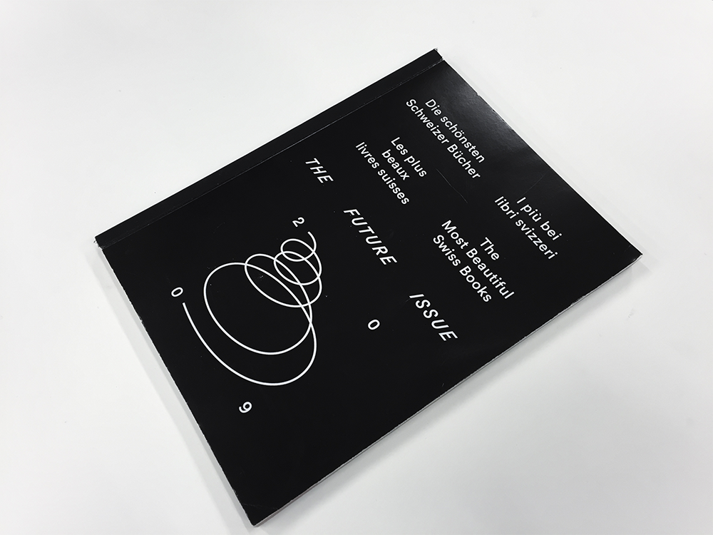
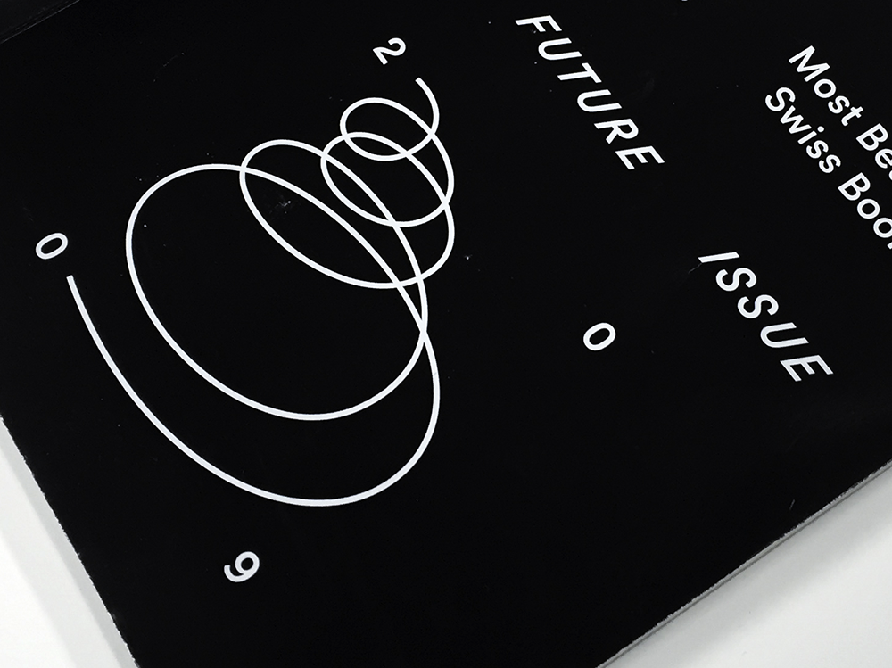
Lets jump forward in time and look at the cover of “The Future Issue” (Vol. III). The first you notice is that it does not look anything like the previous volumes. First of all the front page is completely covered in black. Second, there is no images. Only text. Despite this time, an illustration is also covering the page. The numbers in 2009 are spread out in a square with a loose spiral connecting them together. For me the cover feels much more mysterious and cryptic than the two previous ones. It’s atmosphere also works better with the title. The future is something that is unknown to us. Something that lies completely concealed in darkness. The spiral also emphasizes the mysterious vibe and makes me think of space. Which is also something that is very unexplored for us.
VECTORS AND HARMONY
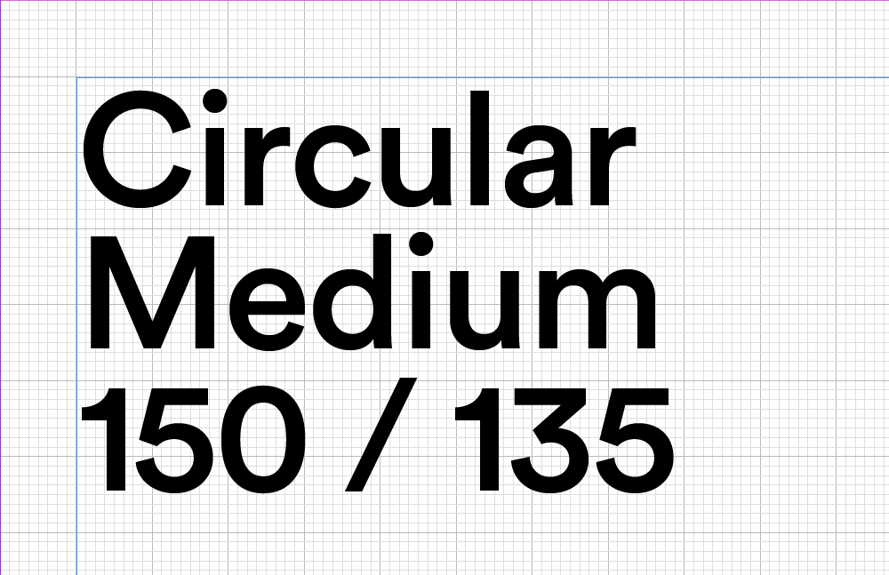
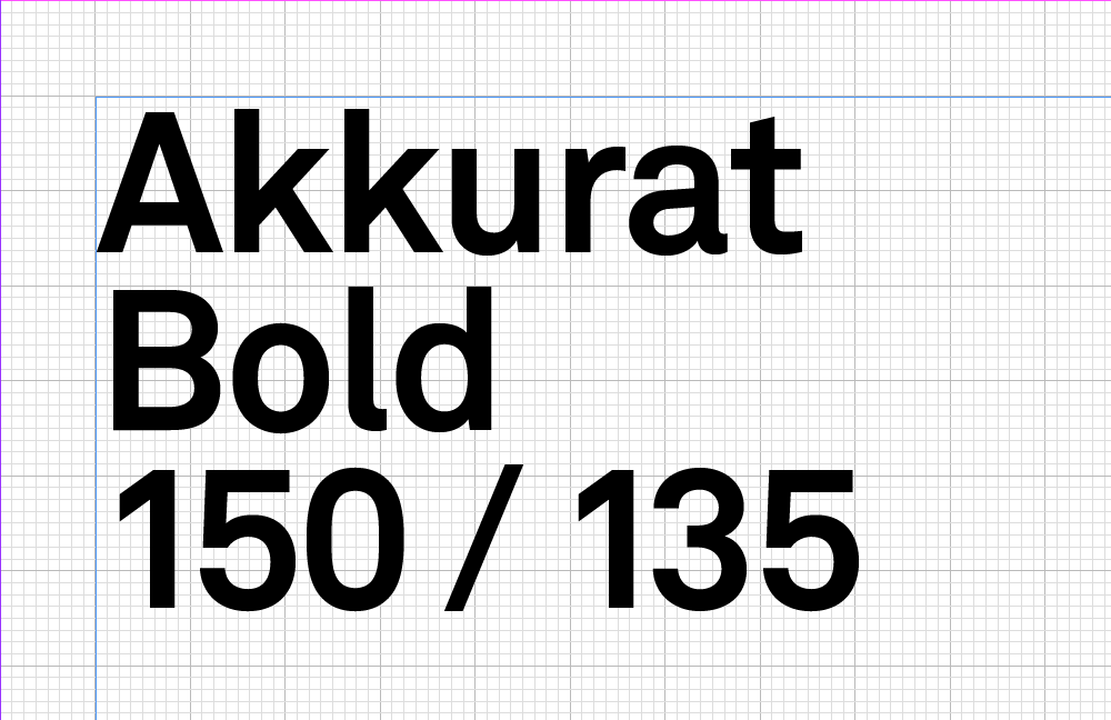
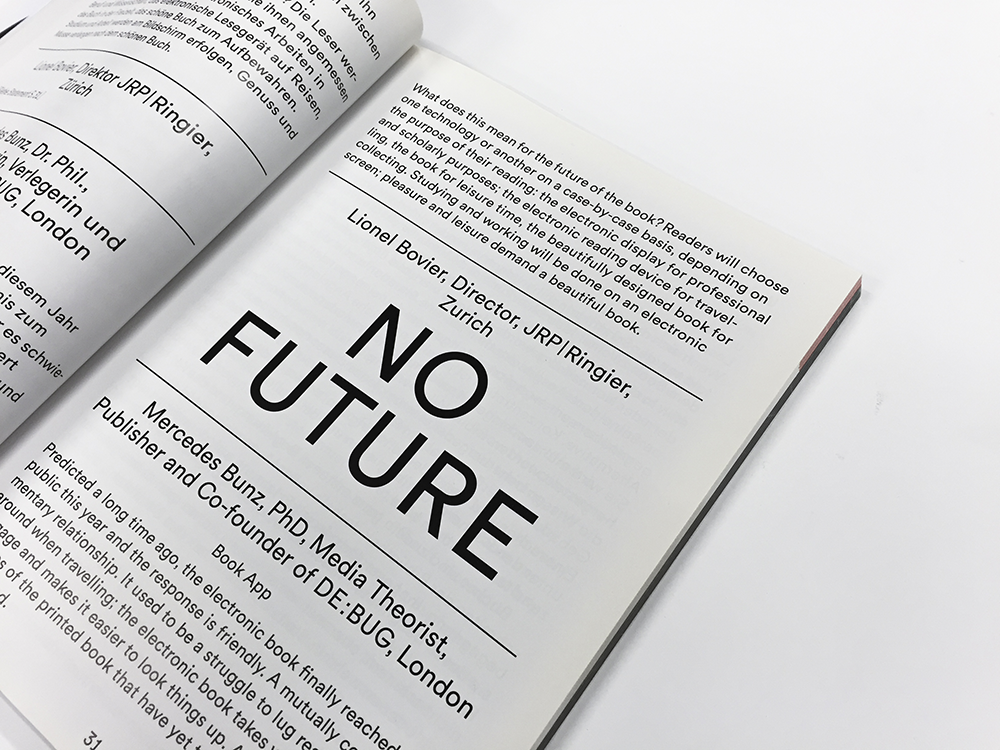
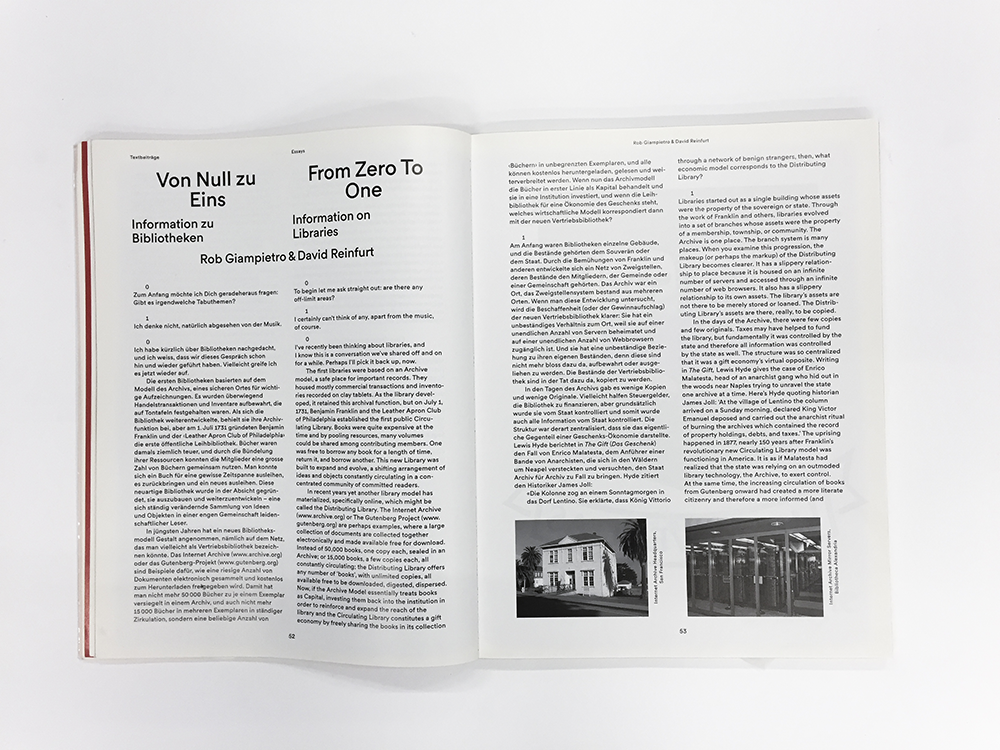
All three catalogues are set in Circular. Which is a geometric sanserif created by Laurenz Brunner himself. In 2004 he released his first typeface LL Akkurat which shortly became very popular. After it’s success he created Circular which is inspired by Paul Renner’s classical typeface Futura. Both typefaces has a purely geometric approach and a balance between functionality and idiosyncrasy. Circular also possess a recognizable character yet a universal appeal. The geometrical shapes became the representative elements of the Bauhaus design style and you can clearly see the influences in Circular and “The Most Beautiful Swiss books” series. The simple use of color also draws inspiration from the past, working only with red, green and blue. The layout and the typography of the series are simple. Designed in a minimalist way with high readability. Titles set in a clear hierarchy and text set in either two or four columns.
The way Laurenz Brunner is working with the typography connects the individual catalogs in a clear energetic way. All based on the previous one but with another layer added to it. The design varies but always with the same principles in focus. Laurenz Brunner’s fine harmony between tradition and modernism creates a design that I find engaging and timeless, in a very intriguing way. Function always in mind but set in a contemporary way.
Below you can find some pictures showcasing the typography from all three issues.
Rietveld library catalog no : 758.3 swi 2009
