DIY DIY DIY DIY DIY DIY DIY DIY DIY
HOW TO MAKE A CATALOG
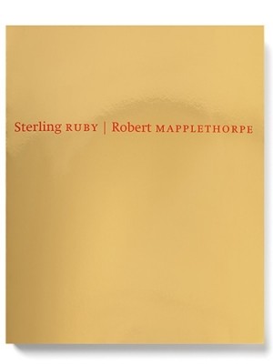
Sterling Ruby [x] / Robert Mapplethorpe [x]
Designer Rutger Fuchs, living and working in Amsterdam [x] [x]
Prep time: 1-2 months
Cooking time: 2-3 months
Total time: approx. 3-5 months
copies : approx. 1000 [x]
Before you start you need to collect a few people to work with.
Besides that you will need:
– Corporate identity for Xavier Hufkens [x]
- Typeface: Swift* by Gerard Unger [x]
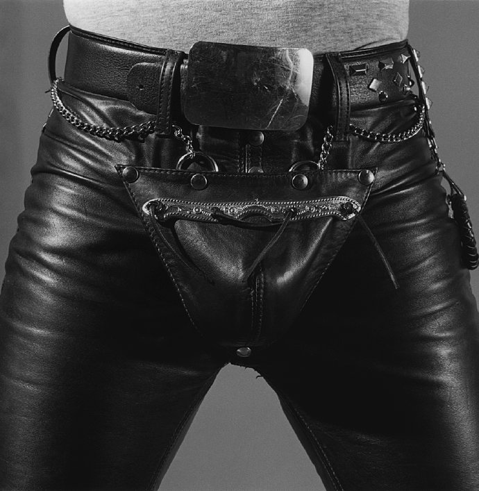
– Pictures of art work/photography
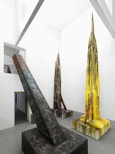
– Pictures from the exhibition [x]
– Exhibition notes by Sterling Ruby
– Essay by Ed Schad
– Gold coated mirror board (spiegelkarton)
– Red ink
– Printing Press
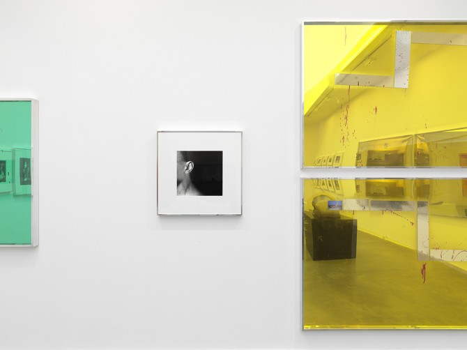
When you have found just the right team you collect all the images and structure them. Arrange them as you would hang the exhibition. Make sure that the pictures correspond to eachother. It is crucial to recreate the dialogue between the works, as seen in the exhibition. (A tip: start out with the photography of Robert Mapplethorpe and make Ruby’s works react to that afterwards – it works for me, but play along until you established the dialogue within.)
Then you add a good portion of graphic skills and mix it all up. When that is done, go through the content once again. Does it give you a feeling of entering the actual exhibition? Does the pictures relate to each other? Is the answer yes, please continue to the following step. If not, please go one step back and rearrange until you are satisfied with the result.
Now comes the difficult part – time to press the cover. Here you will need to add a lot of patience and some overwork. First you start out by printing the red title on the front cover. Print it twice to keep the typeface in place. The material is very easy to damage, so be careful to avoid scratches when you uses the printing machine. When the title is printed on successfully and you are happy with the outcome you let it dry. Leave it to dry for a couple of days to make sure the ink is completely dry. (Tip: try to avoid touching the red ink while drying. It might ruin the cover and you will have to do it over again.)
After this you end up with the final result, which should measure approx. 21,4 cm. broad, 26,4 cm. long and 1 cm. thick. This size will make it more suitable for shipping to collectors, friends etc.
Hope you’re happy with your result – enjoy your catalog!
* Swift (1985) This typeface has proved its worth in corporate identities, magazines and newspapers and occasionally in books — it is a versatile type and can be used in a wide range of circumstances. It is a striking type, with large serifs, large counters and letters that produce a particularly strong horizontal impression. This means that words and lines in Swift are easily distinguished, even where there are large spaces between words, as can occur in newsprint. Swift’s large, robust counters were designed to improve legibility particularly in newspapers. It was designed in the early eighties, when papers were less well printed than they are today, and its special features help it survive on grey, rough paper printed on fast rotary presses. Today it is used more often outside newspapers than in. The current Swift (1995) is an improved version with technical and aesthetic enhancements, and has been expanded into a family of twenty-four variants.
///////////
BONUS INFO
A catalog representing an exhibition [x] of Sterling Ruby (American artist 1972) engaging with the photography of Robert Mapplethorpe (American photographer 1946 – 1989).
“Can one have a conversation with an artist who is no longer living? What is the nature of autobiography and biography? Why is psychoanalyzing Robert Mapplethorpe so compelling?”
These are some of the questions Ruby has been working with towards creating a whole new line of works.
“In a way, one can say that, while Mapplethorpe captured surface transgressions, Ruby’s response has been to take the inside outside and shove it in our faces.” [x]
The catalog itself catches your eye right away with its reflecting golden cover and the red stained typography in the front. I wanted to figure out why especially this shiny cover caught my attention and found this phrase online:
“We have long been obsessed by shiny objects – from the latest glimmering gold iPhone to the sheen of a pair of high heels. … It is humbling to acknowledge that despite our sophistication and progress as a species, we are still drawn to things that serve our innate needs–in this case, the need for water.” [x]
Rietveld library catalog no : map 6