Juergen Teller is seen as one of the most influencing fashion photographers of this time. For the past twenty years his work has been featured in leading magazines. He has had exhibitions in museums and galleries. He has done campaigns for the worlds biggest fashion brands, and has worked with top models as well as with celebrities.
He is perfectly capable of combining the world of fine art and the world of commercial photography. And he walks an extremely fine line between these two.
We recognize his pictures by the random and untidy context in which he places and photographs his models, and also himself. His pictures seem negligent snapshots rather then constructed fashion photos. And therefore, according to a lot of people, rather art than advertisement.
Looking at Tellers oeuvre (so far) it is extremely difficult to draw this line between fine art and commercial photography. Teller himself refuses to separate the commercial fashion pictures and his most autobiographical non commissioned work. He tries to combine his commercial commissions with his personal work, even though it is very difficult to find the right balance. “This is something I struggle with and think about a lot. I need the commercial commissions to support my family and me and to finance my personal work. I prefer being able to do my own work with as little boundaries as possible, for example the pressure of selling the pictures. But the commissions I get are not unpleasant at all. I meet inspiring people and get to visit places I would never visit. Above all that I see everything I do as my work, commission or no commission. The division is not so clear actually.” Teller is very autonomous in his ideas. With his raw, sometimes autobiographical style he is able to push the levels of commercialism.
When I was researching Tellers history there were a few things I found remarkable. I will point these out in order to underline my perspective in this research.
First is his strong attitude, which influences his ideas. He is persistent on achieving what he has in mind and will not easily let anything get in the wayof it. He doesn’t care what other people think about his work, and is convinced by his own style.
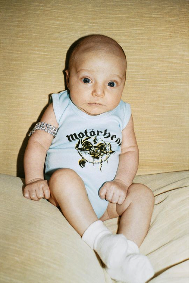
When he got the commission to photograph jewelry for a catalog of the auction house Phillips de Pury, Teller at first thought of using supermodels. This choice would have made sense. But he thought about these young girls, who are not so much interested in jewelry than for example his mother is. Therefore he decided to shoot all the pictures for the catalog with his family.
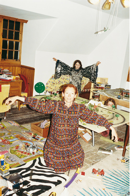
He doesn’t try to create something that isn’t there. He anticipates on movement, time and place and therefore manages to capture extraordinary moments. When he worked with Tilda Swinton to make a fashion-editorial he found it difficult to get her out of her role as a mother. Instead of forcing her, he decided to let the kids join in the picture.
Second is his willful, creative mind and his perspective on beauty. Teller has a remarkable preference in his subjects and models. This unique perspective has a lot to do with his frustration about the fashion industry, which I will explain further in the third point. We see a gradual tilt in his preference in subjects and models. He explains: “In the past I always thought I had to photograph people that I really liked or that inspired me. I thought it was the only way to shoot good photographs. But when I made my book “Go-Sees”, in which I photographed girls who introduced themselves as a photo model, I learned to concentrate and photograph people which wouldn’t interest me at first sight”.
(The book ‘Go-Sees’, mentioned in the quote above, marked a turning point in Tellers career. The following video embarks upon this point and……., well, it speaks for itself. Juergen Teller on his Go-Sees series)
The models Teller favored have always been different from other photographers. In his early career he noticed Kate Moss. She was short and quirky, fairly strange compared to the supermodels of that time.
As time passed by Tellers popularity grew, he got more commissions and editorials. His preference for models tilted from younger girls to older women. This is closely related to the third point which is his attitude towards the fashion industry.
“Most fashion photography is done by gay people finding women sexy, which is sort of not sexy at all, at least to a heterosexual man. She’s so retouched, so airbrushed, without any human response at all, and, well, you don’t really want to fuck a doll. I just turn the page. It doesn’t really interest me very much. My work has nothing to do with that. I just really like women, and I like men, and I like children, and I like eating, and I like doing everything. It’s something real. I’m for the individual human being, not some plastic figure some gay guy thought out. That’s valid for something, but it’s not my cup of tea.”
He takes a clear viewpoint compared to the average fashion photographer. He is determined about capturing the moment as it is, and therefore he never retouches his photos. About this Teller says: “I’m interested in the person I photograph. The world is so beautiful as it is, there’s so much going on which is sort of interesting. It’s just so crazy, so why do I have to put some retouching on it? It’s just pointless to me.” Already in his early career Tellers work was completely different to the general fashion photography. He gave them raw photos and dared to show the ugly side of things. He visualizes the imperfection of what’s real.
While doing a commission for Vivienne Westwood he decided to photograph Westwood herself instead of the model that was present. Every other photographer would have frowned upon this situation, choosing a sixty year old woman with sagging breasts over a skinny, soft girl.
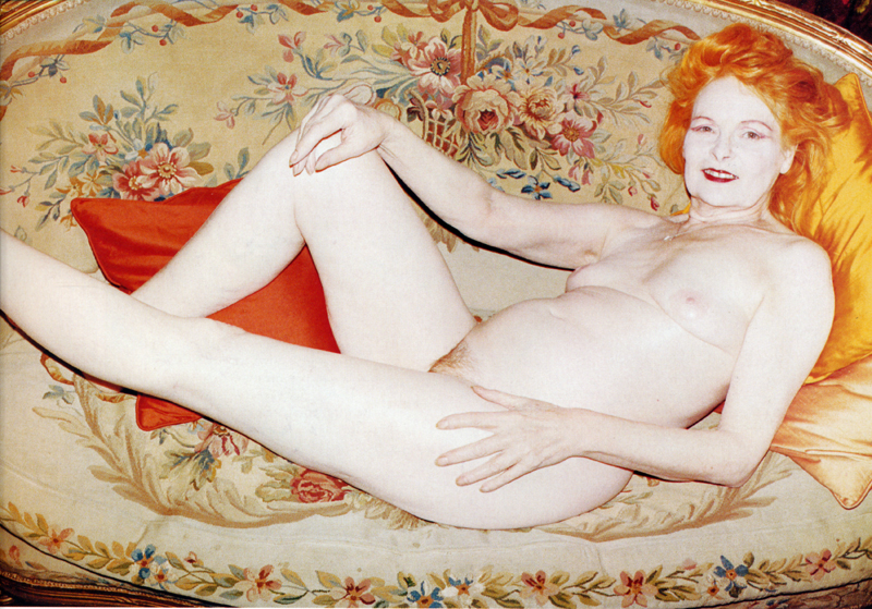
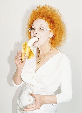
It takes a lot of courage to make this conscious choice to go against the grain. He dares to seek the controversy; he dares to make fun of the objectifying fashion industry. He remains true to his own aesthetic. He explores the relationship between the photographer and his subject and pushes it into new territory. The line between fine art and commercial photography will remain thin, if not invisible. Teller does commercial commissions, he has an eye for the brand and it’s customer. But his work is so specific, that he dares to make it for an extremely small target group. If they don’t like it, they don’t like it. He has found a smart way of combining his individual creativity with commercial commissions. This hits the core of his work and his success. “I just want to do what I want to do”.