* *
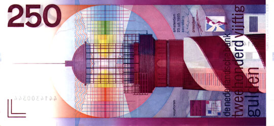
To choose an item in a graphic design museum with which I felt a particular connection wasn’t the easiest thing to do. I am able to see the beauty or the richness of a composed design, but usually it doesn’t grab me like for example a painting can do. In order to do find a reason to be there, except of looking at nice images, I tried to search for a design with which I did feel that personal connection. In the end I choose an item that is as general as it is personal. Our old fashion outdated but beautifully designed Dutch guilder. The paper money that when we look at it nowadays looks more like the monopoly money we used to play with as kids. But it was no children’s game at all. It was the last design in a series of national currency. Maybe it is some sort of melancholy for a time that has past on pure patriotism. In any case I love the design that R.D.E. Oxenaar made. It is the clearness in design, the beautiful intense purple color and the nicely composed graphic elements that intrigues me when I look at it.
But how do we come from a subjective preference to a little history of Dutch banknotes design? This is what I wanted to share with you.
Out of three designers that were asked by the Bank of the Netherlands in 1965 to sketch and design a new series of banknotes, R.D.E. (Ootje) Oxenaar was picked to execute. A tumultuous journey in the world of the printing works was about to start. In the playful way that Oxenaar made his design for the Dutch guilder there seems to be a lot to discover. Did you know that…
* he did put in elements that were accessible for blind people and was the first in the world doing this?
* he hid some personal elements in the banknotes? Like his own fingerprint in the hair of Baruch Spinoza on the 1000 guilder bill and the rabbit of his girlfriend in a watermark.
* Oxenaar underlines the fact that the lighthouse on the 250 guilder bill has something of a phallus symbol, but that he mostly uses it as a symbol of safeness, as something that is watching over the dikes to protect us? A link to the 250 guilder clip on You Tube
THE NEW STANDARD
In a book about the history of Dutch banknotes design I read about the struggles and the slow development stage the design process tended to stay in. Then I read an interesting lecture of Oxenaar
that he gave at a design congress in 1987. read this all in the linked pdf