Organizations and brands have logos and fonts to show their respective identities. This is called BI(Brand Identity) or CI(Corporate Identity). BI, CI give an easily identified image for an organization or company, and it can affect the perception of the entire country as well. It is because The country also functions as a brand.
© Wikipedia
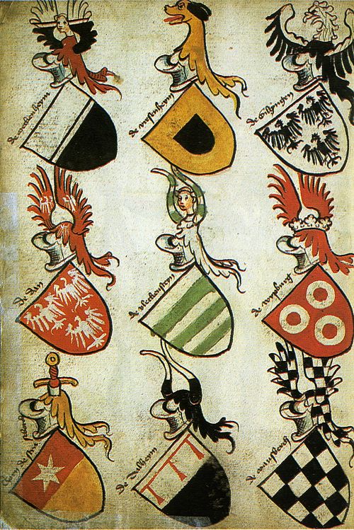
Heraldry has been used in many countries as a symbol of countries. The national symbol as national CI is explained as an official sign that shows illustration, graphic letter, etc. in order to inform the existence of a nation in the international community.
The National CI contains the essential elements of national identity, such as values and beliefs that have arisen over many years. Many nations borrow their identity patterns, colors, etc., while simultaneously developing Nationality fonts to show their identity. Each country has a different cultural background. They apply different cultural differences and reflect them. Even on fonts.
We will research the Sweden-Sans and the Korean government official font as representative cases and examine the identity of each country reflected in typography.
Sweden Sans
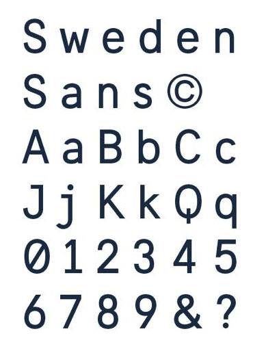
Sweden Sans is a sans serif typeface that can be used in both analogue and digital formats. It’s developed by the Swedish design agency Söderhavet. Their starting point was the Swedish flag, the yellow Scandinavian cross against a blue background that has been used since the 1600. It is also inspired by signs from the 40s and 50s.
There is an expression in Swedish, lagom, which means ‘not too much and not too little’, something in the middle that means you’re satisfied. Swedes are very fond of this expression and use it a lot. This was also what Söderhavet aimed for with Sweden Sans they say.
When I read about this customized typeface on Sweden.se it says:
“Sweden Sans is a long-term choice of typeface; it has an unassuming character and fits well with a broad spectrum of other typefaces.”
This I find very interesting. On one hand I see a connection to the known political concept of the Swedish Folkhemmet. Which is in a poetic sense referring to the Swedish welfare state, and in a political sense referring to the lagom way between capitalism and socialism. Here I see a very clear connection between Sweden Sans and the Swedish history, culture and strong mind set around the word, lagom, which could be one argument to support why Sweden sans would be very suitable as a national typeface.
On the other hand I also see this thought of ‘one type fits all’ that they are trying to propose on the website explanation. I’m relating that to throughout the histories known open migration politics that has been strong in Sweden. But the nationalistic and far right-winged winds are blowing through Sweden as well as through the rest of Europe so how well does actually this adaptable typeface represent Sweden in a nationalistic sense? Is it Sweden that is adaptable or is it the Swedish people that should adapt to old Swedish ideas of being lagom?
To make a comparison with something else then a nation but with similar problematic I would like to bring up MoMA. When the MoMA design studio [x] chose to have the same typeface for most of their exhibition identities, curators and in-house designers were scared to loose their freedom of expression. But the MoMA design studio had good arguments for it. For example the designer/curator could focus more on their idea then on the millions of typefaces you can use. In this case having one type that fits all, works out as a facilitating tool. This might work out in a national context too, but I think its more complex. A national identity build up like that could work as an attempt to solidarity and standing together, or as a nationalistic striving to fit everyone into one lagom type, and therefore keep everyone who doesn’t fit out. I guess the question is more about if you see yourself fitting (liking) the national identity/font and then being satisfied, or not.
South Korean Official government font
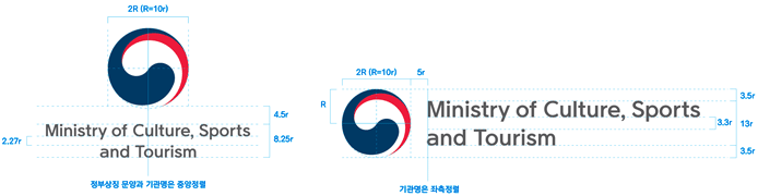
The South Korean government announced a new national identity in 15th March, 2016. Ministry of Culture, Sports and Tourism has unified the design of the Republic of Korea government symbol for use in all departments. It is used by all 22 ministries and 51 central government agencies. It was the first time in 67 years that the nation has installed new identities.
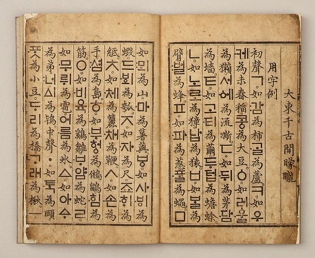
Hunminjungeum, the original manuscript for the Korean langjuage © Korean Intellectual Property Office
A Korean official typeface inspired by the font used in the “Hunminjeongeum”, or “The Correct/Proper Sounds for the Instruction of the People” that was published in 1446, when King Sejong implemented a new written language called Hangul, Korean alphabet.(Reference Article via here)
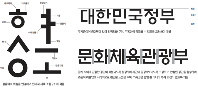
They developed fonts based on Hunminjeongum, the origin of Hangul, to give them historical / cultural legitimacy. The font is designed the basic formative image and visual characteristics of the Hunminjeongeum and modernizes the first Hangul with the harmony of Hunminjeongeum and the modern Korean font, Dotum which is Korean generally uses a lot. It is in a way that can be adapted to modern media and images. And also It was designed to harmonize with Taegeuk, the pattern forming the center of the Korean national flag.

The official font of South Korea reflects the formative characteristics of the early Korean calligraphy in the system of modern font design and also consider of harmony with traditional symbol. Through this, Korea ‘s history and culture is put into each letter.