Skip to Content Skip to Search Go to Top Navigation Go to Side Menu


"lustre" Tag


Lustrous Lips and Fingertips


Sunday, May 21, 2017

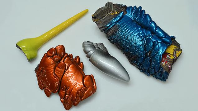
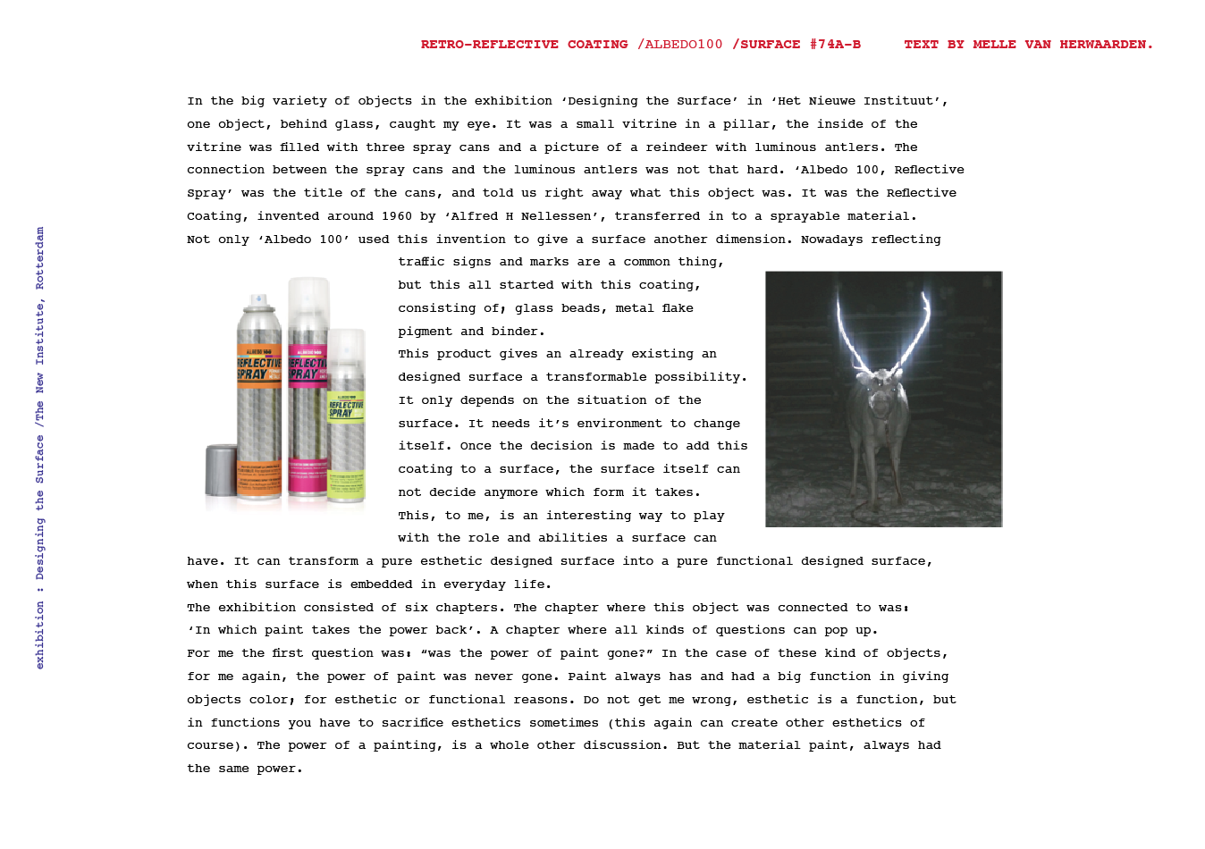
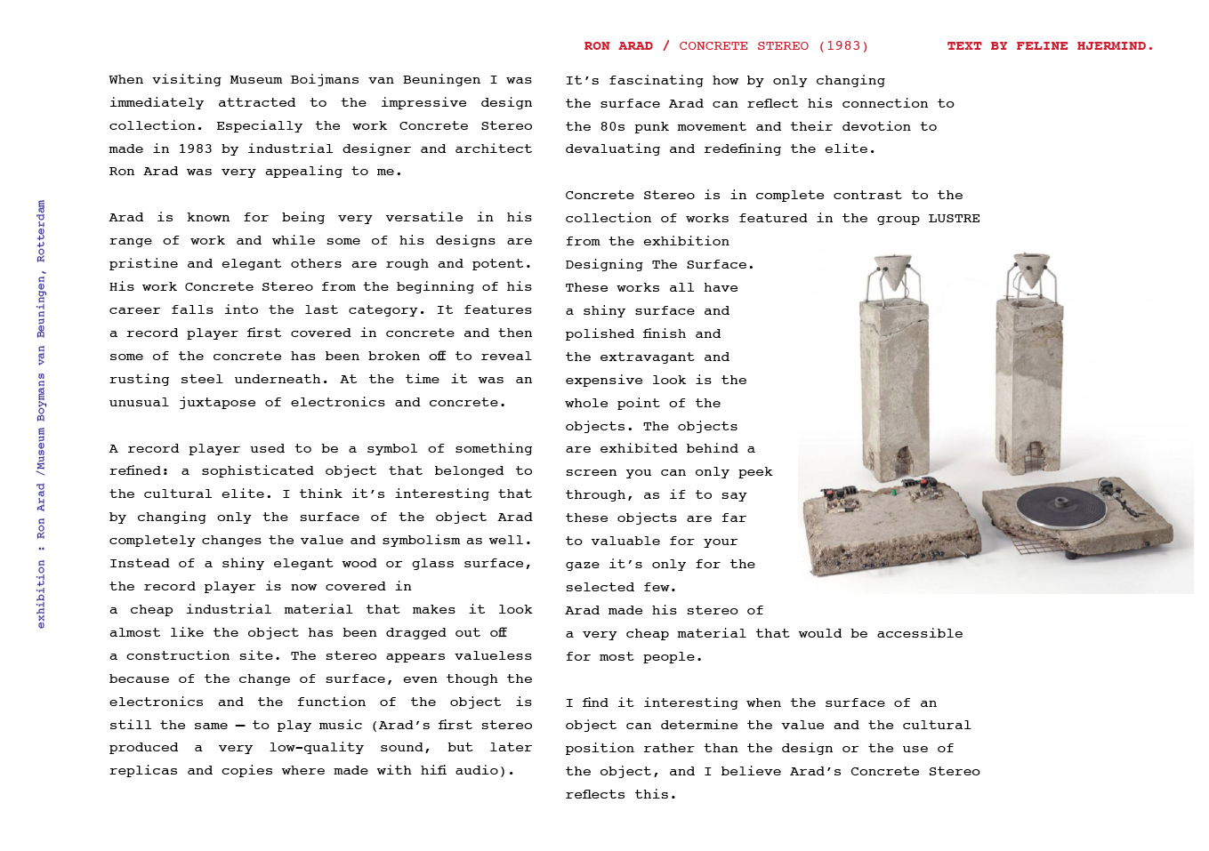
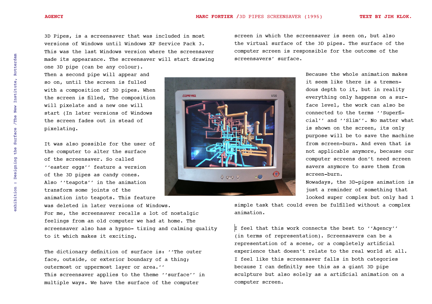
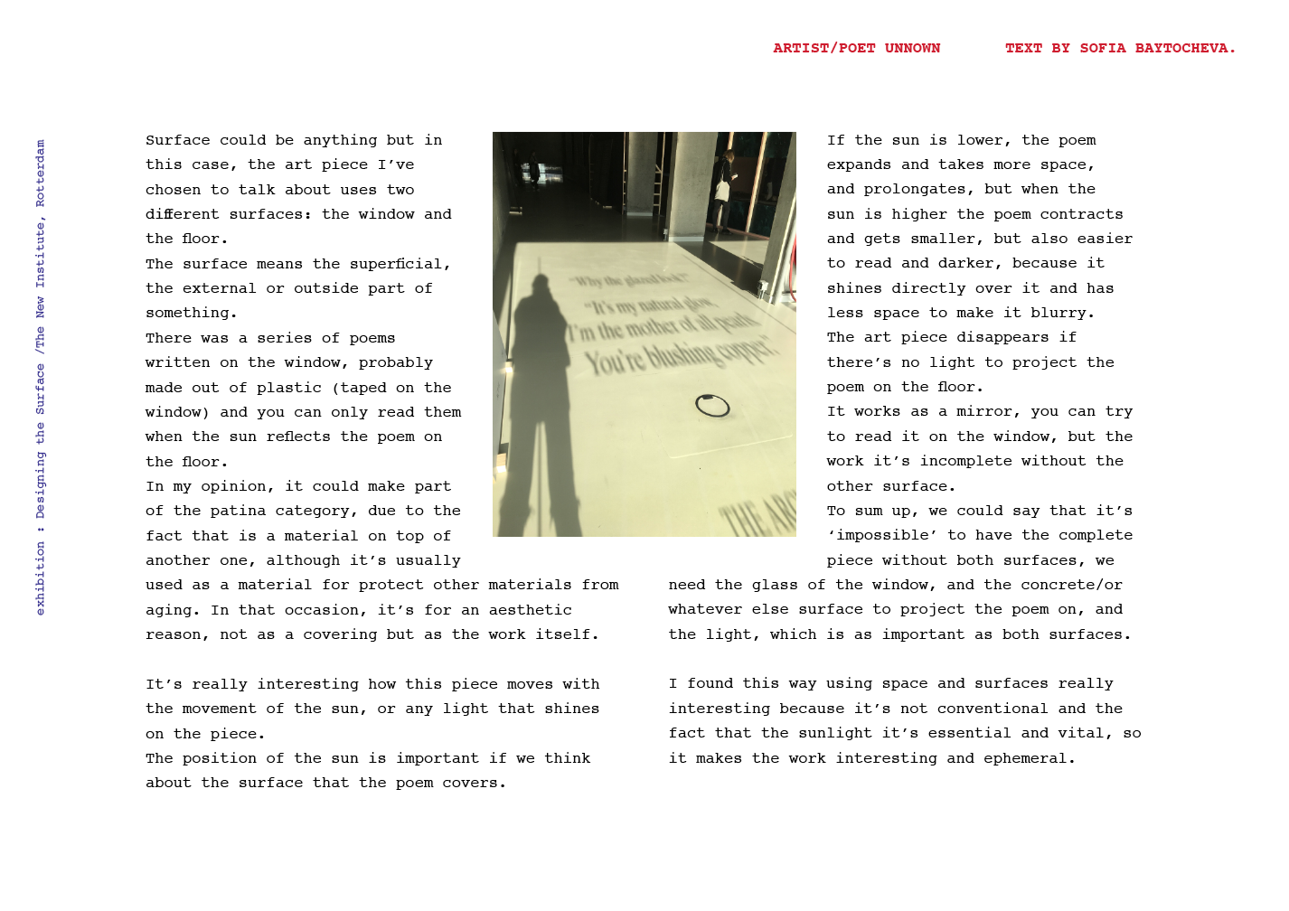
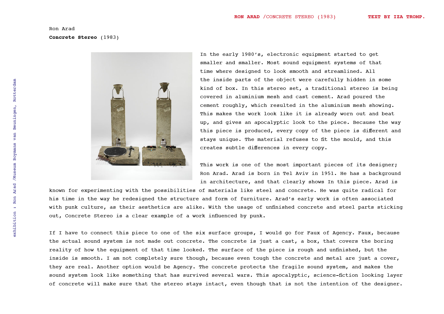
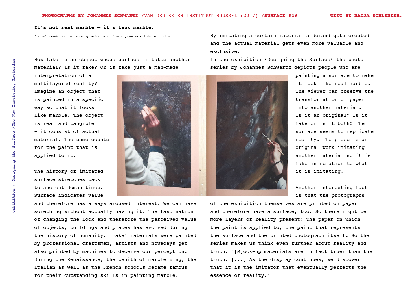
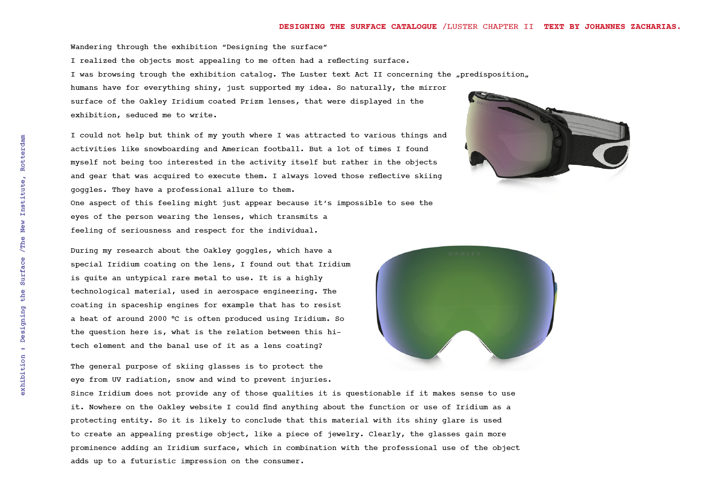
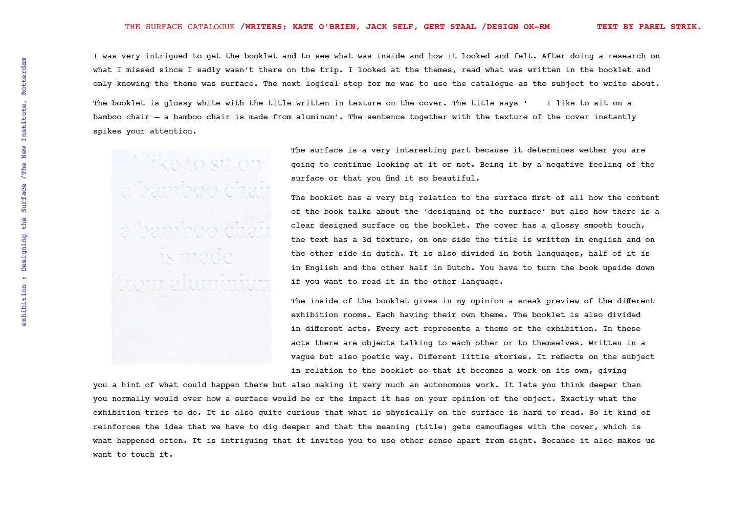
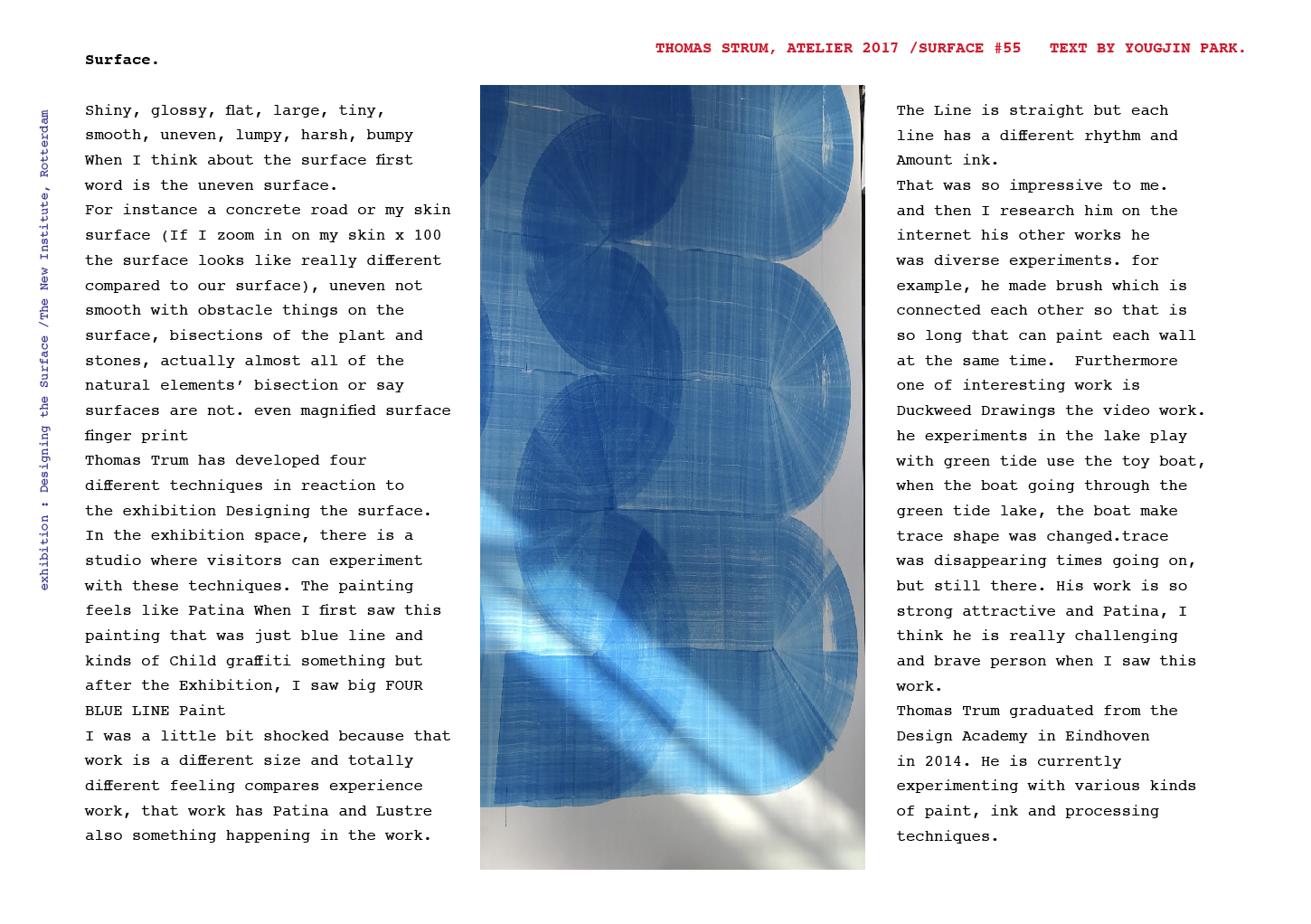
Warning: Do not scratch the surface.

lips


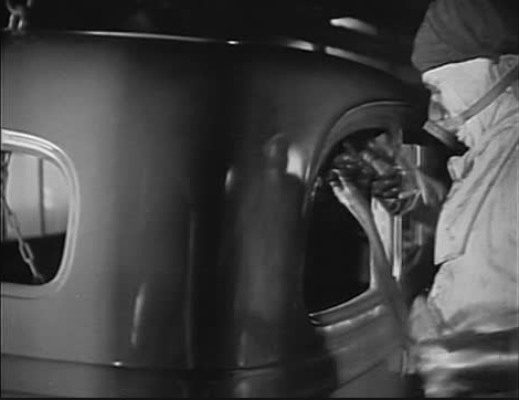
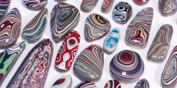
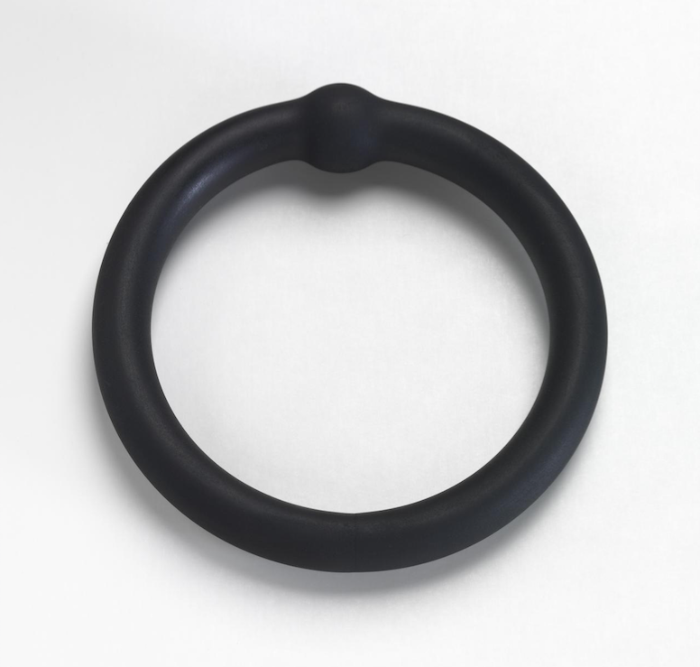
The nail polish stand is linked to the Lustre section of the exhibition for the visually obvious reasons such as its shininess and sheen, but also for its historic link to car paint (also highly featured in the Lustre section) as an inspiration for the first nail polishes.


tumblr_on9d8801wK1rze8z7o5_1280 Designing the Surface Nail Salon Screens


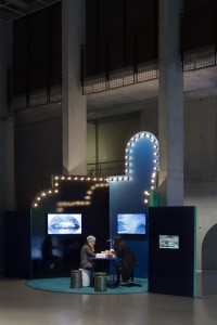
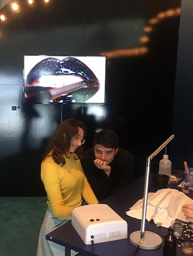
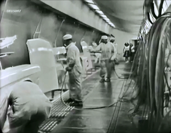
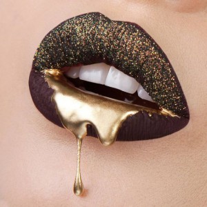
The exhibition designed to feel like a fun fair, is divided into pavilions. The Nail Salon becoming an attraction for visitors. Drawn to it like magpies, visitors are able to get one nail painted and glittered. Somehow promoting the addition of Lustre to ones body, to have one nail become like a car door, while you watch two screens flash lips dripping with gold and gloops of glossy colour, nails painted and paint peeled from pristinely polished cars. Somewhat hidden is a third screen. I must admit I did not catch it at first. Too distracted by the glitter goodies, to notice the children labouring in mines. Since I did not pay full attention to this third video, I am not sure what they are rummaging in the dirt for? How is it linked to getting your nails painted? To the lips pouting at you from the first screen and to the expensive cars in the second. How are these poor children linked to these items of luxury?


Perhaps they are mining for titanium dioxide or ground mica, which can be found in some glittery nail polishes? Why then was this screen placed out of view from the person sitting getting shiny minerals added to their fingers?


I wonder if the artist Jonathan Auch was offering a critique to lengths we go to to increase our lustre? These videos differ from the artists’ usual street photography style. Black and white photographs of real people in real settings. Rough, gritty, textured faces of everyday faces. Seems odd then, this choice of work for this exhibition. Accentuating the fake-ness of the surfaces we crave to have not only on our cars but also on our very bodies, and who in another part of the world this may affect.


Jonathan Auch for Koehorst in 't Veld, Nailsalon screens Mother/Father/Child 2017. exh.cat.no.24A/24B/24C

Fordite: the post-industrial agate


Friday, May 19, 2017

Skærmbillede 2017-05-27 kl. 19.20.22

Fordite is a material left over from when car manufactures used to paint by hand. It is an incidental leftover material. Fordite comes from layers of paint being sprayed on top of each other on the bed the car chassis would sit on when its was painted.
 

Fordite_Carplant Skærmbillede 2017-05-19 kl. 15.06.23

It can be found mostly in America, especially in Detroit were all the old great car-factories were. The layers were hardened repeatedly in the ovens that the car bodies went into to cure the paint. Eventually the paint would layer up so much that it had to be chipped off. The practice of spray-painting by hand started in the 1920s and stopped in the 1970s when the process was automated. Because of this fordite has gotten a nostalgic appeal, with people also remembering their old cars. Also it means that its finite with people looking around the ruins of old factories to find it. All the layers of different coloured paint end up making a unique looking product, striped, almost psychedelic to look at. Its hardness makes it possible to cut up and polish, making it ideal for things such as jewellery.

The name Fordite is of course made up, nobody is sure where it originates from. Maybe Ford-ite. Its also called other names like motor-agate, Detroit-agate. Agate is a gemstone, where the slow accumulation of sedimentary layers creates beautiful patterns and colours.

In the ‘Designing the Surface‘ exhibition, Fordite is in the second act of the “lustre” section. Part of the”pearly entourage” playing the character of the ‘The Derivative’. Lustre is a type of metallic glaze, that’s originates from the middles east and has been around for almost a thousand years. It is the first enamel if you will, while the car paint might be the last.

unnamed (1) DSC0475

raw fordite v.s cut and polished fordite.[x]

A new material is rare, and what peaked my interest, is that fordite is a new material born out of chance. An accidental waste product. Alas it had to take some time before it was perceived as something much more precious, and beautiful.

I’m fascinated by idea that something like a massive industrial operation, such as the ford factories can leave something as complex and beautiful behind. I hope in the future that our current wasteland of factories might leave small nuggets of beauty like this behind in the rubble.

raw Fordite v.s cut and polished fordite.


unintentional surface


Thursday, May 18, 2017

Silen-Witness_950

 
These works are created unintentionally over years, silently coming into form. The first work, a tin used to collect small parts of paint where after some years dust has assembled on the surface to grow on the paint and bloom into a totally new object. In the second work it is about the paint dripping down and forming stalactites. Both works that at first had no apparent form/function or where the object is somewhat misused, they had time to grow and form a skin that now attracts full attention. These objects have a certain relation to imitation (faux) where I assume that you would expect a different material at first, something that has a long thinking process behind it, and where technique seems to be funest to create such an ornamental artwork. These works hide perfectly behind being part of a long growing process where they just slowly and unnoticed can find their purpose. Also it is interesting to think about certain materials and their aging form where the possibilities and speculations seem to be endless. I think these objects have an interesting point of view where you have to think about an aging process. You wouldn’t be actually able to make something like this in a short amount of time and where you almost never really will be able to control the way it will grow. This way of designing that is more unintentional, often by accident, requires an eye on detail, tryouts and attention. For me personally these works that sometimes almost appear accidentally by just trying out things and looking closely to the options, combinations and faults, are the things that bring some depth or in some way a soul into the work where I want to approach it as a living form that deserves a place to get recognition.
Silen-Witness2_1100


Silent Witness 1 and 2, private collection C.Pompe. exh.cat.no.19A/19B-lustre

Extravagant kettle


Monday, February 27, 2017

bollitoredesignblog


This kettle has been designed by Richard Sapper, a well known german designer. Richar Sapper started as a designer at Daimler-Benz, then, as he wanted more freedom in creation, he moved to Milan and started working for Alberto Alessi  in 1958. He had an obvious proximity with the Italian editor. Alberto Alessi is one of the most influent designers, he especially worked on “emotional kitchenware“. (see more of his works: Alessi index)

The first Bollitore 9090 was released in 1980 and was the first to be exposed at the Moma in 1983. The Same year, the Bollitore 9091 with melodic whistle came out [x].

Alberto Alessi's presentation of the Bollitore 9091.

The Bollitore 9091 has the same design as the 9090, with a very reflective silver surface, a golden spout and a black handle.

By placing a golden chorister whistle (little tubes meant to tune wind instruments) on top of the spout, Richard Sapper is adding a poetic aspect of a melody to the very materialist function of boiling water.

In both editions, the design of the kettle is not the most influent element but the surface is the most important. The materials completely transform the kettle, the meet of silver gold and black makes it extravagantly popping out, and seducing.

Using the minimalistic aesthetic, he is making the viewers wonder about the object itself, its design, its function.

« For him, the form follows the function but his notion of function is going far beyond pure material aspect. In his projects, he is always aiming for a sort of «  spirit function, he loves when his objects have a soul » Alberto Alessi.

Richard Sapper is here seeking for a poly-sensorial object, that appeals more senses than a regular kettle.

Sapper’s Bollitore is also making us reflect about the function of our everyday items.

The kettle has been completely transformed by the material covering the surface of the object, the match of shiny silver and gold has a very attractive effect which directly disturbs the perception of the object behind.

The luster of the Bollitore is perfectly inappropriate to a regular kettle situation. A surprising feeling I also felt with the Fordite, when I realized it was just paint layers component of a precious stone look.
Both of the Fordite lustre and the Bollitore lustre are disturbing because it’s making the perception of the object more ambiguous.


Reflection


Sunday, February 26, 2017

Bildschirmfoto 2017-02-26 um 15.56.29

Since I moved to Amsterdam I regularly visit the Stedelijk museum. The last time I was here it was different. Normally I just wander around but this time I was looking for something. A surface that would be interesting for me.
The last Text I wrote on the design blog was about the Iridium coated Oakley glasses with a colorful reflective surface. The object I want to write about this time, Slaapkamer-ameublement, is very much related to the previous text. It is a bedroom mirror designed by Elmar Berkovich in 1930.
A mirror is a reflecting surface, historically made of obsidian , silver, bronze, or aluminum. Today, most mirrors are made of glass, with a silvery, metallic, or amalgam backing. They serve many purposes, ranging from personal grooming to exploring the universe and they are also a common theme in art and Philosophy.[x]

 
Berk106-01_1000px
Elmar Berkovich: slaapkamerameublement, 1930 [x]

 
At its simplest, the mirror reflects what is positioned before it. In viewing ourselves in a mirror, we see what we recognize as self although this reflection is an image reversal of what others see in looking at us.
Sometimes I have some weird experiences when I look into a mirror. You know that you are looking at yourself but sometimes it feels like it is not you that is looking at yourself but rather yourself observing another person. We recognize ourself but actually, we do not know how we really look like. We only know how other people see us with the help of a mirror.

Bildschirmfoto 2017-02-26 um 15.57.04

The philosopher  Jacques Lacan, based his ideas on the human infant’s response to its image in the mirror.
Lacan’s theory is not about the mirror as a reflection of self, but about the mirror as the constitutive element in the construction of the self and self-recognition. This theory is interesting in my opinion because it suggests that we define our selfs by what we see in the mirror and therefore what others see in us. We describe ourself for what we are, but we cannot describe ourselves from outside or in formal terms. It is not us, it is just a reflection.
 

When the surface is sticking it to the man


Tuesday, February 21, 2017

At the design section of the Stedelijk Museum I felt an attraction towards objects that glitter and sparkle instantly. The jewelry collection was filled with extravagant pieces made from expensive materials and with a shiny finish that effectively seduced me. But in the middle of all of these flashy designs I found a simple and minimal bracelet made from lusterless rubber and with a small bulge in the middle as the only detail. As it was in such contrast to the other items, it raised my curiosity.

Gold macht blind

Otto Künzli, Gold macht blind (1980)
galvanized rubber, gold


Otto Künzli created his jewelry piece ‘Gold macht blind’ in 1980. It’s seemingly just a simple rubber bracelet, but Künzli claims that under the surface a ball of pure gold is concealed in the rubber. Instead of letting the gold do its job by shining and seducing the viewer, Künzli has decided to cover it up by a cheap, industrial and unpolished material. He raises the tension between what you experience on the surface and your desire to dig inside and reveal the gold. This way the bracelet comments on our destructive greed towards everything that glitters: “If the owner wants to know with certainty whether gold is concealed in the armband, he must destroy it.” (x)

concrete stereo

Ron Arad, Concrete Stereo (1983)
Concrete, steel wire, electronics

Gold macht blind was made as an effort to undermine the expectations we have that jewelry is supposed to be decorative and flashy symbols of status and rank. This way Künzli’s bracelet has a lot in common with the industrial-looking record player covered in concrete, Concrete Stereo, Ron Arad created in 1983, which I described in my last text (x). Both works play with notions of value, and whether objects with lusterless surfaces can be desirable, and both artists create works that devalue status symbols. While Arad was part of the punk movement, Künzli is known for his humorous “stick it to the man”-attitude [x].

It’s obvious how ‘Gold macht blind’ with its matte rubber surface is in huge contrast to the sparkling works seen in the collection LUSTRE from Designing The Surface. Just like Arad’s Concrete Stereo [x] I find it fascinating how Künzli can convey his anti-elite opinions by playing with our expectations to what the surface of a piece of jewelry is supposed to look and feel like. By removing the shine and luster, the jewelry piece appears valueless, even though beneath the surface gold is hiding.


Designing the Surface Supplementary Show /New Institute


Monday, February 13, 2017

bieb_15029_mahoniehout-03_950

Gebr.A.R.& P.van der Burg /wood and marble painting examples in color 1876


Supplementary Surface Show Under Construction


20 students of the Rietveld Academy’s Basic Year visited the exhibition “Designing the Surface” organized at the New Institute Rotterdam (2017).
The intriguing aspect of surface, an issue that is generally avoided in a discussion about the context of content, raised our curiosity.
The exhibition and the accompanying publication was inspiring as were other additional exhibits like ‘Screen Savers’ or various shows in adjoining musea.

/FAUX /PATINA /LUSTRE /TEFLON /AGENCY /SLIM

Curious for our reflections on these subject?

Chose an image and click on it.

We assembled this small supplementary research show for you to enjoy.


PastedGraphic-4

FelineH VanilleOugen

SimonMarsiglia Screen shot 2017-02-13 at 12.05.50 PM CeliaNabonne

KaanKorkmaz JimKlok

Screen Shot 2017-02-12 at 11.43.35 PM

KimLang OfiaBaytocheva FelineHjermind

NadjaSchlenker JohannesZ

Parelstrik vantablack

blauw_400


Log in
subscribe