Everything around us has a color, from the ground we walk on to the sky above, the world we see is anything but black and white, never achromatic. Some people prefer to wear black clothes while others feel them selfs most comfortable in white, empty spaces. Red light automatically makes us cautious, while green lets us know that it is ok to go. Could the colors you see actually influence the way you feel and the decisions you make in your life? In fact colors can represent many different feelings, moods, and concepts. There is reason why people have certain favourite colors or why some shades become color of the season in fashion. By looking deeply at the colors of the things a person is choosing in their everyday lives, a cognitive perspective could help to understand the reason of this occurrence. Colors are one of the many things that play a part in our daily lives, whether we realize it or not.
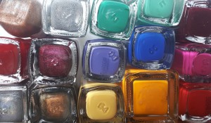
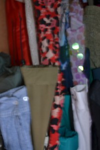
The starting point for my color project was observing my own personal color choices. I made an attempt to look consciously at my closest, most colourfull surroundings –my wardrobe, my make-up kit and my personal belongings. I was inspired by color analysis, also called skin tone color matching, personal color or seasonal color. It is the process of finding colors of clothing and makeup to match a person’s skin complexion, eye color, and hair color in cosmetics and fashion industry. The goal is to determine the colors that suit best persons natural coloring and it was popular in 1980. My aim was to simply observe how often I would choose certain shade over the other, so to determine it’s importance in my personal color system. The colors that I like to wear most are from variety of pink-purple-blue. I do tend to avoid red items, as I associate it with aggression, except for classic red nails. Interestingly in my paintings and drawings I use a lot of red, usually combined with contrasting blue. When I’m sad I tend to surround myself with gray and brown. In general observing people’s behaviour in context of colors we can agree that colors are communication as well as they have direct influence on us. Many examples show that when people see certain colors they feel different emotions. Bright colors portray happiness and excitement, dark colors are more somber and sad, and those in between trigger all kinds of activity within a person’s mind and body.
wardrobe colours
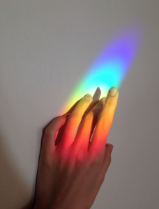
When you look at an object, the “color” of that object that you see is actually the wave length of the light reflecting off of the object itself. Color as feature of our vision don’t exist without light. From what we know, the primary colors are, red, yellow and blue. Followed by secondary colors and then more complex color mixtures including green, purple, orange, black, grey. Red expresses passion and draws attention to itself, positive and negative, and it has also been known to cause a rise in a person’s blood pressure. Yellow is the color of happiness, but if it is seen in too large of quantities it can have an ill tempered effect. Blue is the most popular color of mens wear, it is calming and basic and shows to lower blood pressure. Green reminds us of nature and tranquility, purple represents royalty, orange is often very friendly, and white is the color of cleanliness and purity. On the darker side of the spectrum is black which we see as depressing and bold and even grey that can make one have a feeling of loss and sadness. The other significant aspect of colors I focused during my research for the project was color combination and contrast. As I discovered color where never to be alone, there no such thing in nature as perception of a single color without influence of other shades. They can be contrasting or complementary or may appear to change a tone of each other when they are together. A very good example of this phenomenon is glitter. Glitter describes an assortment of small, colourful, reflective particles that comes in a variety of shapes. Glitter particles reflect light at different angles, causing the surface to sparkle or shimmer. Since prehistoric times, glitter has been made and used as decoration, from many different materials including stones such as malachite, galena, and mica, as well as insects and glass or nowadays from plastic.
So it it something that appears somehow consistent but hard to describe as one single colors, more like seeing few colurs at the same time. Something like this may occur in synesthetic experience when sensorial perception can link a colur to a smell or a word. Also people having hallucinations whether caused by substance or medical condition can have problems with describing a color or seeing a single color at once.
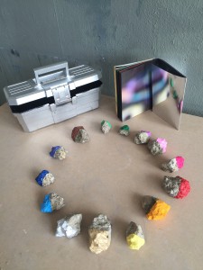
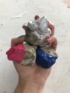
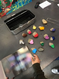
14 stones, 12 colours
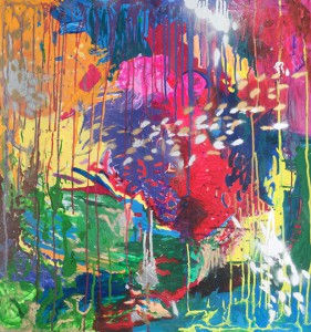
In my color sytem I decided to extract 12 colors as a basic set of shades of nature. Instead of white and black I introduce metallic colors of gold and silver. A metallic color is a color that appears to be that of a polished metal. The visual sensation usually associated with metals is its metallic shine. This cannot be reproduced by a simple solid color, because the shiny effect is due to the material’s brightness varying with the surface angle to the light source. In addition, there is no mechanism for showing metallic or fluorescent colors on a computer without resorting to rendering software which simulates the action of light on a shiny surface. Consequently in art would normally use a metallic paint that glitters like a real metal. I think it is a great emphasize of unique and variable nature of colors. Metallics are both light and shadow at the same time. By applying seemingly synthetic medium of color to the organic surface of stoned a specimen of colour system is created. A circle of colors is closed and harmonious. The shades remain unnamed as they are intuitively recognised. Together as a part of the project I created an abstract acrylic painting, which tries to represent full range of shades.It is an expressive palette of colours that are dripping, smudging and shining. It it a vibrant landscape with it’s only inhabitants – colours. Created this painting as an exercise for perception of colors and becoming color sensitive.
Untitled, 2018, 80x90cm, Acrylic and spray paint on cardboard
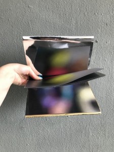
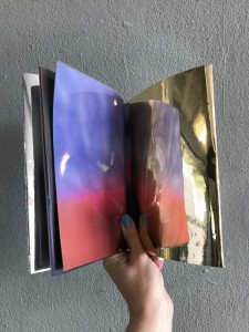
As well as photo book with silver/gold covers that can reflect the photographs in a various tones. It is a publication with no text, just blurred, abstract photographs that focus on the colours in my surrounding. To experience the colour with metallic reflection I flip the cover to overlap the page.
