Skip to Content Skip to Search Go to Top Navigation Go to Side Menu


"context" Tag


Jan Toorop’s Delftsche Slaolie


Saturday, October 27, 2018

This poster is one of the first works that is exhibited at the Stedelijk when you enter the base. I spent a couple of hours at the museum looking at everything, trying to look for different options, but in the end it is the first one that I saw that made the cut.

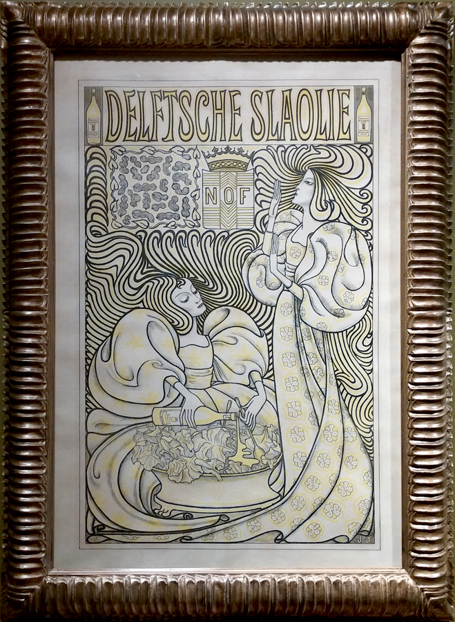
It is a lithograph made by Jan Toorop in 1894 for the Dutch Oil Factory (Nederlandse Olie Fabriek, NOF), but it is also because graphic design (and in this case advertisement) can be forgotten; when people think about design, the first things that usually comes to mind is furniture. I then wanted to investigate how different it would be to research in this field of design.

I first started by going to the academy library and found three books about Jan Toorop, two in Dutch and one in French. In art books, Toorop’s posters are always quickly mentioned, if ever mentioned at all. Most of them focus more on his paintings and drawings and his advertising period during the 1890s is largely overlooked. But what would there be to say? It seems to be a question I cannot find an answer to this. I find it strange that this piece is considered one of the most famous works of Toorop and Dutch Art Nouveau and that there is so very few information and texts about it.


Furthermore, when I did my research on the internet, only basic information showed up, usually on museum’s websites like the Rijksmuseum or the Victoria and Albert museum in London. Both of them have a print in their collection, that’s why you can find it there: a picture, with a title date and dimensions. So no analysis or study or history or context like I expected. For instance there was only one website (the Moma) that mentioned the company this poster was made for; you can find the initials on the poster (NOF).

Another thing really intrigued me: in the first websites popping up under the research bar were both Christie’s and eBay. On the first one, original 94×64 cm prints are auctioned from 22500 euros. On the second one 53,7×12 cm prints are sold for 25 euros. The one in the Rijksmuseum is 95×62,5 cm, in the V&A it is 101×69,9 cm. I also stumbled upon Vintageposter.nl who retailed two sizes, for 50 and 70 euros. The posters always come in different sizes and prices, original print or not; they even come in different shades since Toorop made versions with slightly altered color schemes. I also came across stamps with the design printed on it.


Everything published before 1928 is automatically public domain, which is the case for the Delftsche Slaolie poster (which was created in 1894); it means that with no copyright, anybody can use it. If I wanted, I could sell postcards like this person on eBay or commercialize shirts with this image on them.
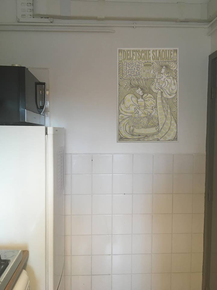
This thought also made me realize another weird thing: when I was browsing on google images, I only found pictures of the poster alone, but never in context. At first, this poster was supposed to be an advertisement, but I never encountered a photograph showing a situation where this work was actually put to its initial use. I also expected to find pictures of this poster as decoration, since it also sells like this nowadays, but absolutely nada.
After searching for a long time I only found one image with a framed poster. It was on the website of a gallery and the piece was sold for an unknown price.


I started wondering about the fact that more than a century ago, people saw this on the street like we see advertisement ourselves nowadays; we wouldn’t think about hanging this Oatly (a brand of oat milk)

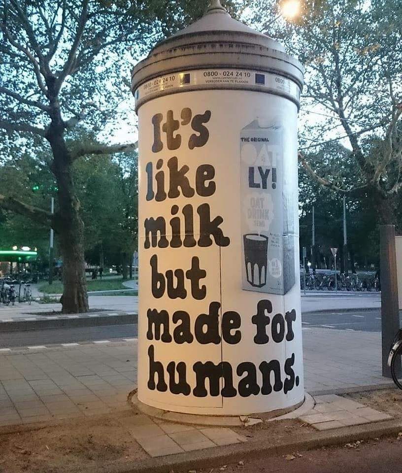
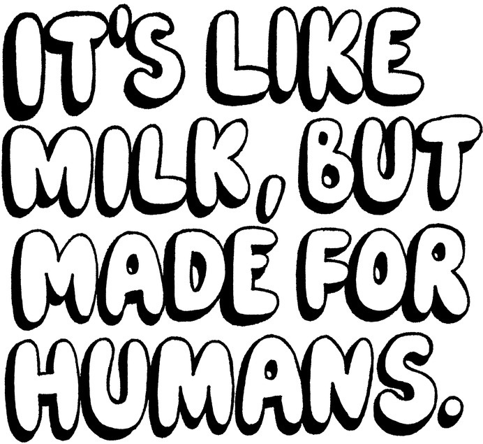
poster that has been all around the streets of Amsterdam on our wall, and in the same way maybe the people back then would have laughed at the idea of putting the Delftsche Slaolie poster in their home.

I went to the Stedelijk museum again but couldn’t find a postcard of the work in the gift shop. Since I couldn’t find any picture of the poster in context, weather it be advertisement or decoration, I would do it myself, and I decided to do that with a kitchen wall because I figured that most people would hung that in their kitchen. It is food related after all.


If I print it myself at school in good quality and same size as the original it would cost me a couple a few euros, and maybe it would be even better than the eBay or Vintageposter.nl ones. I will have to do that for my grandmother so she can add it to her collection on her toilet wall.

What does all this mean for the future of our present advertising? All brands try to make beautiful or eye-catching or subversive ads in order to differentiate themselves from the rest; but what does it have to take to end up in the Moma, Christie’s or an old lady’s toilets?

Camouflage


Sunday, May 6, 2018

We started this project by choosing a color and trying to find a match in our surroundings. And instead of searching for the solid color objects have, I started to look at the colors that were reflected in certain objects and how the colors change in the shadow. So when we were asked to make a color system I started thinking about working with reflecting colors. But after researching the CIE-1931-system and reading about all the other really mathematical systems I got a little bit confused.

8.-Liz-West-Our-Colour-Reflection-2016.-Image-Credit-Hannah-Devereux-660x400

A color system was now in my head something that was very structured, had a mathematical origin, even and could be presented in graphs. So when I was working with the reflection of color I soon got stuck on trying to systematize this. First, I did some visual research on the different ways materials reflect color. I did this so I could maybe make my own objects which would reflect the color. But I didn’t see how to make this into a system. I thought maybe using different gradients and different materials to get various color reflections, but I didn’t really think this was a real system.

static1.squarespace So I moved on…

This is the moment when I got really stuck. First, I just tried to research a lot of different color systems and came up with a few ideas, but never really worked them out. So when I was talking with a classmate about his color system I mentioned the idea of using google maps to get an overview and then I thought why don’t I use google maps for my color system, because for the first time I had the feeling I could approach this in a systematic way. There was already a lot given in Google Maps, almost everything is already visualized and there’s also already some sort of system, countries are divided by regions and cities by neighborhoods and so on. So I could make a color system out of this. Maybe measuring the green in different capitals, by taking screensavers of google maps and pixelate the capitals in color graphs and look at the graduation of the green. So I opened google maps, and Photoshop and started to take some screensavers and pixelating them.

1616 kopie7 kopie 3715 kopie153 kopie3

But when I was working with this, it felt so easy to just make a graph of the green in capitals and only making a screen shot and pixelating it. So now when I made screenshots in google maps and edited them in Photoshop I slowly started to let go of the idea that it had to be confined in this systematic approach.

9-kopie-29

This was I think the first time there was some freedom for me in the assignment. So I just played around with the pictures, editing them in Photoshop.Although I still felt that what came out didn’t really made sense, I tried to ignore this feeling for a while and just see what happened. What came out of editing these photo’s more freely were all kinds of camouflages of the city. For the first time in the project I gave myself the space to explore what will happen in the making and this at least created something to react to. Now I had these pictures, I had to find a way to bring them together in a next step. The most obvious way to do this is to make a booklet and this is what I did.

Screen Shot 2018-05-18 at 17.22.51

DSC_0431

But I knew this wasn’t the best way to present it. Not only because it was a badly published booklet, but the pictures also needed something extra to make them work. Now they’re just plain pictures in a book without getting a clear notion of what they represent. I had a talk with Matthias and we both agreed that maybe the best format for this is to bring it back into the city, to give the pictures a context. So what I’m now going to do is making posters and put them up in the city and photograph them.

In the end, I think I learned that I should have given myself the freedom to let go of this rigid idea of a system and to try out things earlier. Because when I did this it became more fun to do and there was also more room for other possibilities.

DSC_0419

Parallel Landscape


Friday, November 21, 2014

In general the work of Aliki van der Kruijs explores the relationship (context) between colour, culture and environment with a specialization in textile. Nature is material and subject at the same time. During the master Applied Art at the Sandberg Institute (2012) Aliki juxtaposed her graphic- and fashion design background into a practice where textile as information-carrier plays a fundamental role.
Her thesis Parallel landscape is part of CONTEXTILE: a research into colour, context, text & textile. This thesis is not about what colours are but attempts to see what colours can do.
 

pl1
To read the full thesis you can click the image above or link to ISUU where it is published among her “Traveling concepts” like Made by Rain and others.

Aliki vd Kruijs at ISUU.com


BOOKParallellandscape1-2

Parallel Landscape, Sandberg Institute thesis by Aliki van der Kruijs 2012 : graphic design icw Lena Steinborn

quotes:

Colour is everywhere. Everything is coloured. Colour is always the characteristics of something. Colour is an ever-changing self. Can colour support itself? Where does colour become visible? How do we make use of colours? Can colour become an environment in itself?

The remarkable thing about colour is the way it takes place. Visible as well invisible. This thesis is not about what colours are but attempts to see what colours can do.

I tried to find out how colours are changing location and dimension. It’s a thesis on how colour takes place parallel to the landscape in which they emerge.


GRA : DRESS-INDEX #0


Sunday, February 10, 2013

spring 2013

GRA = Gerrit Rietveld Academy, Amsterdam
DRESS = Clothing in a broad sense; the way people wear, move around and behave in clothing
INDEX = List arranged usually in alphabetical order of some specified datum (as subject, or keyword)


Group D students will be tasked to each observe and register dress at the Gerrit Rietveld Academie.
GRA is the context and dress (of fellow students, faculty, etc.) is the subject of this visual research. The focus is on reoccurring patterns in dress. Perhaps a pattern of dress is linked to gesture; e.g. the way jackets are zipped half open in order to easily get cigarettes out of inside pockets. Students have to document a pattern, re-look and arrange, make new connections and draw conclusions.

All individual findings will be posted on this blog, serving as: GRA DRESS INDEX (Spring 2013)

Researchers / editors: Group D students
Initiators / guides: Elisa van Joolen and Henk Groenendijk


Log in
subscribe