Skip to Content Skip to Search Go to Top Navigation Go to Side Menu


"autonomous" Tag


Spaces in Between


Tuesday, April 19, 2016


Spaces in Between


Unsorted, disarranged, unorganised library, full of elements placed according to different components, which have an order or perhaps do not have it at all, just existing in an unrestricted randomness. Which ironically speaking could actually be seen as the same thing, since a lack of order is also an order in itself. Chaos with a clear beginning and ending kind of like a bad book. What exactly did I find there…? Big books, small books, orange, white, shiny, mat, hard, soft, precious, forgotten, books that are filled with content, wedding books. Books of a specific nature, books that are about nothing at all, ones that wait for attention and ones nobody cares about. Art books, design, educational, pointless, and sharp and blunt, basically all you can find in a library. I was asked to find a solution for the lack of structure in their position on the shelf. So the primary question that I am asking myself is; what is the point of doing it at all? Of course the obvious reason would be the easy access to the content, otherwise lost in the madness of disorganisation. However, I still struggle to understand why to bother ourselves with creating this specific order, if in the end it is still the same amount of books in the same space? Somehow I think this action is irrelevant, especially if we put so much effort into creating a puzzle that can be made in an infinite amount of ways… according to any system that a specific person would find attractive or interesting (depth weight, etc).


    In the name of captivation and curiously-provocative passage, I am trying to crack this system of easy predictable result, which in my opinion is rather obvious to foresee if you limit yourself by the boundary of an actual shelf. Instead of doing that I would rather step out of this radius. The concept that I tried to create is aiming to expand the perspective on how we view the book. What is a book actually? In short, it is a box of content pocket size captured by the single pages glued together, now isn’t that somehow equal to the very idea of a book shelf, in which many different books are aligned in the same way as the pages, however this time at a larger scale of information? Somehow I believe it is possible to see these systems as parallel ones. If a thousand books make a library; then, so to a thousand pages, and further, a book can also be seen as a pocket size bibliotheca.


The establishment of the fact that from now on, one copy can stand on its own, gives me the possibility of putting in on a pedestal and seeing it as something autonomous, in other words, let’s give the books the space that they deserve. There is no reason why they should be kept together in one place since in the end it’s just creating a bigger chaos. Let us treat books as unique objects instead of piling them on top of each other. As absurd as this sounds, to create an order you have to separate everything from each other and never put them back together again.


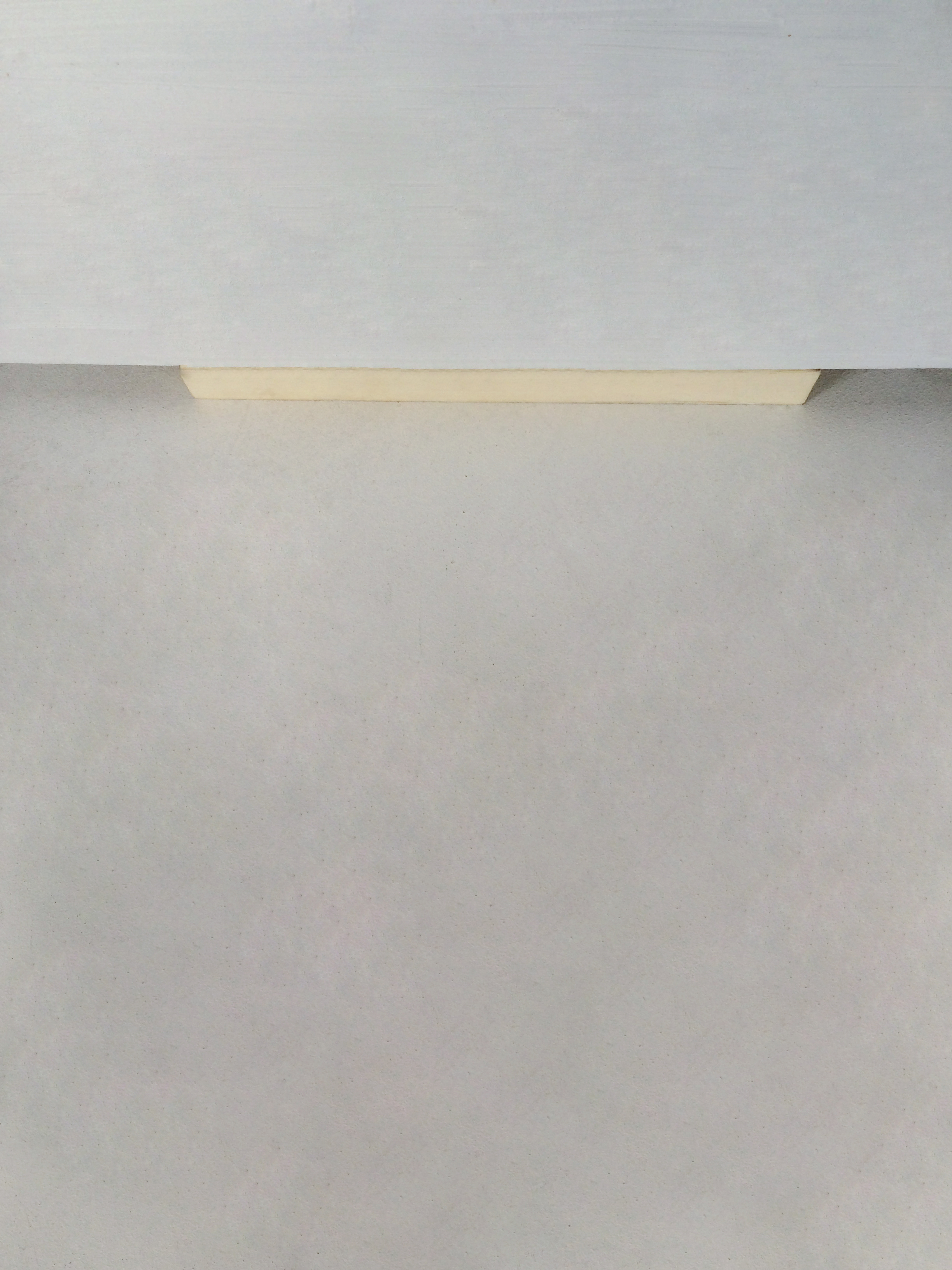
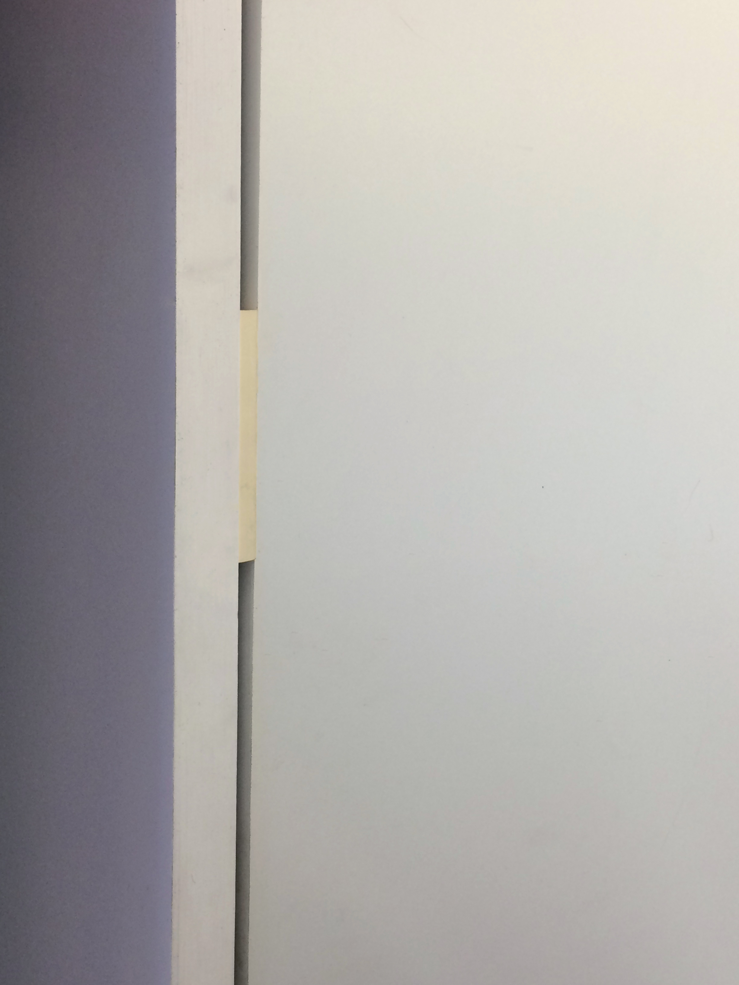
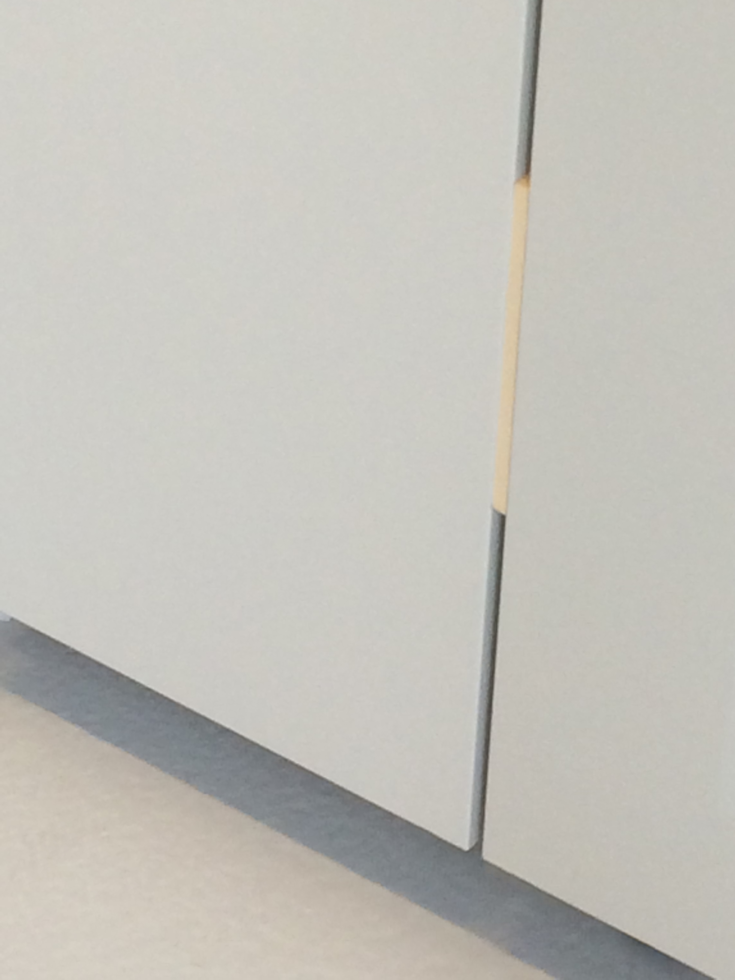
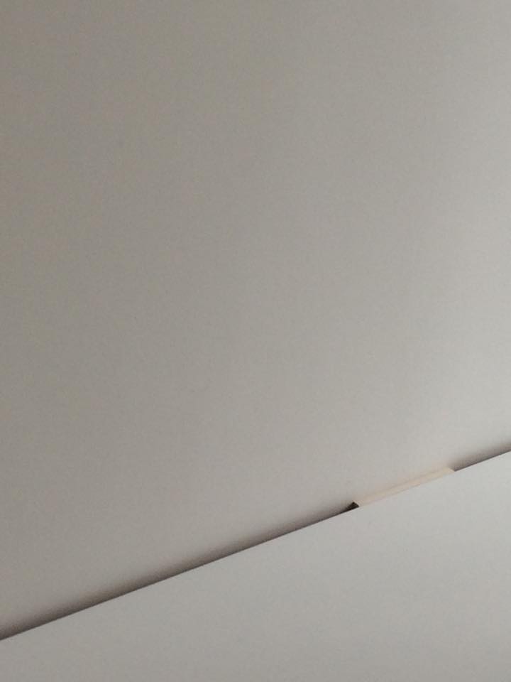
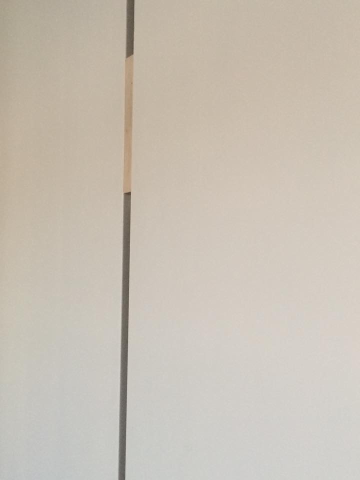
For my next step, I have chosen ten books from the shelf that I eventually turned into their own autonomous libraries, spread all over the city; one book for one building. I did this by searching for the places that seemed to me as the right environments for the books.  The main question that I had to ask myself, is how do I decide what aspect of the book should be the main criteria for the location, the physicality or the content. Not to leave it too vague, by physicality I mean the literal materiality of the book and where it could fit in the space of a building, so in the end it seems as the space was designed for the book and not reversed. In this case of preciseness, the dilemma of leaving the content out of the picture was not so disturbing anymore. However, after I found the main foundation that would determine the way of approach, I decided to take it further and only use the fore edge  of the books (opposite side to the spine), which presents it as more of an anonymous object rather than a work.


The result of this practice was the creation on ten completely autonomous bibliothecas, in ten different buildings. This created a situation in which a book stopped being a book, but rather a body living in perfect symbiosis with the surrounding environment.
 

12966812_1097222463654098_999562320_n


12992332_1097221753654169_1811051460_n


IMG_4769


IMG_4770


IMG_4777

A vieuw on modern design


Sunday, November 18, 2012

Marcel Wanders and his airborne snotty vase

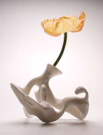
Scanned from the microscopic specks blown out when humans sneeze, hugely enlarged, and then produced using SLS rapid prototyping technology (dimensions 15x15x15 cm).
This is the description of the airborne snotty vase designed by Marcel Wanders. When I was looking around in the design exhibition of Stedelijk Museum Amsterdam I felt directly connected to its color, shape texture and the energy of the piece. How is that? What attracts me so much with the piece?
I started a research on Marcel Wanders to understand more about his perspective on design and his extraordinary new vision on what the function is of design. Especially his vision is what interests me so much. As a student he was already discussing the ”function” and set-up of design. His view on design is ”a designer should not apply to one’s costumer”. According to Marcel Wanders it is the other way around. He works towards his designs and says it is up to the designers to carry out their vision to this world.
Other students and teachers at that time found his statement/vision not in any way realistic. Still Marcel Wanders was pursuing his dream which made him a autonomous thinker within designs.

”Products can change function, the core is design”

This work (snotty vase) has a autonomous design. The function is not what made the piece, its the concept. The airborne snotty vase is a perfect example of his vision on designs. He shows that he can design according to his vision instead of a method. This points out that Marcel Wanders is able to execute his dreamy perspective on art and design.

For me this piece could also be used differently then only a vase. It could be worn as a piece of jewelery, a pen holder, it could even be a model for a bigger sculpture work. The endless possibility’s of the piece leave a gesture for the observer as well. When I saw the piece at Stedelijk Museum Amsterdam I didn’t think it was a vase. For me it was a free form giving me the possibility to analyze what his vision is about and to give it multiple functions.
Because of this free interpretation the piece shows it could be a solution to have a broader perspective on design and art. It gives new information about the mind of the designer and the need of people to see more then only a constructed piece.
For me this is an important statement. By this way of working and thinking, one creates more interest, personality, and life in art and design.

Observing Marcel Wanders work I can see the need to create one’s own vision, and working with new techniques and materials. This is also what I try to do in my work. When I was learning the craftsmanship of jewelery I applied this new material experiments as well. Working with 3D printed elements and polyurethane to create a new movement within the traditional jewelery scene. Exclusive and provocative designs made my work change the perspective on traditional jewelery. By doing this I have shown my need for change, and my interest in the future.

Another important thing shown in the present time is that we have the ability to design on an another level. Intuition and concept capturs a bigger role in the design process. Craftsmanship occupies another purpose in the piece. Still craftsmanship is important to indicate the value you give to the piece and to reach a certain personality. The possibility to design on another level is what we could use to give more meaning to the piece and to make designs more collaborative with the future perspective of the world.

Marcel Wanders shows in his work this future perspective and combine’s it with craftsmanship. He understands that perfection is not most important anymore. Maybe it is even a small mistake which makes a work personal.

Designs can be made perfectly, everything will be calculated and mistakes are seen before the making has begun this is because of our modern industrial and digital world. It is time to look for other values then perfection. Values you find in a layer which weren’t touched before Marcel Wanders gave his input in design. And this might be a layer we can expand more to keep moving forward and to take more out of modern life with its endless possibility’s.


Log in
subscribe