Skip to Content Skip to Search Go to Top Navigation Go to Side Menu


"black & white" Tag


INCOMPREHENSIVE TITEL


Thursday, November 29, 2018

I had difficulties reading the title, which made me pick up the book in the first place. Different kinds of black letters which reminded me of the graphic bauhaus logo. Since I am a pretentious, yet troublesome, art kid I had listened to some bauhaus earlier that day, which might have affected my interest in trying to read the title. Though it was impossible to read the title without knowing what was actually written. Thankfully the title was also written with bold letters in the bottom of the left corner; “JURRIAAN SCHROFER (1926 – 90) Restless typographer”.


This intrigued me to know more about this Jurriaan Schrofer. Why would someone choose a typo for the cover of a book, which you cannot read in the first place and in what way is this man restless?


I tried to get some more information about this book by looking at the backside, where you usually see some information, or a short summary about the book. But it was just the same incomprehensive letters, but this time reversed. A cool way of dealing with the backspace of a book, respect! Not being able to fully understand what the book really was about intrigued me even more to choose it, I wanted to know what it was all about.


I liked the binding of the book, a japanese binding, which you very rarely see in a bookstore or library. The pages are put together with a special way of stitching, which I find very aesthetically pleasing to look at. It looks homemade yet professional at the same time. I want to learn how to bind books that way. The japanese binding of the binding also gives the impression of a exclusive and a bit luxurious, like “this is not an ordinary book you are holding in your hand”. And just like everyone else I want to feel special every now and then.


757.3 sch

genuine product of light and shadow


Wednesday, March 7, 2018

18

Athanasius Kircher,was a German Jesuit scholar and polymath. As he had outstanding talents and  wide range of interests in mathematics, geology, medicine, etc.  he has been often compared to fellow scholar Roger Boscovich and to Leonardo da Vinci. Kircher also was a follower of the theory called ON COLOURS which argues that all colors (yellow, red, and blue) are derived from mixtures of black and white.


12


As we can see in this diagram, all the color points of the system can  be reached from white and black, and this shows his fundamental view on colors as genuine product of light and shadow. In his system, all combinations of colors are produced with three colors between white and black and all the possible mixtures are shown on half-circles.
132
For example, in the case of green, which is a mixture of yellow and blue, it is located at the overlap of yellow and blue and takes a special position as it is in the center with red below. It remained influential until Isaac Newtons’s experiments with light refraction came out. In fact, the prism, and its effect on light, was something already known to Kircher, but he made an incorrect ordering of colors from bright to black. Newton was the one who defined the right order of the rainbow colors.

14


Still his system has significance for the color theories for these reasons.


It is a linear diagram with red, yellow and blue as the basic colors

It is  a theory behind De Coloribus (all colors are derived from mixtures of black and white)

It also provides a firm idea of mixed colors, characterized by semi-circular bows


Photography: A Reproduction


Wednesday, October 25, 2017

Photography: A Reproduction
Johannes Schwartz’ exhibition Blue, Turning Grey Over You at the Annet Gelink Gallery [x] shows photographs of photographs that Piet Mondrian took from his paintings. In other words, Schwartz’ works are ‘reproductions’ of reproductions. Nevertheless, one should note that Schwartz’ intention goes beyond documenting or copying art works. While Mondrian argues that photography is mainly suitable to imitate art works rather than to be an art form itself, Schwartz proves otherwise by depicting Mondrian’s reproductions, address book and records in photographs exhibited as autonomous art works. Hereby, Schwartz positions himself in a greater debate in the history of photography. The tension between photography as document and personal expressiveness has been the core discussion concerning the status of photography as art.

Nowadays it seems self-evident that photography is seen as art form. This, however, has not always been the case. There was already disagreement on the artistic potential of photography in the 19th century, when the medium was introduced. Nevertheless, it had by far the same recognition as painting. Moreover, photography was often considered a mechanical – rather than an artistic – practice. A century later the distinction between technology and art was put in question. The Bauhaus artists had a multi-disciplinary approach and aimed to integrate design, art and modern daily life. This questioned the position of photography and lead, particularly in Germany, to a highly topical debate during the 1920s. The Bauhaus artists considered photography, as product of modernity, suitable to depict this Modern Era. This was also stressed out in the article “Painting and Photography” (1927) by Ernst Kállai, editor of the Bauhaus Journal i10. Even though Kállai admitted that painting was a higher form of art, the Bauhaus’ approach on photography was still quiet controversial at the time. The Frankfurter School theorist, Walter Benjamin, claimed that art works have a certain authenticity or aura which photographs –whether a mechanical reproduction of a landscape or an artwork – do not have (1935). Mondrian wrote a few lines about photography that comment on and contradict Kállai’s article (1927)[x]. He considers the medium, as Benjamin, a mechanical practice suitable to imitate or reproduce objectivity. He did not value the creative or artistic potential of photography. Mondrian made reproductions for albums that enable him to show and explain his paintings. After that it was no longer necessary to explain the development of his work in his studio. This allowed him to show only his latest painting. Hence, photography was not used as an artistic expression, but as a tool to establish himself as an artist. Interesting is to add that there were only black and white photography at the time, which forced Mondrian to describe the colour composition of his work in the albums as well.

johannesschwartz2017_1100

Johannes Schwartz PM #2, 2017


Johannes Schwartz saw Mondrian’s albums along with other personal belongings at the Netherlands Institute for Art History (RDK), when he was asked to document them for a magazine. This gave him the opportunity to see objects that are normally are not publicly accessible. Schwartz was particularly fascinated by the albums, which demonstrated the motivation and working drive of the artist. Mondrian took great effort in making high quality reproductions and describing the paintings carefully. The limitations of the medium at the time – e.g. being in black and white – did not seem to bother him and instead he found ways to overcome them. Schwartz got interested in creating a possibility in which more people would see Mondrian’s work attitude. However, his goal goes beyond documenting the objects for an exhibition. Instead, he plays with the (re)presentation of them. Mondrian’s reproductions, for instance, are photographed in colour and put on a wooden shelf with a blue-grey wall in the background. In one work different ‘reproductions’ are grouped in one line, noticeably build up from different pictures photoshopped next to each other. All these characteristics remind the viewer that the photographer took different decisions and actions in the making process. The latter raises questions that refer back to the central debate. It also doubts Mondrian’s position [x]… Do reproductions have the capacity to imitate or reproduce objectivity? Can photography in itself be objective or do the choices of the photographer inevitably evoke subjectivity? Does the intention of the photographer decide whether it is a document or an artwork? These questions, from the many one could ask, put the earlier mentioned discussion in a contemporary context. The visual aspects of the photographs add a conceptual level to the works, which differentiates them from reproductions that are merely meant as a copy. His work aims to intellectually activate the viewer and invite him/her to make associations, reflect and take a position in the debate. One can also go a step further and state that the works themselves provide an attitude towards photography. The exhibition shows that throughout the centuries, photography has developed to be part of the visual arts and that a conceptual level allows reproductions of reproductions to be autonomous works of art.

Get the Flash Player to see this content.


A video reproduction of reproductions of reproductions
When visiting the exhibition, I started to think about the role of photography in general and the fact that the medium has never been as accessible as it is today. Everyone can take pictures and videos with their phones and share them globally. This consequently raises new questions about the relation between photography and art. In this train of thought, I filmed my gallery visit on my Iphone. The voice-over is a fragmented reproduction of a conversation I had with Johannes Schwartz about this exhibition.

systems of thoughtful straights to speed up the round


Monday, February 22, 2016


IMG_2700IMG_2694


1 2


3 4


9 5


The code uses a sequence of vertical bars and spaces to represent numbers and other symbols. A barcode symbol typically consists of five parts: a quiet zone, a start character, data characters (including an optional check character), a stop character, and another quiet zone. The stripes can be scanned, the code is transferred to a computer where it is linked to the information about the product.

Unknown

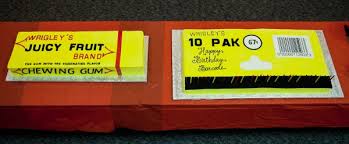
It appeared for the first time on a piece of gum, invented to speed up the process of the person behind the counter, monitoring sales and supplies and eliminate errors and mistakes.

The speed and accuracy of the Universal Product Code made the barcode one of the most important and used designs of today.

In 1948 Bernard Silver, a student at Drexel Institute of Technology, was interested in developing a system to automatically read product information during checkout. Together with his friend Norman Joseph Woodland he started working on a variety of systems. Their first working system used ultraviolet ink, but the ink faded too easily and was rather expensive.


barcode patent1


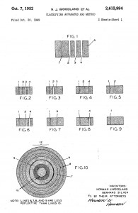
His next inspiration came from Morse code. He used the dots and dashes of the code and extended them downwards to make narrow and wider lines out of them. To read them, he adapted technology from optical soundtracks in movies, using a 500-watt incandescent light bulb shining through the paper onto an photomultiplier tube from a movie projector. Although there was a interest from various of companies to buy the patent, the required equipment that was needed to process the information was some time off in the future.


KarTrak


Some years later David Collins used a similar system to developed a system called KarTrak IIIII, using blue and red reflective stripes attached to the side of the cars, encoding a six-digit company identifier and a four-digit car number, the system was found to be easily fooled by dirt in certain applications, which greatly affected accuracy. And was therefore abandoned.

In 1967, Collins formed the Computer Identics Corporation to develop a black-and-white version of the code for other industries. As its first innovations, Computer Identics’ moved from using incandescent light bulbs in its systems, replacing them with helium–neon lasers, and incorporated a mirror as well, making it capable of locating a barcode up to several feet in front of the scanner. This made the entire process much simpler and more reliable, and typically enabled these devices to deal with damaged labels, as well, by recognizing and reading the intact portions.
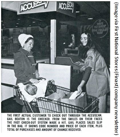
With these innovation the system became interesting for the food industry and in 1972, a supermarket in Cincinnati began an eighteen-month test with this system.


first accuscan


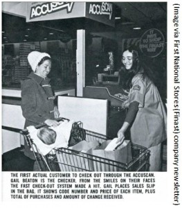
Barcodes were printed on small pieces of adhesive paper, and attached by hand by store employees when they were adding price tags. The code proved to have a serious problem; the printers would sometimes smear ink, rendering the code unreadable in most orientations. However, a linear code was printed in the direction of the stripes, so extra ink would simply makes the code “taller” while remaining readable.

All these technological and practical developments and decisions were crucial for the outcome of the design and therefore the success of the barcode.

Being first printed over a carefully designed package of gum, it soon manifested itself on almost all products that surround us. On a bottle of water, a wrapped piece of meat, a car tire, a steel pipe, plants in the plant shop and made its way into schools and hospitals. IIIII


barcode shop
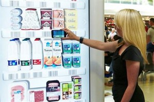
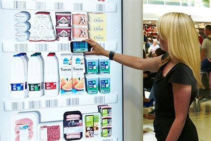
One of the latest innovations: virtual shopping
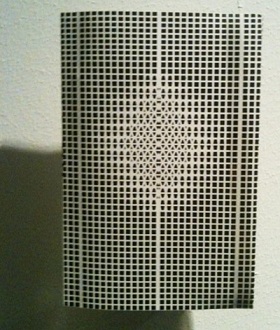
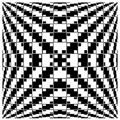
 

so many stripes
beech forest in winterland
brilliant black and white


The ability for a visual design that only follows the rules of function, is present everywhere around us but rarely noticed, has to be included within other designs because of its economical value, and is still being useful after more than forty years makes the barcode a brilliant piece of design.

[white stripes on the hot and cold black lanes, crossing vast sands

long and longer directed, goal and great precision

moving all scanned created and known needs over water and land

straight to the verticals and horizontals of men]

Viviane Sassen: “I just love the black skin of people”.


Sunday, April 8, 2012

Viviane Sassen photographs people. But she doesn’t consider her photographs as portraits. Her models are more composition than persons. They are never photographed in close-up: it is always a total or semi total scene in which they figure. She almost uses her models as sculptures. Bodies always have a very sculptural aspect. She underlines that with very contrasted pictures. The faces of Sassen’s character’s are often no more than suggestions. They are surfaces and contours, black holes that contrast sharply with the bright, colorful surroundings. She uses a technique that could be called “the revered Clair-obscur”. While Rembrandt and Caravaggio used the light of a candle or their characters to emerge from dark decors, Sassen drapes a veil across the face. A tree, the edge of a roof, bystanders of whom only the legs are visible – they suggest eyes, mouth and nose with the echo of their presence.

Sassen makes 3 kinds of photographs: recumbent figures, lying with their head turned away from the viewer; intertwined bodies; and “Mystified portrait”: individuals who cannot be identified as such, who avert the camera’s gaze, who have a plant or a shadow of a plant where you expect a smile or a frown.

Between the age of 2 and 5 Sassen lived in a village in Kenya. It was a world of skinned goats’ head on market stalls, morning dew on the red earth, and sweet soft drinks in glass bottles and the smell of burnt charcoal. Her father worked in a hospital, and she herself played with the young patients from the polio clinic next door to their house. For a child of that age, who has not yet made the distinction between I and the other, the identification is complete.

She left Africa quite young and only came back there with a camera in 2001. During this in-between period, she flirted with the profession of fashion designer and became acquainted with photography. She sucked up the work of Araki, Nan Goldin, Thomas Ruff, Andres Serrano and Wolfgang Tillmans. Besides her autonomous work, she worked on assignment for progressive fashion labels like Miu Miu, Viktor & Rolf, Diesel, So, Adidas and Stella McCartney.

It is tempting to give an autobiographical interpretation to the images of her African’s work. But that would be too easy, opening the doors to accusations of navel-gazing and narcissism. “I’m attempting to recreate the images of my youth”, she says. But because of a lack of precisely determined locations these images have a universal charge, transcending personal ups and downs. And there’s a particular, political meaning behind them.


(more…)

Black and White for today


Monday, October 18, 2010

We could imagine that an artist who decides to make a book to present his works, will make the choice to present it in the most realist way. The works have to be shown as clear as possible, with all the details and from the best angle in a way that the public can figure the work out as better as possible. (more…)

Hoe?! ‘The Fat Booty of Madness’


Sunday, September 19, 2010

Weldoordacht geklad en geklieder is wat er in mijn hoofd knalde toen ik dit boek uit de schappen trok.

Gewicht, omvang als dat van een saai oud wetboek. Maar uiterlijke kenmerken die speelsheid en frisse veranderlijkheid verraadden.

Het is een boek over sieraden, hedendaagse sieraden om precies te zijn. Allemaal ontworpen door (ex) studenten van ‘Munich Academy for Applied Art’[x]. Blad voor blad ontdek ik, dat mijn kennis over sieraden nog armer blijkt te zijn dan ik dacht. Dat, terwijl ik me verbaas over de vele opties en keuzes in materiaalgebruik, vormgeving, grootte.


Wat zijn hedendaagse ofwel autonome sieraden nou eigenlijk?


Is de term ‘Autonome sieraden’ niet wat de Engelsen een oxymoron noemen?

Een stijlfiguur zoals ‘knap lelijk’ of ‘oorverdovende stilte’?

Deze term lijkt in te gaan tegen het idee dat deze sieraden een toegepaste kunstvorm zijn. Dus daarmee, geen autonome. Wat is het verschil tussen een antieke trouwring en een neonkleurige kunststof ring in de vorm van een schedel? Misschien heeft symboliek ermee te maken, misschien het verleden. Voorheen hadden de sieraden behalve een decoratieve misschien wel meer een praktische functie.

Status, afkomst, burgerlijke stand en noem zo maar op.

Voor mij is de kunst van sieraden een toegepaste kunstvorm. Het is kunst dat op het lichaam gedragen word en heeft de functie de drager te onderscheiden van anderen, Of iets toe te voegen bij hem of haar. Iets wat hij of zij niet nodig heeft, maar wat alleen geld in verband met hem of haar.

Maar dan, een kunstwerk dat ‘ toevallig’ gerelateerd is aan het lichaam en alle eigenschappen bevat van een sieraad. Is dat kunstwerk per definitie een sieraad, dus dan ook toegepast?

Nee, vind ik niet.


Every Thing Design


Wednesday, September 8, 2010

When I was looking for some really nice book to look deeply, this thin white line peeler design caught my sight. Also this small black book was in between two big books-It was grey cover with big white letters and two book that can see back and front side-white cover with big black letters and front side, there is blue colour picture). That is why I can see it right away at that moment.

This really thick and nicely painted black colour book is attractive for me who really like simple design with only black and white colour. And drawing of peeler with thin white line on the black colour cover was so amazing, because that peeler seems making me peel-off the page by page and discover new pages afterwards. I have to peel-off one design if I want to see next design. Like I am looking for something through page by page. Even I feel the first page is the oldest one and last one is the latest one.

Also at the side of the book, not the book cover, there is big and thick white letter which interested, too. It can be simple white letters on the black background, but it looks not that simple if I see little bit closer. Because of the paper inside, black background is not same black as book cover. Also when I look at it little bit more closer and closer, I can see there is other colours, not just white and black. It was very funny that I discovered something I don’t really want to discover from that black and white book.

Why is this happening to me?


Wednesday, September 8, 2010

Als je langs de rijen loopt, wat een geweld.

Een boekomslag die je bij de lurven pakt, een boekomslag die je verwonderd, eentje die je doet reageren. Des te groter de reactie, des te intenser het exterieur bij je aankomt.
Ik was niet zozeer opzoek naar het wow-effect, maar simpelweg naar een boek waarbij ik me comfortabel bij voelde. Een middenweg van gevoelens van nieuwsgierigheid en het vertrouwde. Ik vond ik dit bij het boek ‘OMA 2008’. Ik ervoer dit boek als onherroepelijk direct maar niet schreeuwend om aandacht, het evenwicht ervan beviel me. Zonder te weten waar de inhoud over gaat .(Dit is onmogelijk te raden, de voorflap bevat geen text)

Het ontwerp straalt een bepaald soort anonimiteit en helderheid uit die mij niet alleen aanspreekt, maar die mij misschien zelfs fascineerd. Misschien ben ik jaloers op bepaalde kwaliteiten die ze bezit, haar orde en gekristalliseerde duidelijkheid. Misschien word er met me gespot, Zij die pronkt met haar krachtige lijnen en wiskundige precisie.

‘Ah but don’t you know not ever to judge a book by its cover?’

Het boek laat een duidelijk contrast zien. Zowel letterlijk als figuurlijk. Naast het vanzelfsprekende contrast van het patroon aan de buitenkant, is er ook nog een contrast in het opzicht dat het boek een zelfverzekerdheid uitstraalt en wilt opvallen maar tegelijkertijd alles verzwijgt over de inhoud, wat we noemen een ‘tease’.

Langs de rijen…Ik moest stoppen. Maar te lang kijken is ook niet aangenaam. Alweer haar Geweld.


Log in
subscribe