Skip to Content Skip to Search Go to Top Navigation Go to Side Menu


"imagination" Tag


The book of imaginary beings by Jorge Luis Borges.


Monday, November 27, 2017

imganiary-book_950


” I would say my design-style is pretty classic.

I try to make my designs inviting and appropriate

to the subject matter, whether fiction or non-fiction. ”

 – Francesca Belanger 


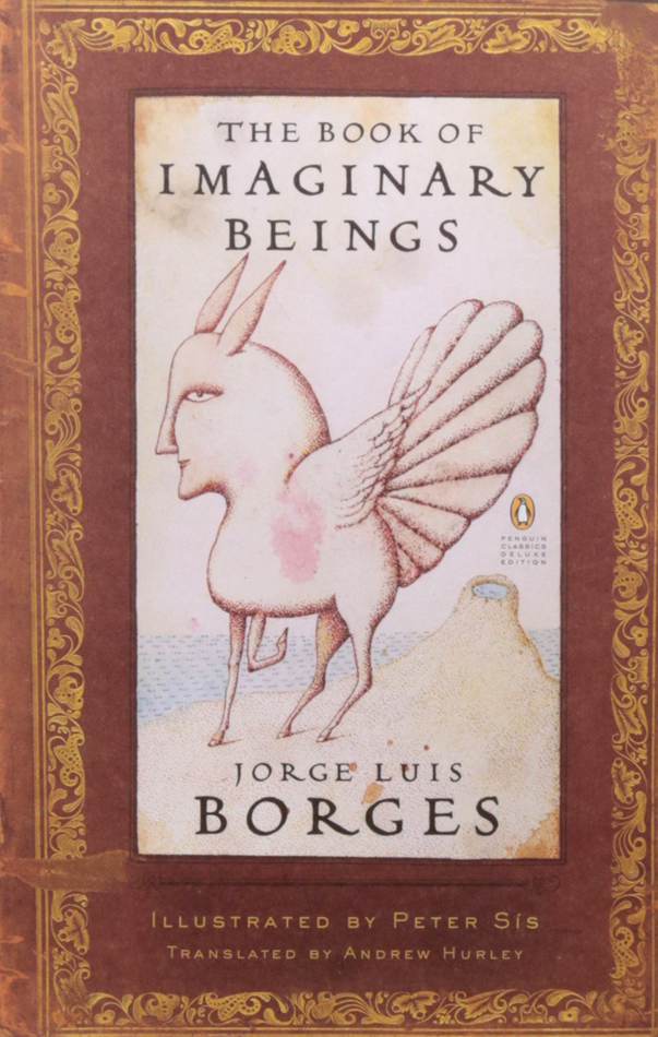
For thirteen years ago Francesca Belange designed the cover of  The book of imaginary beings written by Jorges Luis Borges. The only guidelines she got about how the design should be was the length of the book. The author passed away the 14th of June 1986 so communication was impossible, which maybe makes the design work different. Or easier? Because direct opinions do not really exist only the words through the editor. However the book turned out wonderful, with its old but new appearance. And there we have it, that is the reason I choose this book. I loved how it felt when I first held it, when I flipped through the pages and felt the uneven cut of the pages in the book. It reminded me of a really old storybook with a long and rich history. It felt like a book with strong words and that made me curious. I got the urge of wanting to know more about it. And the design, what was the feeling they wanted to accomplish?
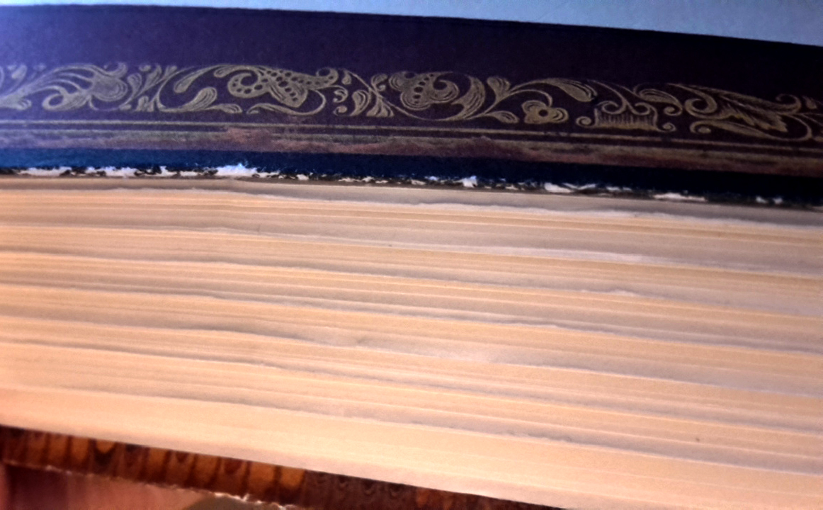
20171127_003024
 The uneven pages

Belanger wanted to give the book a dreamy and exotic look. She used the Aldus text font with the Locarno light display to try to achieve it, and I must say that she has. The book look really like a dreamy and of course it is a fantasy novel, but the feeling that this book contains another world strongly appears. It’s interesting to know which font she used, believe it or not but the font says a lot about the book, its feeling, its own language and everything between that.

belanger 343belanger 22

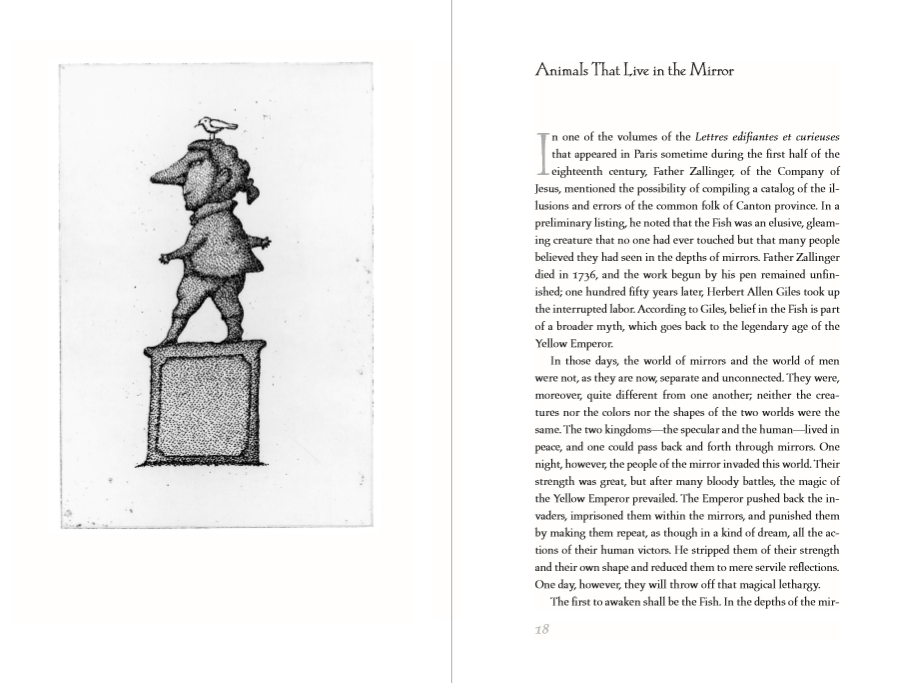
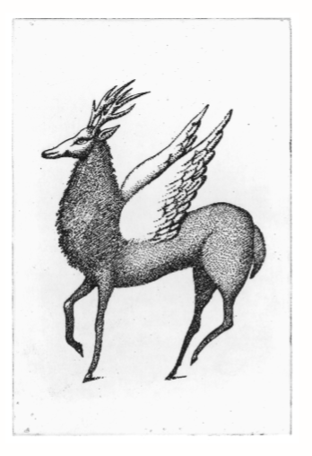
The book also has many beautiful illustrations of the imaginary beings. They are fantastic as well as the design, I asked Francesa if she had contact with the illustrator Peter Sis, and she had. She says he was lovely but can not recall exactly what they talked about. It’s visible in the work they did together on the book that they had some kind of connection I would say, I think that is important in all work, whatever there is, that there is some kind of affection between the people. Even if they hate each other or do not speak that much to each other. It just has to be there, even if it is just a few words.
Belanger divided the layout of the book based on the placement of the illustrations, and that the imaginary beings needed to start on a new page to give the book style a flow and organization. But also because sometimes the imaginary beings is on a page itself, some times on the same page as the text and sometimes w
ithout the border that appears on the full page art, all these decisions were made in relation with the space. Belagner says that this must have been something she asked Peter Sis about. She says that she would never alter art without the acceptance of the artist.

belanger 34belanger 33
It all comes together to a strong, wonderful book with a strong expression and layout. When I hold the book I get that – I really really want to read this book – feeling. Witch book design are all about.


I like to say that a book jacket or cover has to grab a

reader’s attention, and my job is to invite her in”

– Francesca Belanger


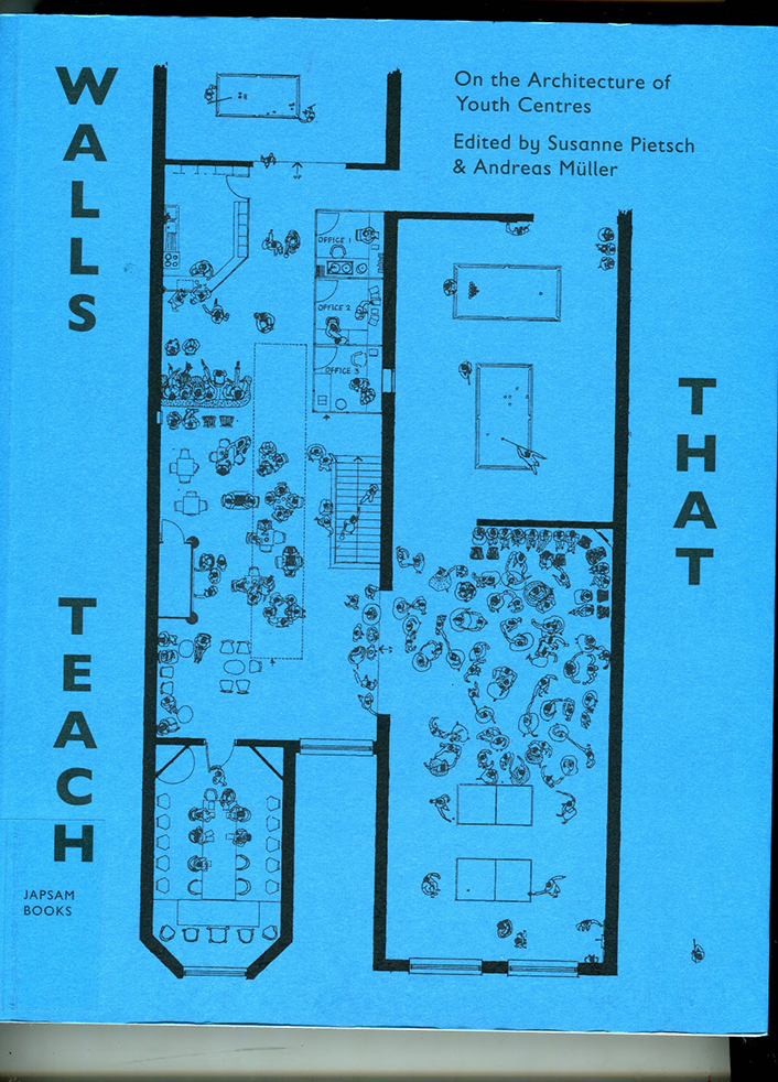
The book of Imaginary Beings, designer: Francesca Belanger, Rietveld Library Cat. no: 855.6 bor 1

Judge a book by its cover


Saturday, November 25, 2017

Book Cover     Illustration 2

Sound file: ‘Front Cover’

[audio:https://designblog.rietveldacademie.nl/wp-content/uploads/2017/11/Front-Cover-Audio.mp3|titles=Front Cover Audio]
The blue colour of the spine was the first thing that attracted me to the book ‘Walls That Teach’. I reached up to grab the book and upon closer inspection I discovered a beautiful cover with an interesting layout of text and attractive illustrations. The layout of text on the back of the cover for example runs horizontally, forcing you to turn the book to the side to read the text – something that reoccurs occasionally within the book. Despite the title of the book and the topic – architecture of youth centres – being an unknown topic to me, the design of the cover intrigued me enough to give the book a chance and look within it.

Typo 'w'

I opened the book and ran my fingers through the pages to feel the paper. The book felt light and the paper felt thin. The colours of the paper were the next thing that I noticed – they vary between green, white, and black paper. The main texts appear on the green and black paper. The illustrations and images appear on the white paper. The white pages are laid out horizontally requiring the reader to turn the book to its side in order to look at it.

Sound file: ‘Chronological’

[audio:https://designblog.rietveldacademie.nl/wp-content/uploads/2017/11/Chronological-order-paper-choice-and-consequences.mp3|titles=Chronological]

Young Pioneer Palace 3

The way the font (Gil Sans, Gill Sans Infant) is used and the strokes of the letters, the layout of the paragraphs, the letter spacing, word spacing and line spacing give a feeling of space on the pages without giving the impression that the page feels empty. The letters, words and lines are spaced quite far apart. The Paragraphs are centred on the middle of the pages, leaving a space of about an inch on either side. The strokes of the letters are also light (there are specks of white on the text that is black). All of these factors contribute to the appearance of the pages not looking cluttered.

Sound file: ‘Playful Typography’

[audio:https://designblog.rietveldacademie.nl/wp-content/uploads/2017/11/Playful-Typography.mp3|titles=Playful Typography]

Illustration 4

The illustrations throughout the book are very imaginative. The first illustration is on the front cover. it is an architectural drawing of a youth centre with illustrations of people demonstrating how the space would be used – people are dancing in a disco, some people are playing table tennis, some people are sitting around and some people are working.

Sound file: ‘Illustrations’

[audio:https://designblog.rietveldacademie.nl/wp-content/uploads/2017/11/Illustrations.mp3|titles=Illustrations]
However, these illustrations change inside the book. The people depicted in the illustration on the front cover are no longer contained within the walls of the ‘youth centre’, but are left to roam freely over the pages. Sometimes at the bottom of the page you will find a couple walking hand in hand. On another page there are people playing table tennis. On another page beside a paragraph about the planning of a youth centre there are a group of people meeting around a table discussing something.

Illustration 5

The contrast between these illustrations and the more practical architectural drawings within the book is really amusing. For someone like myself who doesn’t know much about the topic of architecture, small details such as the people wandering through the pages really capture my attention and encourage me to read. The different photographs of the youth centres under construction, how they were used and exterior shots of the buildings punctuated throughout the book also adds another dimension. The combination of how the text is put together, the illustrations, drawings and photographs really brings the book to life for me.

Sound file: ‘Images’

[audio:https://designblog.rietveldacademie.nl/wp-content/uploads/2017/11/Images.mp3|titles=Images]

Book Images 2 Book Images 3

My first impression of the book was that it appeared to be playfully made. This struck me as being funny because the topic of the book is about youth centre architecture, but the topic of the book suggested that it could be heavy to read. Upon opening the book and reading it, I was pleasantly surprised to find that the playfulness of the cover continued throughout. All the different elements brought together really encouraged me to read. I think that the intention of the design element of the book is to inspire the audience to interact with the book and create discussion. All in all a very well designed book.


Walls that Teach, designer: David Bennewith & Sandra Kassenaar, Rietveld Library Cat. no: 718.5 pie 1.8 met 1

Stone, Space, Me; Pretending to be Solid


Sunday, October 30, 2016

How to enter a stone? by knocking? stroking? breaking it with a hammer? or by curving a door in order to step inside?

Thinking and imagining about how it must be like to dwell inside a stone and take part in the universal creation, I find my search. Focusing on the human ability to relate, think and imagine spaces in objects, I create a link between the interior of stones and human memory and imagination.


6_Naama_IMG_1100

Pretending to be Solid, Naama Aharony, Gerrit Rietveld Graduation show, 2016.

( solid as stone they say…)

Along with personal notes and thoughts of dwelling a stone, I collect, trace and place cultural narratives, legends and philosophical thoughts contemplating the meaning found in stones. Through those I look to change the perception of stones being solid, suggesting to look at it as constant movement. The mind then becomes the traveler, moving through environments, places and spaces the stone I hold may offer. Those spaces are changing, coincidental, circumstantial.

This writing can be seen as a collection of short texts where the shared ground is memory, imagination and the stone. It will not necessarily talk about actual caves, walls, floors or corridors that might exist in the interior of stones, but will be researching the potential content of the stone, the meaning and narratives this stone might bring. And although while reading you might drift away from time to time, one will always go back to the ground, and the stone.


650-_MG_8700
For my graduation project, I was focusing on the relationship between man and the stone. I wanted to work on the way people approach and perceive stones. To open up the understating of A Stone to discussion and new ways of seeing. To create tension between what people usually think of a stone and the sensible perception I am offering them.

<wall-stone_950 Overvieuw_650 IMG_6344_650

Writing the thesis and researching on different layers the stone offers, pushed me to create my own, man-made stones. Using ceramics, a study of oxide glazing and experimenting with different firing programs, enabled me to create a divergent collection of stones. Where each of the made stones carries different qualities, tells a chapter, a layer and where all together they create a story.

IMG_6343_1100

The installation ‘Pretending to be Solid’ consisted of the stone collection I have made, creating a constructed landscape inside the room. The spectators were invited to walk through the room, in-between the placed stones. Through the walk, I looked to evoke a personal contact between the spectator and the made stones. Which was for me, a place for memory and imagination.


cover_image_shade download this thesis by Naama Aharony
all rights to this thesis are property of the author © 2016


The shortest search


Tuesday, May 14, 2013

This search for a book was the shortest search in my life. I’ve got six tags. One of them is ‘rules’. So, I’ve set up rules for myself. I am allowed to check books only from top shelves. The third tag is ‘coincidence’. I have had no idea what kind of book I was looking for, which means it was going to be a coincidence any way. One of the first book I picked from the first top shelf from the art section is a book with a naked lady on the cover. I went thought the book. The artist was mostly working around naked human body. My search was going really well!
Inside of the book I found oily finger stamps and prints of cup of tea. Apparently some one had breakfast in front of the book and left all this marks inside by coincidence.  First book I took from the book shelf exactly fitted all the tags I had! It confirmed the rules I made for myself. The power of coincidence convinced me how important to trust your own intuition and used a bit of imagination.

Rietveld Library cat.nr: BECK 3

Use Designblog TravelTags


Tuesday, November 23, 2010

.

Visit all “50TravelTags”

.

from the Designblog tag-list.

.

browse mapping by Maria Micheva

It is not easy to navigate in the design world, let alone Designblog.
The 979 postings and over 2000 keywords turn it into a subjective maze. How are you going to find an entrance to amazing stories and surprising opinions. In-depth interviews and downloadable theses and research papers.
Before you know it, you turn from user to participant of a universe that sucks you in or swings you out.


browse mapping by Severin Bunse

Students from A group decided to help you along by browsing the blog for you. Becoming your guides, in a manner of speaking. Creating new tags that can serve as “Travel Tags”. [invention, ice-cold, climate, crisis, fun, erudition, rules, gravity, convention, removable, purple, symbol, social-talk, audio-zine, similarities, mode, funny-story, flexibility, women, do-it-yourself, icon, sharing, interpretation, role, masterpiece, travel, imagination, slowMe, play, peaceful-living, mystery, sexuality, reflector, 0-dimension, no-comment, theater, ideology, dress, sharing, hidden, art-of propaganda, dependency, break-up, sign, young, pulling-pushing, conditional, breakfast, porcelain, Norwegian-mythology]-tt. You can look them up in Designblog’s tag-list, under [50-TravelTags].


browse mapping by Anouk Buntsma

Browsing surely illustrates that Designblog can become a true Pandora’s box. On the TravelTag poster, which was printed on this occasion, you can see a selection of their journeys in the form of ‘browse-maps’. Visualizations of their browsing history. These visual sketches show clearly that browsing through the blog leaves a clear individual trace. No person experiences it the same way. The blog creates –by design– a colored travel experience that synchronizes with your personal taste and ambition.

>THE >PRACTICE >OF >MOVEMENT


Friday, October 8, 2010

Have you ever wondered if there is something in common between offices in

New York, desert tribes and living spaces of Amsterdam?
In order to find out the answer for this question I went to the Rietvedl’s library.
When I was looking for a book I was keeping in mind two key-words : “focused” and “imagination”.
I had an incredible finding – a book about nomadic design and architecture. It tells that in today’s dynamic and global world more and more people are departing from the settled family houses tradition, where all the things are heavily rooted in a single place and don’t change for generations.
In order to keep in synch with the pace of changes people gravitate towards more agile and lightweight lifestyle that eventually unfolds into it’s own new ecosystem.
This phenomena is known as “nomadic lifestyle” and it has been around for ages ever since the first nomad tribes roamed from place to place.http://www.nomadicarchitecture.com

Over decades people in western societies have experienced the world and their private lives as static with respect to their spatial and social coordinates. In the view of globalised and virtualised societies this felt security vanishes resulting in behaviour that falls back into strategies long assumed buried in the past: nomadism…One of the later stages of nomadism, called nomadic pastoralism. The concept of nomadic pastoralism celebrates its resurrection in industrialised nations in various forms, i.e. In management practices, social organization, or the composition of information. An example of nomadism in social organisation is the growing movement of RV lifestyle (RV = recreational vehicle), where people are interested in travelling and camping rather than living in one location.
"Nomadic Information in Social Environments".Frank Nack and Simon Jones HCS,  University of Amsterdam.

nomadic arch

Nomadic lifestyle develops it’s way in architecture and design starting from poorest neighbourhoods with homeless people all the way up to the yappy residential areas.
This design was inspired by utility of nomad life and has absorbed it’s plasticity to transform and adapt to the environment. It’s not trying to stand against something, it just follows the trend making any change easy and keeping it in human scale.
As proponents of the nomadic design say “We’ll share with you what we know about the process of going from work-at-home to work-anywhere-you-damn-well-please.”
http://www.knowmads.nl/

They call themselves “Technomads”.Technomads make use of work arrangements in which they enjoy limited flexibility in working location and hours, such as e-commuting, ework, telework, or telecommuting.
The main aspect is that the daily commute to a central place of work is replaced by telecommunication links. Many work from home,while others utilize mobile telecommunications technology to work from coffee shops or myriad other locations.

There are two core aspects of nomadism, namely mobility and individualism.
All nomadic design, architecture and lifestyle are about these very two words.Being inspired by this idea I’ve traveled to many places in Amsterdam from refugee areas to student campings and the downtown.
Here are a few moments:

If you want to read about how nomadic design develops itself in New York, try “New York. Nomadic design.” by Ronald Christ/Dennis Dollens.

Rietveld > lib. cat. no: 772.9 chr 1

Little red


Wednesday, September 8, 2010

Adults are used to collecting big toys like cars or antique furniture.
Kids are used to collecting small toys like puppets, useless crystal balls or colorful stickers.
When I was a kid I also collected small postcards and teddy bears.
They lived in an old candy box that I got from my grandma.
Now there is something lying in may hands that reminds me of those dearest small things that are so valuable for every adult.

These fragile memories from the past childhood help grown ups to keep a child in their souls.
Otherwise if a pure and cold rational view of the world dominates it’s going to kill that sparkle.
I think that Irma Boom with her tiny books reminds adults of the small child that still lives in their souls.
Even when it’s buried somewhere deep inside.
Just holding this tiny book in someones hands inevitably brings a childlike smile to their face.
I find these moments very important in someones life.
Even if that book is about Ferrari engines or the latest research in nanotechnology.

My best friend lives in Russia. She is an artist and a photographer.
She sends me these “children’s” gifts that she has made herself.

Take care of your childhood.

What’s In A Name: a Project for Gray Magazine


Saturday, April 18, 2009

On request of Gray Magazine #5 (yearly published on the occasion of Rietveld’s final exams show) 40 students of the Foundation Year, guided by Henk Groenendijk and Tine Melzer, unleashed a two day project to create a new context for a highly varied 20.000 slide images archive. André Klein, now chair of Fine Arts and Sandberg Applied Art Dept, compiled these slides over his 25 year long career of art history teaching.

We could only guess after the motives and meanings that bound these images together in a dynamic process of ever changing contexts and wonder what new context of relation they would have in the eyes and minds of the basicyear students. The uninhibited existence of a ‘democratically’ selected 1000 reproductions, registrations and images was given new meaning through a process of retagging with subjective keywords. In the 2 day process new contexts and connections were created, processes where discovered, and results presented in a physical display of image related tag-lists and monumental alphabetical (key)word lists. I am a kid
I burn
ice
ice cube
iceberg
ice cream
Iceland
ideal
IKEA
ill
illusion
Illustration
image
imagination
immigration
imitate
imitation
immaterial
impale
imperfection
impossible
impression
in scene
incest
inconvenient
increasing
identical
India
India
Indian
industrial
industry
infinity
influence
information
ink
inner space
innocence
inquiry
insane
insect
insecure
inside
insides
installation
institute
instruction
instruments
integrate
intellectual
intense
interaction
intercourse
interest
interference
intergalactic
interior
intertwine
intimacy
intruder
invasion
invention
invisible
invitation
irresponsible
island
isolation
it
Italy
itch

Awareness surfaced about the relation between content and image and word and form and content in the contexts of our own terms. Tagging images uncovered these relations

some of the question we asked ourselves were:

The mechanisms of images and imagination on one side and the mechanisms of names and naming on the other – where do they both meet?
What is the link between what we see and how we call it?
What is the process of agreement with the other(s) to find relevant and appropriate names?
Is tagging also a kind of ‘baptizing’? Or rather an act of memory and memorizing, how things are called?
What is the level of interpretation when we have to give an image a tag?
What is the relationship between tag and image, word and view?

:
  download Gray Magazine # 5 [this is a 44 MB document] :
For more information on this and other lecture projects based on the same archive, read Gray Magazine #5. Get your own hard copy from the Library

.


Log in
subscribe