Skip to Content Skip to Search Go to Top Navigation Go to Side Menu


"book" Tag


YES/NO COLOR SYSTEM


Monday, April 2, 2018

When first introduced the idea of creating a color system, a small panic appeared in me. After studying ‘theory of color’ in my previous studies, I was afraid that it would turn into a theoretical and precise boring system, where the colors are mixed based on a strict formula, very far away from my interests.
What is then what is so interesting about color for me? What will make me excited or what do I need to create a color system for?
After a long process of reflecting, I decide to take a step out and look at color differently and alienate it from any system that I have studied before.
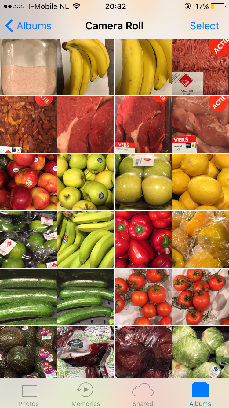
Reflecting on my need, I’ve always looked at color in food, due to my intolerance to sugar, some food is forbidden, meaning, some colors are forbidden. For example, when my friends ask me, what vegetables can you eat? I say, only greens, so it’s easier for them to remember that tomatoes or paprika or others are not good for me.
Thanks to this I started collecting images from the supermarkets, walking around and seeing the difference between what I can eat and what I can’t. All the bright colors from the fruits and some vegetables, were forbidden of course, and all the not so hysterical colors from the rice, beans, meat were fine.

IMG_8729 IMG_8728 IMG_8727

Now the challenge was, what do I do with this pictures?
Something like a guide, a small booklet I could carry around, and I could give to my close friends, similar to a little Bible.
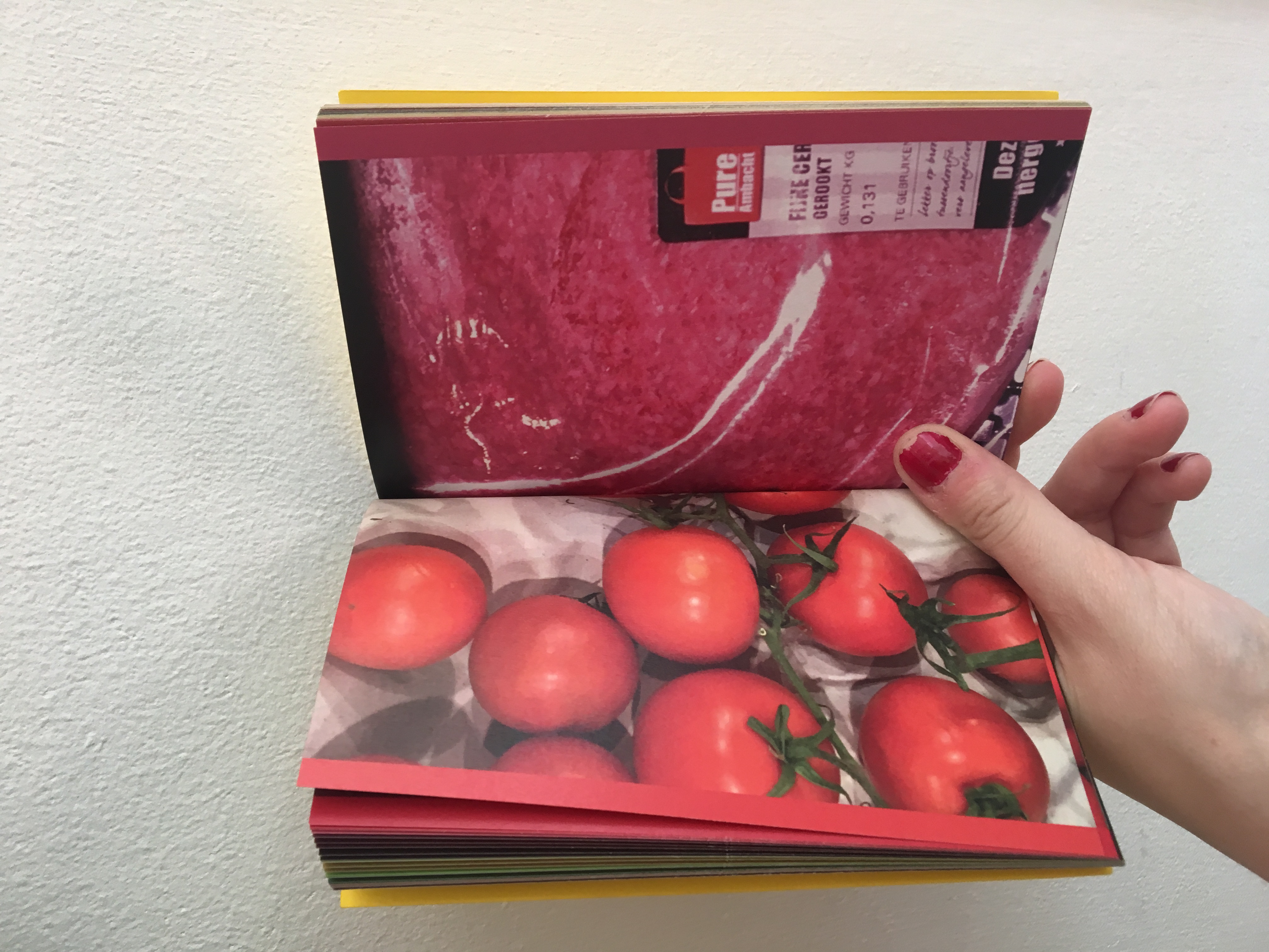
I always carry a small notebook that fits my pockets, so I decide to take that format and create a two sided booklet, where one side has all the food I can eat, and on the other side it has all the food I can’t.
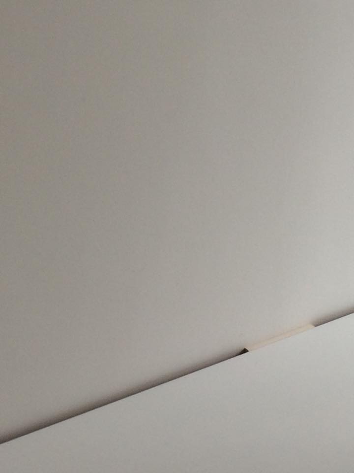
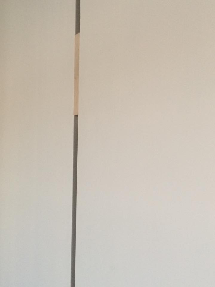
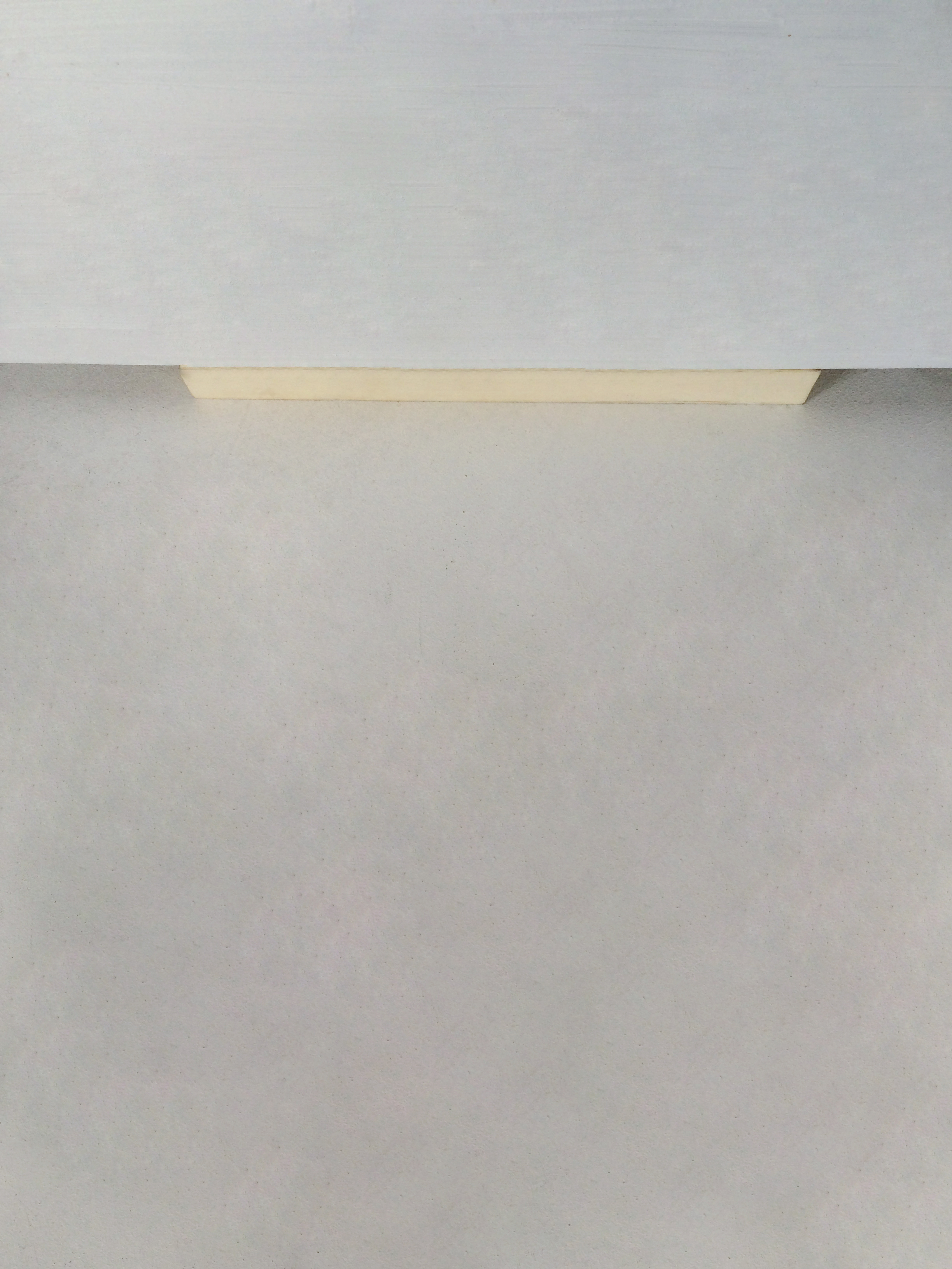
I took the decision to add a small color mark on the side of each page with the exact color, creating a small gradient on the side of the booklet. On both sides, it starts with light colors, and goes to yellow, orange, red, green, brown and darker. The order of the gradient has been influenced by the harmony between colors in the Coloroid system I wrote previously about.


fructosemia4 yes                        fructosemia3 no
Because it’s a double sided publication, the gradient is on both sides, and always both pages contrast with each other, one being the yes and one the no.

IMG_0913 IMG_0912


7122 The book that inspired me is 9,5 x 15,cm, single pages and glued. The design of it is taken from the notebook ‘Notizen, edition suhrkamp’. (click on both images to access more information about the edition Suhrkamp)

7Teaser

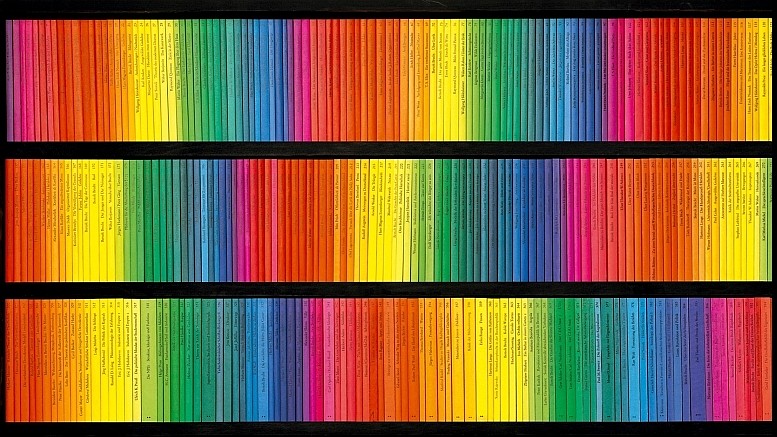
These are the rest of books that this publisher has created and this as well was a part of the inspiration for the harmony in the gradient.


IMG_9375        IMG_9378

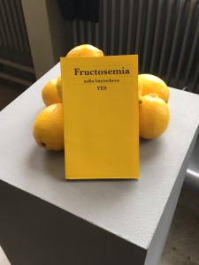
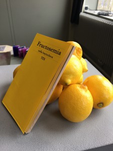
It has a yellow cover first, because of the inspiration I took the book from, and as well because of the color of the lemons, which is the only fruit that I can eat. In the presentation I decided to include some lemons that ill hold the book standing and as well camouflage it and integrate it in the space so it’s not flat.
I am very satisfied with the result as well as happy about how much I learnt about book binding, and the paper. For example, how important it is the direction of the fibers of the paper when you print so the corners of the paper don’t bend. Since it was a very precise color scheme, it had to have specific bleed marks and cut marks that I never used before.

Spaces in Between


Tuesday, April 19, 2016


Spaces in Between


Unsorted, disarranged, unorganised library, full of elements placed according to different components, which have an order or perhaps do not have it at all, just existing in an unrestricted randomness. Which ironically speaking could actually be seen as the same thing, since a lack of order is also an order in itself. Chaos with a clear beginning and ending kind of like a bad book. What exactly did I find there…? Big books, small books, orange, white, shiny, mat, hard, soft, precious, forgotten, books that are filled with content, wedding books. Books of a specific nature, books that are about nothing at all, ones that wait for attention and ones nobody cares about. Art books, design, educational, pointless, and sharp and blunt, basically all you can find in a library. I was asked to find a solution for the lack of structure in their position on the shelf. So the primary question that I am asking myself is; what is the point of doing it at all? Of course the obvious reason would be the easy access to the content, otherwise lost in the madness of disorganisation. However, I still struggle to understand why to bother ourselves with creating this specific order, if in the end it is still the same amount of books in the same space? Somehow I think this action is irrelevant, especially if we put so much effort into creating a puzzle that can be made in an infinite amount of ways… according to any system that a specific person would find attractive or interesting (depth weight, etc).


    In the name of captivation and curiously-provocative passage, I am trying to crack this system of easy predictable result, which in my opinion is rather obvious to foresee if you limit yourself by the boundary of an actual shelf. Instead of doing that I would rather step out of this radius. The concept that I tried to create is aiming to expand the perspective on how we view the book. What is a book actually? In short, it is a box of content pocket size captured by the single pages glued together, now isn’t that somehow equal to the very idea of a book shelf, in which many different books are aligned in the same way as the pages, however this time at a larger scale of information? Somehow I believe it is possible to see these systems as parallel ones. If a thousand books make a library; then, so to a thousand pages, and further, a book can also be seen as a pocket size bibliotheca.


The establishment of the fact that from now on, one copy can stand on its own, gives me the possibility of putting in on a pedestal and seeing it as something autonomous, in other words, let’s give the books the space that they deserve. There is no reason why they should be kept together in one place since in the end it’s just creating a bigger chaos. Let us treat books as unique objects instead of piling them on top of each other. As absurd as this sounds, to create an order you have to separate everything from each other and never put them back together again.


For my next step, I have chosen ten books from the shelf that I eventually turned into their own autonomous libraries, spread all over the city; one book for one building. I did this by searching for the places that seemed to me as the right environments for the books.  The main question that I had to ask myself, is how do I decide what aspect of the book should be the main criteria for the location, the physicality or the content. Not to leave it too vague, by physicality I mean the literal materiality of the book and where it could fit in the space of a building, so in the end it seems as the space was designed for the book and not reversed. In this case of preciseness, the dilemma of leaving the content out of the picture was not so disturbing anymore. However, after I found the main foundation that would determine the way of approach, I decided to take it further and only use the fore edge  of the books (opposite side to the spine), which presents it as more of an anonymous object rather than a work.


The result of this practice was the creation on ten completely autonomous bibliothecas, in ten different buildings. This created a situation in which a book stopped being a book, but rather a body living in perfect symbiosis with the surrounding environment.


12966812_1097222463654098_999562320_n


12992332_1097221753654169_1811051460_n


IMG_4769


IMG_4770


IMG_4777

2 Sheets, 1 Elastic


Thursday, December 12, 2013

During my visit to the Art book shop “San Serriffe” I didn’t know where to look because of all the attractive books.
Between all the “shouting” book-covers I saw a serie of small (A5) books bounded by elastics. Curious I grabbed a random book out of the shelf, I saw that the cover was filled with text, even the backside of the book was covered with a big (± 24 pt.) san serif font.

Weg is weg nr. 5
Letters op gebouwen
van Gerrit Rietveld

foto’s uit het archief van Gerrit Oorthuys / digitalisering Frank Oorthuys
ontwerp Klaartje van Eijk en Marianne Elbers / druk robstok ® / © 2012

The subdued radiation and technical simple way of bounding was quite nice, according to my oppinion, and made me even more curious about how the inside of the book would look like.

Besides that I am interested in typography and I want to know some more about Gerrit Rietveld since I study at an institute named after him.

After I opened the book I saw that the inside of the cover also was filled with text, and the elastic is keeping a sheet of paper in position. This sheet only contains black-and-white photos, no text and is unfoldable to an (A2) poster, demountable because of the elastic.

At that moment the question “Is this a book?” came to my mind.
It consists out of one A4 sheet of thick white paper, folded to A5 size,
one A2 poster, thin paper, also folded to A5 size and an elastic.
The elastic seems quite practical because now the book can be decomposed.

I, deffinitely, call this a book.
It is readable like a usual book, but it has a lot more opportunities, while it is a real simple system.

Hands up here comes the paperback traveller


Wednesday, April 10, 2013


There is at least fifty books on each shelves. Fifty title, and probably as much authors’ name. Maybe less actually if on have more than one book in this section. Go for a stroll among them is quiet random. Your eyes get caught and release instantly. The purpose is not to look for something. The quest without no goal has something relaxing. Maybe the atmosphere of the library is issue from that. A group of lonely loafer in between an ocean of lonely writers. If choosing imply the end of the journey, I might go on a bit longer.

Eyes flying over the cover. Plans among dead trees, I keep traveling. Suddenly I try a different contact, I touch. As the first encounter to this unknown world, my risk is huge. Infinity of lines, cliff to climb up and down. My first handlers is a soft old cover. The time is entering the journey now. Should I old to that?

I must take a precaution. Let’s stay simple and small. The comfort is not something to underestimate in trip. Over the practicality of the diary the relation toward the pocket map is always different.

Bending over, to put it back down. Rock and roll over the wooden shelves. Hold on sailor the storm shall end soon. A riff of page, this might be the end. It cant be that. Not now, the exploration started the dream catcher. The fingers are getting more grip as the training goes on. A ballerina step to the right, and the right hand got catch at the bottom left. Two flip, and a perfect landing on a monograph. But the local topics miss eccentricity. Layers of clouds over paper skin and the way thats getting more fogy. There not wet season forecast, but the time run on my watch. Straight turn to the left and larboard all sailor. Here it is, pocket size and soft paper. You must move rocks to find some precious grass. But the harvest isn’t always a success. But a web start to catch the essential. Title, destination, impossible choices. The hands go down the mine. No pity, scratch, move, rip it off to catch it. The lonely traveler is now isolated.

Unsatisfactory  feeling of beautiful emptiness. No more drift. Camping isn’t aloud on this land. The eyes get back on the track. Catch a pattern, them two. Hundreds of maps in my small hands. The plastic shield doesn’t matter anymore. The balance in the right arm sounds okay. The secret isn’t reveal and the quest over. There is always a next season to picking books. Run, run, booty in the hand and new journey to begin.

Rietveld Library cat.nr: 6247

A Printed Book History X : A Visual History Of The Printed Book


Wednesday, May 30, 2012


The Rietveld Library acquired a copy of the book [x] “The Printed Book : A Visual History”. The book of “The Printed Book” is compiled by Mathieu Lommen, and designed by Cees W. de Jong. It gives an impressive overview of 500 years western bookdesign [x]. Read this article in the New York Times for some background [x]
So for all who missed that exceptionally beautiful and well designed exhibit at the Special Collections of the UvA (University of Amsterdam) can still dream away online at home because students from the Foundation Years D_Group went there for you and selected their favorites, . Scroll down and enjoy…..

poster, catalogue and exhibition design by Experimental Jetset


Obsession


Sunday, December 6, 2009

Unique obsession is my current and last goal.

This time it’s all about miniature textile. don’t ask me why.  It’s just a random what I put my hands on kind of thing.

I am flipping the pages of this miniature and unique book and I am amazed !

hundreds of miniature works of art that looks like collages, assemblage, sculptures, paintings, napkins and other abstractions.

than I go back to the title of the book and ask myself textile? miniature?  where are all the textiles? apart from two conseptual napkins I didn’t see any.

Confused and full of inspiration I go home, I flip through the pages of the book and I find myself impressed.

but is this a coincidence or am I drawn to miniatures ?

And why am I asking it now after more than a decade of working with miniature trees and other vegetables?

1649, 779.0 cat 4

Unique Book


Sunday, December 6, 2009

I entered the library with a goal to find a unique book, and I did.

But what is unique ? Isn’t it pretentious ?

A funny thing happened, I picked a unique book about one of the least unique subjects that I know. Shoe obsession, which is really almost every average woman’s obsession.

The book is a miniature with more than 500 pages of text and images with at least one image of some kind of shoe per page.

Pretty unique.

But what is unique ?

I came to a conclusion that :

Unique Is Not So Unique.

Unique Shoe

(Unique Shoe)

12178 / 908.3 o’kee 1

‘ : ’


Tuesday, September 1, 2009


Titel van dit schrift_spread_conditions Screen-shot3

left edition 1 booklet • right edition 2 booklet

What kind of object is a book? How can it be used and how can its user relate to it? Co-auteurs of ‘Titel van dit Schrift:’ (translation ‘Title of this Notebook:’) marked traces in the publication, leaving layers of reactions and transforming the previous edition.

Screen-shot1

audio dialogue fragment edition 2 booklet

[audio:https://designblog.rietveldacademie.nl/wp-content/uploads/2013/07/dialogue-fragment-Use-of-this-notebook-1.mp3]

Screen shot 2011-11-29 at 4.34.23 PM 650-Janneke-van-der-Putten_003

left edition 1 booklet present at 'Acting the Script', Graduation Show Gerrit Rietveld Academie, Amsterdam 2009.

After writing my Bachelor thesis in 2009, I am now interested in how this material can be interpreted in speech and voice. This i have investigated through several dialogues and performances. From these events, quotes and words have been selected. With the residues of the booklet, i composed a musical performance for solo voice which will be presented live at Vondelbunker, Amsterdam, within a new setting during the ASCA exhibition 28 March to April 1st 2012. Listen to my interview


Pdf-icon Download this thesis: Titel van dit Schrift [dutch language]

more: www.jannekevanderputten.nl [link]


Log in
subscribe