Or the unexpected discovery of sorting books
In an ideal world we would identify ourselves with knowledge or wisdom.
In an ideal world the most knowledgeable people would be the one with the highest social status.
In an ideal world knowledge would be accessible for everyone.
In an ideal world knowledge would be the strongest weapon to fight with.
In an ideal world we would put higher emphasize on knowledge than money.
How to promote knowledge and what are the negative sides of promoting it?
Since long time libraries are the key for wisdom or knowledge.
There you can find any book on any topic.
After monasteries have opened their libraries the access of this knowledge is easy.
I am very interested in the way libraries can influence their readers. As a cinema can with the choice of movies they are showing, a library can decide which books and in which order, structure they are presented.
Books written by authors whose name start with an A are more likely to be looked at than books written by authors whose name start with a Z. If a library chooses to organize their books according to the alphabet.
I would like to break any of these structures.
In an ideal world libraries would educate their customers by promoting more text books.
This is most important to me.
Even though it is fun to look at books with a lot of pictures inside, I want a library that patronizes its own power to stimulate the creativity and knowledge of the customers.
On the other side I would like to look at the book it self, its shape and its lay out.
When seeing a book, the title is written in a way that a book is not meant to stand in a book shell.
First the cover of a book is severely damaged when standing for a long time in the traditional way.
Second for the customer reading the title of a book will always be harder when seeing it on the side.
Personally my neck always hurts after visiting a book store or a library.
Books need to lay in piles!
Easier to read the title, healthier for the book and your neck.
Seemingly random I chose to organize the books by the length of their title. Shorter title at the bottom, longer title at the top.
When I started to organize the books in this way, I realized something that corresponded exactly with my initial idea that a library should be a place to stimulate knowledge on all levels.
Books with shorter title are more likely to be big books.
Books with longer title seem to be more likely to be small books.
Big Books with shorter titles have more pictures inside.
Small books with longer title have less pictures inside.
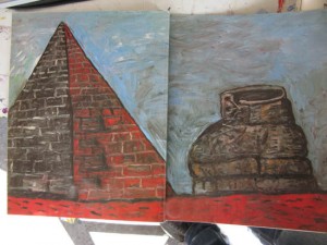
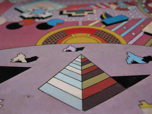
I built a pyramid of knowledge.
Data at the bottom,
Wisdom at the top.
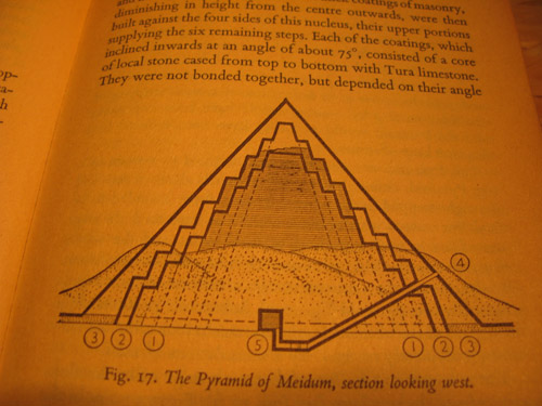
The shape of a pyramid gained its efficiency a long time ago already.
Around the world people started simultaneously to built pyramids for their Gods or religion.
Independent pyramids all around the world.
Egypt, Peru, Germany, China, Bosnia, Japan.
How can we understand that people around the world built seemingly similar pyramids without knowing from each other?
Along with a lot of wild theories about aliens, etc. There is a theory that could explain the connection between the different pyramids. Humans have always been impressed by naturals changes and special environmental situations. They saw God’s sign in it. One of these natural changes where the sun rays
breaking through a layer of clouds which hurray had the shape of a pyramids.
In an ideal world people would start believe again in the enlightenment of knowledge.
Nowadays we do not identify ourselves with any religion but social status comes with wealth.
In my ideal library I want to create a modern stairway to enlightenment of knowledge.
I want to incorporate the system of portraying hierarchic structures in our daily life.
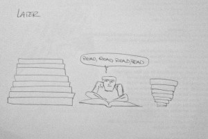
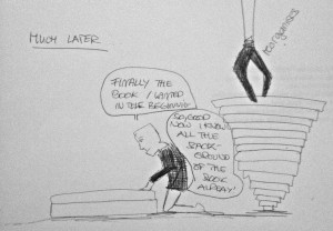
A stairway out of books. The reader is forced to first read the books that is at the top of the pile otherwise the pile of books will collapse. As I realized the top part of my books pyramids are books with only text. If the reader wants to read a book which is more at the bottom of the text, he has to ‘work’ his way down. Until he can read the desired book. After that happened, he can decide to continue dig to the bottom of the pile or move to the next pile of books.
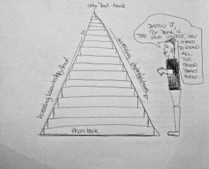
It does not matter that it may be a book about love, biology or literature. What matters is that the creativity of the reader is stimulated by only reading text.
The more he reads the more picture come in. First his own creativity is encouraged, later he will be able to apply the knowledge he has gained throughout reading the upper part of the pile to the pictures in the lower books.
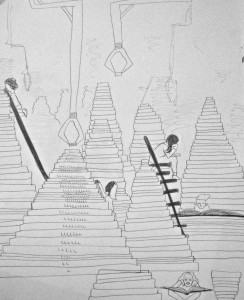
I see a forest of books piles, up to the ceiling, in which people are forced to start at the top, and read their way down, getting to the essence of the topic they are interested in.
Each pile is dealing with a different field of study. Biology, Politics etc.
Nowadays our knowledge has changed a lot, we are used to get information quickly and are not used to really dive into the topic of our interest. Less people read and more people only look at pictures, gaining an shallow superficial knowledge about a topic.
In my ideal library this is not possible.
Here people are forced to dive in and are eventually rewarded with a book full of pictures in the end.
In an ideal world.

