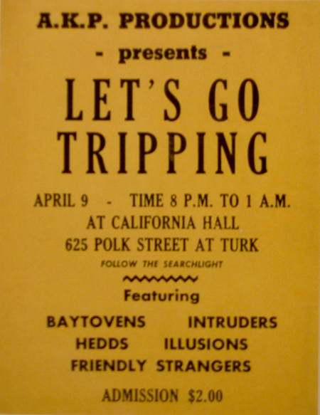
The book ‘The Art of Rock’ is about rock posters from 1955 until 1987, ‘From Presley to Punk’ stands on the cover.
I think. Only if you want a clear image of the atmosphere that these poster want to give you, you should not look at them closely. You should just brose through the book. Then you will find out that the atmosphere is mostly about drugs, endless summers and music. I like that. It takes me back to a few years ago when there were these cosy Friday and Saturday evenings with friends and no parents in the house when we just wanted to get as fucked as possible.
Another reason to not look to close at the posters is because most of them are not that good. When you do look good at them and look true all the tricks you will see there is a lot of graphic design creativity, which can work inspiring.
cat. nr: 754.1GRU
keyword: time


March 22nd, 2009 at 10:36 pm
Rens van der Knoop, the.awkward.position@live.nl,
Another thing that is interesting about these posters and covers to me is that it can tell you something about the (popular) culture at that specific moment in time. This can reach from political statements to household situations. These images often function as a gross exaggeration of the age. By looking past the extremes and deducting the core elements from a multitude of images you can get a pretty good idea of the concerns and ideas of the posters target subculture.