Part 1
Library, spines facing you, from every direction. The opaqueness of all this knowledge is overwhelming to put it mildly – your head spins of confusion. The environment breathes an air of calmness, yet great anticipation, as if the myriads of hardbound works of literature and art are eagerly yearning to reveal their insides.
You stand still indecisively – you feel yourself on the narrow interface between on the one hand panic like running down the narrow corridor, to the door, halfway collapsing onto the floor and dying, and on the other hand siting down, indulging yourself in every publication that catches your eye, never leaving.
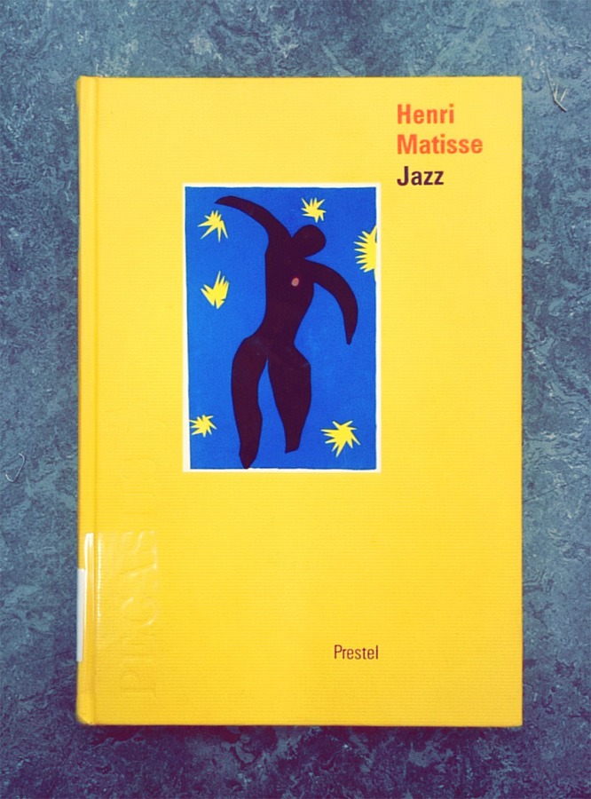
You regain your grip on reality. You see a bright yellow rectangle in front of you. You reach for it and you look at the front cover.
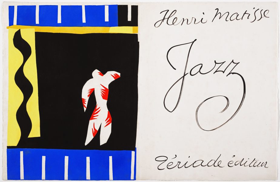
You look at the cover for a solid minute. You like the bright yellow colour and the sturdiness of the cardboard. You look at the image on the cover. Primary colours have always fascinated you immensely. The blue night, the black figure, the yellow stars, and above all the tiny Red Dot as a heart. You are intrigued – you know of this man, Henri Matisse. In your head appear images of bright coloured faces and dancers, composed with mildly crude yet incredibly accurate brush strokes. You also like jazz, and wonder what this book could be about. Filled with curiosity you open it.
That’s it. You’re taking this one.
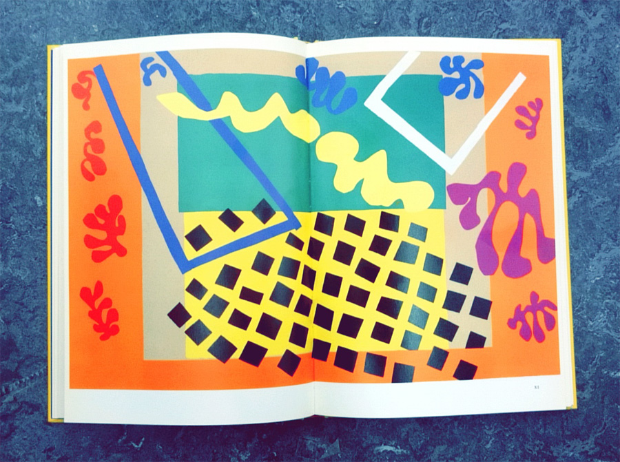
What appears to be a great and interesting book, turns out to be – according to knowledge that you have newly obtained – merely a small, relatively unimpressive excerpt from the original Jazz. Published in German, this small yellow book is actually a book within a book. A book about a book. The middle set of pages are reduced size copies of all images of Jazz. A ten-page introduction preceeds it; succeeding are German translations and a timeline of Matisse’s life. The design of the yellow book is not very striking – minimalist but conservative, done by the publisher. Judging from the looks, the middle part – the excerpt from the original Jazz – is by far the most exciting.
The original is a thick pack of folded paper, twice as wide and twice as high as the yellow booklet you have found in the library. Twenty colour prints, of which fifteen that span two-page spreads are included in the unbound book, together with seventy pages of huge, handwritten cursive text in French.
Marveling at the bright and bursting colours you wonder – How? Why? What does it all mean? You want to find out everything about this book, so you start researching and reading, to learn more about how this artwork came to be. As you learn more and more you suddenly find yourself 74 years in the past, in the south of France.
Part 2
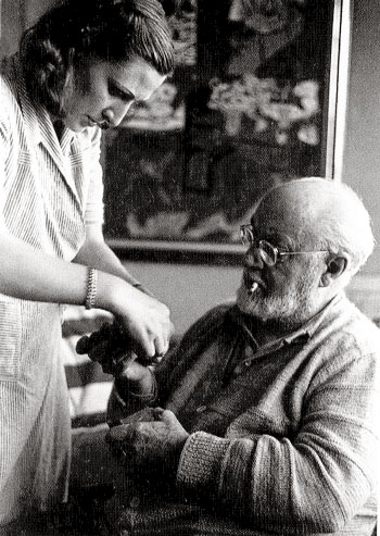
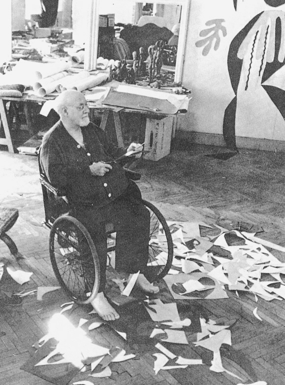
You are now Henri Matisse. It is the summer of 1941, and you are 72 years old. You are living in a suburb of Nice, and you own a nice house with a flowery garden, a big studio and a personal assistant. The gods of health have not been benevolent to you – you were diagnosed with abdominal cancer a few months back, and though doctors have removed the tumour, you suffered from serious complications. You have been on the brink of death for a while, and since then you’ve been only slowly improving. Standing is possible but laborious, so you prefer to lay down on your bed.
You have tried to pick up painting again, but it is tiring and difficult, and virtually impossible from a laying-down position. Thus, the ultra-creative human being you are, you have invented alternative methods of creating colourful expressions of expressionist effervescence: the cut-out method. Simple but very effective: cut-out pieces of paper, laid on top of each other to create compositions. You have used this technique before when making paintings, but only as an aid to perfect the lay-out, never as a means to an end. Your assistant dyes paper with pure, unmixed gouache and you use scissors to cut them into any shape you want. Easy and less labor-intensive than painting, you really like this method.
You feel that scissors carry way more feeling for line than a pencil or brush ever will. You feel so much more improvisational and spontaneous, and your life after your near-death state feels like an artistic renaissance. You feel like cutting out people, and flowers and trees. Flowers are so amazing to make, since the natural world is not hindered by preconceptions of classical art. As you once famously said:
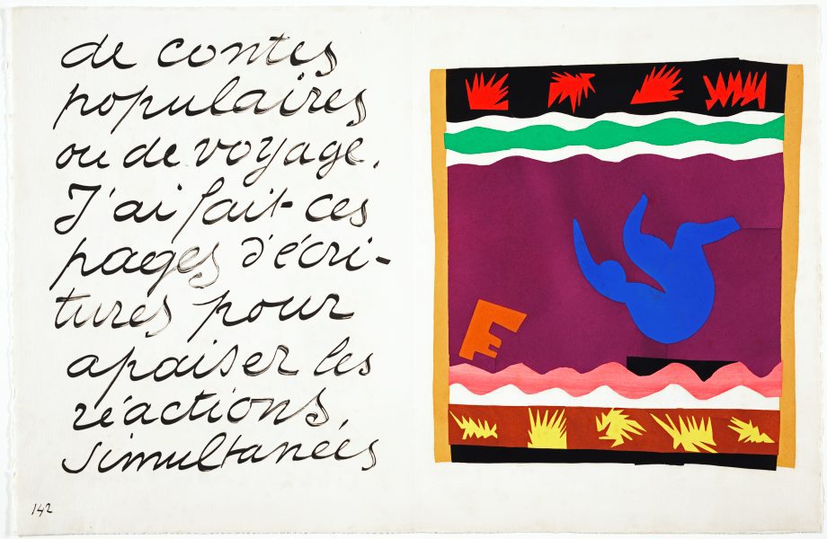
Full of inspiration, you start to create one, two, twenty collages. You write handwritten text, loosely accompanying the themes of the collages. The text is very big because you feel it is necessary in order to be in a decorative relationship with the colour prints. Your publisher likes the book and wants to print it: 100 copies without text and 250 ‘deluxe’ copies with text. The copies are printed by brushing paint over metal stencils made in the shape of the cut-outs. The paint is the exact same gouache used to dye the paper, so the copies are highly accurate in shape and colour.
Page from Jazz: Le Toboggan (The Sled)
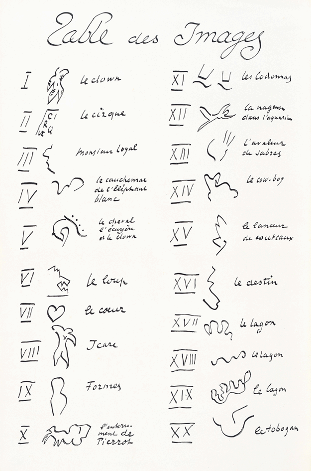
The collages depict circus scenes, stories, myths, abstract shapes and personal experiences, in vivid colours and an uninhibited style. The cover displays one of your first collages, the clown, and the title of the book: Jazz. You chose this title because you like jazz, and you think there are parallels with the music on the basis of your unbounded, improvisational and innovative way of working. You consider the previous title, le cirque, not inclusive enough for all the themes the book discusses. In the front of the book you include a ‘table of contents’, an overview of all the collages, with individual titles.
Front and back cover of Jazz
Table of Contents of Jazz
The book is received as a wide success and it kick-starts a new stylistic era: the next 12 years, until your death, you will work on more cut-outs. You like the works you have made, though you doubt the artistic quality of the book – you think that the best way of presenting these collages is in their original form: loose pieces of paper, laying on a table in your studio, playful and vulnerable to any gust of wind.
Rietveld library catalogue no : mat 17
