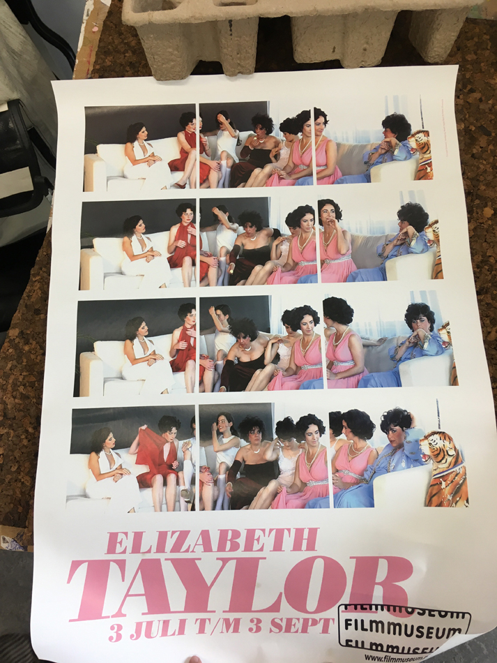
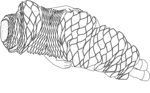
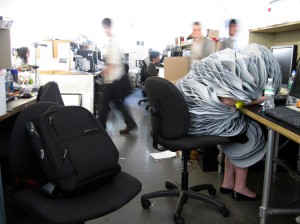
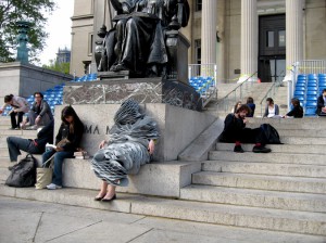
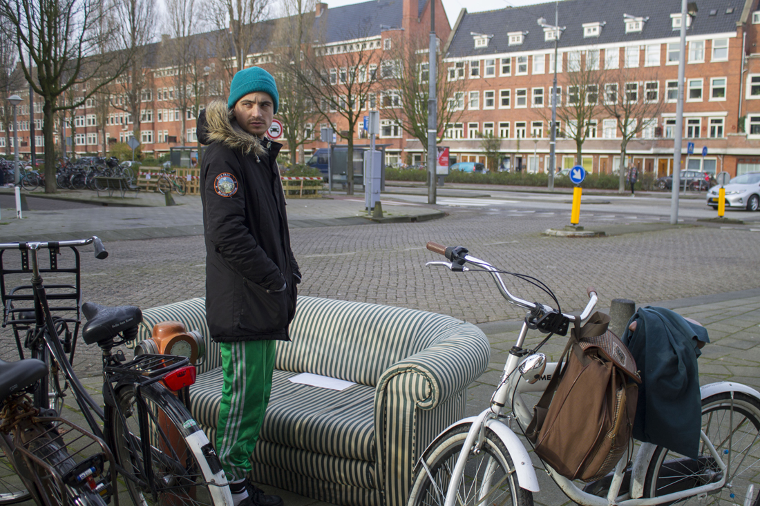
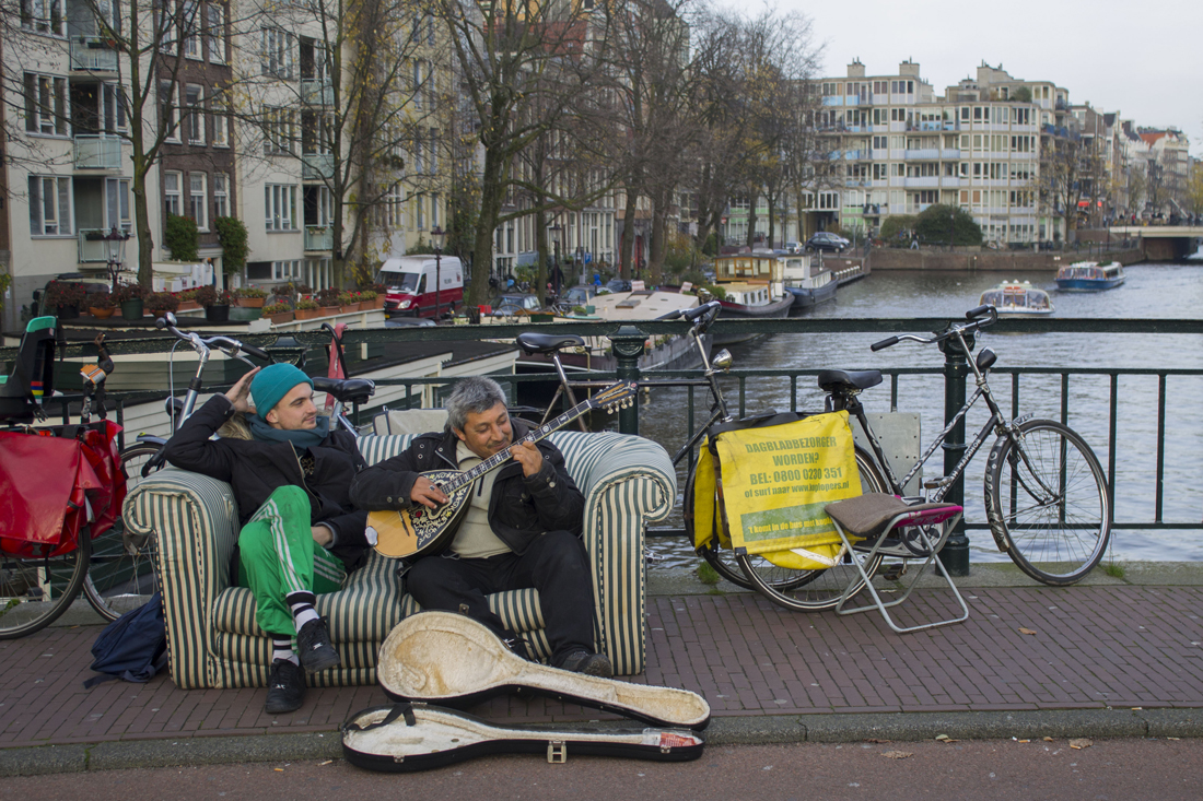
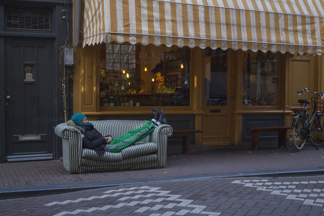
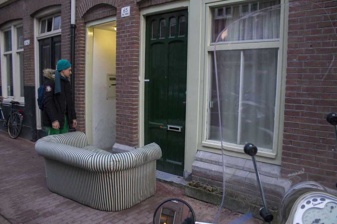
With my roll of freshly drawn papers I step out of my house on a rainy day in the direction of Rietveld. I see my neighbor throwing away a stack of paper rolls. Another unfamiliar face to me of the many people living in the city of Amsterdam. The rain is too bad to go out without protecting my papers, and I manage to put my roll of papers in one of the tubes.
Satisfied with the abundance of the trash of the city I cycle away. Smiling because I realize that sometimes a problem can be solved unexpected, quick and easy. Many times the world around me seems too complex and too unpredictable to find suitable solutions. This complexity and unpredictability often gives me the idea that the world around me is imperfect and far away of any ideal world, any fantasy world or any utopian world. I start to wonder how artists and designers of different times make an attempt to get step by step closer to for them a more perfect world.
Questioning the material world
Opening my paper roll at Rietveld I see there is still a poster in it. A well protected and kept poster. A poster that once was a solution to a certain question. I try to figure out the question that lays hidden in this poster. Why and based on which principles is this made? As an artist and designer myself, I keep on questioning this to the material world around me. But many times, I find myself in getting shallow answers and understanding of the material world around me.
A well protected and kept poster. A poster that once was a solution to a certain question. I try to figure out the question that lays hidden in this poster. Why and based on which principles is this made? As an artist and designer myself, I keep on questioning this to the material world around me. But many times, I find myself in getting shallow answers and understanding of the material world around me.
A day later during a dinner at my place a friend tells that he had been in my neighbors house. He was inspired by the man. A lot of chairs were made by himself. Made from cheap wood and using every part of the wood. He described the place as a little utopia for creators. For me to grasp a small vibe of utopianism is to be in a place were someone is an active creator of his direct surroundings. That someone takes control over his or her surroundings with a certain inspiration and wish. A feeling that someone is living in their own fantasies, and go into the direction of making their fantasies realities.
The solution for a problem
New Social Design
I send him a mail and we meet up the next day. Melle Hammer tells me how he is creating mainly by necessity. He says "The difference between art and design is ridiculous. The underlying principle is just the creating, nothing else". Creating is not to create a nice fancy tool, not to have something decorative, but just to serve a certain function. He tells that his girlfriend had a birthday party but didn't had enough space to let all the guests sit, so in one day he made a table and extra chairs so all the guests had a place and a table to eat from.
“The difference between art and design is ridiculous. The underlying principle is just the creating, nothing else”
In making his decisions certain things are important. Such as recycling, using everything from the material and not creating waste, and using simple material options and using the maximum of working with the qualities of the material. In hearing his story of his years as a student and as an professional designer you hear mainly his eagerness. The eagerness in his hands, the eagerness in his ideas, the eagerness in his eyes and the eagerness in giving smart solutions to the world around him.
He tells me that he just moved out. He is now looking for a new place to live and recently went to Almere to visit the project called The Fantasy and The Reality. Thise project I consider as Modern Social Design. Modern Social Design is a new term used in design. A group of people is attracted by it to shape reality. Examples of principles they work from are:
-
- Search a connection with the society
- Design social
- Sustainable
- Connect ethics with aesthetics
- Strife towards involvement
- Be critical
- Be transparent
- Be humble and serving
- Be dedicated and radical
- Take responsibility together.
The fantasy and the reality
All these principles can be found in this project. Melle explains to me that Almere knows two experimental neighborhoods, The Fantasy and The Reality. These two neighborhoods are a result of a contest. On a place of 450 m2 people were able to design a house with fantasy, with a temporary character, this was the assignment for The Reality. The designers did not had to take construction rules, destination plans and quality requirements. The seventies winning designs are realized with a subsidy with ten thousand gilder. Just as The Fantasy, did the buildings get a temporarily character. The place is now functioning as a holy place for people that love experimental architecture. The inventive solutions on energy, price and recycling are serving recent issues. The first experimental neighborhood in Almere was the neighborhood The Fantasy. In 1982 a contest was send out with the name “unusual living”. The idea was to break down the neighborhood after 5 years, but the project was a great success and got the status of high architectural appreciation. After 5 year it was decided to keep the neighborhood. A second design competition started after the success of The Fantasy. To develop diversity was the theme “temporary living”. The participants didn’t had to be a designer or architect. These days a lot of Dutch and foreign tourists visit the neighborhood on a yearly base. In this story as well, you hear that the initial plan is adapted and new decisions are made. This is again the research and the questions again that counts most.
How high can the creative class rise
Giving, creating or claiming empty spaces to let something new emerge is essential for the development of the world around is. This is a great example of a place the government gives to let something new emerge. A answer to a question of how should the world look like when designers get the freedom to create? A realized fantasy, a small utopian answer. These places of creative explosion are essential to create and keep a creative class in society alive. For more in-depth understanding of the creative class, Richard Florida wrote the book “The rise of the creative class“.
Utopian thoughts in design
This wish to develop works for a future utopia is alive in a lot of human beings. To my own surprise, I relate the word utopia in the first place to social and economical issues. The word utopia is first used by Sir Thomas Moore in 1516. He used this word for an ideal community or society possessing perfect socio-political-legal system. In this definition I don’t hear much about architecture or design. Utopian visions are of all times and shapes, as written by Faber and Faber in the Faber book of Utopias. They keep embarking of new creative solutions and ways what it means to be human and live in a society. A specific field that draws my attention are utopian thoughts about sound as a more integrated part of our societies. A specific symposium was held about this topic called Utopia of Sound. This in bundled in a book by Diedrich Diederichsen and Constanze Ruhm. For the excerpt click this link. It was held in 2008 at the Academy of Fine Arts in Vienna. Here thought were shared about futuristic ideas about the sonic. Not emancipated from music, but sound as a genre on itself. Sound gives human freedom against the representational logic of notation, Societies can get stuck in patterns that are harmful. How can you give people a mechanism to escape from that trap and make real progress? In many famous utopias, design and architecture are not the main focus but the condition humans live by.
De STIJL
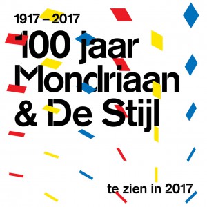
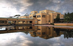
Although, the fact that De Stijl exists this year (2017) for hundred years made me realize how much designers work from an utopian idea just as much as social and political change makers. An exposition in the Gemeente Museum in The Hague (Den Haag) elaborates broadly on this topic. I always believed that the material and shaped world around me is less important than the situation. Diving into the Stijl actually made me aware of the fact that this goes often hand in hand.
 Where Thomas Moore uses Utopia as a perfect place, diving into how design works. I come closer to realize that the perfect place is an illusion to live up to, but creating a perfect research and process will give in the end more output.
In that sense, the developments the Stijl made are fascinating to follow. The Stijl stands out because its aspirations were as social as they were aesthetic. By ostensibly removing the individualism of the artist in favor of precision and universal harmonies. The De Stijl (Dutch for “the style”) group was one of several art and design movements that responded to the chaotic trauma of World War I with a “return to order.” Their aspirations were total: in order to reform society, their aesthetic aimed to eliminate false distinctions between so-called “high art,” “applied art” (such as graphic or product design) and architecture. The fascinating aspect is that De Stijl artist made a huge impact on modern designers: minimal simplicity, establishing tension and balance between solid and empty space, the grid. The style has been a catalyst for innovation.
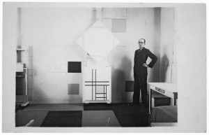
The most remarkable way of creating was the way of Mondrian. BBC wrote an in-depth clarifying blog about his vision. He was applying his utopian rules in his own lifestyle. Other people part of the stijl were focussed on shaping other people their surroundings, but on a less rigorous way in their own life. With Mondrian it was exactly the other way around. It speaks for itself that in his interior only his own paintings were there. In the end, he is one of the most radical de stijl interio designers. By 1909, he felt sufficiently self-confident to depart radically from 19th Century traditions – as witnessed by the way he transformed his studio. He got rid of some old-fashioned furniture, as well as several fusty carpets and drapes, and painted the walls bright white. For the rest of his life, Mondrian always arranged his working environment sparsely and meticulously, in a way that chimed with his abstract paintings – as journalists who came to interview him often noticed. Between 1921 and 1925, Mondrian created in his famous studio in Paris at Rue de depart 26 an environment that corresponded exactly with his idea of the the new plastic, as he called his extraordinary art. A famous quote of him is: everything is expressed through relationships. This is made directly clear by everything that is in his work space with a reason. Carefully placed and thought of. In his mind a radical world of an artist takes place, that works on new art for a not yet existing outside world. The desire for the style is entirely satisfied in it.
Slowly I start to see the profound relationship between utopian ideas and Mondrian’s art. His art can give a feeling of heightening reality. And that’s what Mondrian was searching for in his paintings: a heightened experience of reality. Certainly, his abstract paintings have a sure grasp of a visual utopia.
In the stories of Mondrian I hear his obsession for modernity. Sometimes he gets criticized that he did not had a relation to the real world. Some people assume that he was living a monk-like life, who devoted his life to abstract paintings with no relation to the real world. Although, throughout his career, he engaged with, and fed off, aspects of modernity that he encountered in the cities where he lived. He loved music and clothes, always kept up with the latest developments in popular culture. From this I learn that sometimes it is necessary not to have a close relation with the real world and withdraw from it, to give a new answer on the question what it means to be human.
In hearing the stories of these designers, they seem to have a sharp analyzing ability in questioning the world around them. Plus being aware of their dissatisfaction and being able to react on that with a new solution, a new answer. In the work of these people I sense a strictness to the principles they work from. A certain sincerity, directness and clarity to that what they create.
Shaping your world
In the end designers and artist can focus on shaping and creating the world of people around them, but most essential is shaping your own direct world. Next to really doing the deed of creating, it is of importance to share stories and moments of an imagined place or state of things in which everything is perfect. For me the creators that take the effort to make a change in their direct surrounding the most true to themselves. From their way of decision making, we can learn that working, creating and implementing your own utopian ideas in your direct surrounding are essential to let your own utopian ideas become more realistic. It is necessary for people to learn that the access, the freedom and the impact people have on their direct living surrounding is always present. It is the direct space people live in and have the freedom to shape it.
The necessity of uplifting stories
After the conversation with Melle, I realise that he was the owner of the cardboard cases. The poster designed as well by a great photographer lady from Rietveld that committed suicide. As sad the story can get. This reminds me to even share more stories of hope that an uplifted version of reality is possible. The last week was full of expected and unexpected relationship with humans and objects. I used them to get new inspiration and to express my insights. I look at the cardboard case that came into my live by necessity and I look at the poster that came into my life by coincidence. Realizing now, that the unknown face of last week and the unfamiliar and meaningless poster for me, now became a familiar face, with a name and a story. And that an understanding in me was born that where the poster, the font, the colours and the layout came from. I smile realizing that with being eager to understand the simple question “Why is this made and based on which principles?” gave me an unexpected answer back that helped me to develop further my own design and art principles. The accessibility to smart solutions, can in this case, and in many others, literally be found on every street corner in Amsterdam. Many designers create from their own inner utopia. Everyone has moments that they experience something or hear something that sparks our imagination that the reality we currently experience is heightened. This drive to keep on searching and creating for a heightened idea of reality will keep people and the material world moving forward.
