Skip to Content Skip to Search Go to Top Navigation Go to Side Menu


"simplicity" Tag


Beauty is the harmony of purpose and form.


Thursday, February 15, 2018

Alvor Aalto : Screen 100
Skærmbillede 2018-01-18 kl. 16.17.03

Alvor Aalto was born in 1898. Most of his childhood and youth he lived in Jyväskylä, a town in the center of Finland, surrounded by the big finish nature. Thousand of lakes and woods with millions of birch trees, must have influenced the young Aalto.
In his work nature is always present, either in the organic shape of the products or the choice of materials. And Finland is present, one can say that Finland is with Aalto and that Aalto is with Finland.

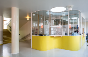
Aalto was both an architect and a designer. It is very obvious in one of his early works, the Paimio Sanatorium. In addition to the new and functional building he also designed all interior for the building. Today the Paimio Chair is probably the most well-known Aalto chair from that time. It was designed for the patients, functionality and mass production was important issues, together with the organic shape it all makes the chair an icon of good design.
Skærmbillede 2018-01-18 kl. 16.17.48

“Beauty is the harmony of purpose and form.”  Alvor Aalto 1928.

Alvor Aalto has had an immense impact on our perception of Scandinavian design today.
In 1935 he founded the company Artek together with his wife Aino and Nils-Gustave Hahl and Maire Gullichsen. The company should handle the sale of Alto furniture, but they wanted to take it further. They saw themselves as promoters of “Rational living and interior Design” (as they write in ‘the Artek Manifesto’). In other words they wanted to educate people and teach about the ”good life”.

All over Europe design changed or evolved in to something more functional, modern and lighter. There was a new way of thinking, new production possibilities and materials. Just think of the Bauhaus movement in Germany. In Aalto’s design he combines that thinking with natural materials and organic shapes.

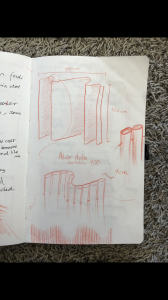
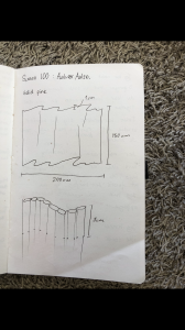
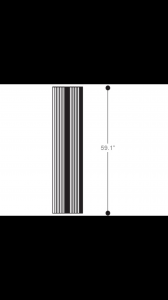
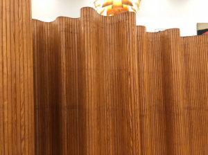
It is evident in the screen 100 from 1936. The construction is so simple. Wooden sticks assembled with a metal wire. When the screen is used as a room divider or a simple screen it forms different organic shapes.
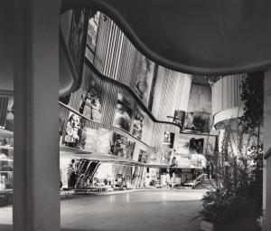
The repetition of the vertical wooden sticks leads the minds to forests with beautiful slender birch trees. An effect Alvor Alto also used, when he worked with different expressions on the facade of his buildings. That can be seen on the picture of the finish pavilion which Aalto made for the world exhibition in New York in 1939.
Skærmbillede 2018-01-18 kl. 16.17.31

The screen has been sold since late 1930s. At the Stedelijk, I found it attractive and it caught my attention at first because of the simplicity and round shape.

On the attached picture it can be seen in the Artek Showroom in Helsinki in the late 1930s.  Today it is still for sale in the Artek Showroom together with the Paimio Chair and many other Aalto products.

Even though Alvor Aalto made fantastic design he still wanted the user to influence the design.

 “ A standardized object should not be a finished product, but on the contrary be made so that man and all the individual laws controlling him supplement its form.” Alvar Aalto 1935 

The Screen is a standardized object, but the user is the one who forms it.

Skærmbillede 2018-01-18 kl. 16.17.18

A small conclusion:

Why did I try to build the screen, how was it and what happened on the way?

At first when I saw this screen, my first thought was that I wanted it at home. It looked so simple and gentle in it’s look. How it stood there and divided the exhibition with its calmness and simpleness. But still what I was fascinated by, was that it was also simple to make, it is basically just sticks put together and then the shape makes it stand.

But such an iconic and great design object needs time to make. And often with design and especially Scandinavian design, simple stuff takes the longest.

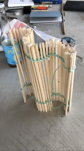
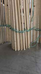
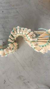
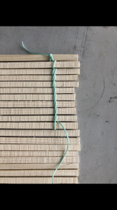
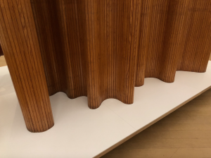
Therefore I decided to build a model myself, I wanted to try and put myself in the making and designing of this. It was fun, I made a small 1:10 scale model

IMG_6040 IMG_6039 IMG_6038 IMG_6037

The small model didn’t give me any trouble that I didn’t expect. It was simple and easy and a very honest object. I think If I scaled it up I would have had more trouble and I would have been confronted with some other problems.

But all in all it was clear for me after trying to make a model and looking into the design and production of this, that this object is very honest.

It is exactly what you see.
IMG_6036 IMG_6035 IMG_6034

‘The Mosquito’


Friday, March 27, 2015

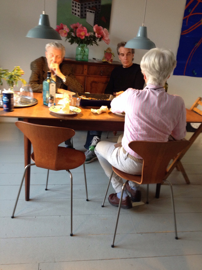
I am sitting behind a table, in my parents house, on a familiar, comfortable chair. I am used to this seat and it has been around for as long as I can remember. My grandmother got a set of four teak wooden chairs with a matching table as a wedding gift in the late fifties.  I have seen them in two different states throughout my life. My mother was given the set when she was about twenty years old. Feeling that the natural teak wood colour was outdated and ugly she decided to paint the chairs red. The table was not present until recently.

About a year ago my mom started to regret her decision to paint the chairs, and had them brought back to their original state. After my parents moved to a new house the chairs and table were placed in their newly furnished home, where they stand in full glory. Ever since then I keep admiring them more


family-around-Jacobsen_900

two generations sitting at the dinner table


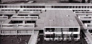
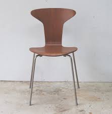
The Danish designer/architect Arne Jacobsen (1902-1971) introduced the munkegaard chair – also known as the mosquito – in 1955, in the Munkegaard school located in Gentofte, north of Copenhagen. The school is considered one of his most important architectural works, within which he designed everything from the light fixtures to the sinks [x]. The chair that belonged to it became an absolute classic. Because of the setting that the chairs were made for, the design is highly functional. They are very easy to stack, which is perfect in places where you have to deal with limited space. They are extremely durable and comfortable at the same time. The part on which your back rests follows the natural shape of your spine. The seat of the chair is made out of pressure moulded sliced veneer. The bases are made of chrome steel tubes. The thin wood is strong but flexible. If you lean backwards, the wood moves slightly with you. The chairs are more than just convenient though. The elegant objects have an inviting look. They are unique in their simplicity with an understated aesthetic quality, which makes them so brilliant. They will complement any decor or surrounding, and bring an edge to any interior. Having only been produced from 1955 until the late sixties (and for a short amount of time in the nineties), they are now back in production again. When you pay attention they appear everywhere. When I was on a holiday in Denmark, I noticed that the chair was used in many different places, from office spaces, to cafeterias, and from the fancy to the less fancy places. Everyone seems to appreciate them. See here a website made especially for the chair.


Munkegaard schoolThe mosquito chair

Munkegaard School                             The Mosquito Chair, Teakwood


Jacobsen plays an enormous part in the image we have of danish design, and maybe even design in general. Traces of his work are found worldwide, even now still, thirty years after his death. Jacobsen was a man of extraordinary vision, strong ideals and in his time was considered true avant-garde. He is not considered intellectual or analytical in a traditional sense. Jacobsen was a producer; even when he was not working he worked nonetheless. Relaxation for him meant a shift in the creative realm. His output therefore was enormous. As a designer he strongly believed in the ‘form follows function’ motto. Jacobsen was inspired by the works of Le Corbusier, Mies van der Rohe, and Walter Gropius, which is explicitly visible in his own early works. He was also inspired by the furniture of Ray and Charles Eames who worked a lot with bent plywood. Even though Jacobsen is most famous as a designer he never called himself as such, and it is said he had a strong dislike towards the word. A lot of his designs were created in the context of the architectural buildings that they would be placed in.

I see Jacobsen as a visionary, as he played a huge part in designing the environment we live our daily lives in. From architectural masterpieces to simple things we use everyday, Jacobsen surrounds us. He makes things exactly the way I like them. His designs are the perfect formula of functionality, durability, and aesthetics. They are modern simplicity: all that it needs to be and nothing more. His mosquito chair will remain a timeless object that people will appreciate for ever. As for the chairs in my parents house, they are probably not originals, since the design is one of the most copied in the world. Nonetheless I am happy that I have grown up acquainted with such a beautiful piece of design.

The Power of Simplicity.


Friday, October 26, 2012

Adrian Frutiger, born in 1928 in Interlaken Switzerland, is the creator of the ‘Univers’ and ‘Frutiger’ typefaces. Besides typefaces he is also known for signets, logos, corporate typefaces and corporate identities for publishers and industrial enterprises. At a young age he experimented with invented scripts and stylized handwriting frustrated as he was with the formal, cursive penmanship being enforced at the Swiss school he was attending. At the age of sixteen, he was interested in sculpture and learned woodcutting, engraving and calligraphy. His father discouraged him to continu his studies in sculpture and encouraged him to go work in the printing business. Even though he was in the world of printing, he kept his love for sculpture which influenced a great part of his type forms.

But in this research I will only talk about his independent works, the symbols; the forms and counterforms.


Generally speaking, form and counterforms, is the way in which the type and its background have an effect on each other. We can also say; letters or in this case, symbols are created by positive and negative shapes. The positive shape is referred to as the form, the negative shape is referred to as the counterform.

It is easy to make a negative or positive image and reverse it afterwards, but the meaning of the symbols will change completely. This is what Frutiger wanted. Nothing has one meaning, the imagination of our thoughts is so wide that you cannot give it a name. Even though Frutiger gave his symbols names, titles, or better said feelings, I for example do not feel the same way as he does about those symbols. Which is a nice thing, because we do not share the same past, we lived in different periods, so this influences the way of how I look at it. The forms are recognizable in my eyes, you can easily define the subject of it. In the counterforms though, it is a bit difficult because the symbols are not free in space anymore. They are encircled, outlined, which confuses the imagination to think ‘out of the box’. Even though they are connected with each other, they obtain different atmospheres. 


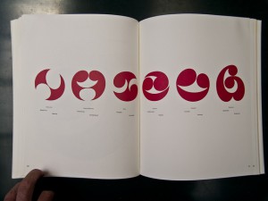
This is an example of forms – positive

               This is an example of counterforms – negative

The symbols are ‘Frutiger Symbols’ and ‘Frutiger Stone’ was made to express Frutiger’s thinking, feelings and opinion in signs. It is a symbol font of plants, animals and stars as well as religious and mythological symbols. This typeface builds a completely new design system, which offers endless possibilities, the “world language system” as Frutiger said. Better formulated, the entire spiritual world of his mind or even our minds becomes readable trough symbols. There’s no need to use letters to express ourself, only symbols matter. The simplicity of letting go our feelings on paper, with a brush or in woodcutting. 

An example of Frutiger Stone

The idea of universal connections determines his thinking and marks all his creative work. No need for intellectual capacity for reading the signs, Frutiger wanted people to use their dreams to understand his work. Which is a beautiful idea, but almost impossible. Because our thinking does not always match the way Frutiger wanted. His symbols were in a way, a spontaneous interactions between his feeling at that time and what his hand was doing with those informations.

I truly like the fact that all the symbols are connected witch each other yet not completely. In his forms there is a representation of movement, there’s always a beginning but never an ending. He thought that he could always find a way to make it “better”, “uglier”, more “aggressive” or put more “emotions” in it. Nothing was in his eyes finished. Like the human existence and thoughts, which were the main themes of the forms, he asked himself often the same questions about life, beauty and our thoughts. Those impressions of the feelings he had at that moment fit well in his forms.

While I am talking about a way to communicate with each other without using the alphabet, I can show you an example that is still in use: Charles de Gaulle Airport at Roissy, France.

He was asked to make a new directional sign system. The yellow background with the white letters in French and the black letters in English is an invention of Frutiger. I think this task which was given to him, completed his way of thinking. Frutiger wanted to make an universal language connected with symbols to make it understandable for everyone, young and old. It is remarkable how those symbols hit us in the eyes, and what it means to us. I can imagine that when you are in a hurry to catch your flight you would not have the time or the ability to read, only to see symbols. It makes live easier, understandable and there is no speaking or wrong communication. There’s only one language that we all do speak Frutiger’s language, and that is the symbol-language.

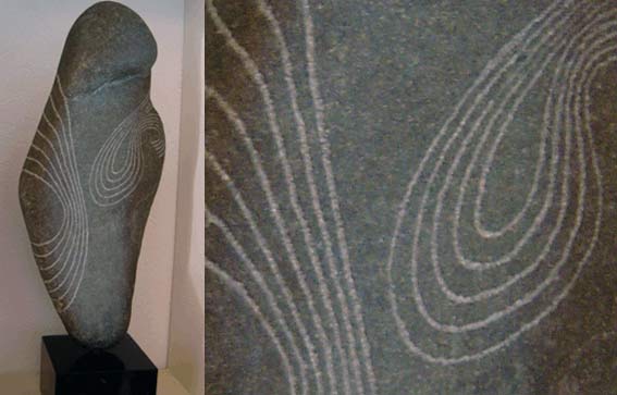
Frutiger is found in the work of the Romanian sculptor C. Brancusi, who made sculptures that represented what Frutiger wanted in his works. Leave the unnecessary for what it is and focus on what you want to see, to feel. Trying to reach the perfection. Frutiger took note for his forms and counterforms. He also developed some sculpture himself.


Frutiger opened a door to express ourself, our feelings and thoughts in symbols, an international language without knowledge, but only the use of our dreams and our unconscious. We share the same feelings, but we do not show them equally. And this is in my opinion the essence of what Frutiger wanted to show us. Nothing is the same, yet it is.

If you want to know more about Adrian Frutiger and all his typefaces, there’s a documentary The man of Black and White – Adrian Frutiger by Christine Kopp and Christoph Frutiger. There’s also a good paper about Frutiger’s life and works; Travail de Maturité « A.Frutiger »; Frutiger .


Log in
subscribe