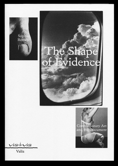
Always when i have to choose a book, i will try to find one that feels nice when i touch it. I prefer softer over the heavy ones. When i held ”The Shape Of Evidence” in my hands, i thought the cover was the most interesting part of it. It has a soft cover, it is comfortable to hold and it resembles the skin of sphinx cat.
I chose ”The Shape Of Evidence” by Sophie Berrebi because this september one of my friends invited me to the book presentation in the Rijksakademie voor Beeldende Kunsten, but i did not go. However, I am still interested in the role of the document, the archive and the museum in today’s culture.

It surprised me later to find out that the designer of the book is Sam de Groot, i had heard his name before, but i had not heard about his graphic design work. Last year, i went to his concert in ”Butchers Tears” and became a big fan of his music he’s been making lately and today, even yesterday. He is part of a Londom/Amsterdam hip-hop duo and he makes the instrumentals for the group. Sam de Groot and Paul Haworth make music and lecture-performance pieces. You can also hear their music on the Red Light Radio (do not miss next concert with the new album ‘Illegal emotions’ in Berlin in the early of next year. I hope they can make it!).
I thought that a person who makes such a cool music must be cool with everything he does. It is true, i swear. De Groot has also published books under his True True True imprint, which evolved out of his experience of translating and producing the English edition of Nescio’s Little Titans. For a relatively short period of operation, True True True has produced a small yet substantial body of work, ranging from translations to original novels and audio work, developing a unique genre of comedy—typographic or otherwise. This combination as a writer and a publisher has resulted in three short novels produced through True True True (Silk Handkerchiefs, Alone Desperate And Going Nowhere and Andy De Fiets: letters to Robin Kinross). Sam de Groot graduated from the graphic design department of the Gerrit Rietveld Academie, Amsterdam, in 2008. Since then, he has been working as a freelance designer for cultural clients. As I realized later, Sam De Groot is a proud member of the Rietveld Preservation Society. Every Monday he teaches typography students of the graphic design department.
I asked him what helps to be so productive. The answer was: ’’I am productive because I like to work and I say yes to many things, which then forces me to deliver’’. He has several interesting design commissions coming up and he holds and directs many workshops. “That keeps me busy enough. I would like to free up more time for music”
In addition, Sam de Groot was a member of the Typojanchi 2013, Seoul International Typography Biennale. In his works Sam tried making something archetypical, anonymous, without mimicking anything specific. He dislikes posh, bibliophile ‘literary’ aesthetics.
The Shape of Evidence, was the first book in a series, so design for it was made for the whole series, not just for this book in particular. Originally the series was going to be set entirely in the typeface Windsor and the publisher liked it. Despite that the author of the first book of the series, however, really objected to use the typeface with the reason that it did not seem serious. Therefore, Sam had to find something new that would please everyone. What he love about Windsor [x] is that it is so rich in curves and contrast – much richer than the average typeface. In the end he went for a more conventional typeface that still has a lot of idiosyncratic shapes (Eldorado [x]).
He aimed to reinforce this visually unique feature with the exaggerated bottom/outer margins and the non-straight lines that are used for chapter titles, etc. The strategy was to find unusual aesthetics that could still work in a respectable academic context. To explain about typefaces of ‘The Shape of Evidence’ I would like to mention Tariq Heijboer who also graduated Gerrit Rietveld Academie. He created the SKI DATA typeface [x], working with the words, ‘ski’ and ‘data’ what gave him the idea of representing counter-balance. There are two different weights, horizontal and vertically stretched.
The typeface was used by Sam de Groot when he was designing The Shape of Evidence. It was the first title in Vis-à-vis, a new series of books published by Valiz [x]. Valiz is a young company which was established to respond developments in contemporary art, photography, architecture and design in a broad-based and imaginative way. The main focus is on the composition, editing and quality of the text and images.
I was really happy to work on this assignment because i have a joy of good music in my heart and beauty of good graphic design in my eyes. And this is one more example of how small our world is.