An overwhelming neutrality swept over me as I entered the Library that dry early winter afternoon.
My brow, void of perspiration and still furrowed from the hours of tedious busy-work that preceded my breaching the threshold of the Athenaeum.
I looked around at the people sitting and noticed that most of them were not reading, but rather working on their computers. One girl was reading but I knew that she went to a different school, so I will relieve her of any narrative relevancy. Having been given the task of retrieving a book related to the subjects of historical or contemporary typography, I searched through the many rows of graphic design and typographical content; stopping only to dispose of excess mucous secretion that had been accumulating in my upper respiratory tract.
My digits were cold, having remained nearly motionless during the previous class but were slowly regaining their warmth and supple qualities.
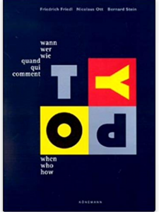
My eye caught a black book, titled in small, unassuming characters: Typography : Quand Qui Comment / Typography : When Who How / Typography : Wann Wer Wie.
Upon further inspection, I noticed that the cover was in fact dark blue, which stood in contrast to the playful colors used as backdrops for the letters of the word TYPO. A cathartic feeling was induced by the inherent beauty of the cover alone and I was excited to see its content.
A wide array of depictions of book designs and graphic posters presented themselves upon my opening the cover. Some dated back to ancient times, while some represented the collected works of contemporary designers. I closed the book after inspecting it for about five minutes and walked to the checkout desk to acquire permission of appropriation from the librarian.
"typography" Tag
More fear and loathing in the library
Monday, December 3, 2018
Fear and Loathing in the Library
Wednesday, November 28, 2018
The library in the Rietveld Academie is organized in a spiral form and looking through the books in it’s shelves is much like wandering the streets of Amsterdam as they circle around and around. This layout motivates random discovery but abstains in aiding any targeted intentions.
Luckily, the assignment did not require any knowledge of the library or the contents therein.
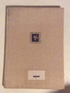
With a vague idea of which sections we were to choose a book from, I gazed upon the tall typography section. The individual shelves are lined with countless textbooks and magazines; each bearing their distinct design along the spine. The magazines tend to utilize bright colors, which, when aligned beside one another, blur into an inaccesable mass. Amidst this sea of color I spotted a tall beige book with a black title. The contrast to the surrounding books made it unique. The book’s individuality in this context can be attributed to it’s age; It was printed in 1955.
I took the book off of the shelf the study it in detail. The cover is made of laminated canvas and the title on the spine reads: ALBERT KAPR DEUTSCHE SCHRIFTKUNST.
The font reminded me of the font found on my family grave. Sturdy and very legible with well proportioned serifs. The front depicts a small white on black graphic of writing tools in a frame of black letters. The graphic is humble and unassuming; almost disappearing into the distance of the large beige cover. The first page reads in German “Versuch einer neuen historischen Darstellung” almost apologetically labeling itself a mere “attempt”.
This honesty won me over immediately and I started leafing through the book. Old battered pages depicted forgotten fonts and the names of their creators. I recognized the name Schneidler from old correspondences between him and my grandfather that I had been reading that very morning. This made me feel like a historian piecing together the forgotten past of his ancestors. Maybe F.H. Ernst Schneidler held this very book. All speculation aside, I seem to have picked the book because I subconsciously recognized aspects of my own identity presented in print. I am book. Book am I.
757.3 kap 1
Abeceda NOW
Monday, May 21, 2018
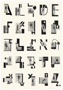
ABECEDA 1926
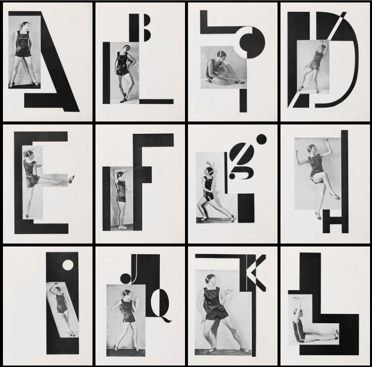
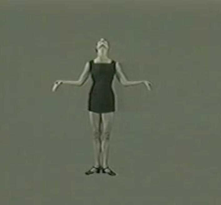
In 1926, the Czech dancer Milca Mayerova choreographed the alphabet as a photo-ballet.
Each move in the dance is made to the visual counterpoint of Karel Teige’s typographic music.
Teige was a constructivist and a surrealist, a poet, collagist, photographer, typographer and architectural theorist, and his 1926 photomontage designs for the alphabet are a uniquely elegant and witty invention, and one of the enduring masterpieces of Czech modernism.
In the graphic design world, movement refers to the path of a viewer’s eyes as he or she looks at your work. Since movement can add such a large sense of unity in design, it plays a significant role in the ceration process. By tying the different elements of a design together in a specific way, you can control the movement of your viewer’s eyes throughout the medium. As a different media, body does the same thing in ABECEDA 1926 photo-ballet. There is the different movement which is more analog, natural and already exist but still a path of a viewer’s eyes as he or she looks at the work, using the body and an action as a method of design. Despite the fact that the terms action and surface are disconnected even opposite things.
Letters get created
by movements > Movements who
literally give the sound exhaling.
In our case of the Abeceda Alphabet an example
with the first letter of the alphabet, the letter ‘A’.
The body language of reaching towards the sky asking an ‘A’.
But expressing ‘A’ as confidence standing tall, putting your hands in your wrist, chin up.
So one single letter can have a wider scala of meaning.
A letter without a sound of the voice, a movement of the hand can be like an incomplete inform. Just an ”A” on a paper.
Body language which is connected to words is a missing factor in language these days. Digitization is transforming things into less natural outcomes. Which is interesting is relating those two opposite sides; the digitized, formulized and made as a stabilized, structured letters out of the natural, smooth, changing, body movement. Even we can find some elements from both sides in all the sides, still the texting, mailing and internet talk has no presence of body and sound which is ironic because we generally attend to imitate the existing features that we know, take them as a starting point or repeat them.
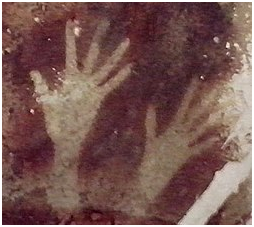
We can see the first examples of this attend in the ”Cave Paintings”. Cave paintings are also known as “parietal art”. They are painted drawings on cave walls or ceilings, mainly of prehistoric origin, dated to some 40,000 years ago (around 38,000 BCE) in Eurasia. The exact purpose of the Paleolithic cave paintings is not known. Evidence suggests that they were not merely decorations of living areas since the caves in which they have been found do not have signs of ongoing habitation. They are also often located in areas of caves that are not easily accessible. The paintings are remarkably similar around the world, with animals being common subjects that give the most impressive images. Humans mainly appear as images of hands, mostly hand stencils made by blowing pigment on a hand held to the wall.
Some theories hold that cave paintings may have been a way of communicating with others.
The body and other elements are using for communication in a way with ”movement/action of the body and also in a way with ”captured frames such as; paintings, photographs, and even typography as visuals. So we can really understand the idea of connecting body language with the captured, reflected typography together.
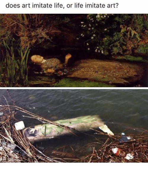
According to that point and various examples, we can tell that art may imitate life. The movement, the performance reflected and created an alphabet. But could it possibly be possible to create an alphabet without any reflections from life?
A Seer Reader
Thursday, February 2, 2017
I was trying to find a book in the library with a design which excited me; something I’d like to write about. I chose to pick up A Seer Reader for the assertive, bold cover design it boasted. By using red, white and black, the colour contrast is stark, the combination connoting power. The font type replicates typical, 70’s typography, with its sweeping thickness and curvy motion; it asserts a confidence. A shallow indent delicately engraves ‘A Seer Reader’, indicating the importance of the books title, over the authors name. The ‘A’ starting the title, leads a triangular shape centering attention to the middle of the page. Every element to the cover designed by Zack Group, makes for an eye-catching, attention-grabbing book. The cover enticed me to open the book, and discover what inspired me to chose A Seer Reader for my investigation on design. Surprisingly my analysis wasn’t the result of my initial drawing to the cover, (and therefore comes without credit to the books designer,) but moreover to the author, Ed Atkins.
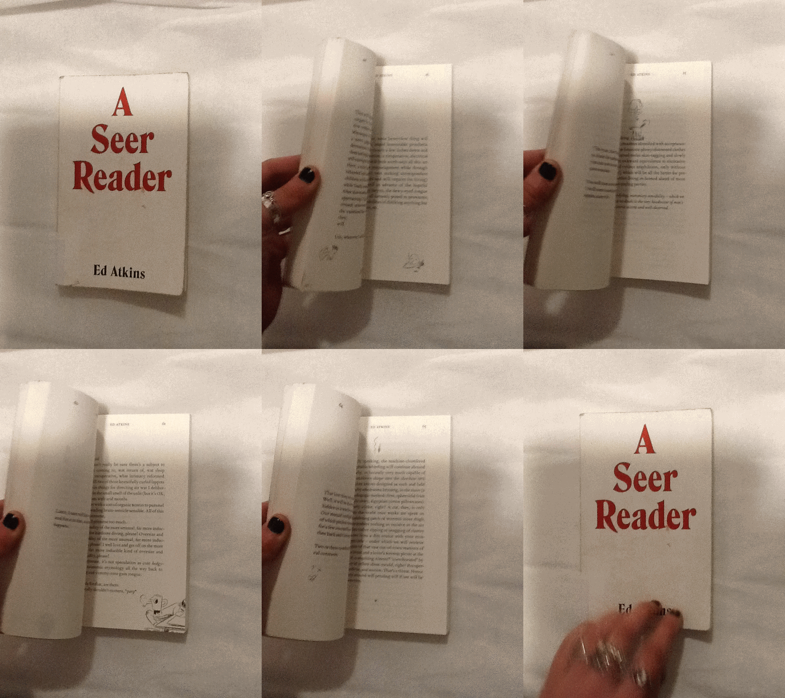
I discovered that every page of the A Seer Reader was adorned with dancing doodles; playful, printed, pen-style drawings dangle from the words, interrupt the verses and sulk in the far corners of the pages. There are tiny squiggles, illustrations, and symbols referencing or resembling punctuation. The doodles appeared to me, to specifically elude each poem with unique visual imagery. I decided I’d like to discover why they were designed in the way they are. I’ll investigate the context the book is published within, and therefore the content of A Seer Reader. Focusing on the style of the font used for the doodles, their arrangement on the page, and the choice of imagery, I’ll analyze specific examples from the book in attempt to explain why the doodles are designed in this way.
A Seer Reader was published for Ed Aitkin’s solo exhibition in Serpentine Gallery during 2014. Working predominantly with video and language, Ed Atkin’s visual art is inspired by the poetry he wrote for A Seer Reader. Ed atkin’s solo at Serpentine consisting of sound works, text instillation and images revolves around a multi-screen video instillation named Ribbons, where Atkins attempts to emphasise questions concerning the relationship between real life and virtual concepts, objects and environments. He explains that his videos are a ‘…kind of poetry of their own’.’ ‘…interested in previously literary-theoretical concerns about seeing and reading, interpretation of metaphor, figuration and literality.’ He uses CGI to literalise what was once only possible in metaphor.
In Ribbons he creates a surrogate character resembling his own physical appearance in a haunting online replication of a life. Atkins intends to ‘re embody’ himself as a possibility of what we may become in an paradoxical way of spreading a message that we need to focus on developing a more powerful mortal life. Through this high tech HD animation he ironically uses his medium to do exactly the opposite by creating a virtual world.
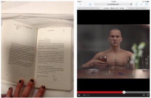
The character developed by Atkins is a young white male, wearing a bald
head and an action man body adorned with tattoos, he has a habit for drinking alcohol and smoking cigarettes. His appearance and his humanly habits reflect somebody stereotypically disapproved of, in today’s society. Atkin’s concern for the world we exist within, is evident in the design of the tattoos enscribed on the skin of his surrogate, Dave. Desperate phrases like ‘love please’ and ‘bankrupt’ are scrawled onto his skin to illustrate his story of conflict. They physically demonstrate the feelings Dave would have as a human, but as a virtual delegate, his being is absent from. On his skin; they’re positioned outside the human nervous system. I think this indicates a detachment from the animations human intimacy with himself.
After studying the videos Atkins produced for his solo exhibition, I noticed similarities in style between the doodles illustrating A Seer Reader, and the tattoo’s scrawled on Dave’s skin. It now became evident to me, that considering the importance of what the drawings suggest in his video work, the way they are designed in A Seer Reader will also have a special significance to the ideas Atkins questions in his work.
I’m curious as to why the doodles appear in the font style they do. They are printed on the paper in a scrawly handwriting in a biro or sometimes with a bold marker
The independent, physical and primally instinctive movement of writing with a pen in ones hand, is raw and natural to the intellectual human being society knows today. Atkin’s uses the soon disappearing practice of writing by hand, to convey the humanly emotions of himself, or anybody in our society today, onto the virtual future we face (the skin of Dave). Therefore the font design that distinguishes the poetry in A Seer Reader, from the handwriting doodles can be compared to the contrast between Daves cgi skin and his tattoos.
The poetry is written in a serif font type, commonly used in literature of today, its appropriate for clear messages to encourage the reader to focus on the content of text. It may be used to help develop the trust of the modern target audience, which is important if they are to value Atkins’ poems as high literature. By choosing a serif font which was developed digitally, Atkins paradoxically hints at what the digital world has already done to change the way our brains work, to raise questions regarding our future and technology. There is a confident, official level of professionalism created by digitally produced font, totally un-emotionless and un-personal for the reader of today. Its in these respects that the I relate the choice of serif font to Atkins virtual surrogate replica of a human. Both the poetry in sensible, digital serif font and the pinky rendered skin of the CGI Dave is tormented whilst illustrated by a real humans handwriting scribbles. The choice for handwriting therefore poses a conflict between some of the characteristic, fundamental elements of human development regarding language in the mortal world, (a practice at threat of,) the human’s of our virtual future; a product of our current society.
By using handwriting the design of the doodles appears uniquely personal; autobiographical. Atkins uses his own style of taking notes to project his personal concerns with society onto his surrogate; he plays with his ego, flipping himself into his virtual identity blanketed by his naked, surplus and mortal emotions Through his CGI in Ribbons. In A Seer Reader the intimacy created between the reader and Atkins, through his use of highly personal handwriting, implies the doodles are like entries to a diary, personal thoughts belonging to the artist. The doodles style in handwriting therefore allows us to understand Atkin’s truly distressed feelings towards our existence in the future he insights, in the mostly raw, open and honest way.
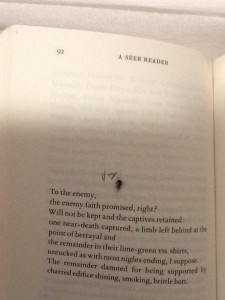
A consolidation thoughts form from Atkin’s head; the handwriting translates a universal language of emotion, in how each word is formed from the authors hand to the paper. The handwriting helps to illustrate Atkin’s feelings as he writes, and emotionally connects with each specific word. For example on page 92 of A Seer Reader, Atkins poem stabs at capitalism and using a current slang, (another characteristic typical to a human of our time,) he makes a metaphor for our choking industries; ‘butthole’.
He illustrates with a pencil sketch of a butthole, labelled with more slang; ‘hey’. He adopts a loose, scrawly joined up handwriting to do so. It feels fluid, creating a casual, relaxed visual effect which allows the readers feel comfortable to laugh, as he playfully mocks the sincerity behind his poetry. By contrast the choice in design regarding capital letters, a larger size font to the majority of the doodles and sharp points determining the end of letters, suggest aesthetics which relate to an irrational state of urgent, abrasive, human panic.
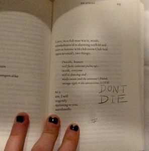
Page 103 in the handwriting ‘DONT DIE.’
Capital letters accentuate importance, taught in the grammar of the languages in our society, showing Atkin’s thoughts which should shout from the page. These features of the handwriting style show how Ed Atkin’s conveys different emotions through the doodles design, he plays with his readers to elude how he feels as the artist.
The design regarding the placement of the illustrations on each page and they’re relationship with the text arrangement is also of interest to me. The doodles are very specifically positioned, creating a new design and rendering a unique layout on each page. The notes are cheerful, their haphazardness and impermanence in position creates a youthful energy of its own. Many harass the text, dangling from the words, interrupting them like a vandalised high school text book decorated by an excited teenage rule-breaker. Upon flicking through the book I think Atkins creates a chaotic feel with the arrangement of the doodles. Maybe he does this in an attempt to question the power which our mortal life (represented by the emotive tattoos / doodles he writes by hand,) has, over the possibility of a virtual future (what his poetry represents). An issue presently discussed within his poetry, as well as what he represents with his surrogate Dave in Ribbons. Chaos raises concern to me, and suggests Atkins might be trying to raise awareness of his issues with the future and society today, through fear.
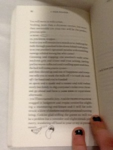
On some pages it appears the design regarding the placement of doodles serves purely for illustrational purposes. For example on page 86 a smiley mouth and a big floppy tongue curve and grin around the word ‘mouth.’
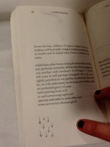
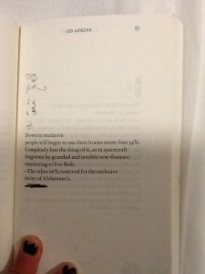
The positioning of the doodle presents a clear visual anecdote of the text, as its placed directly next to the words, the reader sees them together creating imagery. The poem on page 94 begins with ‘down the line.’ Directly beneath at the end of the poem and the lowest point on the page is an illustration of 9 arrows pointing downwards.
Again this provides a clear illustration of the text, but it also speaks of itself and the symbol is close to the bottom of the page, it feels they are going down as well as ‘being’ ‘down’.
I’m curious to understand if there is a relationship between the way the doodles are used for illustrational purposes which seem therefore to be in harmony with the poetry, and the concepts which lie behind Atkins exhibition at serpentine which A Seer Reader was published for. Despite the chaos of the doodles, and the lively energy they carry as they appear in different places for each poem, they do help the reader take their imagination further in their illustrative quality. If the handwriting doodles refer to issues regarding mortal life, and the poetry talks on the concern for the virtual future, then Atkins could be showing the bond between the illustrations of his thoughts, and his poetry. As one where he symbolizes how mortal life still has power to change the effect of the virtual world or what is to be of the future, as the illustrations aid the text.
The discourse structure (involving the positioning of illustrations with relation to the poetry,) may be designed as it is in A Seer Reader to give stage directions to the reader. It creates a similar discourse structure within the poem to that of a script. On page 46 Atkins places the handwriting scribble ‘nausea,’ in a new verse, in line with the direction the poem would be read in.
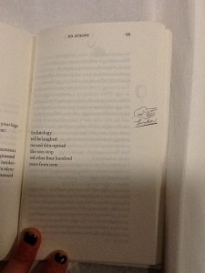
Atkins allows these direct assertions of feelings to stand as lines by theirselves. They appear significant and with a different font (in scrawny pen,) they contrast to the rest of the poem, they work as powerful instructions. With their own space they order the reader to feel something. They also give relief to the poetry; a breath between verses to give time for the reader to reflect, to feel, before continuing to read. When looking at page 99 a short, six line poem is centred to the left of the page, so the text lays closest the core of the book.
A poem which torments human’s obsession with eschatology, with disregard and humour. A slap-stick illustration of a hand, labelled ‘swallow,’ underneath, sits directly in line with the verses on the opposite side of the page. Aligned with the poem on a vertical axis, its clear the text and illustration are to be read one after the other; they have a connection, although they are separate because they imply a direction; a change of action. The illustration is cut right to the edge of the paper, giving the impression there is something to reveal on the next page. Its likely that after reading this grave poem, which makes dark humour about the possibilities of our future, the space allows the text and the reader to breathe. I think Atkins wants the reader to digest the words of this poem, look to the right and ‘move on,’ indicated by the encouraging instruction of a pointing finger to turn the page. In this case the positioning of the doodles may be used as a order to feel an emotion like a stage direction, or to initiate a direction.
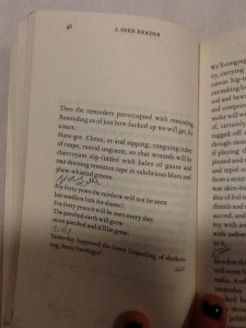
Some doodles intimately relate to words in the poems. On page 57 a bold marker is used to underline the final verse in the poem, this draws attention to it and marks the line with importance.
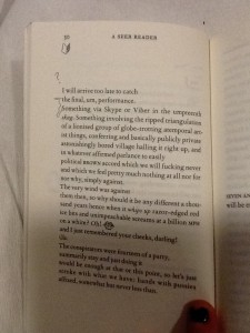
On page 30, the two opening words, which start verses following each other, are connected with a squiggle.
When joined they spell the phrase ‘the something.’ Making a new verse within the poem. This statement also exists on the page now without relation to its context in the poem without the joining squiggle. This draws emphasis to the phrase and creates layers within the poetry.
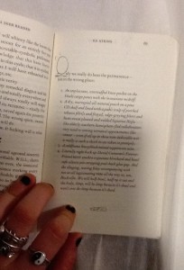
In some cases the positioning of the handwriting squiggles make them a part of the poem, although they contribute letters in a different style to the rest of the poetry in its serif font. On page 67 the poem begins using letters O the handwriting style, to begin the first words of following verses.
The size of the squiggly letter is obese to the rest of the text, it helps to compose a bold and grand opening word. This is a common design in a lot of literature, Atkins makes a reference to it in his own style in an impish attempt to add intellectual value to his poetry through his page design. The choice to have these in the doodle style instead of the serif font refers to the power the doodles have over the poetry on the page, as they refer to the dying practice of handwriting as a symbol signature of our mortal lives in society today.
I’d like to find out why Atkins chose to use this specific imagery, for his doodles. Many of the symbols he uses look similar to punctuation, commas, full stops, brackets. His choice to use marks in A Seer Reader and for the tattoos in his video, which are similar to punctuation, gives a further clue that not only the handwriting is being used as a symbol of our mortal life today. There are other reoccurring themes within his imagery, including hands, eyes, penis’ and delicately sketched vaginas. All parts of the human body. Atkins decision to design his illustrations using this imagery, again, references mortal
life and current society which he discusses along with his thoughts about the future in his poetry.
By investigating Ed Atkins process as an artist, focussing primarily on his exhibition at Serpentine Gallery 2014, and more specifically the video work Ribbons, I have come to various conclusions about why the doodles which intrigued me into investigating the design of A Seer Reader, are designed in the way they are. The handwriting style the doodles are written in, connotes natural human thought patterns, unstable emotions and ultimately the questions the author presents. Handwriting also serves as a symbol for language and writing in which could represent the typical medium used and developed throughout our human age. It therefore creates a tension with the computer generated font type used for the poetry, which might suggest the virtual future which Atkins discusses, as a running theme to his work. The doodles appear in totally different positions throughout the book, on each page. I therefore discovered various different reasons for the design of their arrangement. They can be placed intimately within contact of the poems, to draw attention to specific words or phrases, or to illustrate an idea directly which shows how human knowledge can still be useful for bettering the future, when considering the broader context of his practice. They can be placed in a location on the page which will give a direction to read in or indicate that one should stop reading to feel something. The placement of the doodles when they create letters which integrate directly with the poem, connate high literature as Atkins desires his writings to be read with sincerity as he discusses deep issues surrounding our society and regarding the future. Finally the chaotic feel created by the different placement of doodles on each page questions the urgency of the issues the handwriting stands for; the mortal world and its conflict with the virtual world of the future. To end my investigation I discovered that the imagery Atkins uses in the design of his doodles references English punctuation, and the human body. Again it links directly with his exhibition and his proposal of questions regarding our existence in the society we live in today, and its relation with the virtual future.
Approaching the Archive
Sunday, December 11, 2016
‘Approaching the Archive’ begins from a coincidence that becomes an unexpected point of access to the archive and book collection of artist, writer, editor and graphic designer Will Holder, in the context of his exhibition ‘Sorry! NO we don’t do REQUESTS’ at Kunstverein in Amsterdam.
The essay deals with the successful as well as the unsuccessful attempts at trying to grasp a lot of material in a little space, and the systems that one makes up in order to organize and process content through. Moreover, it is an essay about books and the stories and associations they convey, as well as it is about the finding of an unexpected relationship between ‘typography’ and ‘topography’.
The studio of Karel Martens
Wednesday, January 8, 2014
I had my worries walking around the book shelves in the art book shop San Serriffe. I didn’t know anything about art books how to look at them and how to look at the design.
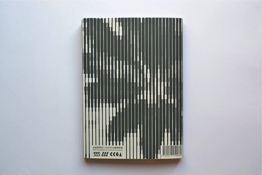
I skipped though some books but didn’t find them interesting. Then I saw a cover that caught my attention. I didn’t know the artist but I was enchanted by the simplicity of the graphic black-and-white book cover with Japanese text on the side and the title ‘Full color’. The size of the book felt a bit small in my hand, handy and easy to flick through the pages.
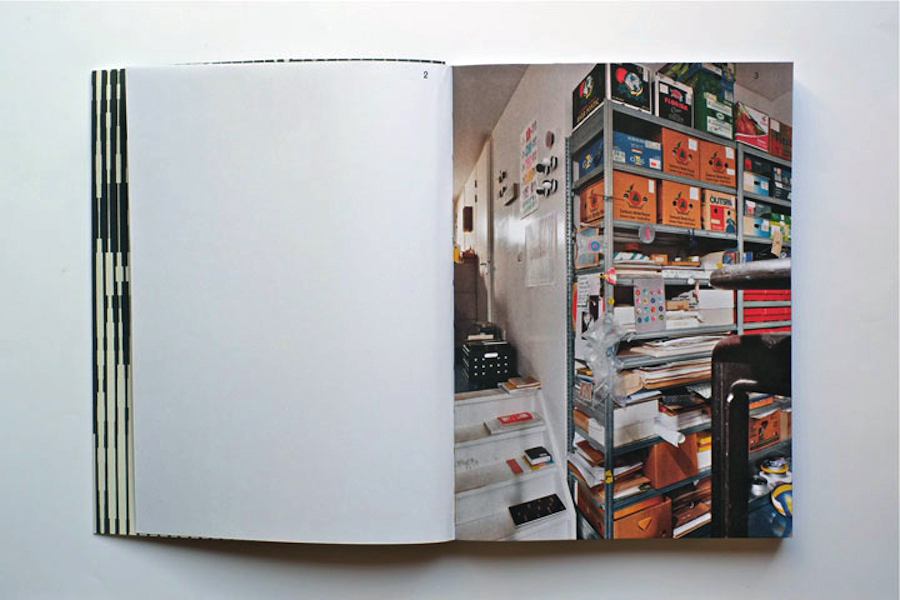
I turned the first page and discovered a colorful photo showing a bookshelf filled up with paper rolls and used fruit boxes properly containing more papers. The photo only shows a small part of the room but on the following pages the panorama of the room which turns out to be an art studio is shown. Page by page I was guided into the head of a graphic designer’s studio.
It turned out to be the head of the Dutch graphic designer Karel Martens. He is specialized in typography, working with prints and books.
After his studies at the School of Art at Arnhem in 1961, he became a freelance graphic designer.
Since 1977 he has been teaching in graphic design at his old school in Arnhem and at the Jan van Eyck Academie in Maastricht. He is now working as a supervisor at the master-program Werkplaats Typografie [x] together with Armand Mevis. This program is based on practical assignments and self-initiated projects. It also works as a meeting place for graphic designers.
The book ‘Full color’ which is showing Martens’ studio was published on the occasion of the exhibition KM, Ginza graphic gallery in Tokyo in May 2013 [published by Roma Publications].
With the information about the artist and his work I started to look deeper into the book.
The photos by Johannes Schwartz are divided into 4 parts by the graphic designer Julie Peters together with Martens himself.
The first part contains photos from the artists’ studio. They seem to form a long panorama, cut up and organized so you see some parts of a room at one photo and the second part of the room at the next photo. This way of organizing the photos gives you the impression of flashbacks and even more if you already know his work.
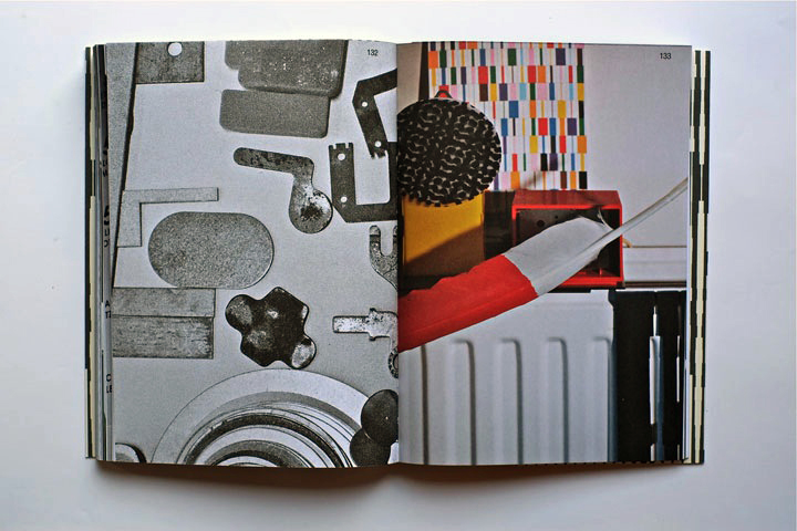
The next part is Martens’ archive, collected in boxes from the bookshelves. Here you look directly into the boxes which contain sketches, illustrations and prints of the artist. If you look at the prints you’ll find some of the shapes recognizable. When you flick through the book you get the impression of a system of colors and shapes which are being repeated. An example of that could be the small industrial metal pieces which shapes are to found on some of Marten’s prints. It seems like the editing of the book creates some sort of pattern – just like Marten’s prints.
The third part is a close up of Martens kinetic work with clocks seeing from behind. A study about composition and color, by printing a dot pattern on two glass disks and attaching the disks to the second and minute hands of a clock. The chose of photographing the clocks from behind is again a way to show the process from his work.
The last pages in the book are writings by David Senior and Martens him self. The text is in English and Japanese describing the project around the book and the work of Martens.
One thing I was wondering about was why Martens choose to have a graphic designer on this book when he himself makes books. I asked Johannes Schwartz about that and he told me that the making of this book includes a close co-operation between all 3 artists. This book does not only work as a documentation of an artist. Not only the contents of the book tells about the artist and his work but also the editing is very important.
The result is this fascinating portrait which gives you a good insight knowledge of Martens’ visual language.
If you are curious for more please check one of his other books “Karel Martens: printed matter/drukwerk, 2nd Edition” which contains a big amount of exhibitions, art works and articles he have been taking part in. This book gives you a good insight into Martens’ environment and way of working too.
Rietveld library catalog no: marte 1
 This is honey.