Skip to Content Skip to Search Go to Top Navigation Go to Side Menu


"Damien Hirst" Tag


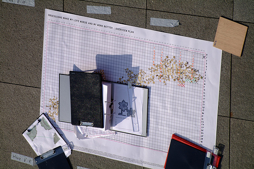
“Obsessions Make My Life Worse and My Work Better”


Wednesday, November 19, 2008

Stefan Sagmeister is a graphic designer who lives and works in New York.You might know him from his CD cover designs for the Rolling Stones, Lou Reed and many more.

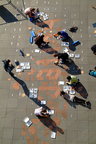
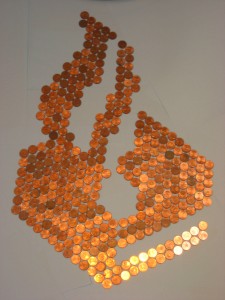
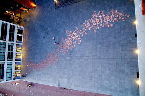
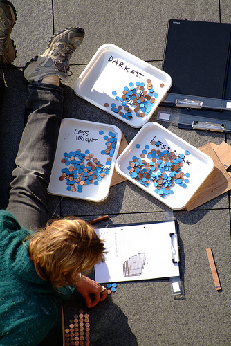
In Experimentadesign he showed us a quote from an old diary of his, saying; ’obsessions make my life worse and my work better’. Spelling out these words he used 250.000 Eurocent coins. He left it completely open for the public to do with the work whatever they wanted; take the coins and start using it as money; take some and create a new image, turn them around, destroy it or just look at it.

It’s ironic to use money as a kind of ink for this line and put it on the street like that. He’s playing with the value of the money. As soon as you realize that the work is made out of money, there is a desire to have it. But then, he’s talking about obsessions. So it feels like a stupid act to take the money and start using it for your own pocket. Beside that, you really need to carry a lot of those heavy 1(!!) Eurocent coins to have a high number. It would be a real torture to take it. You must be really obsessed almost… This reminds me of the work of Damian Hirst (For the Love of God). Wich you can now be seen in the Amsterdam Rijksmuseum. He is playing with the value of art by making the money aspect in art so dominant, marketing. The big difference is though, that Hirst is putting it in a commercial context himself, provoking a discussion and then, he is the one who is leading it. And in Sagmeisters case, it just happened. He didn’t had a hand in it, while Hirst is blowing everything up and it becomes a hype in a way.

The night after the opening of Experimentadesign two people started to put the coins in bags. The police were called and they decided that they had to secure the work so they took it to the police department. How Dutch is that? Due to a lack of interests by the authorities in events like this, you’ll get this kind of results. They’ll fund you to make things possible, and end up taking the artwork after a few hours to protect it. How much room is there left for interventions like these in our super save and over regulated society? Whose space is this anyway?

But still, it’s an unexpected interaction, and that is what the artwork tried to provoke. Therefore, I must say, I love it.
posting and police logo by Doris Boerman

A group’s researched book-concepts


Monday, March 10, 2008

TM-City SMCS Warhol_Index TM-City SMCS

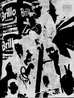
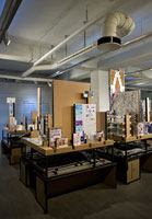
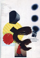
After many month we finally present the research results into 25 selected books from the “Collections Groenendijk”. During a one-hour event every student was presented with the opportunity to start-up a research into the manifest art or design concepts presented in these unique book designs. Designers Julia Born and Will Holder were presented through an interview-DVD made by the graduate program of the “Werkplaats Typografie Arnhem” for the Chaumont festival workshop 2005. Others projects, by Richard Niessen or Andy Warhol, were presented at an visit to the Stedelijk CS, where their books were displayed in context. Coralie Vogelaar (a Sandberg Master) came to visit us in person to give insight in her work and ideas and lecture on the concept behind her latest publication “Masters of Rietveld: design in the 21st Century” published recently by the Sandberg Insitute /Design [above: Niessen TM-City / Warhol Index-Book

A New Art World
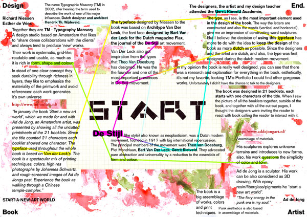
Caetano de Carvalho on “A New Art World” by Richard Niessen + Ad de Jong

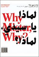
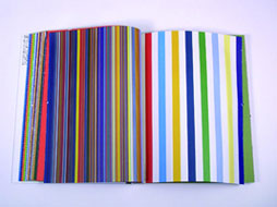
Research material was edited down to A4 sized guided tours into these subjects. All subjects presented in this list are also available as hard copy prints at the Research Folders at the library. The investigation focussed on the following book titles: Ed van der Elsken’s “Love Story in St Germain“, Irma Boom’s Grafisch Nederland 2005 on Color, “Start A New Art World”(published above), the acclaimed cooperation between photographer Geert van Kesteren and designer Linda van Deursen “Why Mister Why“, “Hhalo” by Julia Born and Rebecca Stephany’s “Archiving Today”project. Last 3 ladies all teaching at graphic design department.

SpoerrieThe ThingThe Thing Norm design Swiss TypeS M L XL

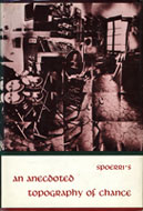
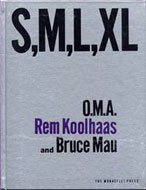
Daniel Spoerrie “An Anecdoted Topography of Chance“(extra info), Dieter Roth’s “Dieter Roth Band 10“, “S M L XL“by Koolhaas, Sandbergs “Experimenta Typographica“: Mens Sana in Corpore Sano and “Counterprint” by Karel Martens. “The Thing” by Norm designstudio, Andy Warhols classic 1967 “Index-Book”, Will Holder’s “Catalogue“: starring Gijs Muller, Edward Ruscha’s “Colored Peolple”, Richard Niessen’s piece de résistance TM-City.

Why Mister Why GN2005:Color

Sandberg Institute Master: Coralie Vogelaar with “The Photoshop” and “De Hedendaagse Ontwerper”, Gerald van der Kaap’s original ” HoverHover” and the monumental cooperation between Jonathan Barnbrook and Damien Hirst “I want to spend the rest of my life everywhere, with everyone, one to one, always, forever, now”.

Dot Dot Dot X Hester Permanent Food 15

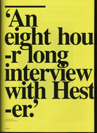
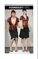
Finaly some highly conceptual magazine concepts like, the 1980’s I-D magazine 2, Jop van Bennekom with Re-magazine: ‘Hester‘, Permanent Food or Stuart Bailey’s “Dot Dot Dot” magazine.


Log in
subscribe