‘Also sprach Zarathustra’
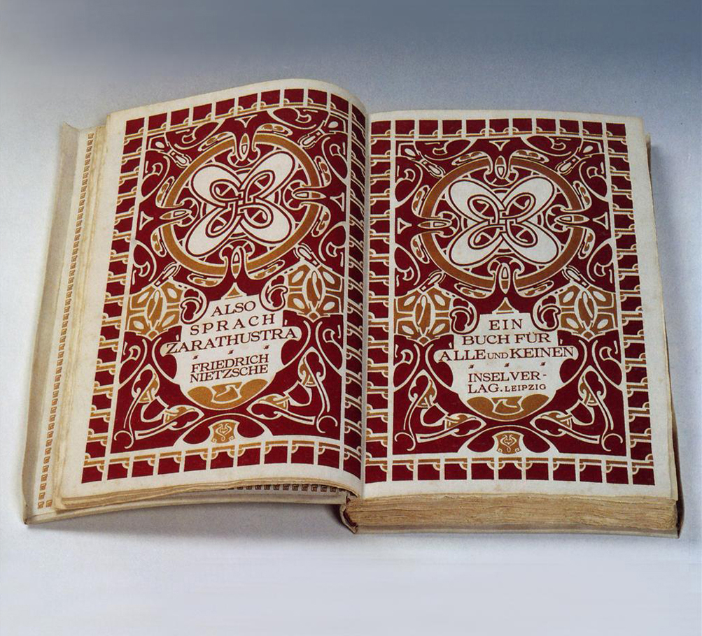
The book I chose to write about is F. Nietzsche [x] ‘Also sprach Zarathustra’ designed of Belgian Flemish painter and architect Henry van de Velde in 1908. The design of this book immediately captured my attention, but when I saw the title I was involved even more because I also have an e-book version of ‘Also sprach Zarathustra’ so it was very intriguing to see this book in real.
In this page layout we see a symmetrical duplicate composition which makes the whole design stronger and more impressive. The deep reddish – purple and gold colours palette gives it a very dramatic effect. The form of the image is massive and monumental and also flat but still decorative. The content of the illustration is quite abstract. H. van de Velde used organic motives which are creating a very dynamic atmosphere even if the framework has a very strict geometrical form though these two different patterns come together very well. Van de Velde leaves some ‘calm’ place for the text. The font of the title is solid and works with framework. The balance Henry van de Velde creates in his design is sophisticated. In conclusion it creates the feeling that there is just a thin line between simplicity and complexity.
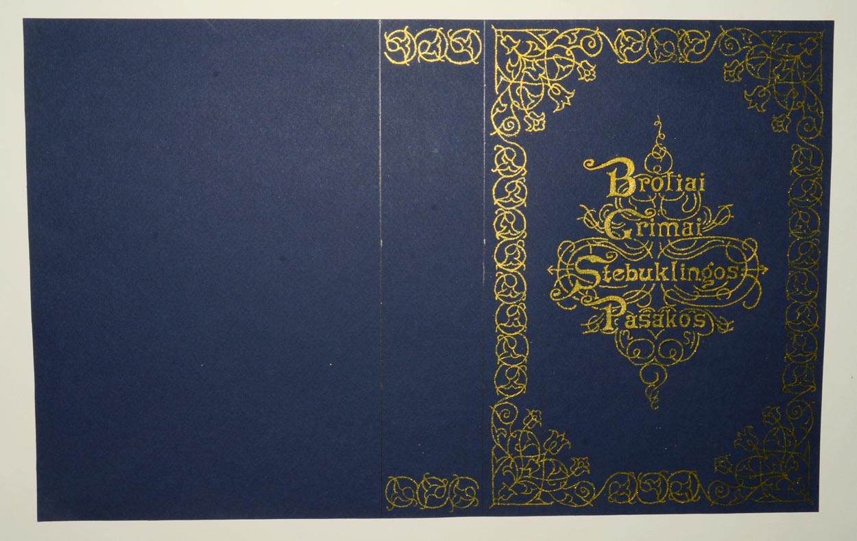
This image I chose to support this text is a cover which I designed myself for the book ‘Grimm’s Tales’ a year ago. It is influenced by 19- 20th century typography. Between both images you can see some similar characteristics which are typical for that period.
post by Egle Petraskaite

