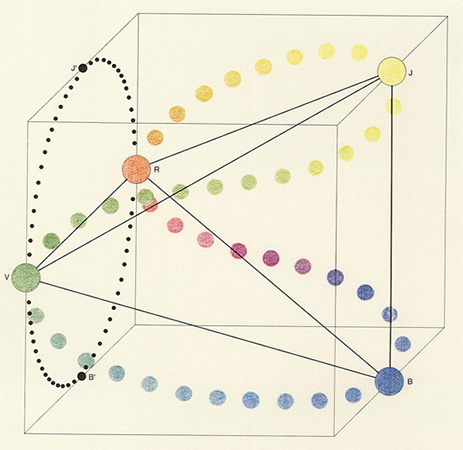
I saw a forest green spine, it was worn down so much that cracks and edges showed the plain white colour of paper. I thought to myself this book has gone through a lot. I picked it up and revealing the cover, it consisted of this same green, this forest green, nothing apart from the name Marthe Wery.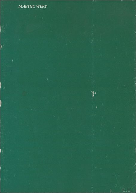 All capital font in white the same white the cracks and edges consisted of. I curiously flicked through, this tattered book comforted me like my grandparents, I felt accepted no matter how much knowledge I held. As I flicked through I saw a blur of red, blue then green. The same green as the cover. I then chose to start from the beginning and saw text, the text was in two columns covering the pages, some pages held photographs of art by the artist Wery and others a combination of both text and photographs. The majority of the photographs are in black and white and showed drawings or paintings. I never choose to read about the artists work when I go to see an exhibition and so I chose to follow my gut instinct and look at the artists work without reading the text. I again felt a sense of comfort by the art, like I didn’t have any pressure to completely comprehend it, I enjoyed the pieces without having a real understanding of it, the dark charcoal drawings drew me in and then red filled the pages with different tones and shades on every page. Abruptly interrupted by grey text and photographs and then blue tones filled the next pages until again it was interrupted by text and photographs. Finally the comforting green filled the pages and I started to realize this was the book I wanted to write about. Have you ever felt as though you were invisible in this world or merely blend in?. This book felt like this to me however, even if you have felt like that, others might find comfort and gratification in you and this is how this book made me feel and it all started with that forest green and an unexplainable link to my grandparents.
I started my research in search of the designer of this mysterious book. First I found out that this was a catalogue for Wery’s exhibition in The Hague in 1986. I began searching for catalogues published in 1986 or similar years from The Hague to see if there was a consistent pattern of the design but couldn’t find anything. I then started investigating the publisher hoping they worked with the designer or designed the book himself/herself.n Lebeer Hossmann was the publisher, and only published catalogues.
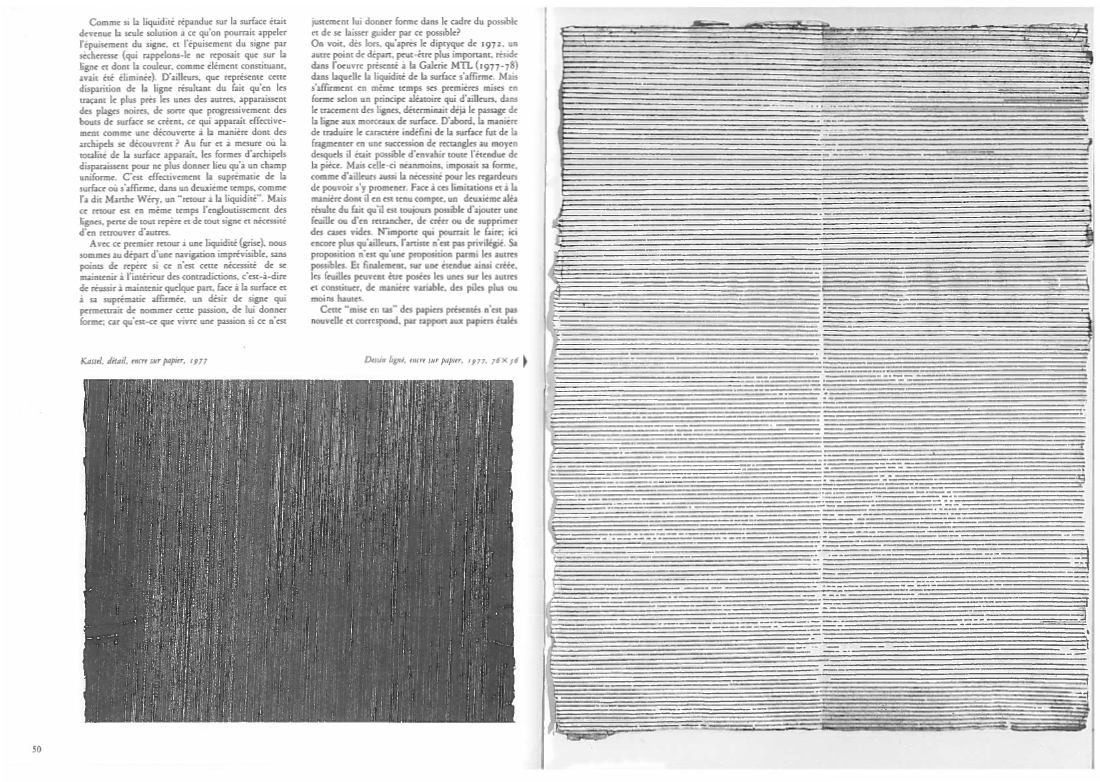
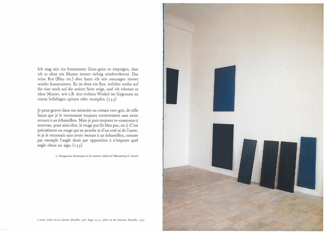
Continuing my research, I concluded that the design and layout of the catalogue portrayed Wery’s work in an intimate form. It was not created to be aware of the design but to highlight the work inside. This I find very humble because a catalogue should be to highlight the work of the artist not the designer. Where as many catalogues design overtakes the artist’s work and become a piece of its own. The format to have the three sections of the book filled pages of the different tones of red, blue and green struck me because I felt as though I was seeing the work through Wery’s eyes. There is no border or text to distract me, it is there to speak for itself, which similarly Wery’s work is. Wery was famous for her minimalism and she studied the different tone and shades of colour, putting together long or rectangle canvases next to each other consisting of the same colour with the variety of tones. Her point was to test the space and architecture with her pieces making it a whole. The majority of the photographs of Wery’s work are in black and white, this challenges the reader when connecting to her work due to the main purpose, colour. This only emphasize the photos and coloured filled pages more, when you came across which then has more effect in fact. The bleakness of the B&W photographs in contrast to the coloured also brings her sense of space making us readers more aware of how colour can affect space outside the art. In an interview at the back of the book Enno Develing describes her work as “earthy” and on first inspection could seem severe, however on closer inspection radiates an intense warmth…undoubtedly has to do with “the pleasure” she takes in the materials. I felt this warmth when I first spotted the forest green spine and now understand that this ‘forest green’ is meant to be more than just a green for a cover, but to overcome just the form of a book and that is what it did for me.

Marthe Wery: Marthe Wery. design by unknown, Rietveld library number: wery 1