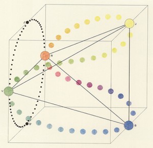
French painter and sculptor Michel Albert-Vanel, specialist in color and symbolic representation of color, presented his Planetary Color System in 1983. Making relation to the color system by Eswald Hering, Vanel accepted six psychological primary colors assembled by antagonistic pairs: black and white, red and green, yellow and blue which mixed result in 64 combinations.
Vanel focuses onto the effects of the color sensations and says that colors are not abstract concepts but real sensations, not experienced in isolation but in groups. There are no isolated colors as one color is necessarily related to the other ones and their sensation also depends on surrounding, lighting, texture, size.
There are three new parameters introduced: chromatism (the conventional scales of hue, brightness and saturation of a single color), contrast (three scales to describe mixtures of colors; for hue, brightness and saturation) and material (three scales – from active to passive, from transparency to opacity, from matte to glossy).
The planetary color system is represented by planets appearing as the primary colors, orbited by many small moons as secondary colors. Using planets as a representation makes it possible to move into multidimensional universe of color combinations and to always go further in the smoothness, into the galactic dust.
The term planet in this color system, is used only as a visual representation, as a sphere. There is no real connection to the planets in our universe. Though this use is arbitrary, my experience is that we all make this connection in our mind. As we experience colors, according to Albert, in groups, in relation to each other, I thought about the relation we, human beings, create with each others too. How do we see each others? Do we see us in color? Do we have colors? Maybe sometimes.
There is an expression: “after she saw it, it became dark in front of her eyes”, or another one: “when we are in love, we see everything pink”.
What can be the meaning of the pink color and possible source of the term ”pink love”: see this link..
or other interesting links about the color meaning, and this ‘pdf’ about color and energy.
The energy or frequency a person emits has a color, though it is not visible to everyone or we have to remind ourselves we can see it, learn it again. The energies, therefore, created between people, in mutual interaction, get mixed just as they do in this color theory: into the scale, darker, lighter, under the influence of a few factors.


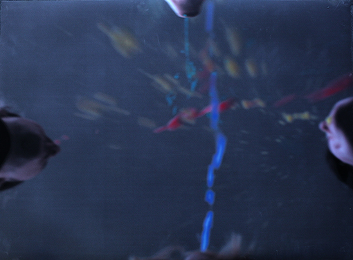
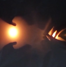
The starting point is a human body, for me a representation of a planet. It is a micro-cosmos, a representation of the macro-cosmos. As the planet interacts to another one, color to color, body to body, a new experience happens. Red, blue, yellow and green are primary colors used by Albert. I used them too. Since it was, and it is for now, impossible to capture the colors the body emits, I wanted them to be visible, produced by the body, out of the body, from the body. Four persons and their bodies created a fountain, a galaxy of colors, as explosion of colors. It becomes an experience documented in a form of one photograph. My wish is to remake it in the form of performance or video, where this creation, motion would be directly visible, we would see it happening.
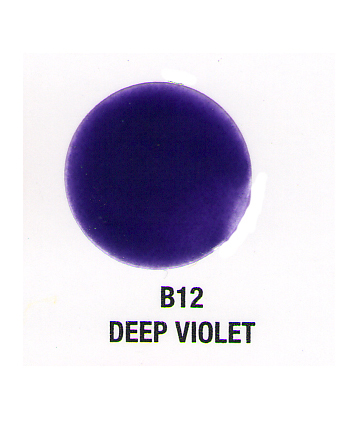
Color has a strong connotation for me. I experience it in a synaesthetic way (look). Green and blue are cold, red and yellow warm. Also they carry more levels when I use them. This time I needed to create just one color out of these. If I mix them, I get brown, and this time, for me, there is no brown in the galaxy. It had to be deep, attractive, also dangerous, clear and not, sublime. Deep violet. The color of the galactic dust. Created out of warm and cold, red and blue. The color in between the planets.
Colors do talk; Albert-Vanel says that through the tarot he made in relation to his system.
Ask, observe.. and see.. is another phenomenon discovered by the Russian electrician Semion Kirlian, we can capture the energy of the body which radiate it. For more information about that follow this link to… photography and the “Aura”
Thank you for the colors..
