Skip to Content Skip to Search Go to Top Navigation Go to Side Menu


"information design" Category


Redesign


Tuesday, May 28, 2019


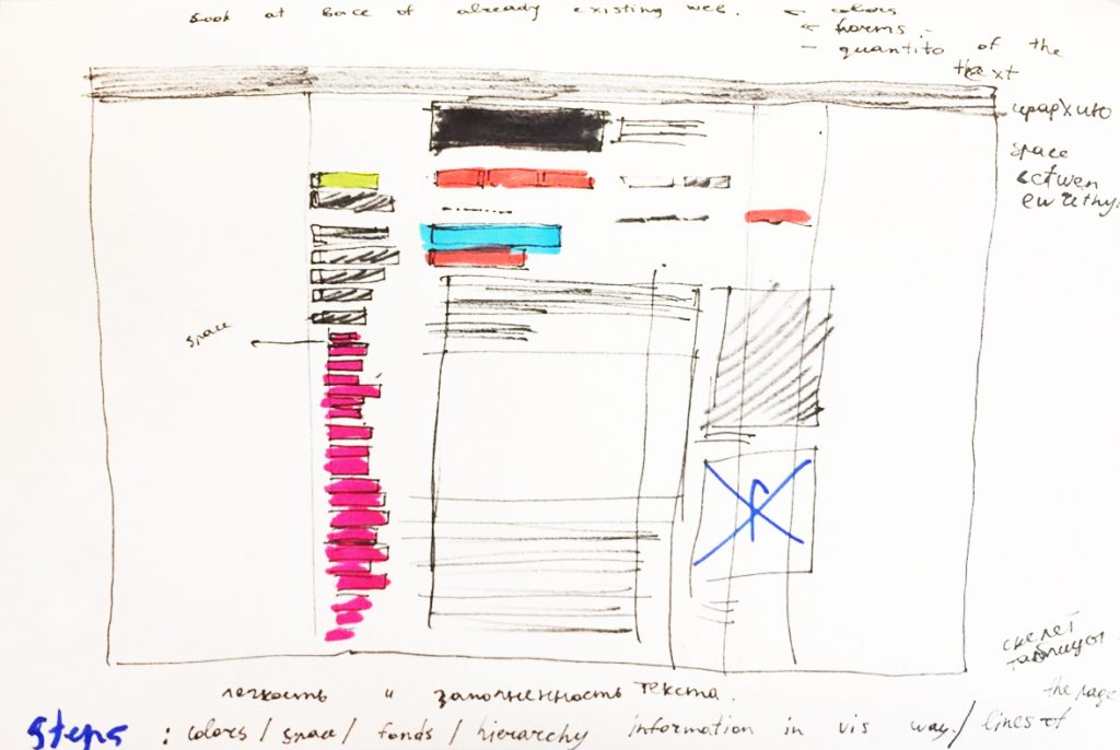
Making the redesign of an already existing page.


It helped me to discover all the interesting moments in the structure of the web page and to divide the webpage into different layers.
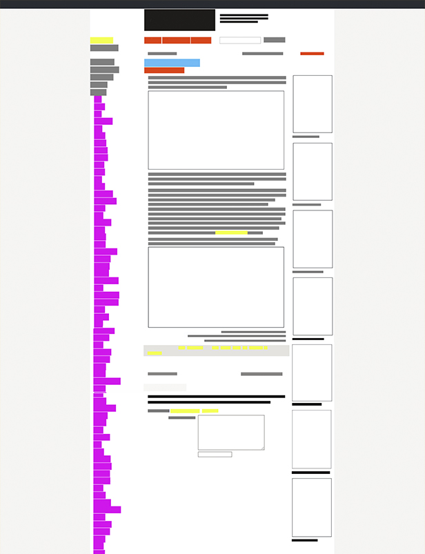
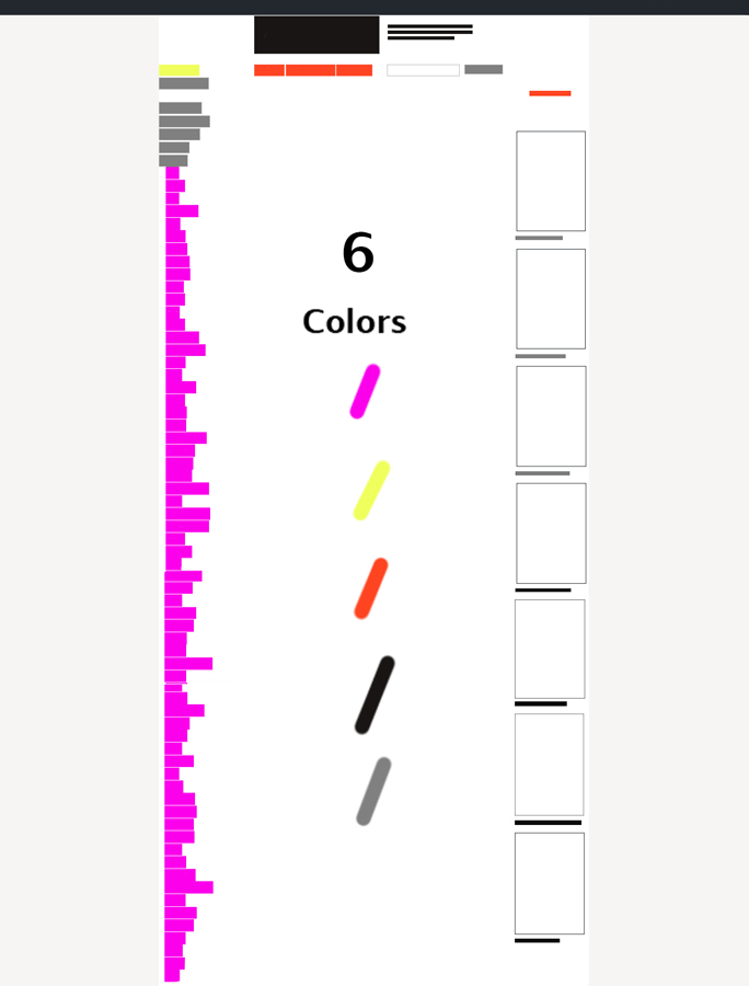
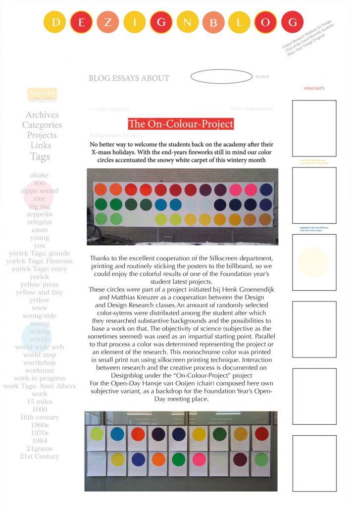
I chose that page (https://designblog.rietveldacademie.nl/?p=77833) and started to draw the structure of it. I noticed that this page doesn’t have a lot of air between different parts of information, words, and texts and all data ranged to the center. Moreover, there are six colors, 4 fonds and two main pictures with bright and sharps form inside. All paragraphs are left-aligned and they end in a rather chaotic order. However, squares around words help to divide information between each other. The quantity of the colors attract the biggest part of our attention and we can feel a little lost.


Sketch


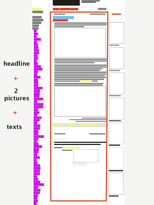
Modular grid


The fullness of the page


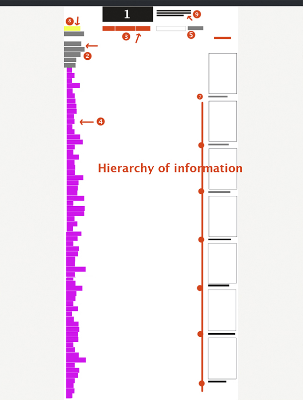
The Hierarchy of the given information


Colors


Example of a new Design


By doing a new design for the existing page I tried to pay attention to the pictures and elements on the images which always can become the part of the website.  In that case, I chose circles as the decoration of the page. Also, I wanted to divide the main text (essay) from the surrounding data. So color gave me a possibility for doing that. Plus I added a little bit more space between words and made distance between tags, title, essay. It helps us to get a breath.


Community to change the system


Tuesday, December 5, 2017

Dave Hakkens creates machines to recycle plastic. The concept Precious Plastic is that everywhere, everybody can build themselves these machines and recycle their plastics. For me, the most interesting point in this concept is the community around it. He says

“To start up an idea is a powerful tool to use these days. A designer is able to bring people together by just sharing an idea or a potential solution.”


Dave Hakkens and his projects are accessible in two points.

Most of his design projects are often provides with open-source instruction videos and blueprints, so it is presenting as a do it yourself project. You can inform yourself, make your own machine or your design object, share on social network, and use it. Make and use these projects is to be active to change the system, and be a designer as well.

Furthermore, he is very active on social networks. On YouTube (with 122 000 followers), he often published videos to clearly explain his projects, how to make it etc. But also he has a certain way of life that you can clearly see in his videos called Story Hopper.

or an other link:  here.

If I had the opportunity to talk to Dave, I would ask him if he thinks that in addition to this solution to reduce plastics wastes we also must have to adopt a minimalist and zero waste attitude. For me, the series Story Hopper highlights this way of thinking because he gives advice on how to consume and act more responsibly. These videos fit perfectly with the sharing of opinions and go further with the ideas that he wants to present. He offers more than just designers content while playing with the border of social network influencers.

Also on his website, you can find the forum where you can talk with people around the world. It’s nice to see all these people who said « I want to recycle plastics but I don’t know where or how to start » Finally I understood that in this big community, some other little communities are created to make projects easier. On the topic, someone answer: « try to find people, and build an association or something with many people to reduce costs!»


expo_02_1100
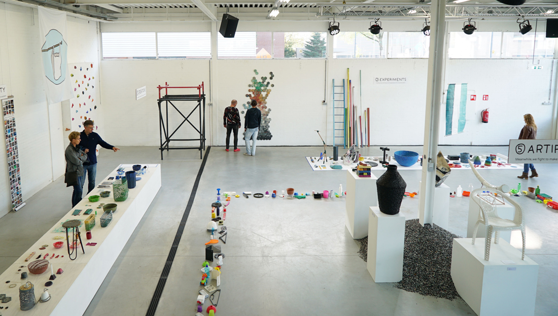
V3 Exhibition during the Dutch Design Week


I am wondering how this concept can grow and evolve in the rest of the world. Are social media enough to share his ideas? The definition of the word community by the Oxford dictionary is: the condition of sharing or having certain attitudes and interests in common“. 

Dave Hakkens and his projects are accessible for those who know him and who share the same interests. Plastic machines were at first introduced in a museum as an exhibition because Dave Hakkens is at first a designer. So a certain public is interested to see it and in this kind of place, it does not have the same purpose. It is difficult to apply something that you just saw in a museum. You can maybe just except to have a discussion but not really a revolution. What effect would he have if he presents his project in a hardware store? The visitors of both places are different and they are mostly not looking for the same interest. So I am wondering about the accessibility if Dave wants that everyone can build those machines and change the system. For me, to imagine the Precious Plastic project in a context more realistic like the hardware store allows more an action than a proposition that we can not touch and allows a wider impact on the population.


I discovered the work of Dave Hakkens thanks to my sculpture class at the Rietveld Academie. Indeed, some students were able to create two of his plastic machines: the injection and the extrusion machine. I spoke with one of these students and she gave me an interesting reflection: « He says that everyone can build those machines, it works for us because we are in art school, so we have all the materials needed and we always can find a way to be creative with the plastic machine, but I am not sure it’s the same in poorer countries, because it has a cost and maybe they did not hear about the Precious Plastic project».

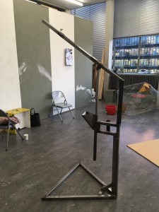
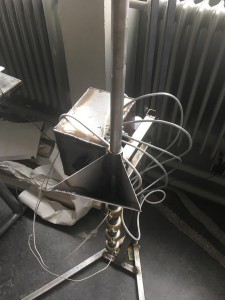
It was quite complicated for students to build these plastic machines because some pieces were difficult to find, expensive, and a lot of detours at the metal workshop were needed. Finally, it took 6 months to complete the injection machine and the extrusion machine is still in construction.


PLASTIC MACHINE             Injection
Injection machine in the Rietveld (Left beginning of the construction, Right the electronics part has been added)


Dave Hakkens went in 2015 to Ghana for research to help the poorest countries to access the construction of plastic machines. As we could experiment at the Rietveld, this needs a lot of resources (internet or specific stores to buy the pieces) and money. But this visit to Ghana shows us that even recycling machines can be an option and it is not necessary to have money. They found machines which are made to press the juice out of fruits which are very similar to the extrusion machine, in this way they were able to reuse these machines as an extrusion machine with a little bit of do-it-yourself.  Also just a few weeks ago, he shipped a big container to the Maldives to clean ocean. However, the help of Dave Hakkens is still necessary to implement these solutions at first. Then, after his visit to Ghana, the local population can be more aware and autonomous to recycle plastic.

The fact that Dave Hakkens brings container is important because “the risk” of this way of building plastic machines is to build them for a personal use or very restrained, as the weekend handyman in his garage. Containers, places of many workshops to recycle plastics, can expand the utilization and bring a lot of people to work together. Indeed, it can not be an activity in its own right, but it should really be part of our way of life and as we can not spend our time recycling plastic. We may wonder if this community of active people is enough? What about the big industries? 

In fact, there is a start-up called The Plastik Bank which collaborates with the big industries. Plastic waste that invades the poorer regions of the world is collected by local people and then sold to companies that recycle it. But in the end, Dave Hakkens gives the opportunity to communities to create something with plastic, be autonomous in the research and win money (if they decide to) as part of the process. It is really like building something new, maybe a new society.


To say goodbye one more very interesting article on other people who tried to find solutions for plastic wastes. 

Analyzing Modern Religious Writing


Tuesday, April 25, 2017


Time Spend Analyzing After Meeting A Modern Cult (The Introduction).

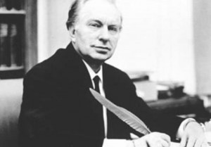
Recently, I have been looking at language while diving into modern religious or cult-ish writing techniques and aesthetics. This is mainly the language used by Scientology and the way its founder L. Ron Hubbard confuses the reader, which then, makes it possible for Hubbard to arrive at simpler conclusions. I have looked at the writings of William S. Burroughs in his book The Job, where he argues for the seemingly nonsense idea of language as a virus.

The following is a result of these readings made with the agenda of publicizing these techniques for us to advantage of.


I: Using “Mental Fogginess” To Simplify Conclusions

In the first chapter of the very first scientology book, Dianetics: the original thesis (1948), L. Ron Hubbard concludes after a small, compact and confusing rant on topics such as heuristic science, workability contrasting idealism, semantic difficulties, psychosomatic ills, the unknowable/the knowable, spiritualism, deism, telepathy, clairvoyance, the human soul, field of thoughts, dynamic principle of existence, that the first cornerstone of what for the reader seems to be everything, is for the human to SURVIVE!. This is just after the section entitled important notes, placed on page four, where the church informs the reader that:


“Trying to read past a misunderstood word results in mental “fogginess” and difficulty in comprehending the passages which follow. If you find yourself experiencing this, return to the last portion you understood easily, locate the misunderstood word and get it defined, using a good dictionary or the Glossary at the end of the book.”


The problem is not that these difficult concepts such as telepathy, dynamic principle of existence, etc. are hard to grasp. The problem is that Hubbard is using them as a sort of “mental fogginess”, so when he finally concludes that the essence of all this is to SURVIVE!, the reader might not have understood what was meant above but the essence of it (to survive) we all surely understood, and we then do not need to use a good dictionary to understand this.

Hubbard also tells us in the text that we do not need to concern ourselves with the basic questions to our existence. He says that by dividing everything in the field of thoughts into two categories, the unknowable and the knowable, we then do not need to concern ourselves with such indefinites as spiritualism, deism or the human soul. This is of course addressed towards those who search for meaning. Hubbard constantly plays with concepts that an ordinary person will be confused by, and what the ordinary person will easily understand and in these easily understandable parts, he then gently pads our backs to ease our worries.

L.RonHubbard


II: An authoritarian language.

As William S. Burroughs writes about his invented professor, Professor Wilson Smith, he does it in a very scientific and authoritarian way. He uses this authoritarian language as a tool to create confusion and chaos, so his own radical and confusing statements have a chance of being seemingly logical. He writes:


“The word has not been recognized as a virus because it has achieved a state of stable symbiosis with the host, though this symbiotic relationship is now breaking down, for reasons I will suggest later. I quote from Mechanisms of Virus Infection, edited by Mr. Wilson Smith: “Viruses are obligatory cellular parasites and are thus wholly dependent upon the integrity of the cellular systems, they parasitize for their survival in an active state. It is something of a paradox that many viruses ultimately destroy the cells in which they are living.”


After Burroughs has claimed that The word has not been recognized as a virus he then quickly makes a shift to Professor Wilson Smith, making it seem like it is exactly this that Wilson Smith argues for, although Wilson Smith is not. But when Burroughs then quickly again reassures the reader that the spoken word as we know it came after the written word due to a virus infection, which also is a highly speculative statement, Borough is then again putting this idea of the word as a virus into our minds, and it is only made possible by the use of an authoritarian language.

We see that Burroughs is using language like it is an actor in a hidden camera show. Like a scene where an actor is dressed up as a police officer on a train station, ordering passengers to get out of the train, only to be left on the station, tricked by what they thought was the law. This is just as I have done by manipulation all of Burroughs’ statements for my own agenda.


III: Take Advantage. 

But what I in generally would like to propose is this: Let everyone take advantage of these techniques to create a more chaotic environment, were illogical facts can sprout in the chaos of all other illogical facts. But to make this environment to perfection, there are other techniques we need to acquire. Luckily every technique can be learned for this purpose since much of it already has been produced for us to observe.


fcec6bfd258dc344b5b5b553975743bd

Mads B Sørensen: Text from the essay collection “Language and Technique”

Retracing, I swear I use no art at all


Friday, November 13, 2015

retracing

I enter the space and I know my mission.
I know that Today is my lucky day.
I’m heading up for something that interests and feels good to me, only one item is required.
It is an especially pleasing and reassuring occasion because I know what this place could do to me.
I love and hate this place.
As an example I know that I don’t know much, and this, adding a bit of curiosity, could keep me here for a couple of days.
Entering here I am well aware that words can trick, seduce, redeem or amaze people.
I remember that words are doors, that books are sleeping souls and that this open graveyard was once compared to a labyrinth, which indeed it is a sneaky way to describe a prison.
But today I’m blind from any content and this is my luck.
Thousands words laying down like disarmed soldiers, sleeping giants.
I’m blind and that’s the reason why I am wandering between bookshelves touching each spine, trying to use a different sense.

In this way I find the book, or the book shows itself to me.
Only by touching I read its title.
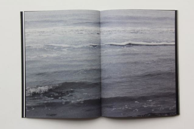
I open it  and I  feel the ink on its pages, the different kinds of paper used. It seems an attempt to remember something lost,it presents pictures in various format, it looks like dialogue between material. I still don’t know what this lost message is, after there is a text that I have not read yet. Anyway I am going to explore it now, trying to retrace it.

retracing.3retracing.2

Artist Rein Jelle Terpstra,
Book Retracing
Publisher Post Editions
Design, Studio Joost Grootens

17:45 12-11-2015

I am starting my research, I flipped twice every page of the book, still haven’t read the few written pages at the end. I am not doing so because I think it will probably be a sort of description of the work, and I would rather focus on the first part.
Like when facing a magician, you don’t want to know the trick from the beginning.
As well I want to keep being blind all those words cause this is why I choose this book, my research method.
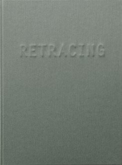
Within its covering major capitals that protrudes through the grey linen cover, I can feel a dialogue, and I want to follow to it carefully.
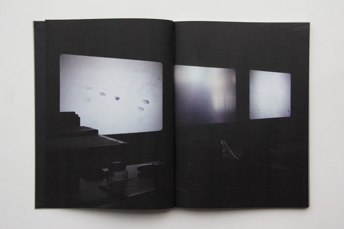
It seems we are facing double track, series of thick deeply back matte pages are followed by glossy, light and shining ones, it is such for all the length of the book.
I figure out that the big thick black pages depict what it must have been a slideshow projection.
projection
In the dark of the room you can recognize the size of 35mm colour film slides projected on a wall, in the background emerge some objects like a desk and a chair. I have no clue what this slideshow is about, the diapositives depict snowy landscapes, flowers, tables.
The photos seems unrelated and the only thing I can feel is a taste as nostalgia and loneliness.
After few pages, this dark thick and deep side crash against a bright, clean and light one.
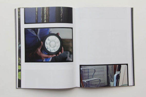
This new part is showing also some 35mm diapositives, but this time, thanks to the properties of the paper and the print, the images are clear and easy to watch. Still they are presented as part of a slideshow, and sometimes images are cut in half, leaving a white space before or after them.
Bright

For the whole length of the books these two part keep switching, dark and light pages alternate themselves, here you can see how.
If content of the pictures seems random I notice that the photos of one section reappear in the other, the slideshow must be about these 35 mm presented in the white side. My feelings are now confused. I feel like facing a reality (each photo) and being driven from a clear to a dark side of it continuously, as if we were inside a paradox,or like facing a duality a transition.
Like going form consciousness (white and clear pages) to oblivion (dark and blurry ones),from reality to memory.
All images show familiar, personal or peculiar places. I don’t know why the author made this double track, I don’t know why these and not other photos are in it and I don’t know why in this order. I need to know more, I wish I know more.

02:21 16-11-2015

I read the end of the book, everything sounds so funny to me now.
I discover why the book was and is so special to me, why I did chose it and indeed why I was so confused by the way is designed.
As described in the internet “Retracing’ is part of a wider investigation into perception, memory, photography, and the possibility of imagelessness. Rein Jelle Terpstra is working with people who are about to lose their eyesight. He has photographed images that are valuable to them on Kodachrome slides, with the promise to describe the prints after a few years very carefully in words, in an attempt to invoke the images in their heads through language. Earlier Terpstra made a slideshow installation with multiple projectors in which the light images of ‘Retracing’ slowly blend”.
The book that I chose blindly turned out being made for blind people, and it’s content try to describe how an image can disappear.
It simulate how our memories work but it is also an the attempt to save them. In fact Rein chose to make visible something impossible to visualize, to describe the process of disappearing while at the same time reverting it. She crystallize memories in order to give them back to their owner, to change the destiny of a memory while showing us how it can and does fade.
I said it sounded so funny to me because in a cynical way I think that my choice couldn’t be more natural.
Retracing came to me because of my research method, but the real magic lay in the fact that its design has been able to translate the content of the book into a material form. The design of the book, starting from its cover, where the letters of the title are almost invisible and only “vaguely looms out at a certain incidence of light”. The cover already speak about its content starting a tautological circle, the thickness and the quality of the paper, different for different papers and its printing methods.
Every element sustains the concept behind the books giving it a physicality.
Every detail is a confirmation  of the central statement and it strengthen its power.
I wish I know more about who designed the book, I know that his name is Joost Grootens, that he lives in Amsterdam and that following what internet says should look like this:
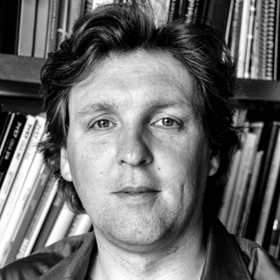
joost_grootens_portrait


01:32 18-11-2015
I still think how nice it is that a book can speak in so many ways.
For example  I have always appreciate old books, probably because you can feel that somebody (and not something) made it.
You can feel that the personal touch overcome its production, and I can wonder how much work and attention is behind every page.
In this way the page itself is becoming a medium behind the text or the information it is presenting. It feels that reading while touching such a book goes beyond its text.

22:24 19-11-2015
Today we had a meeting regarding our researches. I had more info regarding Grootens, for the entire meeting I had in my hands another book he designed, actually his own book, designed by himself for himself,
and it is GREAT.
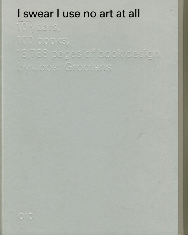
I realize I should start a new post regarding this book but I will just say some words about “I SWEAR I USE NO ART AT ALL, 10 years, 100 books, 18788 pages of book design”, (in short ISIUNAAA).
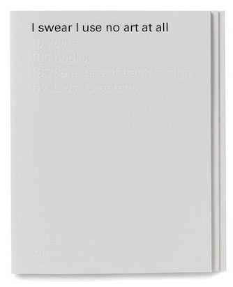
ISIUNAAA_000_cover

First of all, it seems to me as the most rational and efficient work-related autobiography one can person can eventually make, for what I saw so far at least. In it are described all the works Joost made in the last 10 years, first presenting various charts regarding how his projects evolved, with whom, when and how.
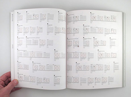
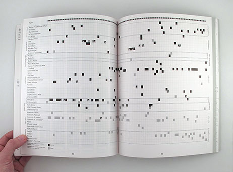
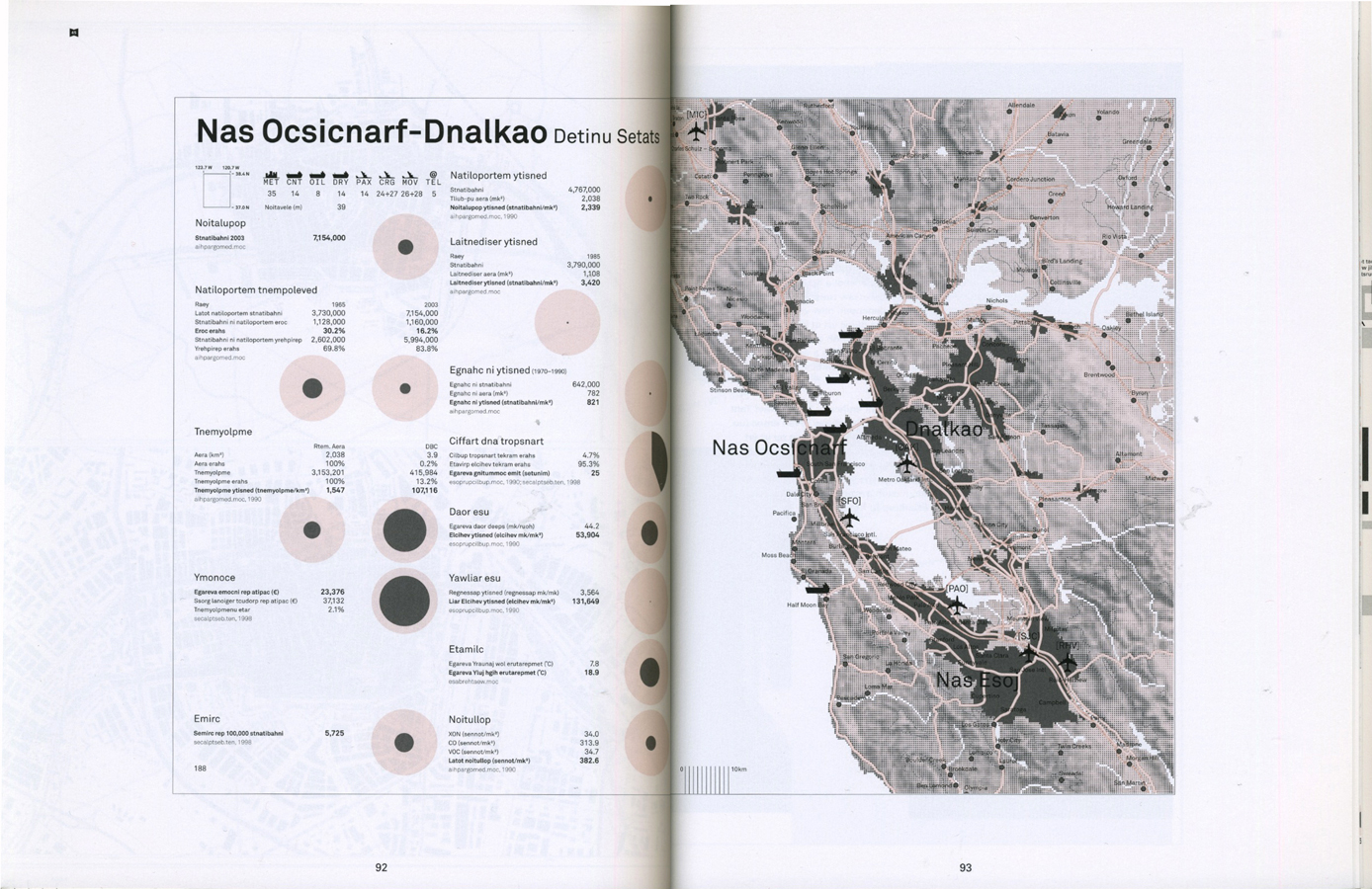
As well he show a timeline about how each book or project was connected with others, describing why they were made or how they started, he present a map of the different studios where he worked, which and how many different kind of paper he used, all the kinds of binding methods, typeface, pictogram, pattern, grid and colour he chose for each book.
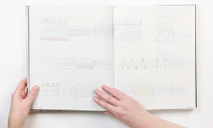
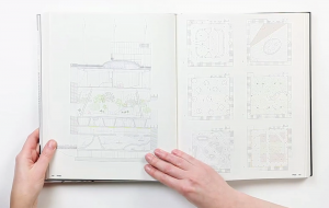
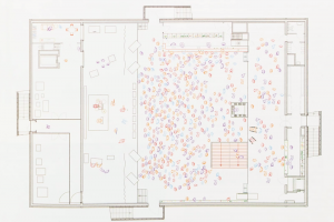
Here I decide to post some of these schemes and charters to make my amusement understandable.
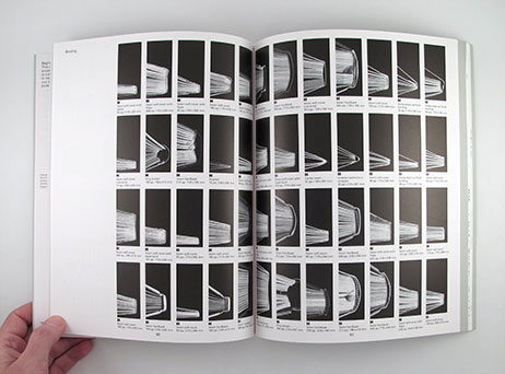
no-art-at-all-crop-09 no-art-at-all-crop-07 no-art-at-all-crop-04 no-art-at-all-crop-10

The book is a masterpiece of order and functionality, but without losing an intriguing physical effect.
As for RETRACING the book can speak for itself about itself without the use of words, intact in the last part Joost present some samples of the 18788 pages he made, but with a trick. He reverse the order of each page so where it should be written “apple” you will read  “elppa”, this on order to make the reader look at the design without the possibility of reading its content.

00:35 23-11-2015
I found myself thinking a lot about ISIUNAAA,and I am amazed about the attention the author placed in his book, as for the control he has over it and the power of a systematical method. I think Grootens must love his work and in his book his passion manifests powerfully. RETRACING is a vivid example of it and ISIUNAAA is its symbol. It is like an old book, the attention in making it help to create a new channel of communication.

3:09 30-11-2015
It is more than a week that I am collecting memories about the book I saw only for one afternoon.
In the last week I went to the city looking for Grootens magical book, no one has it but I finally found it in Denmark.
It arrived yesterday and I can’t escape from it.
This is the end.
My research end with the beginning of a new one.
I had one more proof how much books are powerful, how much they can speak depending on how much attention they received while making them. I understand that an almost maniacal approach can be useful if it explores carefully the possibility to best way for express an idea and I intend to use this approach for my future researches.
It is important to remember that the focus and attention in the phisical presentation of a work is essential for increasing its power and strength. I am very glad all this happen, I am glad RETRACING pushed me to RETRACE, claiming awareness screaming beneath an almost invisible but powerful surface.

Rietveld library catalog no : ter 1
 

MVRDV Buildings


Tuesday, October 28, 2014

9789462080126_mvrdv_buildings_500

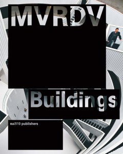
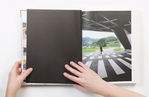
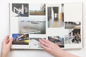
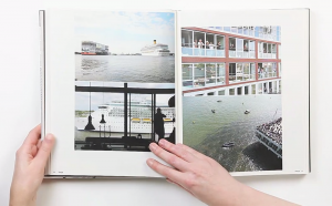
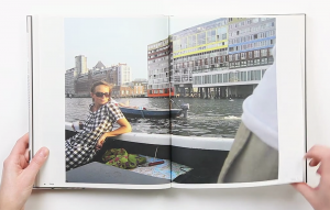
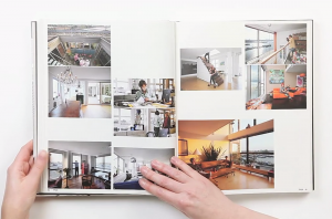
The reason why I chose this specific book was its colour and image placed next and on top of each other. It has caught my eye and wanted me to read and analyze its content. Page after page I began to realize there was a type of system that the designer, Joost Grootens carried out.

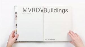
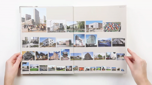
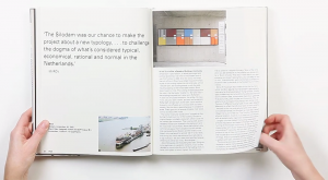
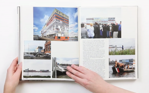
MVRDV Buildings, published by 010 Publishers, is a complete overview of MVRDV’s architectural practice over a total of 20 years. To me, this has been a positive discovery while analyzing the book. It was a very good surprise. I am very much interested in architecture. The way I have understood it was that the designer has deliberately chosen and created a way of method to display and present this portfolio of this architect firm. My impression was that this “method” is a way of telling a nice story or even a nice joke. A way to share important information with people. (click on the title page image and browse the 11 consecutive images)

Screen Shot 2014-10-06 at 21.51.42 Screen Shot 2014-10-06 at 21.51.33 MVRDV Buildings Screen Shot 2014-10-06 at 21.52.11 Screen Shot 2014-10-06 at 21.52.16 Screen Shot 2014-10-06 at 21.52.24 Screen Shot 2014-10-06 at 21.52.30 Screen Shot 2014-10-06 at 21.52.38 Screen Shot 2014-10-06 at 21.52.41 Screen Shot 2014-10-06 at 21.53.14 Screen Shot 2014-10-06 at 21.53.59  Screen Shot 2014-10-06 at 21.54.32


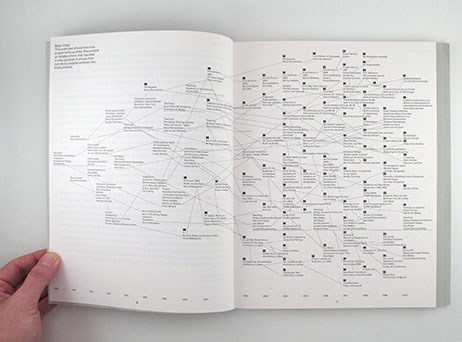
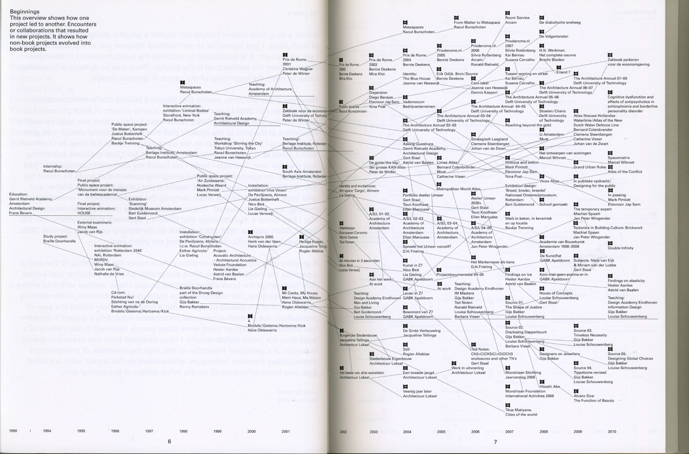
Another consequence was that I got to explore Joost Grootens own book. The book called I swear I use no art all, has been written by the designer and summarizes 100 books, 18788 pages of his book designs throughout 10 years in that field. The interesting part is to see how, the originally architectural-designer became a graphic information-designer. The book describes his relation to publishers, supporters, authors, collaborators, printers, workplaces and studios. A very personal way to present the changes and development that his own working field. It has made me realize how nice it is to make a summary of your own development. Even though I can not yet make a summary and create a descriptive portfolio of the last 10 years of my work-field I have already imagined creating the mapping of my family or origin.

(click on the cover and browse the 2 consecutive images)

I-Swear_bookcover

I-Swear_spread2 I-Swear_spread1

A part which describes the beginning in a overview, showing how one project led to another by encounters or collaborations and led into a new project, caught my interest. The designer has focused on presenting how non-book projects evolved into book projects. This made me think about my own encounters I had in my life that has influenced some decisions made later. Furthermore, allowed me to think in a non project based way. It also made me think of the origin and allow me to imagine the beginning.

As a personal mapping I was first interested in looking online for my origin in order to see routes and possibilities to reach Santiago, the origin of my father, and Budapest, the origin of my mother. I have also looked for the distance between Amsterdam and Budapest. Nowadays, it is very easy to travel between my hometown and Amsterdam which is the city I have chosen and encountered on my own. I had first visited and met this country at the age of 16 and already new that one day it would be my home. Due to the fact that I can not connect to my origin nor to my parents because of their divorce I currently have to focus on the present and the decisions I have to make every day. Choosing to study but first of all choosing to apply to the Gerrit Rietveld Academie has happened by chance. Through the Academy I have also encountered the Design Academy in Eindhoven. These two Academies are important in this case because interestingly Joost Grootens who graduated from the Gerrit Rietveld Academie is now a teacher in the Design Academy.

At this point I have immediately remembered my past with both academy’s. At one point in the last two years I have met students in Eindhoven who have shared a lot about their work process and further information of their studies. This also made me consider to apply to that school. Although I have never succeeded to enter the Design Academy I have, as a result, got to know the Rietveld more.
Once again, choosing >MVRDV Buildings< still proves how interested I am in design, how fascinated I am about architecture.

I knew I had a good feeling about the book’s black cover.

(click on the map and browse the 2 consecutive images)

Screen Shot 2014-10-28 at 20.02.39

Screen Shot 2014-10-28 at 20.02.53 Screen Shot 2014-10-28 at 20.05.11

To conclude; black to me is a colour. It is a comfort zone and also a strong feeling I have towards it. Black to me is the house I wanted to have and the friends I wanted to play with as a child. Black is also the material I preferably wear during my daily life and it is the ink I like to draw with. Black will never leave me and will always be part of my decisions in the future.

Talks about Money: Rietveld library catalog no : 716.9 rub 1
Conditional [Design] Painting


Tuesday, October 27, 2009

Conditional Painting is truly happening in the van Abbemuseum Eindhoven! They call it the Vitruvian Paint Machine.

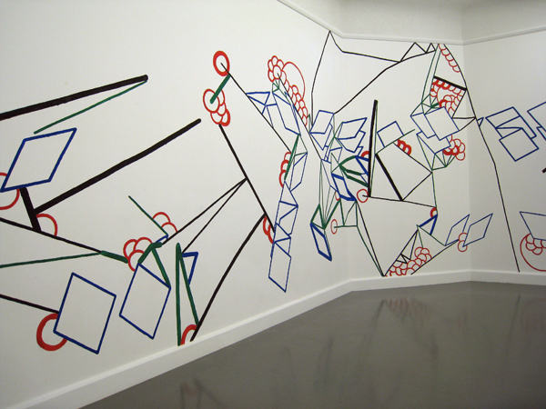
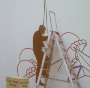
As part of  “Take on me (Take me on)” /Dutch Design Week 17 to 25 Oct 2009, Luna Maurer and Edo Paulus executed a mural painting on pre determined conditions based on the proportions of the body and visitor interaction.

The act of designing is based on rules they say. So Luna and Edo, together with Roel Wouters and Jonathan Puckey, created a manifesto of explicit rules for design.

Visiting their lecture, as part of the “Take on me (Take me on)” event, they made it clear that setting strict conditions does disconnect you from subjective standards and creates awareness in the process. A beautiful time based movie of their “machines” made this crystal clear.


download this research essay: by Jules Esteves: “Conditional Drawing, Conditional Painting” questioning the practice of Conditional Design.


Log in
subscribe