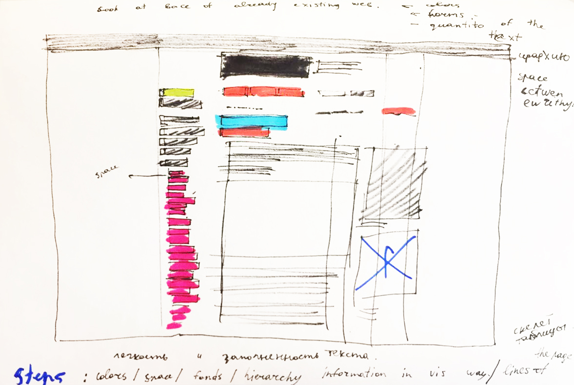
Making the redesign of an already existing page.
It helped me to discover all the interesting moments in the structure of the web page and to divide the webpage into different layers.
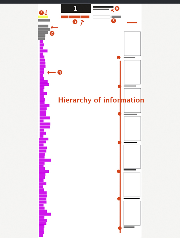
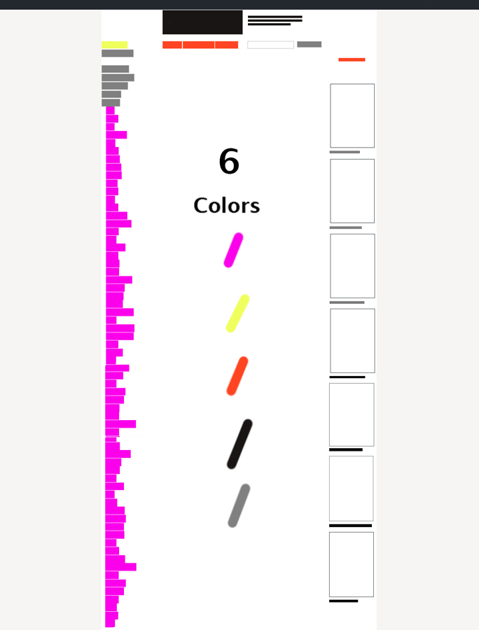
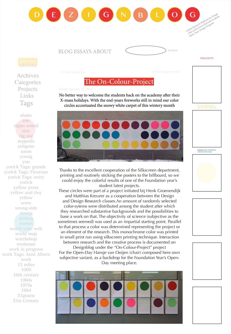
I chose that page (https://designblog.rietveldacademie.nl/?p=77833) and started to draw the structure of it. I noticed that this page doesn’t have a lot of air between different parts of information, words, and texts and all data ranged to the center. Moreover, there are six colors, 4 fonds and two main pictures with bright and sharps form inside. All paragraphs are left-aligned and they end in a rather chaotic order. However, squares around words help to divide information between each other. The quantity of the colors attract the biggest part of our attention and we can feel a little lost.
Sketch
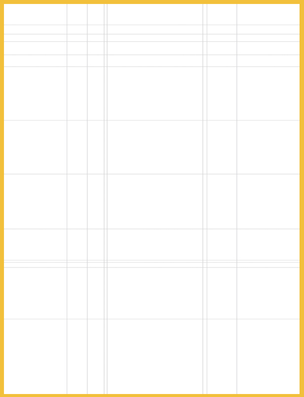
Modular grid
The fullness of the page
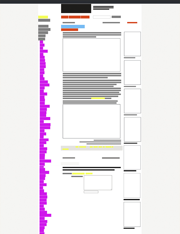
The Hierarchy of the given information
Colors
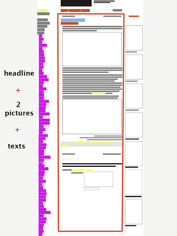
Example of a new Design
By doing a new design for the existing page I tried to pay attention to the pictures and elements on the images which always can become the part of the website. In that case, I chose circles as the decoration of the page. Also, I wanted to divide the main text (essay) from the surrounding data. So color gave me a possibility for doing that. Plus I added a little bit more space between words and made distance between tags, title, essay. It helps us to get a breath.
