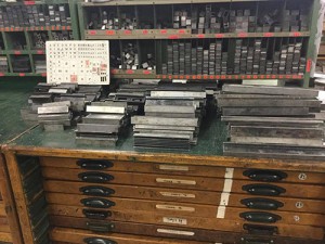
 Spending an afternoon using an old letterpress I experienced what it would have been like to create printed text in the early 20th century until offset printing took over almost completely. This was a nice way to immerse myself into the subject of De Stijl and its relation to type design.
The Stijl movement which was founded in 1917 consisted of artists and architects who started building a new world, presumably as a result of the war that was just coming to an end. They literally started constructing their ideal world out of furniture, buildings and artwork. It seems to me that they tried to clear up the mess they saw around them by creating perfect straight lines and rigid blocks. Using primary colours, black and white, strict rules and useful functions they began portraying a ‘perfect’ world. In a way, they brought everything back to the basics while simultaneously making basic things more complex.
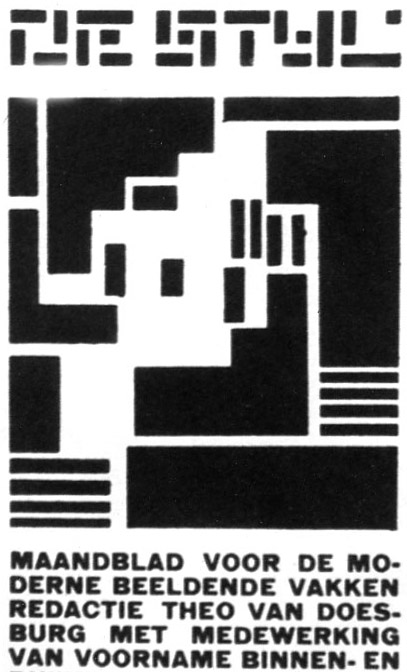
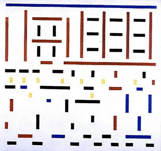
When researching De Stijl’s typeface design the first thing that comes to mind is the magazine published by Theo van Doesburg. The front cover, designed by Vilmos Huszar particularly caught my attention. Specifically the way the same exact rectangles create both the image and the type.
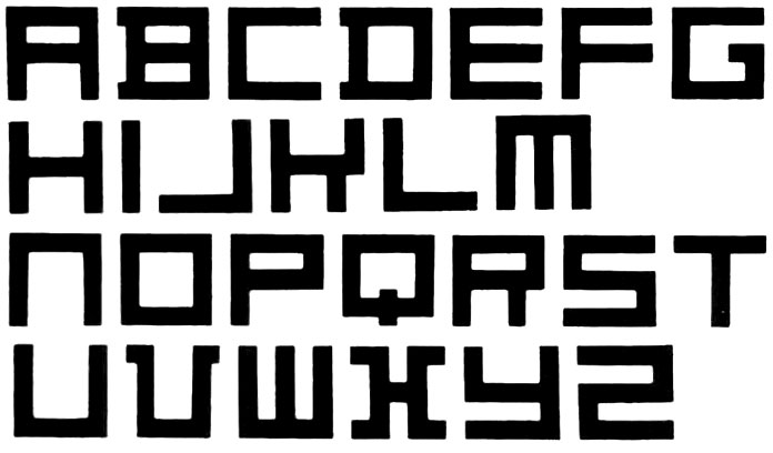
It seems to me like a practical method to create text, why not use the same structures used to create image, kill two birds with one stone kind of thing, and seeing as the spacers of the letterpress are perfect rectangles why not use those…? The Doesberg type shows this use of the letterpress spacers particularly well. One can see exactly where the spacers have been placed to create the alphabet.

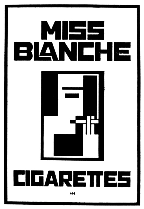
The same goes for Vilmos Huszar’s use of ‘building blocks’ to create both the text and image of the Stijl magazine cover. Or the logo he made for ‘Miss Blanche Cigarettes’, again the same shapes are used to create the text and the image.
This theme of using the same ‘building blocks’ to create image and text alike began to be a recurring subject in my research on de stijl’s type design. The line between image and text seems to blur and they both become the same thing, both showing information to the viewer.
Another fine example of this, is the 1941 publication of the fairy tale Het Vlas (The Flax) written by Hans Christian Andersen and illustrated by Bart Van Der Leck. The entire book is constructed out of straight lines, both the text and the images. One can see the strict guidelines that Van Der Leck stuck to precisely. This idea of having strict rules interests me, I find myself doing this at times with my own work, for example not letting the pen lift off the page. Although it makes sense to create these guidelines at times, I do get to a point where I’m thinking ‘I could create a more satisfying outcome if I didn’t have these self imposed rules’. Perhaps I am experiencing a similar thought to that of Van Der Leck when after disagreements with other members of the movement he decided to depart from De Stijl and create more abstract works with diagonal lines and other shapes and colours. Here is an early piece by Van Der Leck from his time with De Stijl and then one of his later works where you can see his departure from the strict guidelines.
Abstract Composition, 1927 / Compositie no. 3 (Leaving the Factory), 1917
Going back to when he did use straight lines to illustrate the images and text for the fairytale, it seems as if this rigid rule was almost created as a challenge… To push further into the non obvious, the non default way of drawing things, the strictly abstract and to also challenge the viewer. In the literal sense as well: the text in this book is not necessarily easy to read.
Lets not forget who the audience of this book was supposed to be. If I imagine coming across this book as a child, lying among all the other softly illustrated fairy tales it would definitely stand out, I would have had to focus extra hard on each letter for it to make sense and watch as the lines constructing the letters merge into the ones creating the images. This principle, the way the image and the text is created in the same way, out of the same blocks is what stands out most about the typefaces designed by De Stijl. To take this one step further, it could be said that it is all the same, all the creation made by these artists is the same, for they use the same rules and guidelines.
The buildings, the furniture, the paintings, the typeface, all a creation from the same lines, forms, shapes and colours. This element is what I tried to explore in this little animation, the way the same ‘building blocks’ can create image and type. The seemingly rigid forms shift and transform around the page and merge into each other. Where is the line between image and text? I tried to play with this concept by letting the ‘building blocks’ move around the page and shift from image to text and then back again.
https://www.youtube.com/watch?v=UMQ5cDpzgyg